I’ve been showing you how the PM complex has been breaking out from their August 2020 trading ranges which should be pretty evident by now. What we need to focus on are the individual PM stocks that are showing strong chart patterns. Keep in mind a correction or consolidation phase is all about getting you to sell your stocks by driving you nuts with nothing but chopping action. When the breakout finally does happen your mindset is in the consolidation phase thinking this isn’t real.
The psychology of an impulse move is a totally different animal. Instead of trying to buck you off, the price action just keeps going higher which starts to attract a lot of attention and the higher it goes the harder it becomes to get positioned. Instead of a low risk entry point it then becomes a game of chasing your favorite stock. About the time you catch it comes the first small consolidation pattern and you are left wondering, did I make the right decision? Remember we are playing a game of psychological warfare more than anything else.
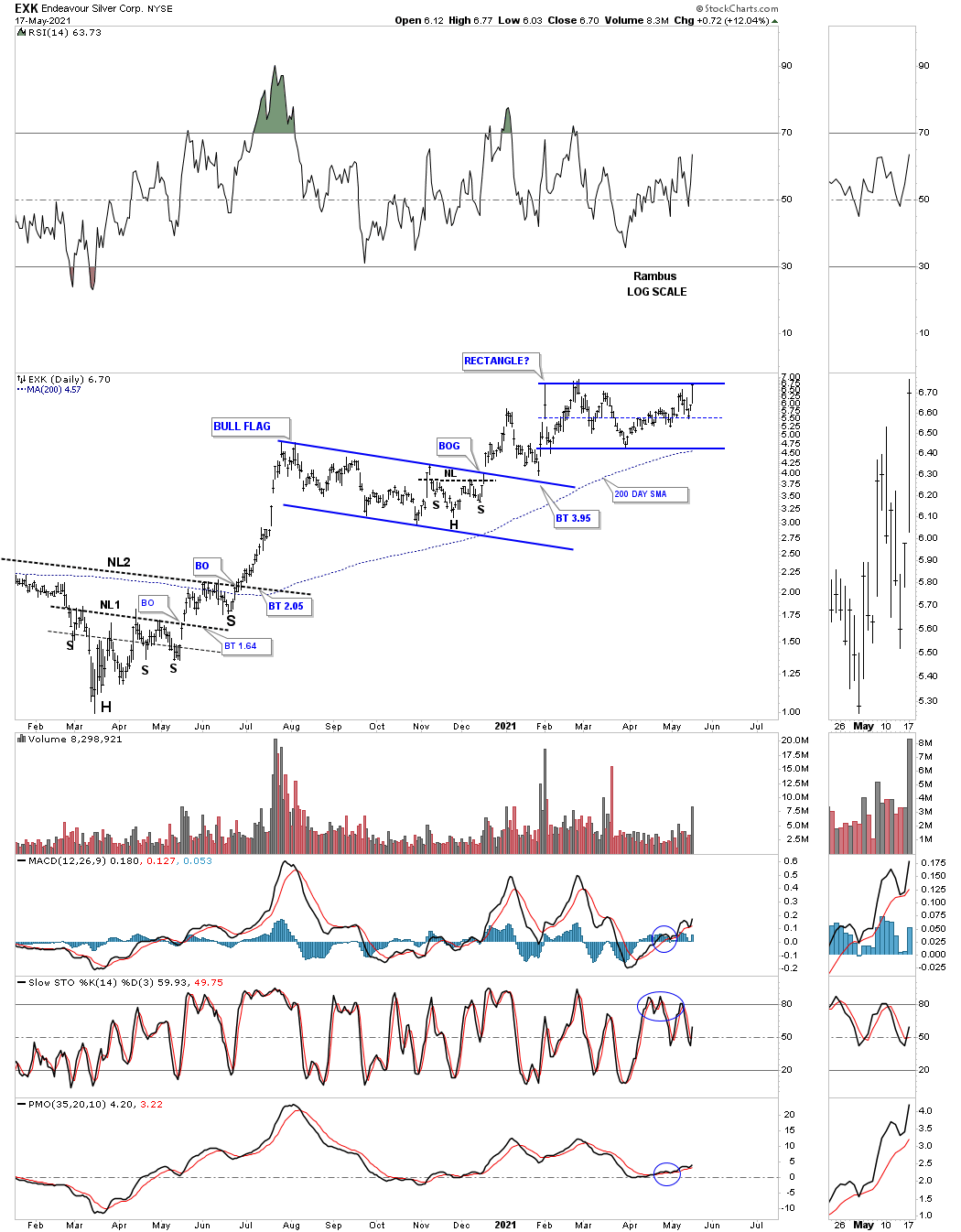
Lets start with the daily chart for EXK which shows it has been forming a symmetrical rectangle since the beginning of the year. By symmetrical you can see the last move down hit the center dashed midline and took off to the upside. Many times the last reversal point in a rectangle begins at the center dashed midline.
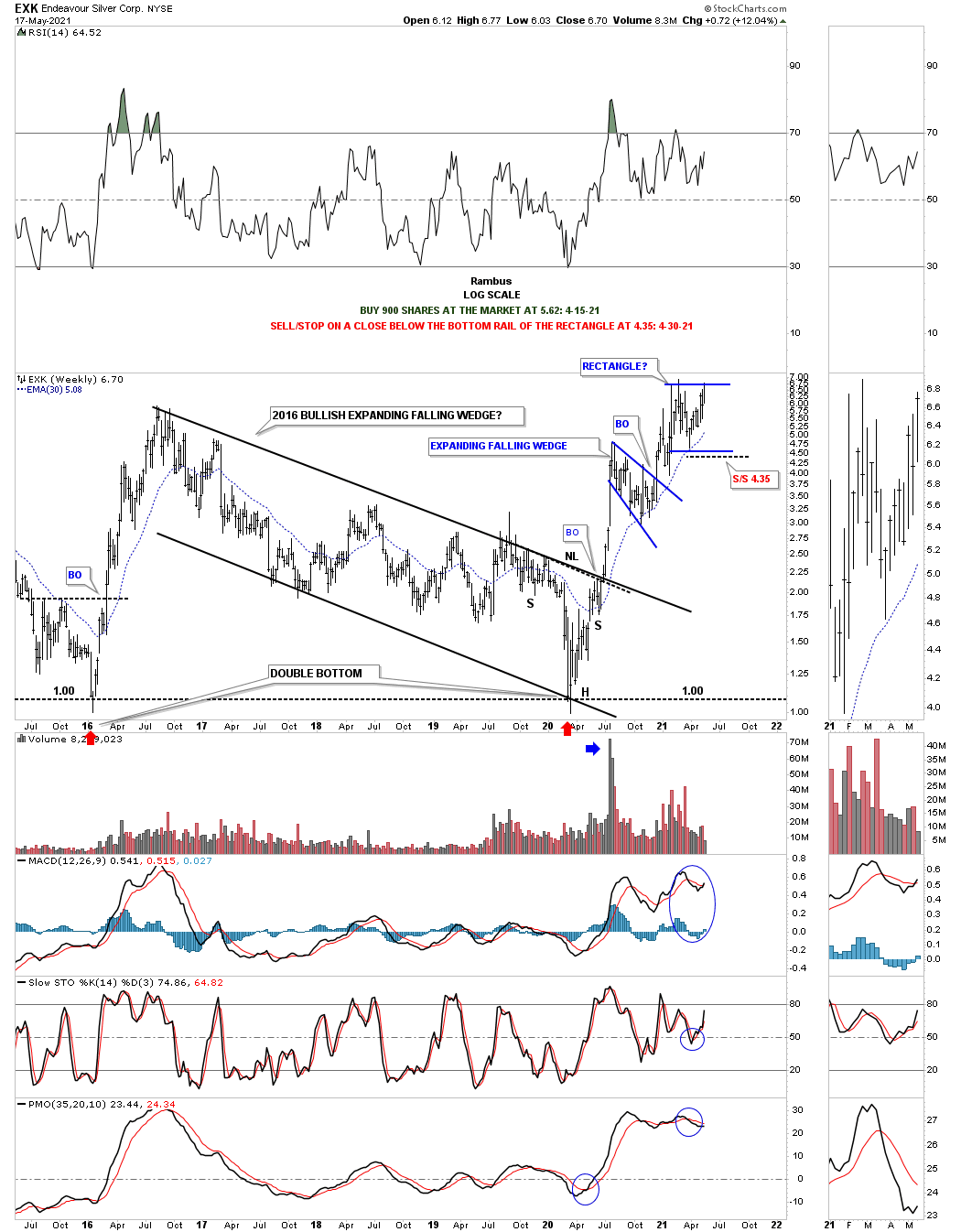
It is common in a strong bull market to see one consolidation pattern forming on top of the previous one. Note the H&S bottom that formed at the last reversal point in the 2016 bullish expanding falling wedge.
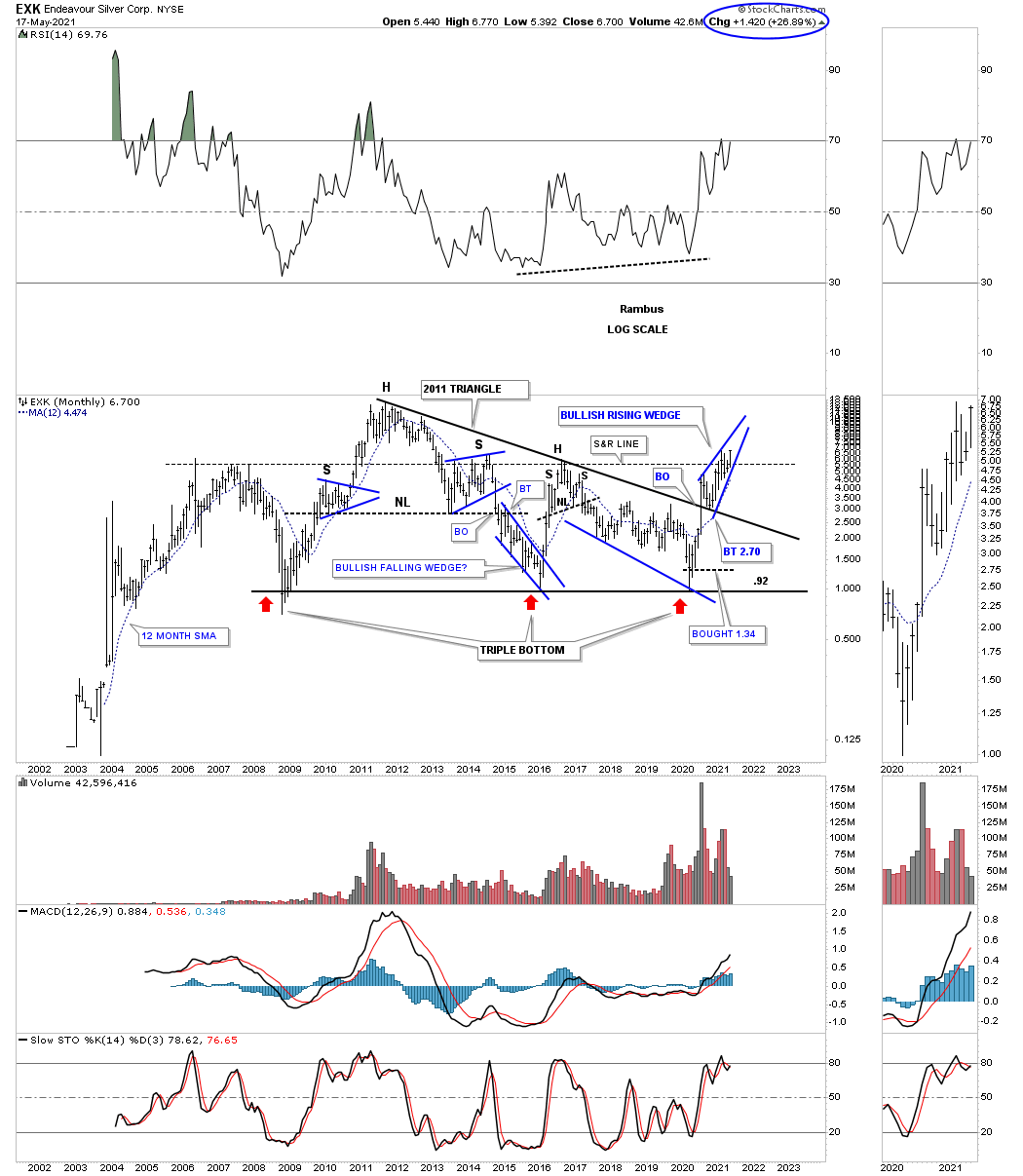
In a very strong stock rally those 2 consolidation patterns that are forming one on top of the other can create an even bigger consolidation pattern which is usually a bullish rising wedge or flag. Below is the long term monthly chart which is showing the potential blue bullish rising wedge under construction. Note the blue circle on the top right hand corner of the chart which shows what EXK has done for the month so far.
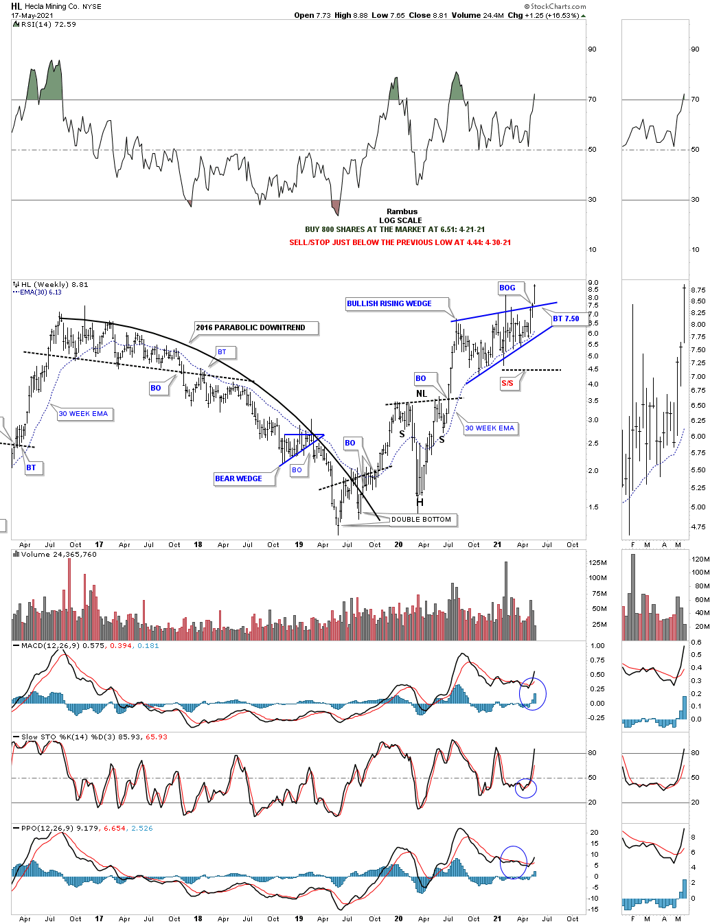
Today HL finally broke out above the top rail of its August 2020 bullish rising wedge.

This weekly chart shows how the bullish rising wedge fits into the big picture. This is about as bullish as a chart can be. It is true that HL has been a dog in the past as this weekly chart clearly shows, but that was in the past. Instead of focusing in on what the negative fundamentals may be focus in on the actual price action because all the fundamental are baked into the chart which makes these patterns. If the fundamentals are so bad why is HL breaking out from one of the most bullish chart pattern there is?
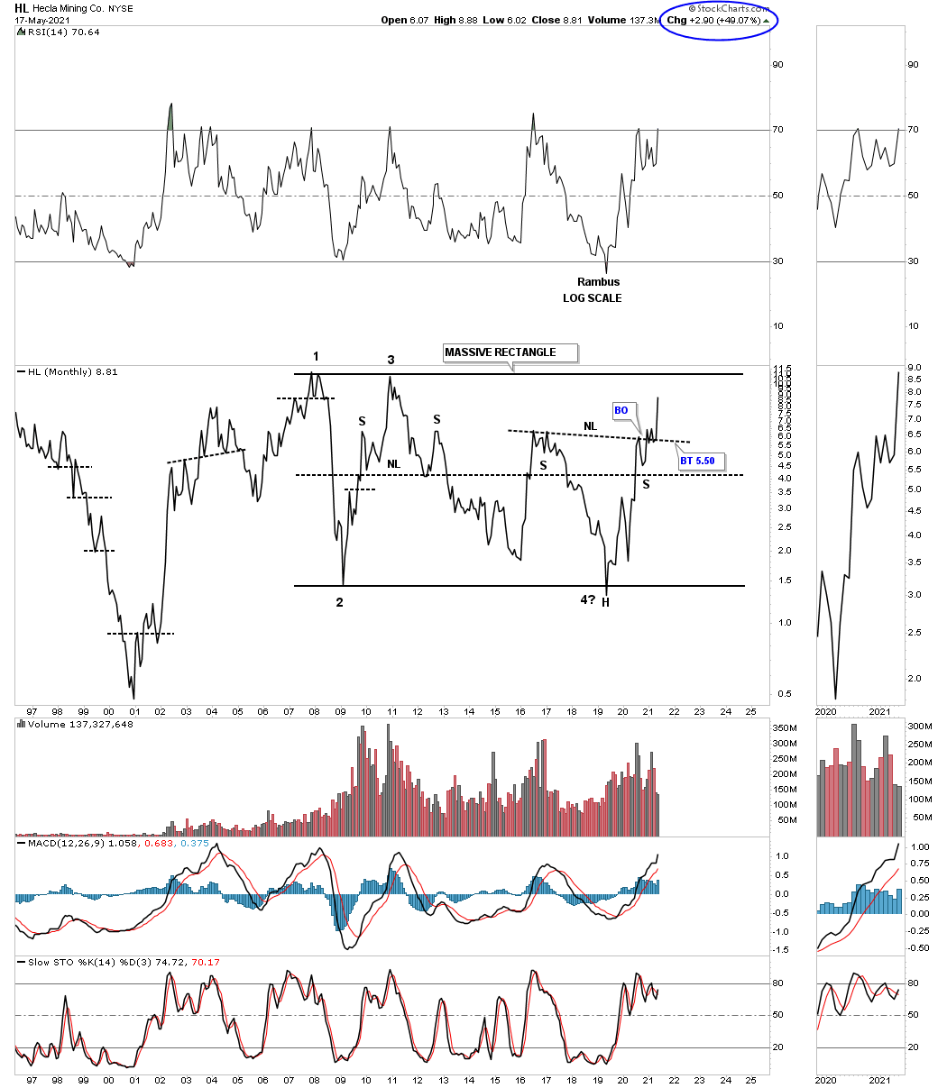
To show you how bullish HL could be below is the long term monthly line chart which shows HL has been building out a massive rectangle trading range that began to form back in November of 2007. The massive H&S bottom has been forming since July of 2016 is strongly suggesting that HL is going to finally breakout of the 2007 rectangle because the price objective for the H&S is way above the top rail. Note the H&S top at reversal point #3 which strongly suggest at that time that it was possible for HL to reach the bottom of the trading range.
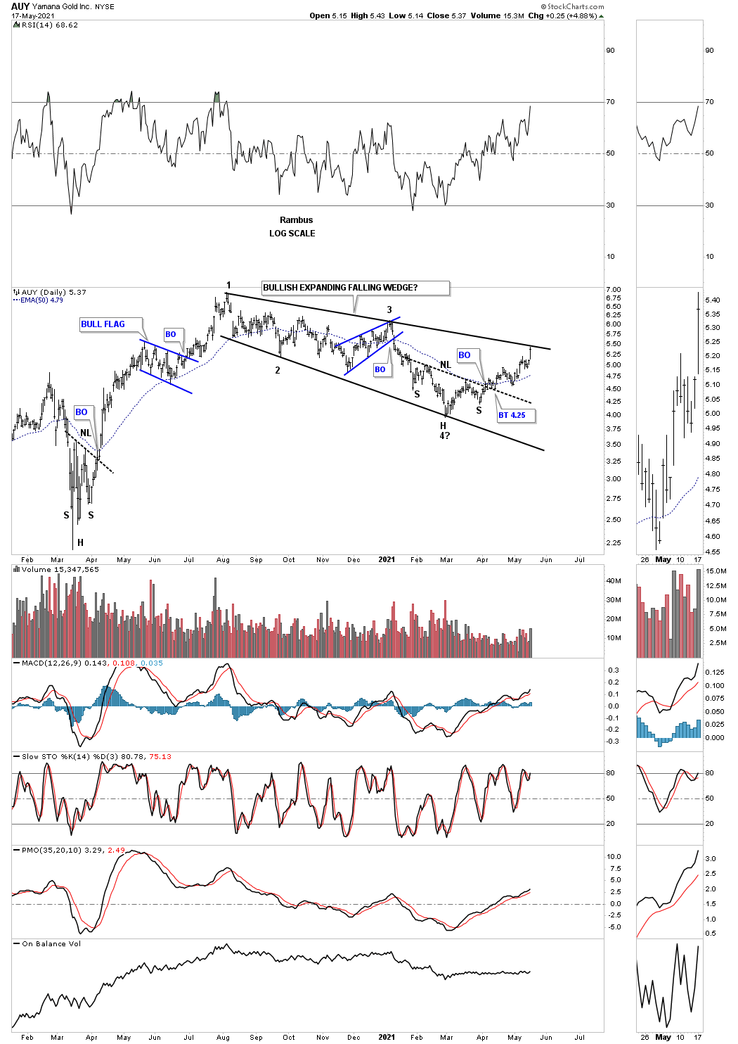
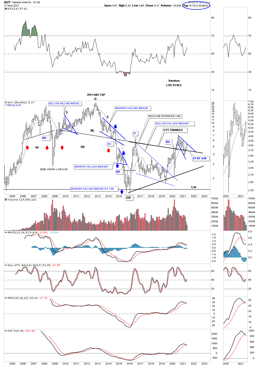
Next lets look at the Classic Chartology for AUY. Today the price action closed right on the top rail of its August 2020 bullish expanding falling wedge. I’ve shown you a ton of charts that produced a bullish expanding falling wedge and the power these patterns can have. A classic piece of Chartology is the H&S bottom that formed at the last reversal point in the bullish expanding falling wedge. I can now take off the question mark at the 4th reversal point because the top rail was hit today completing that 4th reversal point.
This weekly chart shows the bullish expanding falling wedge formed as the backtest to the 2016 five point triangle reversal pattern.
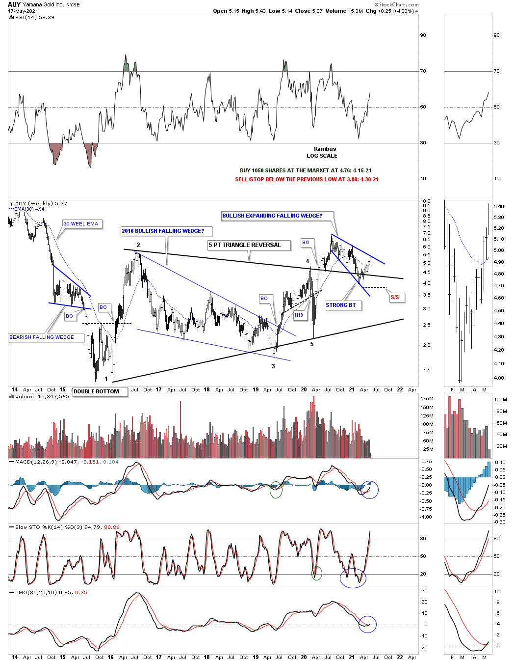
This monthly chart for AUY shows it has created some nice Chartology through the years. Note the bearish falling wedge which formed the right shoulder of that large 2011 H&S top. As you can see it reversed symmetry to the downside as shown by the red arrows and then formed another bearish falling wedge which was a halfway pattern to the ultimate low at 1.56 as shown by the blue arrows. In a bull market a pattern that slopes up into the direction of the uptrend is very bullish and a pattern that forms in the same direction of a downtrend is a very bearish pattern. Note how the 2011 H&S neckline has held resistance during the formation of the 5 point triangle reversal pattern as shown by the neckline extension line and has now reversed its role back to support on the backtest.
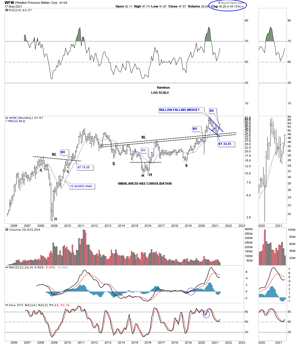
This last stock we’ll look at is the WPM which is showing a H&S bottom at the last reversal point in its August 2020 bullish falling wedge. What is really impressive is today’s price action which broke out above the top rail of the blue bullish rising wedge with a breakout gap.
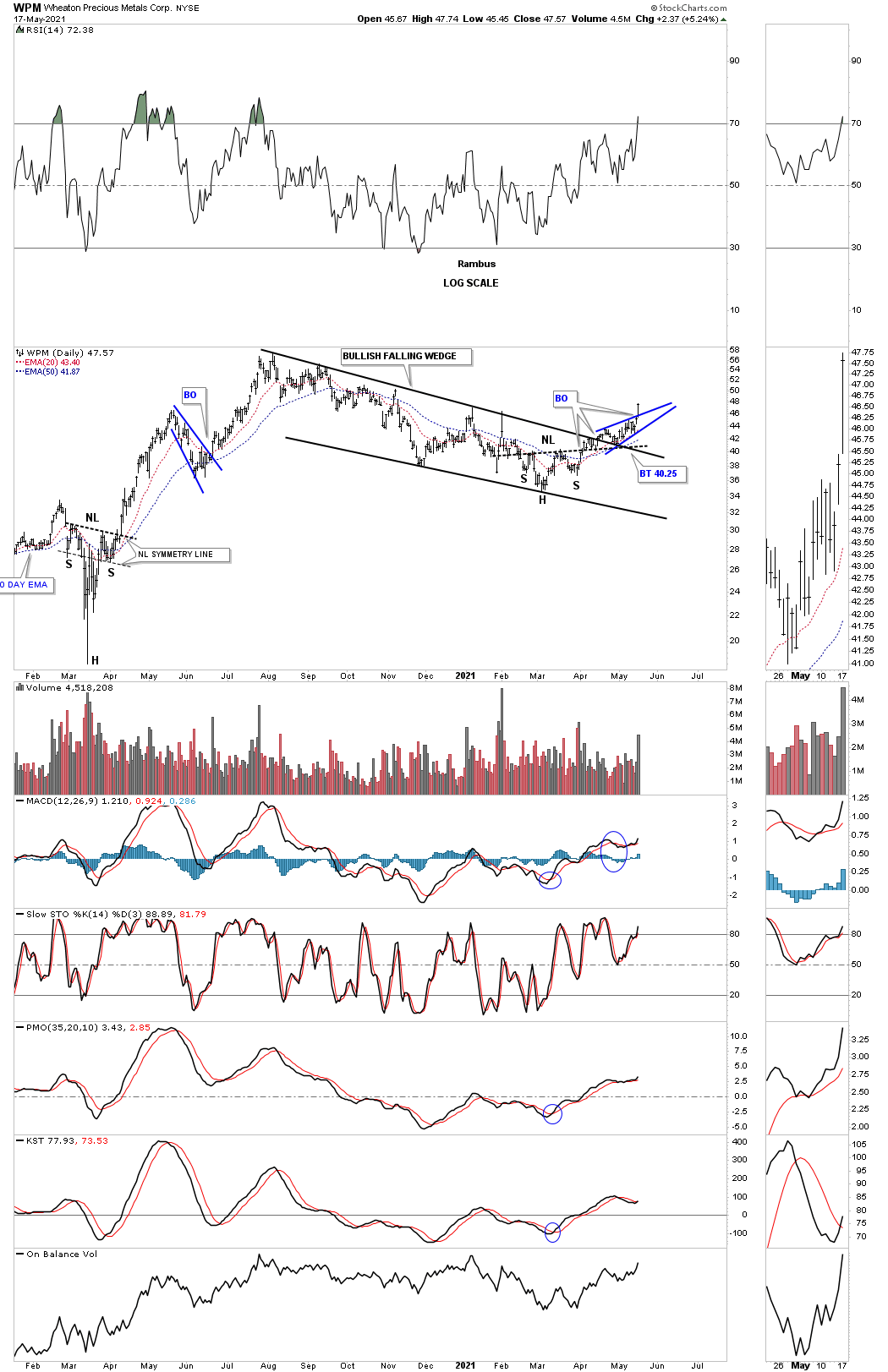
This weekly chart show the bullish falling wedge, on the daily chart above, formed as the backtest to the top rail of the black 2016 five point bullish rising wedge reversal pattern.
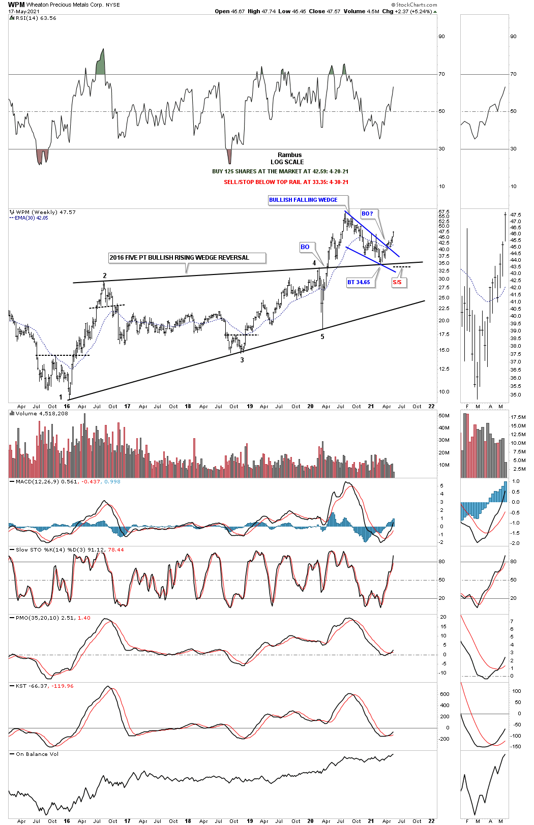
This last chart for tonight is the long term monthly chart which shows the massive 2013 H&S consolidation pattern with the bullish falling wedge forming the backtest.
As we were beginning to see some of the stronger PM stocks starting to breakout from their August 2020 trading ranges a month or so ago I mentioned that it would start out as a trickle with the stronger PM stocks leading first, but then when the impulse move starts to take hold the rest will start to follow and that is what is happing right now. I could show you another 30 or 40 PM stock that are breaking out and beginning their own impulse move. It is time to put the August 2020 consolidation pattern behind you and embrace this new impulse move that we’ve been waiting for for so long which in reality was only 8 months or so which I know felt much longer. All the best…Rambus