
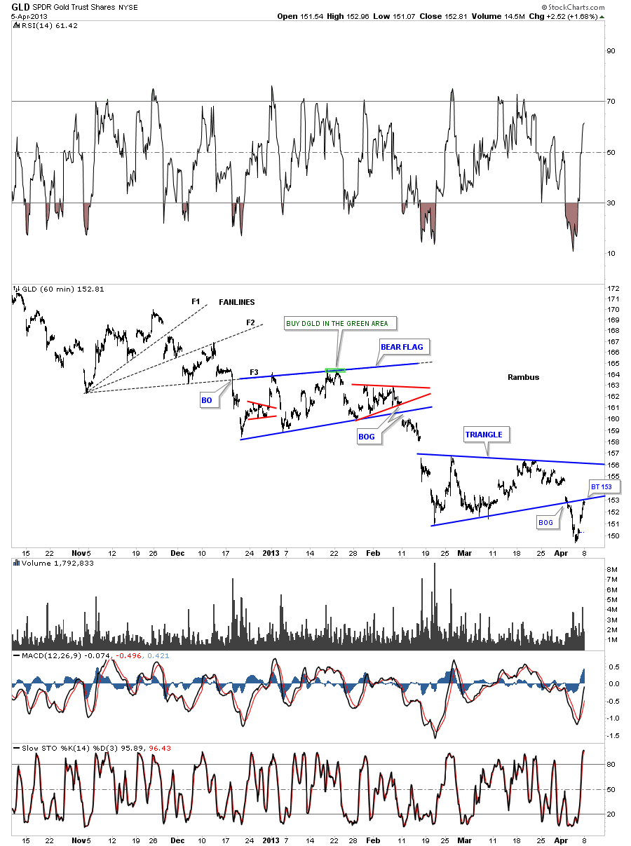
I was going to write about the Risk on Risk off trade this weekend but with the big move up in gold on Friday I thought we should look at gold instead. As you know, gold along with silver, broke down from their respective triangles this week which we have been keeping a close eye on. The 60 minute chart below shows the price action for the last six months or so for GLD. You can see the downtrend has been picture perfect so far with lower highs and lower lows all the way down. The price action broke below the bottom rail of the blue triangle early this week and had a strong rally, that so far, has taken the price back up to the underside of the bottom rail as the backtest. This is normal behavior. What I’ll be watching very close is how the GLD interacts with the bottom blue rail of the triangle. If the price action starts trading up and into the blue triangle that will mean we have a bigger consolidation pattern forming which will still be a consolidation pattern just a bit bigger at this time.
The daily chart shows all the chart patterns that have formed since the October high last year. You can see how critical this backtest is right now to the underside of the red triangle. Again if the price action can trade above the bottom red rail that would be short term bullish for gold. A failure right here would confirm the red triangle as a valid consolidation pattern. So we wait.
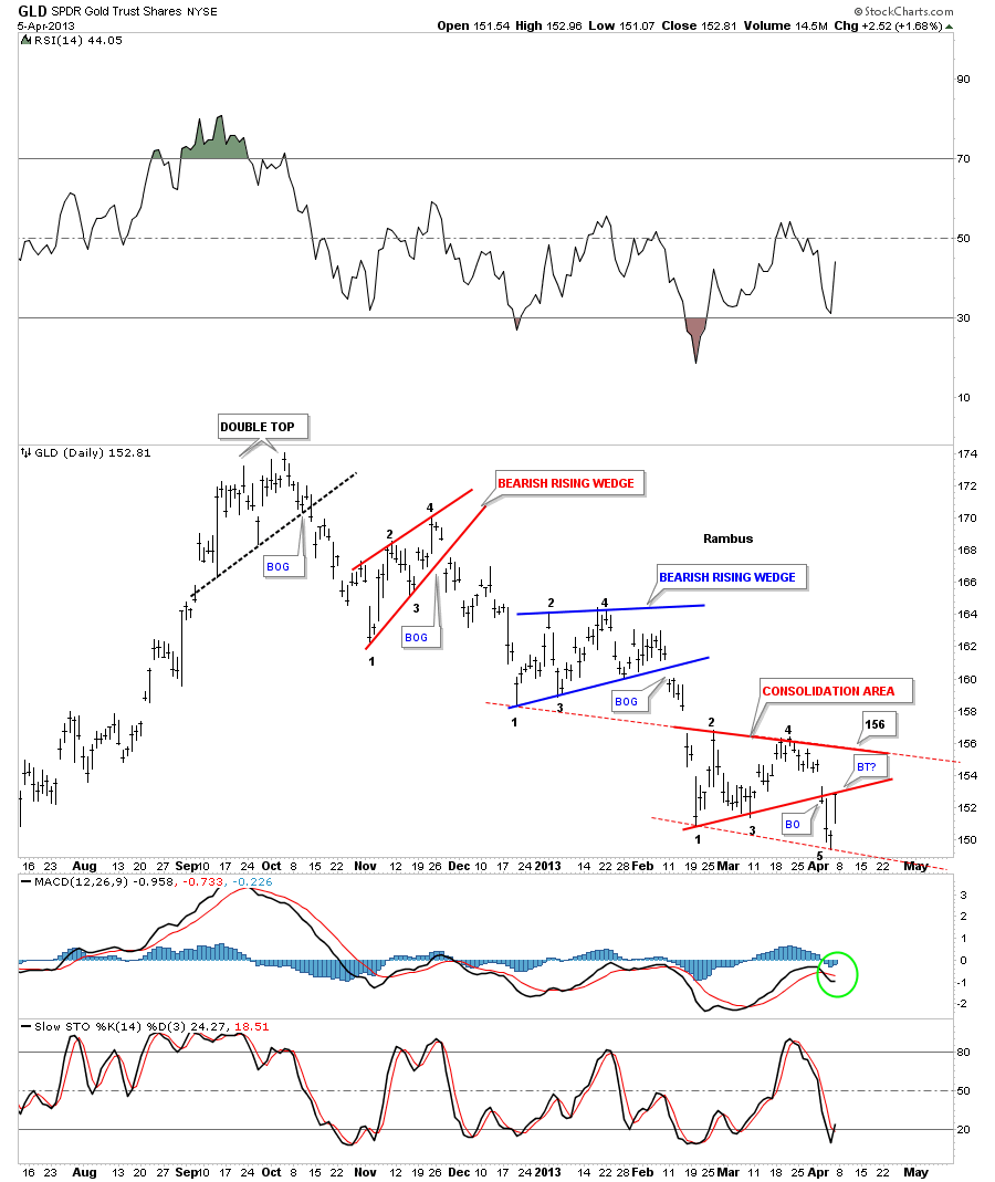
Lets look at another daily chart for the GLD that shows a potential horizontal trading range similar to the one that formed just above our current one. Sometimes a horizontal trading ranges can be a little sloppy where the price action can trade slightly below or above the horizontal rails and then move right back in to the rectangle. If the backtest doesn’t hold on the triangle pattern, that I showed you on the chart above, then I would expect a more horizontal trading range to progress with a move up to the top red rail around the 156.50 area.
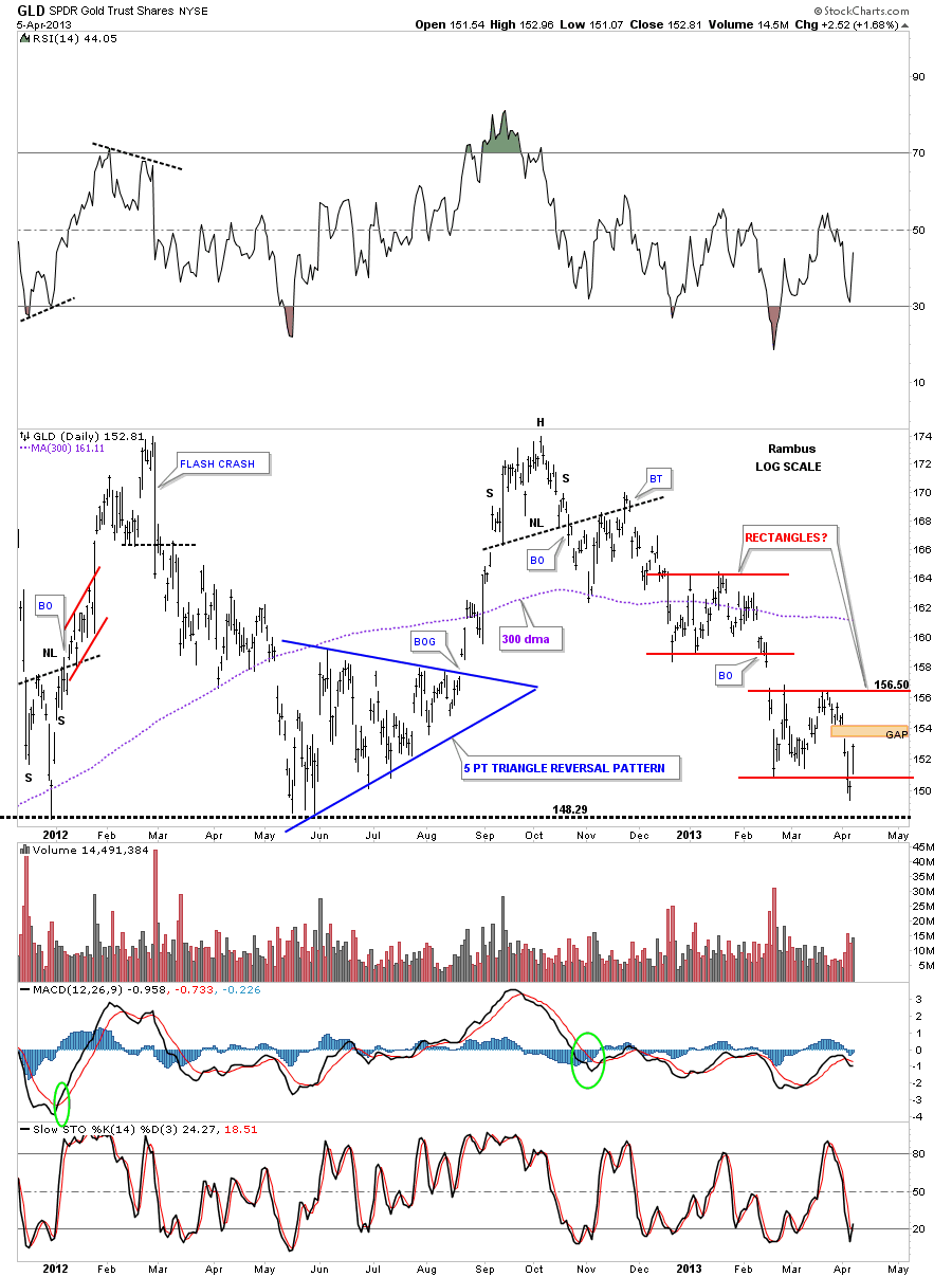
Next lets look at a 2 year daily line chart that shows the big horizontal trading range that gold has been in since the fall of 2011. As you can see the price action is testing the bottom of the big 20 month rectangle. This daily line chart shows a little different chart pattern vs the bar charts above. The little red ascending triangle shows a backtest would come in around the 155 area. I will also be keeping a close eye on the brown shaded support zone, bottom of rectangle, as that has been major support for 20 months or so. We should have a clearer picture in a week or so as to what direction gold wants to go. For right now nothing is broken in regards to our DGLD trade.
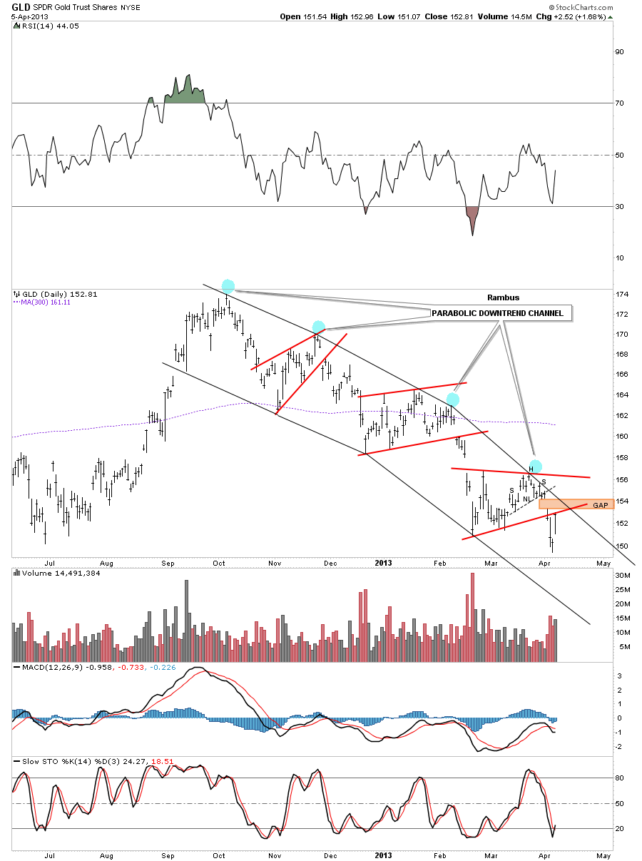
There is a daily chart for the GLD that I haven’t shown you yet that is showing a parabolic downtrend channel that started off the October 2012 high. Silver also is showing the same parabolic downtrend channel. There is a gap just above Friday’s price action that may get filled this week. The gap could get filled and the GLD could still stay below the last downtrend rail which would be perfect. Again it looks like an interesting week ahead.
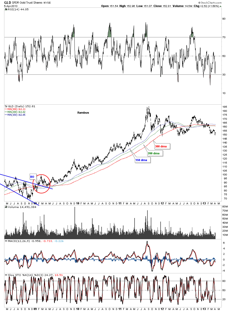
The five year chart for the GLD shows the price action trading well below the three most important moving averages. To really turn gold positive these moving averages will have to be broken to the upside to launch a new bull leg.
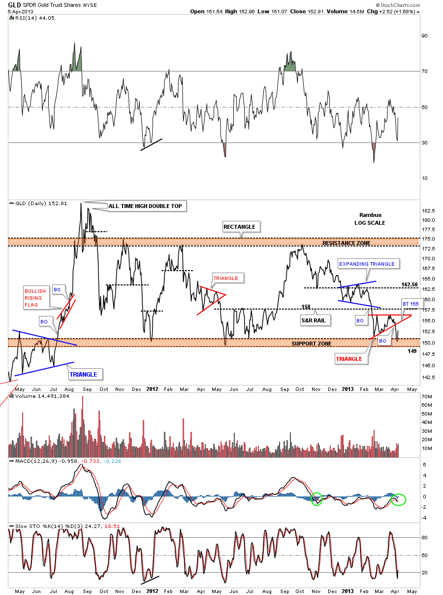
A weekly chart for the GLD shows the price action bouncing off the apex of an old triangle that was in play for some time before prices fell to the bottom blue trendline. It’s still an important area as there are two trendlines that intersect at the 149 area. If the price action does break below the apex that would be very negative for gold.
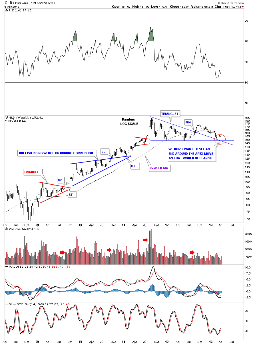
This next weekly look at the GLD shows the 2008 uptrend channel with all the smaller red consolidation patterns that formed during that advance. You can see how perfect the blue rectangle is with the price action testing the bottom blue rail this week. The rectangle is a completed pattern that still hasn’t told us yet which way it will breakout. As it has formed below the all time high made back in the fall of 2011 the odds favor a breakout through the bottom of the rectangle. Those are the odds but if the GLD starts to rally above the 65 week moving average then we would have to reconsider. For right now a bounce should be expected as everyone and their brother knows this is the bottom of the trading range. The big question is, How Strong are the Bulls? This is where talk is cheap. The bulls need to walk the walk and show us they mean business.
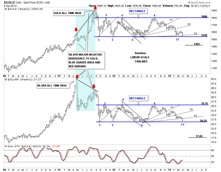
I would like to leave you with one last chart that is a combo chart showing gold and top and silver on the bottom. The blue shaded area shows how each moved to their bull market highs at different times. As you can see silver reached its parabolic high first in April of 2011 while gold languished. There was about a 2 month correction and then gold took off to make its all time high at 1920 while silver fell way short of reaching its all time high made in April. This was a major negative divergence between gold and silver. When I look at this chart it tells me they both got their parabolic move albeit at different times and that a good correction was at hand. As you can see once they both had their highs in place they declined sharply together to point #1 on their blue rectangles. They have been trading in lockstep, for the most part, for the better part of 20 months or so. Both are testing the bottom blue rail of their respective rectangles as we speak.
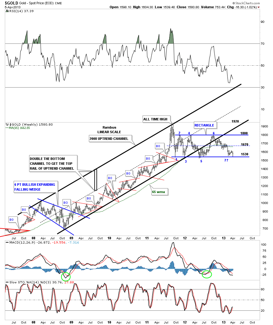
We are at a very important juncture right here where the gold bugs will have to step up to the plate and move the precious metals higher, not with talk, but with action. Believe me I will have no problem shifting from a bear stance to a bullish stance if the charts shows that is the case. For right now it’s up to the bulls to show the way. I will be watching their every move to see if they really have what it takes to move the precious metals up. This should get everyone up to speed on gold. All the best…Rambus
Editors Note:
To Learn More about the Incredible Art and Science behind Rambus Chatology Join Us at
“Give a Man a Chart and he may eat for a day
Teach a Man to Chart and he will never starve”