
Before we look at the charts tonight I just want to make it perfectly clear that I’m not a gold basher or wish for bad things to happen to the precious metals complex. I first found the bull market in the precious metals stocks in the spring of 2002 after having the ride of a lifetime trading the tech stocks up until the spring of 2000 where I cashed out based on a particular chart pattern that told me to either expect a decent consolidation period to begin or it was the end of one of the greatest bull markets in history. It didn’t take long to see a major top had formed and the place to be was on the sidelines. During that great run in the late 1990’s the precious metals stocks were not even close to being on my radar screen. It wasn’t until I looked at a long term chart for gold, in the spring of 2002, that I seen a beautiful inverse H&S base that I couldn’t ignore. I didn’t know anything about the precious metals stocks at that time but with that beautiful H&S base I knew some of the precious metals stocks had to have a bullish look to them as well. I learned about the little juniors that everyone, who was connected to the precious metal complex, were talking about. This was game on for me and I have traded exclusively in the precious metals complex for the last eleven years. The chart patterns that gold, silver and the HUI created during their bull market were some of the most beautiful patterns a chartists like myself could ever expect to see. The reason I’m telling you this is because what the precious metals charts have been showing me is that, like the 1990’s bull market, the precious metals complex has topped out and is now in a confirmed downtrend. How long and how far down this complex will go is any bodies guess. All I know for sure is the 13 year uptrend has topped and is now making lower highs and lower lows which is by definition a downtrend. I hope when you finish reading this article you will have a crystal clear picture of the bull market and the top that has been in place for some time now.
Tonight I would like to show you some charts of the HUI using it as a proxy for the big cap precious metals stocks. We will start out with the very short term look and work our way out to the beginning of the bull market that began in 2001 or so.
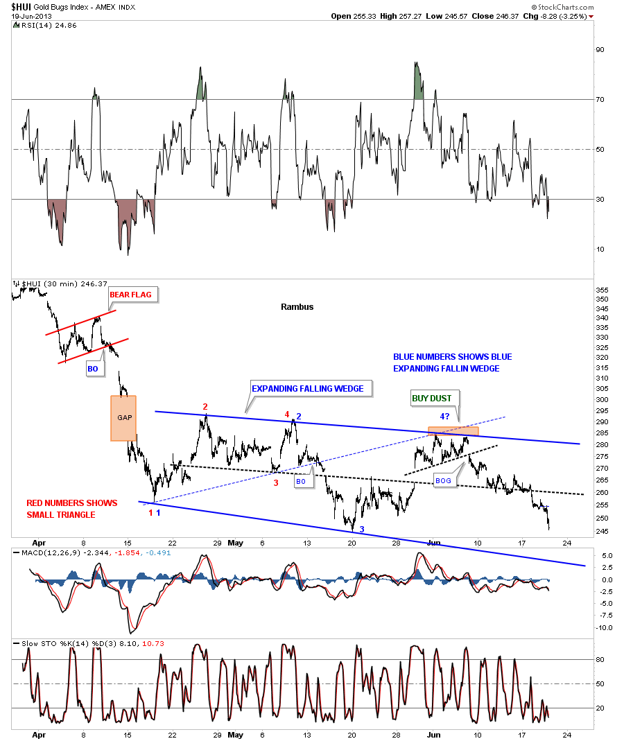
This first chart for the HUI is a 30 minute look that shows the latest consolidation pattern that has formed since the top last fall. This consolidation pattern I call, an expanding falling wedge, because the top and bottom blue rails are widening and falling. It started out as a small triangle, labeled with the red numbers and has morphed into its current form. Most chartists won’t recognize some of my chart patterns and will tell me to go back to charting school to learn the right way to chart. I have been doing this for 35 plus years using the Edwards and Magee Technical Analysis of Stock Trends as my charting bible. I have taken what they have given me and added my own unique style that you will recognize when you see a Rambus Chart.
I won’t get into the details right here just to say when I build out a consolidation pattern I need to see an even number of reversal points, such as 4, 6, 8 or more for it to be valid. A top or bottom needs to have an odd number of reversal points to make a reversal pattern. As you can see on the chart below the HUI is working on its 4th reversal point to the downside. The pattern won’t be complete until the bottom blue rail is hit and at that point I can call it a consolidation pattern. Right now it’s still in the developmental stage. The heavy blue trendlines shows what I think will end up being that bearish expanding falling wedge consolidation pattern when it’s all said and done as I will show you further along in this article.
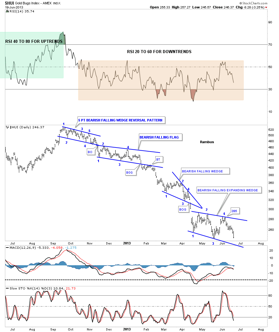
Lets now look at a daily chart to put our little bearish expanding falling wedge into perspective. What you will also see on this daily chart are three more consolidation patterns that you won’t see most chartists use but they are just as valid and useful as any other traditional consolidation pattern. Also what makes the HUI so negative looking is each consolidation pattern is sloping down into the downtrend. Under normal conditions, in a downtrend for instance, a small flag or wedge will slope up against the downtrend. When I see a consolidation pattern sloping in the same direction of the trend, it tells me the price action is in a hurry to go to the next level and when I see one form after the other in a series that tells me all hell is breaking loose.
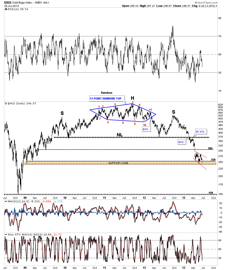
What I have shown you on the charts above is only the tip of the iceberg that just shows the right shoulder of a massive H&S topping pattern. Many times a consolidation pattern can be made up of several smaller patterns that ends up creating the finish product. This next chart is a long term daily chart for the HUI that shows the massive H&S top formation. What I would like you to note is the 11 point diamond reversal pattern that makes up the head portion of the massive H&S top. As I mentioned earlier in this article some of the chart patterns you see will only be found at Rambus Chartology.
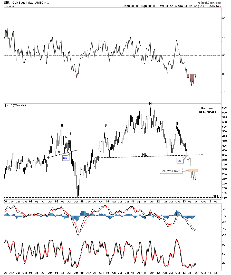
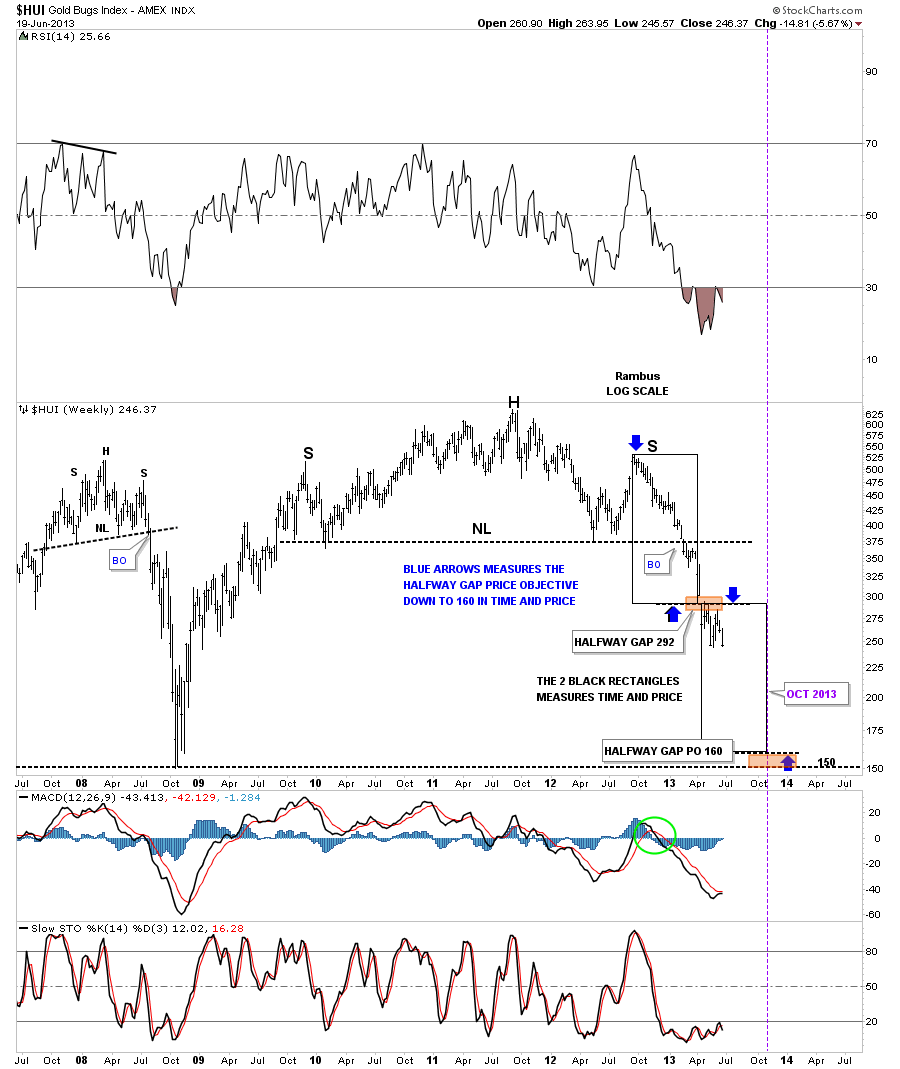
Lets look at a few weekly charts to gain a little more perspective in what has and is happening with the precious metals stocks. This long term weekly chart shows the big H&S top that has reversed the uptrend that started off the 2008 crash low. This weekly chart is a cleaned up version, of the many looks this H&S top has, so you can see it in all its glory. There is an important feature on this chart that happened about 2 months ago when gold and silver broke below their 20 month rectangles, that we’ll discuss at a later date, and that is the big halfway gap, brown shaded area. Most have forgotten about that gap but it;s going to play a big role in the price action going forward as the HUI was unable to close it. There is another important feature on this weekly chart and that is the 2008 H&S top that most missed at the time. You can’t believe the amount of flack I took when I called that top. It was pure blasphemy to call a top in the HUI. How dare some one say something like that. When you say something the gold bugs don’t like you had better have all your ducks lined up because if your wrong your going to be a dead duck. Fortunately for me things worked out and I was spared to chart another day.
Deja Vu ?
Early in this article I said the precious metals complex, stocks and metals, produced some of the best looking chart patterns a chartists will see. Below is another long term weekly chart for the HUI that shows the beginning of its bull market and four beautiful consolidation patterns that formed until the 2008 H&S top called for an end to that leg of the bull market. Note the move out of each blue consolidation pattern that was an impulse leg higher. That is what a true bull market looks like. One consolidation pattern followed by an impulse move up followed by another consolidation pattern until a top is finally found and a well need rest takes place.
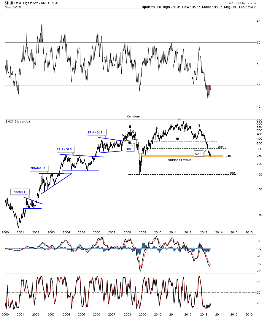
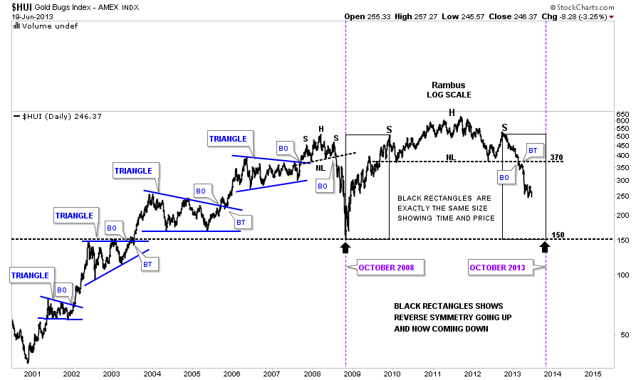
Symmetry plays a big role in how I view a chart especially in fast moving markets. This next chart shows the reverse symmetry that is taking place to the downside that is reversing the rally off the 2008 crash low. The two black rectangles are exactly the same size in height and width. I don’t know if the reverse symmetry down will be perfect and reach the bottom in October of this year but so far it has proven to be dead on the money since I first built this chart back in January of this year. Only time will tell but so far so good.
I would like to show you another form of symmetry that has to do with the halfway gap I showed you earlier and how it may play a big role moving forward. If that gap is truly a halfway gap, that shows up in the middle of a strong move, it will be confirming the October time and price objective that I showed you on the chart above. This time we are using two black rectangles that are exactly the same height and width that I’m measuring the halfway gap with. Again I don’t know how it will play out but so far its been working out better than I had expected when I first built this chart. As long as nothing is broken there is no need to fix it. So we’ll just have to see how it plays out. It is uncanny how one can come up with a time and price objective using two completely different methods. Sometimes the markets are stranger than fiction as you well know.
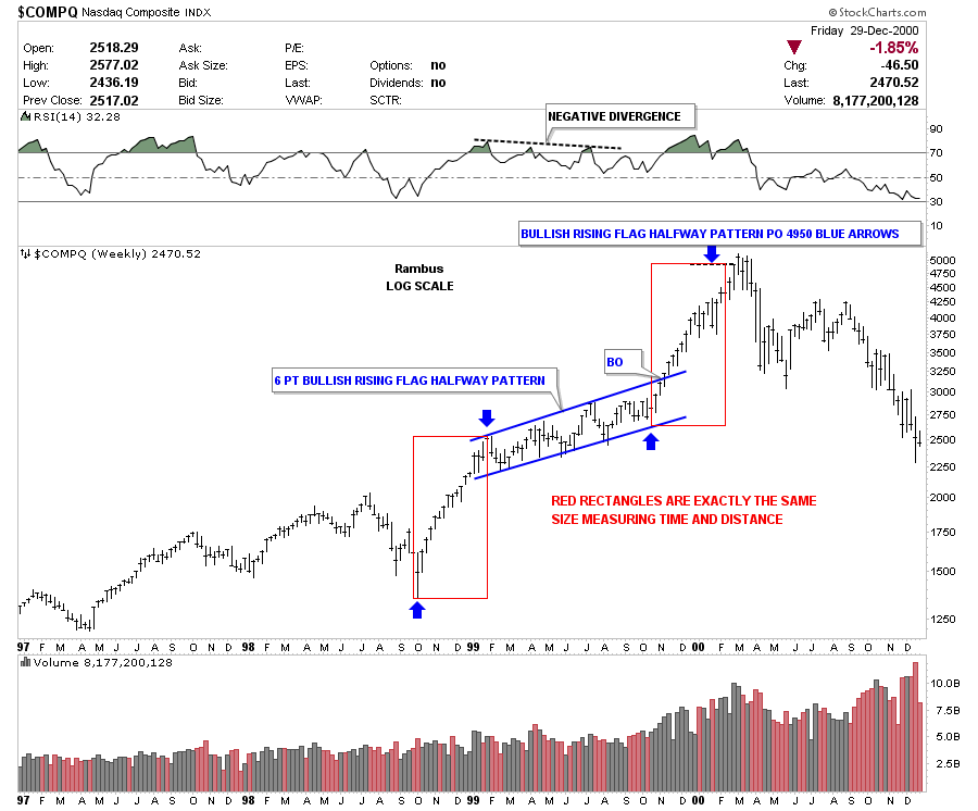
I would like to leave you with one last chart that doesn’t have anything to do with the precious metals stocks. At the beginning of this article I said there was a chart pattern that formed at the end of one of the greatest bull markets of all time. I know when some of you read that you were probably thinking ya right this guy is full of himself calling a top to an 18 year bull market. I only bring this up because chart patterns can give you the clearest view of the markets of any discipline I know. There are excellent Elliot Wave guys and cycles guys and many other forms of analysis that work very well for those that truly understand what they are doing. Charting gives me a way to follow the price action, and done correctly, keeps me out of trouble as so many in the precious metals complex are finding out again. I’m still amazed at how such an old school of charting the markets competes right up there with the best computer programs that are trying to get an edge on you.
Below is the weekly chart for the COMPQ that gave me one of the biggest clues of my life that it was time to really consider what was happening at the time. For those of you that traded during the tech bubble you know how super bullish the hype was and how hard it was to emotionally distance yourself from all the noise. Can we say the same thing about the precious metals complex right now? Only time will tell. All the best…Rambus
Editor’s Note :
Rambus Chartology is Primarily a Goldbug TA Site where you can watch Rambus follow the markets on a daily basis and learn a great deal of Hands on Chartology from Rambus Tutorials and Question and Answers .
Most Members are Staunch Goldbugs who have seen Rambus in action from the 2007 to 2008 period … and now Here at Rambus Chartology since early 2012 .
You will find Rambus to be a calm humble down home country tutor with an incredible toolbag of all the TA based protocols tempered with his own one of a kind style…simply put…He wants to keep his subscribers on the right side of these crazy volatile and downright dangerous markets
What is he seeing Now ?