
In this Weekend Report I would like to take a fresh look at the precious metals complex again as things are still evolving in this area. I want to look at the GDX as our proxy for the rest of the PM stock indexes as it trades with the most volume and probably gives us a better feel for where the big caps are headed. As you know we’ve looked at several different possibilities for our recent consolidation zone that are still valid as consolidation patterns. At the end of some if these more complex trading ranges one can end up with a lot of trendlines that can make things a little confusing at times. With that said lets strip away all the noise and see what is actually there from a Chartology perspective.
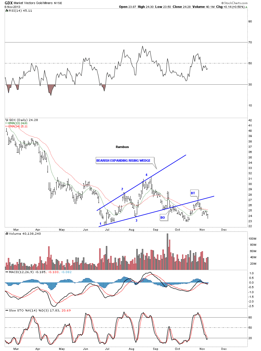
The first daily chart for the GDX shows our first consolidation pattern that formed the bearish expanding rising wedge. As you can see it still stands out as a consolidation pattern with the breakout and completed backtest. The backtest came in exactly where it was supposed to. This consolidation pattern is still valid as nothing has been violated.
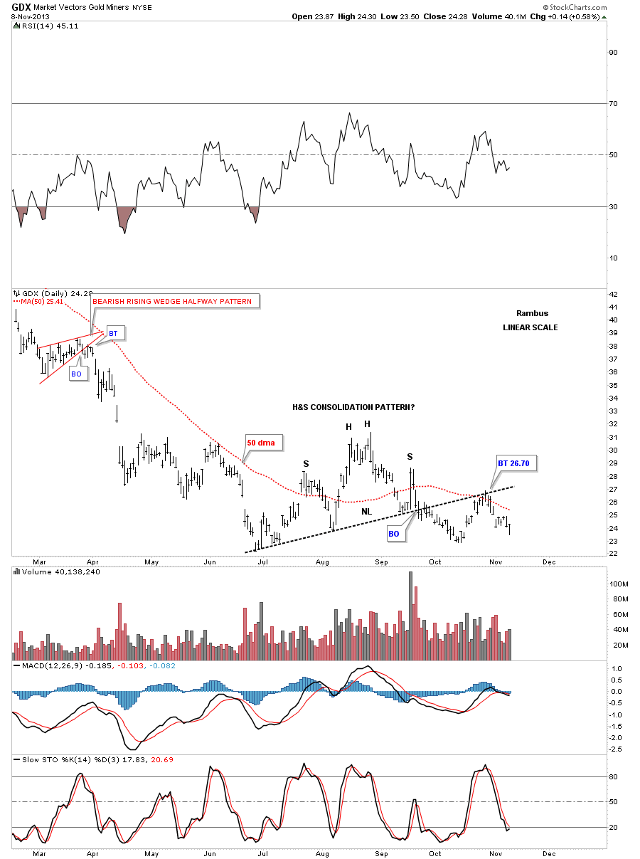
The second consolidation pattern we’ve been following is the H&S consolidation pattern that is still in play. It to had a nice backtest to the neckline and the 50 dma that stopped right where it should have. There is nothing broken on this chart either.
And the possible third consolidation pattern is our 6 point Diamond that encompasses both the bearish expanding rising wedge and the H&S consolidation pattern. This Diamond is very symmetrical in that the top and bottom rails are almost parallel as are the two side rails. You can see last Friday’s price almost got down to the bottom rail before it moved higher at the end of the day. It looks like the 25.50 area is going to be critical resistance as that’s where the 50 dma and the top rail of the diamond come into play.
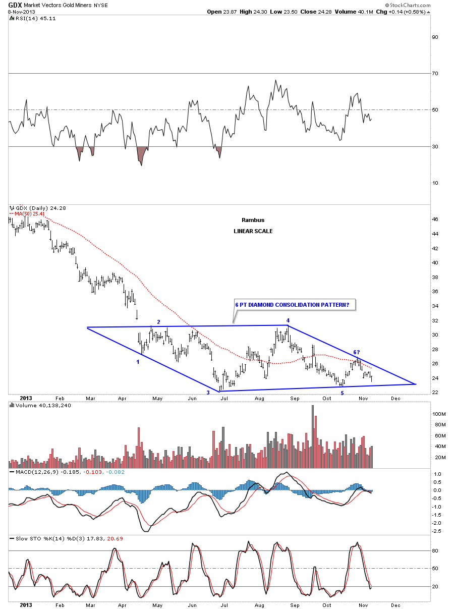
We won’t know until the Diamond breaks out but from my perspective the Diamond is going to be our consolidation when all is said and done. As I have shown you many times in the past, bigger consolidation patterns are usually made up of smaller patterns and this Diamond pattern fits the bill.
If the Diamond turns out to be our consolidation pattern then it will most likely be a halfway pattern that forms in the middle of two impulse moves. One leading into the Diamond and the second one when the price action leaves the Diamond. What this also suggests is that when this next impulse leg down is finished that will mark THE bottom. A very important bottom. It doesn’t mean the big cap precious metals stocks will start screaming to the moon it just tells us the low is in. The most likely scenario is that some type of reversal pattern will form that no one knows how long it will take to complete. All we will know as that an important low will probably be established.
On the weekly chart below I show two different price objectives for the low. The first price objective is the measurement from the big massive H&S top that has nothing to do with the Diamond. I measure H&S patterns a little differently than what the books say is correct. I will measure from the top of the head to the right shoulder armpit. I then take that measurement and add it to where the price action breaks through the neckline to get my price objective, blue arrows on chart below. It basically measures each impulse leg. In this case the neckline is horizontal so you would get the same measurement either way from the traditional method.
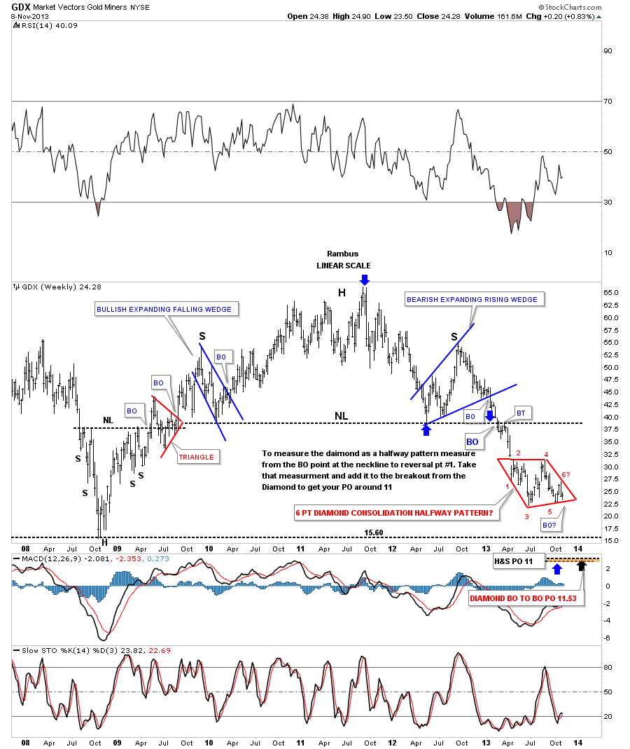
Now lets measure the red Diamond as a halfway pattern. As the big H&S top is the previous pattern I will measure from the breakout from the neckline to the first reversal point in a consolidation pattern, in this case reversal point #1 of the red Diamond. I then take that measurement and add it to the breakout point for the red Diamond to get our price objective. I call this the breakout to breakout method. There is another method I use which I call the impulse method but it’s not applicable to this situation. As you can see both price objectives, from two different measurements, are very close to each other, around 11 on the GDX. First though the red Diamond has to breakdown to get the ball rolling. Keep in mind if the Diamond turns out to be our consolidation pattern then we will experience an impulse move that is totally different than what we’ve been experiencing since April of this year. This is what you live for as a trader. Impulse moves are actually much easier because you have a trend established whereas in a consolidation pattern there is no trend to follow.

Next I would like to look at the SLV that is showing a similar Diamond to the GDX. As you can see it broke below the neckline last Friday and is now attempting to backtest it from below. There is a slight divergence with the spot price for silver as it’s still trading above the bottom rail of its Diamond. For the time being I’m gong to follow the SLV and see if the breakout holds. Notice how our Diamond has formed right below the big breakout gap from the 20 month rectangle. This is a perfect place for a consolidation pattern to form.
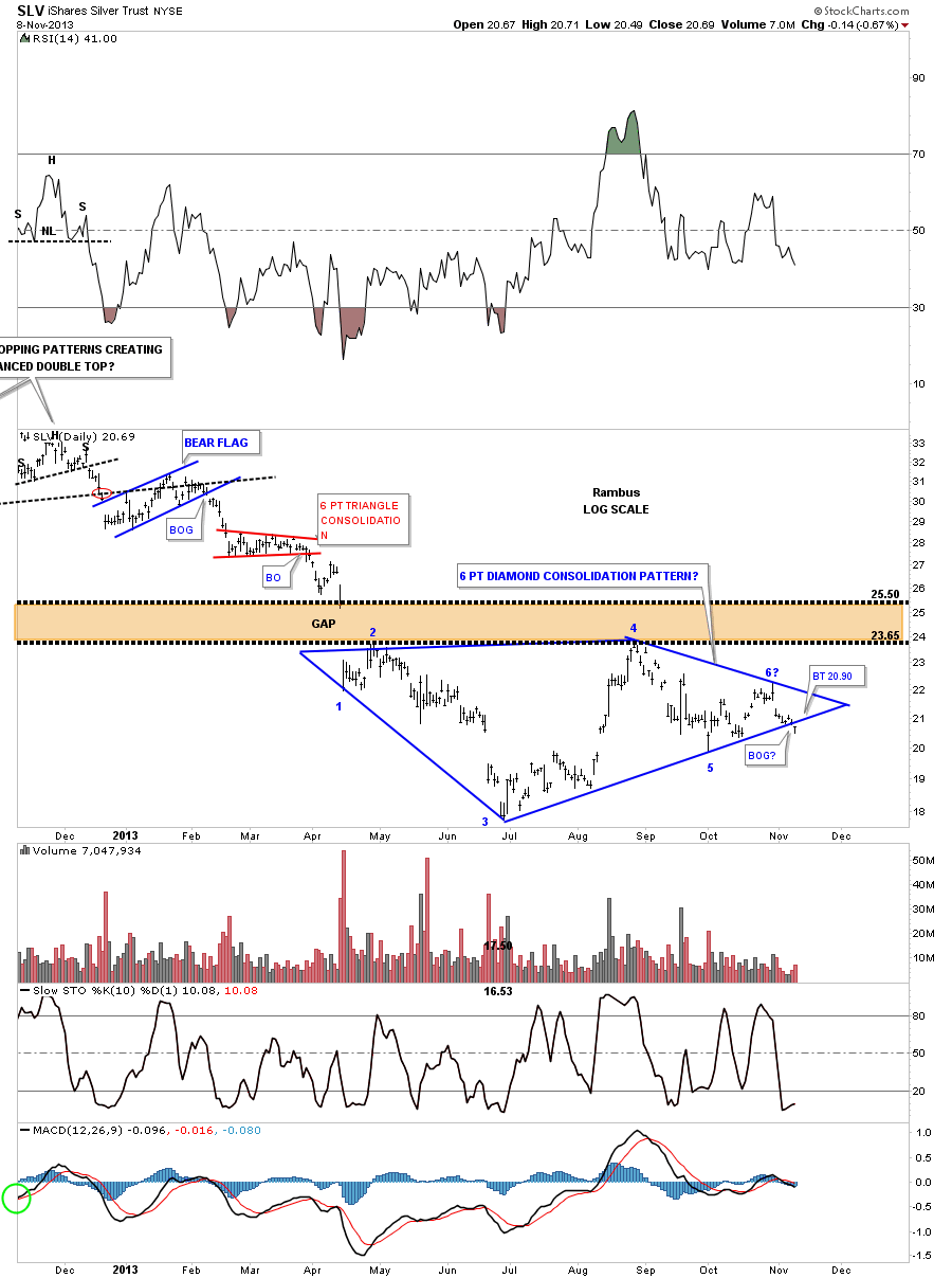
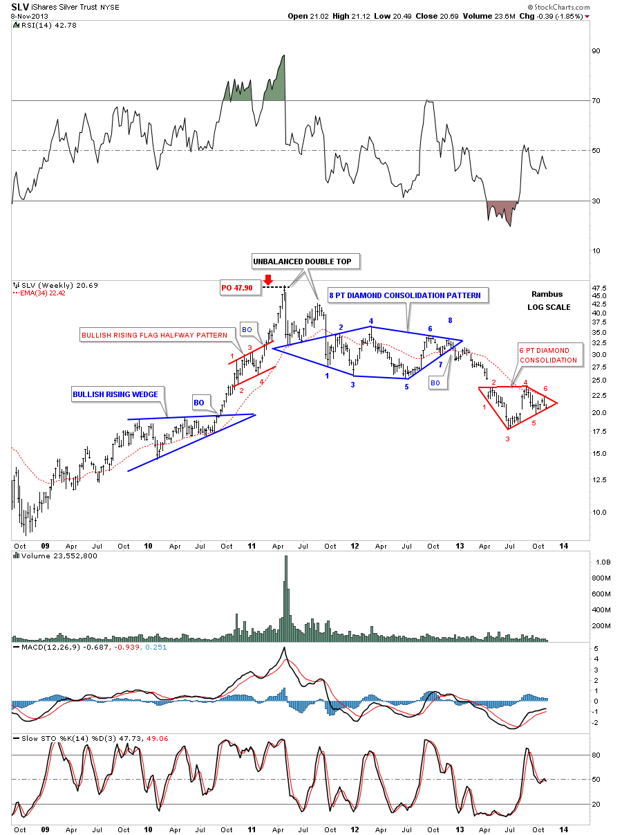
The weekly chart shows how our current red 6 point Diamond may play out as a halfway pattern to the downside. Note the position of the 4 point bullish rising flag that formed back in 2010 that led to SLV’s bull market top. The move leaving that bullish rising flag was almost identical to the move leading into the rising flag in time and price. This isn’t an exact science but it does give us a place to look for some kind of top or consolidation pattern to form. Also note that when the price objective for that red bullish rising flag was reached it also marked the end of the bull market in April of 2011. I think we could be setting up a similar situation if this next impulse leg down plays out as expected.
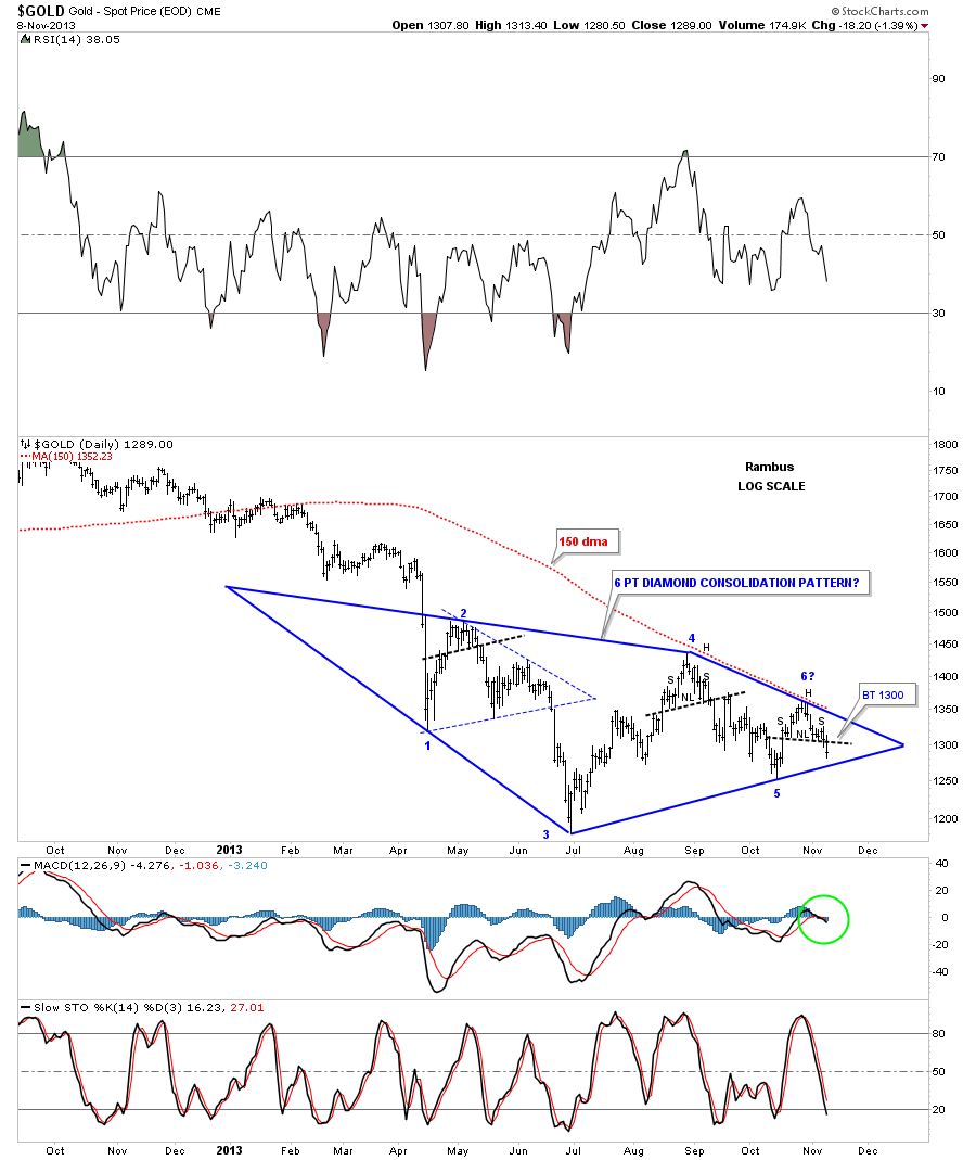
Now lets move on to gold and look at its Diamond consolidation pattern in more detail. Note at each top within the Diamond, even numbered reversal points, a small reversal pattern formed. You can see our current setup is very similar to reversal point #4. From a purely Chartology perspective I could see a bounce off of the bottom blue rail of the Diamond that would cause a backtest to the neckline at 1300. Note the 150 dma that is working as overhead resistance now.
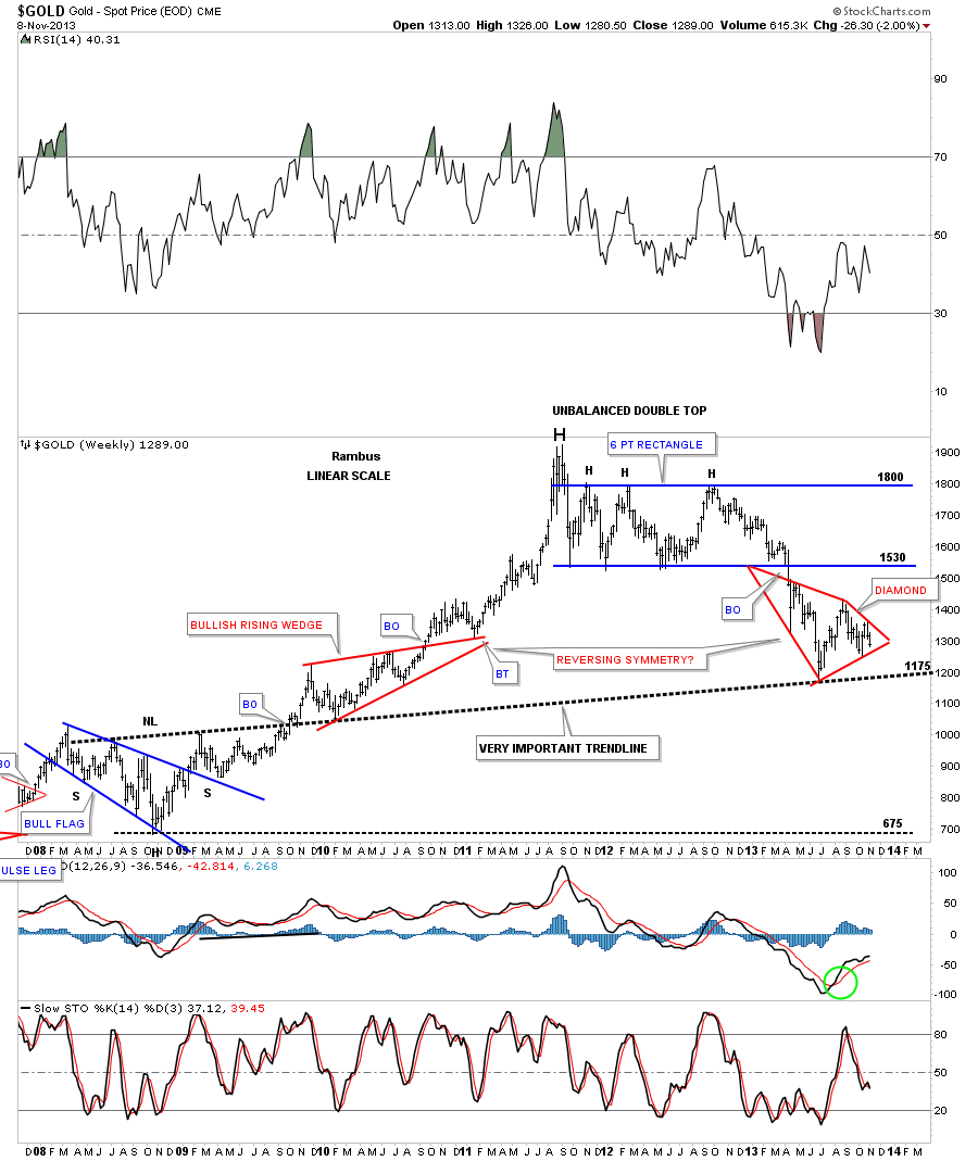
The weekly look at gold shows its diamond forming on the 2008 inverse H&S bottom neckline. It also looks like there is some reverse symmetry down, red Diamond, that is matching the red bullish rising wedge on the left side of the chart going up.
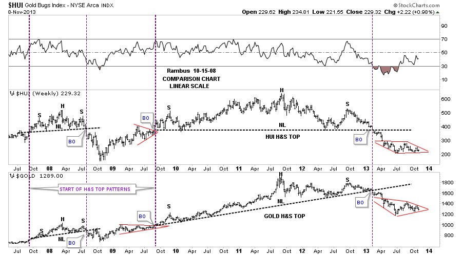
There is a comparison chart I use that shows how the HUI and gold tend to form similar chart patterns. Note the two red patterns on the right side of the chart.
Lets take a quick look at the US dollar and see how the apex of the Diamond formation is functioning. So far it’s acting perfectly. You can see the initial hit and small decline which we were expecting. Then the big breakout move above the apex and then a backtest from the topside last Friday.
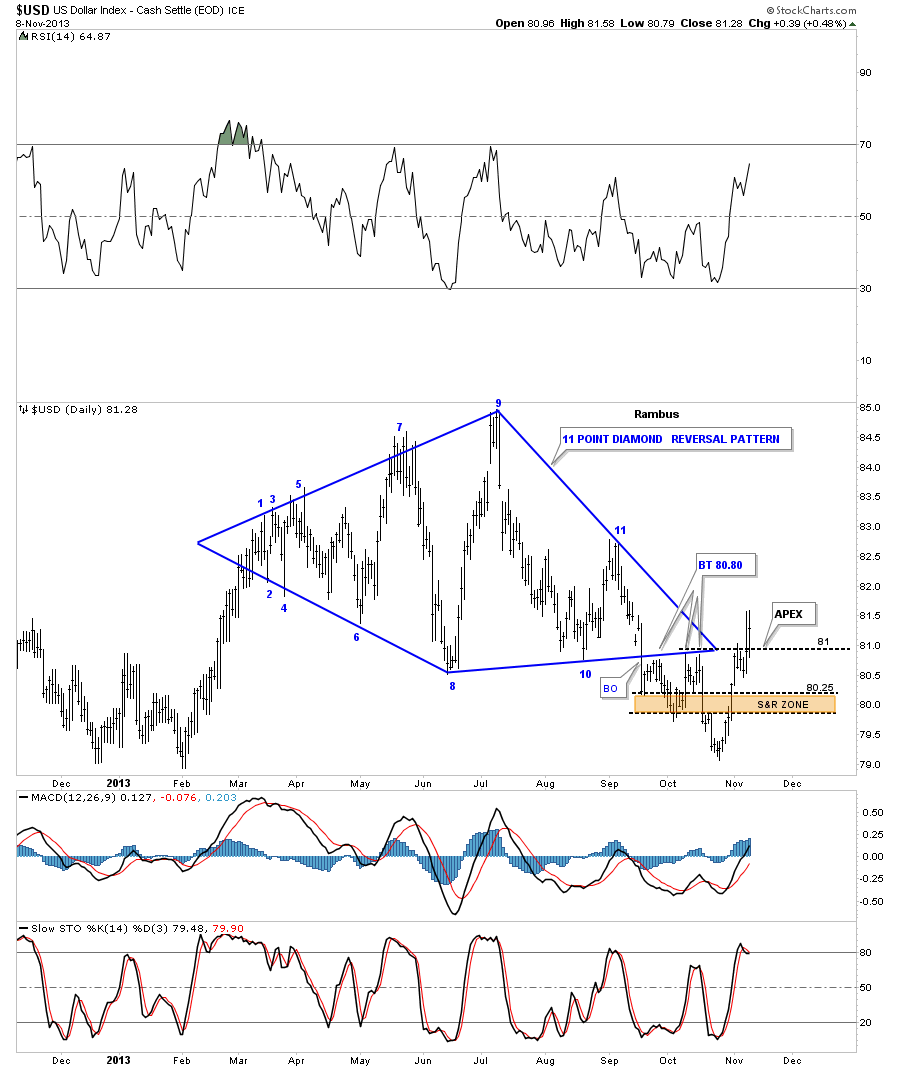
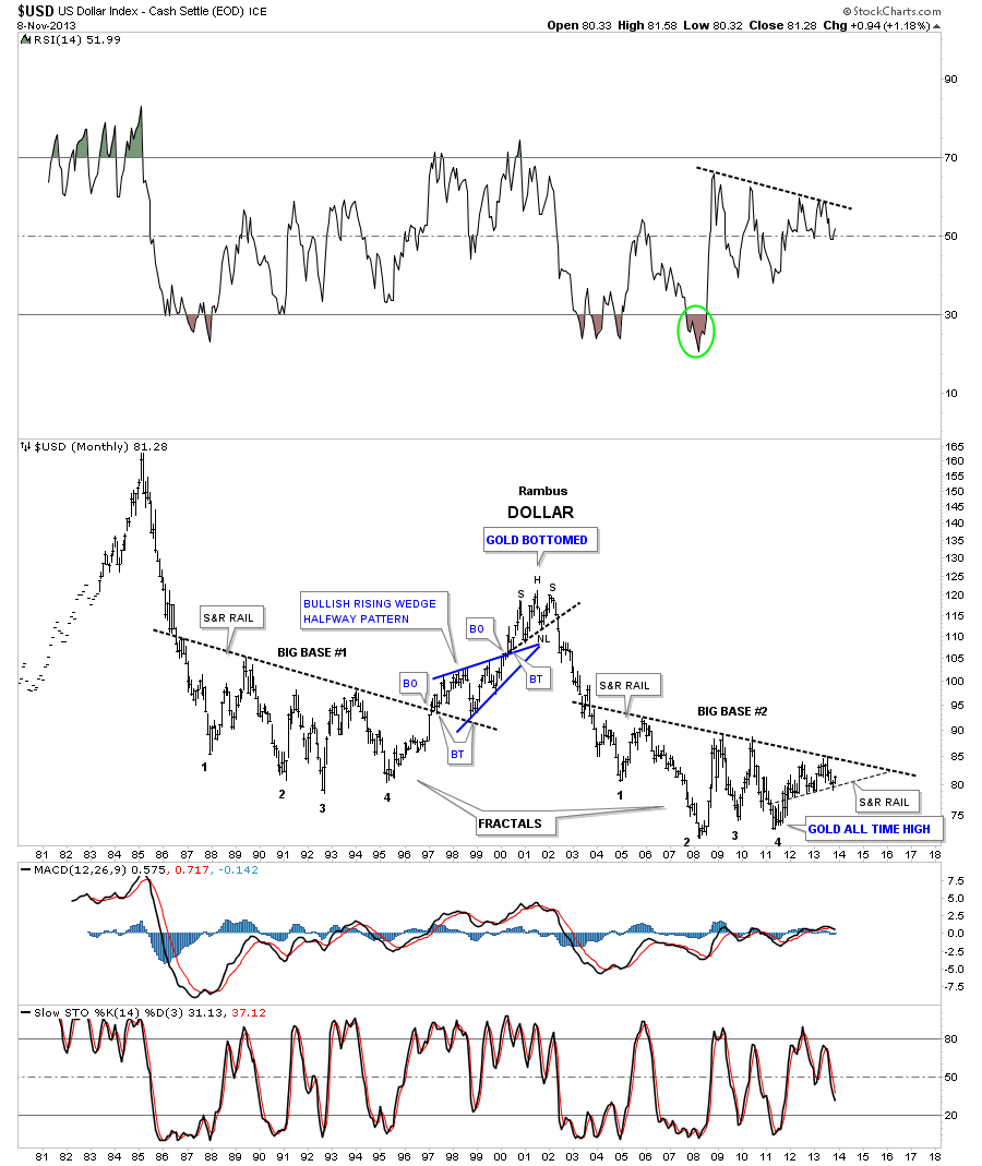
The US dollar waited till the last moment to save the bottom rail of the big base #2 that is so critical to the overall big picture. When it cracked that bottom rail for a week or so it put everything on hold. Now that the US dollar is trading back above that rail I can breathe a little bit easier now. Let me just say that if the US dollar finally takes out that multi year S&R rail that is going to be a big deal. I’ll leave it at that for now.
Lets now take a look at the euro that shows a classic throw over, above the top rail of its bearish rising wedge. As I have shown you before when you get these false breakouts and the price action immediately turns around and trades back inside the pattern it should actually embolden you to get in sync with the new trend as you know that was the last gasp of life to that trend.
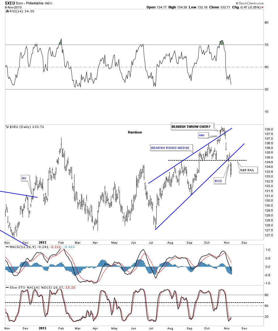
What a difference a week or two can make to a chart. This daily chart for the euro now shows a possible 6 point bearish expanding rising wedge consolidation pattern. Does that name sound similar to you? It still has some work to do but with the way the US dollar is acting this consolidation pattern is very possible.
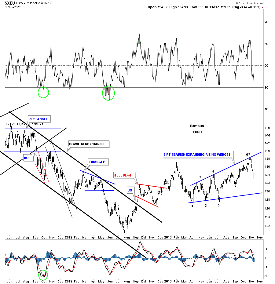
If the US dollar is putting in a big bottom then the euro should be doing just the opposite building out a large topping pattern. I tweaked the top blue rail just a tad when I seen that nice long bar, made from the previous week, where the price action closed toward the bottom of the bar. That top blue rail is now your line in the sand above is positive and below is negative. Right now it’s negative for the euro.
So we have a clear picture of what is transpiring in the precious metals complex right now. We still need conformation of the continuing downtrend once the bottom rails of the Diamonds all finally break down. I have been jumping the gun a bit by taking on some position before the breakouts but sometimes you have to be bold to make a good trade. Right or wrong I’m comfortable with our portfolios right now. I might not be by the end of the week but for the time being the charts are showing more bearish setups than bullish. We just need to confirm the continuing downtrend to get really excited about this 7 month consolidation zone being over and done with. All the best…Rambus