
Before we look at tonight charts I would like to congratulate the folks that are taking the initiative by locking in some of their profits based on their own risk tolerance. Taking profits is a hard thing to do sometimes as greed can get in the way of rational decision making. Risk tolerance iS an individual thing Only you can know the answer. If you took any of my trades last Friday then you have some decent profits right now and depending on your risk tolerance you may want to sell some of your stocks or all of them. JDST is up almost 36 % in less that a week. Most investors would jump at the chance to cash in those kinds of profits in the course of a years trading so keep that in mind. There are going to be many more trades to come. The thing is, once you make a decision to do what is in your best interest, live with it. Don’t do the blame game or I shoulda done that or I coulda done this. Take responsibility for your own personal decision. This will help you further down the road when you are on your own.
I will place my sell/stops where I think is the best place based on the Chartology. We will also have a place on the sidebar which Sir Fully is working on right now that will use a mechanical approach. So you will have several options in which to make your own personal decision on what is best for you.
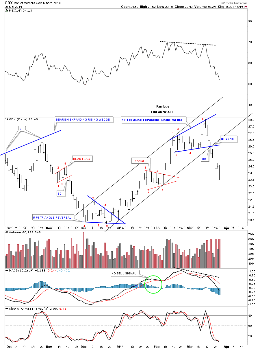
Lets start by looking at the GDX two hour chart that shows what is obvious now, a bull trap, above the breakout point. Put that false breakout in your memory bank as it shows how a failed breakout can lead to a much bigger move in the opposite direction. As you can see that is exactly what has happened. Notice the little but subtle clues that took place after the false breakout occurred. Whenever you have an important trendline, like the top and bottom rails of the blue triangle, always look for a backtest even if there is a false breakout and prices return back inside the pattern. Note the backtest to the underside of the top rail of the blue triangle once the false breakout price action fell back inside the blue triangle. There was another backtest last Friday when the blue triangle broke down. That is where we took our initial positions in DUST. So even though a pattern is broken that doesn’t mean the trendlines are no good anymore, as they may still play a role in the new move that is taking place.

As I have mentioned many times in the past, whenever you know exactly what has happened to a particular trendline, in a chart pattern that goes wrong, always use the new information to tweak your trendlines. Sometimes it may just be a small tweak that shows exactly where the breakout and backtest occurred. Other times it may be a much bigger tweak as with the false breakout on the GDX chart that now gives us a totally different perspective. From what looked like a positive breakout move to a reversal pattern in just a matter of a few day shows you why you can never let your guard down when it comes to the markets. By not giving up on the false breakout, like so many investors who get discouraged when things don’t go exactly as planned, I was able to see a 5 point point bearish expanding rising wedge reversal pattern. Yes we gave back most of our gain but we survived to trade another day unlike most that are still hanging on for dear life waiting for the rally to bail them out. Our Model Portfolio is safe and sound in cash waiting to be deployed at some point in the future along with the Junior Portfolio. Both of those portfolios had small gains that were protected. As you probably know by now the Juniors are getting hammered to no end right now and many that bought them have no clue what is taking place. You do and that is most important from my perspective.
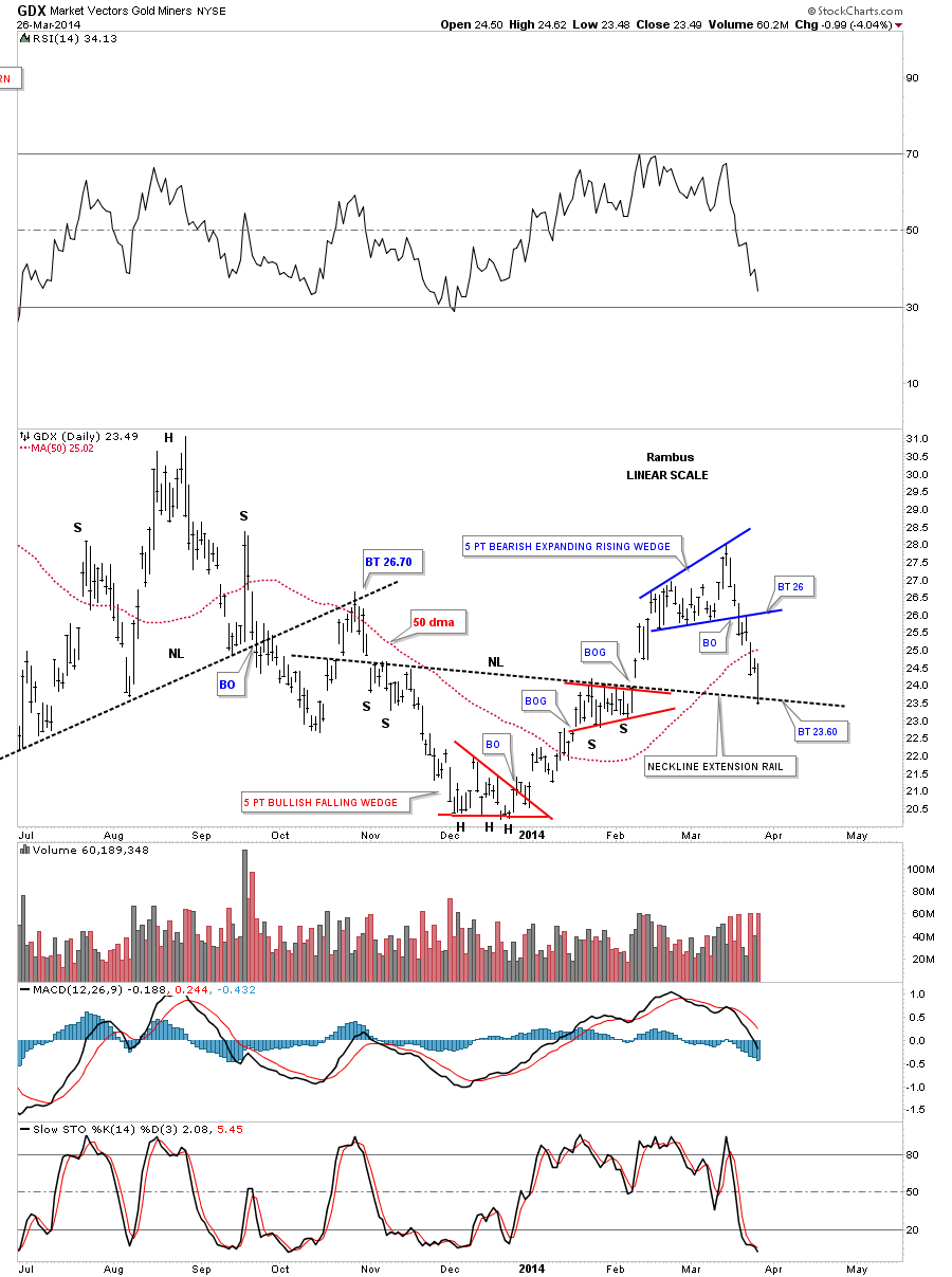
Lets look at another daily chart for the GDX that shows our top, 5 point reversal pattern, and the sharp decline that has followed. You may recall the inverse H&S bottom that led to the three month rally. As you can see I’ve extended the neckline to the right hand side of the chart that may offer some initial support on this decline. Today’s price action for GDX stopped right on the neckline extension rail. As I mentioned earlier, even if the GDX breaks below the neckline extension rail we can still use it to look for an entry point to buy more DUST if things work you that way.
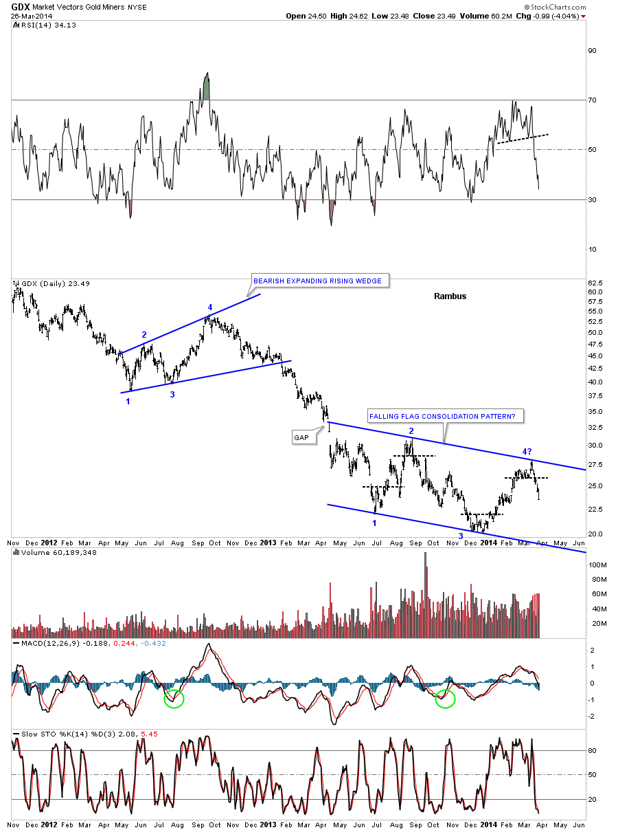
This next daily chart for the GDX shows a potential very bearish setup that maybe unfolding right before our very eyes. I know it doesn’t seem like a fast moving market, it’s all relative, but when you have a down sloping chart pattern in a downtrend that is usually a very bearish setup. If… If this recent false breakout turns out to be the fourth reversal point in a possible bearish falling flag, this would be a halfway pattern as measured from the breakout from that massive H&S top. Keep in mind I’m using the GDX as a proxy for the rest of the precious metals stock indexes. The top and bottom rails of this potential falling flag are exactly parallel.
This last chart I would like to show you for the GDX is the long term weekly look that shows the massive H&S top formation that took over three years to complete. You can see how nicely this possible bearish falling flag fits into the big picture. Using my two different measuring techniques I can tell you the price objective would be around the 10 to 12 area. You may remember that area came up when we were looking at a different possible halfway pattern awhile ago. I don’t want to put too much positive spin on this potential huge setup but if you look at the top of the right shoulder, on that massive H&S top, and follow the price action down to the first reversal point in the blue falling flag halfway pattern, I would expect a similar move starting at the 4th reversal point we just put in that would take the price down to the 10 to 12 region. That would be the impulse measuring method. There is still a lot of work to do but the potential for a big payday is there if we play our cards right.
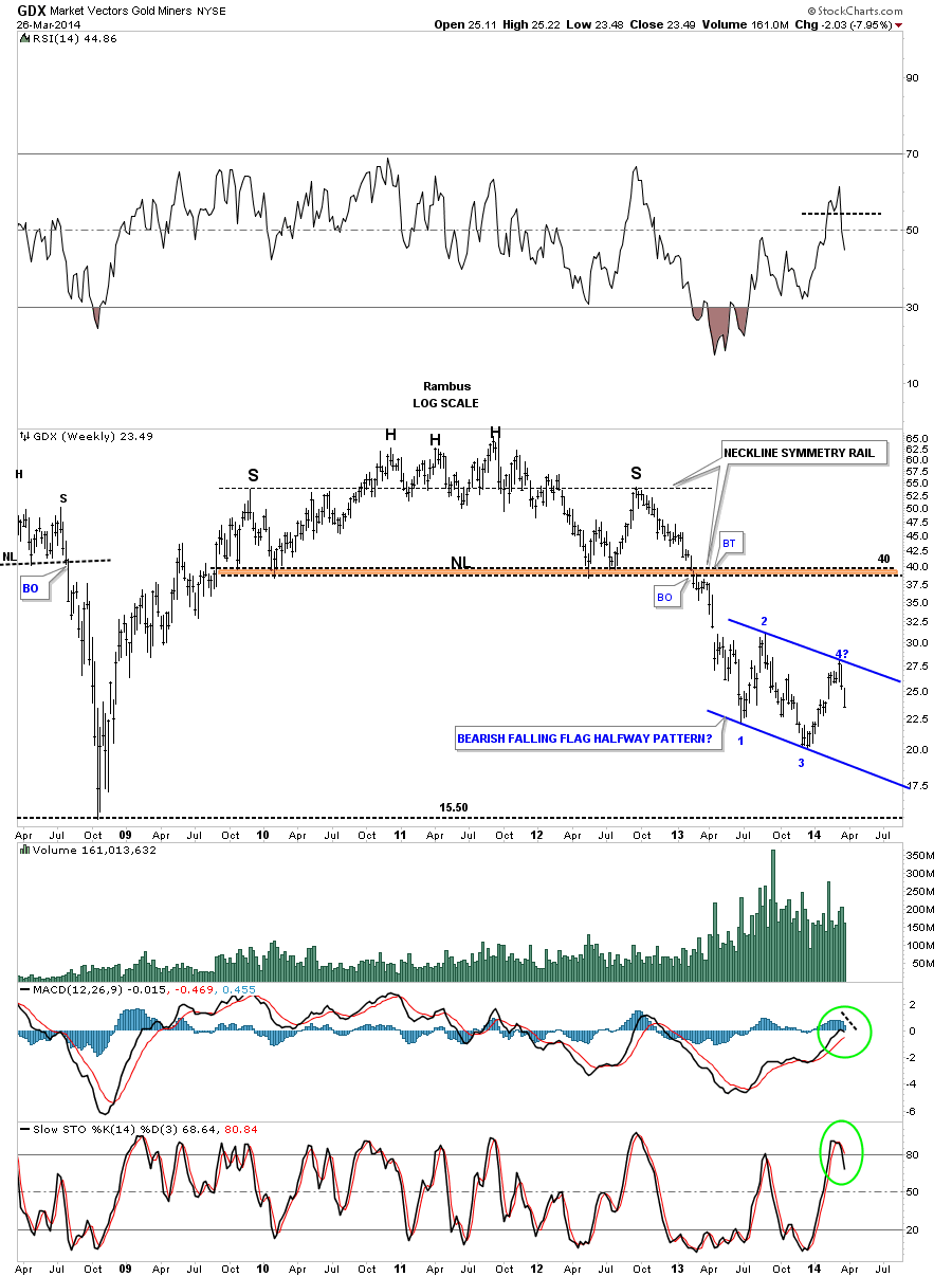
Many of our longer term subscribers know I was originally looking for a consolidation pattern in this area that would be a halfway pattern. Sometimes charts patterns can morph as I have shown you above that can give a false look to what is actually happening. During, what now looks like a three month counter trend rally, there were many potential double bottoms forming that gave the appearance of a major low being formed. After last weeks performance that now looks unlikely. I will start posting more charts during the day tomorrow to show you why this huge potential has a strong possibility of playing out to our advantage. Stay tuned and all the best…Rambus