
Last week we seen the stock markets go down and the precious metals stock indexes go up for the most part, inverse correlation. Friday the stock markets had a big reversal day with the PM stocks being mostly flat to down. It will be interesting to see how long this inverse correlation holds together.
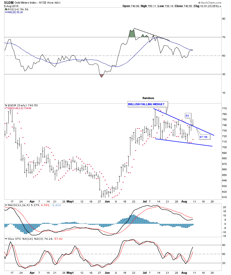
Lets start with a daily chart for GDM that is showing a falling wedge at the moment that has broken out to the upside with a backtest to the top rail last Friday. The PSAR has been on a buy signal for 3 days now. The MACD and Histogram are still in negative territory while the slow stoch is rising giving us a mixed picture at the present time.
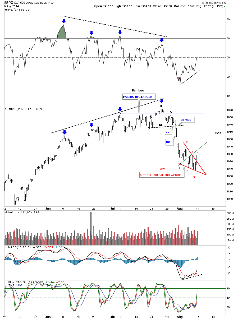
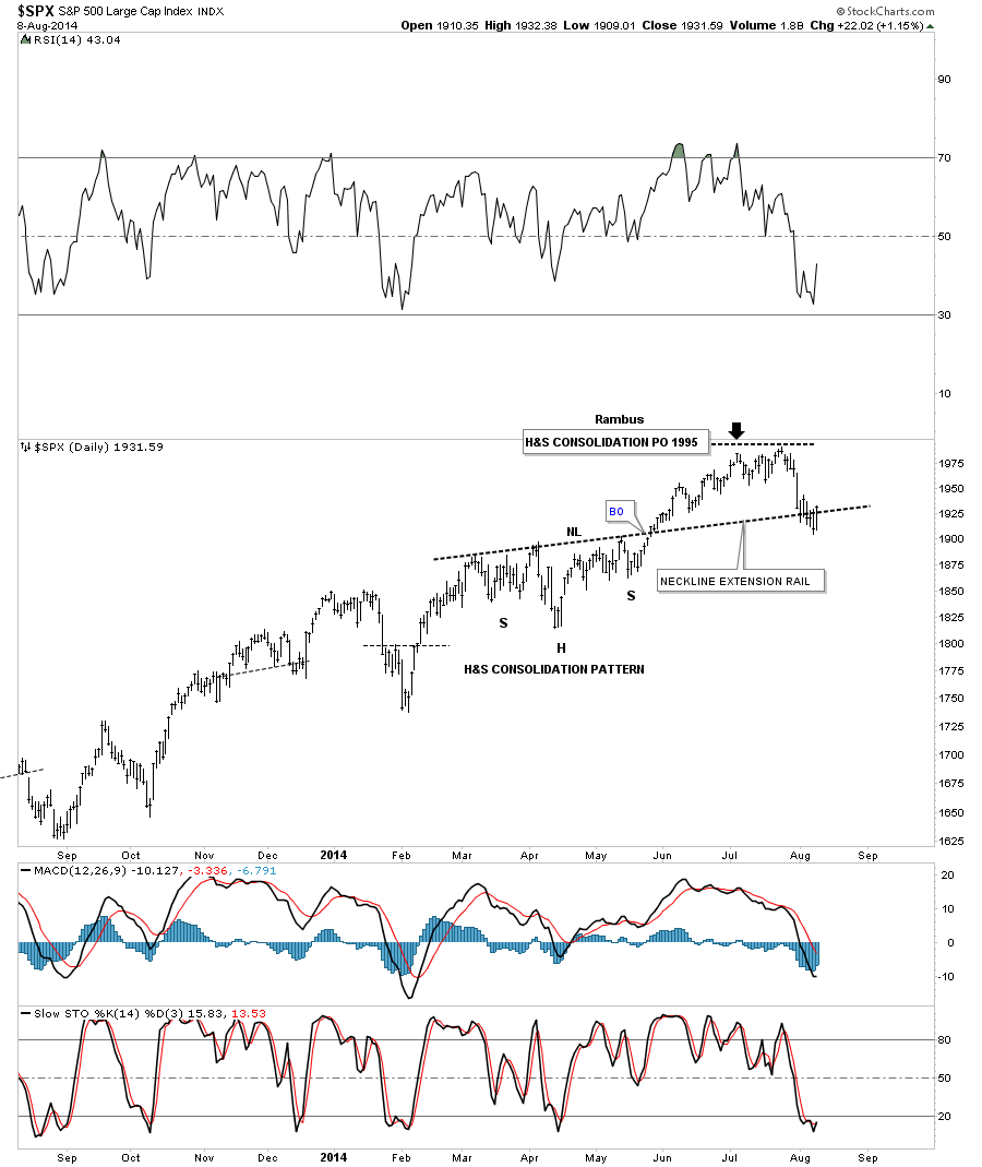
Next I would like to show you the SPX and the decline it had last week which looks like it may have found a bottom of some kind on Friday. Note the red falling wedge that has 5 reversal points which makes it a reversal pattern to the upside. Also there is a possible Wolfe Wave that shows a price objective up to the green trendline which could overshoot a bit. At the top of the chart you can see the blue rectangle I posted just before it broke down that also had a H&S top so that part has played out accordingly. Now the question is what kind of rally will we see going forward. If the green WW doesn’t hold resistance then the bottom of the blue rectangle, at the 1955 area, should be the first real area of resistance.
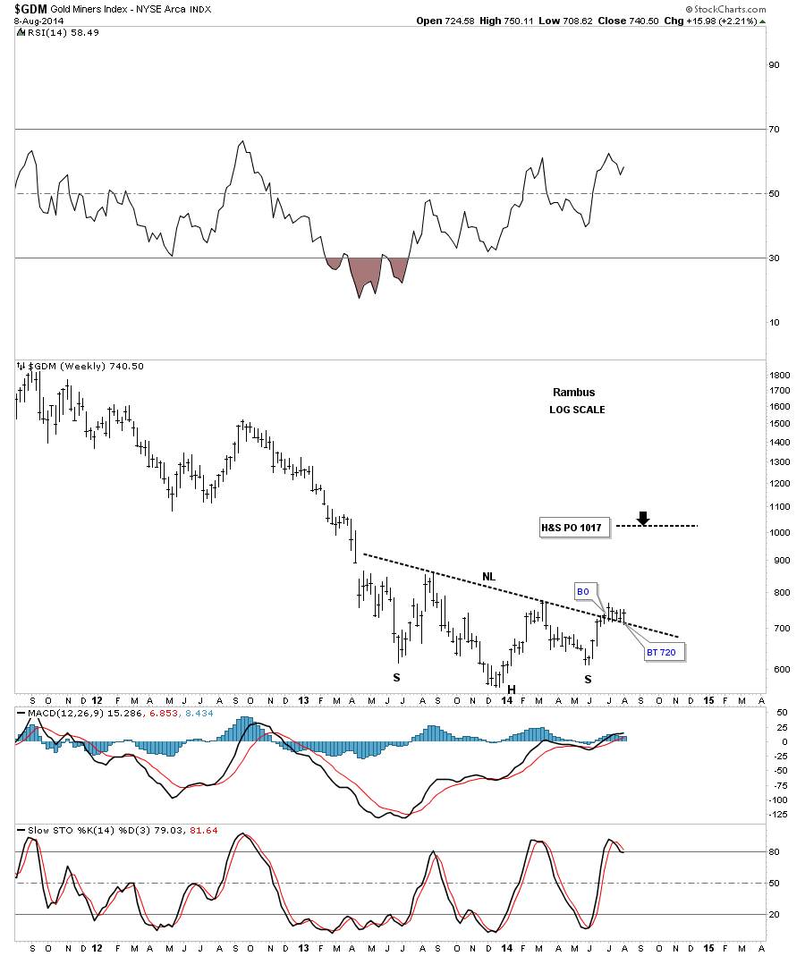
The weekly chart for GDM shows the neckline has held support for the 5th week in a row now. It did drop down to 708 earlier in the week but recovered to close closer to the high for the week instead of the low. Five weeks of grinding action with no clear cut signal yet.
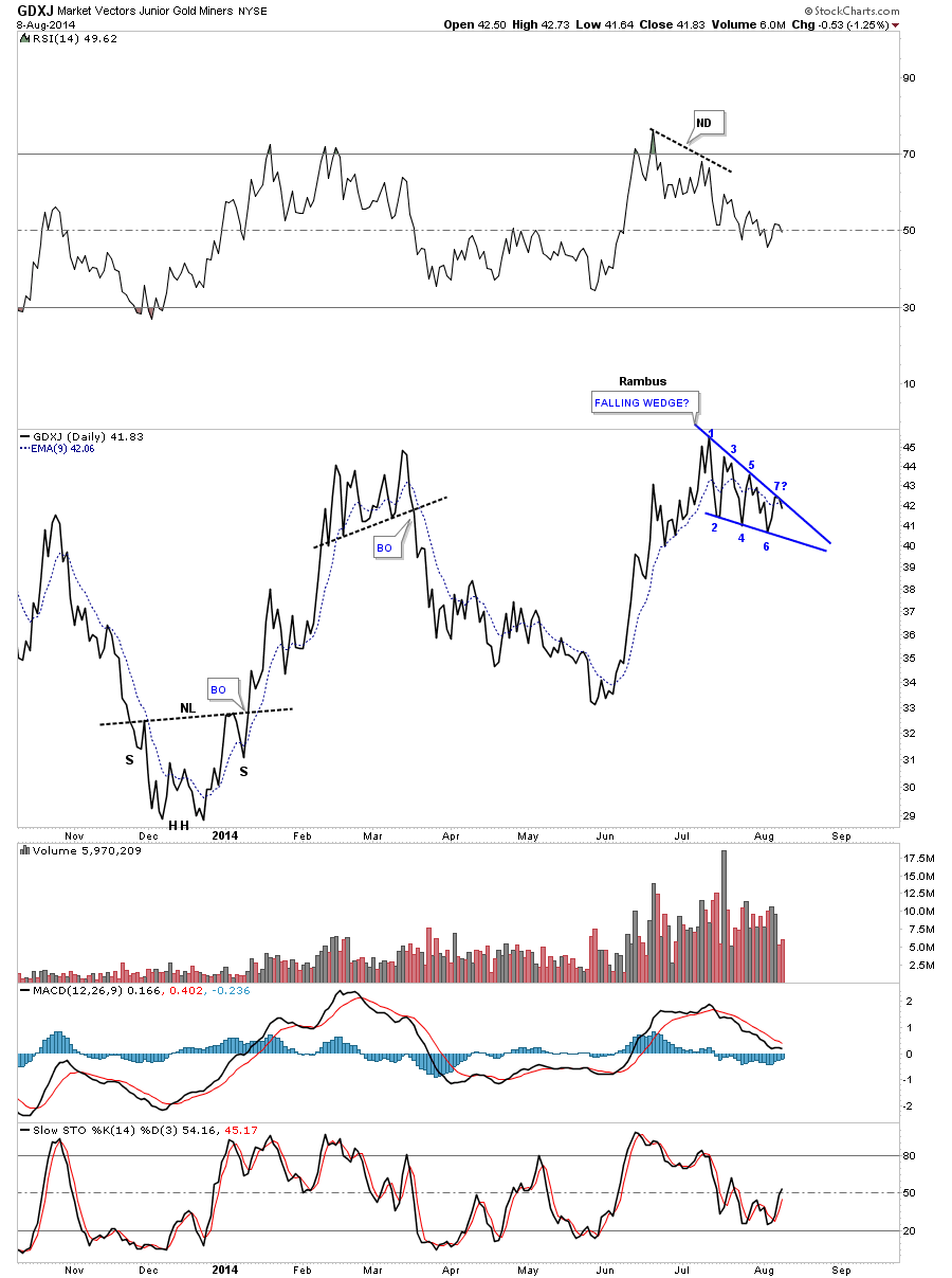
Lets now look at a daily line chart for GDXJ that shows it’s still in the confines of a falling wedge which has completed 6 reversal points so far with the possible 7th one in progress. And the chop continues.
The weekly chart for GDXJ shows it to has tested its neckline for many weeks now which is still holding support. Above the neckline is bullish and below is bearish. We have a very fine line it the sand in which to place a sell/stop if one is long.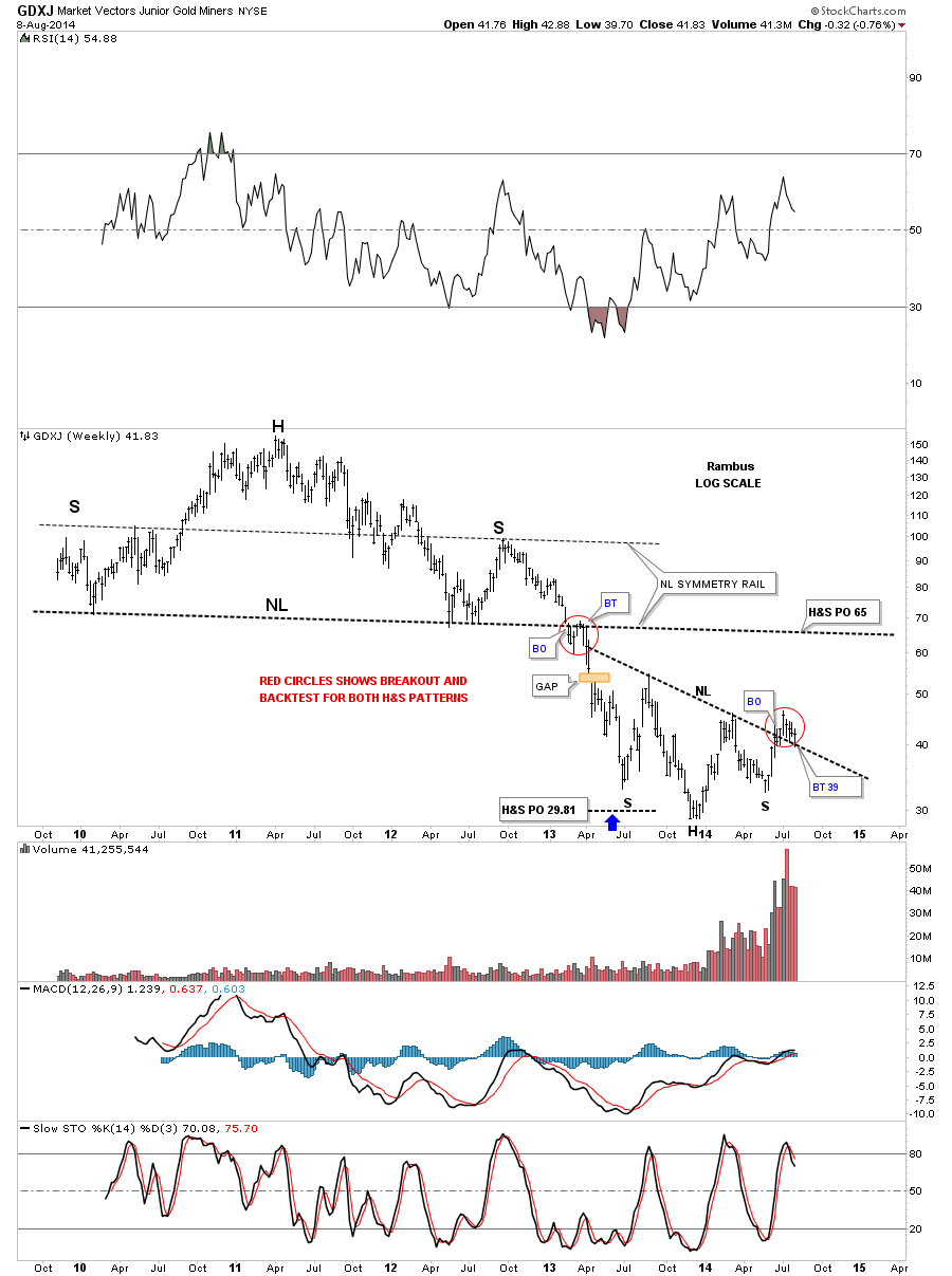
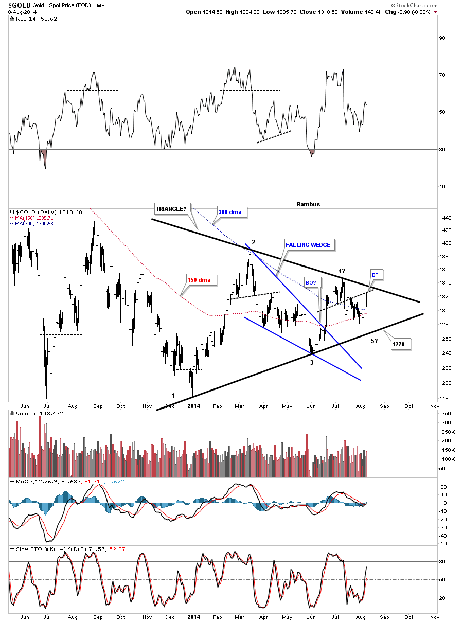
Below is a daily chart of GOLD that shows the potential triangle forming. Note the potential 4th reversal point where the price action broke below the S&R line and then backtested it on Friday and closed toward the low of the day. On a positive note Gold is still trading above the 150 and 300 dma. It looks like the 1270 area is going to be critical support if gold moves down to the bottom rail.
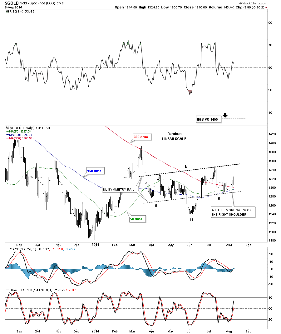
Below is a chart I posted several weeks ago in which I was looking for the neckline symmetry rail to hold support for the bottom of the possible right shoulder. So far the Neckline symmetry rail has held support unlike silver.
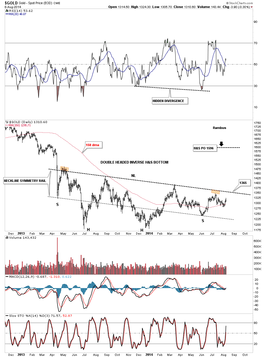
Below is a long term daily chart for gold that shows the potential one year inverse H&S bottom. It looks like the 1365 area on the neckline is going to be critical resistance until it gold can break it to the upside. If gold can break that neckline it would suggest a rally up to the 1596 area. First things first, 1365 needs to be taken out before we can get too excited.
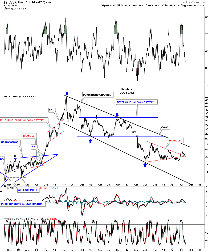
Next lets look at silver as it seems to be a big fly in the ointment. As you know silver has been lagging pretty badly in the PM complex. Is it going to be late to the party or is it leading the way lower? The long term daily line chart shows the one year red triangle that had a false breakout to the downside and then it had one to the upside. As you can see it’s now trading below the apex. When you look at this chart notice all the lower lows and lower highs that have been made since the top in April of 2011. Silver had a chance in July to take out the March high but so far has refused to do so.
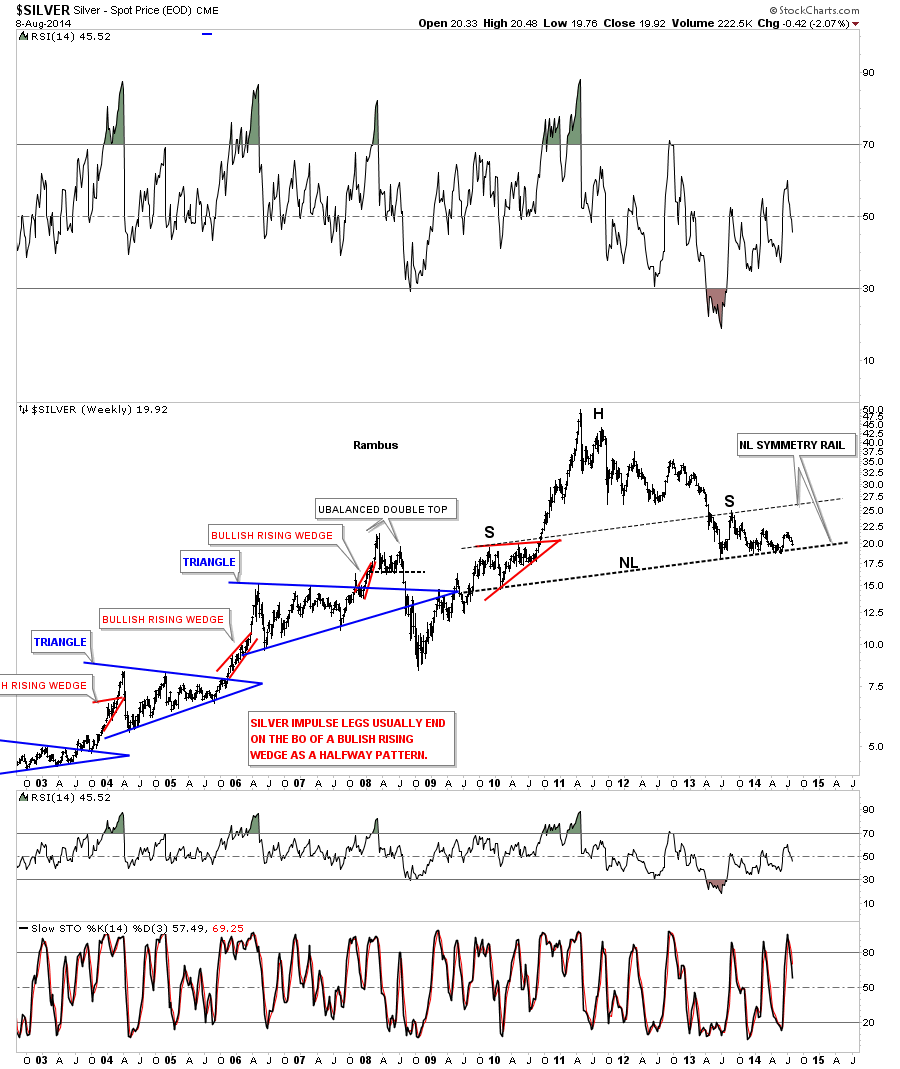
Next I would like to bring back a few long term charts for silver that I haven’t shown in awhile that have some bearish implications if they play out. The first chart goes back to 2003 that shows some of the more important chart patterns during its bull market. Some of our longer term members have been looking at this potential H&S top for close to a year now. You can see the neckline symmetry rail called the high for the potential right shoulder last year. That big neckline has held support and has refused to give up yet. If it does break it would be very bearish for silver but until that time comes the price action is still trading above it.
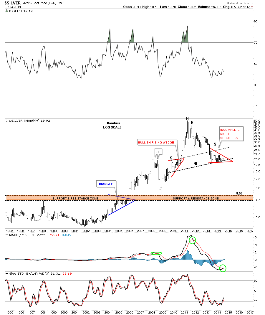
Below is a monthly chart for silver in which I have tweaked the red triangle that is making up the potential right shoulder. By tweaking it I mean I’ve adjusted the top and bottom rails to the symmetry false breakouts of the top and bottom rails. When I first drew in the right shoulder I was looking for more work to be done before the potential right shoulder could be considered finished. As you can see enough time has now passed for this possible right shoulder to be considered complete. Until the neckline is broken to the downside it is what it is.
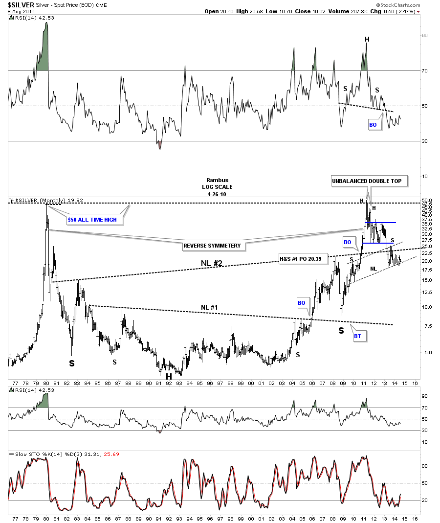
The last chart for silver is a very long term look that goes all the way back to 1977 that shows how silver reversed symmetry back up in 2000 to the top made in April of 2011. You can see how precariously close silver is getting to that 4 plus years neckline. Again, until that neckline is broken to the downside silver still remains positive but if it ever breaks below it there will be a huge H&S top in place that will be reversing the bull market that began in 2001. Something to keep a close eye on.
There is another chart for the SPX that I would like to show you that had a nice H&S consolidation pattern that reached its price objective up at the 1995 area. I’ve extended the neckline to the right side of the chart that sometimes will come back into play as a backtest. The rally last Friday looked pretty strong so the neckline extension rail may not provide resistance. We’ll just have to see what happens.
Below is a long term chart for the QQQ’s that also had a H&S consolidation pattern with the head being the low in 2009. It just recently hit its price objective at 94.80. On a positive note the 30 and 88 wma has done an excellent job of holding support since the buy in late 2009. The QQQ’s could have a decent correction without breaking the 30 and 88 wma.

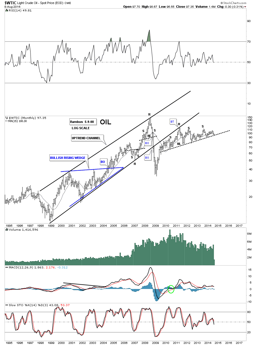
Below is a chart for oil that is also getting very close to an important neckline. This potential neckline goes back 5 years and counting.
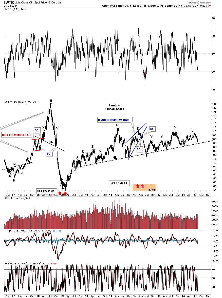
This long term monthly chart for oil shows its major uptrend channel that began in 1998 and topped out in late 2007 after its parabolic rise. You can see the crash that ensued once the move completed. The backtest to the underside of the bottom rail of the major uptrend channel created the head portion of the possible 5 year H&S top.
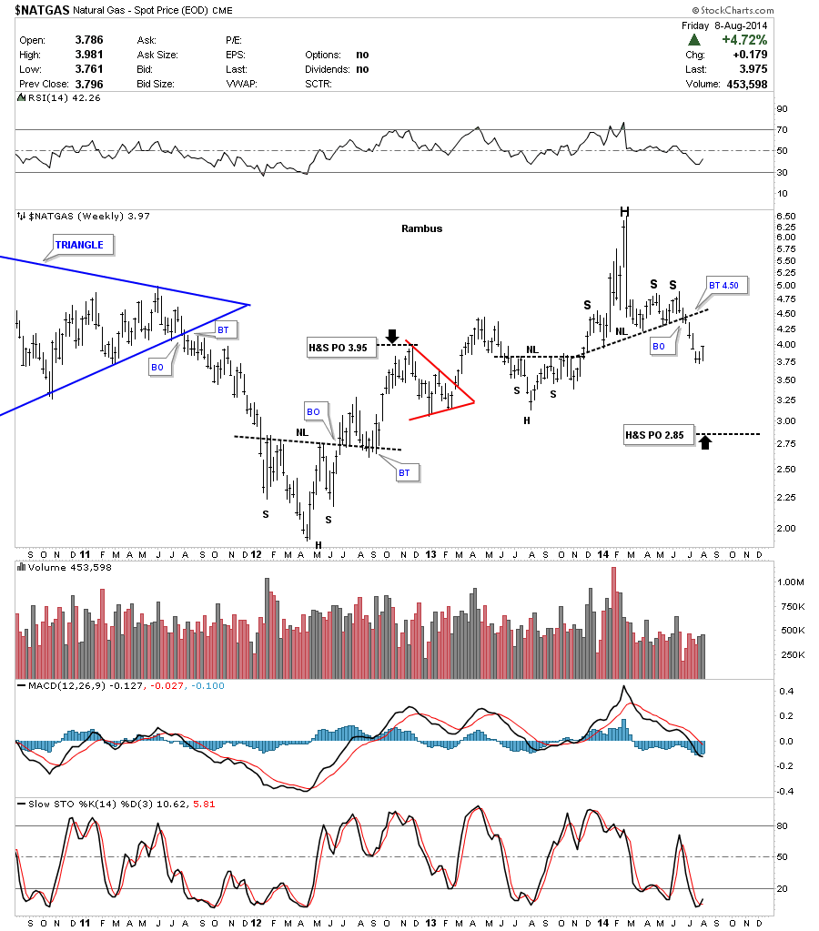
Lets look at one last chart which will be Natural Gas. It too had a nice H&S top but much smaller that broke down six weeks ago. Its in a confirmed downtrend but there are no rules that says it can’t backtest the neckline before it declines is earnest. I would prefer to play this one on the short side unless you’re very quick on the draw.
So there you have it, a mixed bag in the PM complex and the stock markets. Either one could be in the beginning stages of a decent move but we need to see more confirmation of a trend to really get excited. This looks like it could be an interesting week ahead so stay tuned for further developments. All the best…Rambus