
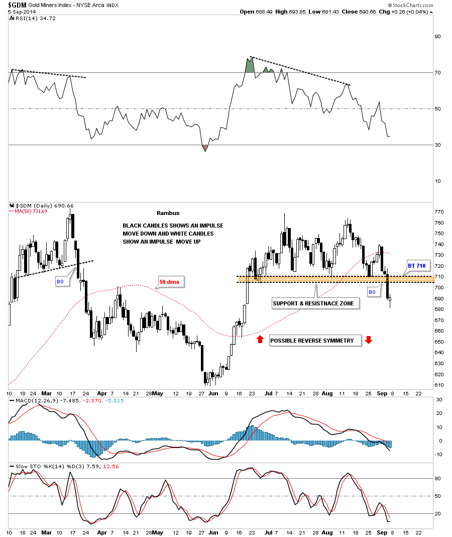
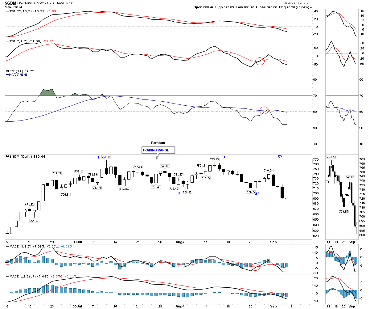
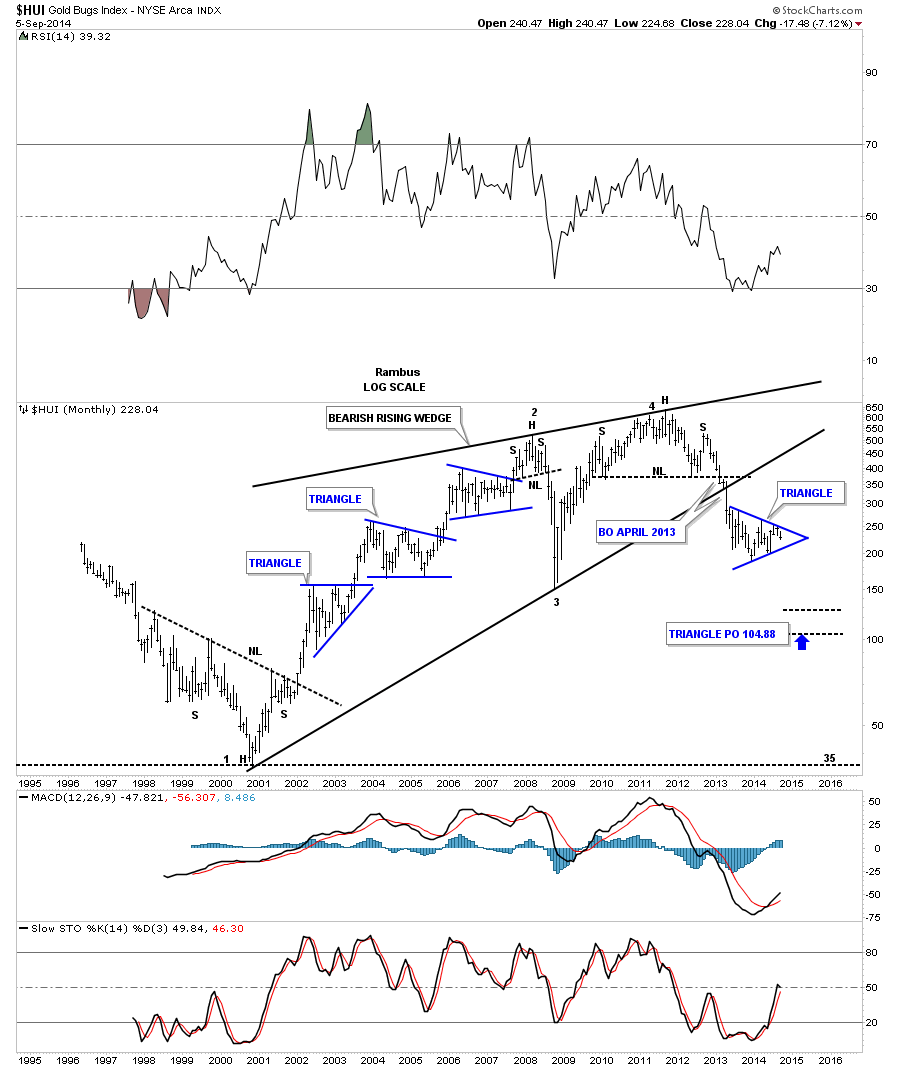
I believe last week marked an important turning point for the precious metals stocks. After two months of chopping in a tight trading range GDM, which I’m going to us as a proxy for the big cap precious metals stocks, finally broke below the critical brown shaded support and resistance zone. This was a big deal for me as now all those bottoms that had been holding support should now offer important resistance on any backtest.
This first chart for GDM shows the two month trading range that one could call either a double top or if you use your imagination you can see a double headed H&S top with a small left and right shoulder. It really doesn’t matter what you call the trading range above the brown shaded support and resistance zone, it’s the S&R zone that matters the most. That S&R zone is now our line in the sand, above is bullish and below is bearish. If GDM is indeed starting a new impulse move lower we should start to see a bunch of black candles forming one below the next. Note all the white candles that formed during the rally off of the June low which told us the move was strong. One last point on the chart below. I’ve labeled the price action below the brown shades support and resistance zone as having a possible reverse symmetry move down which would look similar to the June rally only in reverse. The main thing to keep an eye right now is to see if we get a backtest to the previous support zone at 710 that should now reverse its role and act as resistance.
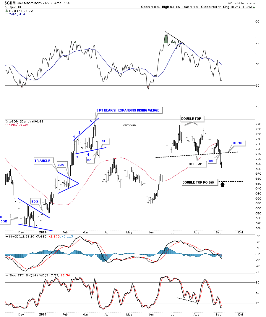
This daily bar chart for GDM shows the double top price objective which would come in around the 655 area at a minimum.
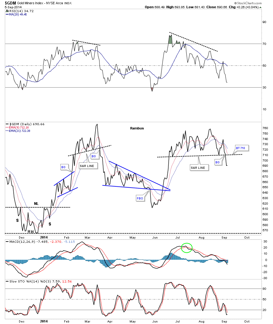
As you know I always like to look at a line chart as it can take out a lot of noise that a bar chart can make sometimes. This line chart shows the breakout and a possible backtest to the 710 area to confirm the top is in place.
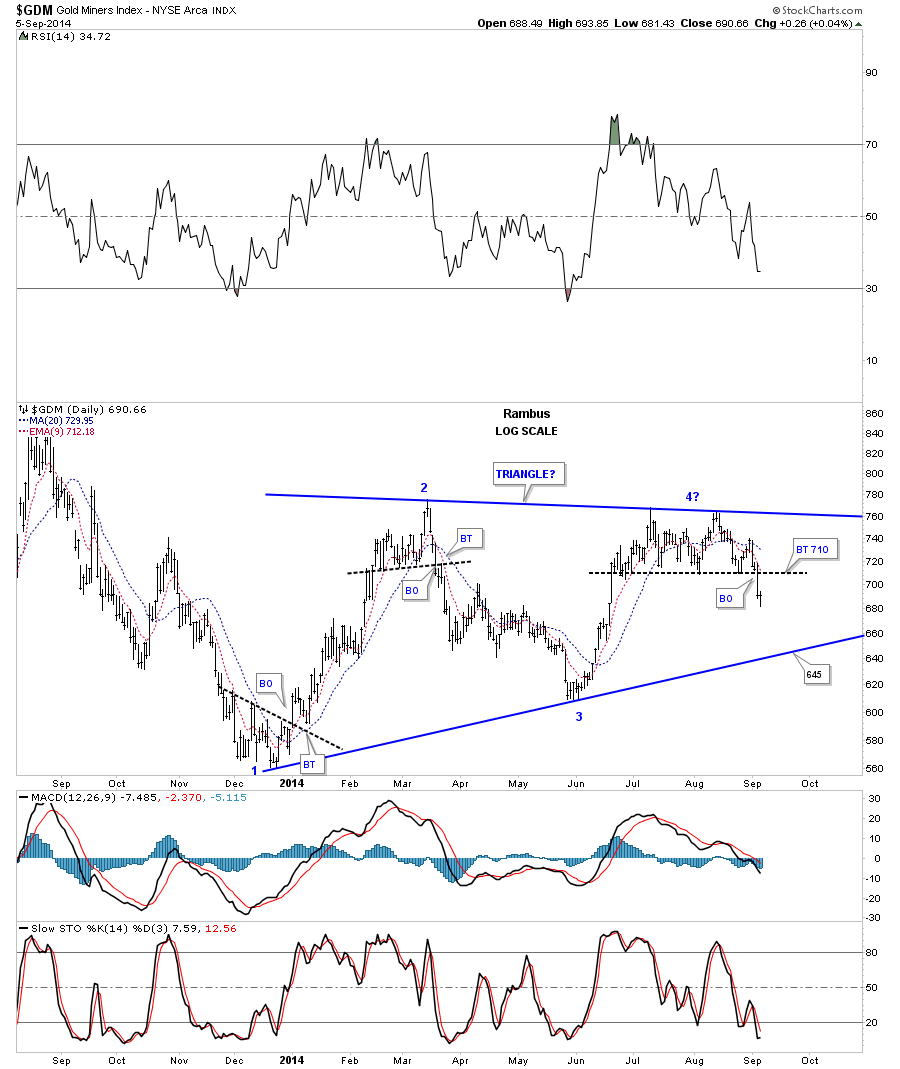
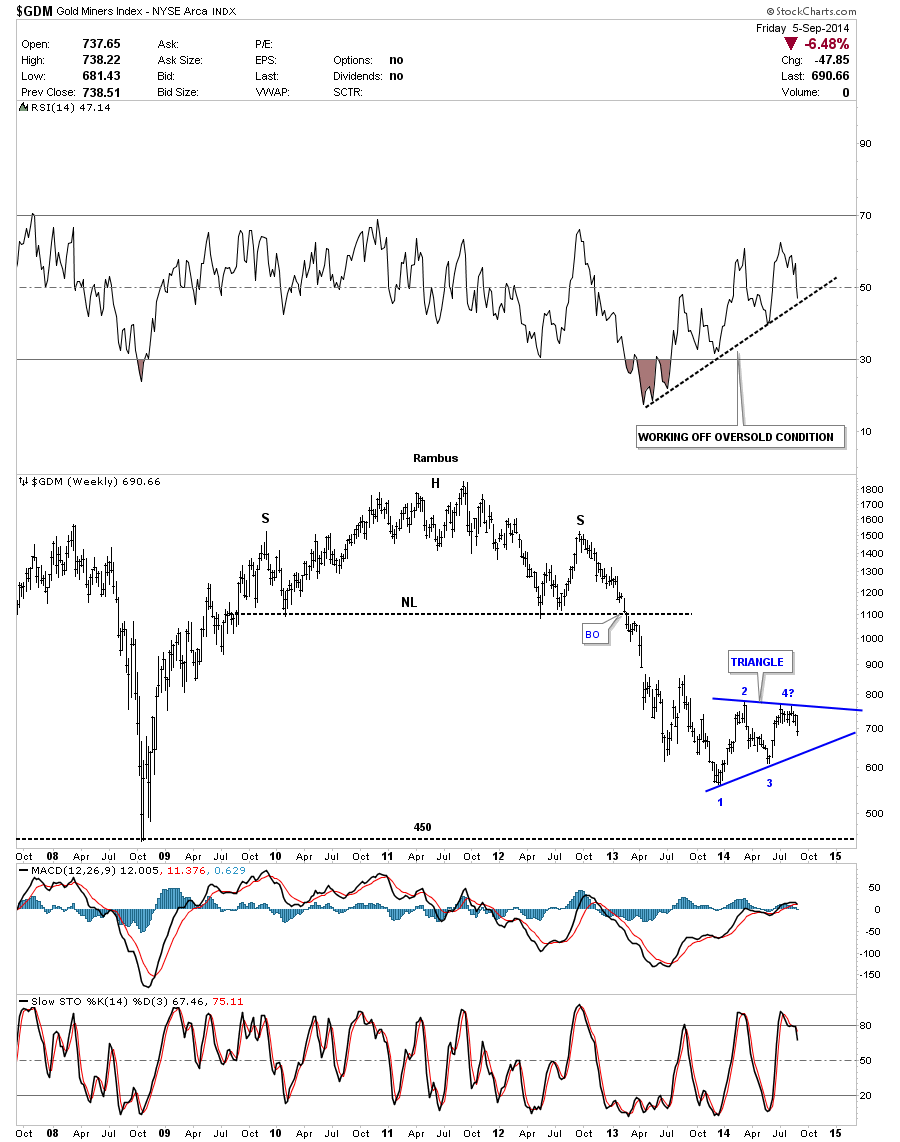
Next I would like to start painting the bigger picture if our current top is indeed the top we’ve been looking for. Last December GDM finally found support at the 560 area which led to a rally that took the price up to the March high. This created the first reversal point in a possible consolidation pattern or topping pattern. GDM then reserved direction and headed back down to the June low at reversal point #3 which was a higher low than reversal point #1.This completed the second reversal point. At that point reversal point #3 began which took GDM up to our current top completing the third reversal point that is making a lower high than reversal point #1 which is giving us a triangle looking pattern. The fourth reversal point won’t be complete until the price action hits the bottom trendline at 645 or so. It may sound confusing but when you look at the chart below is becomes very obvious. So the next important area to watch, if indeed the top is in place, will be the bottom rail of the possible blue triangle at 645.
The GDM Four Horsemen.
Another reason last weeks price action was so important is because GDM has broken down below the neckline of that potential inverse H&S bottom that has kept us in limbo for the last two months. It’s looking more likely that the inverse H&S bottom maybe negated if we see more weakness coming into the big picture over the next week or two. If GDM was embarking on a new bull run it should be showing more strength instead of weakness in here which it’s not.
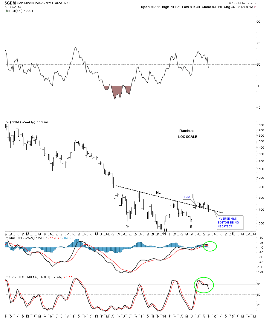
On this next weekly chart for GDM I’m showing the potential blue triangle that we looked at earlier in this post. If you look at the RSI indicator at the top of the chart you can see how the 14 month chopping range has relieved the very oversold condition when GDM first started the correction. It now has plenty of room to run to the downside if it breaks below the black dashed rising trendline.
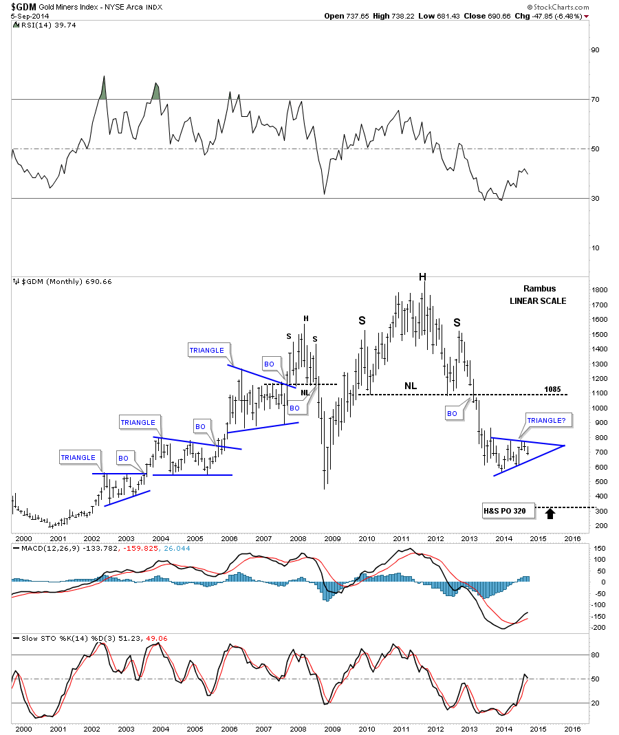
This last chart for GDM is a monthly look that shows the massive H&S top and the decline that ensued. This linear scale chart has a price objective down to the 320 area. Note the three blue triangles that formed during the bull market years and compare our current triangle that is similar in nature that has been forming during the bear market. In an uptrend a consolidation pattern will usually breakout to the upside and in a bear market the consolidation pattern will break out to the downside. The odds favor our current and possible triangle will breakout to the downside.
I would like to throw in this long term chart for the HUI that puts our potential blue triangle in perspective. Note that during the bull market years the HUI constantly made higher high and higher lows. Now compare that uptrend to our current downtrend that has made a series of lower highs and lower lows since the bull market peak in 2011.
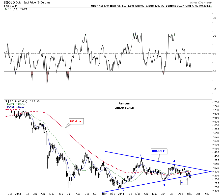
Lets now look at a few gold charts and see what’s happening there. This first chart shows the blue triangle that started to form the same time GDM started to form its triangle. The big difference is gold has broken below its bottom rail while GDM is still trading in the middle of its potential triangle. Gold is trading below all the moving averages on this chart with the 150 ma being the most critical.
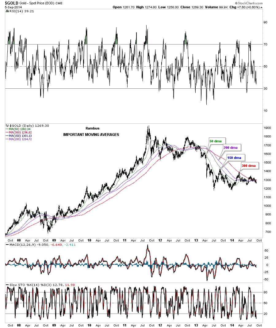
Below is a long term daily chart for gold that shows all the most important moving averages. As you can see the price of gold is trading below all the moving averages at this time. These moving averages actually work best when there is a strong move either up or down as show by how they aline themselves. When they are all bunched up together it tells you there is a top, bottom or consolidation pattern forming.
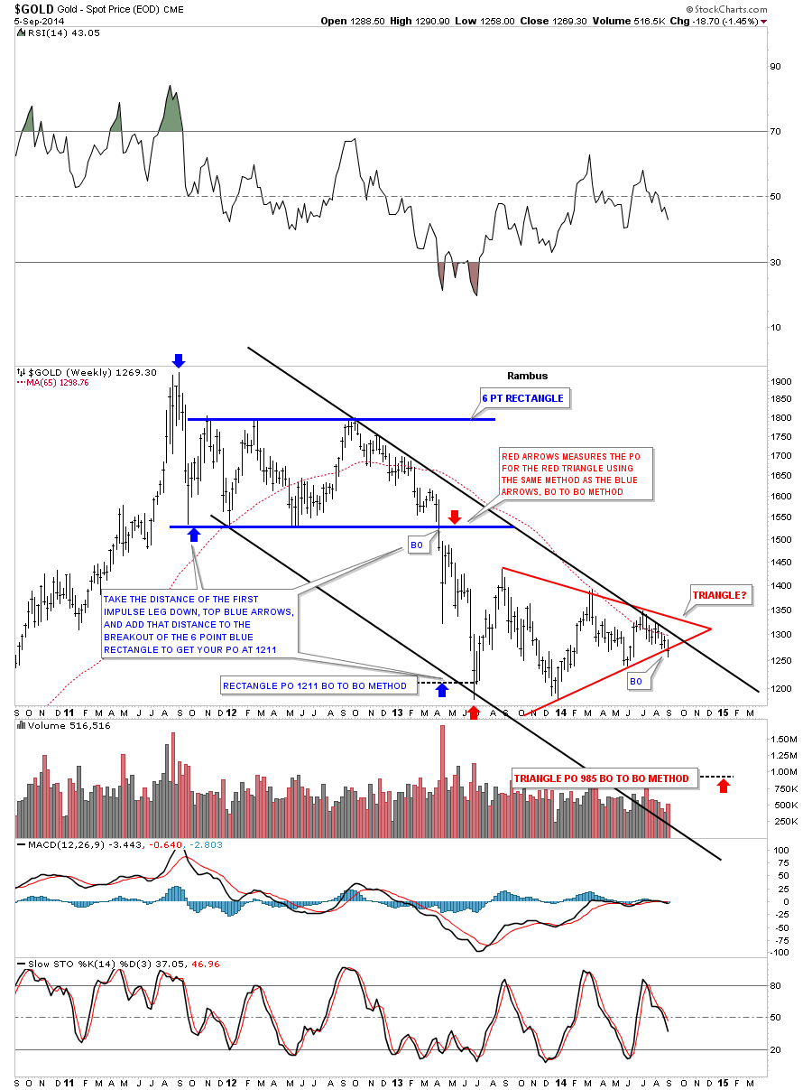
This next chart for gold is a weekly look that shows the 65 week moving average acting as resistance since early 2013. This weekly chart also shows you the downtrend channel that has the blue rectangle and the red triangle forming between the top and bottom rails. I’ve added instructions on how I measured for the price objective of the 6 point blue rectangle. If the red triangle plays out to the downside I used the same measuring technique that would give us a price objective down to the 985 area. Note the last bar on the far right hand side of the chart. Is this the beginning of the next impulse move lower or will we get a fake out breakout? I don’t think we’ll have to wait very long for an answer one way or the other.
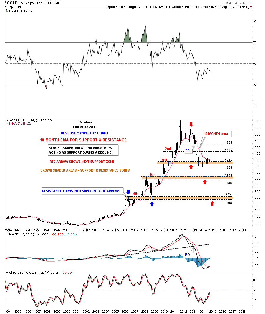
Lets look at one more long term chart for gold the monthly bar chart. This chart shows the 10 month ema that did an outstanding job during the bull market years for holding support. Even during this bear market it has done a good job of holding resistance. This chart also shows you where I would expect support to come into play if things breakdown for gold, the brown shaded S&R zones. As you can see the 985 to1034 would be the next critical support area for gold.
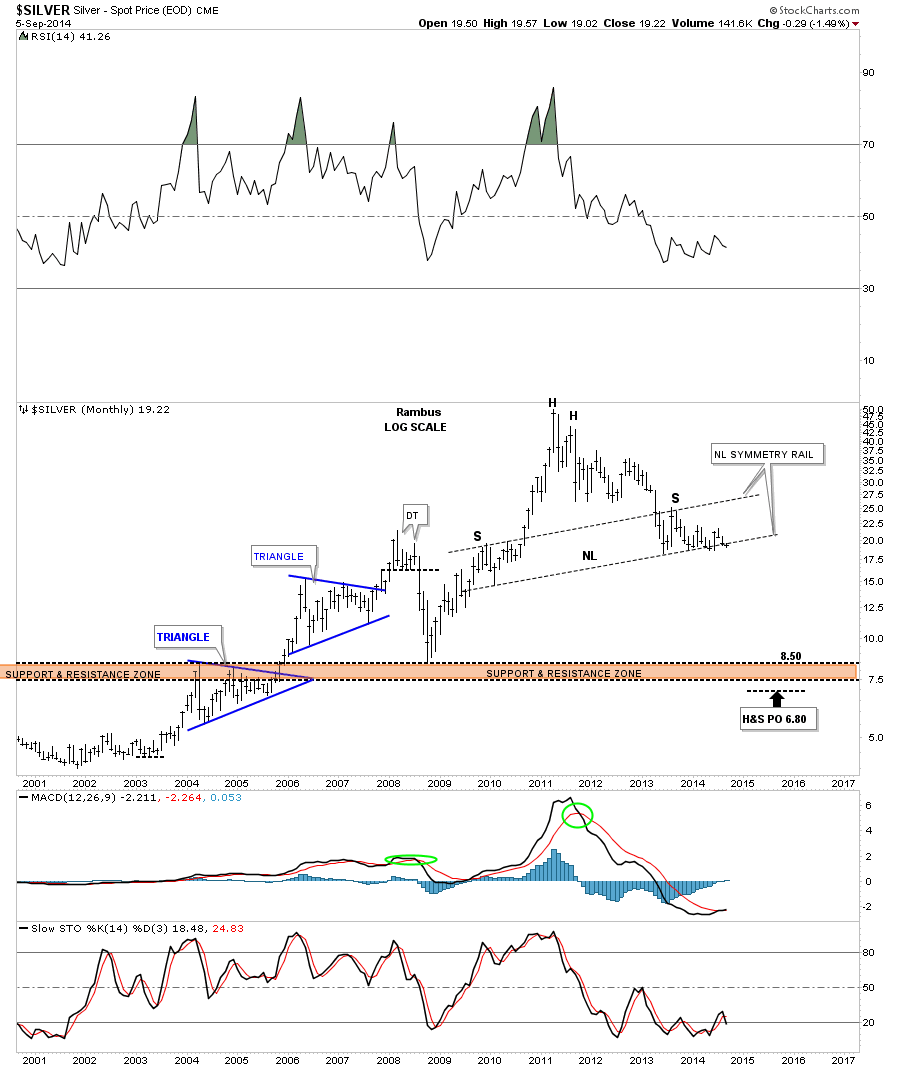
Lets take a look at the long term silver chart that we’ve been following for close to a year now. The price action hit that potential neckline in June of 2013 and has been finding support ever since. As long as neckline holds the potential H&S top is just that a potential H&S top but if the neckline ever gives way it would be a tough ride down if you were bullish on the white metal. One step at a time.
I think last weeks move to new multi week lows on GDM could very well be a warning shot across the bow for the big cap precious metals stocks. The possible backtest to the 710 area is going to be the most important area to keep track of. That’s our line in the sand, give or take a few points, that will let us know which direction the big cap PM stocks want to go. The first part of the week maybe very choppy with some wild swings as the bulls and the bears fight it out for dominance of a new trend that should start to emerge anytime now. All the best…Rambus