In this weekend report I would like to show you some very important H&S top patterns that are telling a very big story that has not been read by alot of investors. These big H&S top patterns are telling me that we are now entering into another deflationary event that won’t be recognized until its too late for most.The big mining stocks like RIO, BHP and FCX are strongly suggesting that we are about to enter into a global slowdown that hasn’t been seen since since 2008. You can speculate with the fundamentals as to why this maybe happening but for this exercise I want to show you from a chartists point of view the groundwork that is being laid, right now, by the all important Head and Shoulders topping patterns.
If there is one chart pattern that I pay close attention to is a H&S pattern as they often show up at turning points from the short, intermediate and long term perspective. There is a reason psychologically why these patters tend to play out like they do. As we are going to talk about H&S top patterns I’ll explain why they look the way they do. First of all when a stock is in rally mode it will move up on heavy volume as investors jump on board. There will be some consolidation patterns made on the way up that help keep the uptrend intact. When the move starts to mature the buyers start to get exhausted and from one last consolidation pattern. This last consolidation pattern is usually the left shoulder or the initial start of the H&S top pattern. The buyers then make one last move higher breaking above their last consolidation pattern. Volume can be heavy on this last move higher as the buyers and sellers fight it out for control of the trend. As the buyers were nearly exhausted during the formation of their last consolidation the sellers easily win the fight as the buyers have no more ammunition left to fight with. This now leaves us with a left shoulder and the top of the head. At this point is where the momentum shifts to the bears. The bears now take control and push the price below the top of the previous left shoulder. The top of any consolidation pattern should generally act as strong support during the uptrend. By the bears taking the price down below the top of the left shoulder is a clear cut warning sign that the buyers have left the building. Alot of times the move down will end close to the bottom of the left shoulder where previous support came in. The buyers then make one last attempt to rally the stock back up but the bears are now in control and the buyers quickly run out of buying power. This last rally attempt falls short of the previous high and creates the right shoulder. The last thing that needs to happen is for the price action to fall below the neckline which is made by connecting the bottom of the left shoulder and the bottom of the right shoulder. Once this neckline is broken to the downside the H&S topping pattern is complete. The bulls may muster up one last little rally that would be called a backtest to the underside of the neckline which happens in many instances. I often talk about an odd number of reversal points being a reversal pattern and an even number of reversal points being a consolidation pattern. A H&S top pattern has 5 reversal points at a minimum. A double top has 3 reversal points. An odd number of reversal points in a triangle or rectangle has to have at least five or more to create a reversal of trend. When viewing the following charts, especially on the weekly and monthly look all the other H&S patterns that show up at critical turning points.
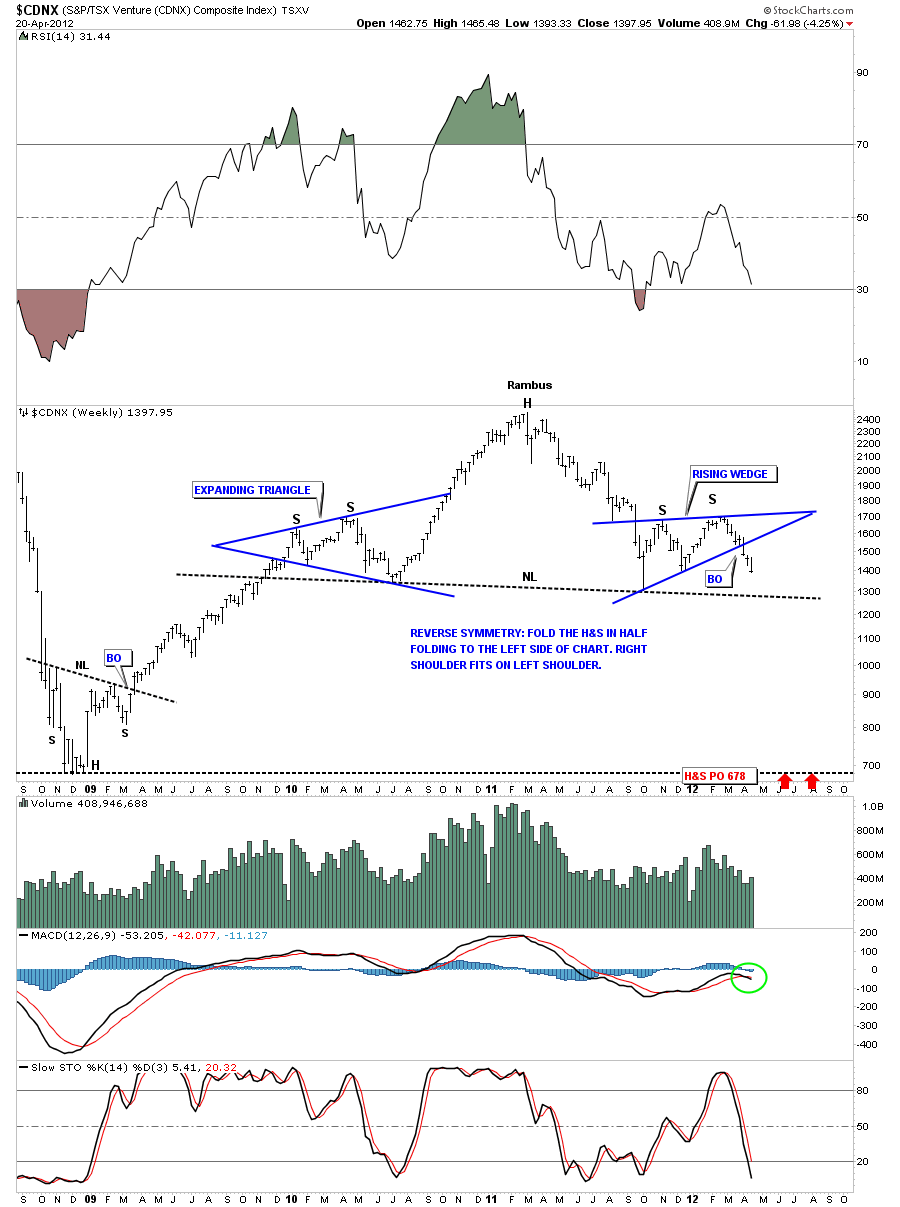
Now that I’ve laid out the groundwork for the H&S top pattern lets look at some in real time and in different stages of development. The first H&S top pattern I would like to show is still developing the right shoulder and is coming down to test the neckline. This is a classic example of a H&S top pattern that has all characteristics described above. The CDNX has very nice symmetry. Note the left and right shoulders are four point consolidation patterns. The expanding triangle formed the left shoulder on the way upand the bearish rising wedge has formed the right shoulder on the way down. This pattern won’t be complete until the neckline is broken to the downside.
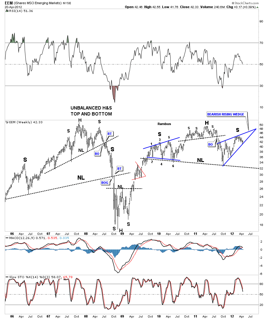
The next chart still has a ways to go yet but the right shoulder is carving out a bearish rising wedge that should break to the downside leaving the right shoulder sticking out like a sore thumb. This chart of EEM, emerging markets index, is a good clue to the global slowdown that is about to take place. Notice the big unbalanced H&S top pattern that formed back in 2008.
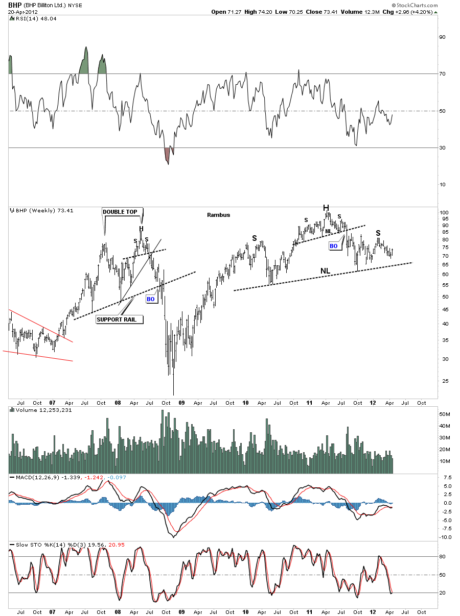
If the global economy is about to slowdown some of the big mining stocks should be showing signs of weakness. Lets start with the weekly chart of BHP that is showing a H&S top that is still carving out the right shoulder. Note the smaller H&S top pattern that is making up the head area of the H&S top pattern.
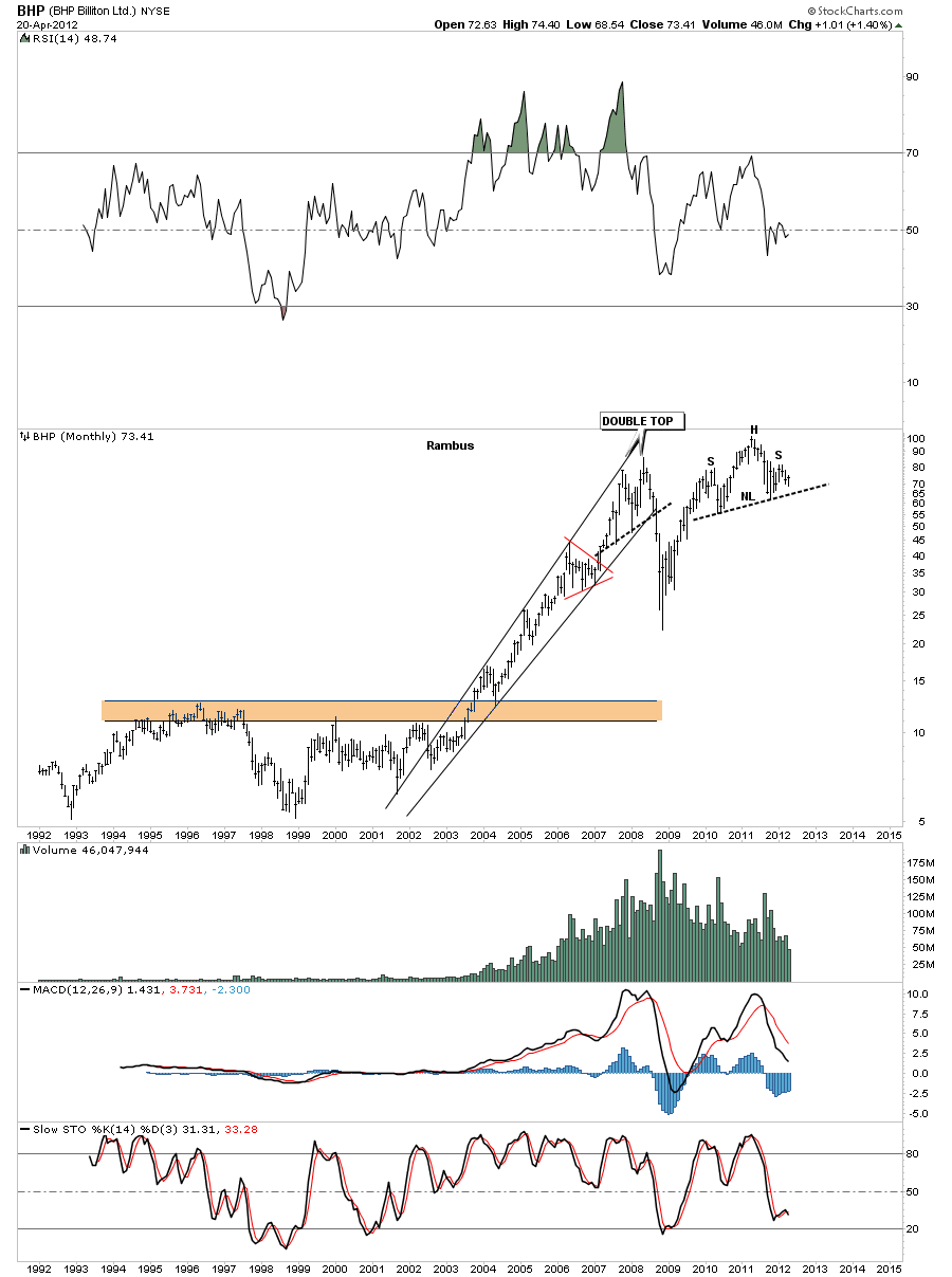
Lets take a quick look at the monthly chart of BHP as it tightens up the look for the H&S top.
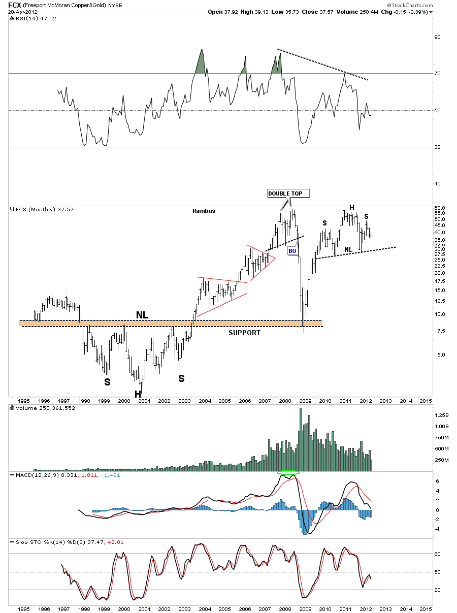
The FCX monthly charts shows a very similar looking H&S top as compared to the BHP chart. Note how the top of the head is at the same height as the 2008 double top pattern. The old highs that were made back in 2008 are showing up to be resistance points in the current rally phase for alot of the basic materials stocks. Where to look for a H&S top pattern is also an important point. When you reach an old high begin watch the price action very closely for sings of a top.
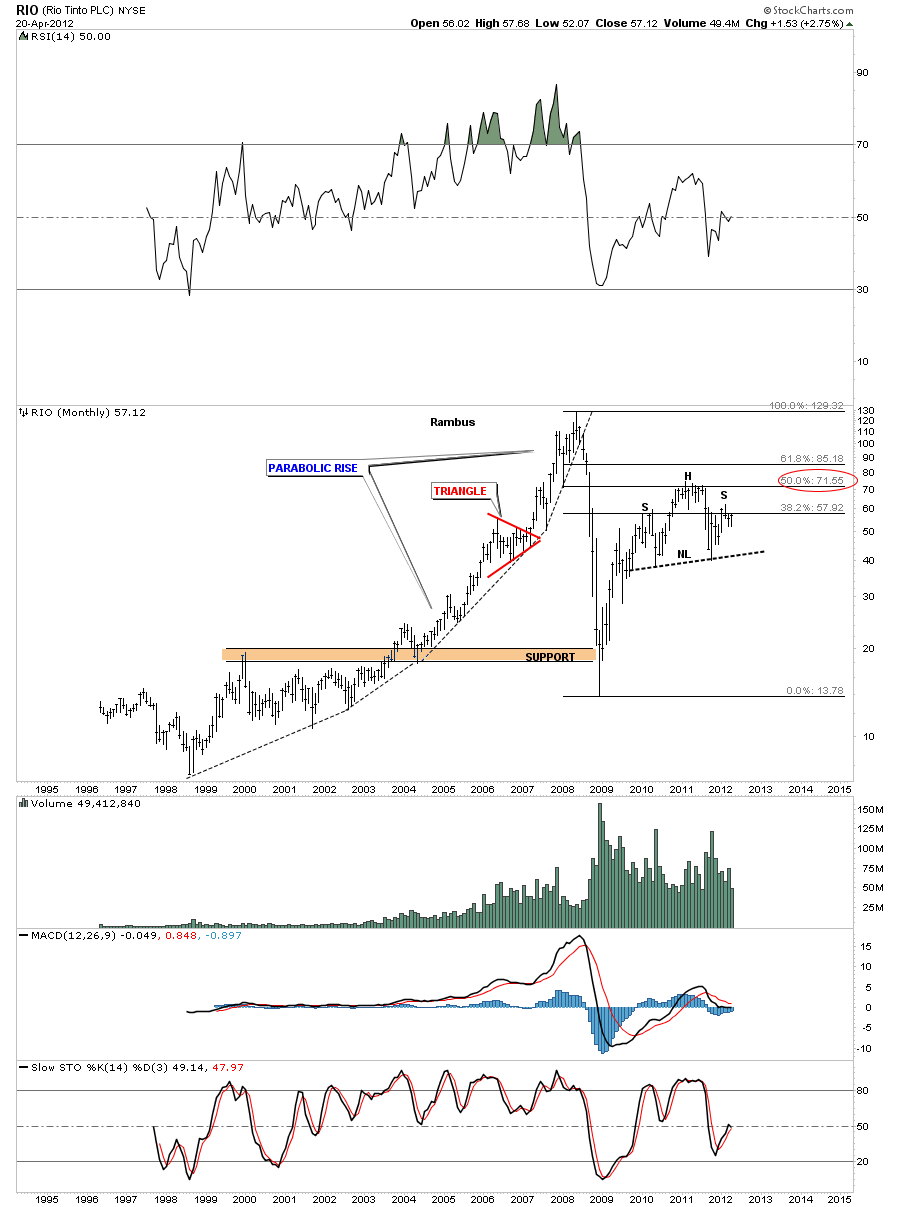
Below is a chart of another big miner that shows the right shoulder still in the developmental stage. Note the parabolic rally phase that accompanied the big 10 year rally that began in 1998. The top of the head is a Fibonacci 50% retrace off the 2008 crash lows.
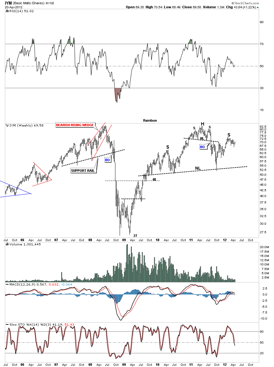
If the big miners are looking toppy in here lets look at the IYM index that tracks the basic materials stocks. Like the big miners the IYM index is carving out a right shoulder like so many stocks in the basic materials sector. Again you can see the this index has rallied all the way up to the previous high made in 2008. The head is made up of a smaller H&S top pattern.
Next I would like to show a chart of US Steel that was one of the first stocks to complete it’s H&S top pattern suggesting the demand for steel has been rather poor. Another little clue for a global slowdown. Note how weak the rally was off the 2008 low. It didn’t even come close to reaching it’s 2008 high.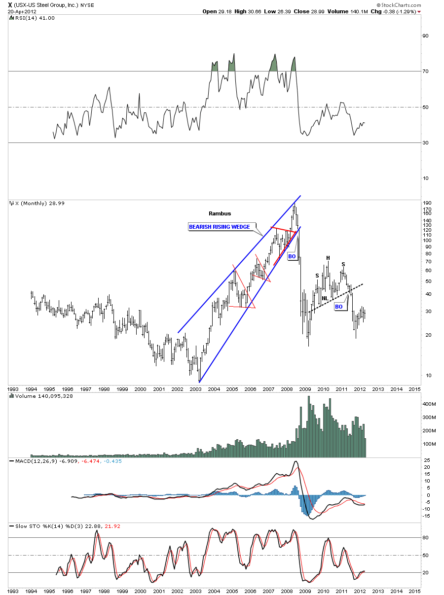
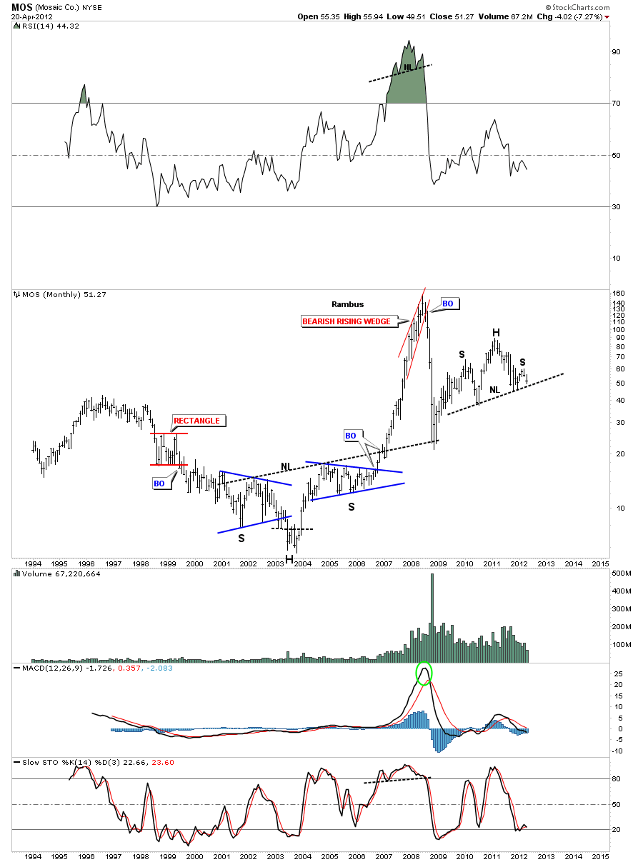
Lets look at another basic materials stock MOS which is getting close to the neckline. This stock has also failed to achieve the top made in 2008 before it ran out of gas.
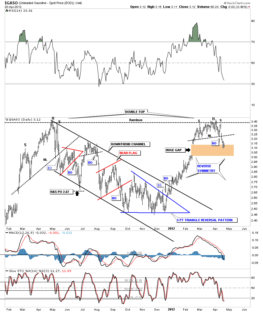
I really like this next chart and its implication going forward. This daily chart of GASO is just 5 days out of its H&S top formation. This chart is suggesting that the top is in for gasoline and prices may start to fall fairly rapid as suggested by reverse symmetry. Reverse symmetry means, how a stock goes up, in this case gasoline, didn’t make any real consolidation patterns on the way up so there won’t be any shelves of support as prices decline. So the price action may go down just as fast as it went up.
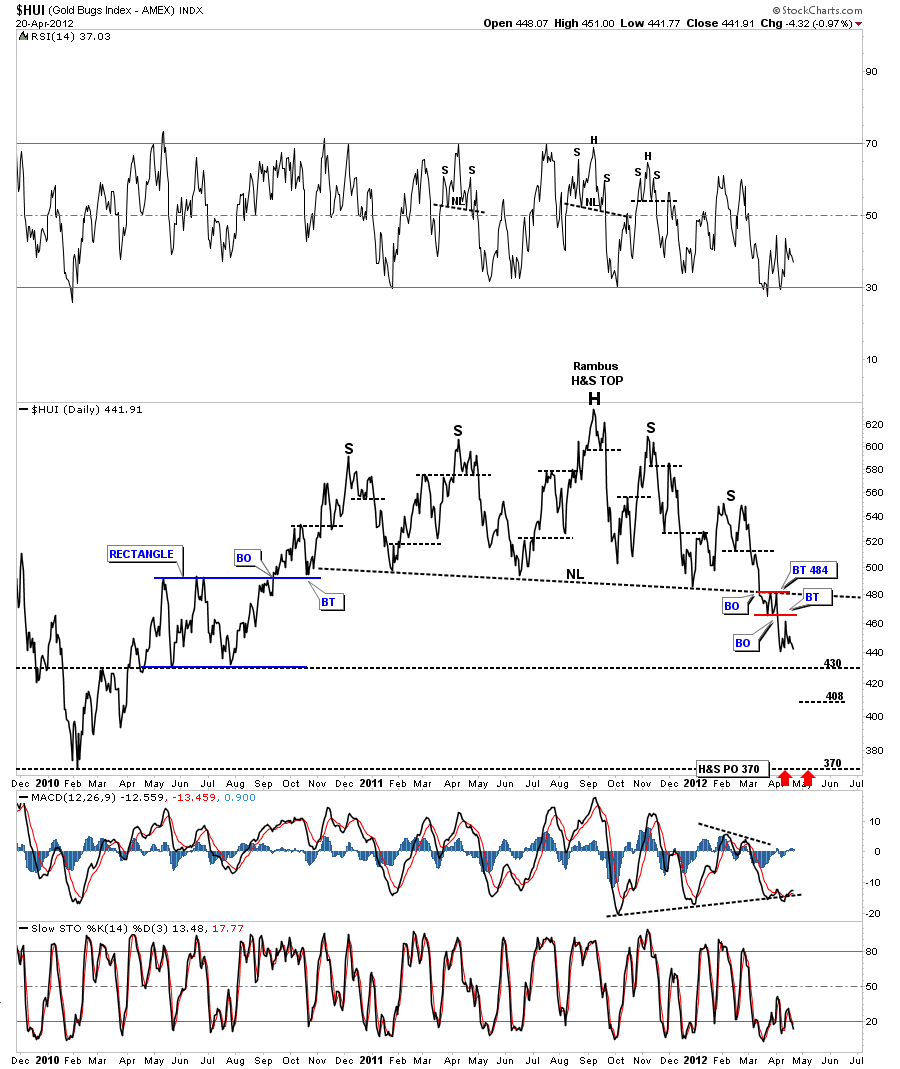
Next I would like to look at some of the precious metals stock indexes as they are part of the risk off trade. As you will be able to see they are further along in their decline than most of the other commodities. You could say they are leading the way down and everything else should follow. The first chart is a line chart of the HUI that has broken its big neckline well over a month ago. You can see the nice backtest to the neckline that was actually a little rectangle consolidation pattern that shows up on the daily bar chart. This big H&S top pattern has a price to 360 at a bare minimum and probably much lower before this phase plays out.
The next weekly chart is of the GDX that shows the neckline being broken 3 weeks ago. It has been in backtest mode to the underside of the neckline to around 48.50 or so.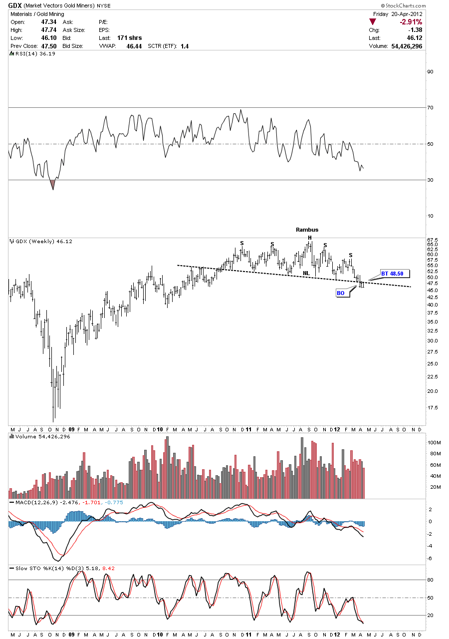
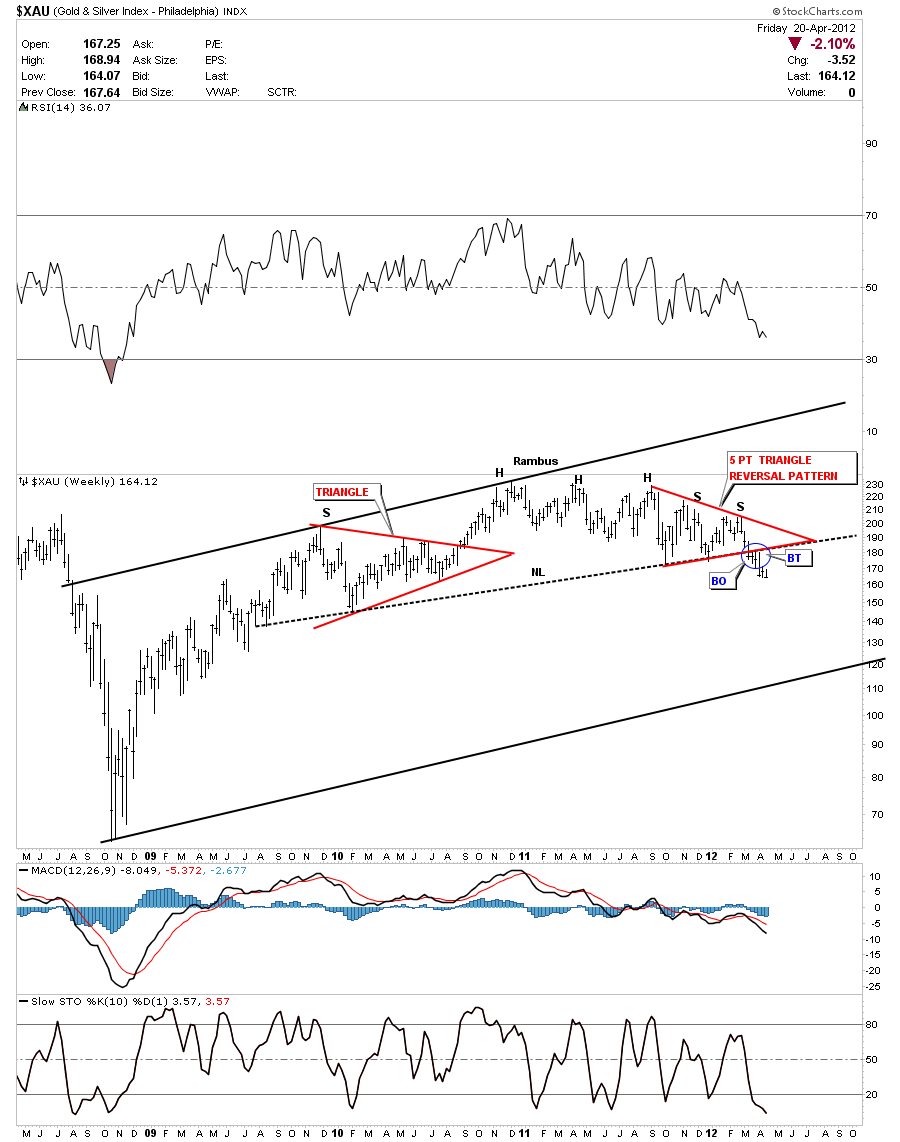
Lets look at one more PM stock index the XAU that shows it has been out of it’s H&S top formation for 6 weeks now. Note the two red patters that make out the left and right shoulders.These big necklines are your line in the sand. Below them is negative and above is positive. So until these PM indexes can get back above their respective necklines I have to rate them as negative.
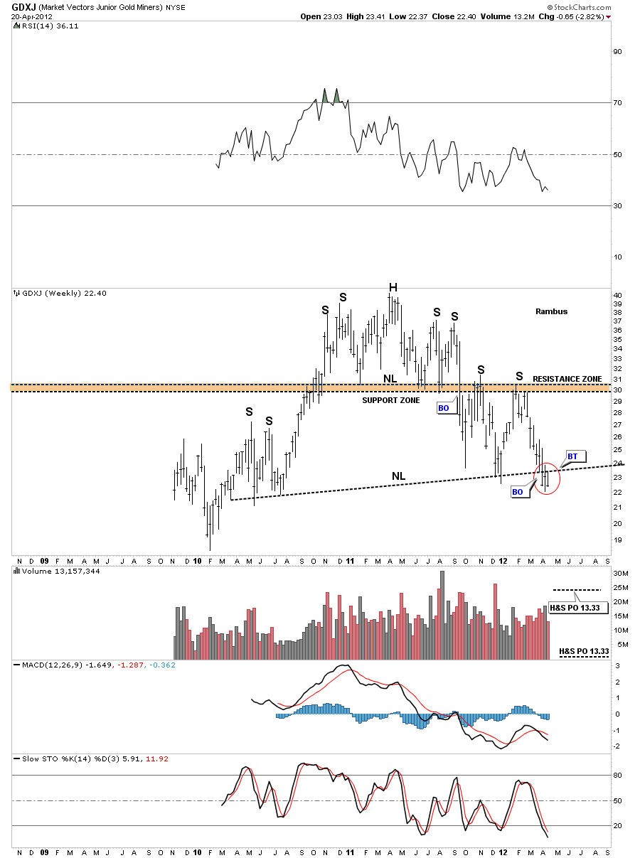
I want to show a chart of the GDXJ that is a small cap miners index that is giving me great concern if one is hold the little guys. There is a big H&S top pattern that shows up on the weekly and monthly chart that is very ominous looking. The weekly look shows the big H&S top pattern that has broken the neckline and a backtest to the underside of the neckline was successful last week. Keep this thought in mind. Below the neckline is negative and above is positive so until the GDXJ can trade back above the neckline I have to view this chart as bearish. The price objective for this H&S would just about cut this index in half. Note the smaller H&S top pattern that formed as the head.
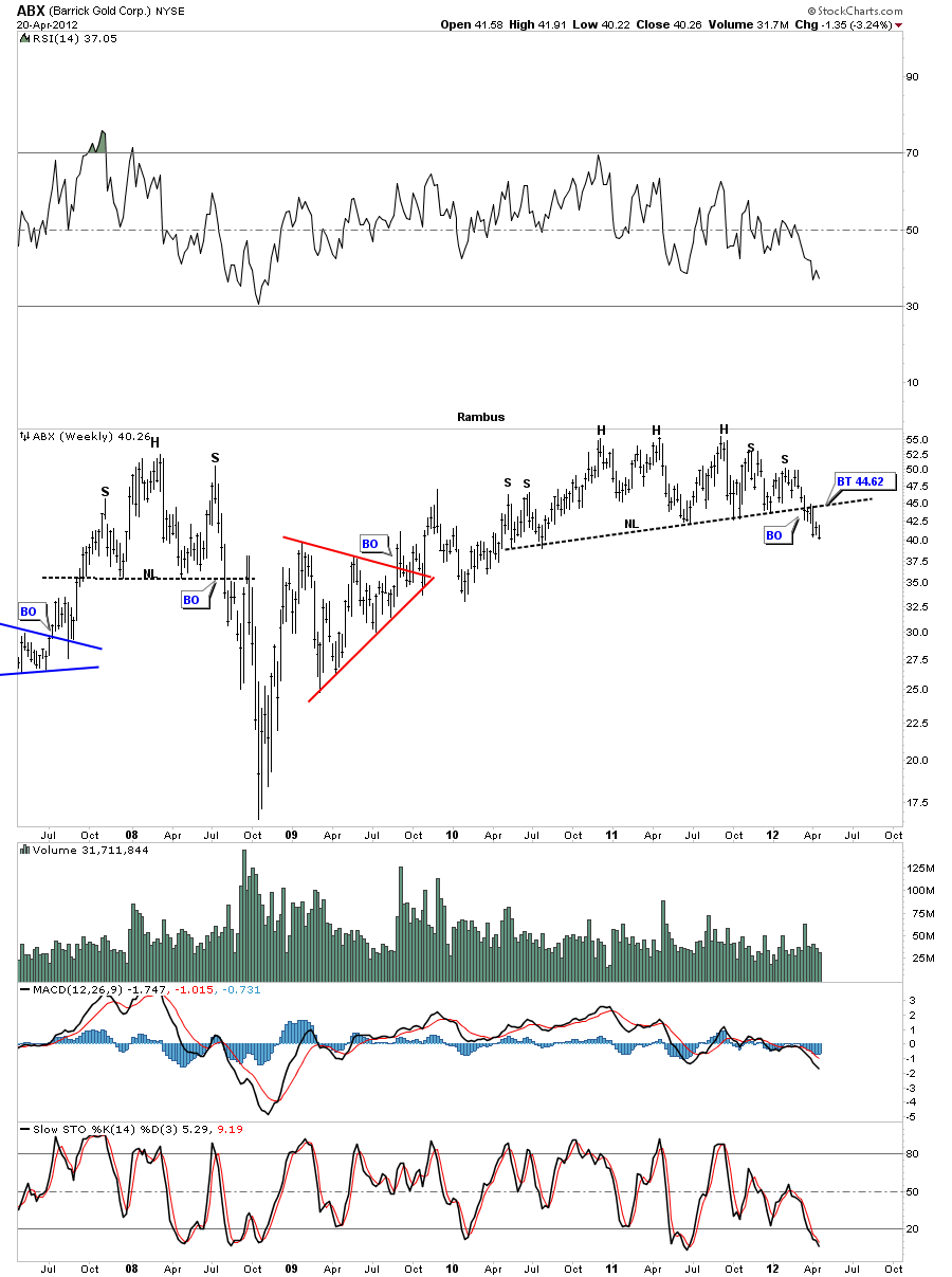
If the precious metals stocks indexes have a bearish looking H&S top then it stands to reason that the individual stocks that make up these indexes will also have a similar looking pattern. Barrick Gold is one of the big cap precious metals miners that shows an uncanny resemblance to the PM indexes.
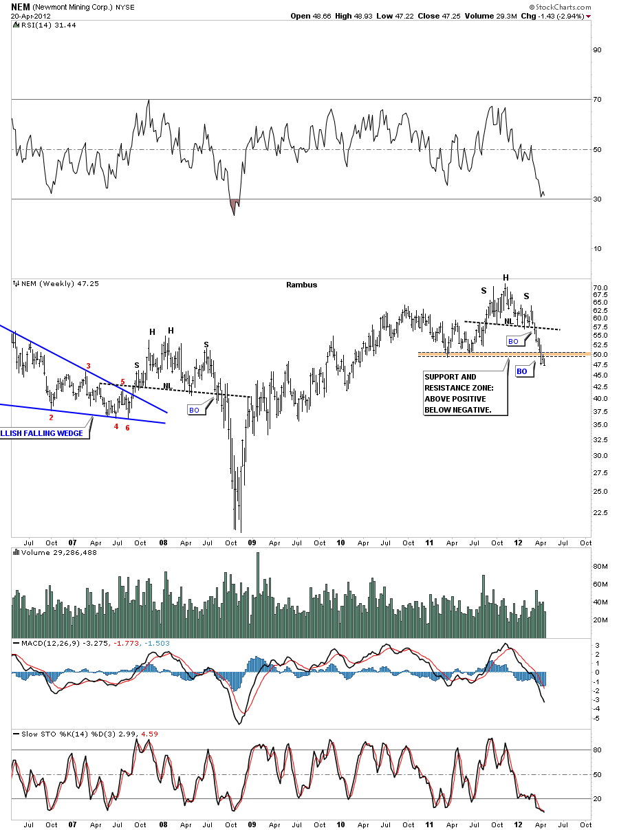
Another big cap precious metals stock is NEM that shows a smaller H&S top pattern that completed a couple of months ago. Note the brown horizontal area on the chart that should have offered up some support. The fact that NEM broke below that critical support zone now puts that brown area as resistance on any rally attempt.
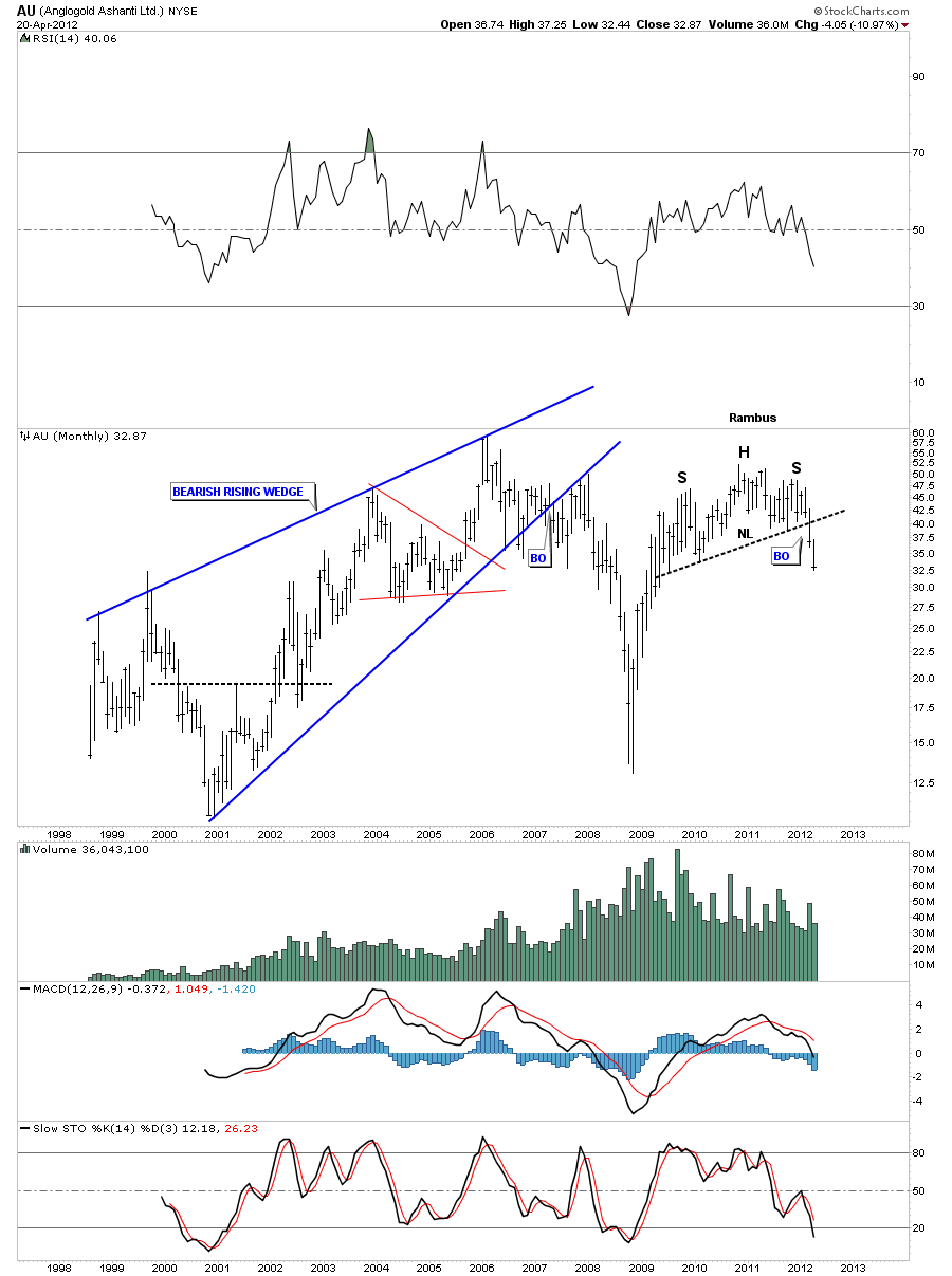
Lets look at one more stock that shows the H&S breakout. AU is in it’s second month of decline from the time it broke it’s neckline. Keep in mind we could get a backtest to the neckline at anytime. The longer and further the price falls the less likely a backtest will show up on a monthly chart.
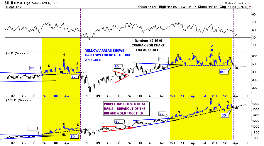
There is one more chart I would like to show you that shows why gold has been unable to move higher.This is a combo chart that shows the HUI on top and gold on the bottom. Even tho gold has been outperforming the HUI they both create similar consolidation and top patterns. On this last chart below I’ve added a purple dashed vertical line that represents the breakouts of each pattern that has formed on gold and HUI. I have marked in yellow the previous H&S top in 2008 and our current H&S top. As you can see both the HUI and gold have broken out to the downside out of their respective H&S tops. Gold has been bumping up against its neckline and that is the reason it hasn’t made any progress.
For me, all these H&S top patterns are speaking volumes as to the condition of the markets. I could show you many more examples of topping patterns but I think these charts says it all. As you could see in the charts above, they are in different stages if development. Some are working on the top of their right shoulders while some have already broken below their necklines. I know many analysis are calling for a bottom in here based on some of the technical indicators or fractals based on the 1970’s bull market in precious stocks but these chart patterns trump all the indicators IMHO. The old wall street adage, markets can stay overbought or oversold longer than one can stay solvent. I think applies to our current situation.
All the best…Rambus

