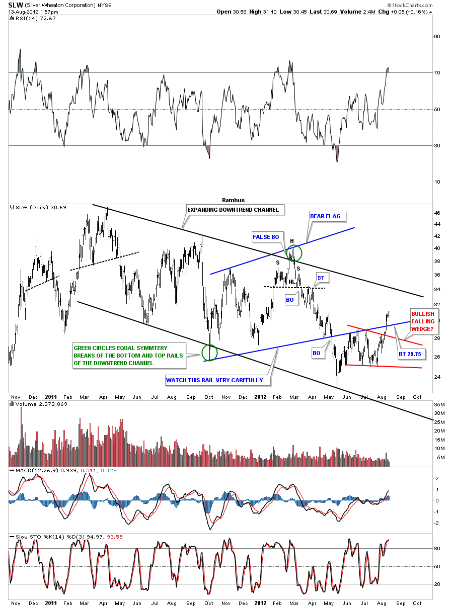
A subscriber has asked me if I could look at these charts and see what they are saying. Lets start with a daily look at SLW that has just broken back above bottom rail of the bear flag. There was a nice increase in volume on the move back above the blue rail. That is a very encouraging sign. Notice how clean the price action is from the bottom blue rail of the bear flag. Above it has been support and below has been resistance. Lets see if it reverses it’s role again as support with a test, from the topside, back down to the 30 area as a backtest.
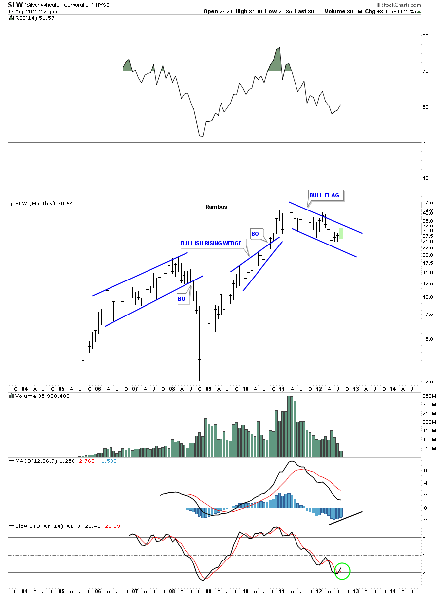
The weekly look is showing an uptrend channel that is forming off the 2008 crash low. Note the big blue bull flag with 5 completed reversal point with the 6th in progress. A touch of the top blue rail will complete the 6th reversal point. At that point we will have a consolidation pattern. It just needs to break through the top blue rail to confirm the huge bull flag.
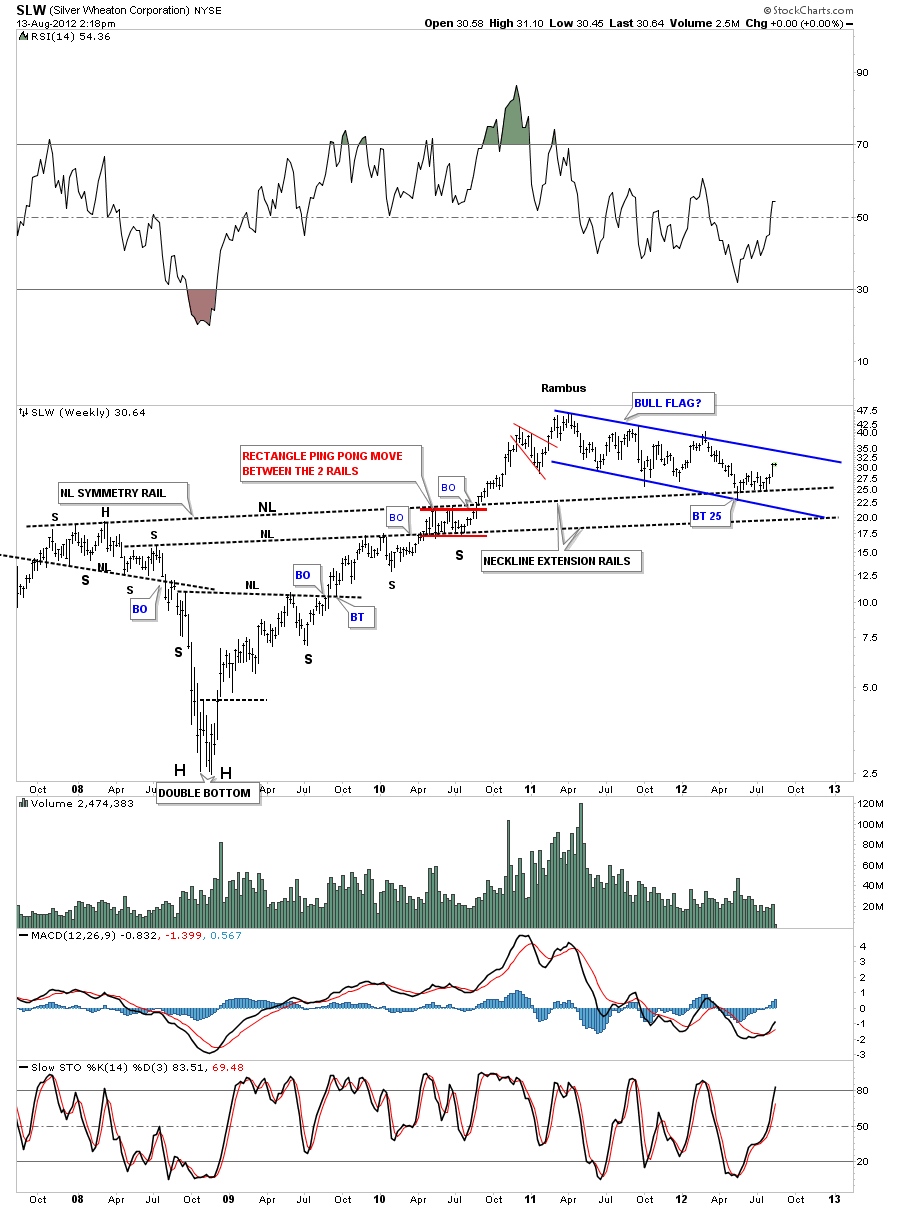
This next weekly chart is probably my favorite look at SLW. On the left side of the chart you can see the multiple inverse H&S bottoms. Necklines never die they just slowly fade away. As you can see I extended both necklines to the right side of the chart looking for some support. The top neckline was backtested in May of this year where SLW tested it as support for several months before finally lifting up about 4 weeks ago.
The monthly chart takes out all the noise and leaves a clear picture of the bull flag.
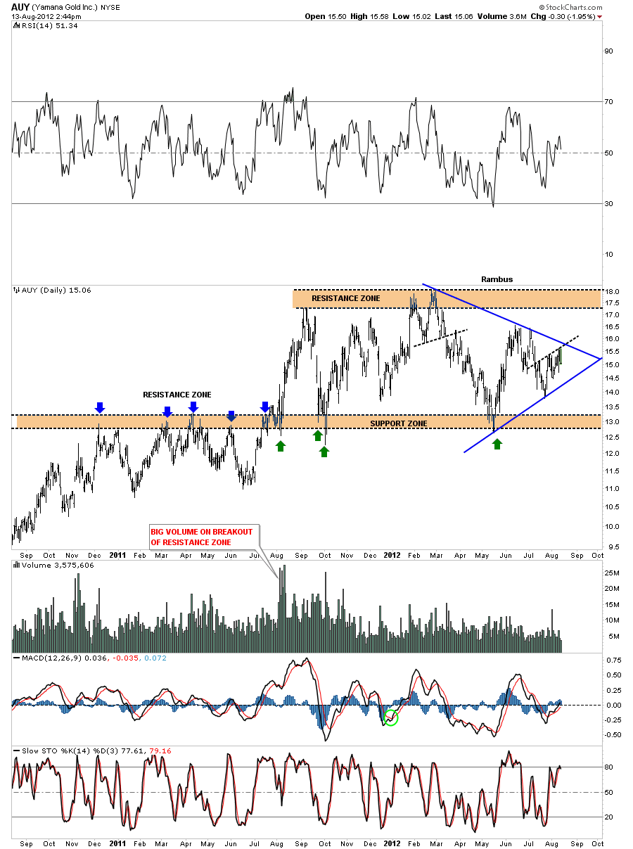
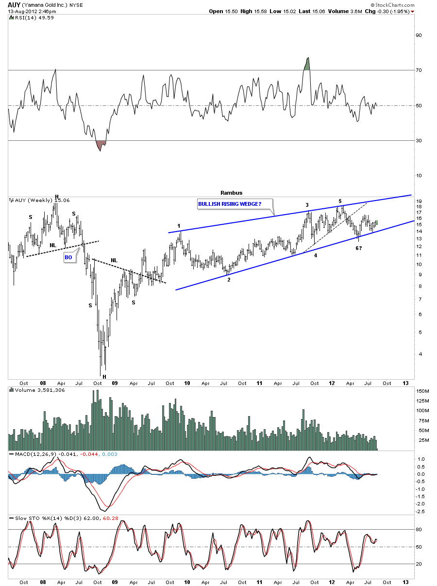
Lets now turn our attention to AUY which has been a fairly strong performer during this latest precious metals correction. The daily chart shows you a good example of how support and resistance works. Note all tops on the left side of the chart, blue arrows. Note how once the price action got above that resistance zone it reversed it’s role and has held support for a year now, green arrows.
The weekly look is showing a possible running correction or bullish rising wedge pattern. This pattern has been forming for 2 1/2 years now with 5 completed reversal points with the 6th in progress. Its critical that the bottom blue rail of the possible bullish rising wedge holds as support otherwise it could be a reversal pattern. So far so good.
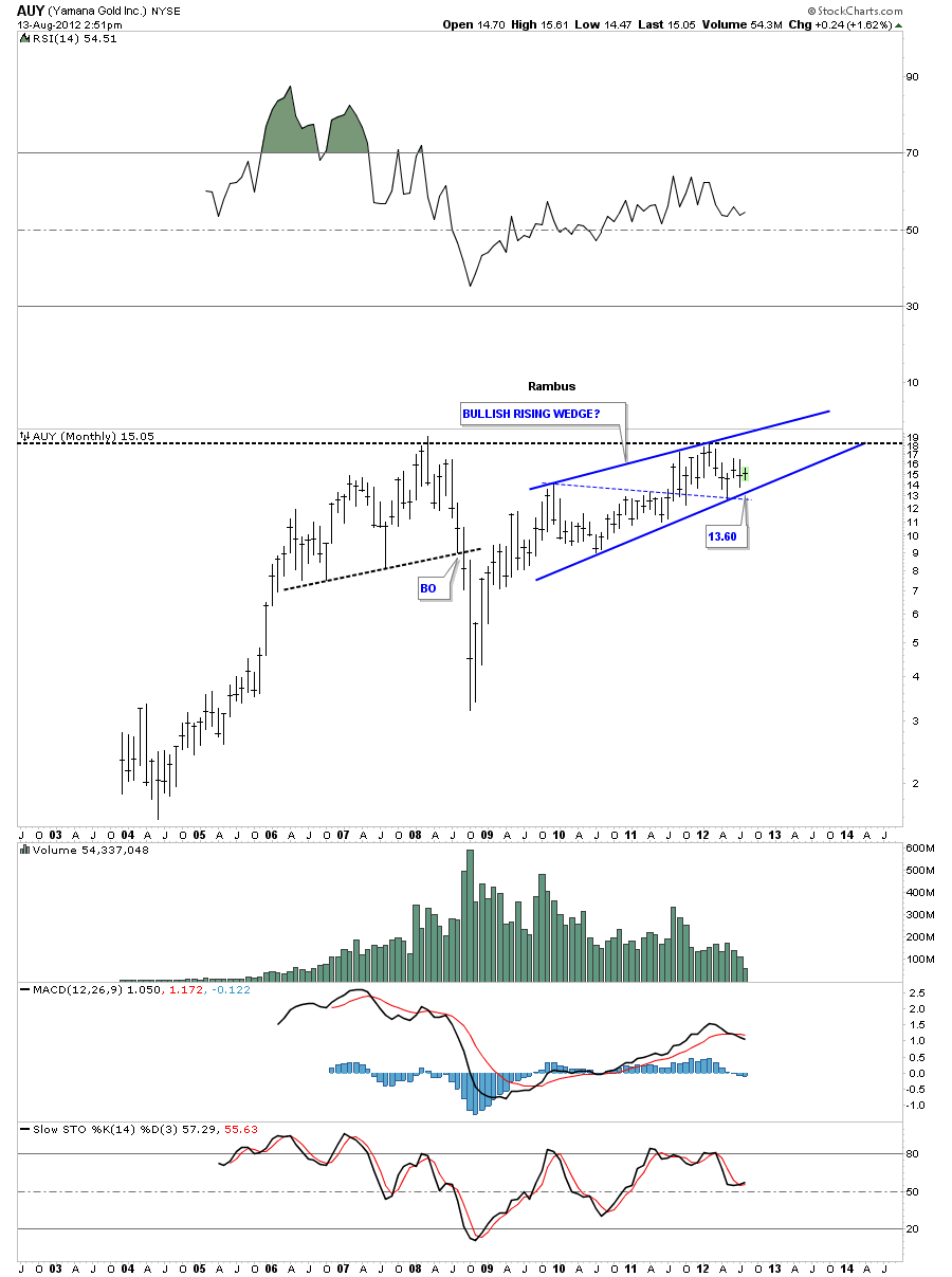
The monthly look shows the rising wedge. The bottom rail of the rising wedge comes in around the 13.60 area which would be a good low risk entry point using the bottom rail as your line in the sand.
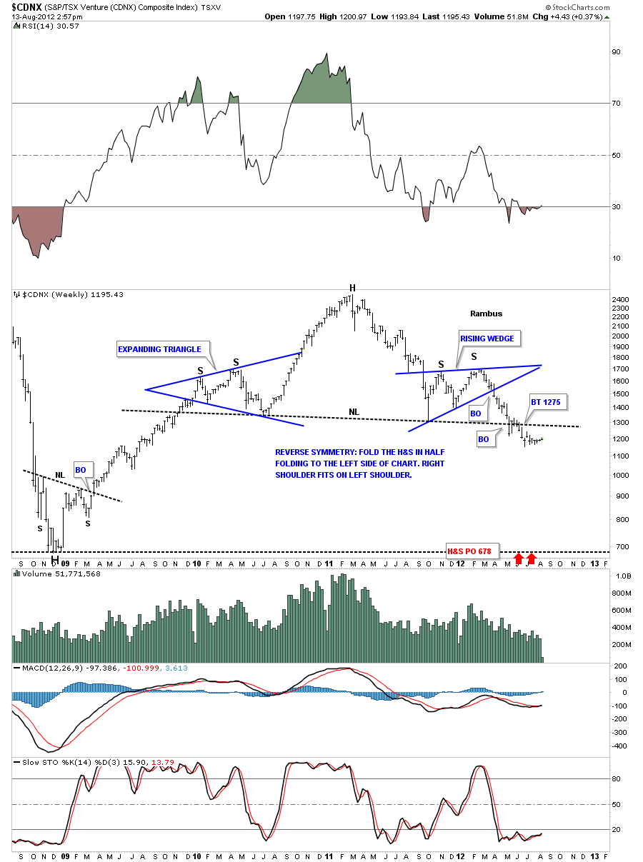
The last set of charts I want to show is the weekly look at the CDNX small cap index. As you can see on the chart below the CDNX has been trading below the big neckline for several months now. To get this chart back to neutral the price action needs to trade back above the neckline. This chart tells us the juniors still haven’t made a significant move up yet but just marking time over the last several months or so.
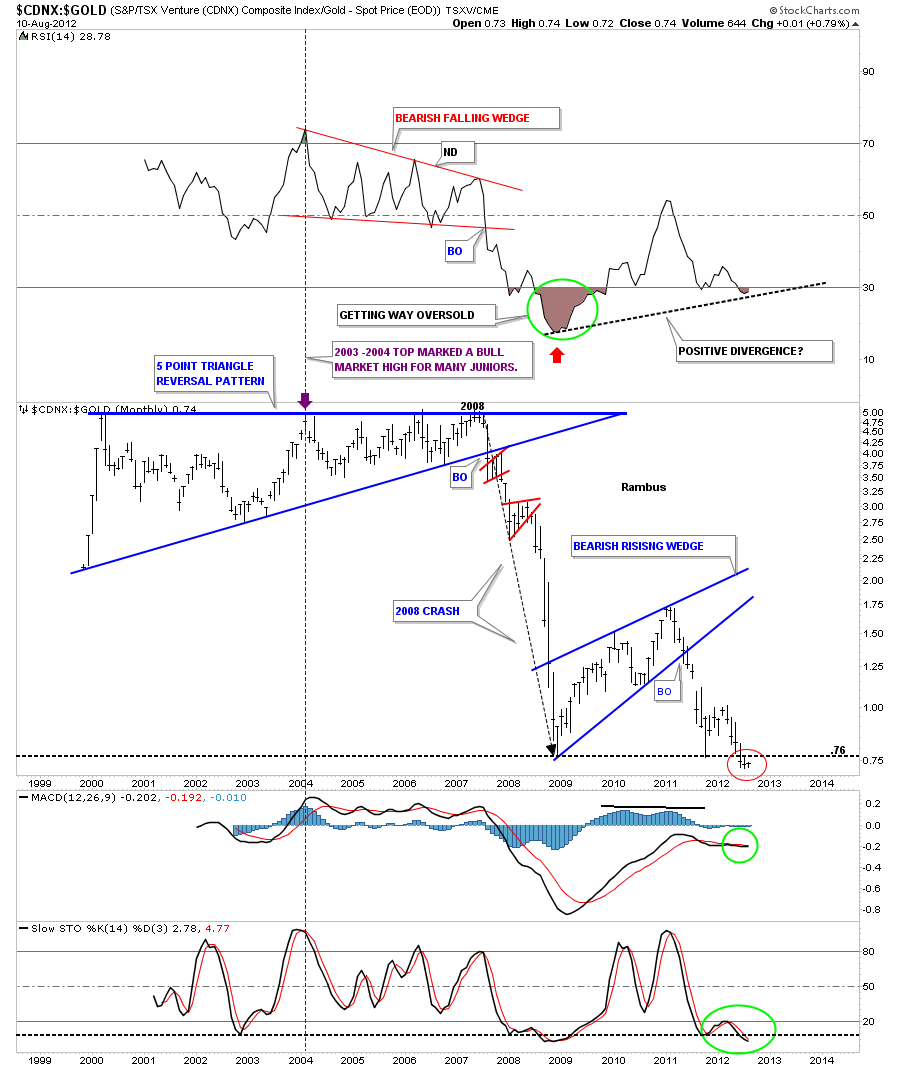
Lets see how the CDNX has been performing to gold. Looking at the monthly chart we can see the CDNX has been really under performing gold in a huge way. This ratio in now at its lowest level in history slightly trading below the 2008 crash low, red circle. If one is a bargain hunter this might represents a good long term buy area. The only real positive thing about this chart is the positive divergence that is taking place on the RSI indicator at the top of the chart.
Lets look at one more ratio chart where we compare the CDNX to the HUI and see how the small caps have been fairing against the big caps. This ratio chart is just a tad better than the CDNX to the gold ratio chart. As you can see it’s at least trading above the two previous lows from the 2008 crash and the most recent low made last year. There is a positive divergence forming on the RSI and the MACD indicators.
I hope this in depth look at the charts above puts things into perspective for you. The little juniors are still not showing much life yet which could change once the price of gold and silver finally breakout of their respective consolidation patterns. For right now selected buy of the juniors seems like a prudent thing to do. At some point they will come a live in a big way and that will be the time to back up the truck.
…………………………..
EDITOR’S NOTE :
Rambus Chartology is Primarily a Goldbug TA Site where you can watch Rambus follow the markets on a daily basis and learn a great deal of Hands on Chartology from Rambus Tutorials and Question and Answeres .
Most Members are Staunch Goldbugs who have seen Rambus in action from the 2007 to 2008 period at www.goldtent.org and now Here at Rambus Chartology since early 2012 .
To review his Work and incredible calls from the 2007-2008 period click on the top right sidebar in the “Wizard of Rambus” ….”What If !!” Post
To Follow Rambus Unique Unbiased Chart Work and participate in a Chartology Form with questions and answeres and learn the Art and Science and Mindset of a Pro Trader please Join us by subscribing monthly for $29.99 at
www.rambus1.com
We have many subscribers from all over the world who are glad they did as they enjoy the many daily updates and commentaries provided at this exciting new site
As you will see Rambus (Dave) has prepared us for this difficult period by being one of the only ones to see and warn about this incredibly debilitating PM smackdown as early as Jan 2 2012 …click on the” HUI Diamond in the Rough” Post in the “Wizard of Rambus” top right
You will find Rambus to be a calm humble down home country tutor with an incredible repitoir of all the TA based protocols tempered with his own one of a kind style…simply put…He wants to keep his subscribers on the right side of these crazy volitile and downright dangerous markets
See you at the Rambus Chartology

