Goldfool requested to see Hecla Mining Co. as his chart of the week. HL has been one of those precious metals stocks that have been in a slow motion, downward grid for the better part of a year now. It’s been locked in a downtrend channel creating one H&S top pattern below the next one. It has lost almost 50% of it’s value since the beginning of this year. It diffidently has not been a star performer by any stretch of the imagination. So without further ado lets see what this silver miners chances are for the next impulse leg up for the precious metals stocks.
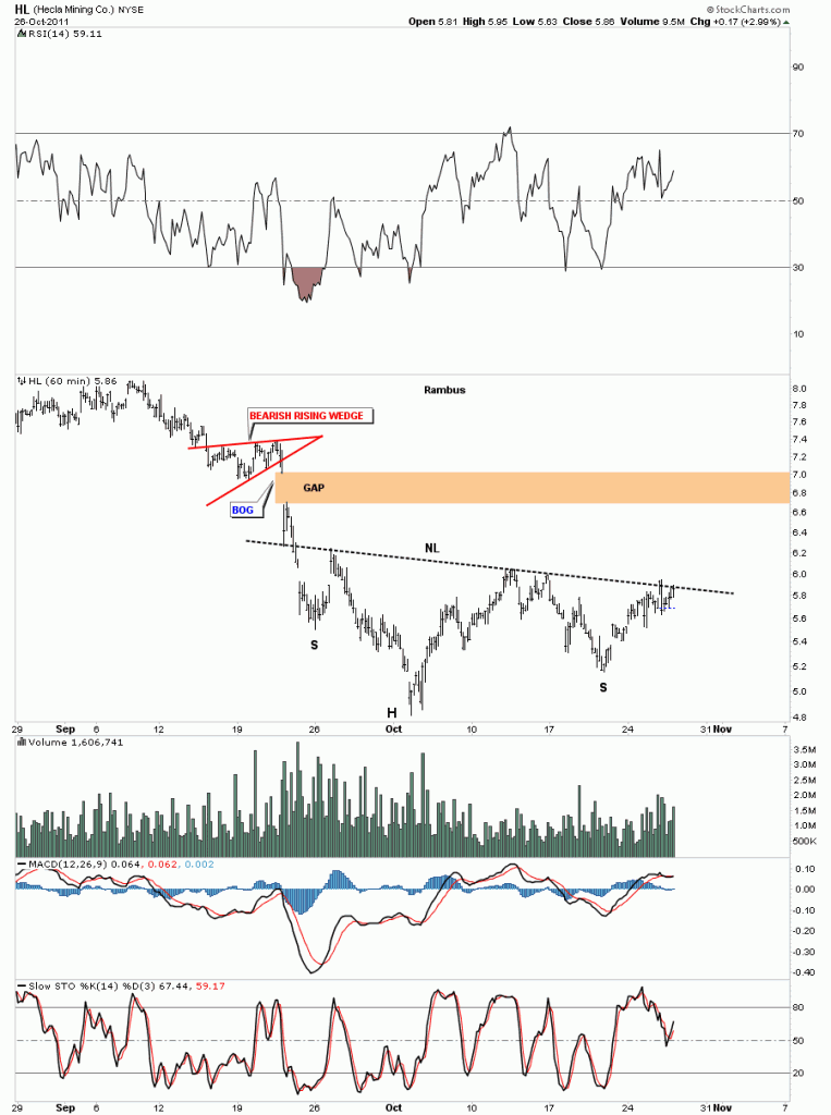
As always we’ll start with the short term 60 minute look and work our way out to the long term 20 year monthly chart for perspective. As with so many precious metals stocks right now there are many stocks that are chopping out H&S bases. This H&S bottom, on HL, is very similar looking to many other H&S bases forming across a broad range of PM stocks. HL is testing the neckline but hasn’t broken out yet.
HL 60 minute H&S bottom.
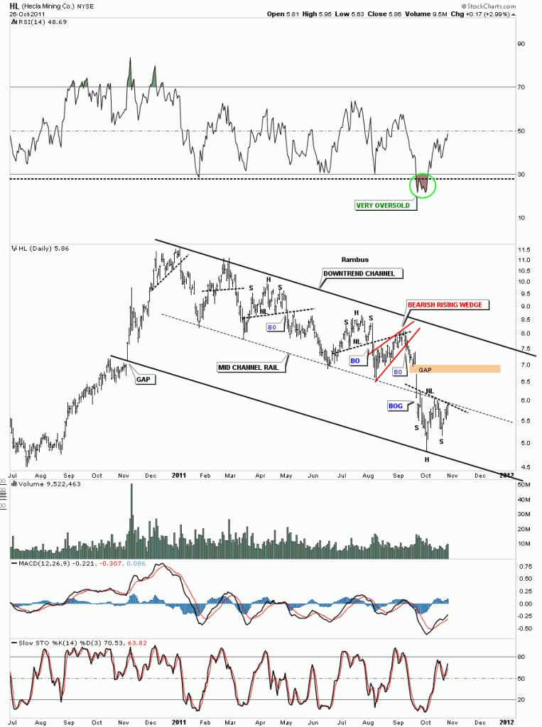
The daily look really shows the terrible grind HL has been in since the first of the year. It wasn’t bad enough that HL was trapped in a downtrend channel but it actually broke out thru the bottom rail toward the last of September and actually doubled the downtrend channel. HL has been one beaten up stock but after such a long drawn out downtrend it’s now beginning to show some life. We will now take the H&S bottom on the 60 minute chart and transpose it to the daily chart so you can begin to see how important the placement of this pattern is. This H&S bottom is coming at the end of something not the beginning of something which is what you need to see from a reversal pattern. Keep your eye on the neckline as we are there right now and the center black dashed mid line. This may offer some very short term resistance but if the H&S bottom is for real the break of the neckline should come fairly quickly.
HL daily downtrend channel with H&S bottom.
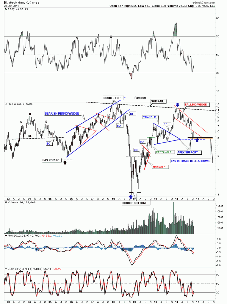
The weekly look gives you a feel for where HL has been in relation to where it is right now. Here are a couple more reasons why the H&S bottom is forming right where it is. First we have the apex of the blue triangle that often times gives good support. As long as we don’t do an end around the apex move the support is solid. Next is the Fib 62% retrace off the rally that began at the crash low in 2008 and our most recent high at the beginning of this year. So again this is a perfect place for a H&S bottom to form. The brown area shows where the two support zones come into play.
HL weekly look.
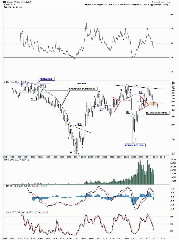
The monthly look shows 20 years of price action. HL had a parabolic downtrend from the rectangle top in the mid 90’s to the bear market low in 2001. I have added a brown zone, buy area, based on one more pattern that says this could be an important bottom. Sometimes I will use the original neckline and bring it down to the bottom of the left shoulder to help find the bottom of the right shoulder. I call this the neckline symmetry rail. HL could be forming a very large H&S bottom that has taken 3 years to build. I don’t know if this pattern, that is setting up on the monthly chart, is actually going to be a H&S bottom or morph into something else. We just have to take it one step at a time. First we have to see if our H&S bottom, that shows up on the 60 minute and daily look, is going to actually be the bottom of the right shoulder. Watch the neckline very close for your clues on what may unfold.
HL monthly look.
I hope, Goldfool, this little exercises in charting gives you a clearer understanding of where HL is in the big scheme of things. Bottom line, there are much better precious metals stocks out there that are close to breaking out into new all time highs and are leading this impulse leg higher. On the other hand you have a beaten up stock that has corrected more than half of it’s value and looks to be putting in some kind of bottom in this area. Good luck and all the best ….Rambus


