In this weekend report I would like to show you some gold ratio charts that compare gold to commodities or indexes. Ratio charts are a good way to see how a stock or index is moving relative to another stock or index. If you have several different areas of the market that you think might offer a good trade setup you can do a ratio chart to see which area is stronger or outperforming. This can be very helpful when it comes time to put your hard earned money on the line.
If you’re an investor in the precious metals complex, stocks and bullion, a gold ratio chart that compares say gold to the gold stocks, this will let you know which one is the best place to invest. If you’ve been investing in the precious metals complex for any length of time you know that the metals can move higher while the precious metals stocks hardly move at all. And then there are times when the PM stocks are strongly outperforming the metals. This is where the ratio charts come in handy.
The first chart I would like to show you is the Gold to XAU ratio chart that compares gold to the precious metals stocks that make up the XAU. So, if we are comparing gold to the pm stocks and gold is performing stronger than the stocks the ratio will rise. On the other hand if the ratio is falling that means the pm stocks are outperforming gold. This can be alittle deceiving sometimes because they can both fall at the same time but if gold is not falling as fast as the precious metals stock the ratio will rise even tho they are both declining. Its a relative thing. In this case gold is still outperforming the pm stocks by not going down as fast which is showing strength against the pm stocks.
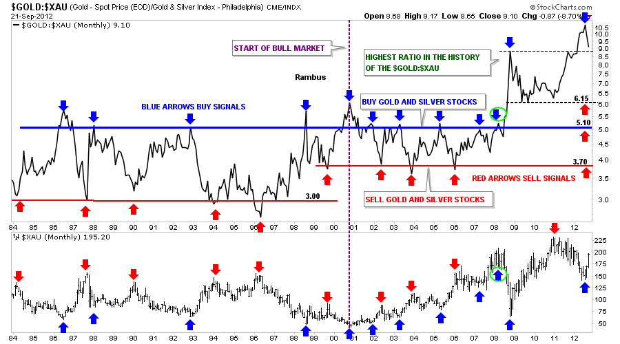
The chart below is a combo chart that shows the Gold : XAU ratio on top and the XAU chart on the bottom. The chart looks busy when you first look at it but its not. Lets focus on the top chart, the Gold : XAU ratio that goes all the way back to 1984. What becomes immediately apparent is the horizontal trading range the Gold to the XAU ratio chops out over time. I’ve drawn in a blue horizontal trendline that shows the top of the ratio and the red horizontal rail shows the bottom of the ratio. During the bear market years, before 2001, whenever the ratio got above 5 that was a good time to buy the precious metals stocks, blue arrows. The reason for that is because gold had been strongly outperforming the pm stocks as it reached the blue trendline. As the markets are always looking for balance it was now time for the pm stocks to rally as the pm stocks were now under valued and the ratio would then fall back down to the horizontal red trendline around three, red arrows. Note the blue arrows shows the highs in the ratio on top and the lows on the XAU on the bottom chart. The red arrows shows the bottom of the ratio chart on top that correspond to the tops on the XAU chart below.
There is still alot of information on the chart above that I would like to go over yet. The dashed vertical purple line represents the beginning of our current bull market for the XAU. Since the beginning of this new bull market the bottom red horizontal rail has risen from 3 before the bull market started to now about 3.70. The top blue rail has stayed pretty much in the same place showing where to buy the precious metals stocks. Up until the big crash in 2008 one could buy their precious metals stocks everytime the ratio got up to the blue trendline and sell their PM stocks when the ratio fell down to the red trendline around 3.70 as shown on the XAU chart.
I’m going to show the same chart below as there is one more important feature that needs to be addressed. Lets now focus on the 2008 crash, blue arrows with a green circles. This is the point where a new paradime shift took place never before seen with this ratio. The precious metal stocks were now the most undervalued in history compared to the price of gold. As you can see on the chart below once the blue horizontal rail was broken to the upside the breakout was vertical. On a bar chart the ratio would show a spike all the way up to 11 which more than doubled the trading range since the bull market for precious metals began in 2001. One would have thought that it couldn’t get much worse since the XAU had a nice 2 year rally taking the ratio back down to 6.15 which is still considerably higher than the old blue resistance rail at 5.10. From that point the ratio rallied all the way backup and above the 2008 crash spike on the monthly line chart over the next year. During that same time the XAU was in it’s own one year bear market which seems to have bottomed in July. The million dollar question now is will the XAU outperform gold in such a way that the ratio will fall back into it’s normal trading range between 3.70 red horizontal rail and the 5.10 blue horizontal rail? Even after our most recent rally in the XAU this ratio is telling us the precious metals stocks are still extremely cheap compared to gold. I’ve place three red arrows, on the right side of the chart, that shows where we could see the ratio bottom. We’ll just have to wait and see how this plays out over time.
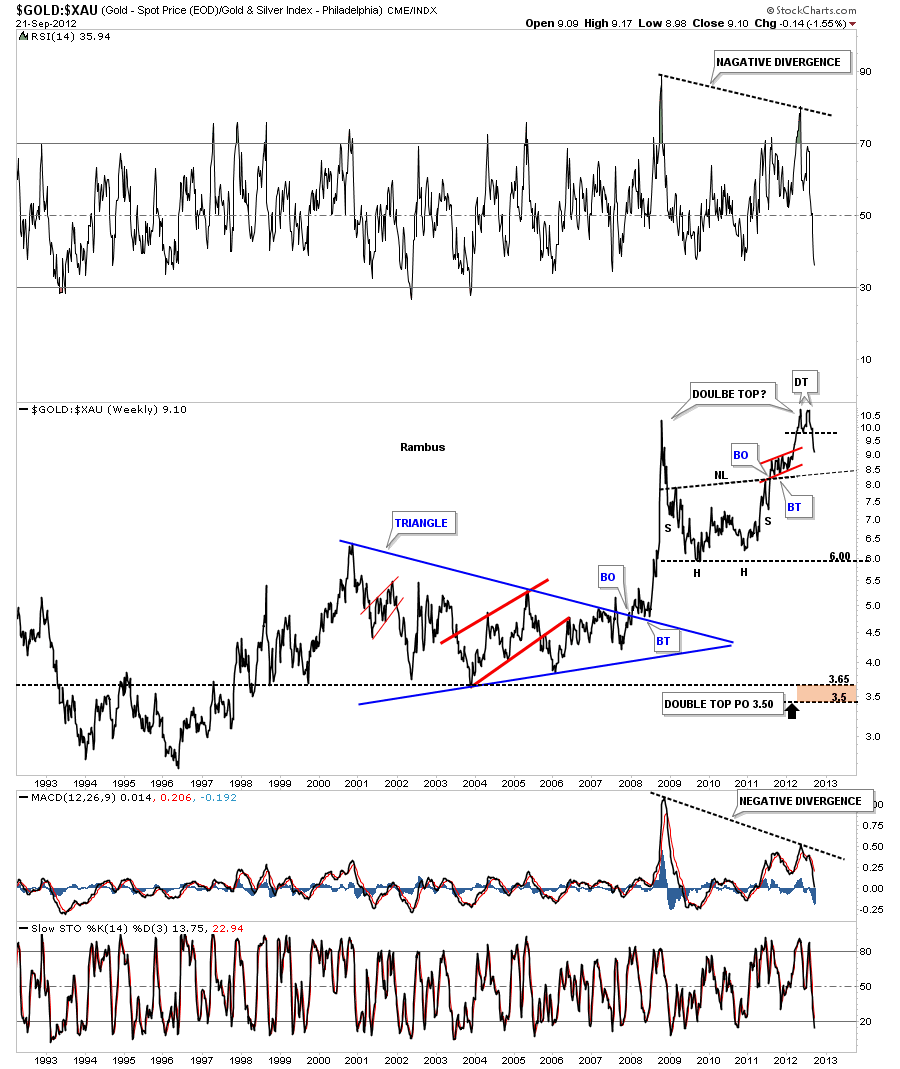
Next I would like to show you the same Gold : XAU chart from a chart pattern perspective. This weekly line chart shows the breakout from the blue triangle that actually launched the parabolic move. You can see there was a nice breakout and backtest before the rally was launched. After topping out around 10 the ratio declined back down to 6 where it then formed an inverse H&S bottom. Once the neckline was broken to the upside that told me this correction wasn’t yet finished yet. The ratio then rallied up and past the old high made at the 2008 crash spike. This was a very critical area now for the ratio as the precious metals stocks were once again extremely cheap relative to gold. If there was ever a place to look for a reversal pattern such as a H&S top or a double top this was the place to look. As you can see on the chart below the ratio has put in a small double top over the last month or so which could be part of a much larger double top that takes in the 2008 spike. If, and I say that with a big if, the bigger double top actually plays out the price objective would be all the way down to 3.50 which would put the ratio in the vicinity of the horizontal red rail that I have shown you on the charts above. That would definitely make the precious metals stocks overvalued compared to gold something we haven’t seen in a long time. Note the negative divergence on the RSI and the MACD indicators at the top and bottom of the chart. This is a big deal IMHO.
Lets now look at a weekly long term bar chart where we turn things upside down by using the XAU : Gold ratio that shows what I consider to be a positive divergence taking place. Again the ratio chart is above and the XAU is below. On the chart above I showed you the possible double top that has the potential to be forming. By reversing the ratio, putting the XAU first and gold second, you can now see a big double bottom on the ratio chart and a small double bottom on the XAU chart below. The reason I”m showing you this chart, this way, is so you can see the positive divergence that is taking place between the XAU :Gold ratio on top and the XAU on the bottom. Note the red arrows that show the possible double bottom on the ratio chart. Now look at the red arrows on the XAU below that are showing the XAU is trading way above the 2008 crash low while the ratio is back down to the 2008 crash low.
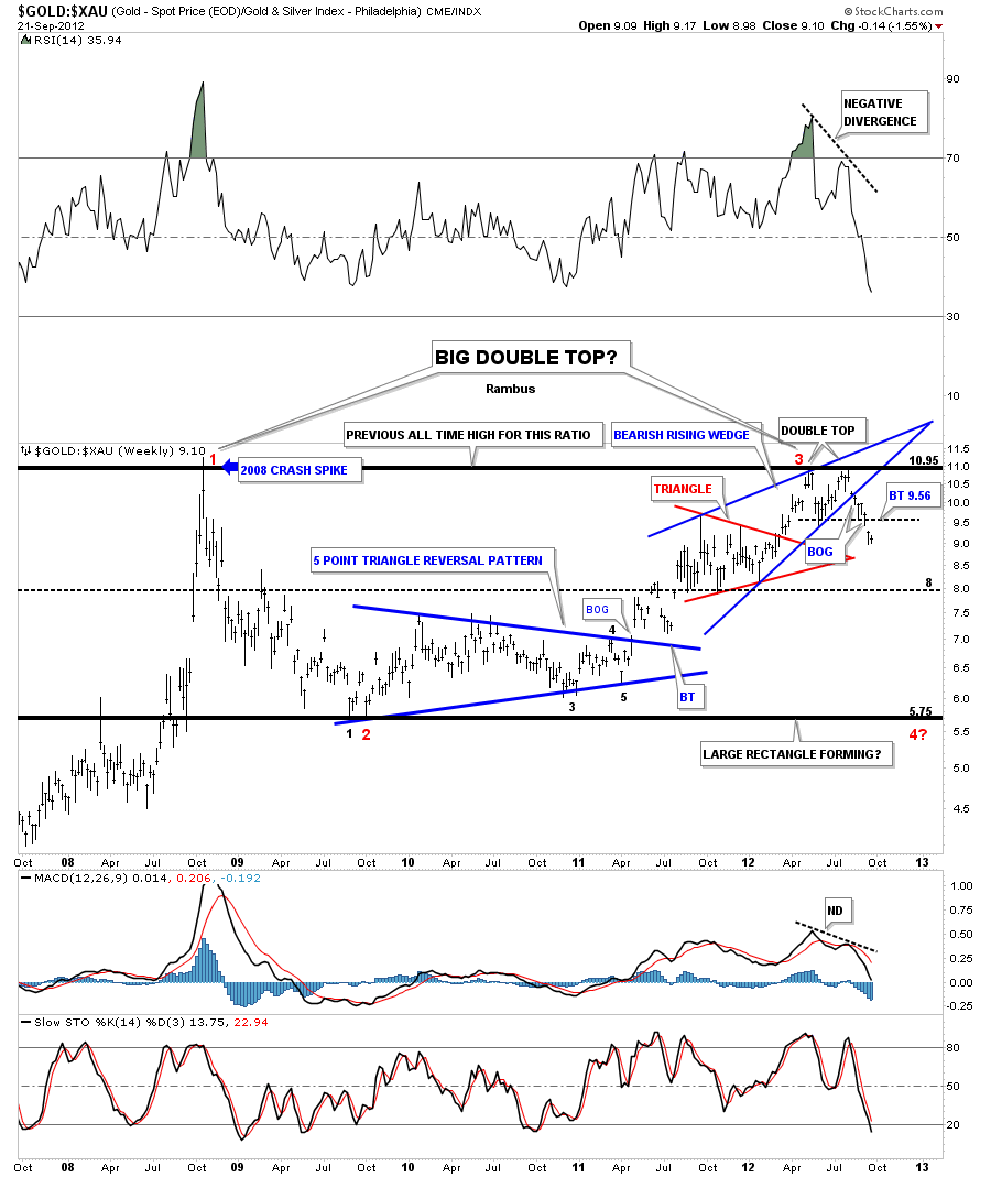
The last chart I would like to show you is the chartology of the Gold : XAU ratio that shows in finer details some important chart patterns that’s are taking place right now. The heavy top and bottom black rails shows the trading range the ratio has been in since the 2008 crash spike. There are two likely patterns that may develop from this horizontal trading range. The first one is the possible double top that we discussed on the charts above and the second could be a huge horizontal trading range similar to the ones I showed you on the very first chart of this article. Lets now focus in on the last year of trading for this ratio that is showing a bearish rising wedge that is comprised of the small red triangle and the small double top. As you can see on the chart below the blue bearish rising wedge was broken to the downside about 6 days ago while the small double top broke down 2 days ago. This chart tells us we can expect the XAU to outperform gold going forward. Note the big negative divergence with the RSI and the MACD indicators.
The bottom line is that these charts above are showing me that the precious metals stocks are still massively undervalued relative to gold and that it looks like its time for some outperformance from the PM stocks. How far can the Gold : XAU drop remains to be seen. If you recall Silver had a nearly parabolic run higher back at the beginning of 2011 where the precious metals stocks hardly participated. Then gold had a very strong, almost parabolic move higher that started in the middle of 2011, and again the precious metals stock didn’t participate. What the charts above are telling me is that its time for the precious metals stocks to outperform both gold and silver in this next impulse leg up that is already underway. At a bare minimum its at least time for a means to the regression to help balance out some of the out of whacked readings between the precious metals and precious metals stocks. All the best…Rambus


