In this weekend report I want to take a good hard look at the US Dollar as its so critical to so many different areas of the markets. Generally speaking, if the dollar is rising then gold and the precious metals stocks are falling. Also if the dollar is consolidating so is the precious metals complex which seems to be the case for the last several months. Alot of precious metals complex investors are starting to become disillusioned with this latest rally in gold and precious metals stocks. This is exactly what corrections or consolidation periods are designed to do. These periods call into question the reasoning why you bought in the first place. Generally, by the time the correction is about over many have thrown in the towel just when they should be holding or adding to their positions.
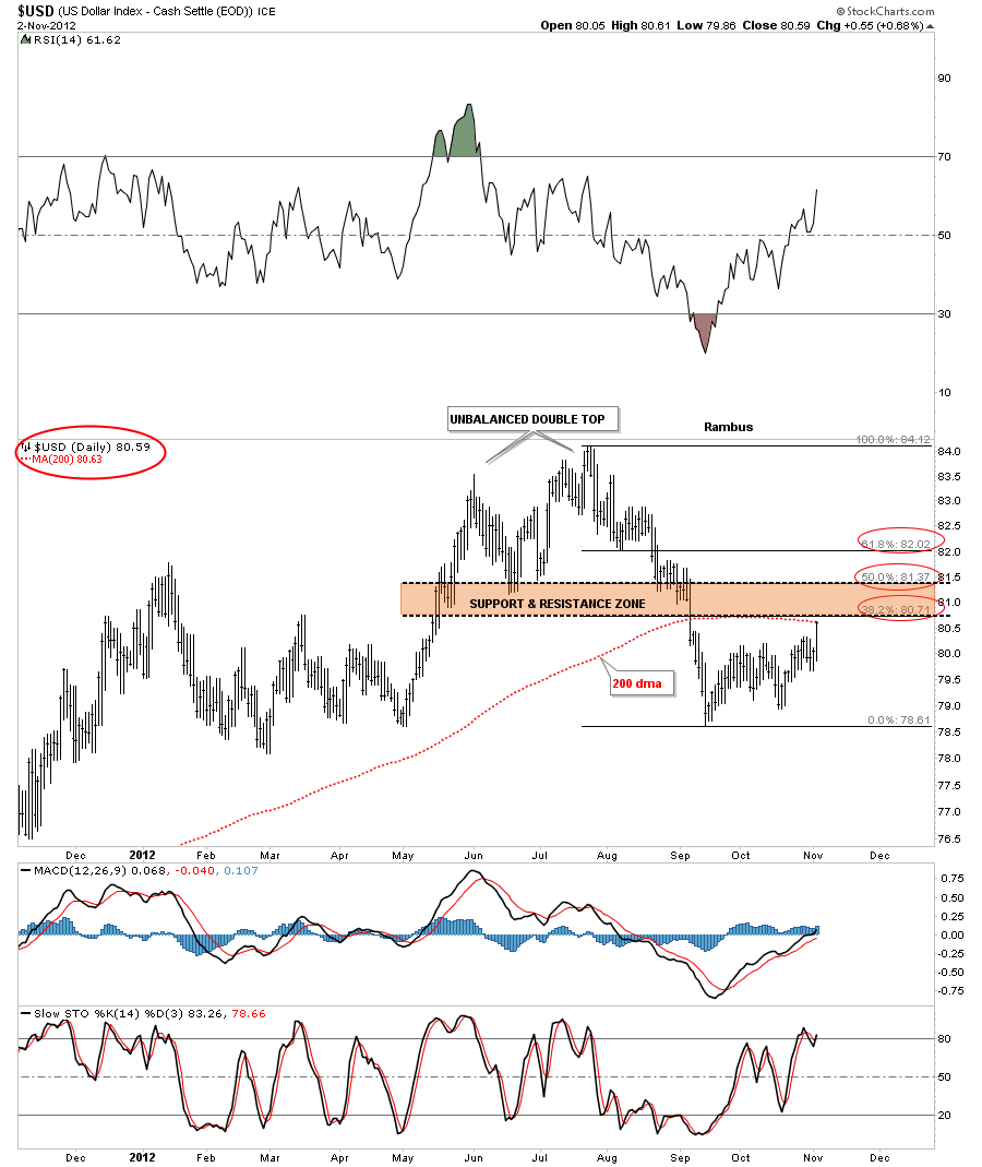
Many are calling a bottom in the US Dollar right now that I think is a little premature at this time. The first chart I would like to show you is just a simple daily look that shows the 200 dma and the Fibonacci retracement levels since the top made back in August of this year. As you can see on the chart below there is a confluence of resistance points that come together right here. First the 200 dma was hit last Friday which coincides with a Fibonacci 38% retracement of the decline off the August high. The brown shaded area is what I call a Support and Resistance zone. When the price action is trading above the S&R zone it acts as support and when the price moves below, it reverses it’s role and acts as resistance. As you can see we are now just touching the bottom portion of this zone. The top of the S&R zone would come in at the 50% retracement. Until that is broken to the upside the US Dollar is in a confirmed downtrend IMHO.
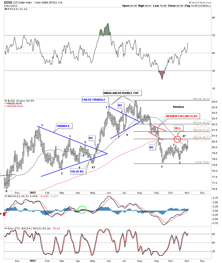
This next chart of the US Dollar is basically the same chart above but I have added some chart patterns so you can see the different patterns that have formed over the last year. Some of the longer term subscribers may remember the blue 6 point triangle that formed back in the winter months of this year. If you recall at one point it broke below the bottom blue trendline that everyone was saying the breakout was complete. I told you not to give up on the blue triangle yet as it could still be a consolidation pattern to the upside, based at the time, on the internal structure that was still in the process of morphing, that was creating the 6th reversal point. As you can see on the chart below the 6th reversal point in fact did hold and a big rally ensued. You can see a second, blue smaller triangle formed, that looked as pretty as any triangle can look. It broke out just as expected but then something strange happened. It failed to launch. You can see it made 3 attempts to really breakout but each time it failed. This is always a very big clue that something is wrong and the appropriate action needed to be taken. As it turned out the US dollar made an unbalanced double top. Note the small red bearish falling flag that formed at about the halfway point in the decline that suggested the dollar had further to fall. One last note. The red circle shows the 50 dma crossing below the 200 dma signaling a sell signal. Also there are only 3 reversal points that have formed since the bottom in September. We need one more to complete a possible bear flag.
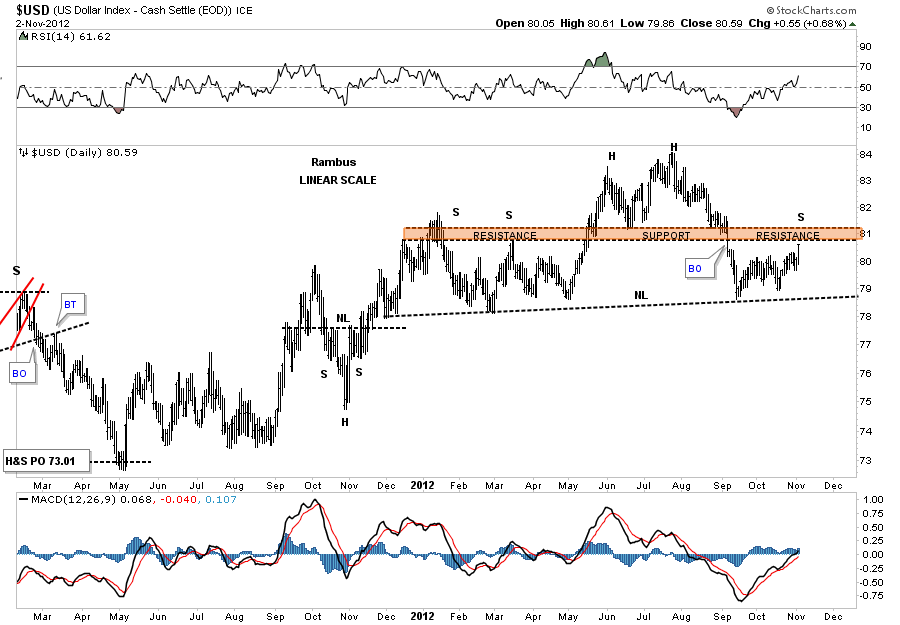
With this next daily chart lets look at a longer timeframe that highlights the brown shaded Support and Resistance zone. As you can see on the chart below the price action off of the September low is now running into a resistance zone that was previously support. If the price action stalls out somewhere around the brown S&R zone this would be the area for a right shoulder to form. Its to early to say for sure but the potential for a very large H&S top would signal much higher prices of the precious metals complex.
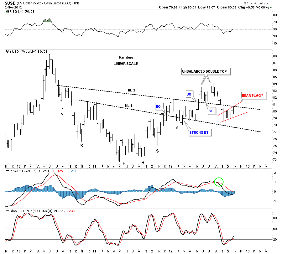
The next chart is a weekly look that shows an inverse H&S bottom that I was following for some time back in 2011. It looked very positive at the time and I had no reason to doubt that it would be successful. Whenever you have an important trendline its always important to see how the price action behaves. There can be some good clues as to the validity of an important trendline by the way the price action breaks out and backtests. As you can see the breakout of NL 1 was followed by a fairly strong backtest. The backtest eventually held and the rally began. Symmetry to the left side of the chart showed me where to add a second neckline. The price action broke out above NL2 which said everything was on track. You can see about 5 weeks after the breakout from NL #2 there was a nice clean backtest that still suggested everything was a go. As I’ve shown you on the daily charts above the rally was aborted with the formation of the unbalanced double top reversal pattern. This brings us up to the point of this weekly chart below. We know that NL #2 was hot by the way the breakout and backtest played out but after the failure to launch the price action broke below giving us another clue a top was in place. As you can see we are now trading right up to the underside of NL #2 which should now act as resistance.
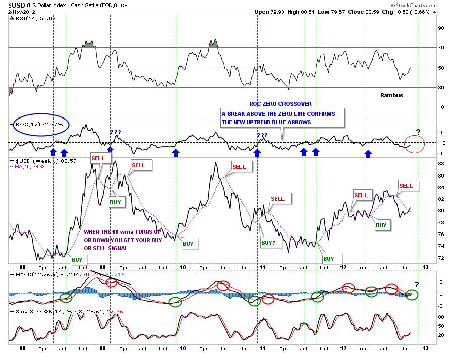
This next chart for the US Dollar is a mechanical system that has been around for sometime. Its basically pretty simple. At the top of the chart is the ROC, rate of change indicator, that has a black dashed horizontal trendline that runs through the zero area. The other part of this system uses a 10 week moving average. When the 10 wma turns up or down you get a buy or sell signal. At that point you want to see the ROC trade above the zero line for confirmation. The green vertical lines shows the ROC trading above the zero line. If you look to the far right side of the chart I have place a red circle that shows the ROC indicator is still trading below the zero line and is still on a sell signal.
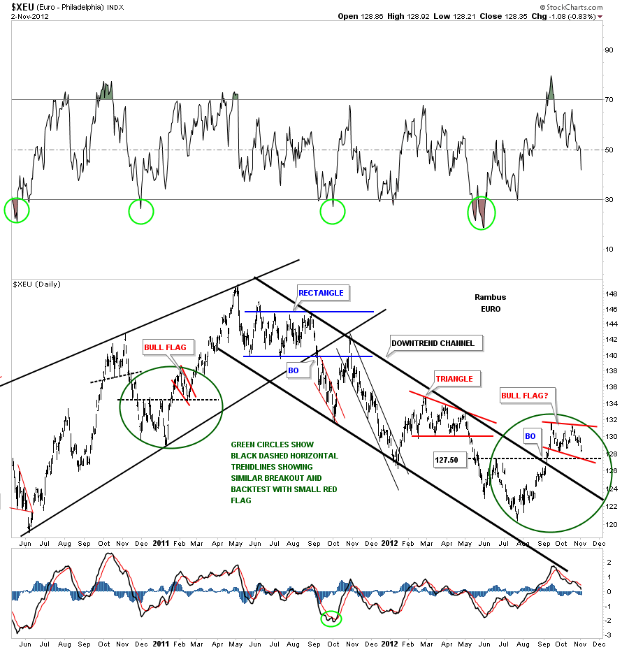
Next lets take a look at the EURO that has an inverse relationship with the US dollar. As you can see on the chart below the EURO topped out in the springtime of 2011 and then started it’s major downtrend that came to an end in August of this year. The top rail of the downtrend channel was broken to the upside in September which was a very bullish signal. I would now like you to focus in on the two green circles I’ve placed on the chart below. Note the black dashed horizontal rails that show you how support and resistance works. The basic principal of technical analysis is being able to read support and resistance areas. On the left side of the chart the green circle shows the little red bull flag that formed right on top of the black dashed rail. That is usually a very bullish setup as you can see. Now look to the right side of the chart where the green circle shows a very similar setup. The test of the black dashed rail comes in at 127.50. That should be the bottom of the red bull flag.
The last chart I would like to show you is the very long term look at the US dollar. Several months ago it looked like the dollar might be breaking out of it’s long term blue downtrend channel. As I have shown you on the charts above everything was looking good for the dollar to rally until that unbalanced double top came into play that reversed the uptrend to down. You can see that unbalanced double top formed just above the blue downtrend rail but once it was complete the decline took the price action back below the top blue rail signaling a false breakout at this time. That top blue trendline should now be back to its role as resistance.
The US dollar is now entering an inflection point. It will either rally strongly and break through all the overhead resistance points that I have shown you on the charts above or it will slowly turn over and continue it’s decline off the unbalanced double top that was made back in the summer months. There is never a dull moment in the markets as there is always something brewing if one knows where to look. All the best…Rambus
………………..
EDITOR’S NOTE :
Rambus Chartology is Primarily a Goldbug TA Site where you can watch Rambus follow the markets on a daily basis and learn a great deal of Hands on Chartology from Rambus Tutorials and Question and Answeres .
Most Members are Staunch Goldbugs who have seen Rambus in action from the 2007 to 2008 period at www.goldtent.org and now Here at Rambus Chartology since early 2012 .
To review his Work and incredible calls from the 2007-2008 period click on the top right sidebar in the “Wizard of Rambus” ….”What If !!” Post
To Follow Rambus Unique Unbiased Chart Work and participate in a Chartology Form with questions and answeres and learn the Art and Science and Mindset of a Pro Trader please Join us by subscribing monthly for $29.99 at
www.rambus1.com
We have many subscribers from all over the world who are glad they did as they enjoy the many daily updates and commentaries provided at this exciting new site
As you will see Rambus (Dave) has prepared us for this difficult period by being one of the only ones to see and warn about the incredibly debilitating PM smackdown as early as Jan 2 2012 …click on the” HUI Diamond in the Rough” Post in the “Wizard of Rambus” top right
More Recently Rambus called a Bottom in HUI in this post…and has had subscribers on board for a Powerful Run to the Upside
http://rambus1.com/?p=5651
BUT
What is he seeing Now ?
You will find Rambus to be a calm humble down home country tutor with an incredible repitoir of all the TA based protocols tempered with his own one of a kind style…simply put…He wants to keep his subscribers on the right side of these crazy volitile and downright dangerous markets
See you at the Rambus Chartology
www.rambus1.com

