About a month or so ago I wrote the Weekend Report on the US Dollar showing many dollar charts that were suggesting the dollar was close to topping out. Its important to pay close attention to the dollar as it affects so many markets especially Gold and Silver. I would like to update a few of the charts to see how the price action has been.
rambus1.com/?s=The+Buck+Stops+here
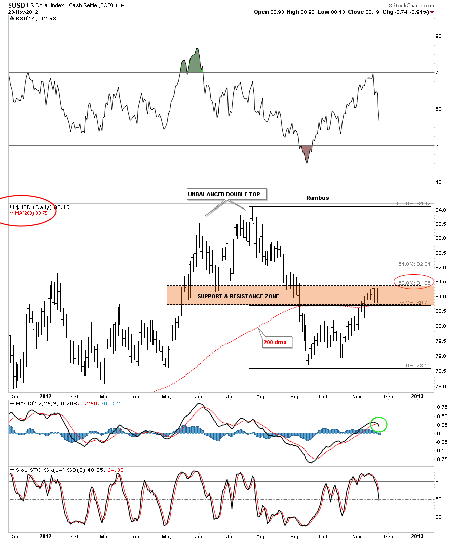
First lets look at the Fibonacci retracements and see which one finally held resistance. The chart below shows the 50% retrace held which also corresponded to the top of the brown shaded support and resistance zone. Fridays price action also closed below the 200 dma and MACD at the bottom of the chart has now crossed giving a sell signal.
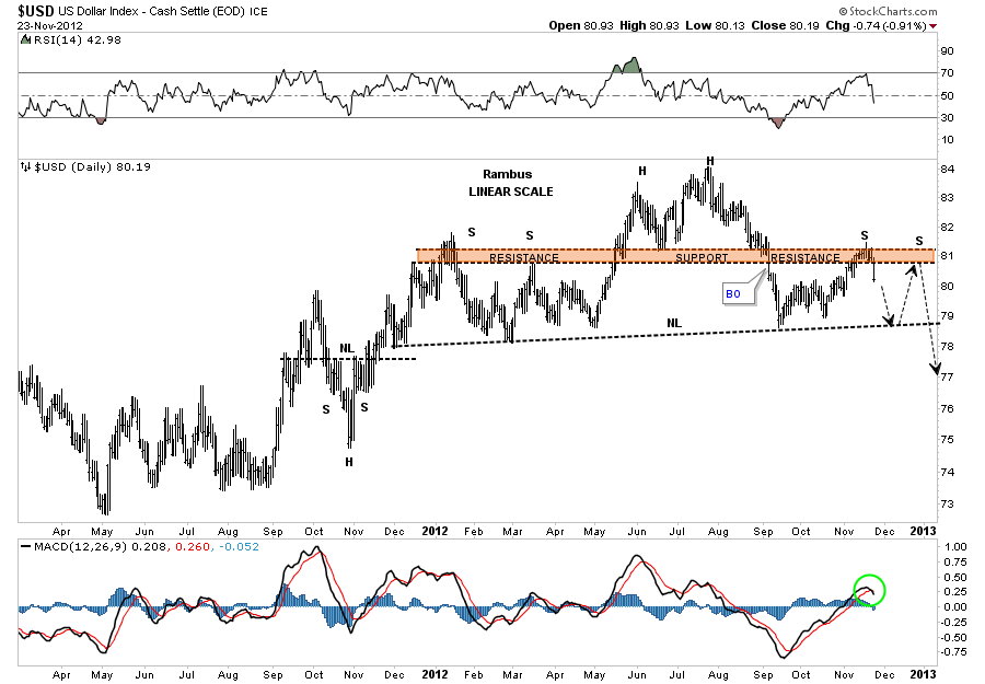
Next lets look at the H&S that was forming that has two left shoulders. It looks like the dollar has just completed the first right shoulder and is headed back down to the neckline. As you know symmetry plays a big role in how I look at the charts. As you can see on the chart below the left side of the H&S top has two shoulders. Its very possible that the dollar may build a second right shoulder before the H&S top is complete. Its possible that this H&S top could be of an unbalanced variety meaning two left shoulders and one right shoulder. We will just have to see what happens when the dollar reaches the neckline and take it from there. Note the MACD has crossed and is now giving a sell signal as well.
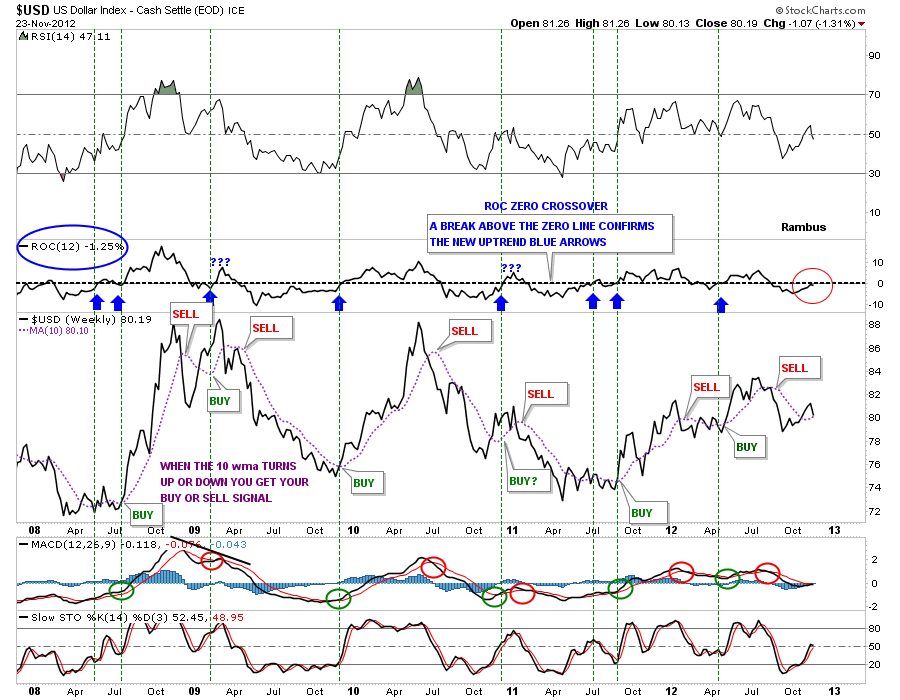
Lets take a look at the ROC indicator that was approaching the zero line, red circle on chart below. Its currently at a minus 1.25 which is still in negative territory. The 10 wma has turned up ever so slightly but with last weeks price action in the dollar there is a good chance it will start to roll over again. From this ROC indicator I still rate the dollar as on a sell signal.
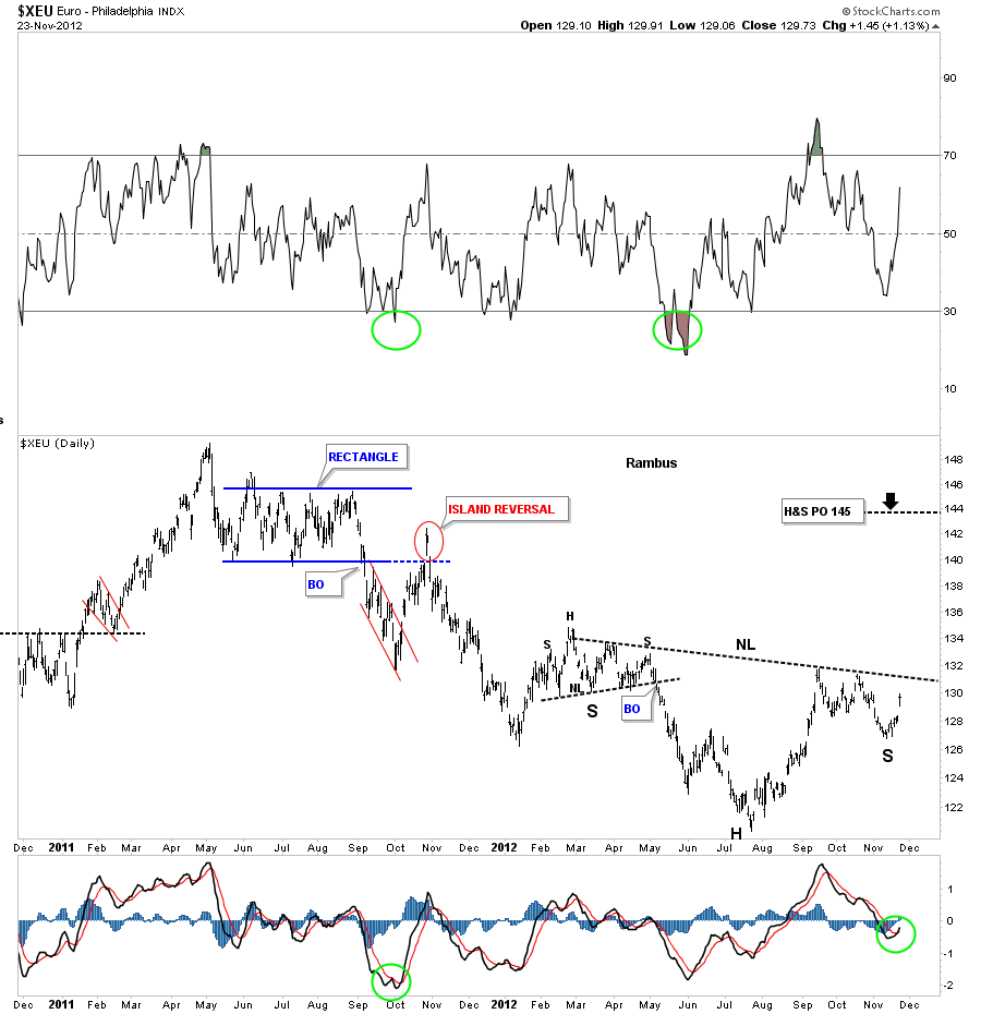
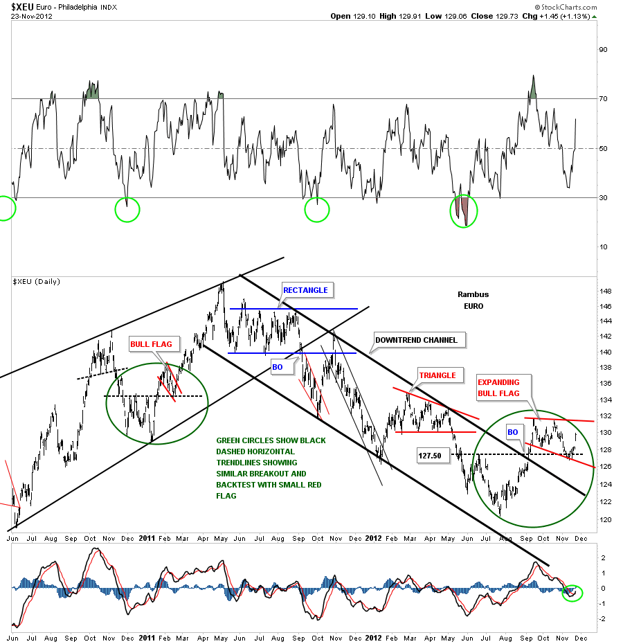
Lets now take a peek at the Euro as it should have an inverse look to the US Dollar. The daily chart below shows a nice inverse H&S bottom forming that has a price objective up to 145 or so as a minimum move. Note the MACD indicator at the bottom of the chart has now crossed and is giving a buy signal.
I used a slightly different approach looking for the bottom for the XEU (The Euro ETF). Notice the big green circle on the left side of the chart and how the little red bull flag formed right on top of the black dashed horizontal rail that acted as support. Now focus your attention to the right side of the chart and the big green circle that is showing the same setup. After testing the black dashed horizontal rail as support the euro began to liftoff last Friday. That bottom is also the bottom for the right shoulder I showed you on the chart above.
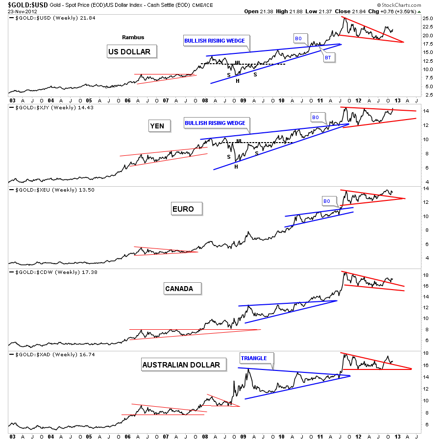
Lets see how gold looks from several different currencies. The chart below is a combo chart that shows how gold is trading against the US dollar and several of the major currencies of the world. As you can see gold has broken out of the red triangles and is in the process of doing some backtesting in some cases. The Yen to gold looks particularly strong in here as it will probably be the first currency to reach new all time highs with the euro right behind.
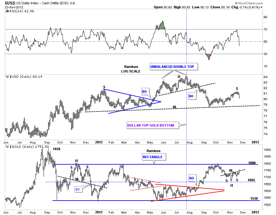
Lets look at one more combo chart that shows the US dollar on top and Gold on the bottom. This chart shows the inverse relationship between the two, purple vertical line. The most important thing to take away from this chart below is the neckline on the dollar and the top blue rail of the rectangle for gold. Those are both strong and hot rails. By the looks of it they will both hit their respective rails at the same time, the dollar the neckline and gold the top blue rail of it’s rectangle. That is what you can call an inflection point. I suspect they will both work through the breaking out and backtesting process together for their critical trendlines. Once the breakout and backtests are complete each trendline will reverse its role. The neckline once broken to the downside will act as resistance and the top blue rail of the rectangle will act as support when it finally gives way.
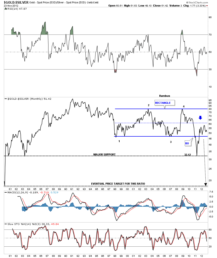
Lets look at one last chart that is the gold to silver ratio chart. When the price action is falling silver is outperforming gold. In a strong move in the precious metals I like to see silver outperforming gold. A break below the bottom rail of the blue rectangle will signal silver is the place to be for investments purpose. This would also be bullish for the stock markets.
OK, one last chart of the gold to silver ratio that shows when silver is outperforming gold it’s good for the stock markets. Thats because its still looked at as a commodity. A strong stock market equals more demand for silver so the two go hand in hand. The SPX is above and the gold to silver ratio is on the bottom. As long as the black arrows point up for the SPX and down for the gold to silver ratio that should be a bullish setup especially for silver.
I’ve been working on a long term gold chart that will show you how beautiful this bull market has been. I still have a little more work to do but It should be finished for the Wednesday Report. So stay tuned as it will be one of a kind chart that you won’t find anywhere else on the net….All the best…Rambus
More at
www.rambus1.com

