There are times in the markets when things don’t seem to make sense which is most of the time for some investors. Then there are times when everything seems to line up and things go according to a plan. Right now the precious metals stocks are back to playing their old games again by not following the metals higher.
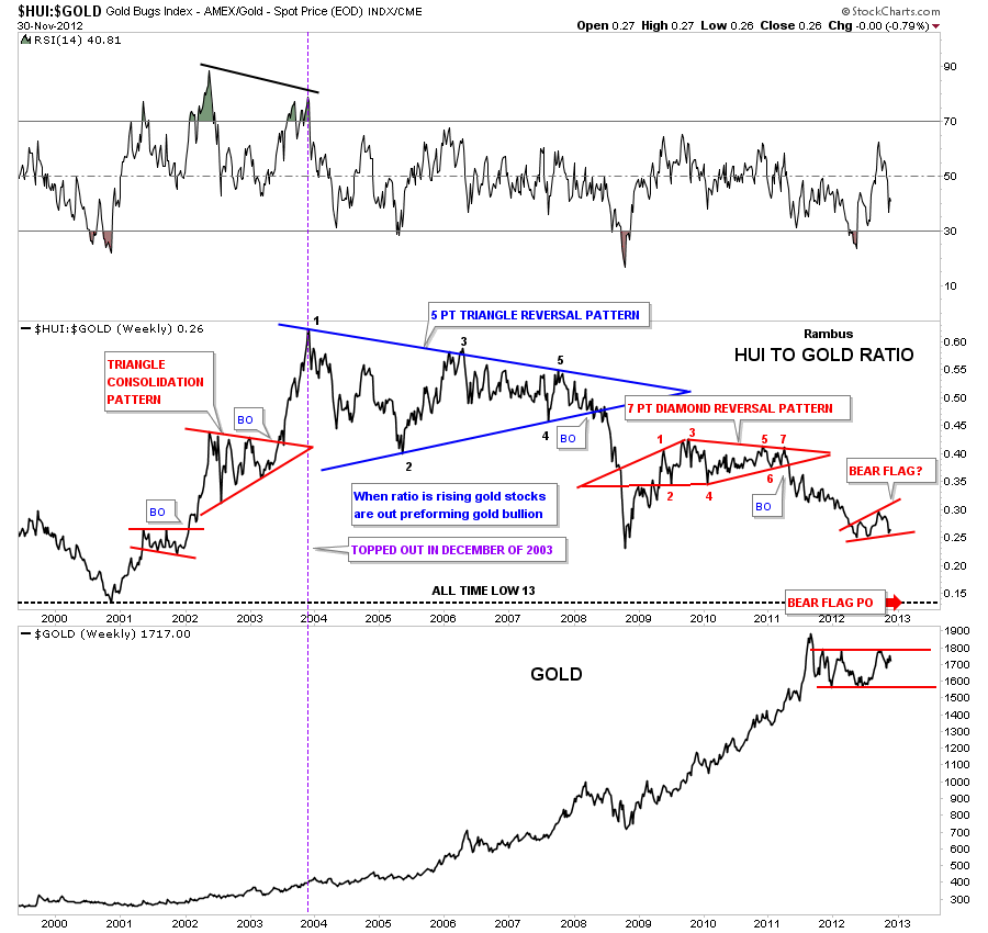
If you recall when gold hit it’s all time high in September of 2011 the precious metals stocks had a fairly decent move, if you can call it that, but woefully under performed the metal. I remember how hard it was to sit by and watch gold going to new highs on a regular basis and the gold stocks hardly moving. The HUI to gold chart below clearly shows that happening.
Before we look at the HUI : gold ratio chart below I want to explain how a ratio chart actually works. For instance, both the HUI and gold can rally together but if gold is rallying faster than the HUI the ratio will fall even tho they are both in rally mode. The other case is both the HUI and gold decline together but the HUI is falling faster than gold the ratio will fall.
What the HUI : gold ratio shows is that during the first three years of this bull market the HUI outperformed gold in a massive way. The ratio topped out in December of 2003 and has been going down ever since. One last note on the HUI to gold ratio chart below. There is a small red expanding bear flag that hasn’t broken out yet to the downside but if it does, the price objective is going to be all the way down to the 2000 all time low at 13. Gold has rallied over 1600 points from it’s low in 2000 yet the HUI is on track to hit its all time low for this ratio at 13. If this isn’t a conundrum I don’t know what is.
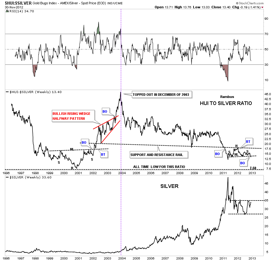
Lets see how the HUI has done compared to silver. As you can see on the chart below the HUI to silver ratio also topped out in December of 2003. You can see on the HUI to silver ratio chart there is a small H&S consolidation pattern that is forming just below the support and resistance rail and is beginning to breakdown. It looks like this ratio is on it’s way down to it’s all time low made in 2000 at 7.50.
All three, gold, silver and the HUI have all rallied since the December 2000 oversold ratio bottom but the HUI stocks are now almost just as undervalued now as they were at the start of the secular bull market when the HUI was trading around 35 and gold around 255. Pretty amazing. Maybe when the ratio’s get down to their all time lows it might be a good time to jump on board the HUI stocks again. You would definitely be buying at the bottom that saw a 20 year bear market for the HUI to gold ratio.
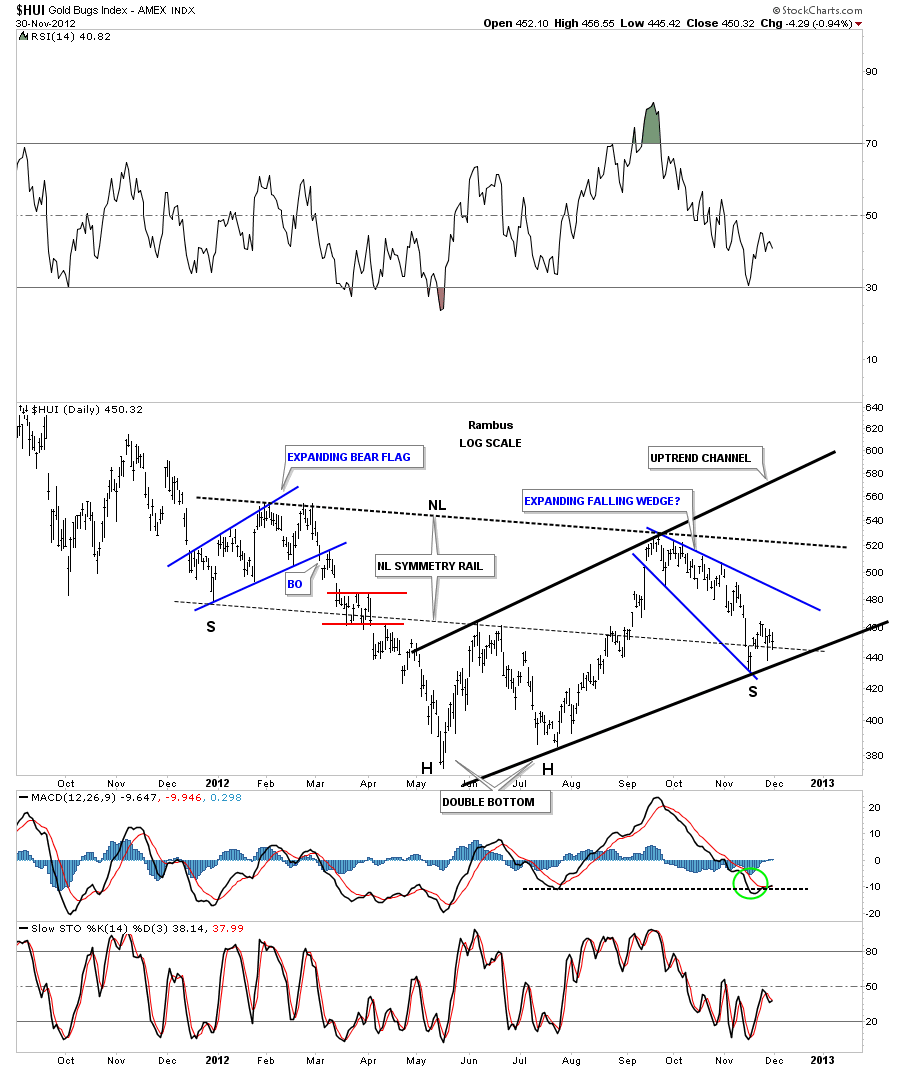
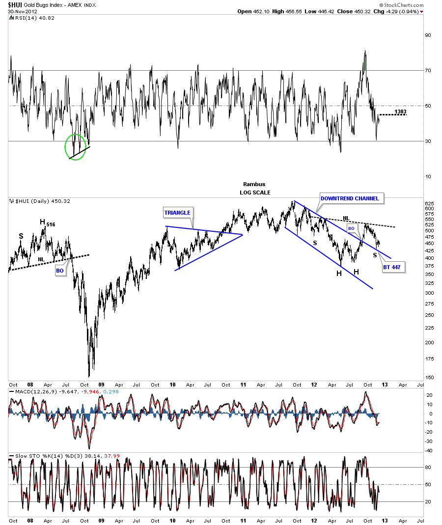
Now First lets take a look at the positive side for the HUI that is showing several potential bullish patterns. First, the inverse H&S bottom where the price action is testing the neckline symmetry rail which would be the bottom of the right shoulder. If the HUI can rally away from this point that would be very bullish. So far the this low has held for two weeks now. Its trying to make up it’s mind if it wants to go higher or lower. We should know the answer fairly soon.
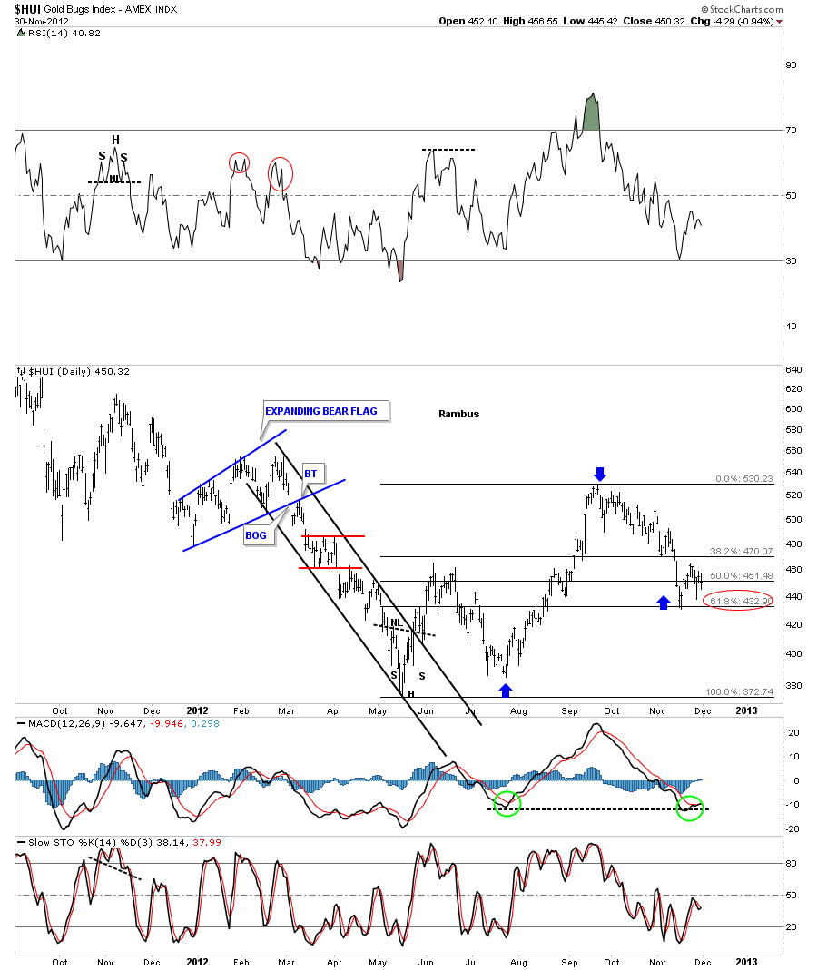
Next lets look at the Fibonacci retracement level which is still holding at 62% which falls in line with a normal correction.
This last positive chart for the HUI shows it breaking above the downtrend channel with the backtest showing the possible right shoulder of it’s inverse H&S bottom. So far there in nothing not to like about these charts. They are all technically positive.
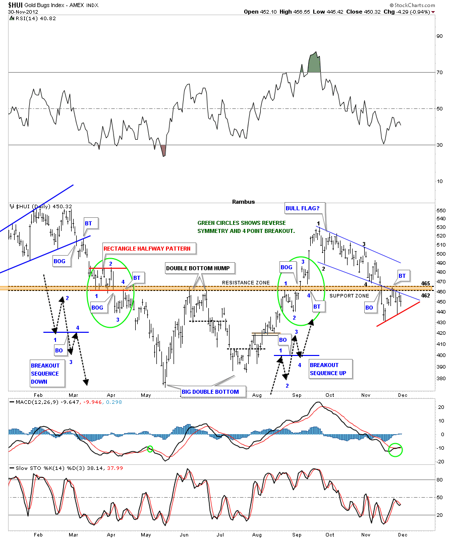
Now I want to show you some charts of the HUI that are throwing up a caution flag. The first chart shows the beautiful symmetry the HUI was producing when it broke out from it’s double bottom. It was picture perfect in every regard as the green circles show. Next I want to focus your attention to the blue downtrend that I have labeled BULL FLAG? Follow the price action starting at point #1 down to point #4. At point #4 is where support should have came in and launched the second impulse leg higher. You can see there was actually a four day rally that quickly faded away before the price action could reach the top blue rail. That hard decline below the brown shaded support and resistance zone should have held support but the price action sliced through it like a hot knife through butter. Next you can see the little counter trend rally that lasted about 5 days that took the price back up to the underside of the brown shaded support and resistance zone where the bottom blue rail of the downtrend intersect. It appears the brown support and resistance zone maybe reversing it’s role again and is now acting as resistance. You can also see a potential small triangle that is forming just below the brown S&R zone. The top of the little triangle is the bottom blue rail of the downtrend channel and I have put on a red trendline that shows the bottom of the triangle. That setup, when it happens above a support and resistance zone is bullish and when it happens below its usually bearish. It still needs to breakout before we can say game over.
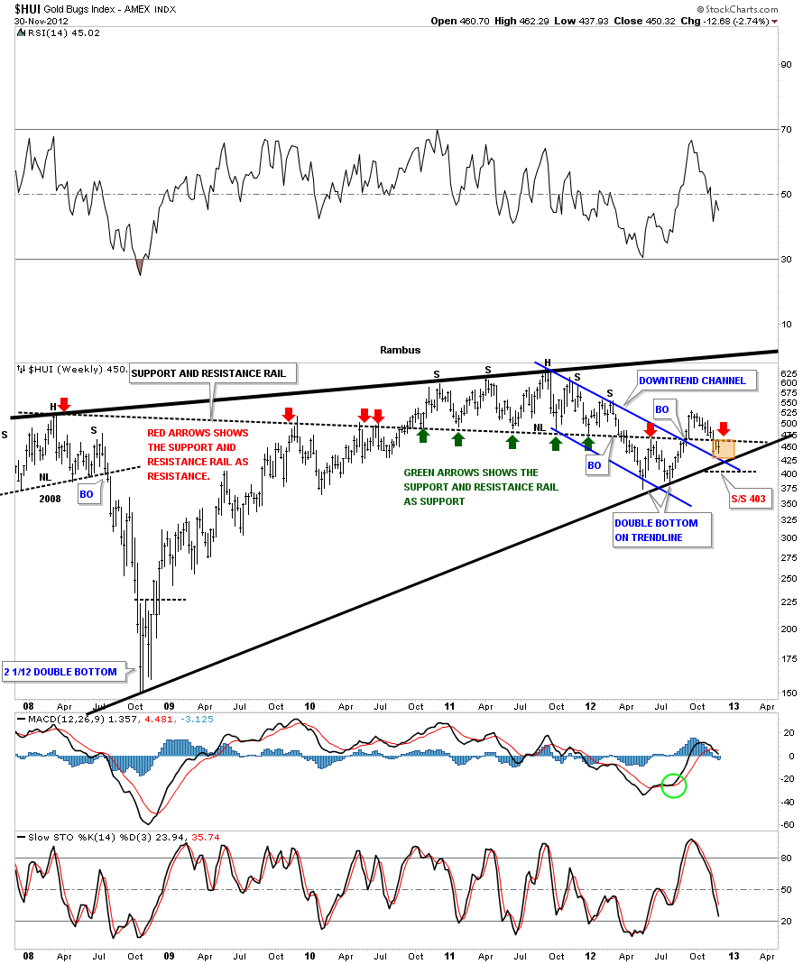
The next chart is a weekly look that shows the five year long support and resistance rail that has told us in the past when the price action is trading above it things are positive and when below things are negative. What this five year chart is telling us right now is that the HUI is now caught between a rock and a hard place. You can see it has resistance at the S&R rail but also has support at the top rail of the blue downtrend channel and the bottom rail of the black uptrend channel, brown area on chart below.
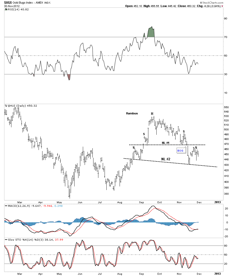
Sometimes a chart can get a little too busy and its hard to see what is really there. At times like these I like to erase all the chart annotations and start with just a clean chart. Sometimes things will jump right out at you and become very obvious. I’ve done this with a ten month daily look at the HUI. What has become apparent is that the HUI could be forming a series of H&S tops. As you can see on the chart below there is a small H&S top that broke down about two weeks ago with a small gap. Then we had that little counter trend rally that stalled out just below the small neckline #1 which is creating a possible right shoulder of a bigger H&S top #2. Sometimes reducing things down to their simplest form can yield much clear results.
Usually, at inflection points, you can get alot of mixed signals that can cause confusion until the trend finally becomes clear once again. This is the most difficult time to be in the markets as there is no clear cut trend in which to trade. My job is to recognize a trend change as soon as possible and get back in sync with it. Its not a popularity contest we are playing here its all about preservation of capital so when a new trend emerges we can take advantage of it.
With these next set of charts I want to look under the hood of the HUI and see what some of the big caps stocks are showing as they are the stocks that make up the HUI. If alot of them are showing a certain pattern that could very well show up on how the HUI looks.
I would like to begin by showing you some of the big cap precious metals stocks that help makeup the HUI. I’ve shown some of these stocks back in the winter months when the precious metals stocks were correcting. Keep in mind most of the stocks to follow will be of the monthly longer term look that helps put things into perspective. The question we have to ask ourselves when looking at these charts, do they look like the beginning of a new leg up for the big cap precious metals stocks or does it look like a top that will lead to a severe correction. I’ll let the stock speak for themselves.
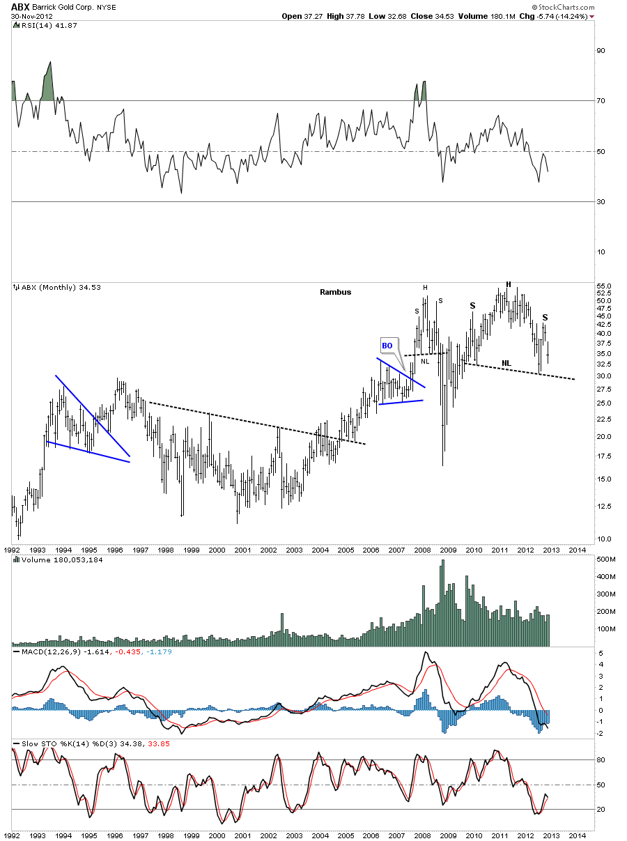
The first big cap PM stock I would like to show you is the ABX monthly look. How many charts have different analysis shown us that tell us we are in the strongest part of the seasonal trend for gold. If that is the case it would seem like the precious metals stock would partake to some degree in that seasonal strength. ABX certainly isn’t following that trend by the looks of this monthly chart. Notice how fast the right shoulder is breaking down. That’s a huge H&S top.
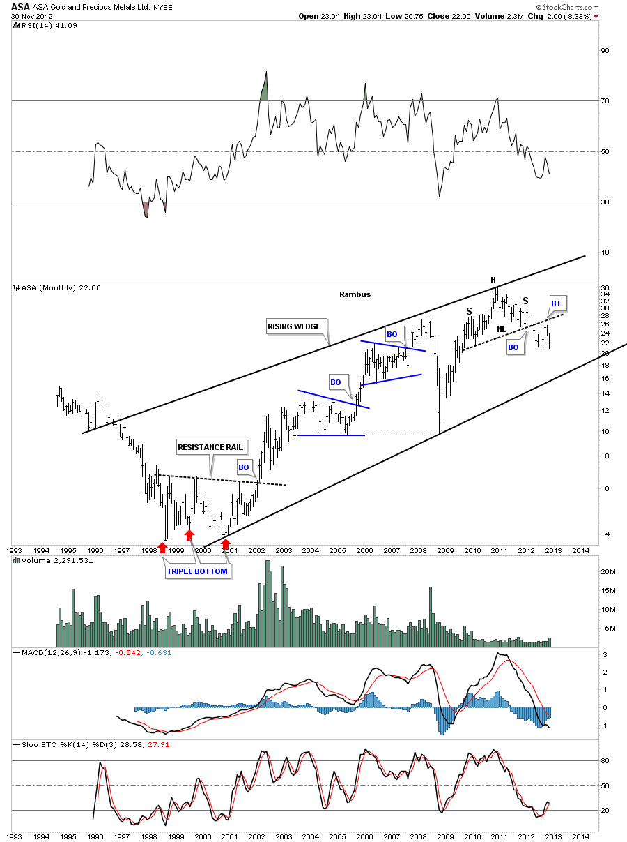
ASA is showing a H&S top at the end of a rising wedge. As you can see it’s on the verge of making a multi year low with just a little more weakness.
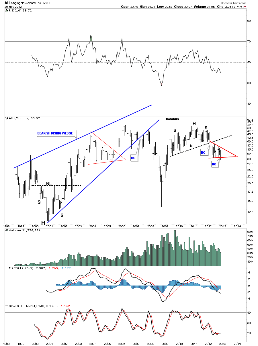
AU also has a monthly H&S top in place which is finishing off a red triangle consolidation pattern to the downside.As you can see it has closed the month of November at the lowest point since 2009. This isn’t how a bull market is supposed to look.
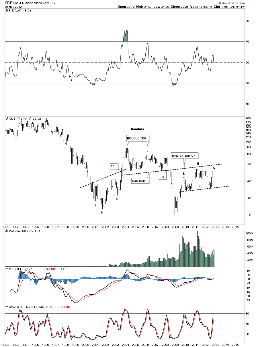
The next stock is CDE which had been one of the stronger preforming PM stocks until it was hit like so many other stock in this category. As you can see its now just breaking off the top of the right shoulder, where many other PM stocks are trading below their respective necklines already.
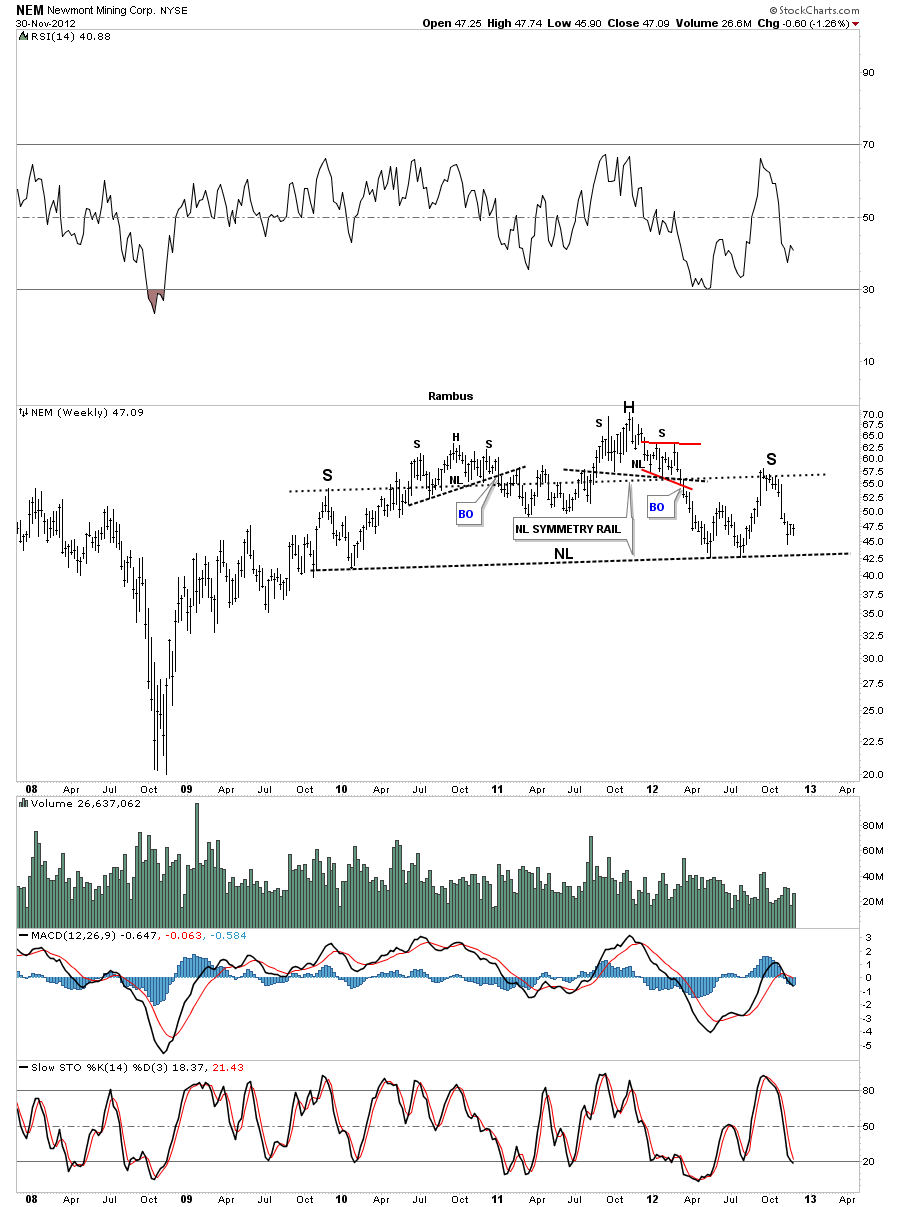
Lets first take a look at the NEM weekly chart that shows some pretty good symmetry taking place. I’ve added a neckline symmetry that is showing the top of the right shoulder that matches the top of the left shoulder.
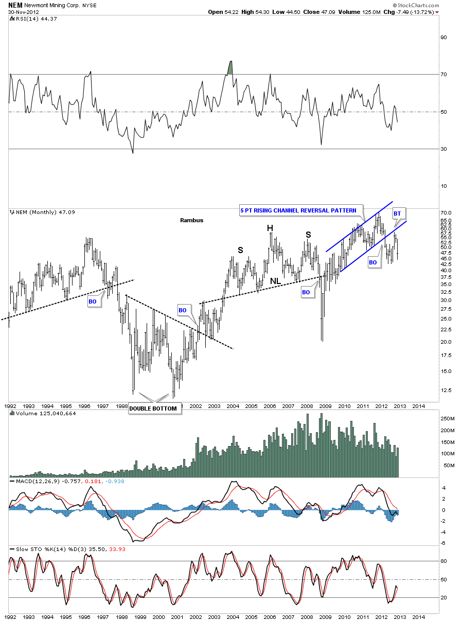
This next chart is a monthly look at NEM that shows a 5 point blue bearish rising channel reversal pattern. Notice the breakout and backtest that clearly shows the pattern as valid.
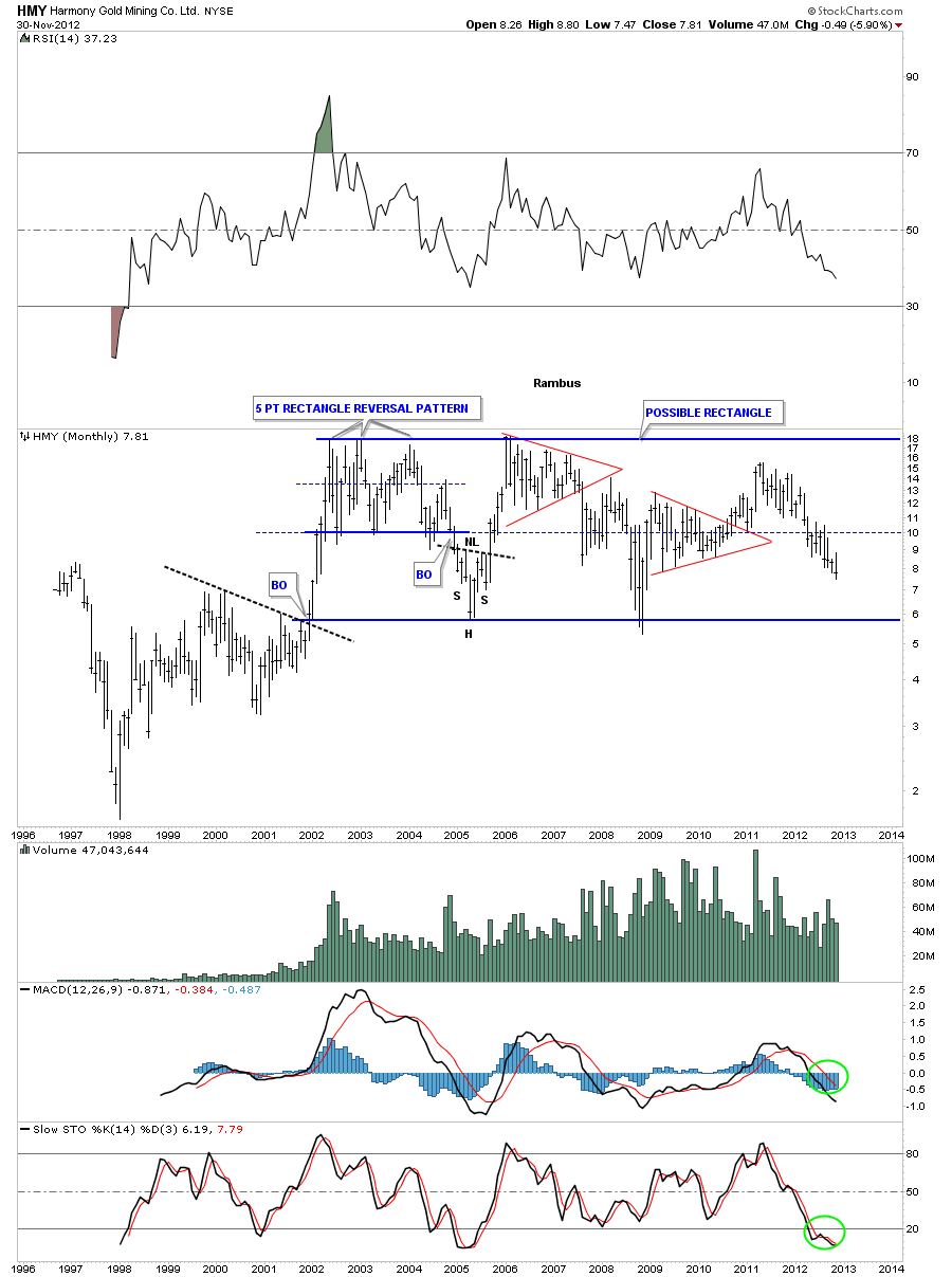
Lets look at a couple of South African precious metals stocks and see how they look. HMY has been trading in a horizontal trading range for most of it’s bull market. As you can see this stock closed the month of November at a new multi year low. Might be a good buy around the 6 dollar level.
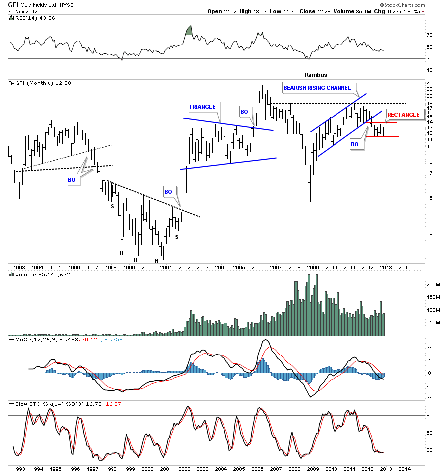
GFI has broken out of a bearish rising channel similar to the monthly NEM chart above. Its been chopping in a tight red horizontal trading range. A break below the bottom red rail will start the next leg down.
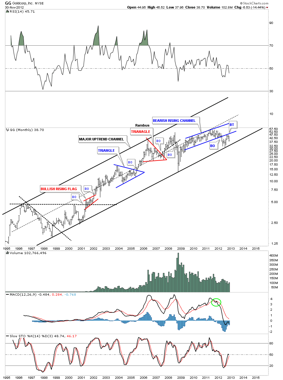
GG has been in a well defined uptrend channel since the beginning of it’s bull market. Like several other stocks I’ve shown you it to has a bearish rising channel that has broken down and has also backtested the bottom rail.
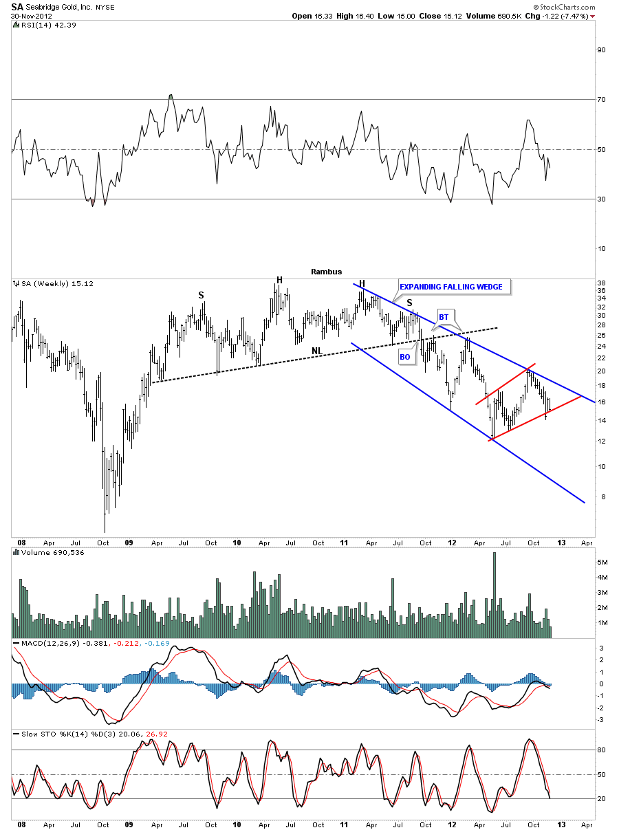
SA broke through it’s neckline over a year ago and has been in an expanding falling channel. It looks like its getting close to breaking below the red bear flag that fits nicely in the downtrend channel.
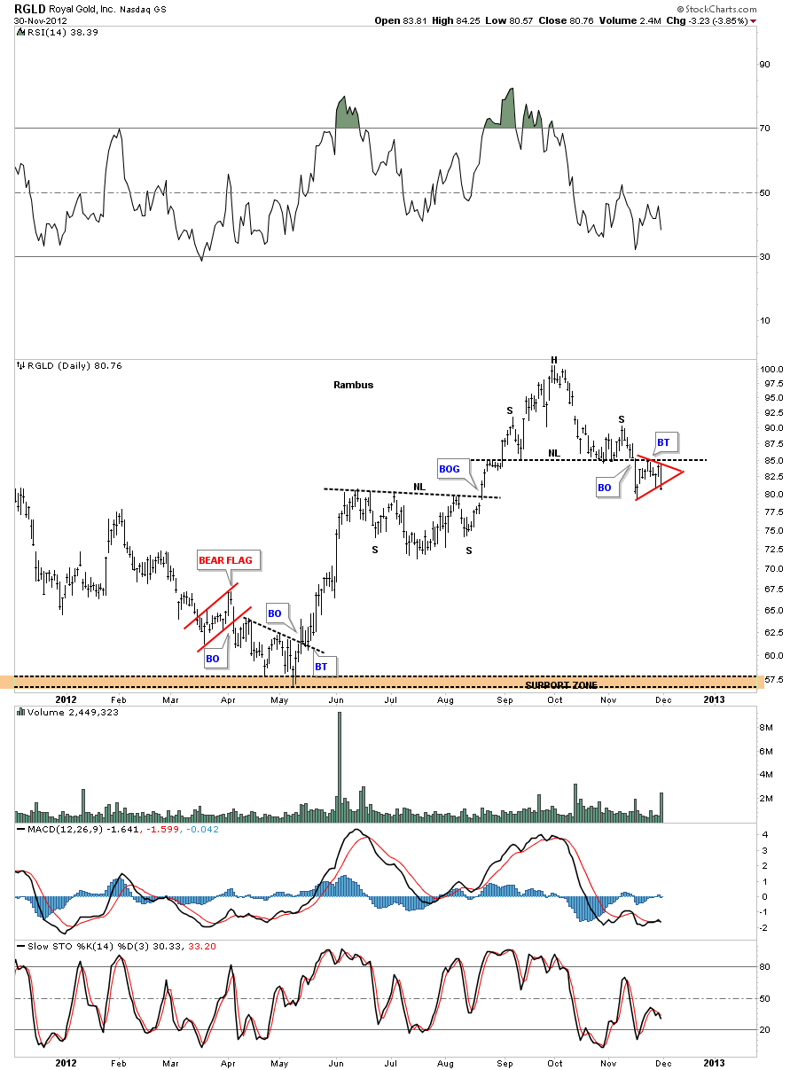
Lets look at one more PM stock that is a royalty company. RGLD has put in a H&S top on the daily look and has broken below the neckline and has formed a small red triangle. This stock was one of the leaders off the May bottom this year. It now looks like it’s a leader to the downside by dropping $20 so far.
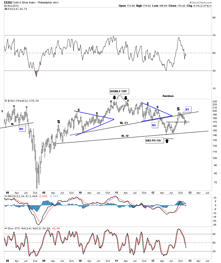
The last two charts I would like to leave you with is the XAU and the HUI long term look. The XAU has a very symmetrical H&S top with two blue triangles on each side of the head. Its also a double H&S top with two necklines.
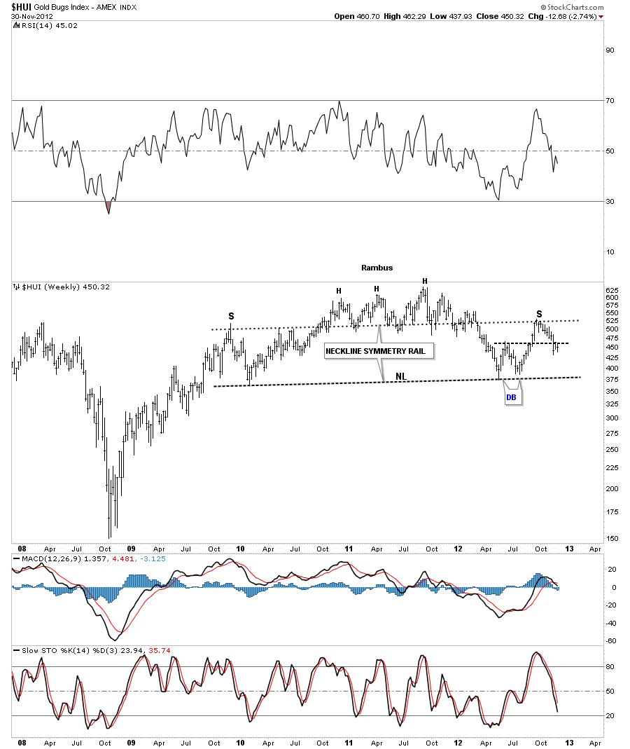
This last chart of the HUI shows about as symmetrical a H&S top as you will ever see. There is one last critical test taking place right now and that is at the double bottom hump. Normally a double bottom hump should act as strong support on the backtest. As you can see the action is getting alittle sloppy around the horizontal black dash rail off the double bottom hump. If the HUI is going to get positive it must hold above the double bottom hump or the big H&S top will come into play. Folks this is a big deal taking place right now.
As some of our longer term subscribers know I was pretty bearish most of the winter months as the HUI was completing the head portion of this massive H&S top. When the HUI finally put in its small double bottom is was time to go long again which we did. As you can see the rally stalled out at the neckline symmetry rail. That was another key point on the chart above. If the HUI was truly in a new bull market phase the top of the right shoulder should have been taken out. As I’ve stated earlier we are testing the most important area on the H&S top and that is the double bottom hump. The H&S top pattern can still be negated if the HUI stocks start a strong rally and the top of the right shoulder is taken out to the upside. But as I have shown you above alot the big cap PM stocks are already starting to break down.
Folks, this is nothing to be afraid of. We can make just as much money with the stocks going down as when they go up. As a matter of fact stocks usually go down faster than they go up. I just want to see little more confirmation around the double bottom hump area before we commit in a big way. As they say there is more than one way to skin a cat and when your dealing with the markets, no truer words were ever spoken.
This week coming up could be a transitional week for us if we start to see some weakness. We will be raising some cash on Monday for sure and then we’ll take it from there. Stay tuned as things could start to get exciting once again. All the best…Rambus.
EDITOR’S NOTE :
Rambus Chartology is Primarily a Goldbug TA Site where you can watch Rambus follow the markets on a daily basis and learn a great deal of Hands on Chartology from Rambus Tutorials and Question and Answeres .
Most Members are Staunch Goldbugs who have seen Rambus in action from the 2007 to 2008 period at www.goldtent.org and now Here at Rambus Chartology since early 2012 .
To review his Work and incredible calls from the 2007-2008 period click on the top right sidebar in the “Wizard of Rambus” ….”What If !!” Post
To Follow Rambus Unique Unbiased Chart Work and participate in a Chartology Form with questions and answeres and learn the Art and Science and Mindset of a Pro Trader please Join us by subscribing monthly for $29.99 at
www.rambus1.com
We have many subscribers from all over the world who are glad they did as they enjoy the many daily updates and commentaries provided at this exciting new site
As you will see Rambus (Dave) has prepared us for this difficult period by being one of the only ones to see and warn about the incredibly debilitating PM smackdown as early as Jan 2 2012 …click on the” HUI Diamond in the Rough” Post in the “Wizard of Rambus” top right
More Recently Rambus called a Bottom in HUI in this post…and has had subscribers on board for a Powerful Run to the Upside
rambus1.com/?p=5651
BUT
What is he seeing Now ?
You will find Rambus to be a calm humble down home country tutor with an incredible repitoir of all the TA based protocols tempered with his own one of a kind style…simply put…He wants to keep his subscribers on the right side of these crazy volitile and downright dangerous markets
See you at the Rambus Chartology
www.rambus1.com

