
Tonight I would like to show you some charts on the US dollar that is finally showing a little action after a month or so of chopping around towards the lows. I have many different looks that might give us a clue or two on what to expect over the next month or so.
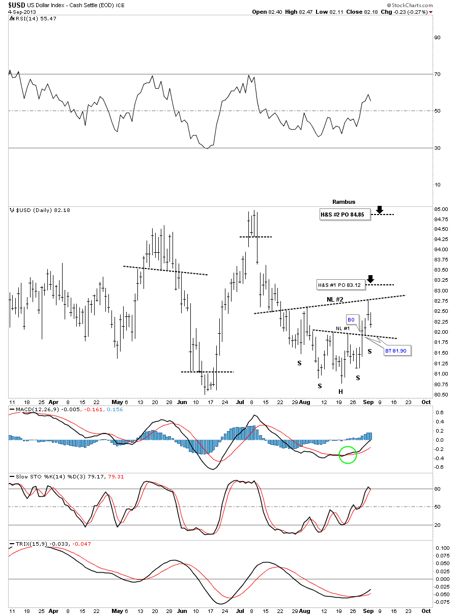
The first chart is a 6 month daily chart that shows a potential double inverse H&S bottoming formation. As you can see the smaller inverse H&S #1 had a nice long bar on the breakout followed by a backtest the next day. That completed the smaller inverse H&S bottom. The rally only lasted one day which gave us a point to drawn in the 2nd Neckline. The price action is now getting ready to backtest NL #1 again that would create the right shoulder for the bigger inverse H&S #2. So this is a critical backtest taking place in the next day or two to the 81.90 area. If neckline #1 can hold support the price objective of the bigger H&S bottom would be up to the 84.85 area which would be back at the previous high made in July.
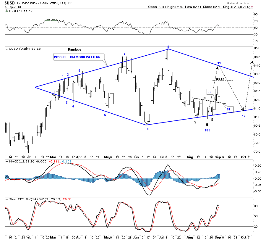
Some of you may recall the potential Diamond that was forming, that for a time at reversal point #10, looked like it may be failing. After about 3 weeks or so of testing the bottom blue rail the price action finally began to liftoff as the short term daily chart above shows. The top rail, on the right hand side of the chart, is not set in stone. It is just a parallel rail to the lower rail on the bottom left hand side of the chart. This chart is a little contradictory to the inverse H&S bottom on the chart above as the bigger H&S #2 has a price objective up to the 84.85 area which would put the price for the US dollar above the top blue rail of this diamond. The smaller inverse H&S bottom has a price objective up to 83.12 which could work for the 11th reversal point. For right now it just time to watch the price action very close and see what clue’s it’s going to give us.
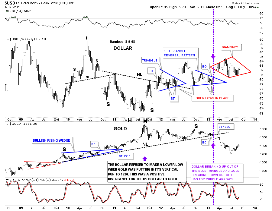
Stepping a little further back in time one can see how the possible diamond pattern could fit in nicely with the overall uptrend that has been in place, for the US dollar, since the fall of 2011 when gold topped out. The dollar is still running a series of higher highs and higher lows. This combo chart that shows the US dollar on top and gold on the bottom shows where the US dollar refused to make a new low while gold had its parabolic run to 1920. That was a very good positive divergence for the US dollar to gold.
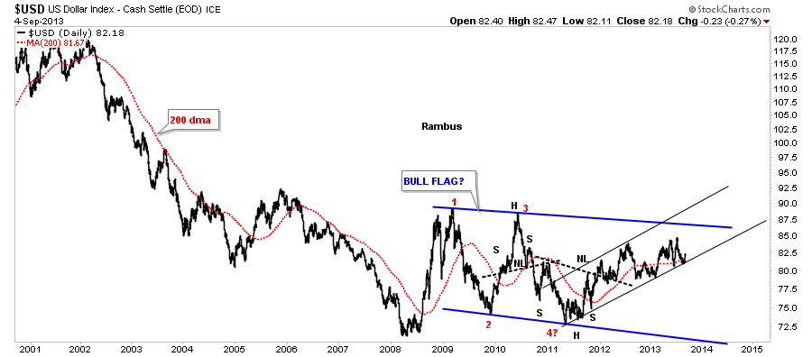
There are several more possible scenario’s the US dollar maybe showing us before it’s ready to move higher. This next chart shows a nice uptrend channel that has been in place since the spring of 2011. You can see where the double bottom hump trendline and the bottom rail of the uptrend channel come together and has held support so far, albeit a little sloppy.
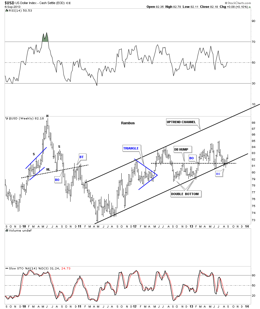
Below is another look at the uptrend channel that shows the 200 dma holding support.
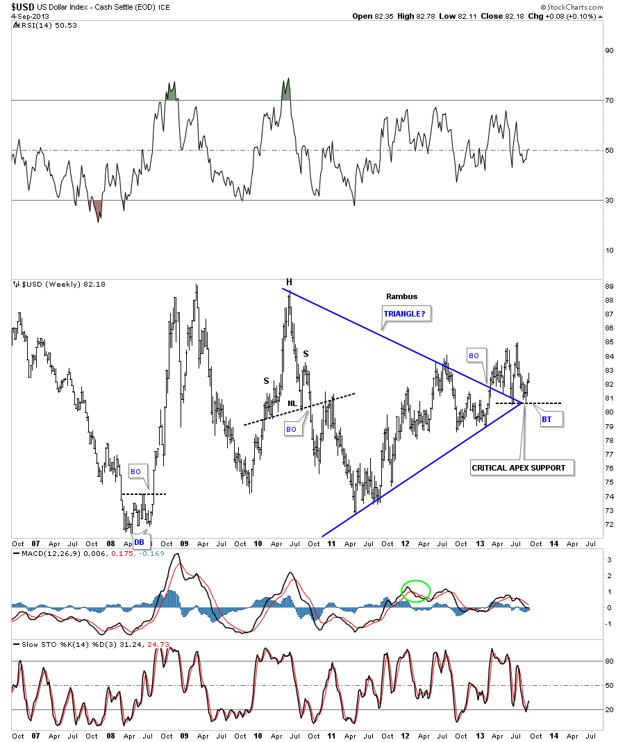
I have shown you how the apex of a triangle can be critical support or resistance depending on which way the price action is moving. Below is a weekly chart that shows a triangle formation where critical support was found at the apex, twice.
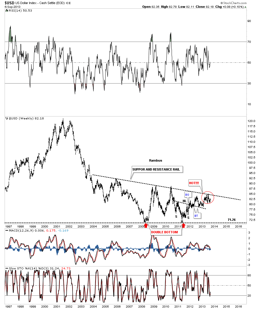
The next chart is a long term weekly look that shows the big base the dollar has been carving out for almost 10 years. That top support and resistance rail has been holding the US dollar back but if the dollar takes that rail out that will be a big deal. You can see, from the bottom on the right side of the double bottom, there is a series of higher highs and higher lows all the way up to our present trading area. Nothing is broken yet that would tell us if this huge base was going to fail.
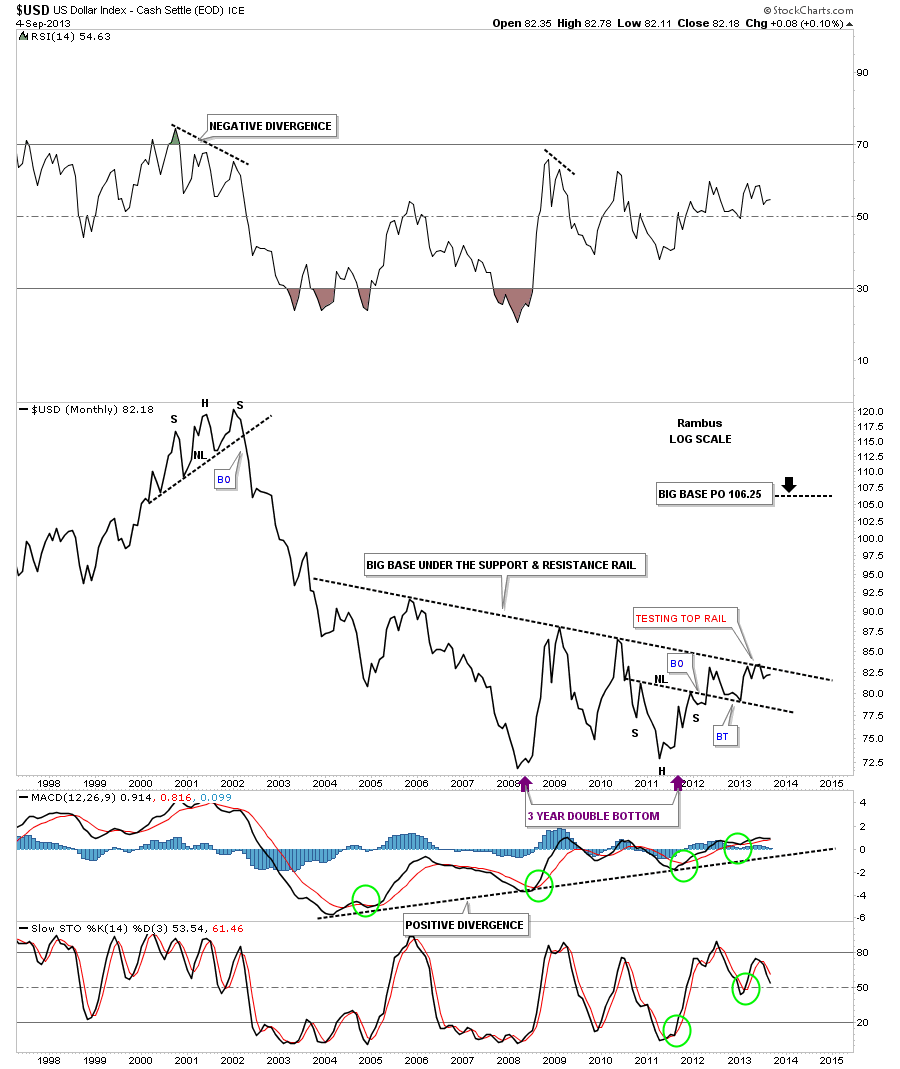
This next chart shows us the big base that was built back in the 90’s that looks like a fractal to our current huge base #2. Keep in mind a big base leads to a big move. These are monthly charts so change comes slowly but change they will.

The next chart I would like to show you is a monthly line chart that will probably give us the earliest clue when the dollar finally breaks through the top rail. As you can see it has been testing that top rail for many months now. It looked like the dollar had a chance to breakout last month but the top rail wasn’t ready to break yet, so the US dollar pulled back again.
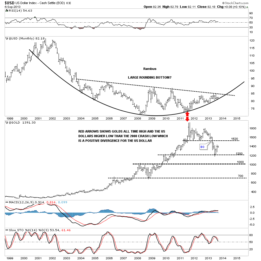
I would like to show you one more chart, in this first part of this US dollar report, which is a combo chart that has the US dollar on top and gold on the bottom. There is a chart formation that is called a rounding bottom. They usually take their time developing but when they complete you know you have a really good base in which to launch a major move. The two red arrows shows you how the US dollar has been rounding up while gold has been moving down. Regardless of what some folks think there is an inverse correlation between the two. It’s not always perfect but you can see it on the longer term charts.
Tomorrow we’ll look at part two where I’ll show you some of the different currency and how they are behaving. It’s important to get the big picture look so we have a guide to work off of. We want to try and trade with the big trend as much as possible. All the best…Rambus