
In Keeping with a Theme here at Rambus Chartology lets look in on the complex game being played on the Chess board that is the Precious Metals Market
Tonight I would like to show you some charts from the bull and bear side of the equation for gold. This is called an inflection point where the precious metals complex can move either way and establish some sort of short to intermediate term move. A lot of these charts you have seen before. Lets start with the bearish charts for gold which there are a lot to look at. Before we do I just want to make it perfectly clear that I’m still in the bear camp but as you will see we could have a short to intermediate rally that fits into this scenario that doesn’t change the big picture.
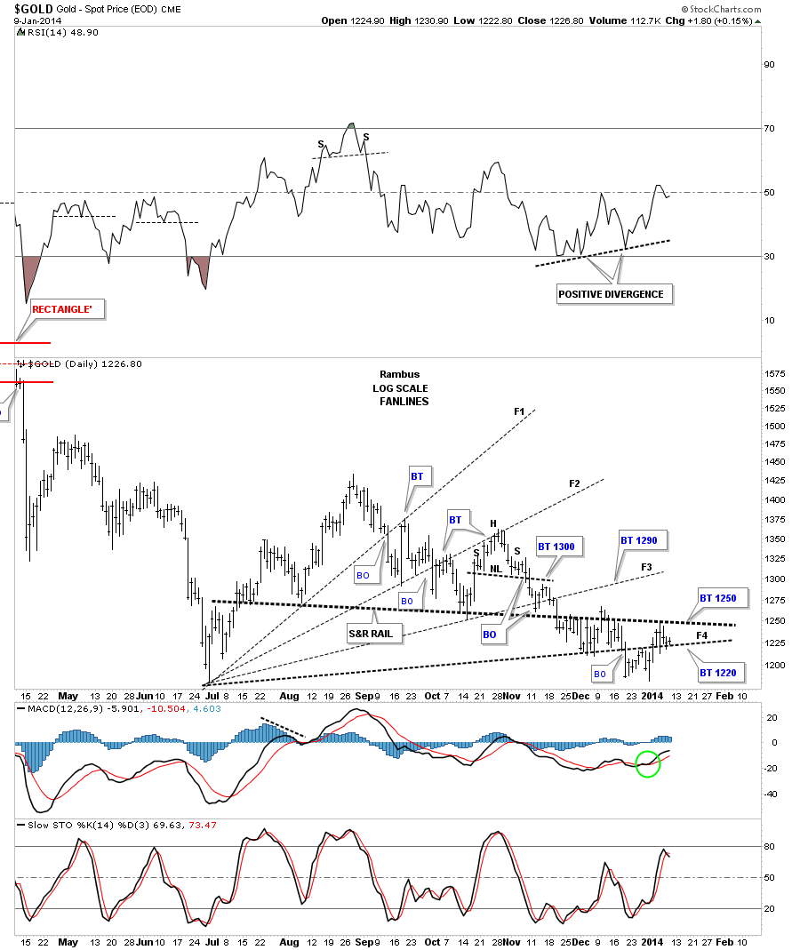
The gold fanlines. As you can see gold is now trading above fanline #4 and below the heavy black dashed support and resistance rail or neckline. The price action is moving out toward the apex of the two rails with the bottom fanline #4 at 1220 and the heavy black dashed S&R rail which comes in around the 1250 area. There is now just 30 points that separate these two trendlines. We could witness some violent moves within the apex until one side wins out.
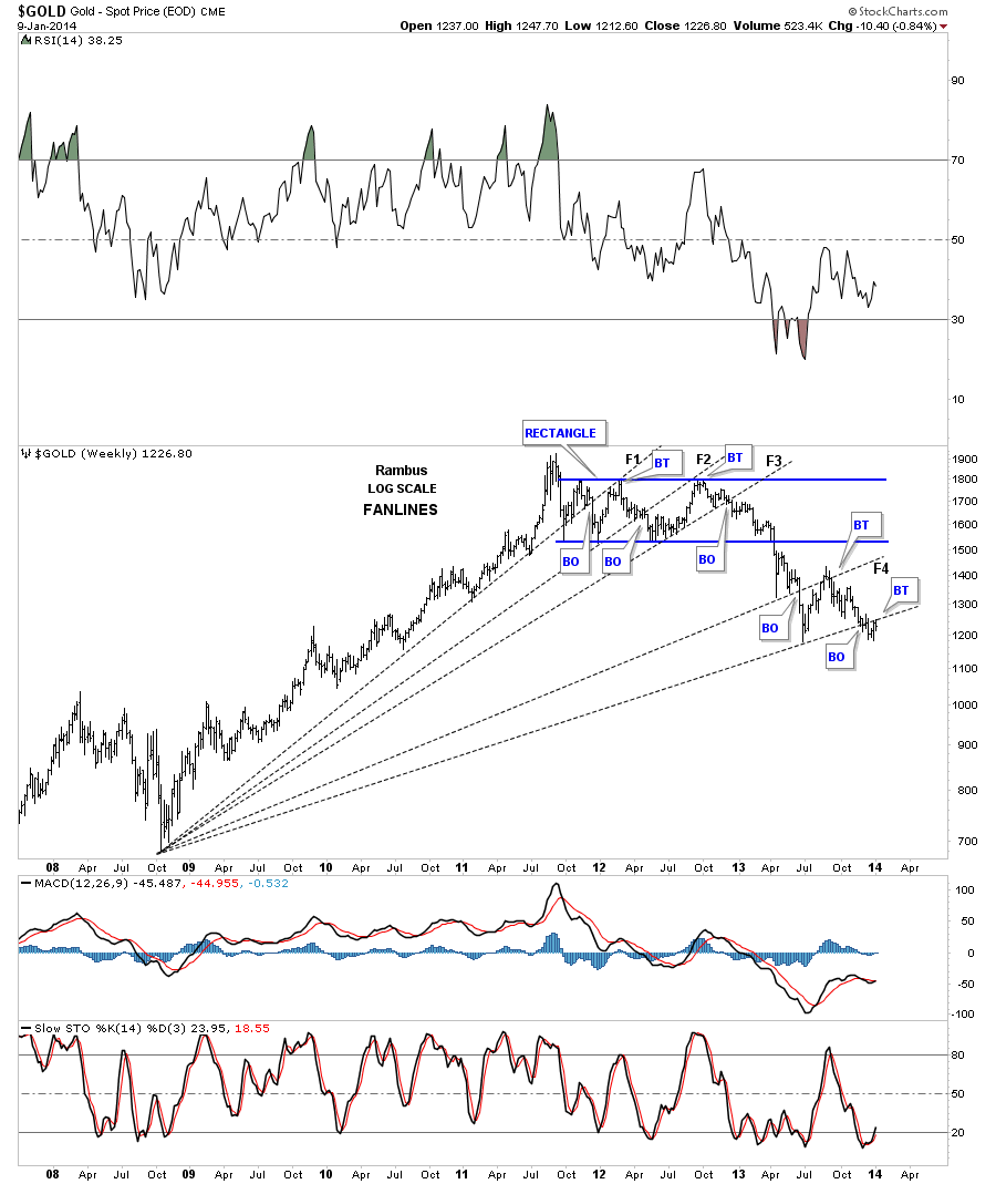
Gold 2008 long term fanlines. Below are the big long fanlines taken off the 2008 crash low. As you can see we are backtesting the bottom fanline from below right now.
Gold H&S consolidation pattern. This next chart shows the H&S consolidation pattern that we’ve been following since November before it broke below the neckline. As you can see gold has had one complete backtest so far and is attempting another that will come in around the 1250 area.
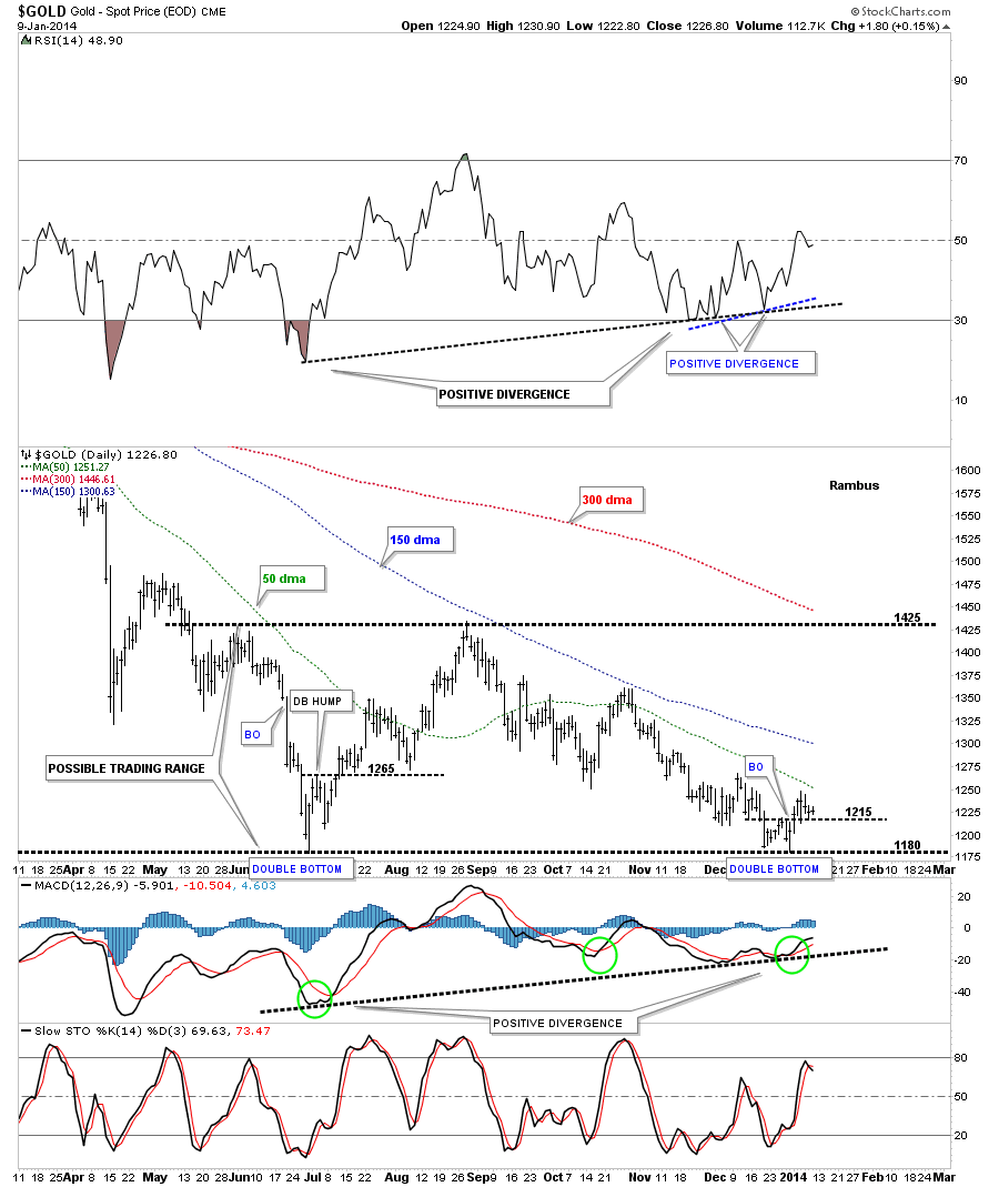
Below is the same chart only It’s a line chart that shows a small positive move when the recent price action traded above the little double bottom hump at 1220. Its not that big of deal right here, but getting above the neckline and the 50 dma will be the big deal, but it’s a start.

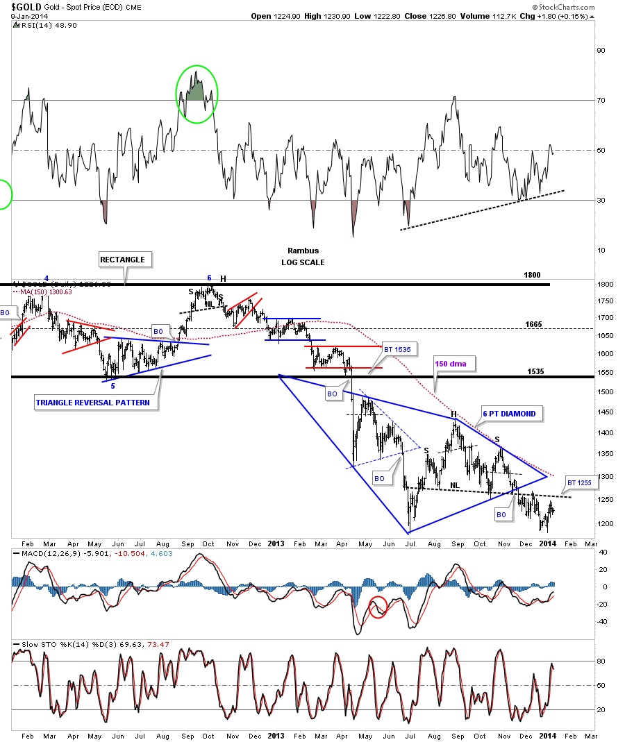
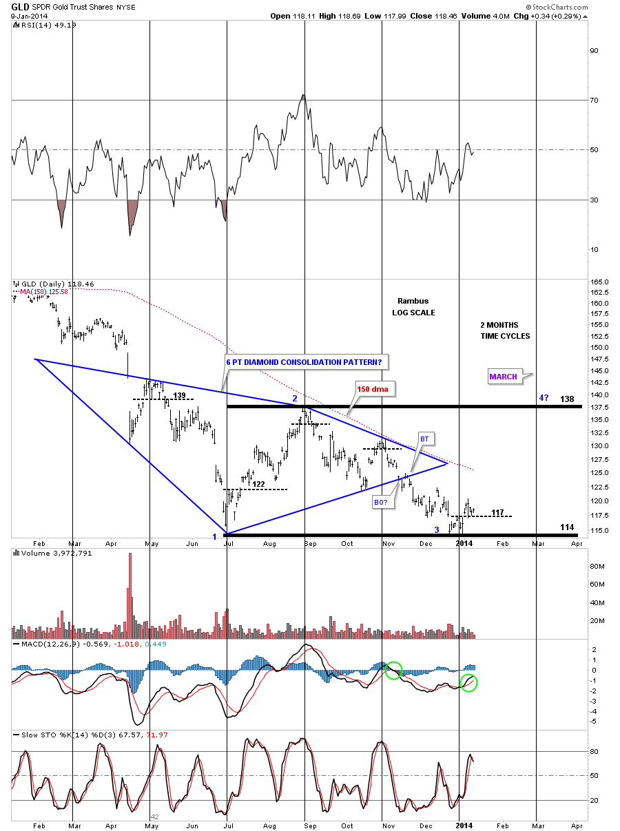
Gold Diamond. Below is our big blue Diamond that is made up of a small triangle on the left side and the H&S consolidation pattern on the right side of the Diamond. The 150 dma comes in at 1300 today which is a very important moving average.
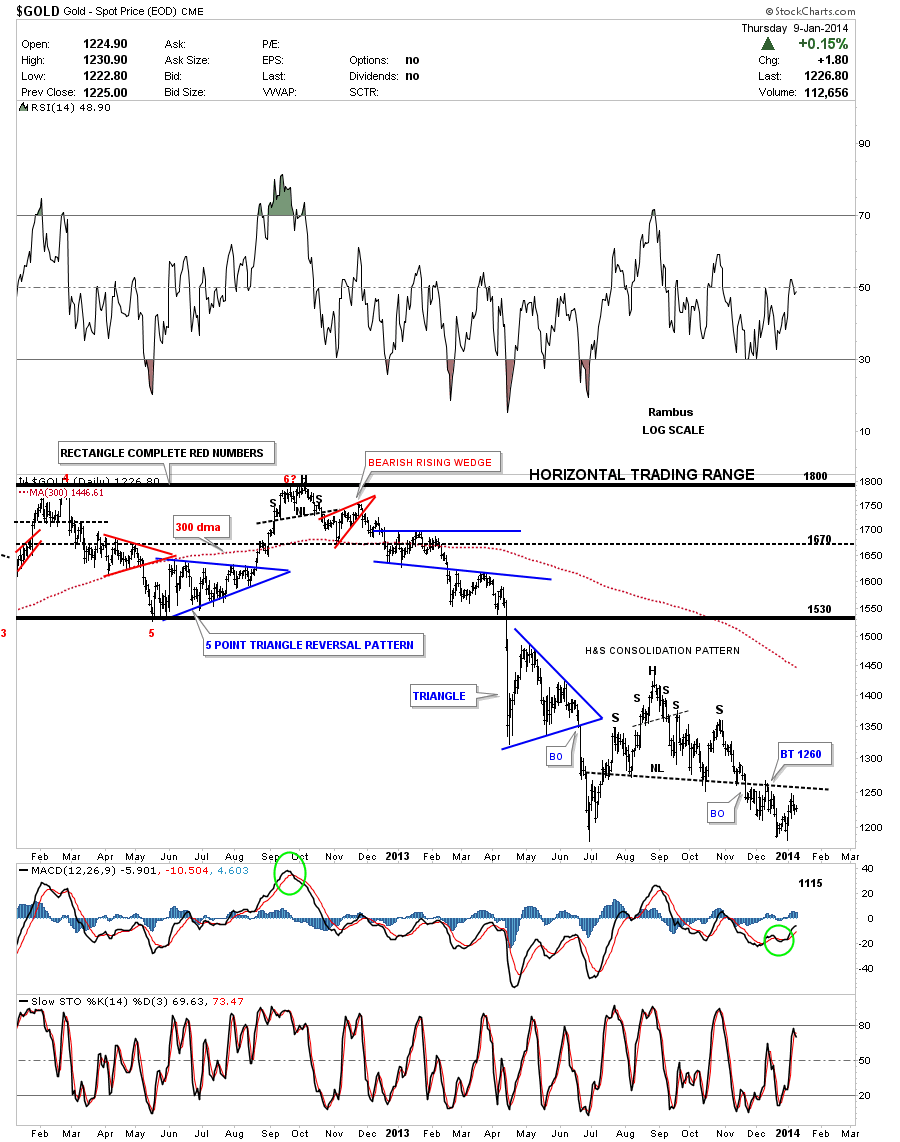
Lets now look at some potential bullish charts for gold starting with this one year daily chart that shows our current double bottom along with the June double bottom low. As you can see with the June double bottom the horizontal black dashed line held the backtest many times before the price action finally took off to the upside. Today marks the 6th day that the price action has traded above our current double bottom hump at 1215. As you can see the 50 dma is coming in right at the 1250 area.
The longer term daily look at gold shows how important this potential double bottom is for an intermediate term rally back up to the top of the possible trading range at 1425.This would be the 3rd reversal point right here with a 4th somewhere higher. The price action doesn’t have to rally all the way to the 1425 area. Gold could put in a lower high and create a descending triangle consolidation pattern somewhere along the way.
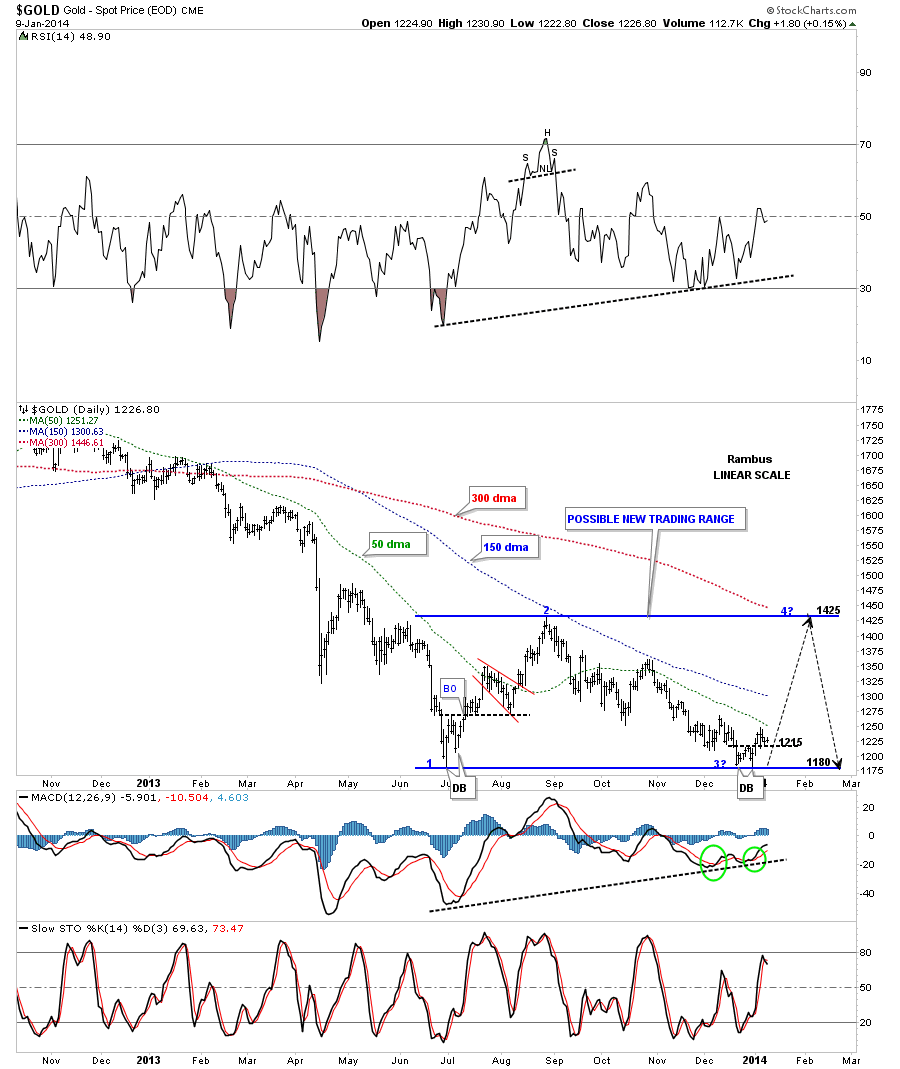
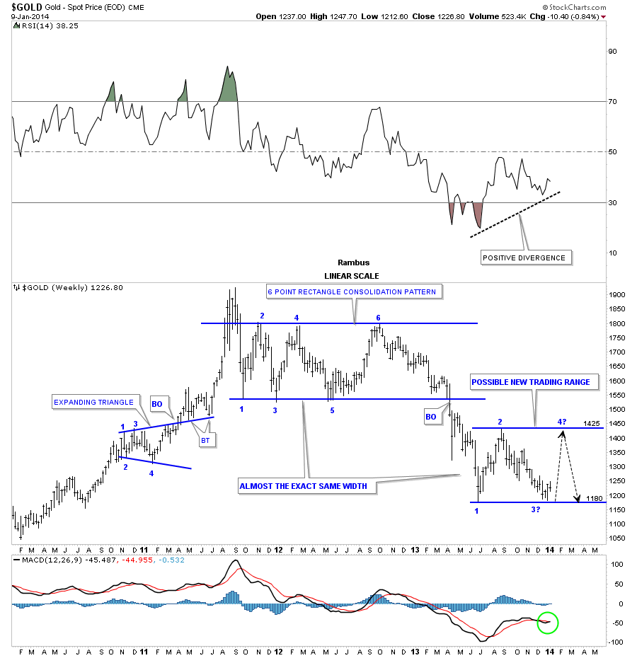
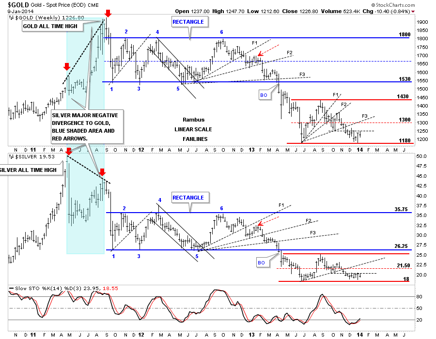
This weekly chart for gold really shows you the possible trading range between 1180 and 1425 or so. As you can see by looking at the 6 point blue rectangle, that was the first consolidation pattern to form during this bear market, it had 6 reversal points. As we know there are no rules to say our current possible trading range can’t have 6 reversal points. Or, if we get a rally back up to the top of the trading range at 1425 and have another decline back to the bottom at 1180 or so, which could then start a 5th reversal point which would then make this trading range a possible 5 point rectangle reversal pattern to the upside, if the price action can takeout the top rail at 1425. That’s just speculation right now but it’s a remote possibility in a bullish scenario.
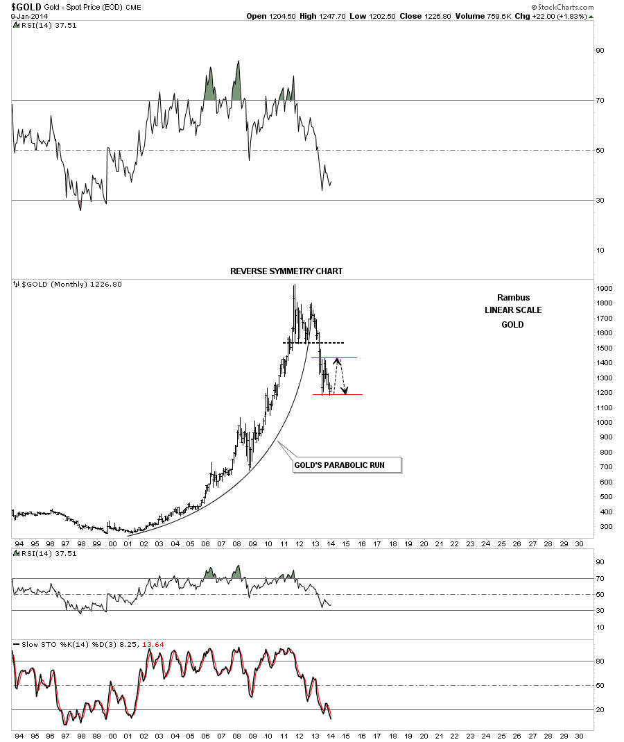
This next chart for gold is the very long term look at its parabolic rally. I’ve added a possible trading range in red that I showed you on the chart above. This looks like it could be a good place for a consolidation pattern to form as a possible halfway pattern to the downside.
This next chart is a combo chart with gold on top and silver on the bottom. For the most part it looks like the rallies are stronger and faster than the declines within each rectangle. Anyway, you can see how important the bottom red trendlines are as they have been holding support for over 6 months now.
This last chart for gold I haven’t shown you before. It”s a two month time cycle chart that has been working pretty good recently. If this next 2 month time cycle plays our as the previous ones then we should be bottoming right here and rally to the very end of February to the first part of March. Usually when you really count on a time cycle to fulfill its move it doesn’t work but we’ll give it the benefit of a doubt until it fails.
This should get you up to speed on what to expect with gold at this very important inflection point. Do we get a tradeable rally from right here or do we just go ahead and crash and get it over with.
Checkmate ?
Stay tuned as things are really starting to get interesting. All the best…Rambus