It’s always amazing to me how market sentiment can move from one extreme to the other taking the herd with it. Chartology is the study of charting and investor psychology which when you put to two together can give one an edge on where you are at any given point within a bear or bull market.
Back in the first week December of 2012 the sentiment was very bullish for the precious metals sector especially the precious metals stocks. Gold and silver both had rebounded off of the bottom rails of their six point blue rectangles that had been building out since they both topped out in 2011. It’s easy to forget how bullish sentiment was back then after a year of falling prices in 2013.
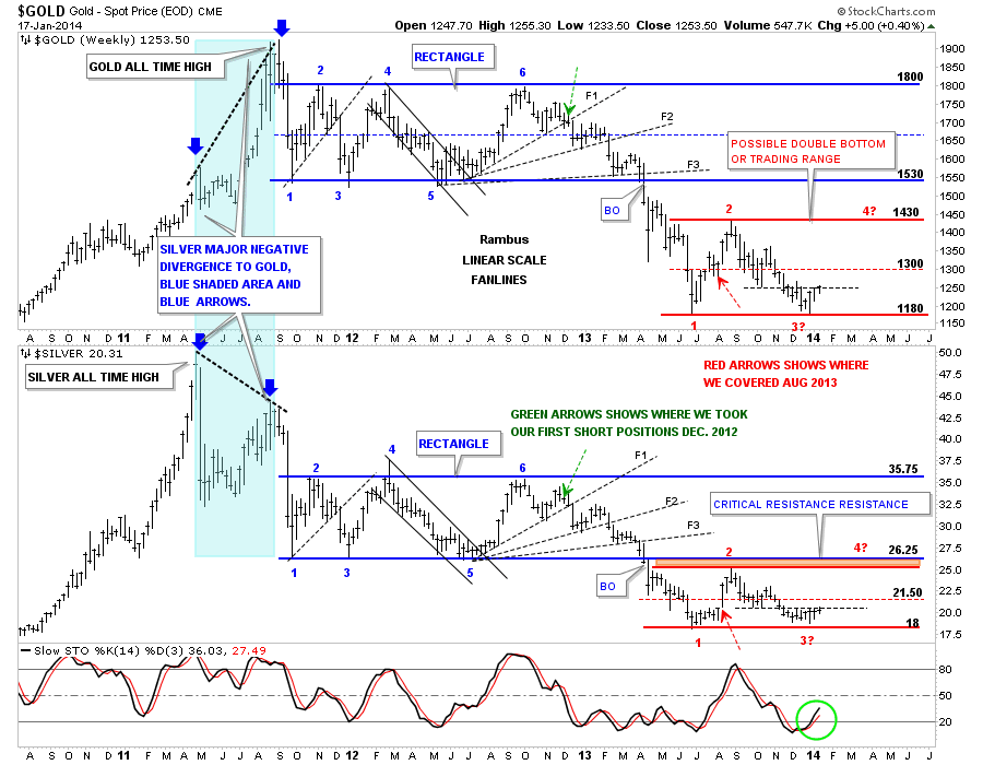
The chart below is a weekly combo chart that has gold on top and silver on the bottom. This charts shows gold and silvers near parabolic move up in 2011 with silver topping out first in April and gold topping out in September. Usually gold and silver tend to move together but not this time. The blue shaded area shows the massive divergence between the two. As is typical with parabolic rises the decline is just as fast if not faster than the rise. Even though they both topped out at different times they both began their long drawn out, blue 6 point rectangle consolidation patterns, at reversal point #1. I can still here the cries of manipulation as gold and silver broke down from their parabolic tops. From a Chartology perspective this is exactly what one would have expected to see happen after such a huge move up with no consolidation patterns to stem the decline once it got started. There is a lot of information on this chart so I’ll post it right here and we’ll look at it some more in just a bit.
As the chart above is showing gold and silver built out a beautiful 6 point blue rectangle that were consolidation patterns for the next leg down. The green dashed arrows shows where we took our initial position shorting the precious metals complex which was the first week of December of 2012 when it looked like gold and silver were putting in another top instead of breaking out to the topside. Again the sentiment was extremely bullish at that time as gold and silver were still testing the top of their trading ranges. Going short up there wasn’t as easy as it looks in hind site. Both the gold and silver could still have broken out to the upside as there are never any guarantees in the markets. What really gave me confidence to short up there was the first fanline labeled F1. I knew once the price action broke below it it would act as resistance on any rally attempt.
The red dashed arrows, in the red sideways trading range, is where we covered our shorts. It was actually when the HUI crossed above the 50 dma for the first time since the top was put in. As you can see we didn’t catch the exact top nor did we catch the exact bottom but we did capture the meat and potatoes of that big impulse leg down. Before we move on I would like to draw your attention to the breakout of the 6 point blue rectangles. Again cries went out about the precious metals were being manipulated, but from a Chartology perspective, this is exactly what a breakout looks like. The bulls were exhausted and there were none left to buy when the rectangles broke down so there was a vacuum where prices could easily fall. Once you can understand the psychology of these types of moves you can then begin to understand how markets move.
I would like to take one more look at this chart above which brings us up to our current market action. Now I wold like to focus on the red horizontal trading ranges on both gold and silver. As with the blue rectangles I’ve labeled our current red trading range with red numbers. As you know I’ve been pretty bearish on the whole precious metals complex for well over a year which turned out to be the right call as both gold and silver had some of their biggest declines going back many years. As you can see at reversal point #3, which I’ve labeled with a question mark, because we don’t know 100% for sure if this is actually the bottom, could be the beginning of the next rally phase. The daily chart is showing a double bottom in place and the placement of that double bottom at the June low is giving us a high probability that at least a tradeable low is in place. Note the thin black dashed horizontal line which is holding resistance that is taken off the previous lows made last fall in the red sideways trading range. That previous low is offering initial resistance right now. A break above that horizontal black dashed line will signal a strong move higher possibility to the top of the bigger red trading range.
The reason I’ve spent so much time on the charts above is because they show how extreme investor sentiment can become. From a parabolic euphoria to our bear market doom and gloom and every emotion in between. Back in December of 2012 very few analysis were calling for a bear market. Most were still talking about how high gold, silver and the precious metals stocks were going to soar.
Now I want to fast forward to the present day. What a difference a 2 1/2 year bear market can do to the sentiment. I’m just as guilty as the next guy that was, or is, looking for even lower prices. It’s hard to fight the herd especially after the drubbing the precious metals sector has taken over the last few years. What I’m seeing now, in regards to sentiment, is that everyone is now looking for lower prices. That is a huge change that often happens at turning points in a market. Right up to New Years Eve I was in the bear camp. When the precious metals sector opened for trading on the first day of 2014, with a big gap up, a warning bell went off for me. I had stated that we were at an inflection point where the precious metal complex could move in either direction for a decent move. For me the big gap up told me to exit all our short positions we had, and take our profits and run.
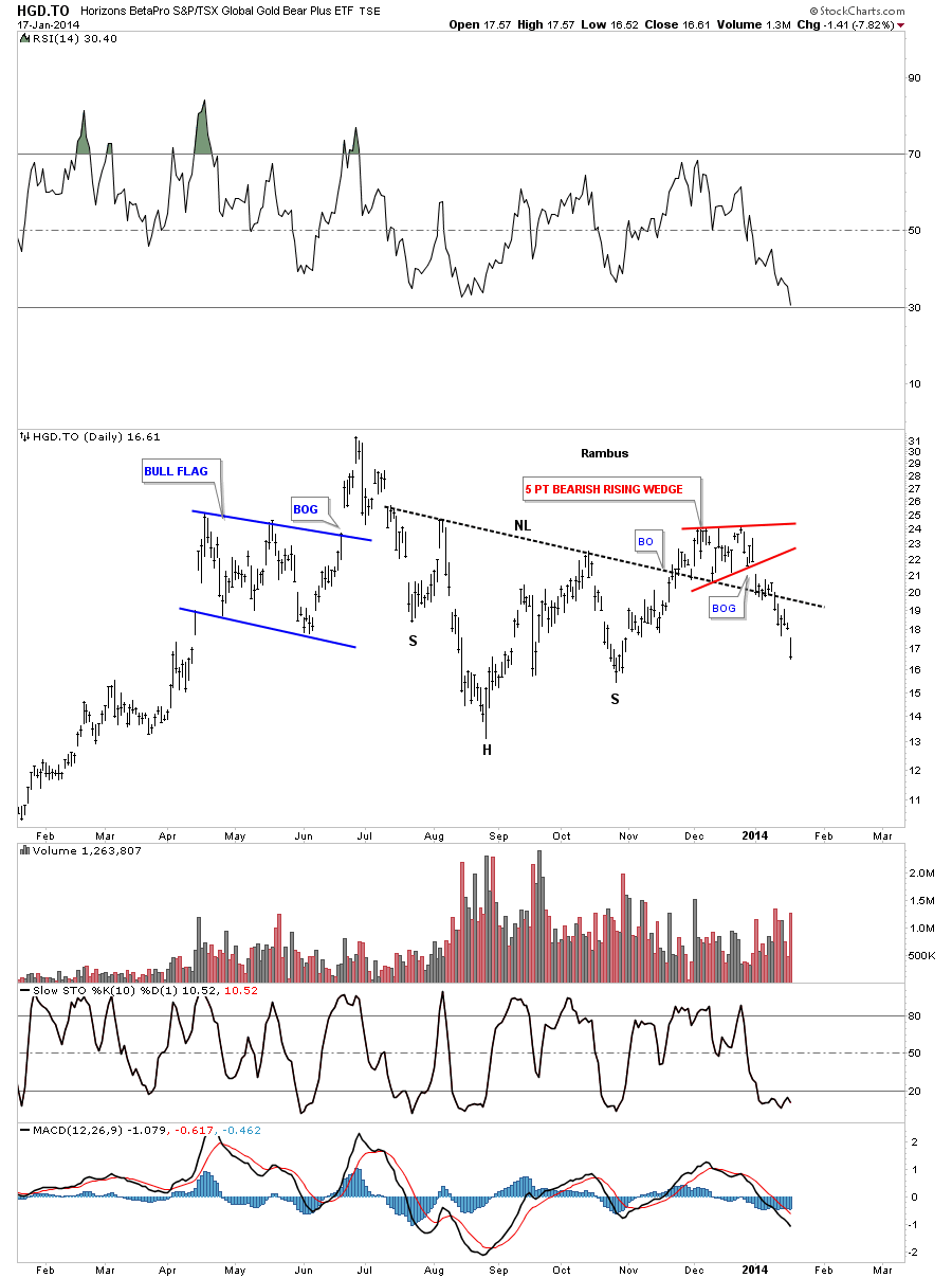
As we were short going into New Years Eve lets take a look at the HGD.To which is a 2 X short Canadian gold etf. As I stated earlier I thought we were at an inflection point which this chart clearly shows. Note the last bar inside the red rising wedge which closed almost right on the bottom rail, that was New Years Eve. As you can see we had a decent H&S bottom forming and the red rising wedge was forming right on the neckline. This is usually a bullish setup. Note the big gap down out of the red rising wedge that found initial support at the neckline. For me that breakout gap wasn’t supposed to happen if gold was going lower. We exited our short positions on that very same day, asking no question. When your expecting something to happen and the exact opposite happens then there is a conflict of interest and the best course of action is to get out until the dust settles.
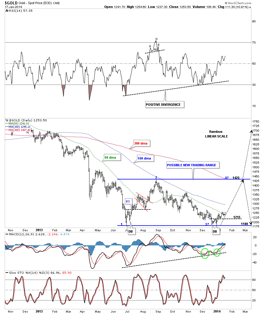
Lets now take a closeup look at gold”s possible rectangle trading range that I showed you on the charts above. Our small double bottom, at reversal point #3, is still holding and gold is beginning to slowly advance higher. Gold is now trading above the 50 dma with the all important 150 dma coming in just above. Also note the small double bottom that formed back at the June low that took the price action back up to the top of the trading range. So we now have a bottom in June and one in December. At this point it’s still too early to tell yet if we are going to end up with a big sideways trading range or if the potential double bottom, made from the June and December lows, is going to be a double bottom reversal pattern. All we know right now is that we have small bottom in place that is worth trading gold to the upside, IMHO.
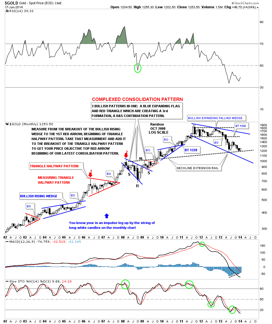
Next I would like to show you a very long term chart of gold that shows a possible bullish scenario. If the possible double bottom that has formed between June and December of 2013 is actually going to be a reversal pattern to the upside then this next chart shows how the 2 1/2 year consolidation pattern may look like. What I find encouraging is that the neckline extension rail, taken off the 2008 H&S consolidation pattern, has now been tested two times once in June and once December, our double bottom months. There is still a lot of trading to go for January but I would love to see a nice big white candle form right on the neckline extension rail. So far gold is up almost $50 for the month of January.
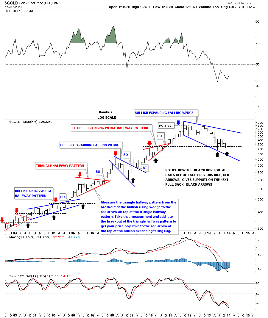
This next long term chart for gold shows how the tops of previous consolidation patterns work as support when there is a decline within an uptrend. Our current double bottom is showing up at the previous consolidation high. Note the blue bullish expanding falling wedge that formed back in 2008 that was part of the complex consolidation pattern as shown on the chart above.
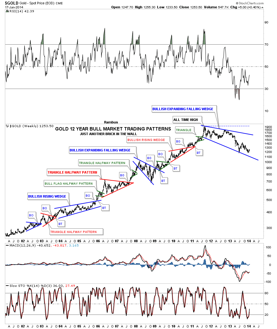
This next chart I would like to show you on gold’s long term chart that I call, “JUST ANOTHER BRICK IN THE WALL.” This chart has every consolidation pattern that gold has made during its bull market. As you can see our latest consolidation pattern is bigger than any other one before it. The 2008 blue bullish expanded falling wedge comes the closest to matching our current consolidation pattern in time and price. From a symmetry perspective our possible latest blue expanding falling wedge still looks like it fits in with the uptrend. Time will tell of course but I’m just keeping an open mind as to what possibilities may lie ahead for us.
There is another important development that has started to show up that I believe could be the most import piece of the puzzle. The precious metals stocks have started to outperform gold. Some of you that have been trading this precious metals bull market for many years will remember the parabolic moves gold and silver had in 2011, which we went into detail on in the first charts above. I remember how frustrating it was to be holding the precious metals stocks as the precious metals were going nuts to the upside. I don’t know about you but I can clearly remember how frustrating it was. We were seeing the perfect setup. Gold and silver were rocketing higher but our precious metals stocks could care less. In hind site that was a huge tell that a bear market of some size and duration was upon us. The precious metals stocks were talking to us if we cared to listen.
Now lets fast forward to the present. There is a subtle change taking place right now with the precious metals stocks. Unlike 2011 when gold and silver were making new highs and the precious metals stocks could have cared less I’m now seeing just the opposite happening. As gold and silver are still barley off the floor the precious metals stocks are starting to make some big moves to the upside. What is even more surprising is that the little juniors are out performing everything in the PM sector. You talk about a change of character?
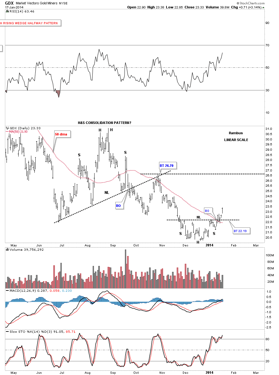
Lets start with the GDX that is showing us a small inverse H&S bottom is now in place. This is a small inverse H&S bottom but keep in mind it is forming at the end of a year plus decline. This is the perfect place to look for a reversal pattern. As you can see it’s trading comfortably above the 50 dma now that has been working as support lately.
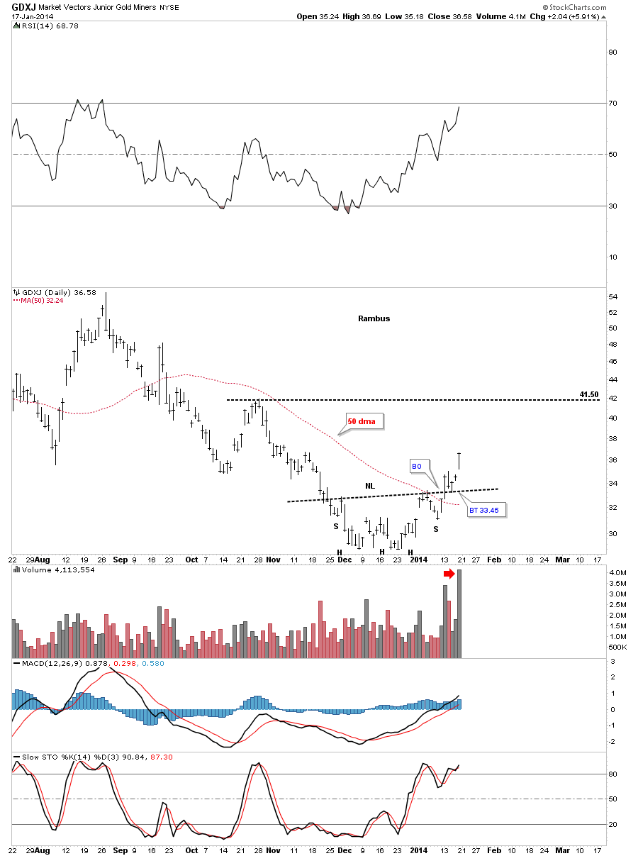
Lets now look at the GDXJ that is showing us a beautiful inverse H&S reversal pattern complete with a breakout and backtest. Keep in mind, even though this is a small inverse H&S bottom, it’s a reversal pattern and it could also be part of a bigger reversal pattern with this part being just the head portion of a much larger inverse H&S bottom. Also note the huge volume that has accompanied the breakout.
GDXJ of course is the Junior Miners ETF
Based on this action I have taken 6 Positions in Our Kamikazi Portfolio (from January 8th trough January 14).. in JNUG, the 3X ETF based on the GDXJ
Already in less than 3 weeks these positions are up 44% 48% 42% 24% 22% and 24% !
The leverage in a 3X ETF is astounding If you get in on it before an Impulse move . I Expect much more to come albeit with potentially
wild drawdowns .
For More Information on these Kamikazi Trades please read the sidebar category “Kamikaze Caution”
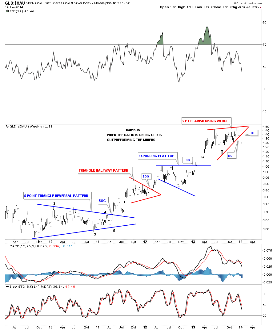
This next chart is a ratio chart that compares gold to the XAU. After under performing gold for so long it now looks like the the XAU maybe ready to start out performing again. This one chart I’ve been waiting patiently to finally confirm the PM stocks are finally going to take the lead like they did in the early years of the bull market. As you can see the ratio has broken down from the red 5 point bearish rising wedge that is now three weeks into the breakout.
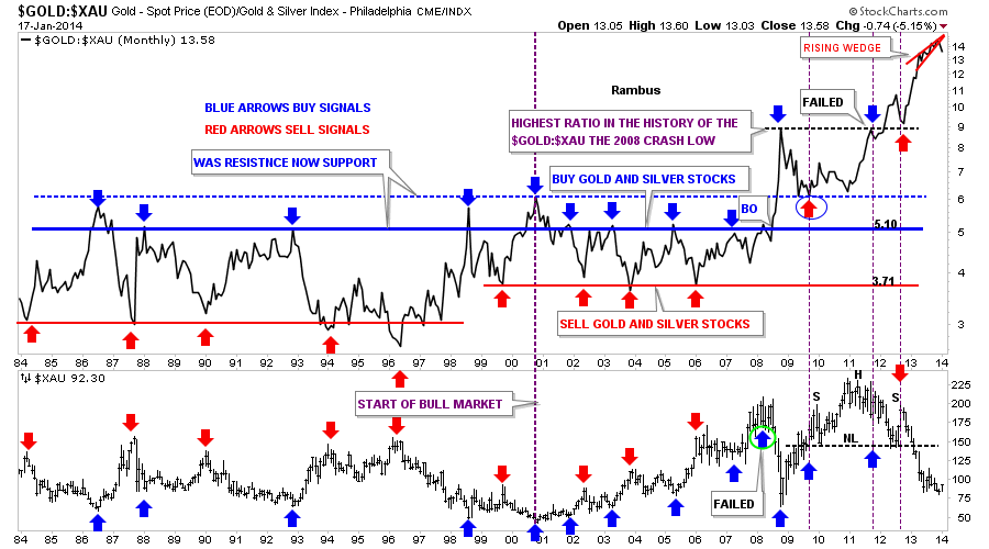
Below is a 30 year chart for the gold to XAU ratio that really puts into perspective how far out of whack this ratio is. Note our little red rising wedge in the top right hand corner of the chart.
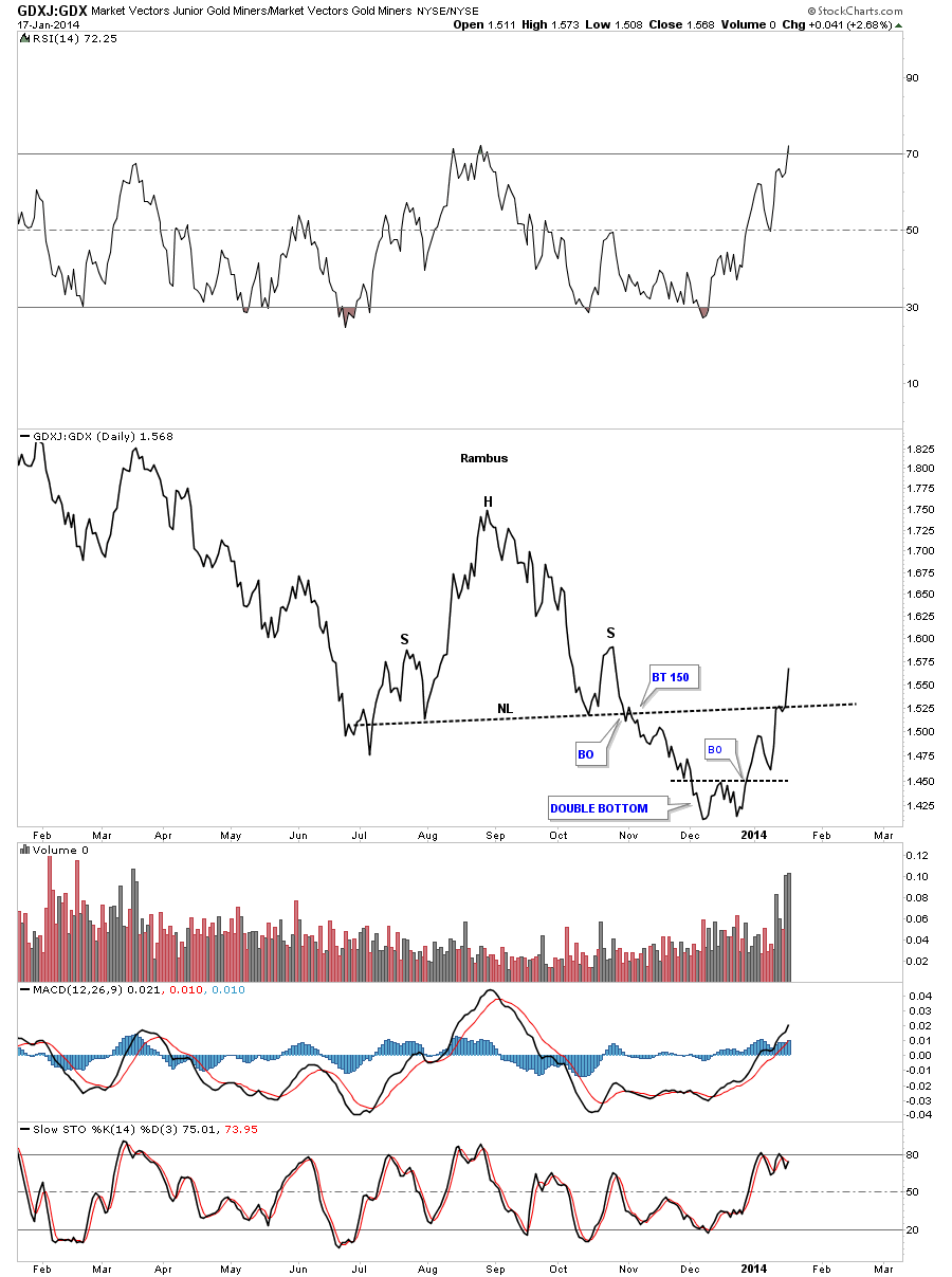
This next chart is a ratio chart that compares the juniors to the big cap PM stocks. Since putting in a double bottom in December the little juniors have been kicking the big caps butt. It’s always encouraging when you see the small caps, in the precious metals complex or even the stock markets, outperforming the big caps as it suggest there is some speculative money looking for a place to invest. Note the volume the last few days.
So for me the bottom line is the precious metals stocks are outperforming the metals which has been a rare event over the last year or so. This is the market talking to us right here just like it did in 2011 when just the opposite occurred. All we can do is follow the price action for more clues as things progress. There is a lot of work to do yet in the precious metals complex, that needs to be repaired, but there has to be a starting point somewhere and now could be that point. At the bare minimum we should have at least a short to intermediate term rally that may or may not be the start of the next major impulse leg up. With Chartology on our side we will be able to see what is unfolding before our very eyes and take advantage of anything the market gives us. All the best…Rambus

