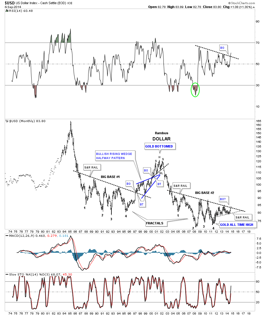
Tonight is a good time to look at some long term charts for the US Dollar and the Japanese Yen. I’ve been waiting for this day for more than a year now when I first created this long term US dollar chart. Some of our long term members will recall this monthly fractal chart that I labeled as having a Big Base #1 and Big Base #2 which are fractals as shown by the numbers on each base. At the time I thought we were ready to breakout above the almost 14 year S&R rail but as you can see the US dollar needed one more small move lower to finish off the big base #2. The breakout doesn’t look very impressive on this bar chart but it is happening.
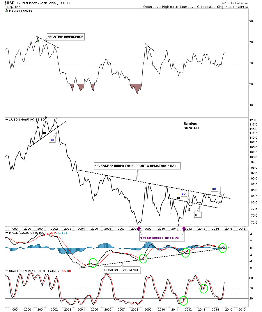
I have shown you many times that a line chart can often times gives you a quicker signal than a bar chart. Below is a monthly line chart that shows Big base #2 with the breakout in progress. Keep in mind this is a monthly line chart so the breakout won’t be complete unless the US Dollar can close the month of September above the big S&R line. It’s a good start to the month.
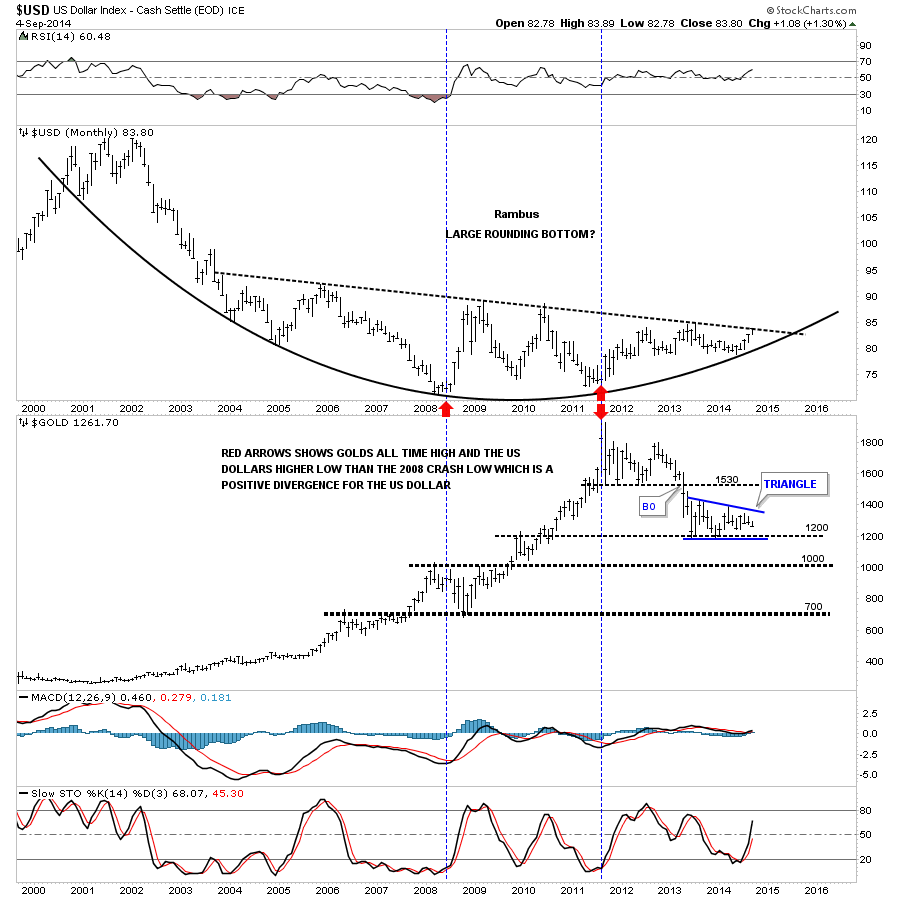
This last long term chart is a combo chart that has the US dollar on top and gold on the bottom. The main point of this chart was to show you the positive divergence the US dollar had vs gold. The red single arrow in 2008 shows how the US dollar was bottoming and gold was in its 2008 crash mode. Note how gold rallied all the way up to it’s bull market high in September of 2011 while the US dollar actually put in a small higher low vs the 2008 low. That’s pretty incredible when you think about it. Gold rallied from roughly 700 to 1920 while the US dollar actually made a higher low during that same time period, double red arrows. It’s easy to lose track of these big monthly charts as it takes a long time for them to come to fruition sometimes but the big picture is most critical to grasp.
Below is a daily chart for the yen that I showed you a week or two ago and how it broke out of the second blue triangle that is making up the bigger black falling wedge. After the breakout I thought we might get a backtest to the underside of the blue triangle but it’s beginning to look like that might not be the case now. Please note the brown shaded gap area that appeared this week. I think that gap is going to play a big role in the long term move for the yen which I’ll show you in a minute.
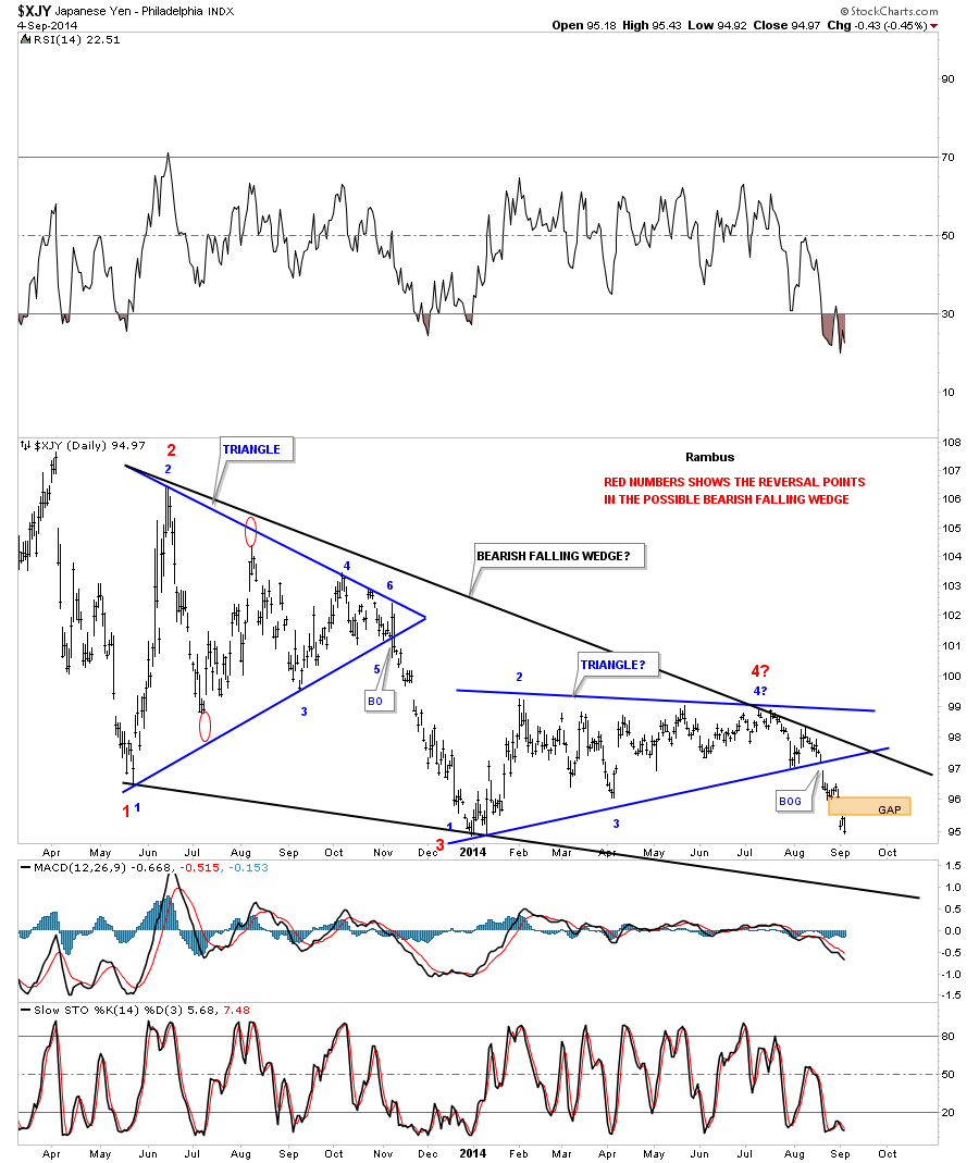
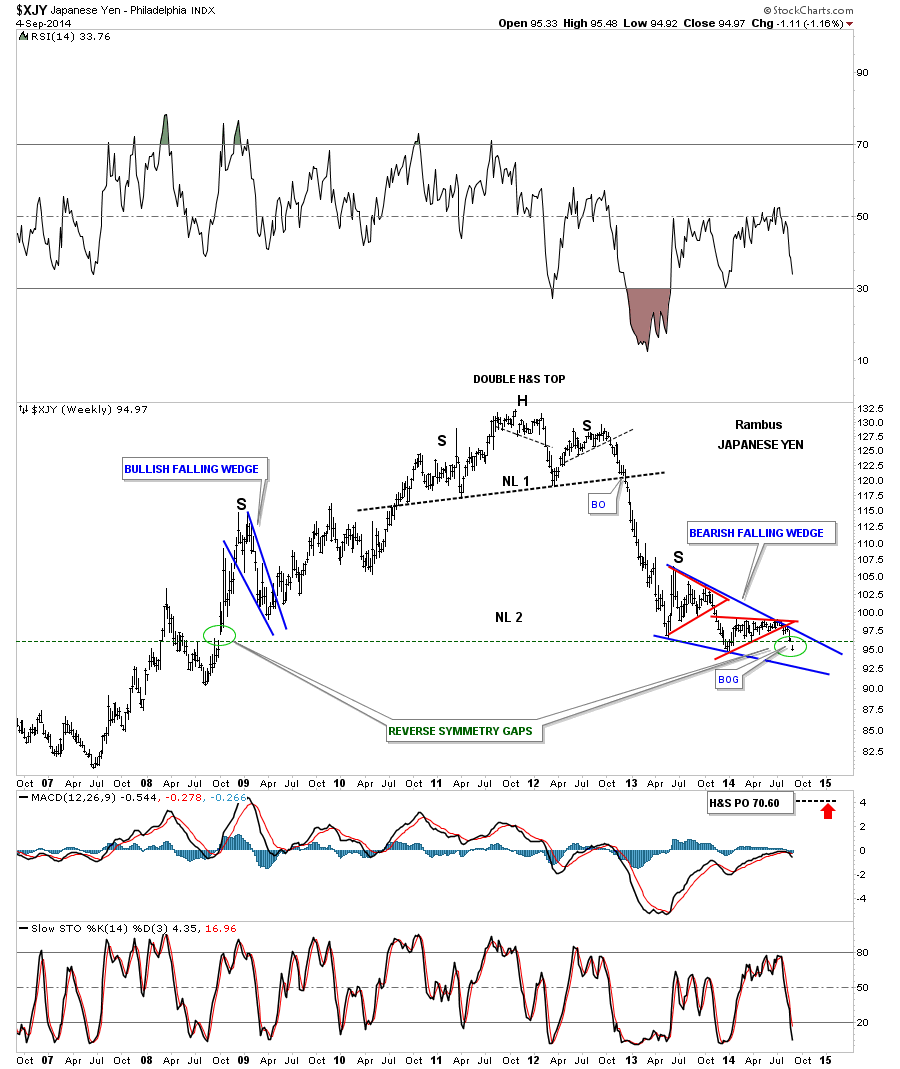
Below is a long term weekly chart that shows the two triangles that are making up the bigger bearish falling wedge which is the right shoulder of the massive H&S topping pattern. Note the last bar on the right hand side of the chart which shows the price action is now trading below the neckline.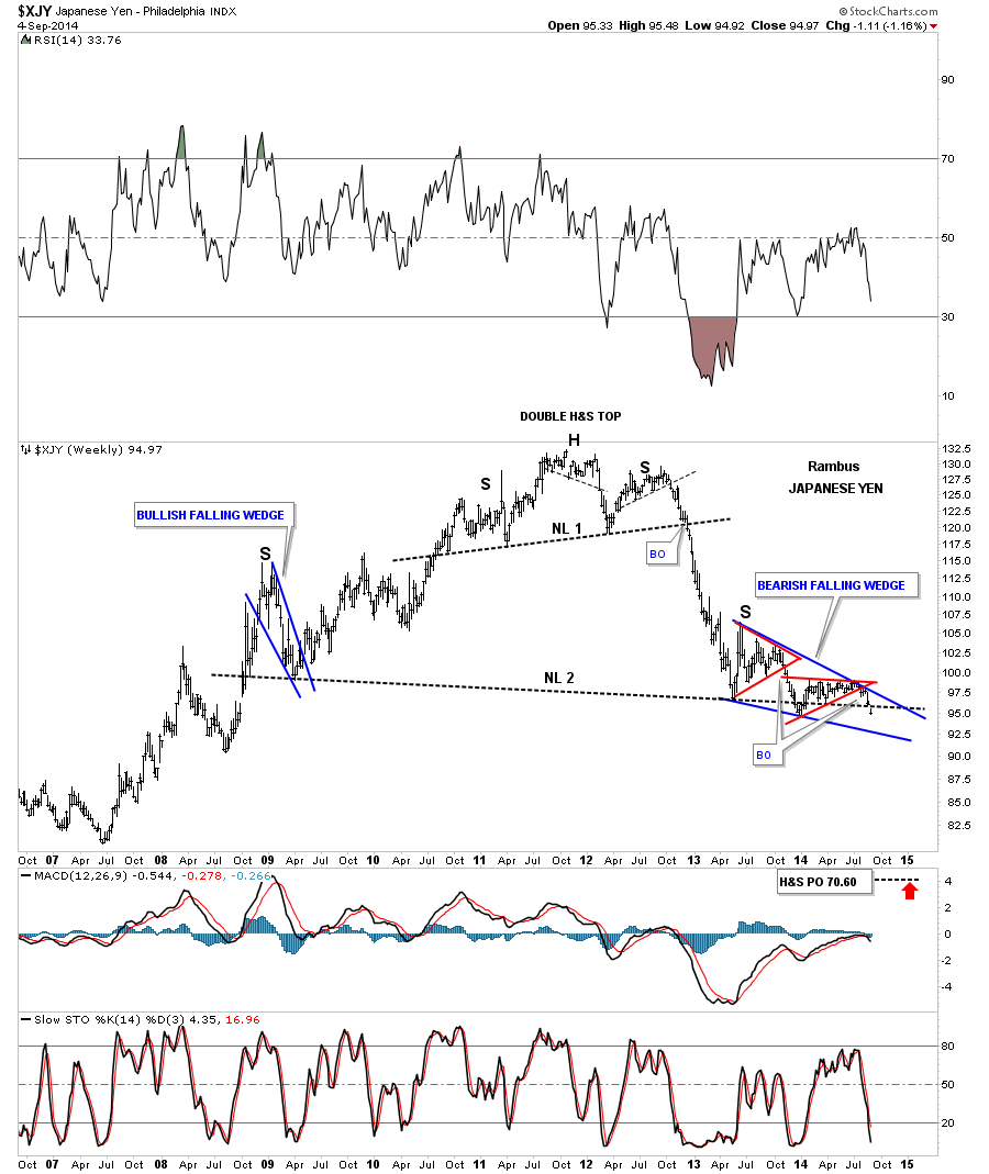
I’m going to show you the exact same chart only this time I’m going to leave the neckline off so you can see more easily the brown shaded breakout gap that is telling us that neckline is hot and that the breakout process is now in progress, green circle. These kind of days don’t come around very often but when we see the US dollar up close to a point and the yen breaking below a multi year H&S neckline, one has to take notice. The implications of today’s price action, in these two important currencies, will have a perfound affect on many markets going forward. Throw the euro in the mix, which looks worse than the yen, and that tells us something big is brewing that we’ll see happening over the coming months. It will be interesting to say the least.
PS: Note the reverse symmetry gap on the left side of the chart. It still blows me away when I see things like this.