CURRENCY WORLD :
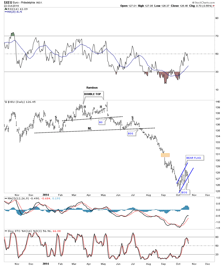
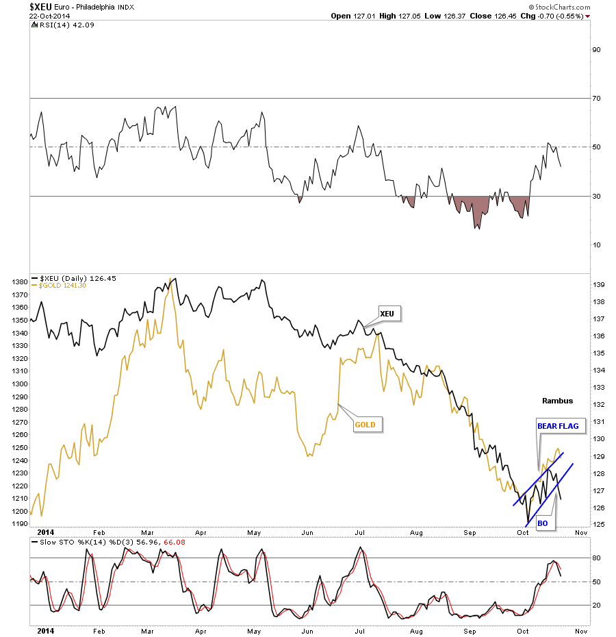
Lets start off the Wednesday Report by looking at several currencies that broke out today. As you know the Eruo has been one of the weakest currencies out there. Today’s breakout of a bear flag confirms there is more downside to come. This first chart is a daily look which shows the Euro formed a H&S top in the first half of this year and broke down sharply in late July. The Euro has been chopping out the blue bear flag for most of October which broke down today with a breakout gap.
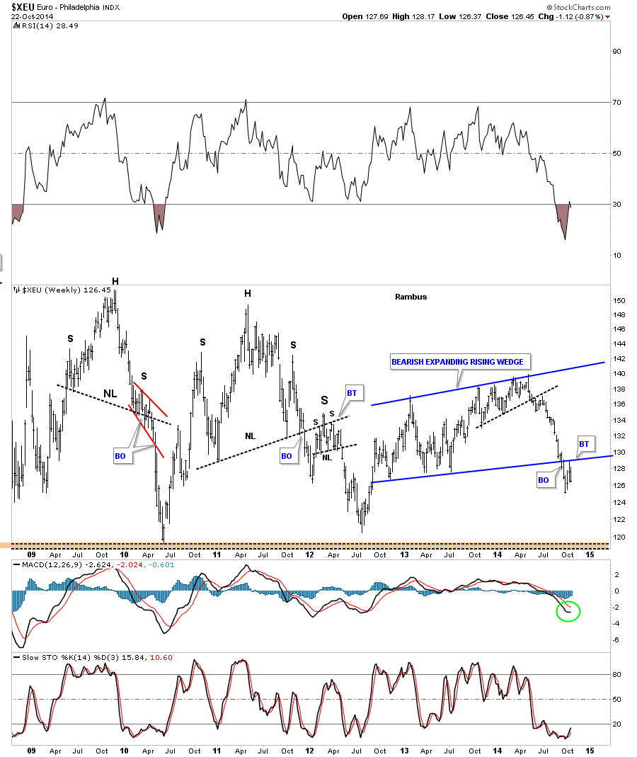
Below is a weekly chart I’ve been following very closely that shows the bear flag, on the daily chart above, was the backtest to the bottom rail of the bearish expanding rising wedge. This chart shows the second leg down is just getting started.
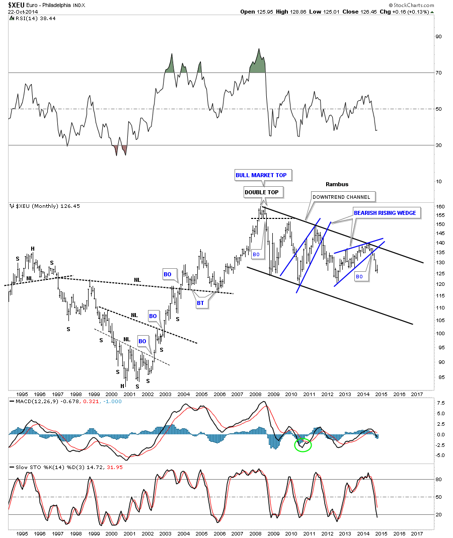
This long term monthly chart shows the break down from the bearish rising wedge and the impulse move that has been taking place since the breakout. The euro has been locked in the downtrend channel since topping out in 2008 with no end in sight.
In this last Euro chart I’ve overlaid gold on top of the euro so you can see how the two can trade together at times. Sometimes they move in lockstep and other times in the opposite direction. Since August of this year the two have been moving together fairly closely.
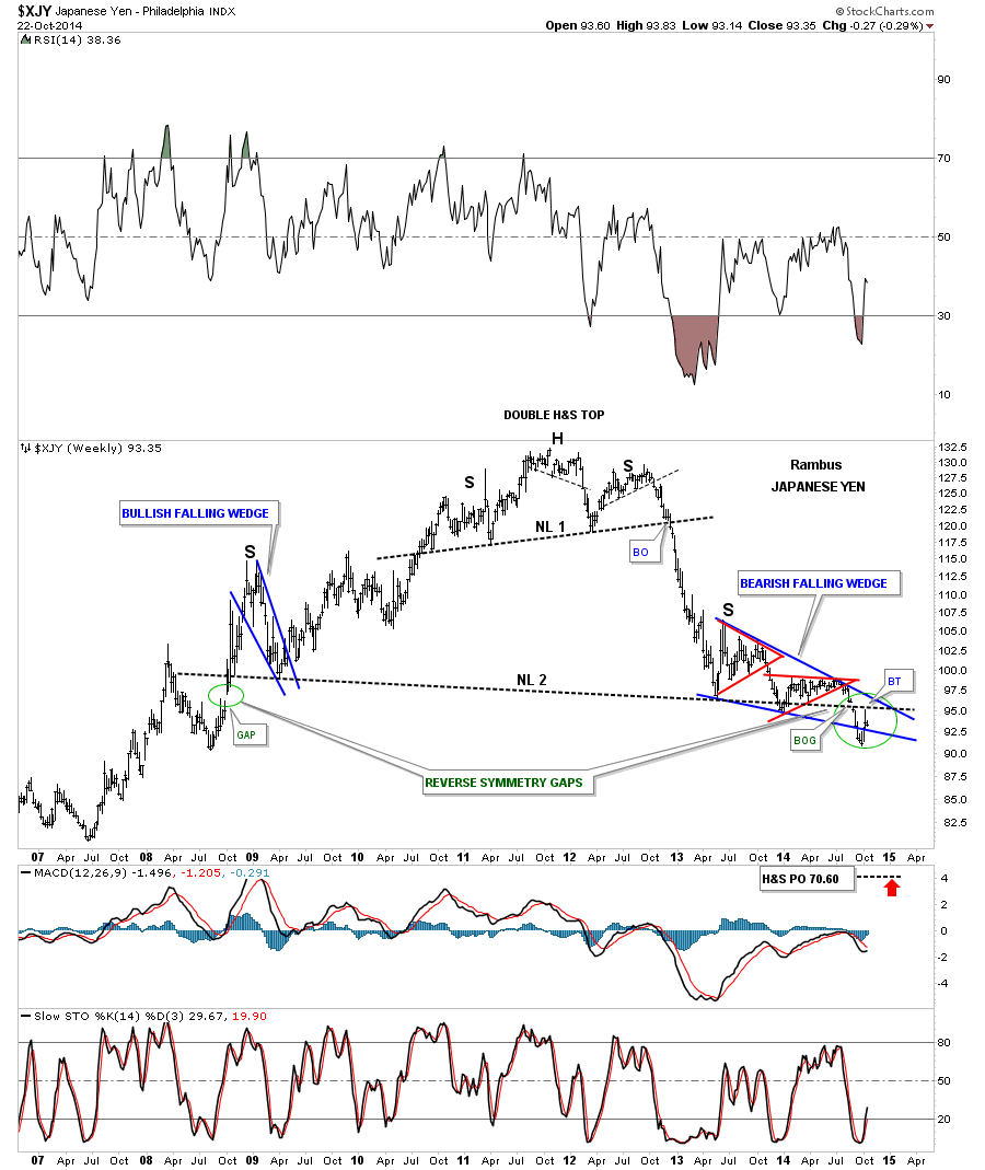
A quick update on the Yen shows the backtest last week to the area of the breakout gap from the massive H&S top, green circle. So far this is prefect Chartology. Now we need to see it break back below the bottom blue rail of the falling wedge to really get the move going to the downside as all the work will be completed in regards to the breakout and backtesting.
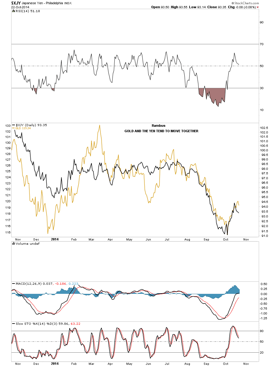
On the chart below I’ve overlaid gold on top of the yen so you can see the correlation between the two that has been pretty strong since the middle of July of this year.
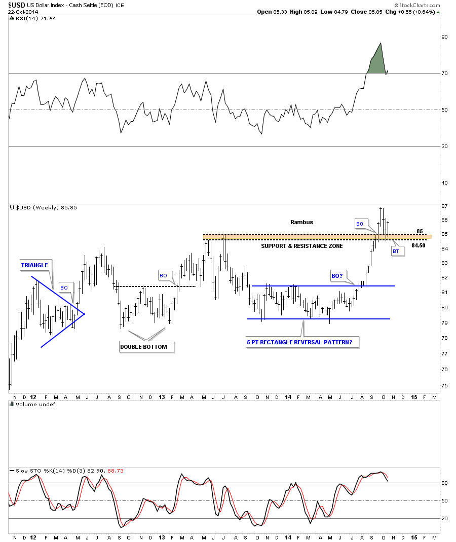
The daily chart for the US dollar shows it has formed a blue flag that is getting ready to breakout. Note the little red rectangle that formed just below the brown shaded support and resistance zone. That little red rectangle gave the US dollar the extra strength to finally breakout above the S&R zone. Now notice how our blue flag has been forming right on top of the brown shaded S&R zone. Again, this is perfect Chartology where resistance turns into support once it’s broken.
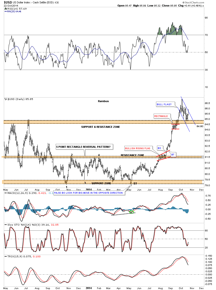
This long term weekly chart puts our brown shaded support zone in perspective. The bottom of our latest move up started with the blue 5 point rectangle reversal pattern to the upside. After reversing symmetry up the US dollar ran into the old highs where it just plowed right on through to the topside of the brown shaded S&R zone. The backtest was the blue flag I showed you on the daily chart above.
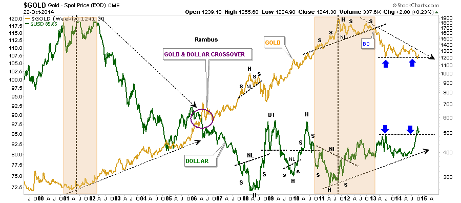
The last chart for the US dollar is a chart I’ve been showing for years where I’ve overlaid gold on top of the US dollar. I would like to focus your attention to the right hand side of the chart that shows a thin black dashed line, one on gold and the other on the US dollar, blue arrows. What the blue arrows show is how gold has been acting a little frisky recently while the US dollar has been chopping out its blue flag as shown on the daily chart. The US dollar has broken above its resistance line while gold is still finding support on its support line. Once the US dollar starts to rally I believe gold will finally break below its support line which is actually a descending triangle. You can clearly see the trend has been down for gold and up for the US dollar since 2011.
KAMIKAZI TRADE
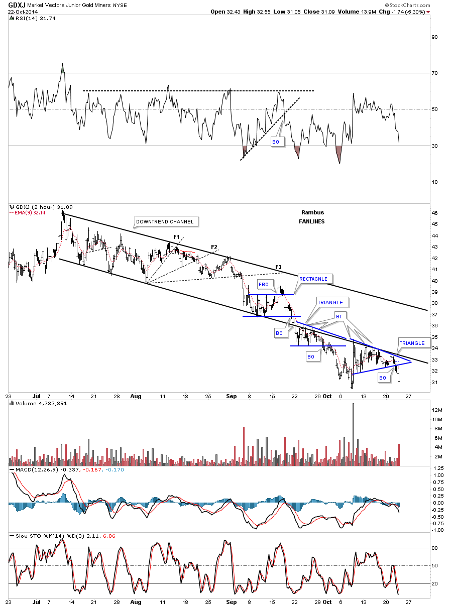
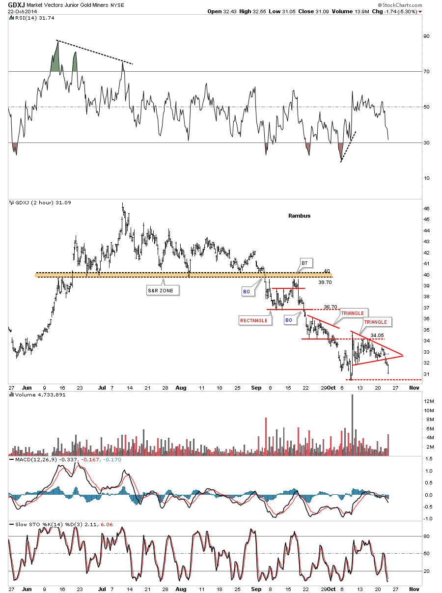
As you know I bought back most of the shares I sold several weeks ago on JDST today. The first chart is a 2 hour look GDXJ that shows the downtrend channel that has been in place since July of this year. Outside of the big rally several weeks ago the GDXJ has made lower highs and lower lows the whole way down. There were the three fanlines that helped in identifying the downtrend. Just below fanline #3 GDXJ formed a blue rectangle that had a false breakout to the upside but quickly turned right around to trade lower negating the false breakout. Next you can see the blue triangle that formed just below the bottom rail of the downtrend channel which gave us one consolidation pattern above and one below which I’ve pointed out many time is a bearish setup. As you can see the bottom rail of the downtrend channel has held resistance since it was broken to the downside in September. Today the bottom blue triangle broke out signaling a resumption of the impulse move lower. Confirmation will be when GDXJ puts in a new lower low.
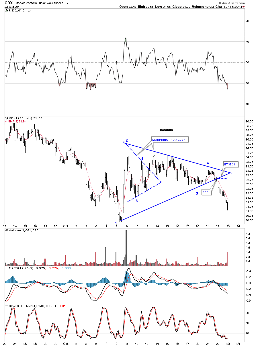
Below is a close up look, on the 30 minute chart I showed you this morning, of the morphing blue triangle. This is the reason I bought JDST in the fashion I did today.
Below is another 2 hour chart shows that shows you the downtrend channel from a different perspective. As you can see there has been one consolidation pattern followed by another since the breakout below the brown shaded support and resistance zone.
Below is a daily look for GDXJ that shows the most important chart pattern for this stock which is the blue bearish rising wedge. As you can see it hugged the bottom blue rail for about a week before gravity finally took hold and the decline began in earnest.
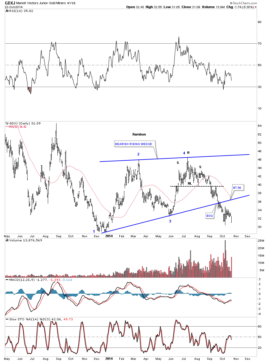
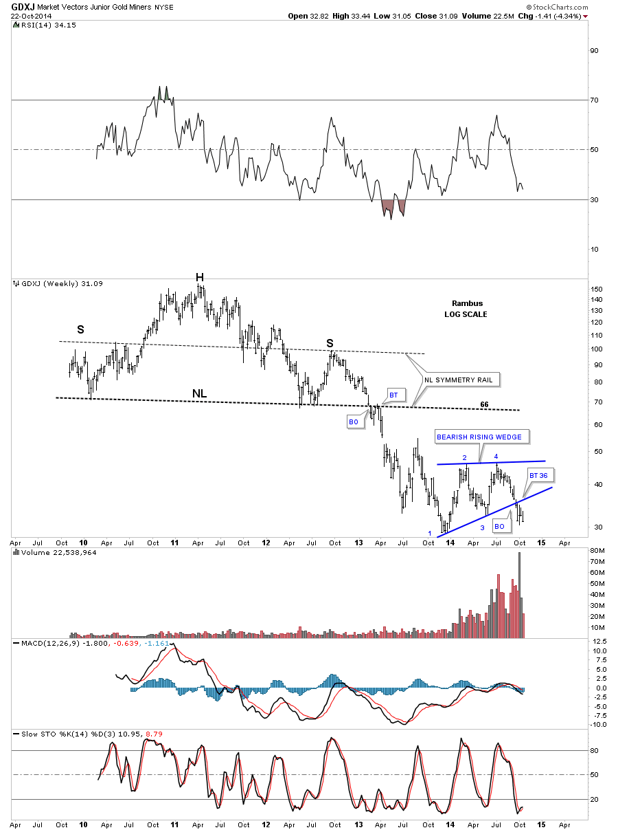
As the rising wedge is the most import chart pattern for the GDXJ I have to put it in perspective by looking at the weekly chart. Folks, it just doesn’t get any prettier. One can complicate things to make it much harder than what it is. Keep it as simple as possible.
US STOCK WORLD
As you know we’ve taken on some big positions in the different areas of the markets recently. We are now entering the toughest time when you take your initial positions. No stock or market goes straight up or down but more like two steps forward, in a bull market, and one step back. After moving 2 steps forward we are now taking our one step back if this is just a correction in an on going bull market. There is no way to know 100% for sure if we’re in still in a bull market or have entered into the dreaded bear market that everyone is claiming.
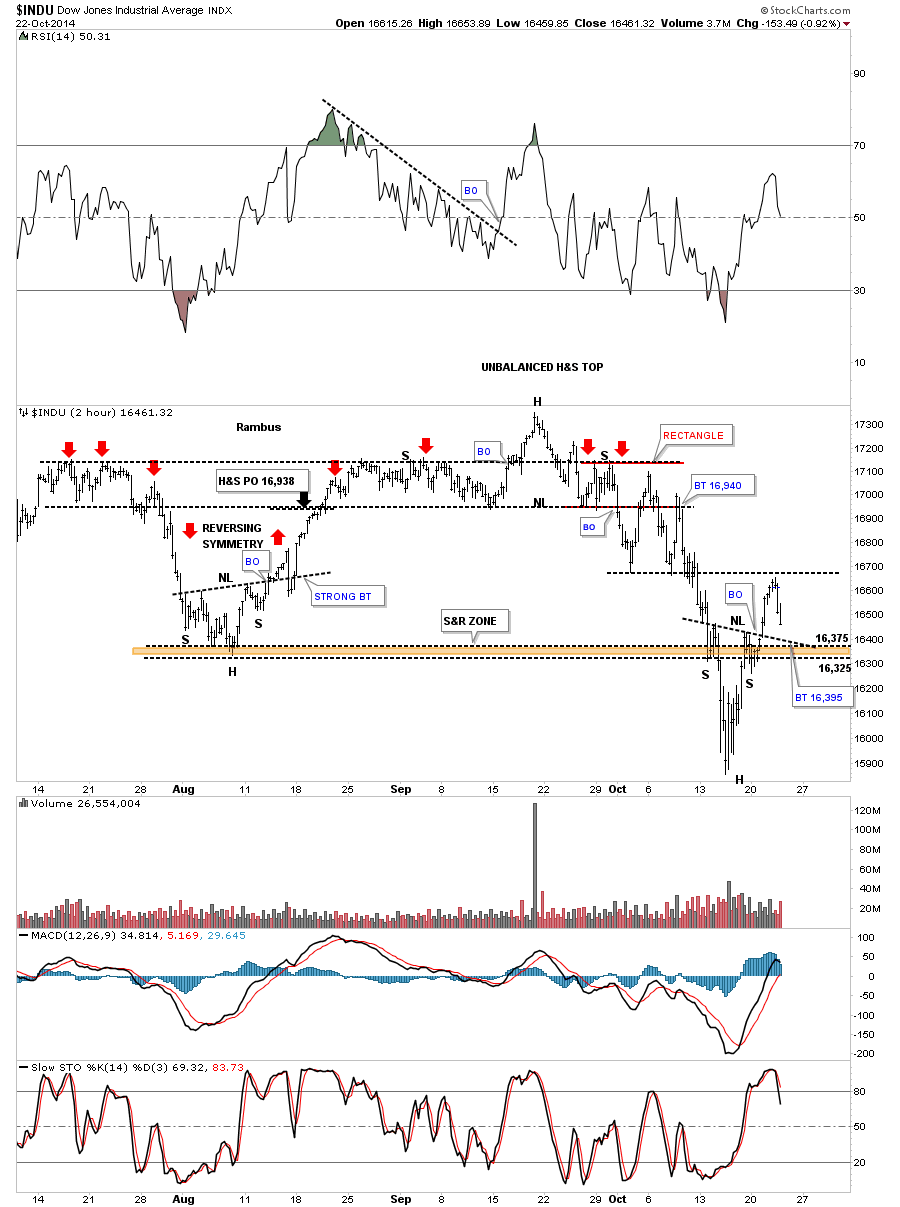
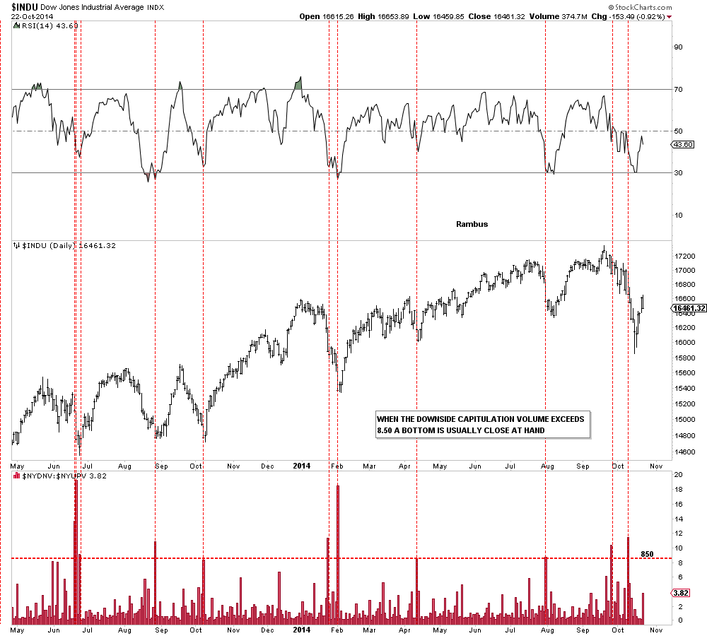
Lets start with a 2 hour chart for the Dow that shows the inverse H&S bottom that broke out and now is in the process of doing the backtest which would come in around the 16,395 area. You can see a similar inverse H&S bottom that formed at the August low that had a strong backtest but still worked out OK.
While we’re on the Dow I would like to show you the down to up volume chart that I’ve shown you recently. As you can see we’ve had 2 days where the down to up volume exceeded 8.5 which can be a good indication of some capitulation by the bulls. The capitulation volume doesn’t have to come at the exact bottom as you can see from previous capitulation bottoms.
Below is a 2 hour chart for the NDX that shows its inverse H&S bottom. The main concern I have here is the big gap that was made on the way up.
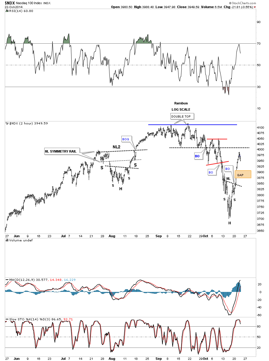
The NDX four horsemen are still positive.
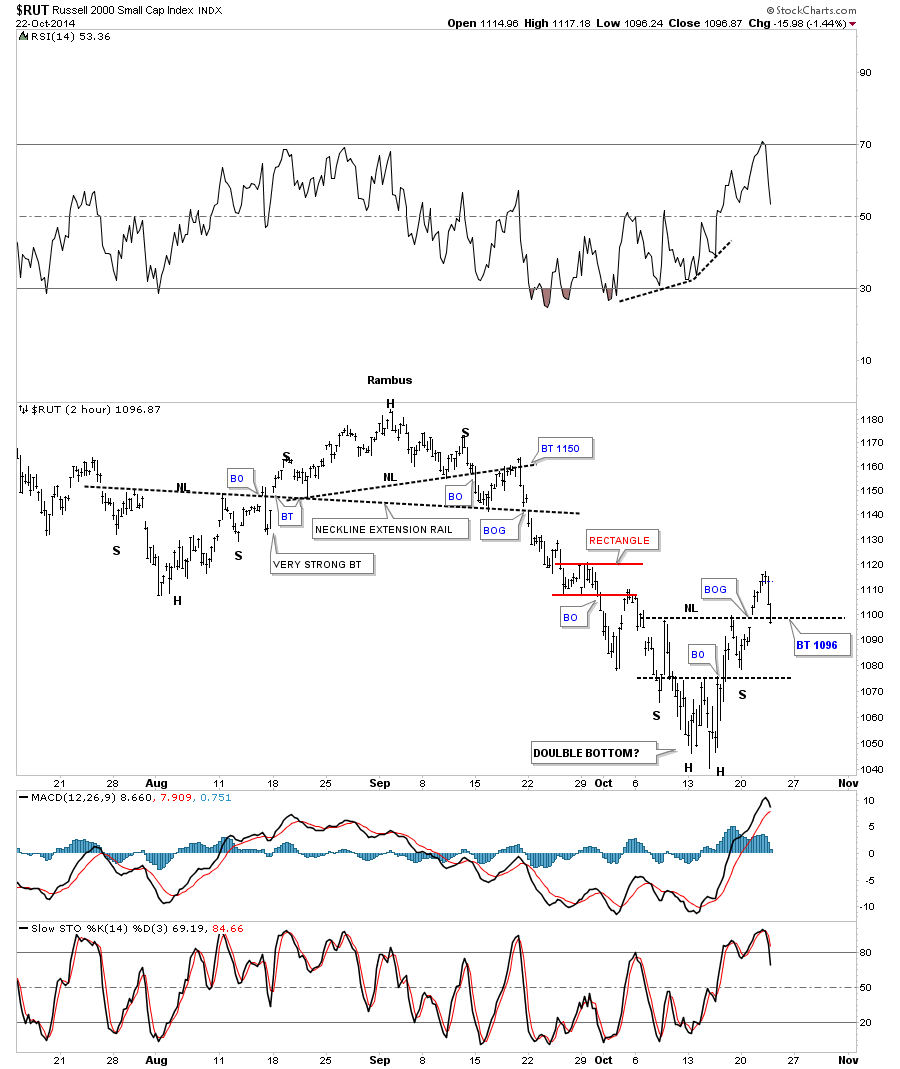
The 2 hour chart for the RUT shows it’s now backtesting the neckline. You can see the August inverse H&S bottom had a strong backtest before it began its rally. So far nothing is broken yet. Tomorrow maybe a different story though.
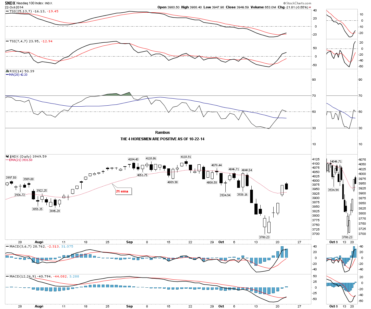
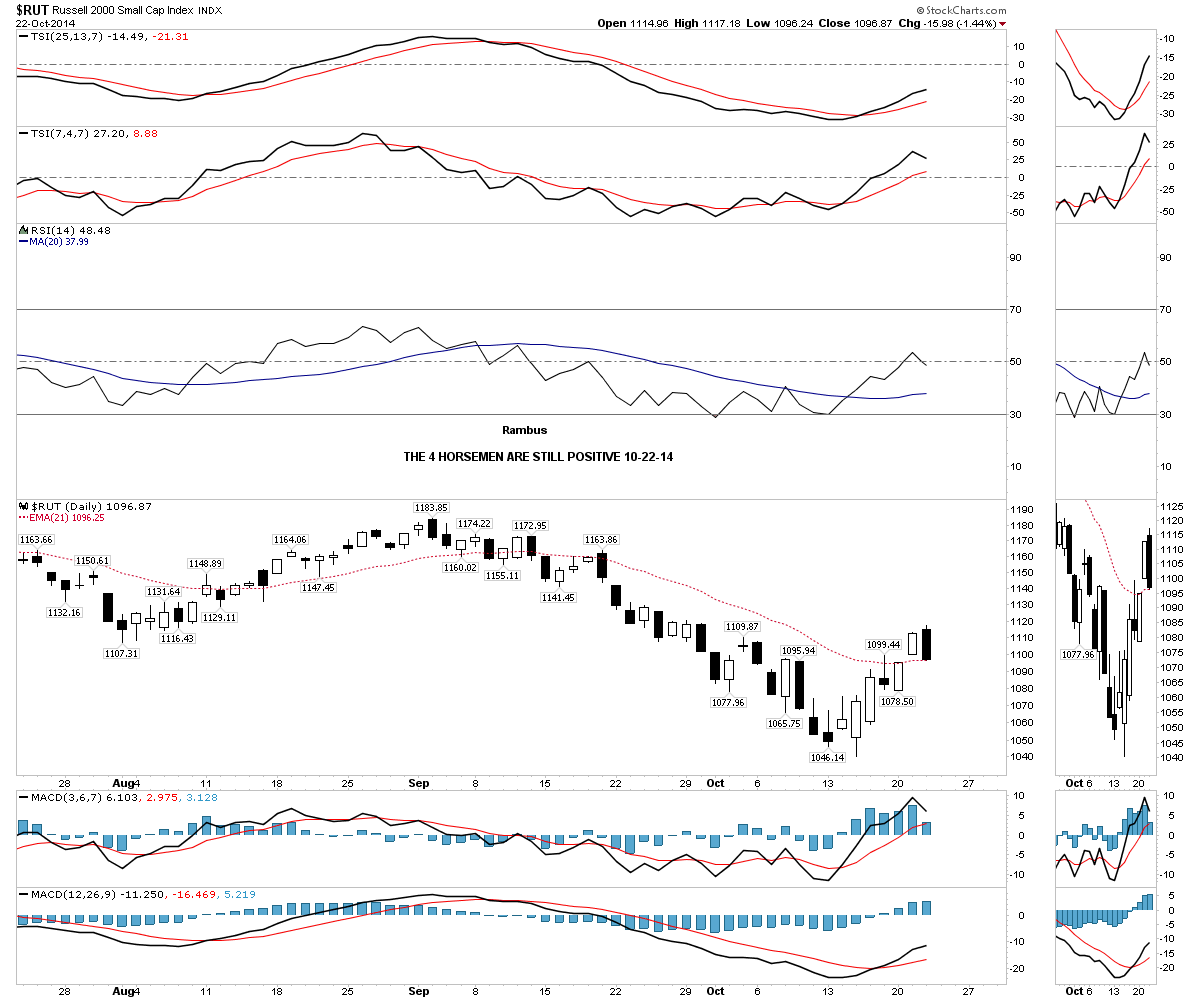
The 4 horsemen are still positive.
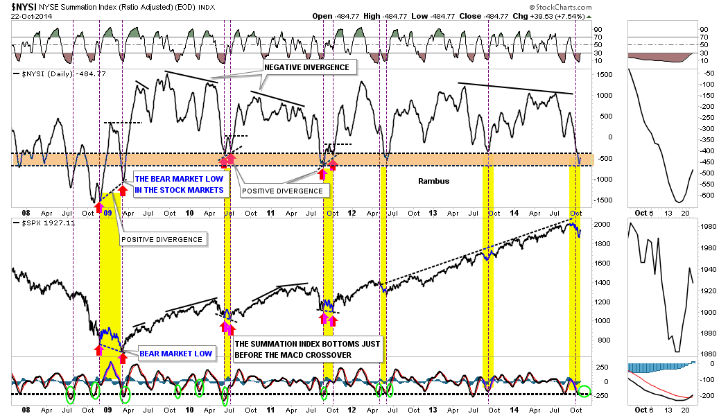
As it is getting late there is one more chart I would like to show you which is the NYSI Summation Index. Normally when the Summation Index gets down to the brown shaded area a bottom is usually pretty close at hand. The exception being is when the markets are in crash mode like the 2009 decline. Many times you will see a double bottom where the SPX will make a lower low while the Summation Index will make a higher low, which is a positive divergence. Our current correction has been the strongest one since the 2011 low. What I’m looking for is for the Summation Index to turn up first, which it has, and then for the MACD to crossover to the upside, which it has. The only question is, will we see a double bottom as seen in 2009, 2010 and 2011? Stay tuned as things are starting to get really interesting.
All the best…Rambus