
In part two of this Weekend Report I want to take an indepth look at the US dollar as many of the important currencies of the world all seem to be making important moves right now. If that is true then the US dollar is also in the process of making an important move in the opposite direction.
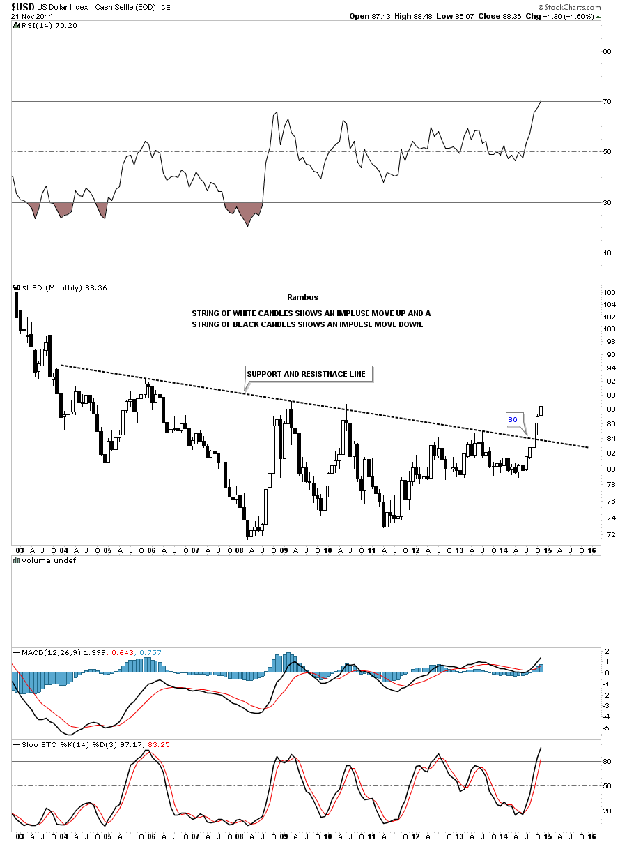
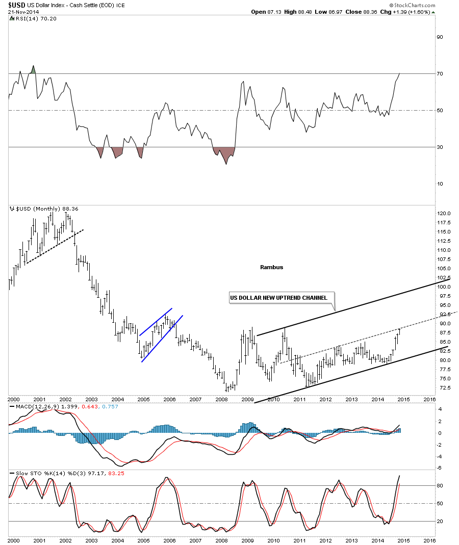
Below is a long term monthly chart for the US dollar that shows black and white candlesticks. In a strong impulse move down you will see a string of back candles all in a row and in a strong impulse move up you will see a string of white candles all in a row. If the US dollar doesn’t crash and burn during this last week of trading for November, it will have completed it sixth month in a row of white candles sticks. This is telling us the breakout move from the massive ten year base is underway and is looking healthy. Remember big bases equals a big move and a small base equals a small move. It’s all relative.
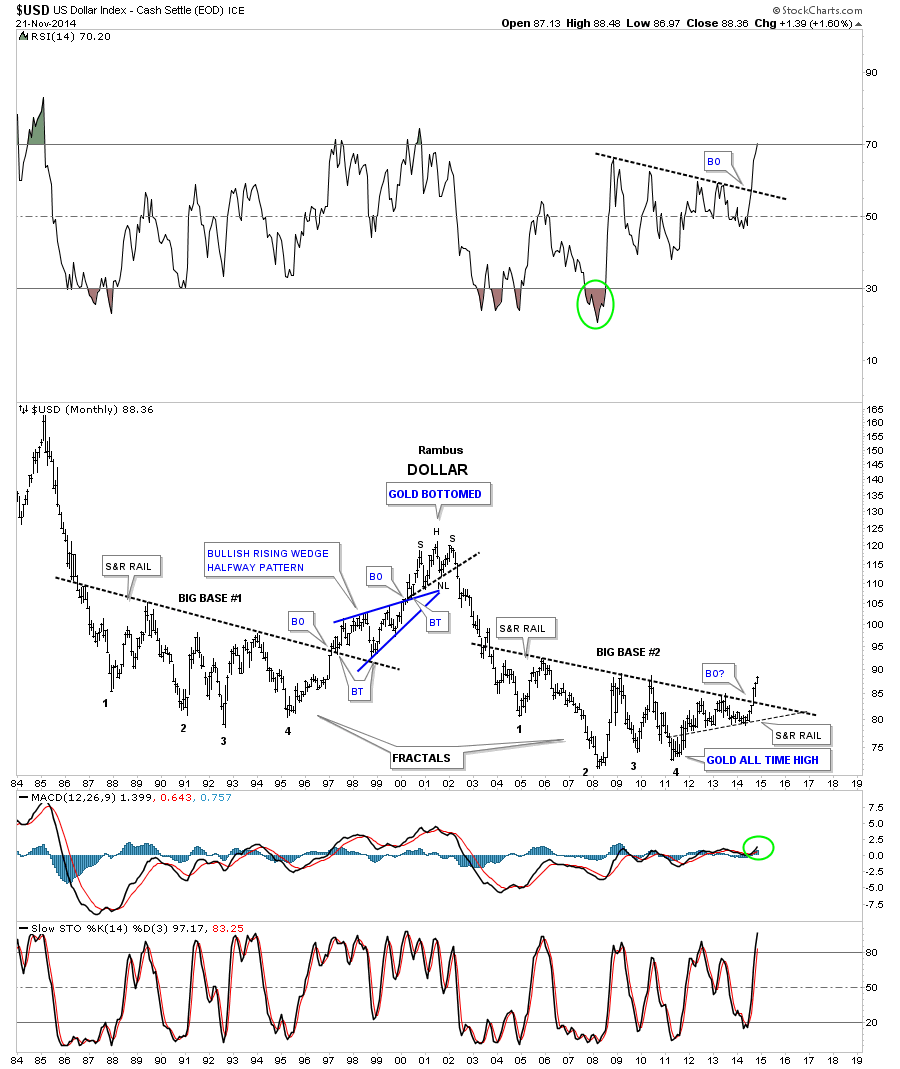
The next long term chart for the US dollar is a monthly look going all the way back to 1984 which shows its all time high around 160 or so. As the US dollar declined from its all time highs it began to form a huge base which I labeled as, Big Base #1. When the dollar broke out of that big base #1 it led to a move to the 120 area in 2000 which started the bull market in the precious metals complex and the stock markets started their cyclical bear markets. The move above the big base #1 S&R line, support and resistance line, lasted about three years. The US dollar built out a beautiful blue bullish rising wedge that formed at the halfway point to the 2000 top. The ride up wasn’t an easy one as you can see from all the chopping action during the formation of the blue rising wedge and this is a monthly chart. The big base #1 had two backtest to the S&R line before the impulse move really got going up to the 120 top. We have a well defined line in the sand now. As long as the US dollar trades above big base #2 S&R line it will remain in bullish mode.
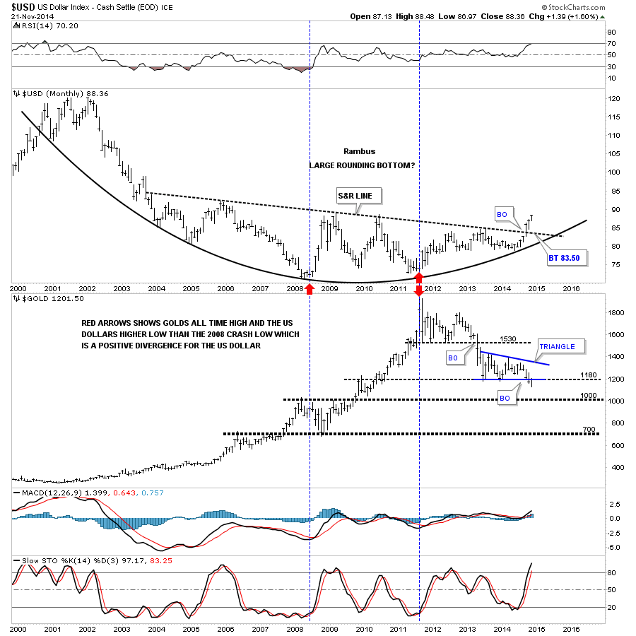
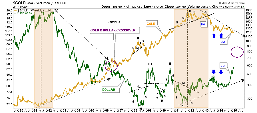
Lets look at one more monthly chart that is a combo chart that has the US dollar on top and gold on the bottom. This chart shows a huge rounding bottom formation that began at the 2001 high. The red arrows shows the first positive for the US dollar vs gold. In 2008 the dollar bottomed and rallied while gold was building out its biggest consolidation pattern for the bull market up to that time. The divergence came in 2011 when gold made its all time high at 1920. One would have thought the dollar would have collapsed during that nearly parabolic run higher in gold but in fact the dollar made a higher low vs the 2008 low. That was a major divergence that told me the US dollar was finished with its bear market and gold was probably finished with its bull market which so far has been the case. As you can see on the gold chart it made a multi year low for the month of November while the dollar made a new multi year high for November which is as it should be.
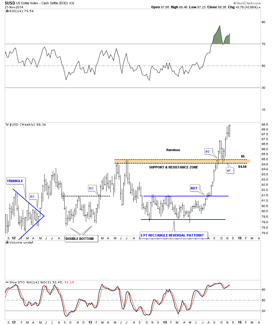
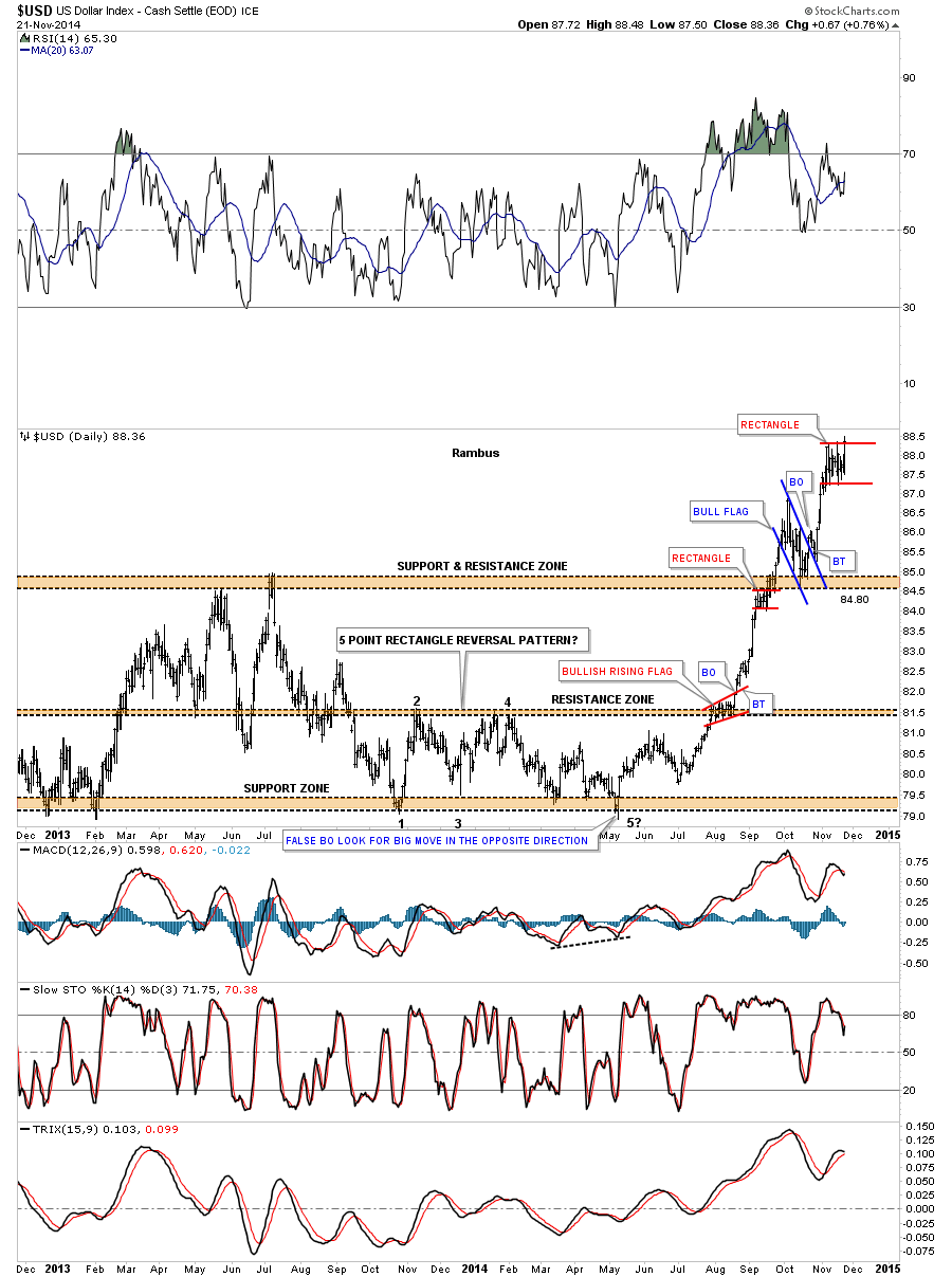
Lets now zoom in to the current price action looking at the weekly chart. The dollar made a blue five point rectangle reversal pattern that kicked off the breakout move above the S&R line on big base #2. That move gained momentum as it reversed symmetry up through the same area it came down through in 2013. The initial impulse move up was so strong it broke above the brown shaded support and resistance zone before finally getting a chance for a backtest which was dead on the money. Since the backtest at 84.50 the dollar has been rallying very strongly. So far there is nothing not to like about this move.
The daily chart for the US dollar shows all the small chart patterns that have formed since this impulse move began off the 5th reversal point on the rectangle reversal pattern. When the dollar had that false breakout of the bottom S&R zone, at the 5th reversal point, I added a note at the time that said, if this is indeed a false breakout we could look for a big move in the opposite direction. I wonder if anyone remembers that time. Back then the bars were much bigger compared to how they look now. As the dollar rises higher all the bars will look smaller and smaller. Note the small red rectangle at the top of the chart. Is this going to be just another consolidation pattern that breaks out to the upside or is it going to reverse the impulse move up that began at the 5th reversal point on the rectangle? At any rate the move from the 5th reversal point is what a strong impulse move looks like.
Below is another combo chart that has the US dollar on top and gold on the bottom. If you look to the right side of the chart you can see some inverse price action taking place. Note the dollar made the blue bull flag while gold made a blue bearish rising wedge. Now both the dollar and gold are locked into their current little red trading ranges that has yet to be decided which way the breakout will occur. I get the feeling that most are looking for the dollar to correct and gold to rally strongly higher. As always time will tell the story.
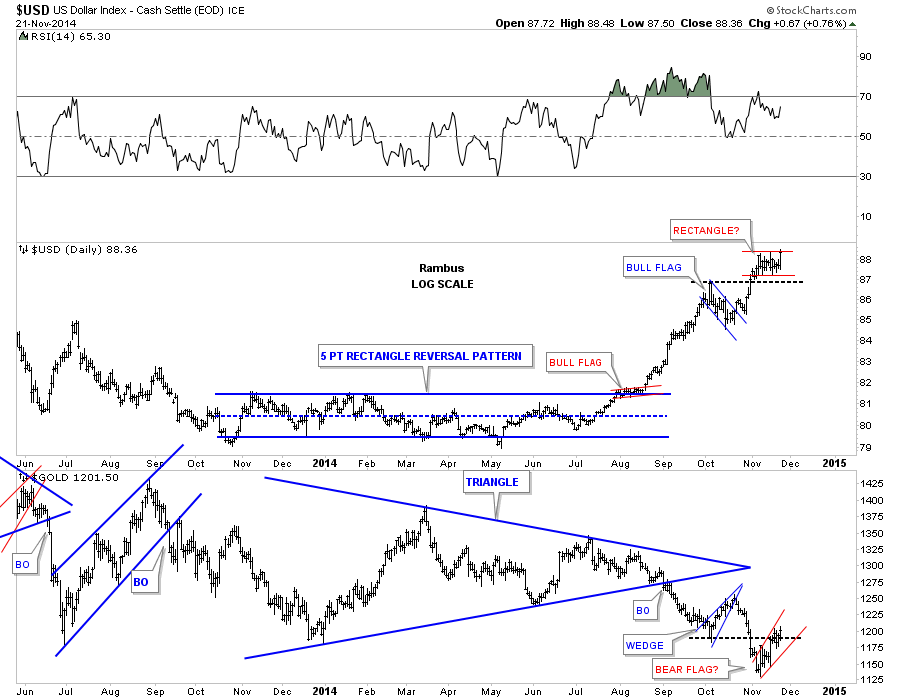
Below is the same combo chart but this one goes back further in time and shows the blue 18 month triangle on gold. I don’t have to tell you how critical this area is for gold and the US dollar for that matter.
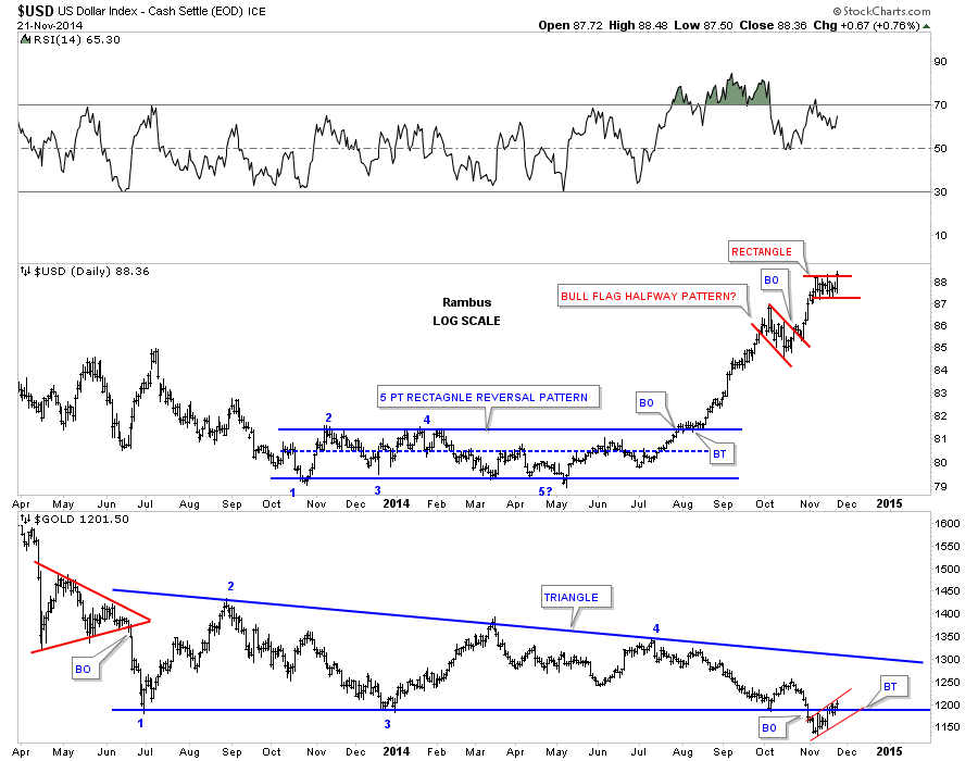
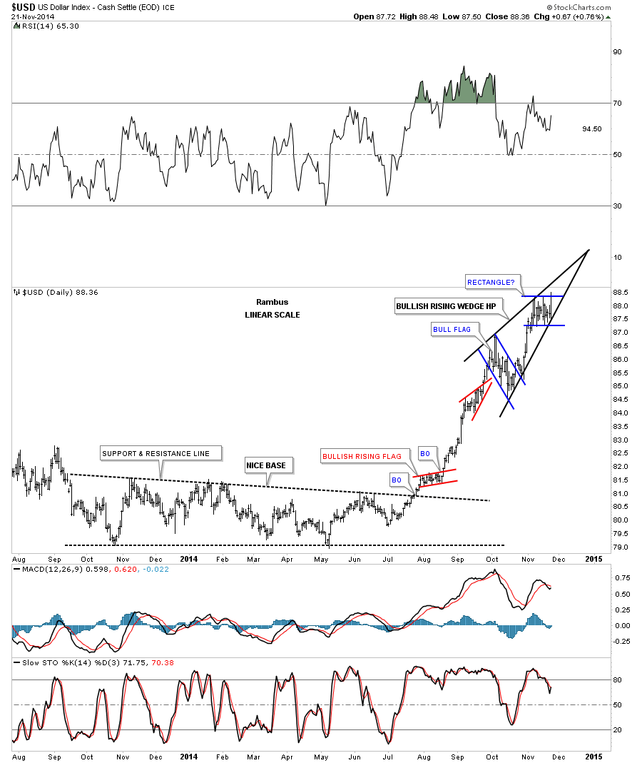
Now I want to get on to the main theme of this US dollar post which is looking at the shorter term daily charts. As I showed you in part #1 of the Weekend Report, many of the important currencies of the world were forming potential bearish falling wedges on their daily charts. If that’s the case then the US dollar should be forming a similar pattern only in the opposite direction. Lets start with the daily chart for the US dollar that Ive been showing you for several weeks or so that shows two small consolidation patterns forming one on top of the other. The lower pattern, the blue falling bull flag, is your topical bull flag that is sloping against the uptrend. As you can see it failed to deliver on the price objective, up to the 91 area, before we seen another consolidation pattern forming the possible blue rectangle. This is now setting up the possibility that the US dollar is building out a bullish rising wedge pattern that will slope up in the direction of the uptrend.
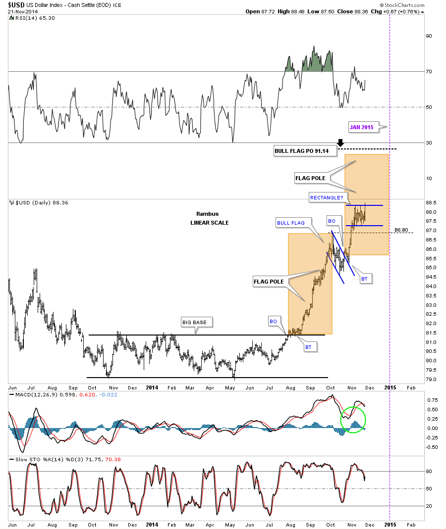
Now lets put on the upper and lower trendlines connecting these two small chart patterns and see what we get. You can defiantly see a rising wedge taking shape. Keep in mind the rising wedge won’t be complete until the price action breaks above the top rail so it’s still a work in progress. If the rising wedge does breakout to the upside we’ll have a very big clue that this impulse move up is only halfway through and we can expect a similar move that led up to the first reversal point in the rising wedge. Note the two smaller red consolidation patterns that are slopping up into the uptrend.
There is an old adage on Wall Street that says if you see the US dollar and the stock market rising together that is bullish for the stock market because capital from overseas is finding its way to the US markets. Since the October low both the US dollar and the SPX have been rising together. Coincidence?
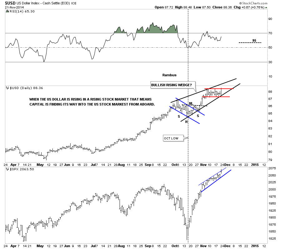
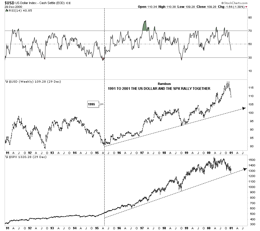
A perfect example of this happening was back in the mid 1990’s when the US stock markets were in the parabolic phases of their bull markets that actually started in 1995. The dollar and the SPX both topped out fairly close to each other in 2000. This is the point that set the stage for gold’s bull market to begin.
There is one more thing I would like to show you on what I think is happening with the US dollar right now. I don’t think anyone has picked up on this potential development yet. When a trend changes from from down to up there is usually a lot of chopping action at the bottom followed by the initial rally off of that bottom. During that initial rally phase a trend channel can form that defines the new uptrend. On the dollar chart below you can see a clear trend channel that has been forming since the bottom in April of 2011. As of the close on Friday the price action close right at the top of the channel. This is the point I want to try and tie everything together and show how the potential bullish rising wedge is so important to the big picture right now. Where it’s forming is critical which is just below, what I’m going to call the mid line of the new uptrend channel. Many times when a new trend is reversing from down to up, which is the case for the US dollar right now, the initial move up is huge which doubles the lower channel. As you can see on the chart below the dollar is sitting right at the mid line. If I’m correct we should see the bullish rising wedge breakout to the upside taking out the mid line of the brand new uptrend channel for the US dollar. This initial move up will be fast and furious equal to the first leg up off of the April low. The blue rectangles are what I call measuring sticks that measure each half of the new uptrend channel. The black arrows shows the last impulse move down into the ultimate bottom in April of 2011. I think we are going to reverse symmetry that move down into the 2011 low with our current rally phase capturing half of that move already.
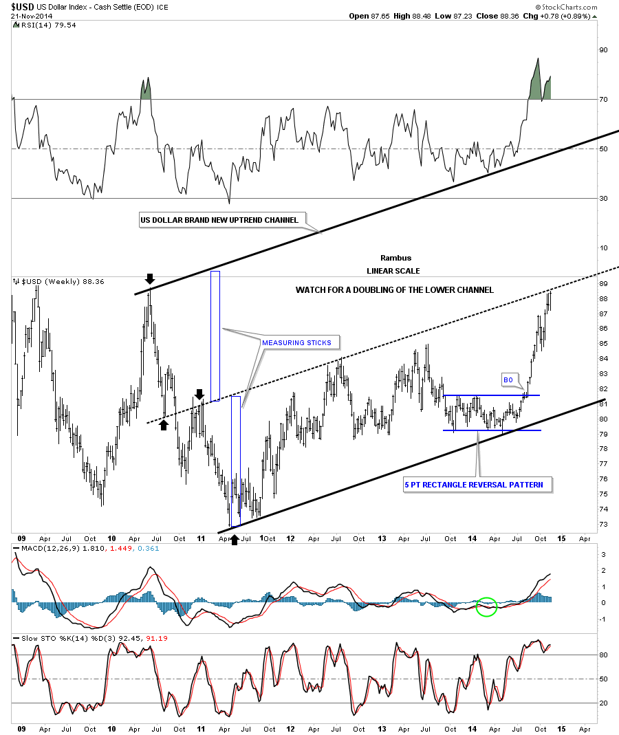
Below is a 15 year chart for the US dollar that shows the possible brand new uptrend channel. If the bullish rising wedge plays out it will give the dollar the energy to take out the mid line and rally all the way up to the top rail of the new uptrend channel unimpeded pretty much.
Lets look at one last chart where I overlaid gold on top of the US dollar chart. I try to show this chart at least once a month or so because it has been spot on since I began posting several years ago. About six months or so ago I put a thin black dashed line on the gold chart and the dollar chart with the two blue arrows. When I first posted this chart, with the blue arrows, the dollar was trading below the thin dashed line and gold was trading above its thin dashed line. Now you can see how the dollar has broken out above its thin dashed line, had a backtest and is now set to run freely to the upside for awhile. On the gold chart you can see it’s still testing the breakout point which isn’t giving us any indication of the impulse move down yet. I moved the purple circle from the crossover area that happened in 2006 to the right side of the chart. If I’m right on the direction of the US dollar and gold then I think there is a good chance that we’ll see these two cross over again in due time.
So there you have it. The next couple of weeks are going to be very telling on which way all the falling wedges I showed you are going to break. Time always tells the story in hindsight but we can’t use hindsight in trading the markets. So until something changes this is how I see the big picture unfolding over the short to long term for the US dollar. How this affects other areas of the markets will remain to be seen yet. Normally a strong dollar is bad for commodities and the precious metals complex. Will this time be any different. Stay tuned to find out. All the best…Rambus