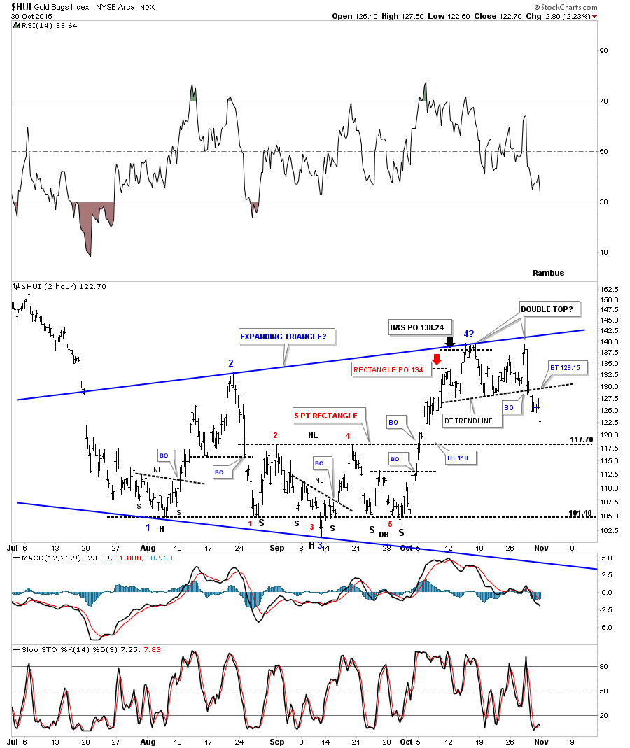
Looking at the three month chart for the HUI you can see the internal structure of the blue expanding triangle that is still building out. What’s most important right now is the potential fourth reversal point is playing out as I had hoped it would. The HUI made five attempts to breakout above the top of the trading range around the 140 area but couldn’t succeed. The next area of support will be the neckline or the top rail of the 5 point rectangle reversal pattern at 117.70, red numbers. Expanding patterns are some of the hardest patterns to figure out as the price action becomes more volatile with each swing. So far no backtest to the double top trendline which would be at 129.15. The bottom line is that it’s nice to see a reversal pattern at the fourth reversal point.
An expanding triangle is how a Diamond pattern begins forming. Below is a 2 hour chart which shows the potential Diamond pattern as the possible consolidation pattern. The fourth reversal point now stands out as a double top reversal pattern. Note the smaller reversal patterns that formed within the five month blue triangle consolidation pattern. The price action shows how the HUI broke below the bottom rail of the blue triangle, red circle. The bulls had just enough energy to pop up off the bottom rail one last time backtesting the neckline before finally breaking out with a breakout gap. We got confirmation with the backtest. This price action is called the pop and drop.
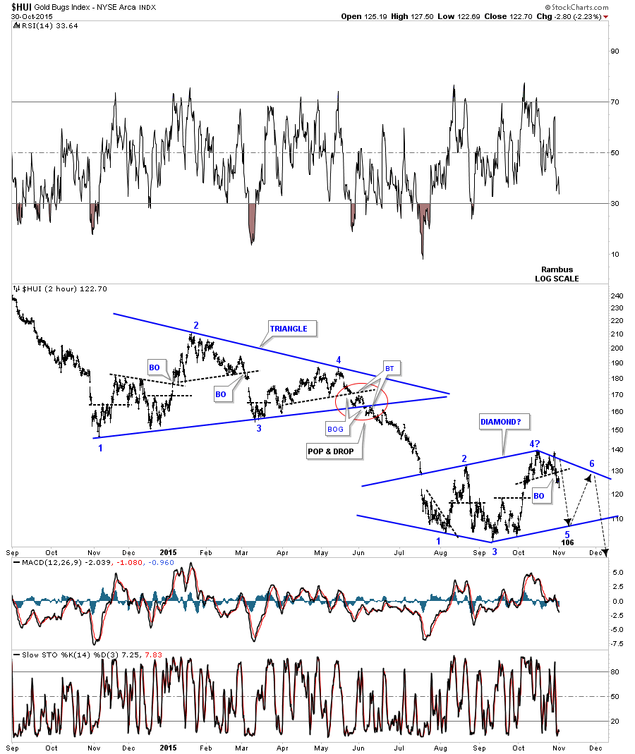
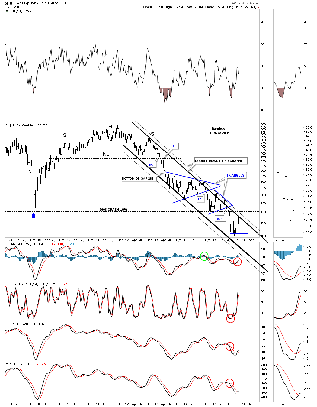
The 2 1/2 year daily chart below shows the HUI’s two previous consolidation patterns. Is our possible current fourth reversal point the start of the next impulse move down which will take the HUI down to new bear market lows? This is how they start. Also note the longer term indicators have crossed to the downside, red circles.
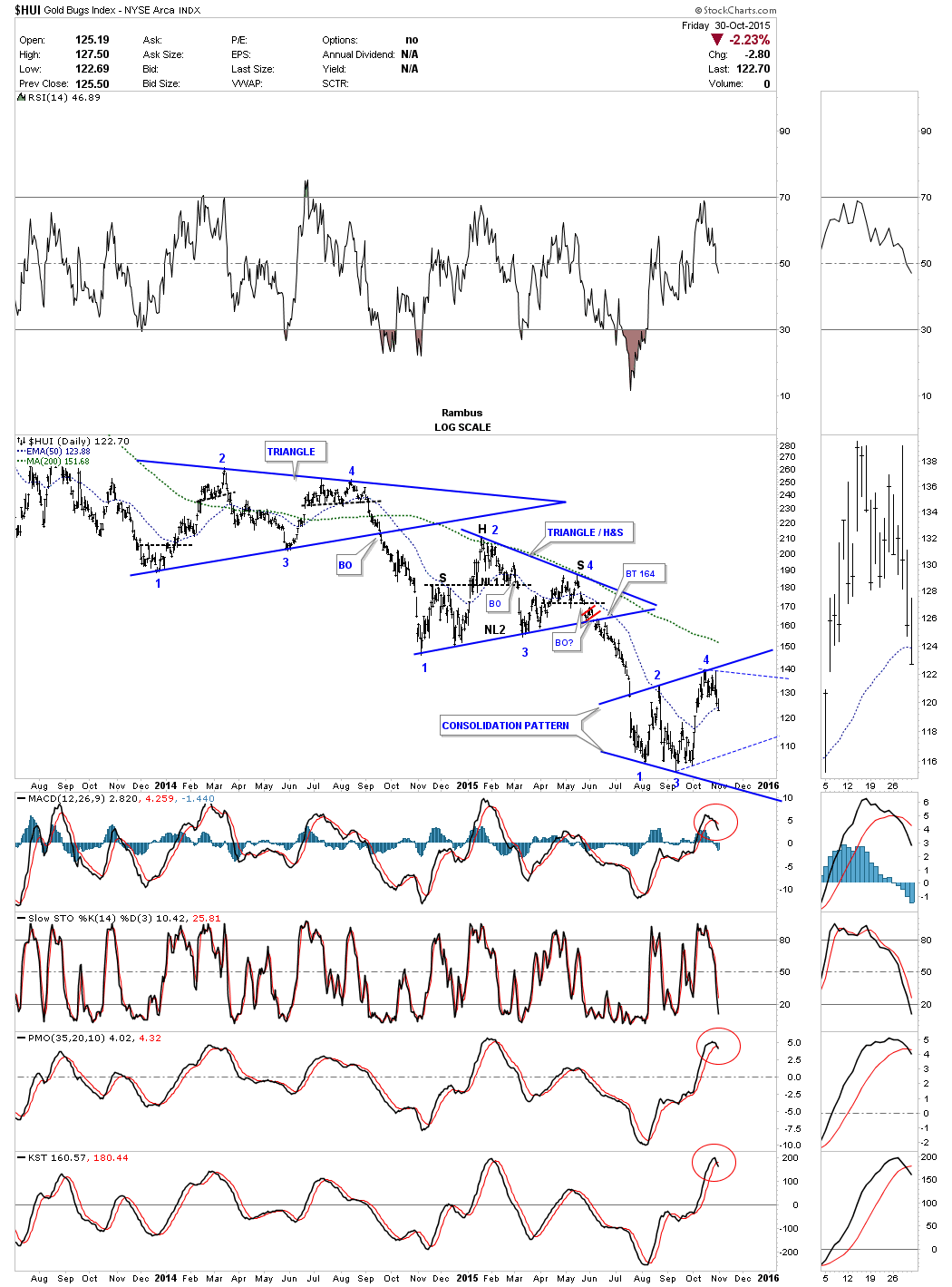
The weekly chart for the HUI shows it hit the inside solid top rail of the double downtrend channel this week and reversed sharply to the downside to close the week just a penny of above the low.
The important moving averages for the daily gold chart below shows the red 300 day ma held resistance this week.

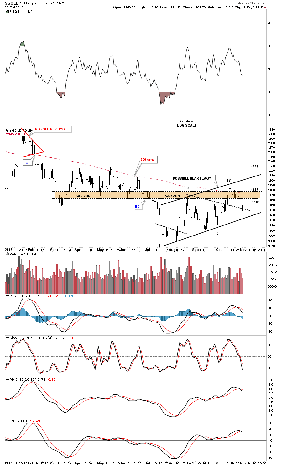
The daily chart for gold shows the potential bear flag that maybe forming. After being strongly tested the brown shaded support and resistance zone has held resistance with today’s price action closing on the black dashed down slopping trendline which was the top rail of the old triangle. The first positive would be to see gold close below that old dashed trendline and then break below the bottom rail of the potential bear flag. One step at a time.
Just like the HUI gold hit the top rail of its major parallel downtrend channel this week also. The two small red consolidation patterns strongly suggest the 1180 area is an important area of resistance. Normally the price action will cut cleanly between the two patterns but gold has been a little sloppy in this respect.
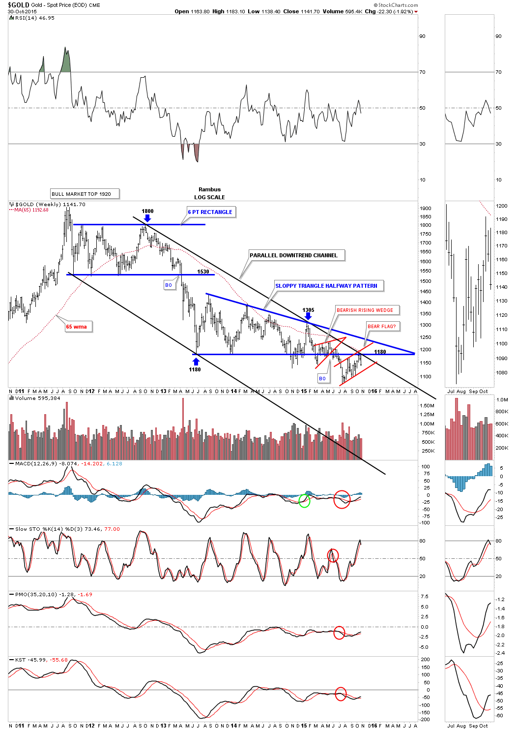
The long term weekly chart for gold shows the two potential consolidation patterns that I view as a halfway pattern to the downside. The bottom rail of the sloppy triangle is irrelevant if we use the impulse method, blue arrows, that measures a price objective down to 855. I still haven’t given up on the bearish falling wedge as the halfway pattern. Depending on exactly where gold breaks below the bottom solid rail the breakout to breakout method gives us a price objective down to 845.

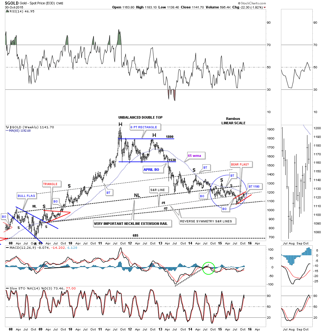
Another long term weekly chart for gold shows the reverse symmetry taking place. What happened on the left side of the chart has a direct impact on the right side of the chart as shown by the neckline extension and support and resistance lines. The blue circle shows the previous H&S consolidation pattern with the potential red bear flag forming between reverse symmetry lines #1 an #2.
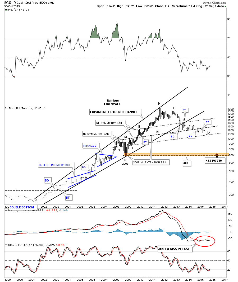
The very long term monthly chart for gold shows it created an expanding rising wedge as its bull market. The breakout and backtest to the bottom black rail created the right shoulder. The H&S consolidation pattern that formed during the 2008 crash is responsible for the neckline and the height for the left and right shoulder on our current possible massive H&S top. Note how the 2008 H&S neckline extended all the way to the right hand side of the chart, neckline extension rail, is also the neckline of the massive H&S top.
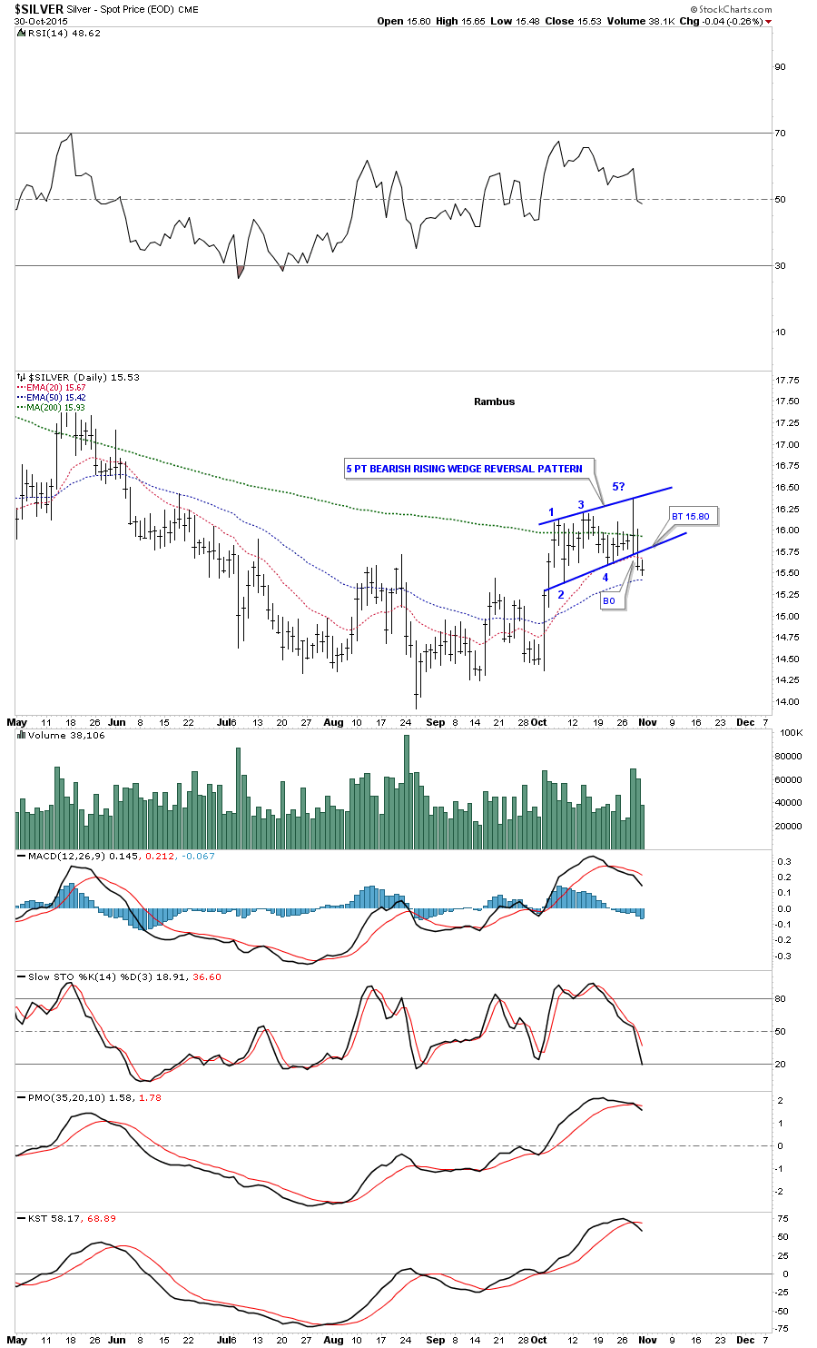
Sir Fullgoldcrown accidentally posted this daily 5 point bearish rising wedge reversal pattern on the main site by mistake a couple of days ago. As this is a reversal pattern the uptrend that has been in place since the August is now over.
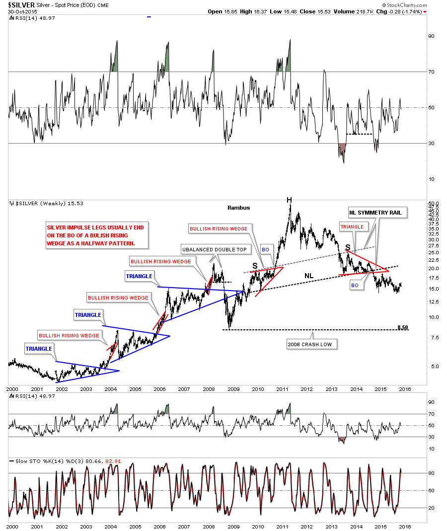
I’ve been showing this weekly chart for silver which shows the reverse symmetry H&S patterns on each side of the chart. Silver has been strongly backtesting the neckline on the right hand side of the chart for the last month or so at 15.85. It’s been a tough fight but it looks the bears may now be back in charge as silver closed below the neckline this week.
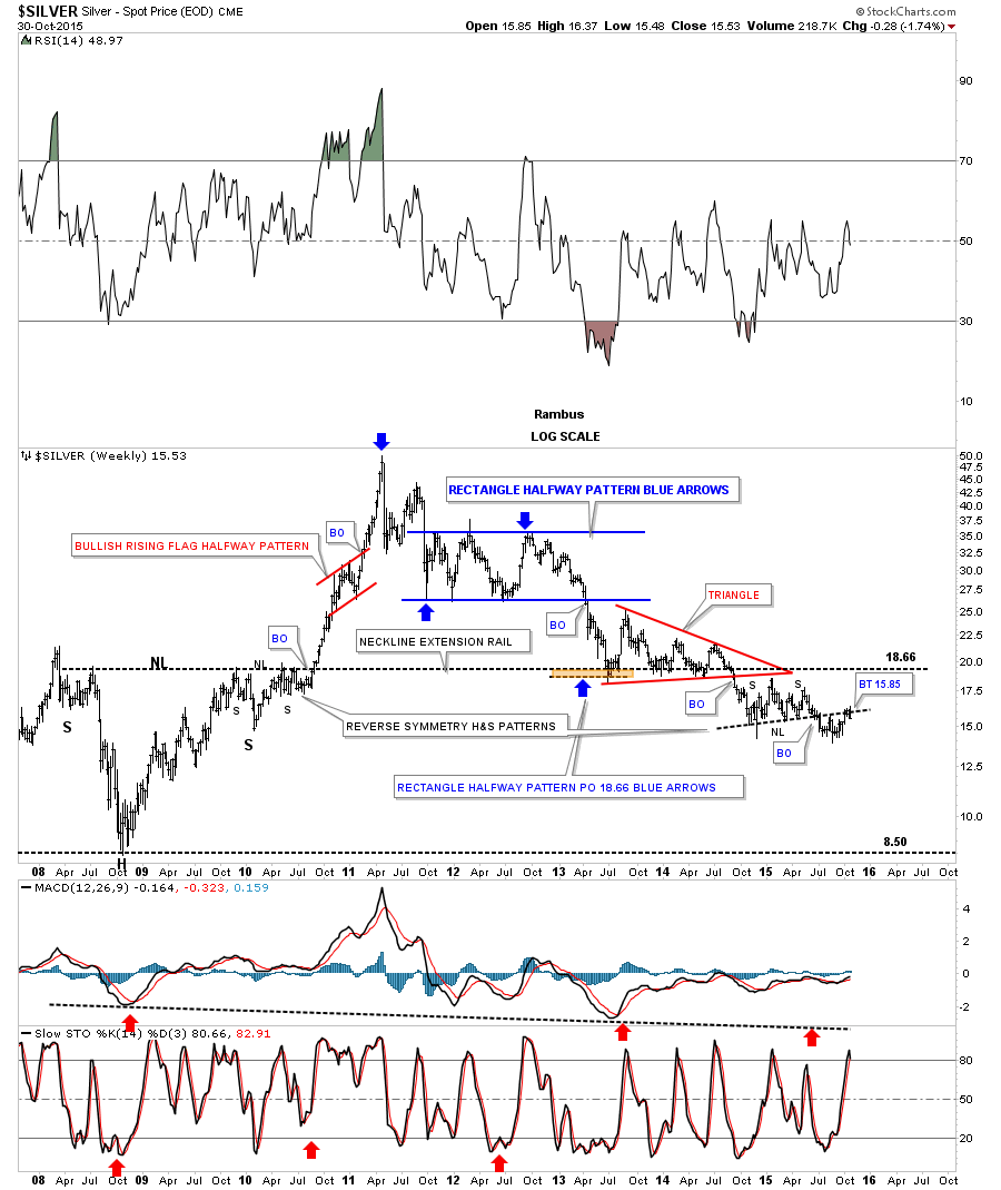
Just like the HUI and gold, silver also has a parallel downtrend channel. You can see how critical this backtest is to the neckline on the right side of the chart. This is about as low a risk entry point that you can get to short silver at 15.85.

Earlier I showed you gold’s massive H&S top with the 2008 H&S neckline extension rail creating the neckline for gold’s massive H&S top. It shouldn’t be surprising that silver is also showing a similar massive H&S top. Just like gold the height for the massive H&S top’s left and right shoulders is taken from the angle of the neckline, neckline symmetry rail. Have a great weekend. All the best…Rambus