

Welcome to PM Trader’s Nightmare.
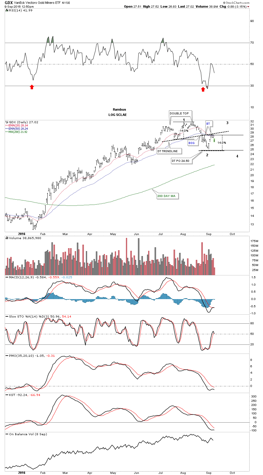
We’ve been following the GDX as a proxy for the rest of the PM stock indexes which is showing the on going correction or consolidation phase of the first big move up off the January low. This first daily chart shows the unbalanced double top which is the first reversal point in this new consolidation phase. The double top has a price objective down to the 24.50 area which was almost touched late last week. As you can see the double top trendline has held resistance on two separate occasions with the second one taking place this week. At this point we still don’t have a confirmed low which could launch the second reversal point to the upside yet. The price action is in the middle of no man’s land presently.
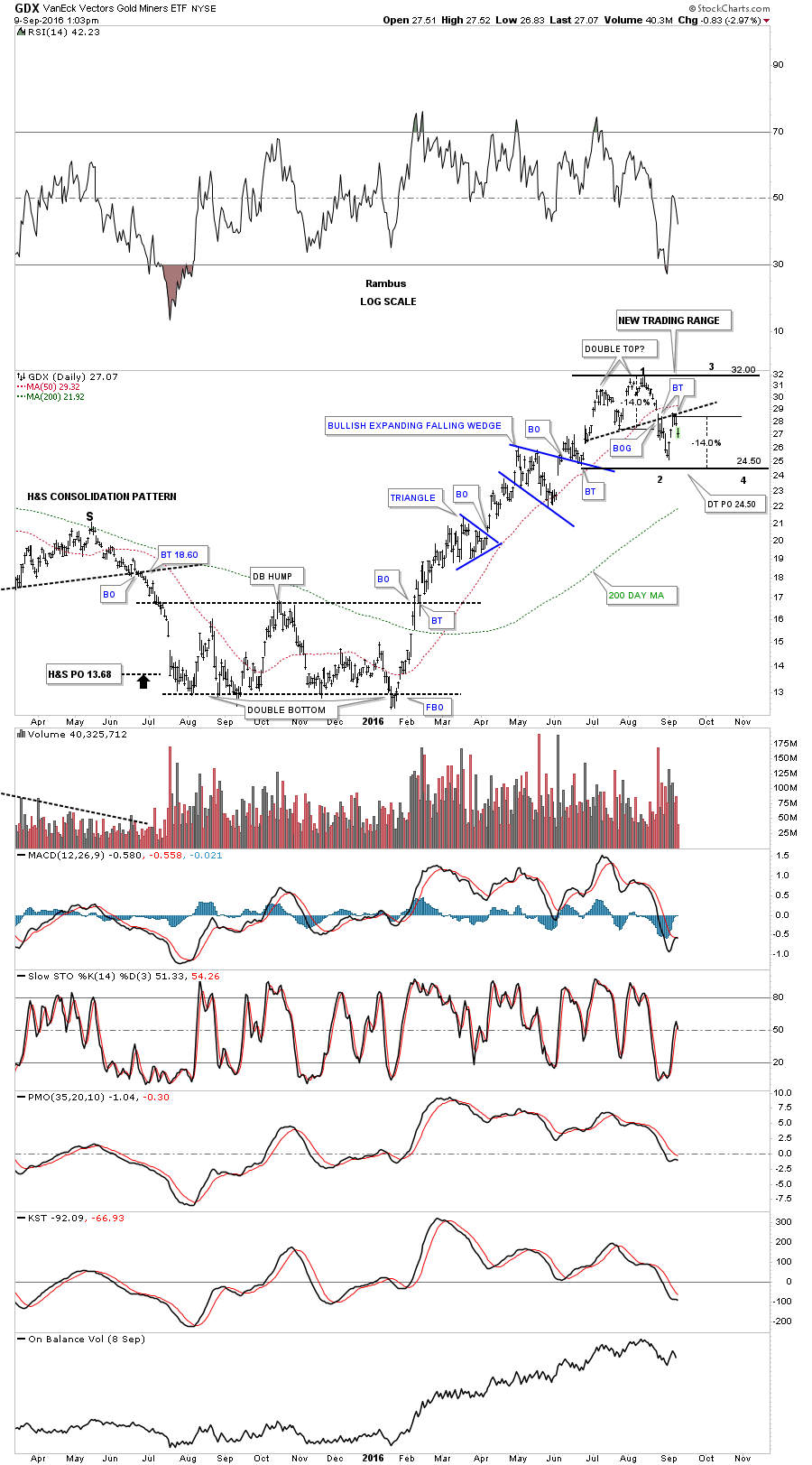
Below is a longer term daily chart we’ve been following which shows a possible trading range between 24.50 at the bottom and 32.00 at the top. Again, we still don’t have confirmation yet on the low for this first reversal point to the downside.
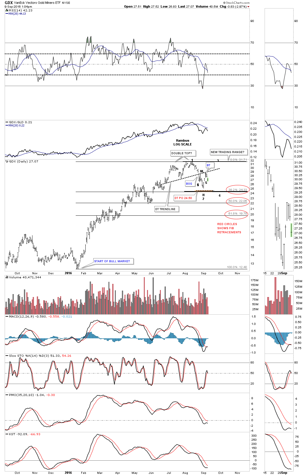
This third daily chart shows the fib retracements with the 38% retrace coming in at the 24.33 area. If, and that’s a big if at this point, but the double top trendline could be the neckline for a small H&S bottom which would fit in nicely with this potential trading range as the start of the second reversal point back up to the top of the trading range. It’s possible we could see a double bottom form at the bottom of the potential trading range which would be a reversal pattern also. Right now the price action is in neutral territory. As I mentioned previously these trading ranges can whipsaw a person to death trying to trade in and out. At least once the top and bottom of the trading range can be established then there is a chance to try and play the swing trades within whatever consolidation pattern may develop.
This next chart is a weekly look at the bull and bear market counter trend moves during the bull and bear markets since 2009. The red rectangles measures the same percentage moves down in a bull market but not time. On the left side of the chart you can see the bull market corrections, red rectangles, that punctuated that rally out of the 2008 crash low. If our current correction is fairly close to the other corrections then price wise the 200 area should provide good support. There is also the 50 week ema that is rising and is currently at 204.
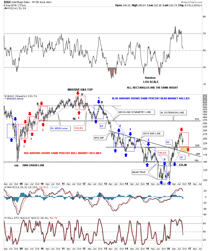
On the weekly chart above you can see the rally out of the 2008 crash low was very strong but even during that strong bull move it had three corrections, one forming on top of the other. Try to put yourself back in the HUI during that strong bull move and how you may have reacted to each correction within the red rectangles. It’s easy to look back in hindsight and see the corrections and say I would do this or that but it’s abstract and not reality. Reality is our current trading range which may very well be just the first correction in the mother of all bull markets, only time will tell.
Editor’s Note: This was posted intra dayAfter the close GDX can be found closer to the Bottom of “The Zone” at 26.41