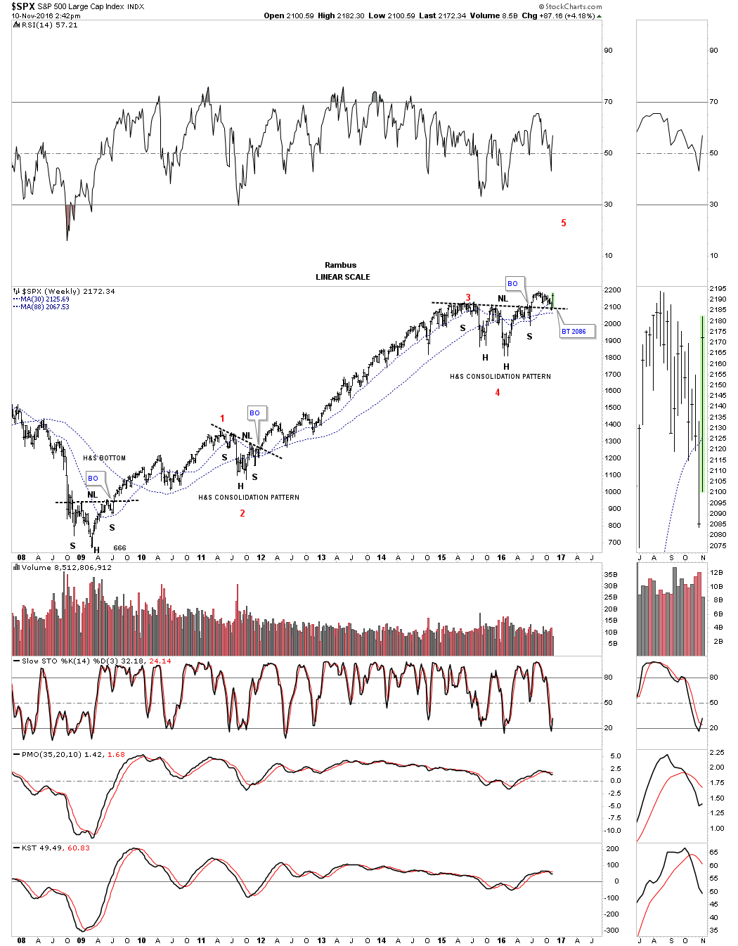
Below is a weekly chart for the SPX which goes all the way back to the beginning of our current bull market that began in the spring of 2009. It took an inverse H&S bottom to reverse one of the worst declines going back to the great depression which scared many investors for life.
Some of you may remember the correction in 2011 which felt pretty negative at the time. As it turned out the SPX just created a H&S consolidation pattern instead of the many other possible patterns that could have formed.
If we are truly in a long term bull market it looks like the SPX has just finished its next consolidation pattern which is close to a two year H&S consolidation pattern. The way the price action is backtesting the neckline and bouncing looks very encouraging. This is exactly what you want to see from a Chartology perspective. The neckline gives one a low risk entry point as your line in the sand, above is bullish and below is bearish. It can be as simple as that.
I’ve studied most trading disciplines through the years and what the red numbers on this weekly chart shows is a basic Elliot Wave count. Maybe it’s possible that the SPX is just starting its fifth wave up which at a minimum should equal the first wave up in the secular bull market. At any rate this is a pretty bullish looking chart IMHO in more ways than one.