
As there seems to be a lot of interest in some of the currencies I would like to show you some charts we’ve been following for a very long time. Most of the charts will be long term in nature which won’t do us much good in the short term, but they will keep us in tune to the direction these currencies are most likely to take
Knowing what to expect in the Longer term is important not only to currency and commodity traders but to the very Countries who’s currencies are impacted and to their exporters and importers as well.
Long time members may remember some of these massive tops in 2011 which led to the sharp decline in the PM complex and commodities. I won’t spend a lot of time on these charts as they’re pretty self explanatory.

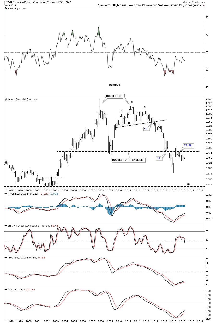
The $CAD, Canadian Dollar, has built out a massive double top formation, broke below the double top trendline in 2015, followed by a backtest.
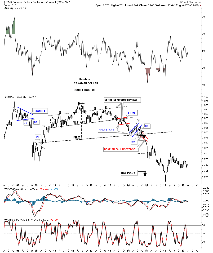
You may have noticed the H&S top which formed the right top. Below is the weekly chart which shows the double H&S top in more detail.

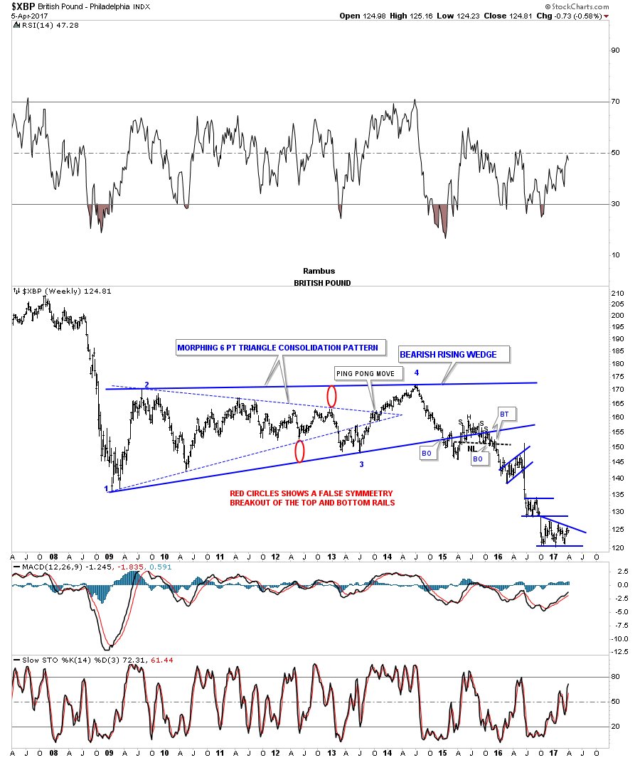
The weekly chart for the $XBP, British Pound, was one of the first times I showed how a triangle can morph into a bigger consolidation pattern, as shown by the red circles. The backtest to the bottom rail produced a H&S top which launched the multiple impulse moves down followed by a consolidation pattern.
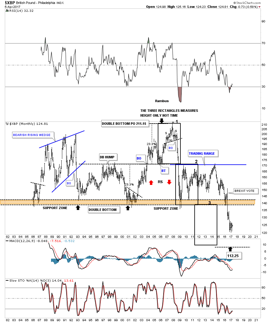
The 30 year monthly chart for the $XBP is setup a little different than some of the other major currencies. In the 1990’s the $XBP built out a double bottom which had a measured move up to the 211 area. After the small H&S top was in place the $XBP basically crashed below the double bottom hump all the way down to the previous multi year lows. After chopping sideways for almost 5 years the $XBP took out the multi year lows on the BREXIT vote.

Next is the $XAD, Australian Dollar, which shows its 2011 H&S top with several odd numbered reversal patterns.
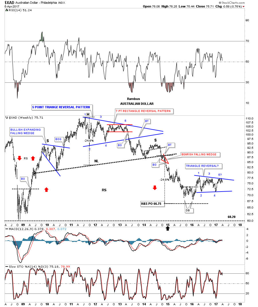
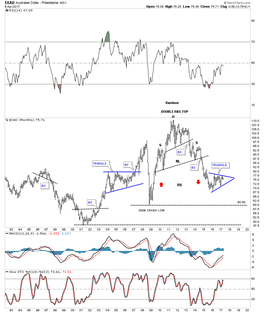
This monthly chart shows the double H&S top and the blue triangle that is currently under construction.
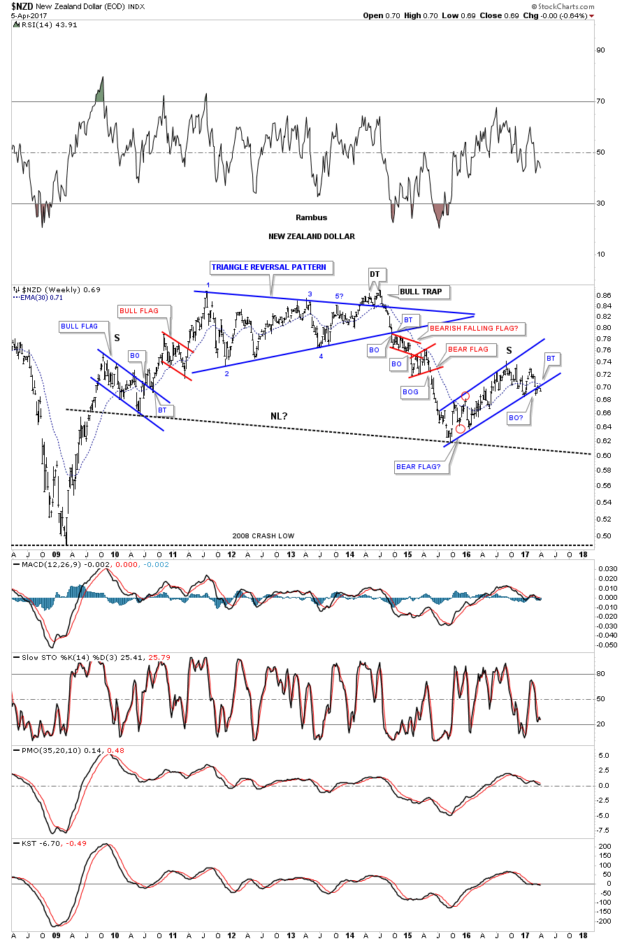
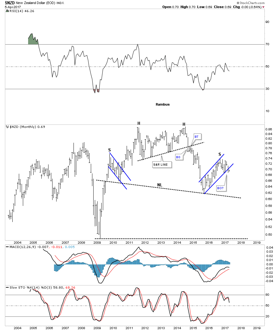
The $NZD, New Zealand Dollar, has been holding up better than most currencies, but it may be getting ready to decline once again, as it looks like it’s breaking down from the blue bear flag that is forming the right shoulder of a large H&S top.
Below is the monthly chart for the $NZD building out the right shoulder.

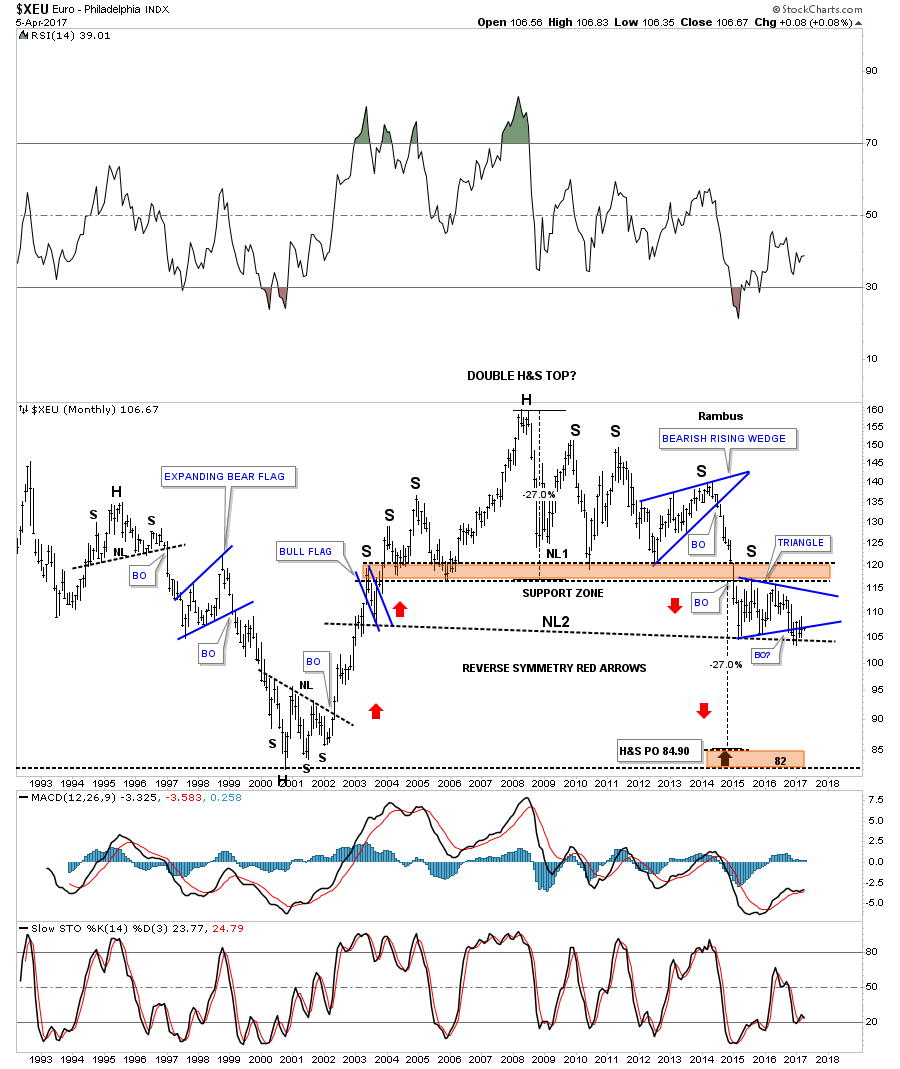
Next is a monthly chart for the $XEU, which shows its massive double H&S top and the blue triangle that is building out the possible right shoulder of the 2nd H&S top.
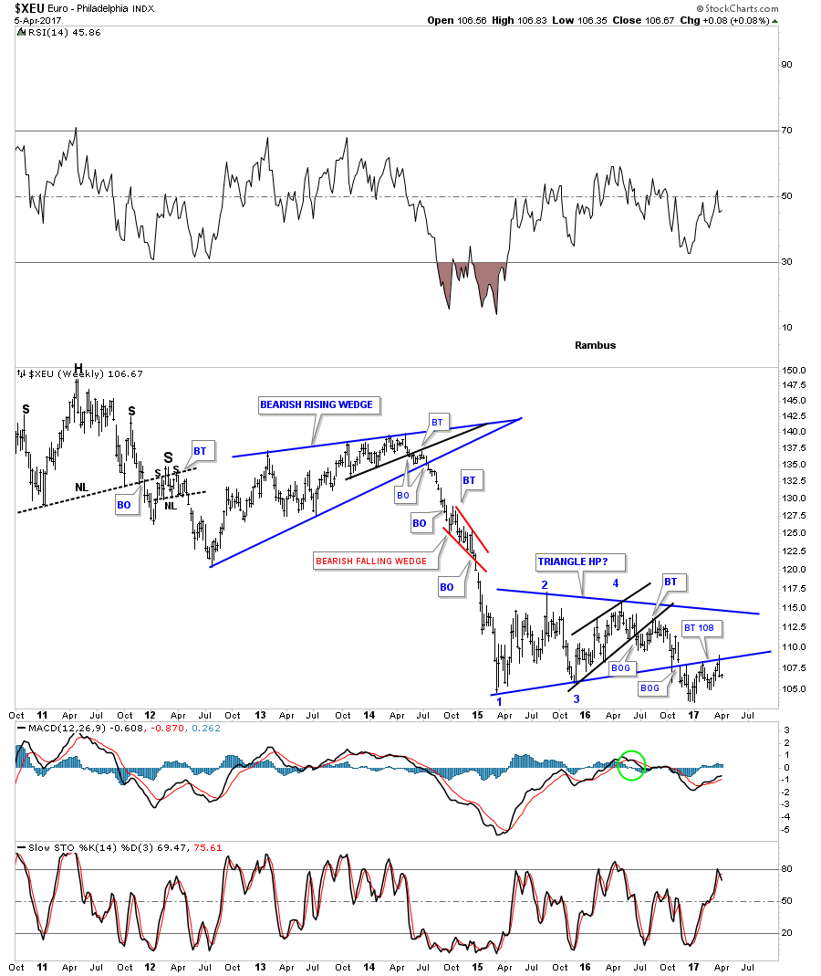
This 7 year weekly chart for the $XEU shows the one year blue triangle that has been building out with a breakout and multiple backtests to the bottom rail which would also be the right shoulder on the chart above.

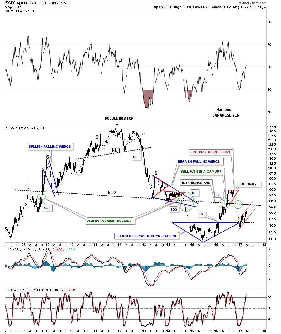
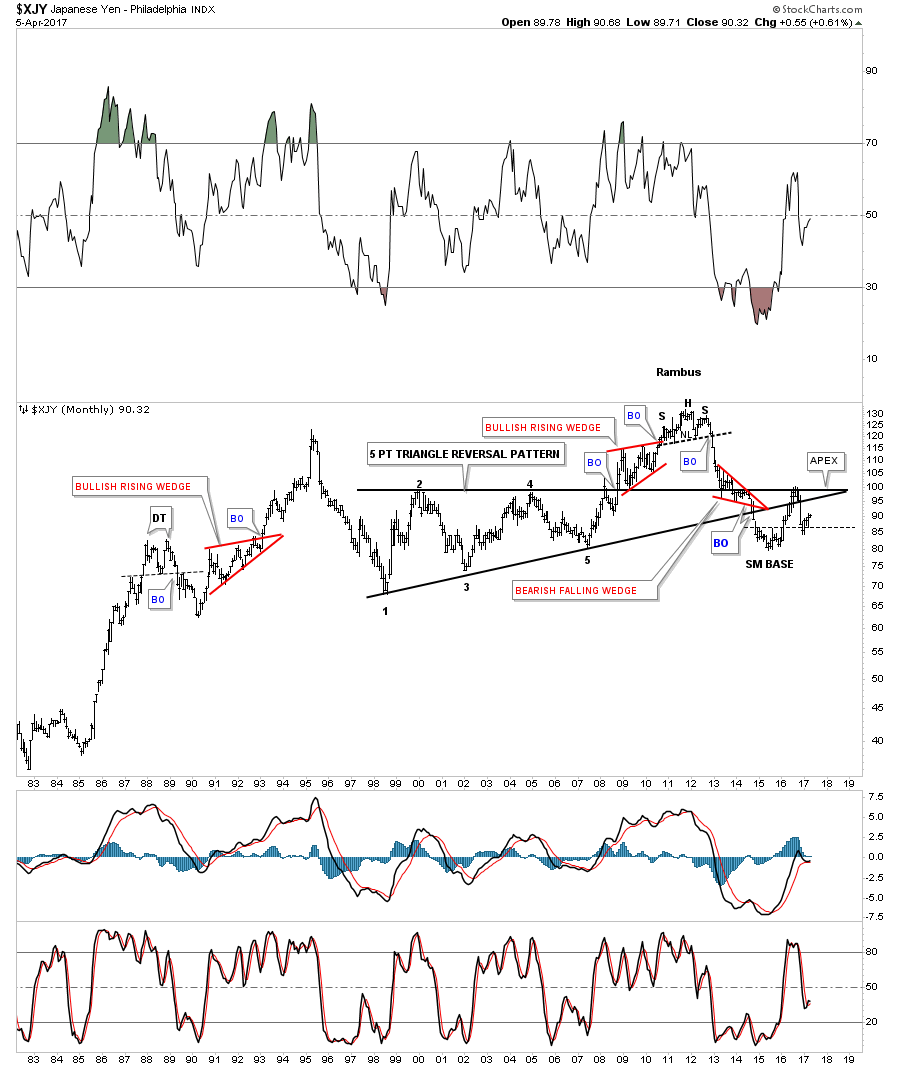
The weekly chart for the $XJY, Japanese Yen, shows its double H&S top. The green circles shows the gaps made on neckline #2 telling us the neckline is correctly placed.
This next chart for the $XJY is a 35 year look whch shows the H&S top that ended its bull market in 2011.
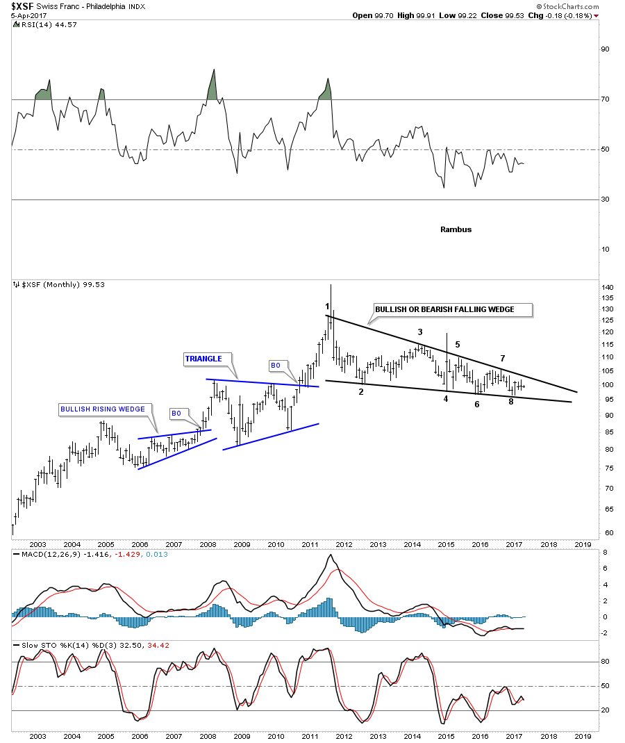
This next currency is a weekly look at the $XSF, Swiss Franc, which looks much different than most of the massive H&S tops we’ve looked at. Starting at the spike high in 2011 you can see a series of lower highs and lower lows which constitutes a bear market.

Whichever way this multi point black falling wedge breaks out a big move will follow.
I’m going to focus in on the US dollar and some of the the US dollar currency crosses in the Weekend Report as there are just too many charts to put into one post. You will see some charts I have not posted before, so stay tuned. All the best…Rambus
Flags produced with Permission from http://www.theodora.com/flags/