Tonight I would like to show you some short and long term charts for some of the PM stock indexes. In the very short term they have had a good run and are getting overbought and need to work off some of the bullishness. This is perfectly normal and should be expected. What we need to focus in on now is where we should look for support to keep the uptrend intact.
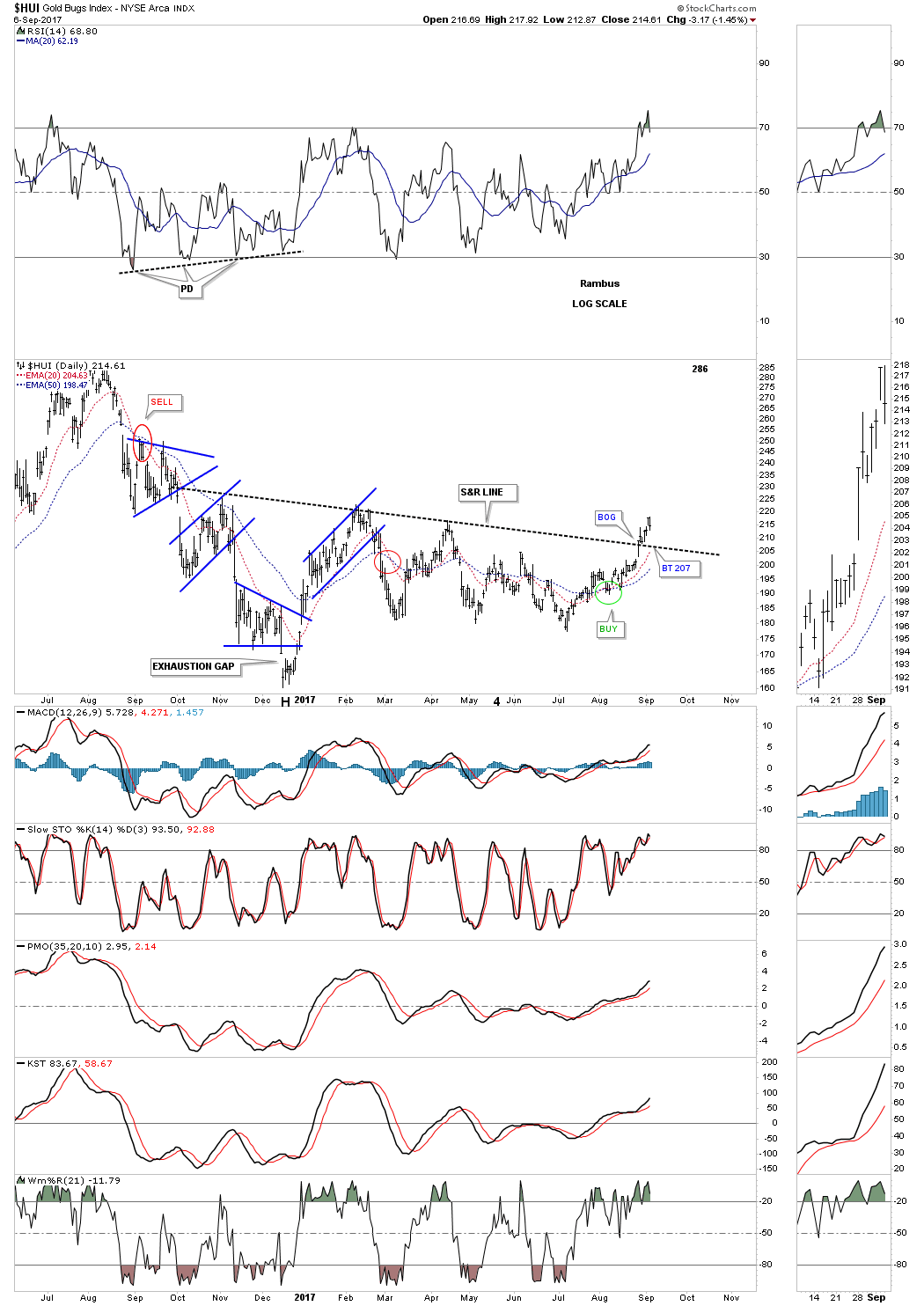
This first chart is a daily look at the HUI which shows us a one year support and resistance line. Two weeks ago already, the HUI broke above that very important S&R line telling us the bulls were in charge after the bears held resistance keeping the bull in check. Now we should look for that S&R line to reverse its role to what had been resistance, to now support. Critical support comes in around the 207 area which would be the backtest. The green circle shows where the 20 day ema crossed above the 50 day ema back in August for a buy signal.
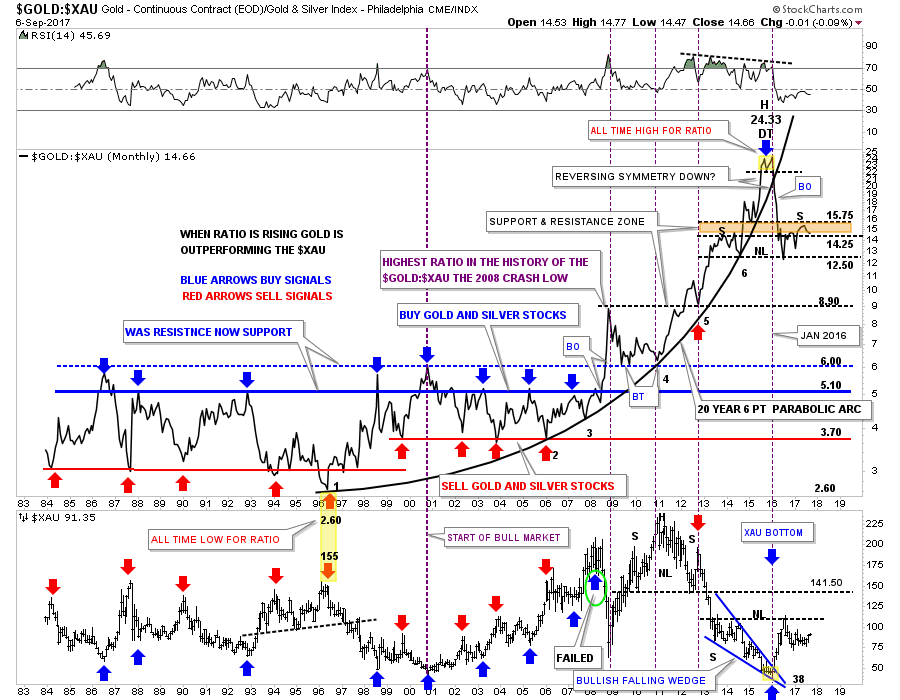
This next chart is one we’ve been following for many years and gave us one of the biggest clues the bear market may be ending in January of 2016. This chart is the 35 year ratio chart which compares gold to the XAU. For our many new members that might not be familiar with this chart I’ll give you a quick rundown. The first thing to know is that if the price action is rising, gold is out performing the XAU. For many many years this ratio let you know when it was time to buy or sell the XAU or your precious metals stocks. When the ratio would get up to the horizontal blue line it was time to look for an entry point and when the ratio traded down to the red line it was time to sell those positions you bought at the blue line.
As they say, all good things must come to an end. The end came during the crash in 2008 when the ratio burst above the blue horizontal buy line which had never happened before in history. I labeled that massive failure with the green circle on the XAU chart on the bottom. For years that area suggested it was a great time to buy your favorite PM stocks. That breakout above the horizontal blue dashed line represented a paradigm shift where gold was going to massively outperform the PM stocks.
That major shift actually began all the way back in 1996 when the ratio made its all time low. From that point the ratio began a 20 year parabolic run outperforming the XAU. Even thou the XAU had a decent bull market run into the 2011 high it failed in comparison to gold.
Now lets fast forward to the January 2016 high where the ratio finally topped out at 24.23 and created the small double top. At the time I suggested we could see a strong impulse move down based on two things. The first thing that suggested a strong move lower was the breaking of the 20 year parabolic arc. When a parabolic move ends it can get pretty ugly. The other thing that suggested we could see a strong move lower was what I call, reverse symmetry. Note how vertical the move was into the double top high. Reverse symmetry suggested we should see a similar move down over the same area on the way up, which we got.
The brown shaded area is where I was looking for initial support to come into play, but the ratio fell a little further down to the 12.50 area. Long term members know we’ve been watching the right shoulder building out for close to a year now. The last time I posted this chart the ratio was strongly testing the 15.75 area which needed to hold resistance in order to have a shot at the right shoulder of a 4 year H&S top. As you can see the ratio is starting to roll over right where we needed it to. A break below the neckline at 12.50 will complete a very large H&S top that was needed to reverse the outperformance of gold to the XAU for over 20 years.
Note how the XAU bottomed in 2016 at the same time the ratio topped out. Now compare the ratio chart on top to the XAU chart on the bottom. It looks like when the ratio chart breaks below its neckline the XAU will do the same thing, which will be just as neat as when the ratio broke down from the double top in January of 2016. Years from now when we look back on this chart it will be interesting to see where the ratio finally bottoms out. Since the January 2016 high is where the XAU finally began to outperform gold after 20 years of underperformance.
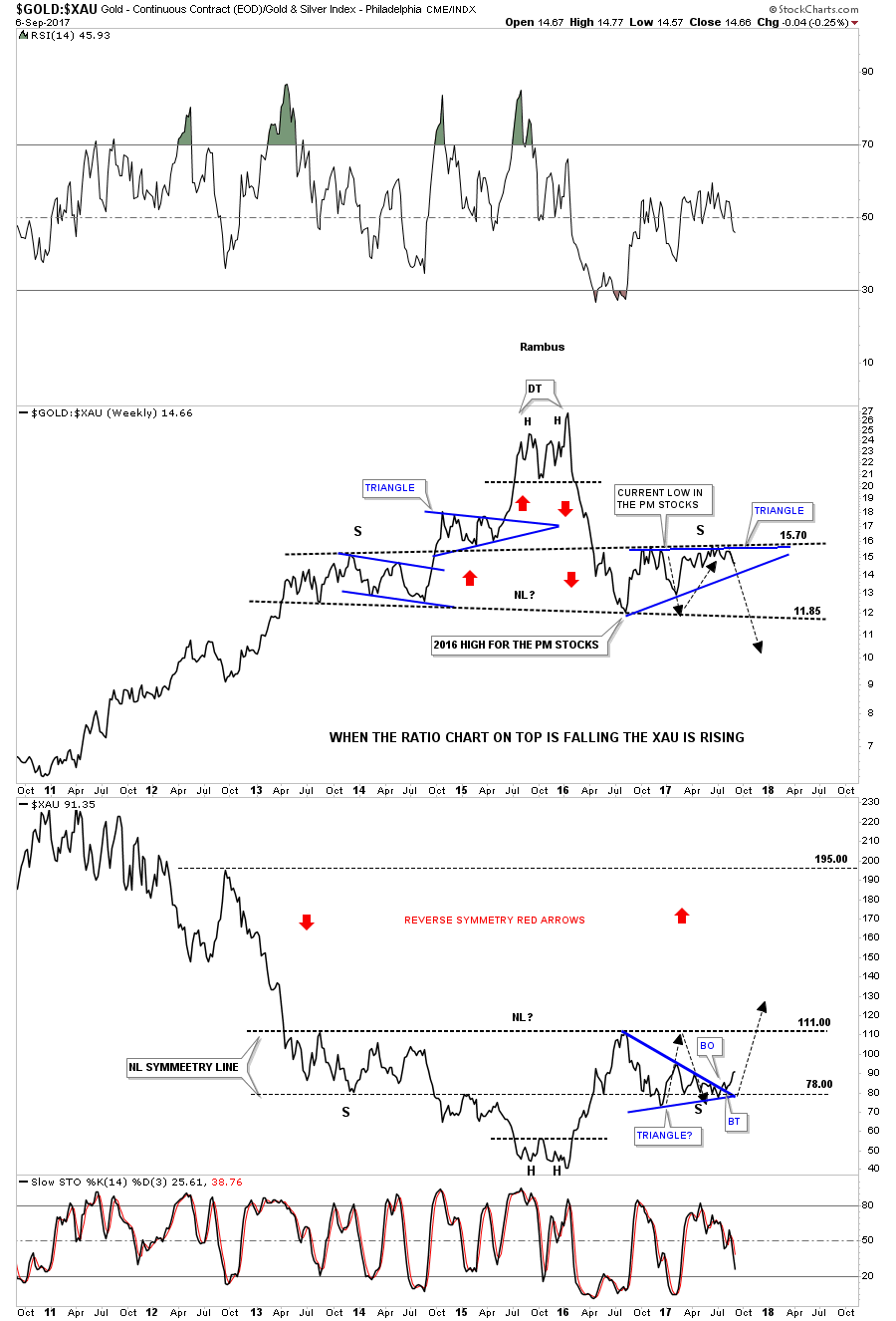
This next chart is a weekly line combo chart which has the gold to XAU ratio chart on top with the XAU on the bottom showing you a close up view of the H&S top we just looked at on the combo chart above. When I first built this combo chart I added the black arrows to show how the possible right shoulder may build out based on the symmetry of the left shoulder. The ratio chart on top is showing a possible blue triangle building out as the right shoulder. A break below the bottom rail of the blue triangle will be very good confirmation that the neckline will be the next important bit of support to go.
The XAU on the bottom chart has just completed a breakout and backtest to the top rail of its right shoulder triangle. Also what this weekly line chart for the XAU is showing us is how we should look for reverse symmetry up, once the neckline is decisively broken as shown by the red arrows. One last thing about the XAU before we move on. Note how the neckline symmetry line has been holding support for the bottom of the right shoulder. We are currently close to the second best buying opportunity since the January 2016 low.
Keep in mind that this potential massive H&S bottom is reversing the 2011 bear market. By the time the neckline is finally broken to the upside this H&S bottom will be about 5 years in the making which is big enough to launch a multi year bull market.
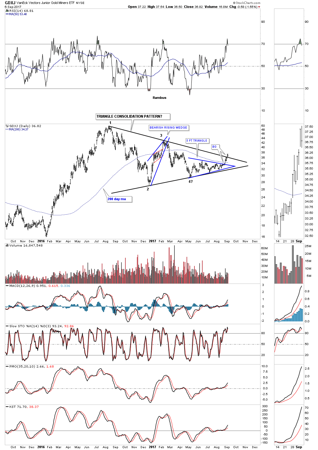
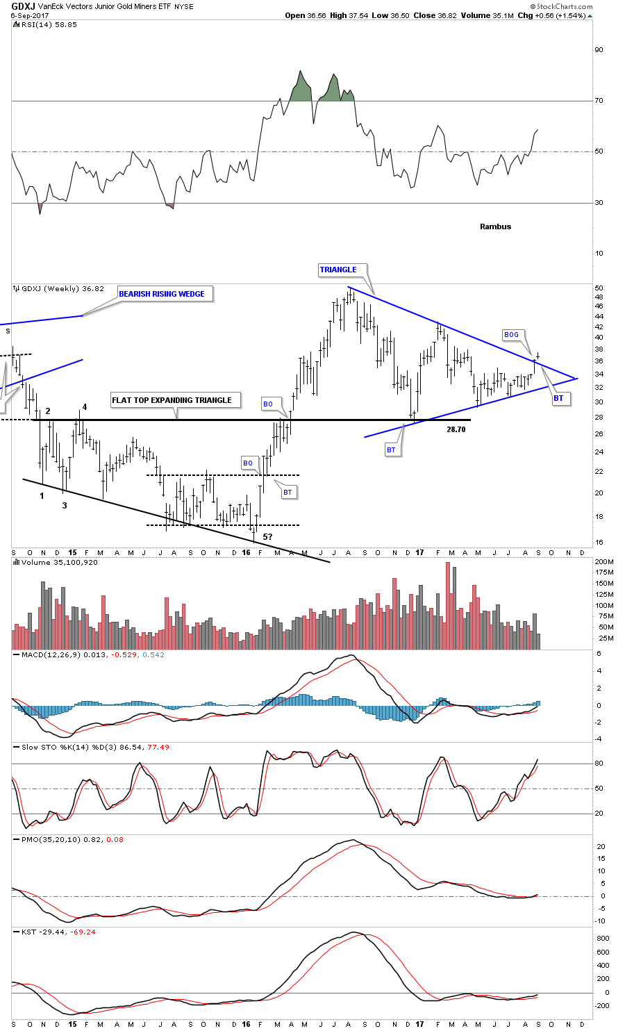
Next I would like to show you the GDXJ which is showing some very nice symmetry. Earlier this week I showed you the black triangle on the daily chart which the price action was attempting to breakout above the top rail of its one year triangle. Previous to the current breakout we looked at the breakout from the smaller blue triangle which was the 4th reversal point in the black triangle.
This next chart is a weekly look at the GDXJ which shows the one year triangle forming on top of the black flat top expanding triangle as the backtest. Now we wait for the backtest to the top rail of the blue triangle for the next bit of confirmation the bull market is back.
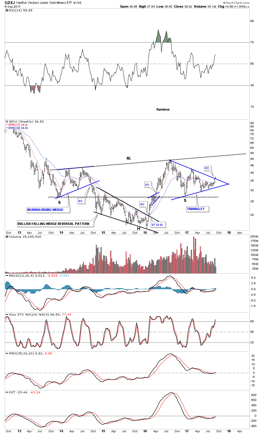
Below is a longer term weekly look at the GDXJ which brings everything into focus. As we saw with the XAU weekly chart, which is building out a potential very large H&S bottom, so too is the GDXJ. The triangle we just looked at on the chart above looks like it will be the right shoulder of a very large H&S bottom.
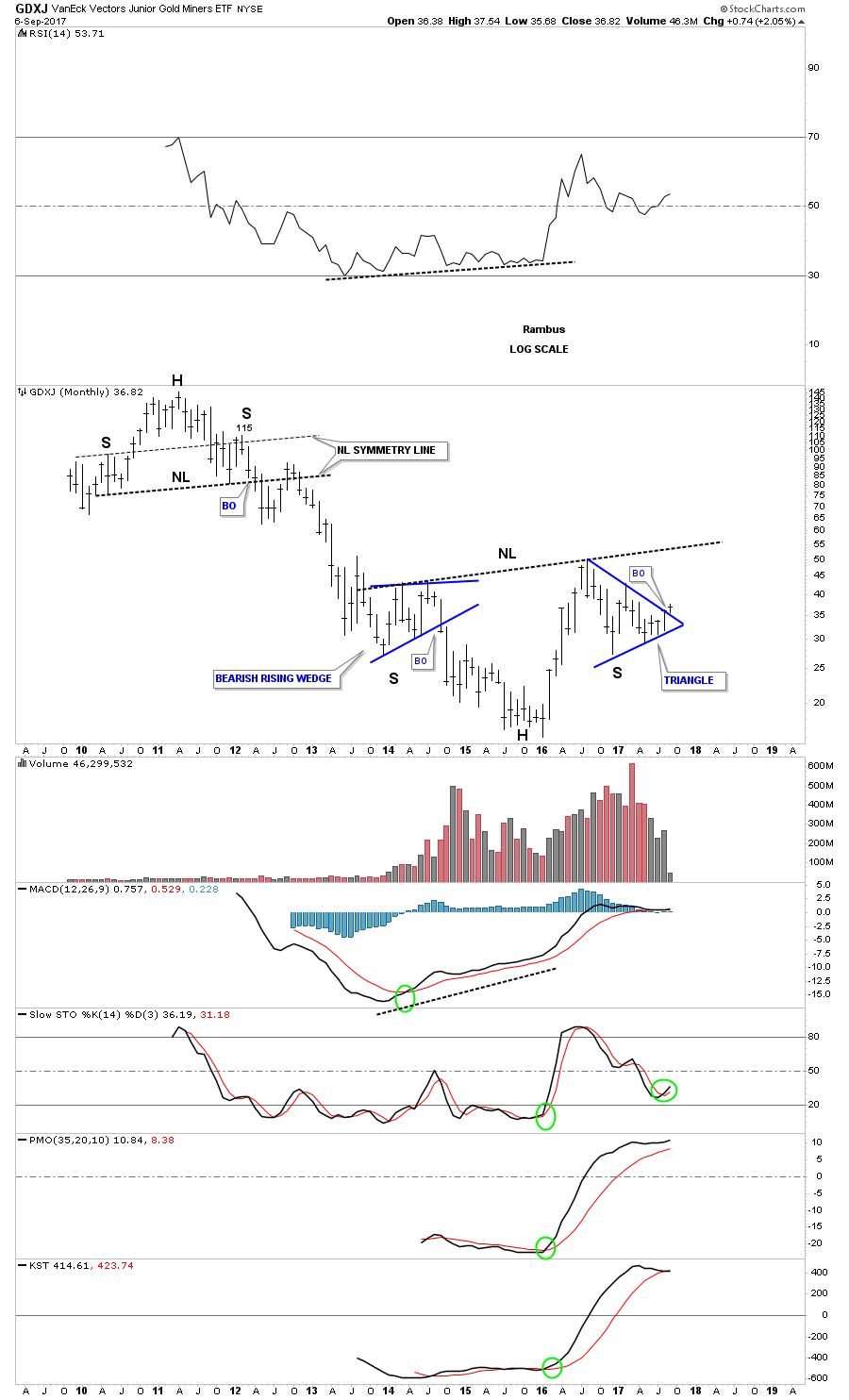
This last chart for tonight is a long term monthly chart which is painting a very beautiful 5 year H&S bottom by the time the neckline is finally broken to the upside. This H&S bottom is much bigger than the one that formed at the 2011 bull market top.
There are no guarantees when it comes to the markets, but if these H&S bottoms we looked at tonight on the XAU and the GDXJ play out as expected there will be a multi year bull market in the precious metals complex. Keep in mind we are still building out the reversal pattern with the impulse move yet to come. When we first opened the Doors here at Rambus Chartology in November 2011, we watched and traded for a year and a half for the development of the bull market top which had a beautiful H&S top to aptly crown it off.
Beauty is in the Eye of the beholder .
https://rambus1.com/2013/02/15/friday-night-chart-what-do-you-see/
This present developing pattern we are seeing is no different except it’s forming at the bottom of the 6 year bear market. All the best…Rambus

