
This is a stand alone excerpt from tonight’s Wednesday report.
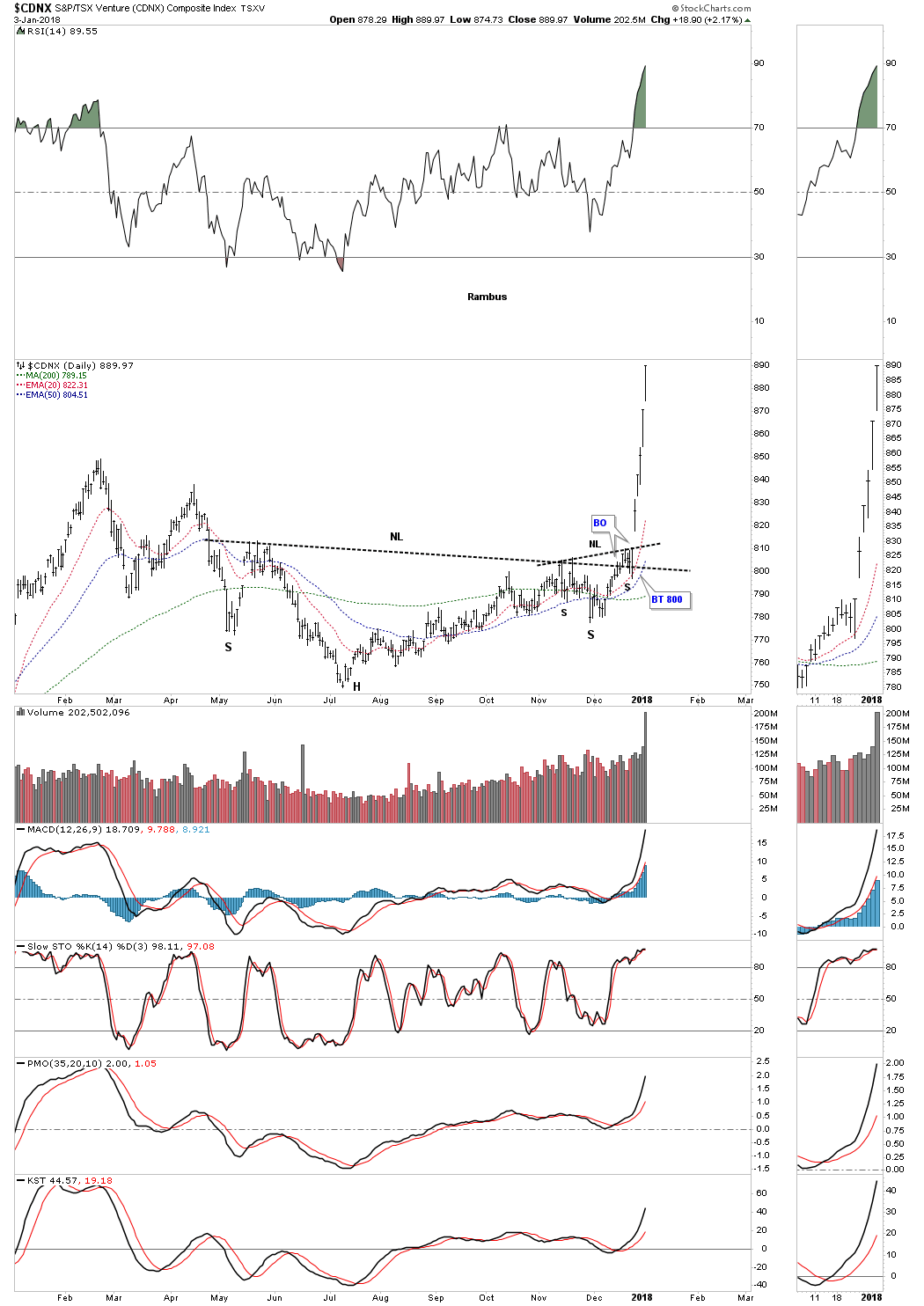
Tonight I would like to start out by looking at the $CDNX, Canadian Venture Composite Index, which blasted higher last week and is following through this week. The reason this index is so important is because it not only has many junior precious metals stocks, but also many small cap energy related stocks as well as other speculative venture capital stocks from other sectors. This is a very good sign for the overall stock markets and commodities in general, as it shows risk capital is finding a home in which to park. This is another important clue that there is no top in the stock markets yet, because the risk on trade is still healthy.
CDNX Companies ftp://ftp.cdnx.com/SPCDNXIndex/Constituents.txt
This first chart for the CDNX is a daily look which shows an eight month H&S bottom in place. This chart shows the principal of Chartology at work. Remember a stock does one of three things. It is either building out a reversal pattern, a consolidation pattern or is in an impulse move. After eight months of base building you can see what happens when all the energy is released. There was no way anyone could have predicted that the current impulse move would start out like this one, but we did know that an impulse move would take place once the neckline was broken to the upside.
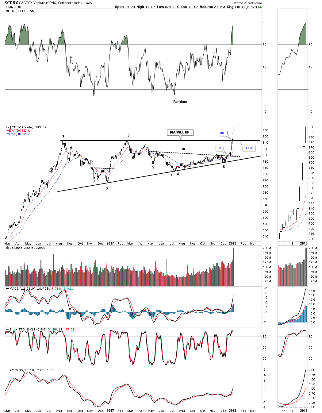
I have shown you many examples of how a big pattern can be made up of smaller patterns before a pattern is completed. Below is another daily chart for the CDNX that you should be familiar with which shows the nearly one and a half year flat top expanding triangle consolidation pattern. Not only did the price action breakout above the neckline, but also the top rail of the large triangle consolidation pattern. The bears were so exhausted they couldn’t defend the neckline, let alone the top rail of the flat top expanding triangle. A backtest, if we get one, would come into play around the 850 area.
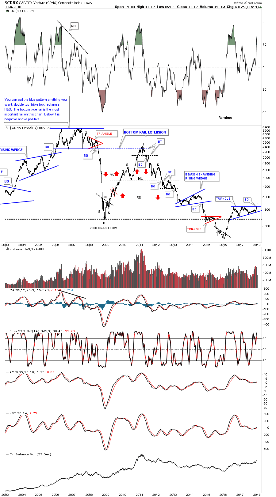
This next chart for the CDNX is a long term weekly look which helped me find the top, back in late 2007. At the time, I called that huge trading range anything you wanted, because there were several pattens that could work out. The bottom line was, whichever way the price action broke out, a big move would follow. Keep in mind that was at the height of the bull market up until that point, and no one wanted to believe that big trading range could be a top.
The big clue came when the small red triangle formed on the right side of the trading range. Until it broke down I still couldn’t say with any confidence which way the big trading range would breakout, but once the price action broke below the bottom rail of that red triangle the writing was on the wall. Again, there was no way to know the magnitude of the collapse only that an important top was in place and an impulse move to the downside would follow. This was also about the time I had to quit posting at the original Goldtent because so many gold bugs were getting angry with my bearish posts.
The CDNX is a good producer of chart patterns as the monthly chart below shows. Our current triangle consolidation pattern has formed just above the 2008 crash low and is now making a multi year high.
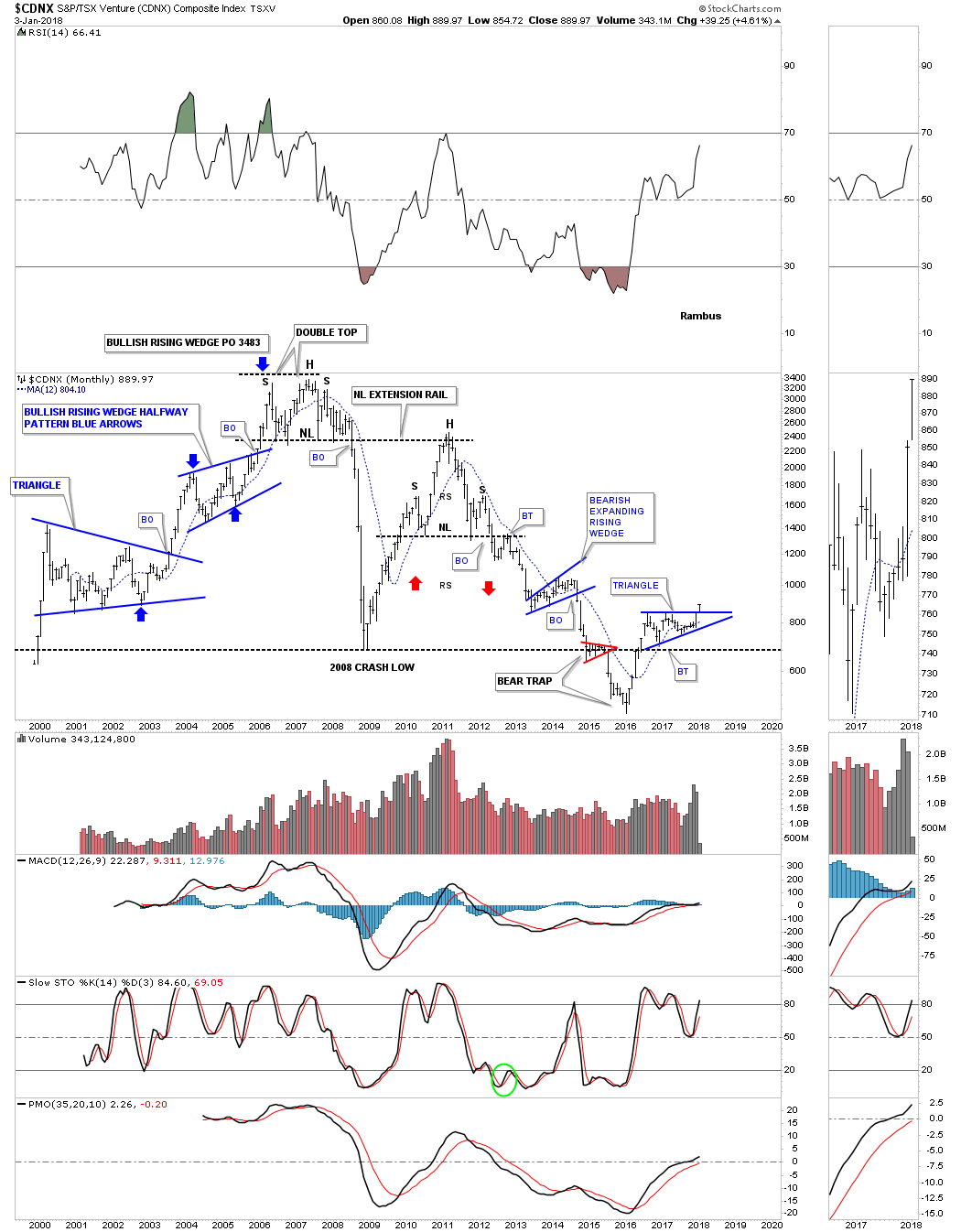
I believe the breakout on this chart is potentially very significant for all the markets we cover here at Rambus Chartology.
All the best
Rambus