For the benefit of many of our new subscribers I would like to go over some of the long term charts we’ve been following that show the secular bull market that began in the spring of 2009. Since we are beginning a new year I think now would be a good time to bring everyone up to speed on what the long term charts are strongly suggesting.
There is a lot of doubt out there about the value of long term chart patterns as most investors never look for them or even seen one. IMHO these are the most important charts to let you know how to invest your hard earned capital. If you’re a day trader these charts won’t help you, but if you’re an intermediate to long term trader these big chart patterns can greatly increase your odds for success.
This is going to sound rhetorical to most of our members, but it’s important to know chart patterns are relative to the time frame you’re looking at. If you are looking at a short term daily chart and see a six month triangle building out the impulse move will be relative to the size of the triangle. If you’re looking at a longer term weekly chart and see a triangle building out, that may be a year or two developing, then the impulse move will be relative to that pattern. This is the same concept for reversal patterns. The bigger the pattern the bigger the impulse move.
What do I consider a large chart pattern? A big chart pattern can be as small as five years or as long as 15 years or even longer in a few cases I’ve seen. I can sense your skepticism with that last sentence. Lets look at some long term charts with some big chart patterns on them so you can see for yourself if there is any validity to that last statement.
Keep in mind that any consolidation pattern has to have an even number of reversal points to be valid, 4, 6, 8 or more. A reversal pattern will have an odd number of reversal points, 3, 5, 7 or more. This goes for a pattern on a minute, daily, weekly or monthly chart. With large patterns in general you will usually see a reversal pattern form at each reversal point, which can give you a good clue, especially at the fourth reversal point, which usually is the hardest reversal point to spot in real time.
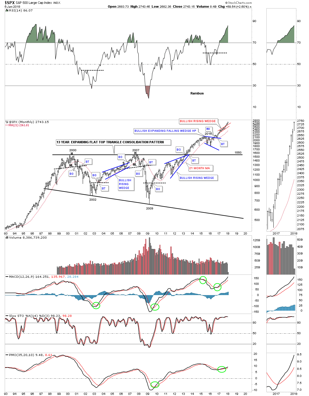
I would like to start with a 20 year monthly chart for the SPX because it was one of the first stock market indexes to breakout from its 13 year flat top expanding triangle back in 2013. Back in 2009, shortly after the crash I made a comment on this chart below on how I was speculating that we could possibly be seeing a large consolidation pattern building out. I was using an analogy from the 1970’s consolidation pattern on how it played out vs how the current multi year trading range may develop.
Back during the 1970’s consolidation period the mid reversal point formed in 1974 which ended up being the middle of the consolidation zone. I speculated that it was possible that the 2009 crash low could mark the middle of the our current trading range. It did mark the low price wise, but time wise the SPX wasted little time in rallying back up to the top of the trading range. The actual breakout took place in May of 2013 with one quick backtest before the SPX began its first impulse move higher.
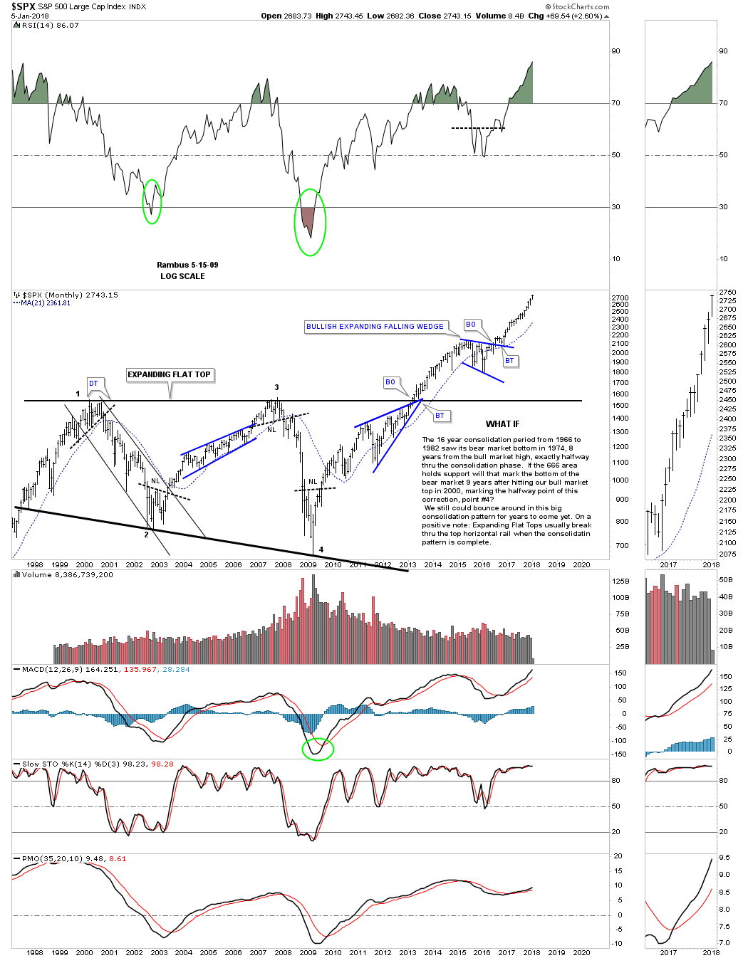
This next chart for the SPX is the same chart as the one above, but this one is the updated version. There is a lot of important Chartology on this chart that has given us many good clues on what is taking place for this 500 big cap stocks index. First, note where each reversal point formed on that 13 year expanding flat top triangle. Reversal point #1 formed at the bull market high in 2000. Reversal point #2 formed at the bear market low in 2002. Reversal point #3 formed at the the top rail during the housing bubble in 2007 and the 4th reversal point formed at the 2009 crash low. These were all very important reversal points in history which created the 13 year expanding flat top triangle consolidation pattern. You can also see a reversal pattern at each major reversal point.
A very big clue that the 13 year expanding flat top triangle was going to breakout above the top rail was when the blue bullish rising wedge formed just below the top rail. We’ve discussed this many times in the past that when you see a smaller consolidation pattern form just below an important trend line it will often times give the stock the energy it needs to finally take out resistance.
After the breakout in 2013 the SPX rallied for a little over two years before it needed to consolidate its gains starting in 2015. The first consolidation pattern that formed after the first impulse move out of that 13 year expanding flat top triangle was a blue bullish expanding falling wedge. Note the nice clean breakout and backtest which has led to our current rally phase. The little red bullish rising wedge is the same pattern we’ve been following on the stock market combo charts.
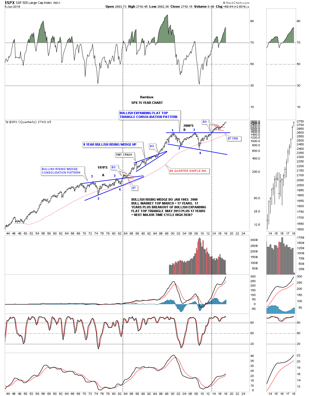
We discussed earlier in this post that the impulse move is relative to the size of the consolidation or reversal pattern that is formed. Small consolidation patterns lead to small moves while big chart patterns lead to big moves. Below is a 75 year quarterly chart for the SPX which has just three chart patterns on it with each one being a consolidation pattern. The 1970’s consolidation built out a bullish rising wedge. After the breakout the price action formed the small red bull flag as the backtest before the impulse move took off.
That initial impulse move lasted until 1987 when we got the infamous 1987 crash which is still the largest one day crash on a percentage basis in history. I can tell you from first hand experience that it felt like the end of the world at that time, but it did little to stop the secular bull market. Instead of crashing the SPX began to build out an 8 year bullish rising wedge halfway pattern which led to the eventual secular bull market top in 2000 which is the first reversal point in the 13 year flat top expanding triangle consolation pattern.
I would like to apologize for going into so much detail on the SPX charts above, but I just wanted to layout the groundwork for many more charts to follow. This is how markets work from the small time frame to the very large time frame where everything is relative. Now that you have the basic understanding of how these big chart pattern work lets look at some more long term charts as they will paint the big picture for us.
One of the most important question an investor needs to ask themselves before they put their hard earned money into the stock market is whether the stock market is in a bull or bear market. If you try to trade long during a bear market you will be fighting the downtrend the whole time you are invested. On the other hand if you trade long in a bull market you will always have the wind at your back even if your entry point is off. Time will eventually take care of your bad entry point.
The stock market indexes to follow will show you that we are in a secular bull market, not just in the US but around the world as well. Regardless of all the reasons that many see as negative signs for the stock markets the Chartology is strongly suggesting something totally different is taking place. A chart paints a picture of the fundamentals and where the investors are actually putting their money to work. That’s what matters more than anything else. A chart pattern shows you the reality of what investors are doing and not opinion.
Since the INDU and the Transportation Average have the most history lets look at them next. Below is a 20 year monthly chart for the INDU which shows the 13 year Jaws of Live expanding triangle consolidation pattern. Unlike the SPX which had a quick breakout and backtest, the INDU had a laborious breaking out and backtesting process. Note the blue triangle that formed on the top rail of the Jaws of Life which was a good clue the breakout would be to the upside. What you are witnessing right now is the impulse move out of the 13 year expanding triangle. Big patterns lead to big moves.
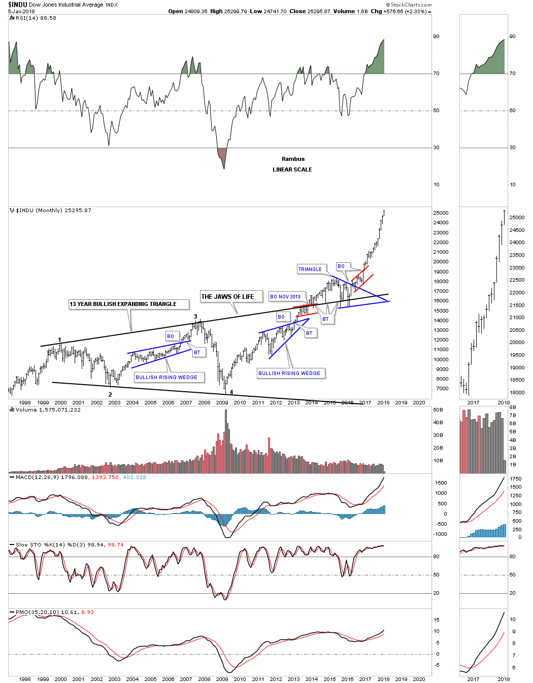
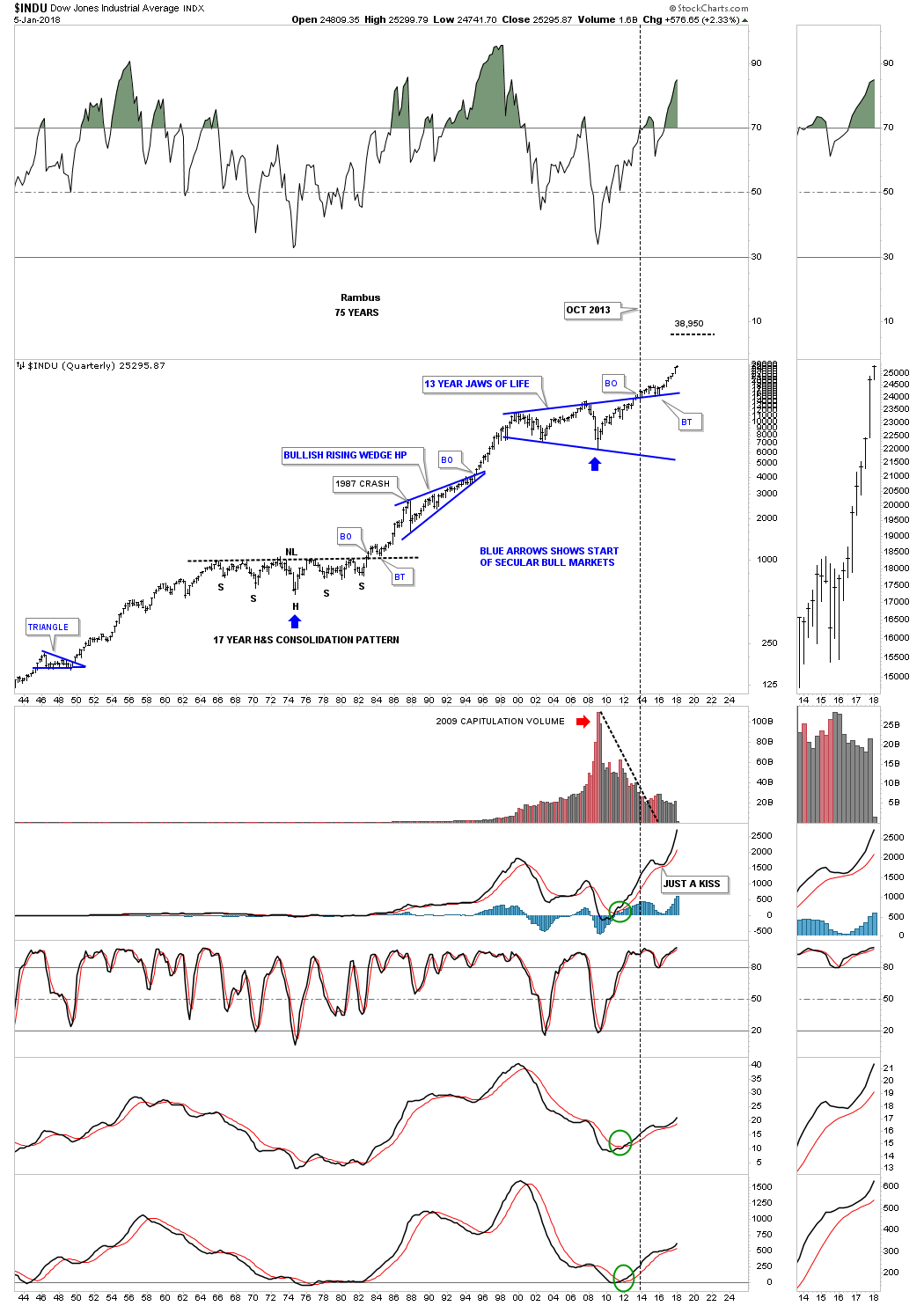
Below is another long term relative chart for the INDU which goes back 75 years. During the 1970’s the INDU built out a beautiful and symmetrical 17 year H&S consolation pattern. It to rallied strongly into the 1987 crash where it began to form the multi year blue bullish rising wedge consolidation pattern. Note the beautiful breakout and backtest that occurred on the 1970’s neckline and the the top rail of the Jaws of Life, which were very big clues the patterns were correct and the new impulse leg up was about to begin.
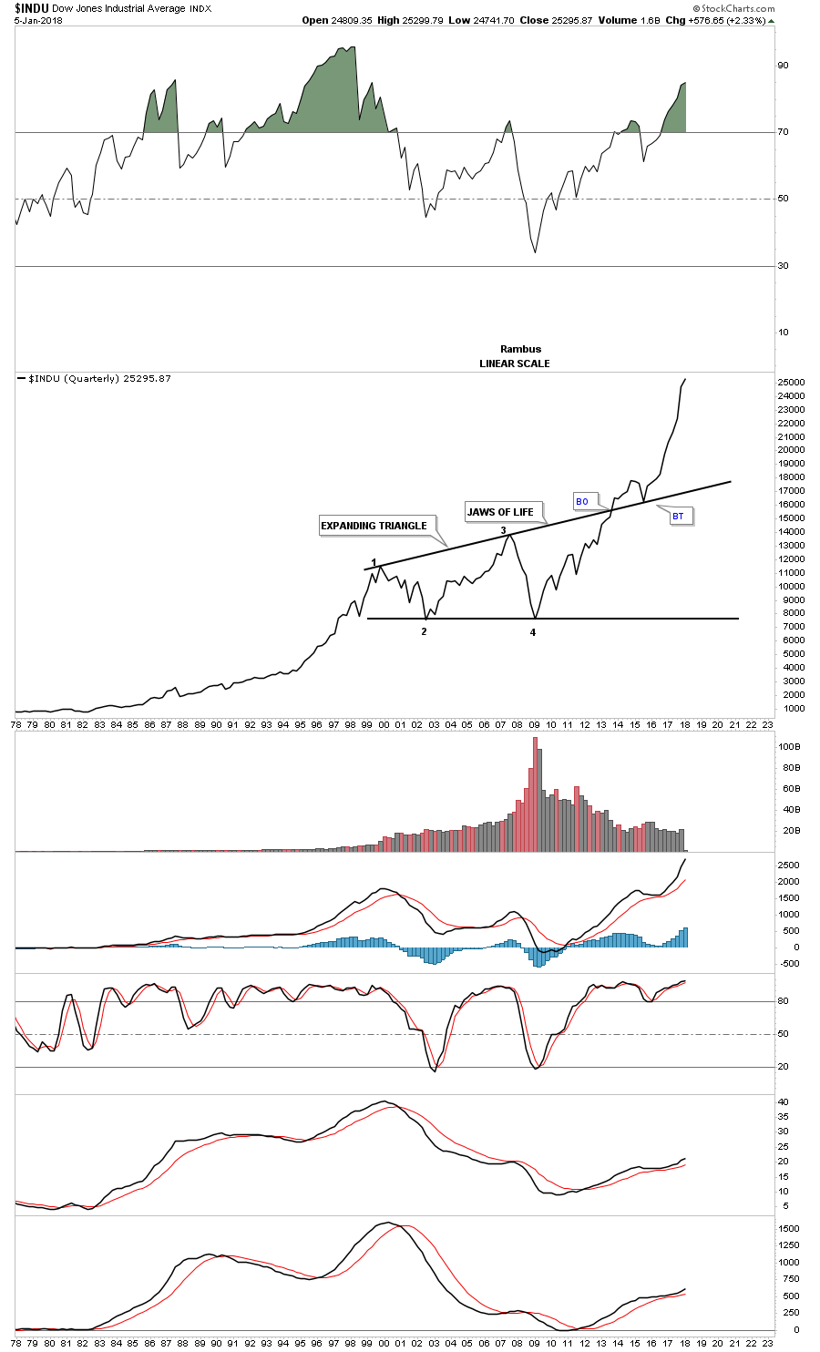
For a slightly different perspective below is a 40 year quarterly line chart which shows how the INDU looks on a quarterly closing basis. Again, big chart patterns lead to big moves.
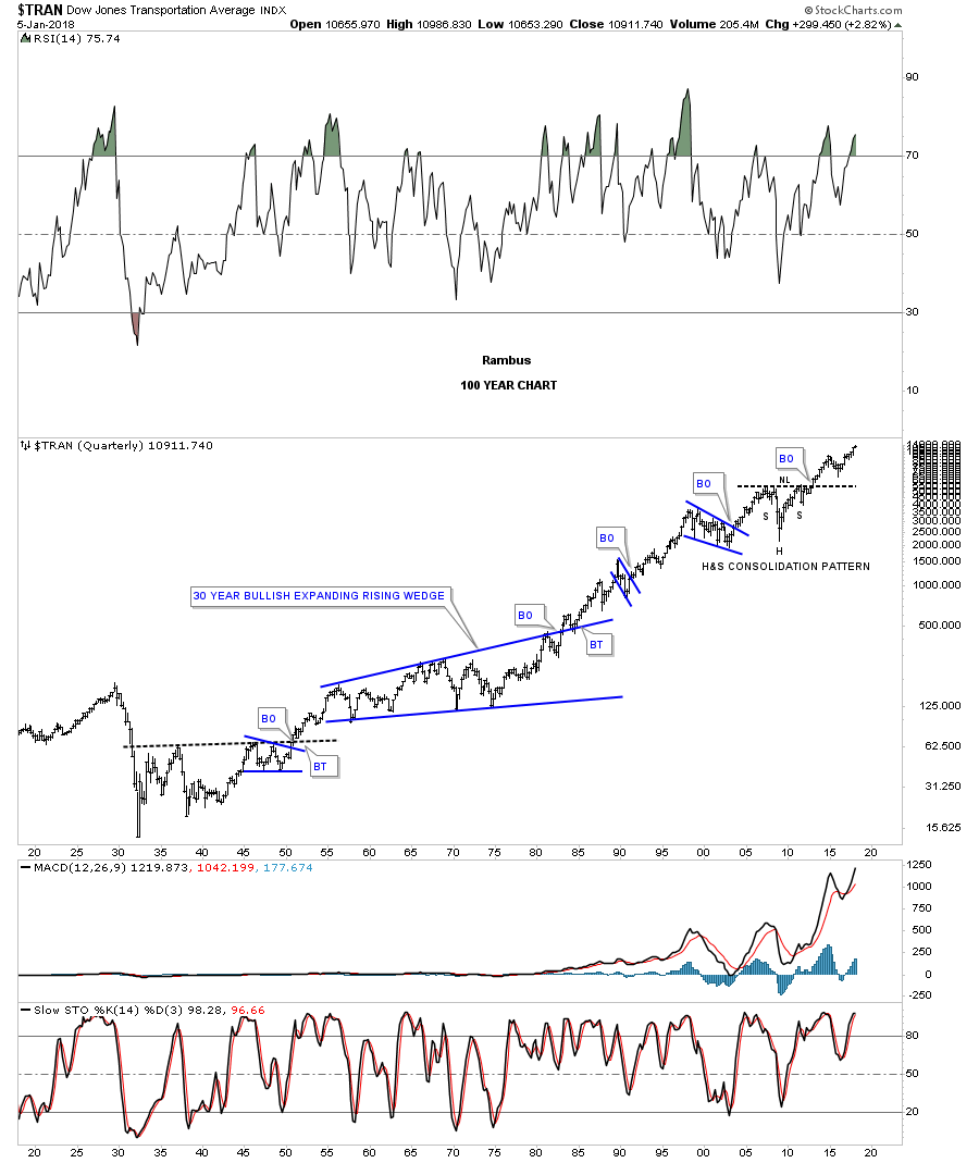
Now lets look at the Transportation Average which has over 100 years of history on it. This 20 year monthly chart has two big chart patterns on it. The first one is on the left side of the chart which was a five year bullish falling wedge. The second large chart pattern is one of the most symmetrical H&S consolidation patterns I’ve ever seen which took seven years to build out. Note the smaller H&S consolidation pattern that formed in 2015 that led to the ten month bullish rising wedge which we are currently breaking out of.
![]()
On this 100 year quarterly chart for the Transportation Average you can see the seven year H&S consolidation pattern in all its glory. There are just several instances over the last 100 years that the Transportation Average made a lower low on this quarterly chart which is pretty impressive when you think about. It’s now trading at new all time highs which is what this chart has been suggesting for a long time now.
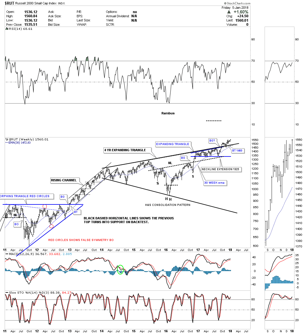
I’m going to breakdown the RUT 2000 into three different long term charts so you can see how the smaller patterns are building out the bigger pattern. As you may know the RUT has been underperforming most of the other US stock market indexes and there is a reason why from a Chartology perspective.
This weekly chart shows a four year black expanding triangle formation with the breakout in September of this year. Also note the smaller blue expanding triangle that formed just below that black four year top rail which gave the RUT the energy to finally breakout. There is also another very big clue that the top rail of the four year back expanding triangle was going to be broken to the upside. The H&S bottom that formed in 2016 has a price objective much higher than the top rail of the black expanding triangle consolidation pattern. Note how the neckline extension line held support on the last reversal point within the blue expanding triangle.
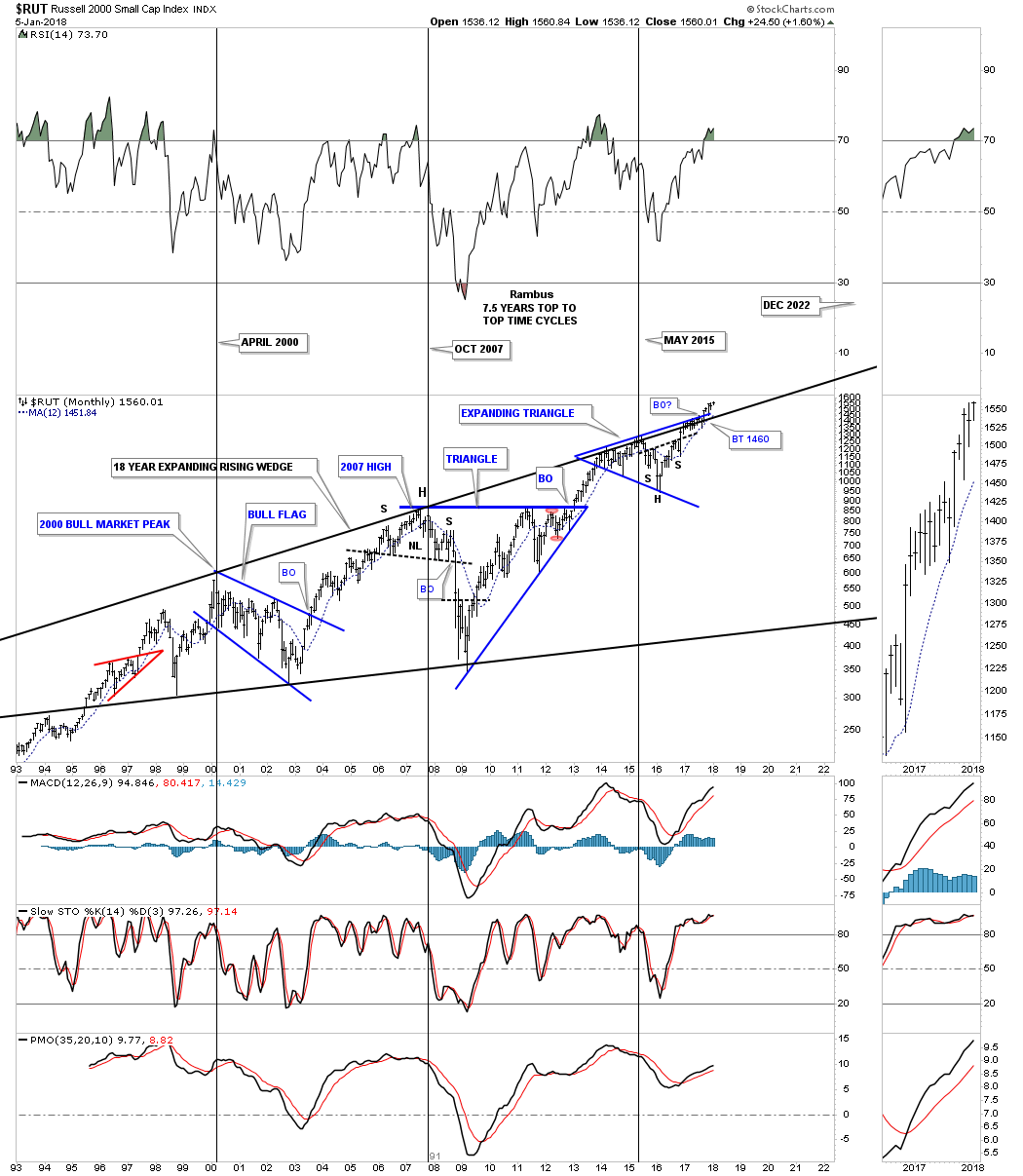
Now lets take the multiple chart patterns one step further and see what the four year black expanding triangle looks like on a 25 year monthly chart. You can now see why the RUT has been lagging some of the other US stock market indexes by all the overhead resistance it has been chewing through since 2013. Again, the H&S consolidation pattern has been telling us for well over a year that the top rail was going to give way, which is now happening. There are four lines of resistance that the RUT has finally broken through. The first one was the H&S consolidation neckline, that was followed by the blue expanding triangle finally giving way, followed by the black four year expanding triangle. The last resistance line was the top rail of the 18 year expanding rising wedge.
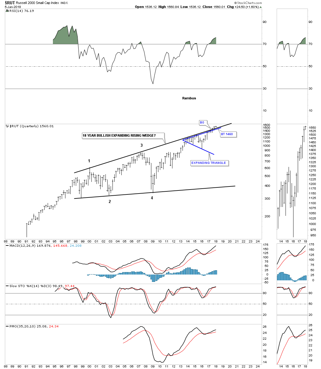
The last chart for the RUT is just a simple quarterly look which is just two big patterns.
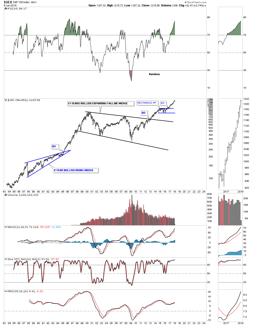
I’m going to go through this next set of long term chart very quickly as they are all pretty self explanatory. Below is the OEX 100.
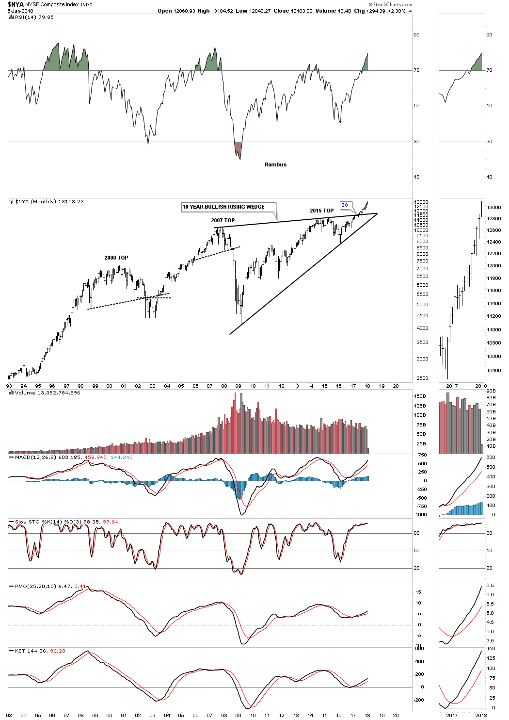
The NYA:
I know I say this about a lot of charts, but this long term 25 year monthly chart for the NDX 100 has some really beautiful Chartology on it. There is the parabolic rally into the 2000 bubble top with the red bullish rising flag as a halfway pattern. Then there is the black ten year triangle consolidation pattern with a beautiful symmetrical H&S bottom at the fourth reversal point. Then there is the blue triangle that formed just below the 2000 all time high at 4816 which we discussed earlier, was usually a bullish setup and is responsible for our current impulse move once the breakout occurred.

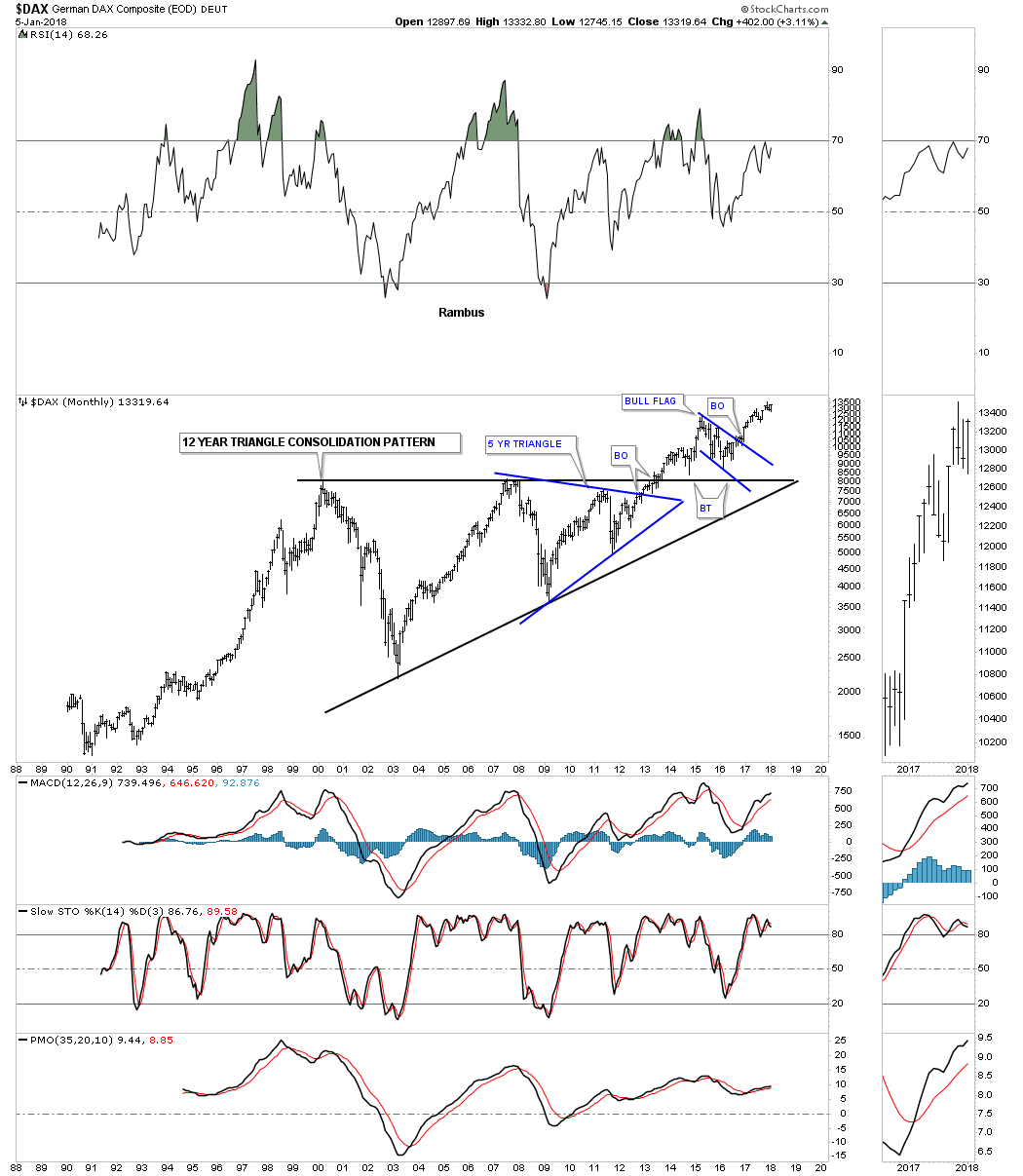
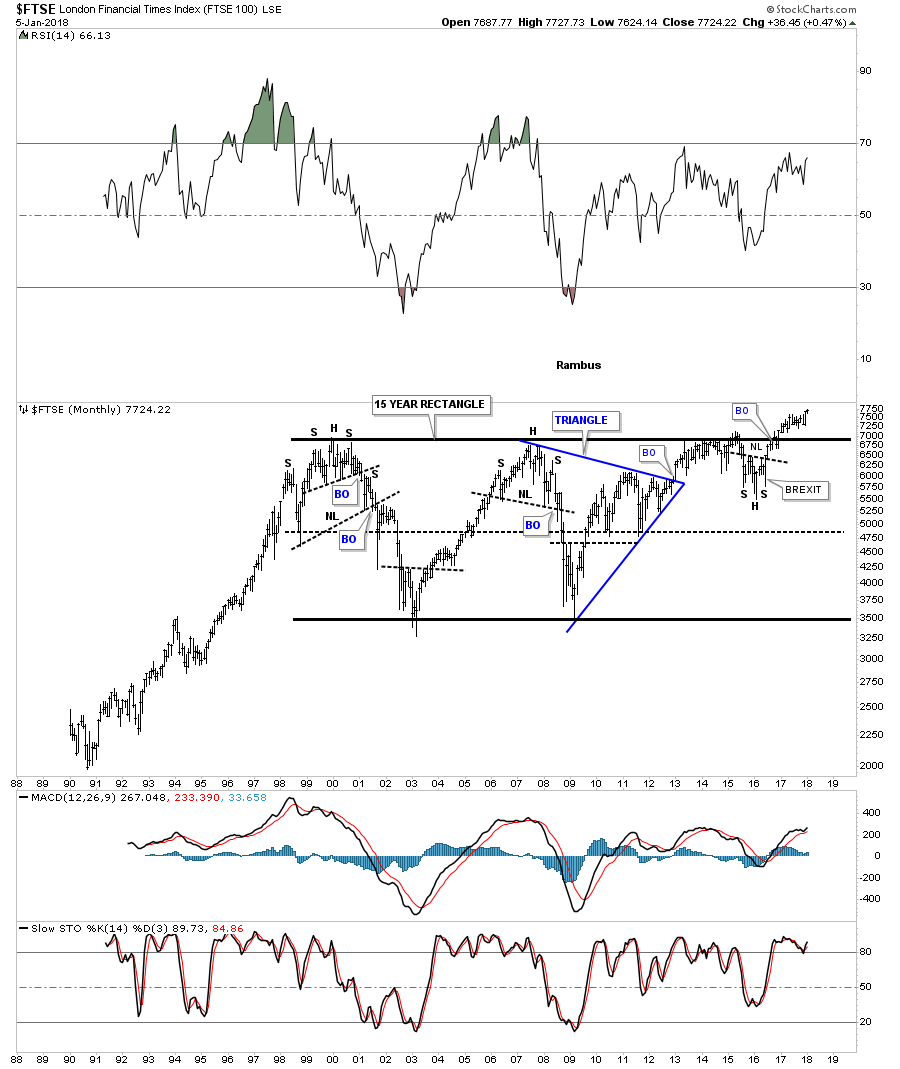
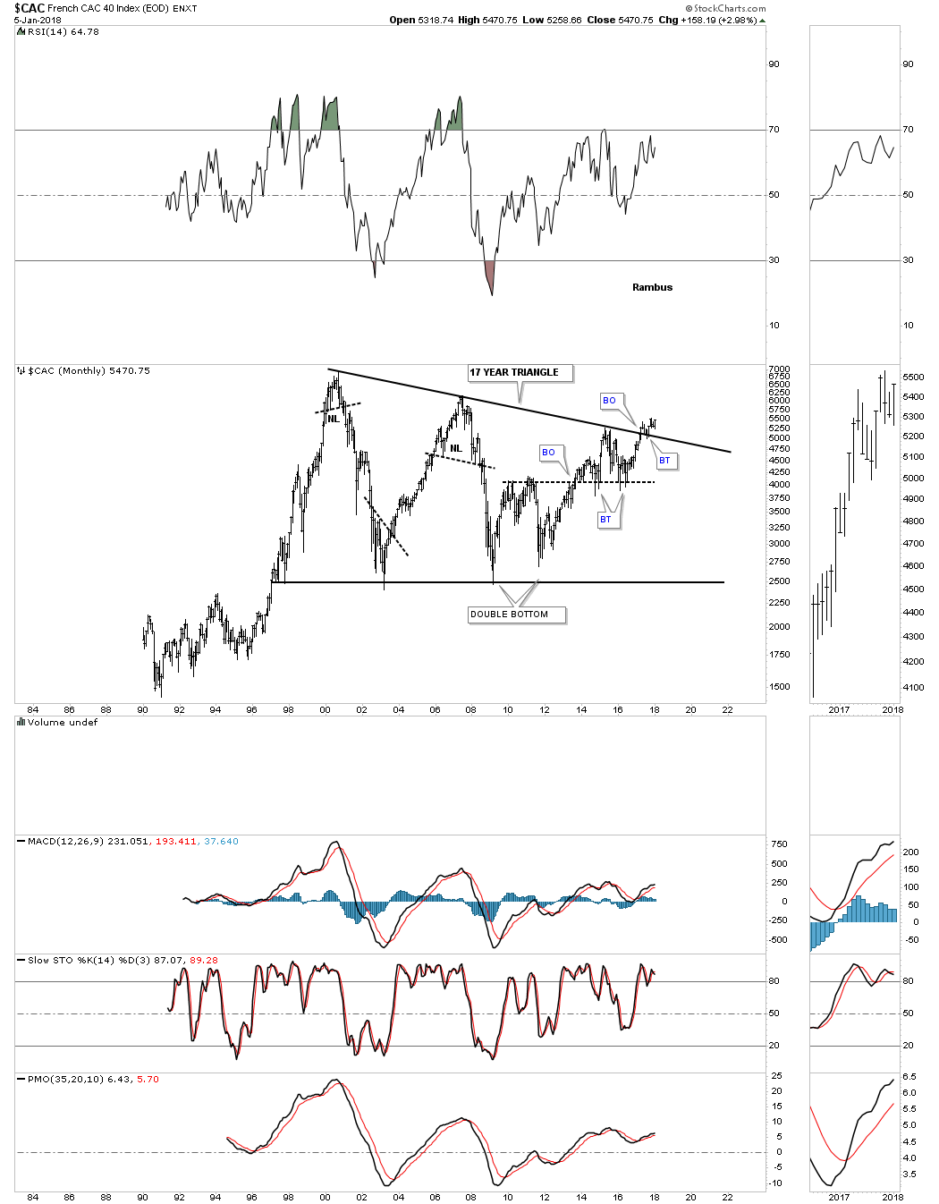
Now I would like to turn your attention to some of the European stock markets as they too have built out some large consolidation patterns which is strongly suggesting they will also enjoy a secular bull market.
$DAX monthly:
FTSE monthly:
CAC monthly:
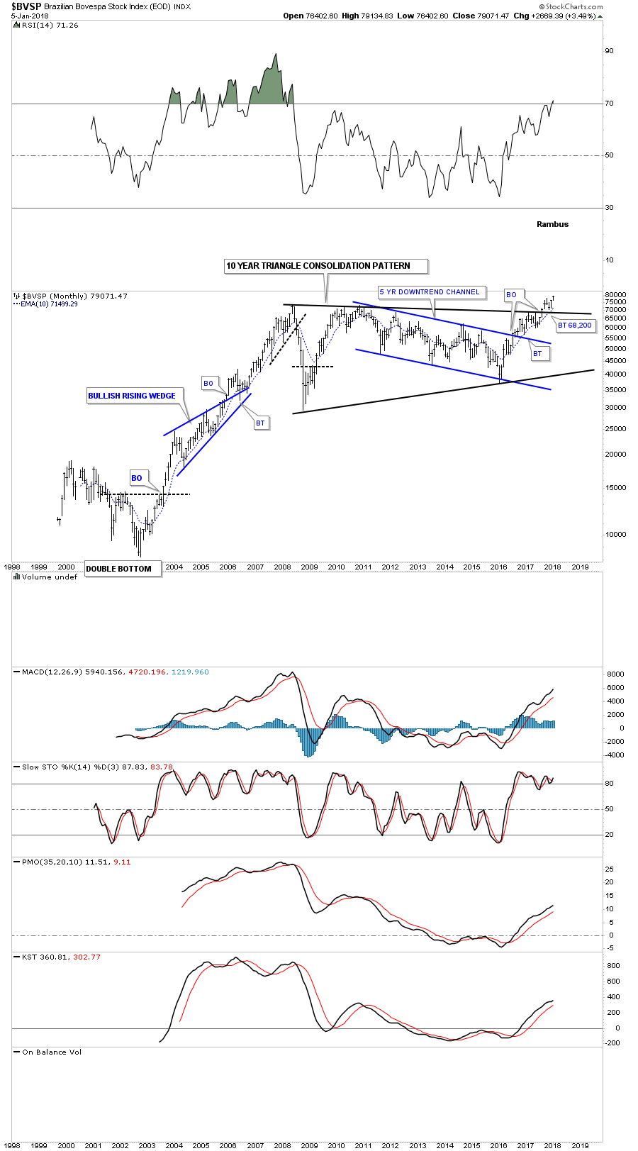
Below is a 20 year monthly chart for the $BVSP, Brazilian Stock Market, which is in the process of breaking out and backtesting the top rail of its 10 year triangle consolation pattern.
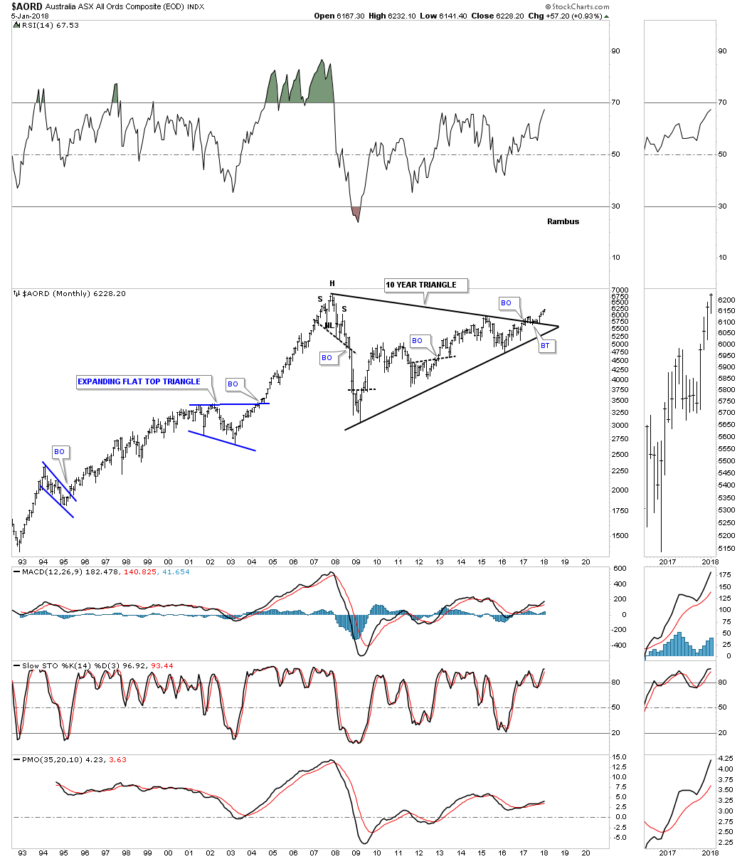
The $AORD, Australian Stock market is in the process of breaking out and backtesting the top rail of its ten year triangle consolidation pattern.
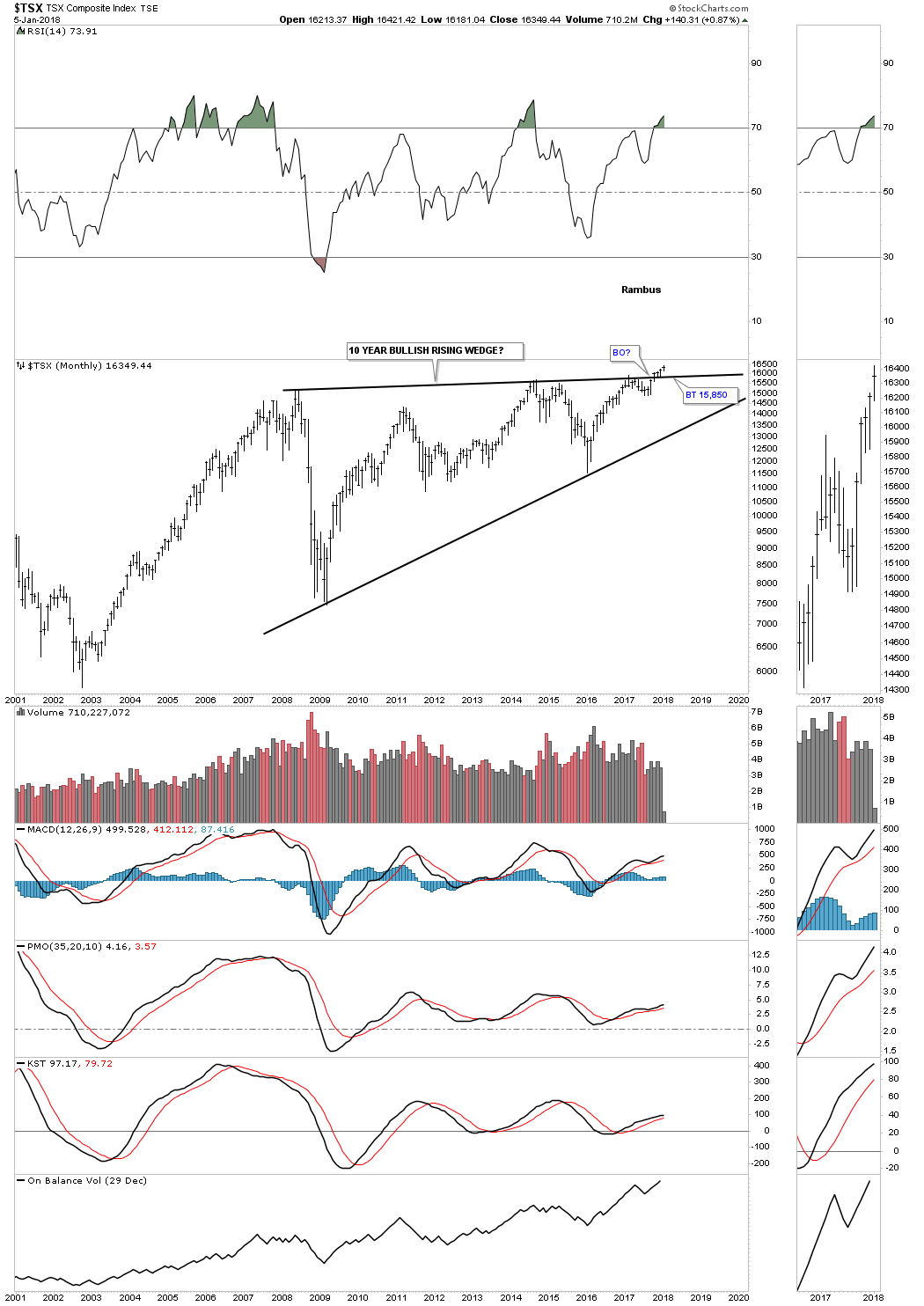
The long term monthly chart for the $TSX shows it to is breaking out and backtesting the top rail of its 10 year bullish rising wedge.
Lets look at some Asian stock markets to see if they are onboard for a worldwide secular bull market. The $NIKK topped out in 1998 and then began a 25 year bear market that formed a bullish expanding falling wedge. Since the breakout above the top rail in 2013 the NIKK built out a small H&S consolidation pattern as the backtest and is now breaking out of that pattern.

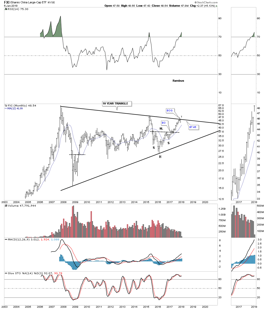
The FXI, China large cap etf, is currently breaking out from a 10 year triangle consolidation pattern with a breakout gap.
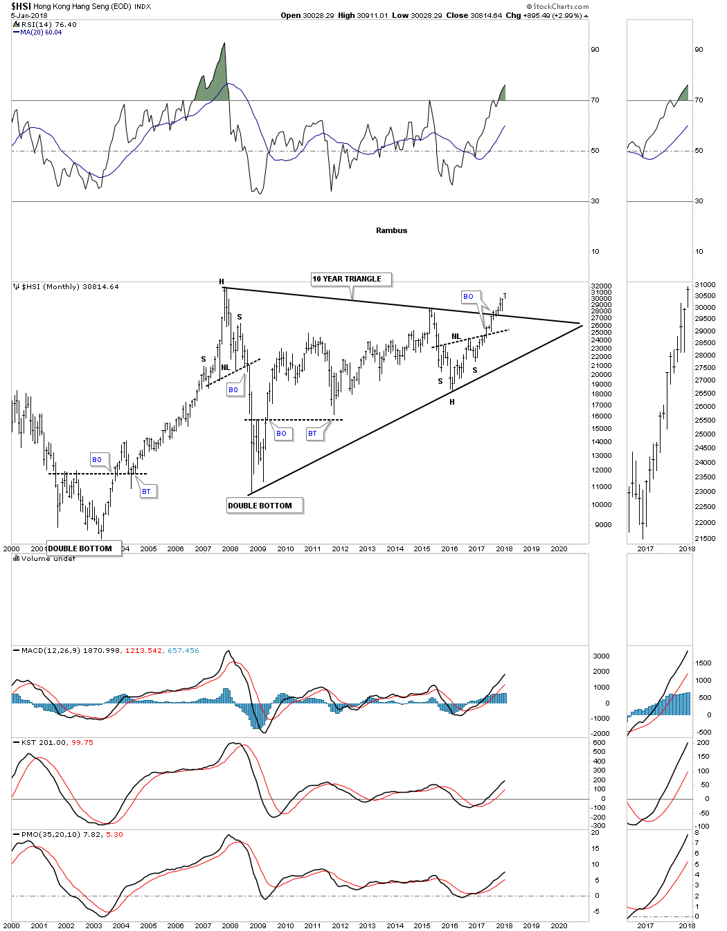
Below is a 20 year monthly chart for the $HSI, Hong Kong stock market, that is starting its four month of breaking out from its 10 year triangle consolidation pattern. Note the small H&S bottom at the 4th reversal point which was strongly suggesting the breakout above the top rail of the ten year triangle would take place.
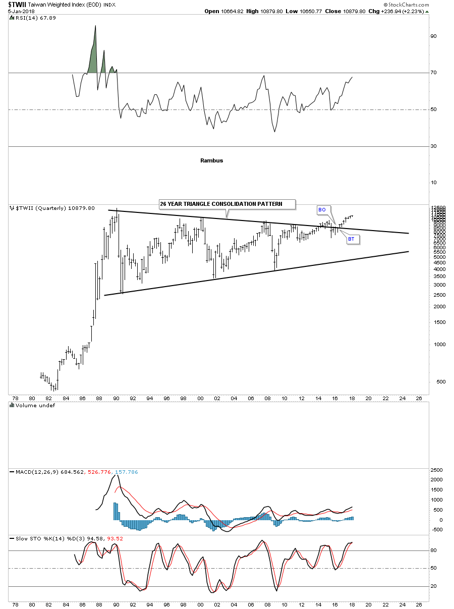
This last chart for tonight has one of the longest consolation patterns I’ve ever seen and I’ve seen a lot. Below is a 40 year monthly chart for the $TWII, Taiwan stock market, which has just recently broken out from a 26 year triangle consolation pattern after completing six reversal points.
This completes part one of this Special Weekend Report. I was hoping to get all the long term charts I’ve collected though the years into two posts, but it looks like it may take three posts to show you how the big picture is shaping up.
How one interpets these long term charts is their business. All I can do is show you what they mean to me and how the secular bull market that started in 2009 is unfolding before our very eyes. We’ve been following many of these charts for years now and nothing has changed to make me think the bull market is over, just the contrary. If anything, these charts enforce my belief that the secular bull market still has a long way to run yet as some of the world stock markets are just now breaking out from their massive consolidation pattern. I will post part two for the Wednesday Report. All the best…Rambus