About three or four weeks ago TSLA was getting a lot of negative feedback from the fundamentals perspective so I showed some charts from the Chartology perspective to see how things would play. Would the fundamentals win out or would the Chartology win.
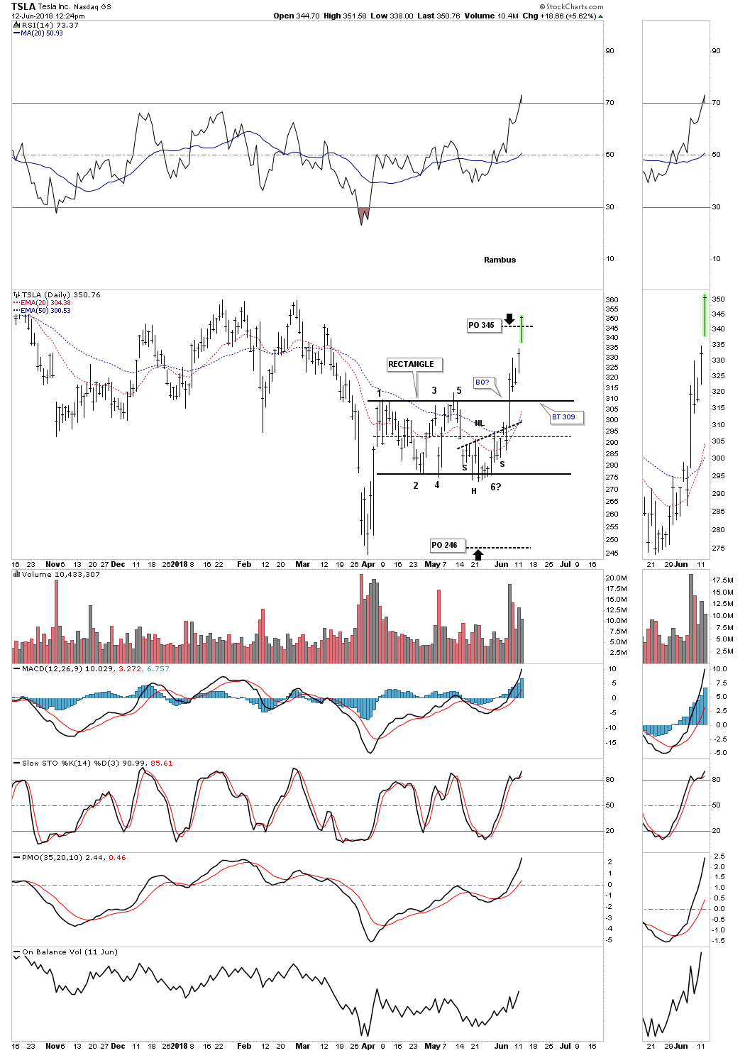
This first chart is a short term daily look which shows the rectangle that was building out with price action trading at the bottom rail when I posted this chart. I gave two price objectives based on the height of the rectangle. If the rectangle broke to the downside the minimum price objective we could expect would be 246 and if the rectangle was going to be consolidation pattern to the upside the minimum price objective we could expect was at 345 which was hit today.
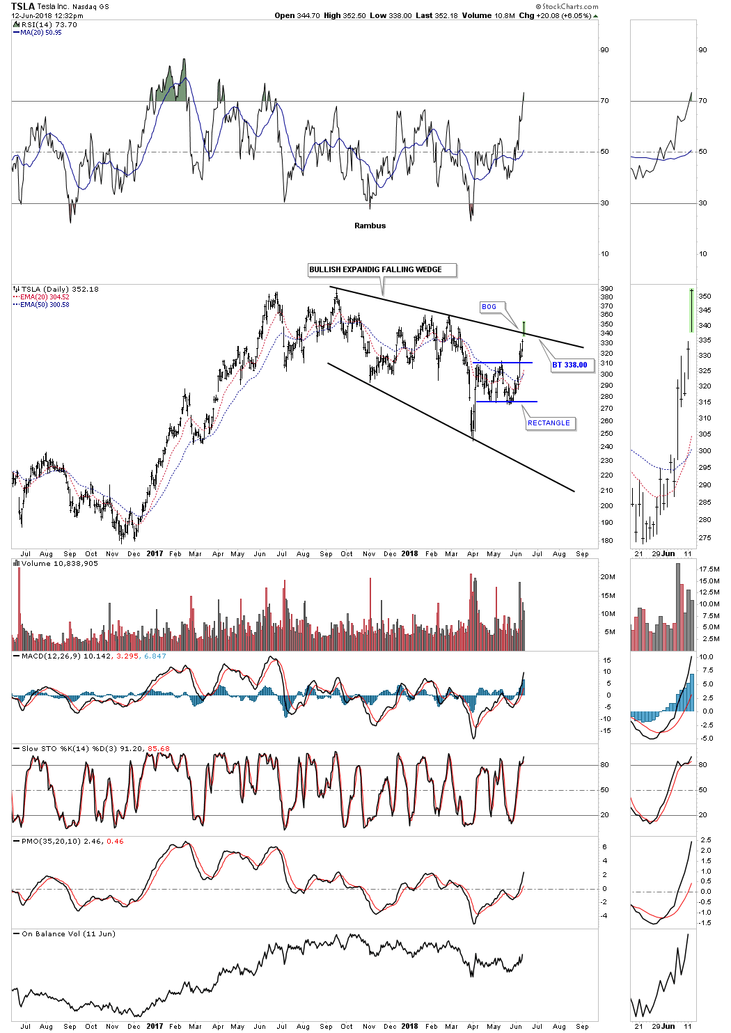
This is where it starts to get interesting. Below is a two year daily chart which shows the rectangle on the daily chart above is part of a much bigger consolidation pattern a bullish expanding falling wedge. Notice the breakout gap which occurred this morning and the big volume over the last five days that coincided with the breakout from the blue rectangle and now the bullish expanding falling wedge.
Bullish expanding falling wedges are one of the hardest patterns to spot in real time as they make lower lows and lower highs. On the positive side when you do spot one of these patterns they can be very bullish because many investors are stopped out just before the bullish move begins. A backtest to the top rail would come in to play around the 338 area.
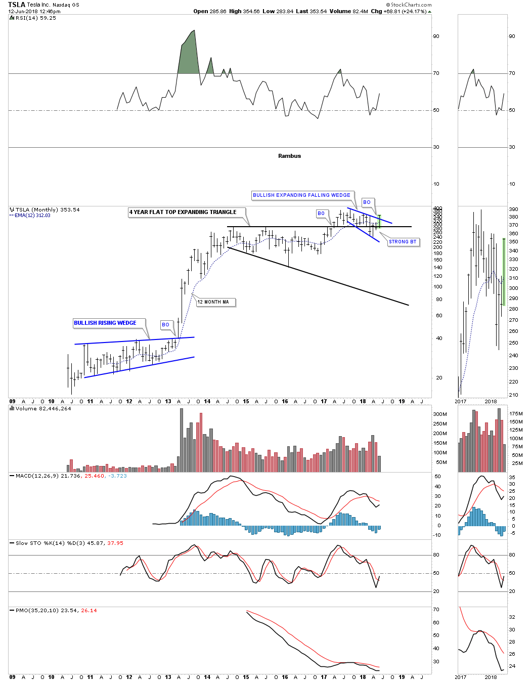
This long term monthly chart shows the entire history of TSLA. When I presented the potential bullish case vs the bearish fundamental case, I suggested that the top rail of the four year flat top triangle should hold support as it acted as strong resistance for four years. At the time the price action was trading slightly below the top rail so I labeled the backtest as a strong backtest which happens from time to time.
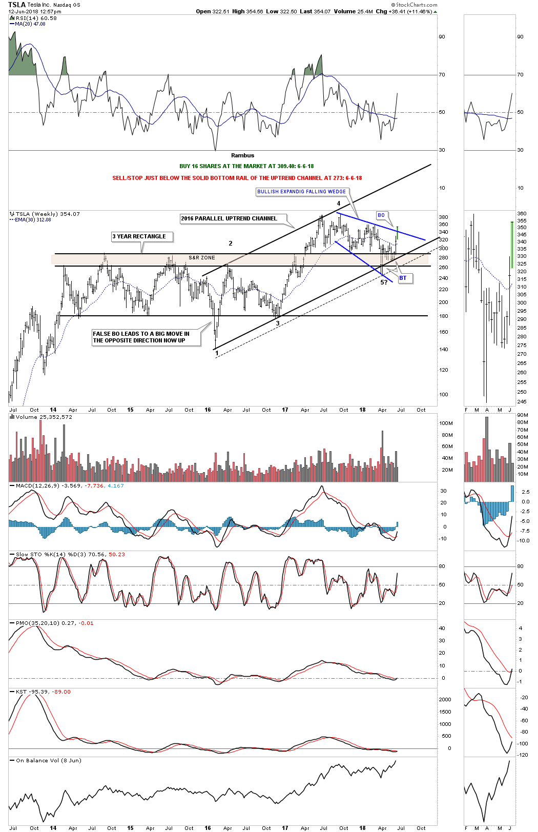
Below is the weekly chart we were looking at which shows the 2016 bull market uptrend channel. When I posted this chart I expanded the top of the flat top triangle to encompass the two shorter highs which gave me the brown shaded support and resistance zone. Previous resistance once broken to the upside should turn into support which was the case.
The psychology of why this happens is that everyone who bought TSLA below the S&R zone are making money and feel positive about their investments. So when the price action declines down to the S&R zone they are still ahead on their investment and hold on to their position which cause support to hold. On the other hand if the price action started to trade significantly below the S&R zone then the investors will become concerned and will start looking for a place to exit their trade on any strength changing the bullish trend to a bearish one.
You may have noticed I got most of our trades updated on the sidebar this past weekend. While I have TSLA highlighted here I’m going to move the sell/stop up to 312.13 on a close below the 30 week ema. In the Wednesday Report I’m going to post the ten big cap stocks we bought on June 1st which I put into one post. In order to show each individual stock I will have to post each one separately and then move it to the sidebar. Each trade on the sidebar will show the entire history of the stock from the first buy point to the current update.