I was going through some old long term charts I haven’t posted in many years to see if there was anything of interest to post tonight. With long term charts things don’t change very fast and the big picture can stay viable for years. I have literally hundreds of charts for the different PM stock indexes that I’ve built through the years that are tucked away in different chart lists that I don’t check very often. It’s always interesting to go through some of those old chart lists, especially with the longer term charts, to see what I was thinking years ago and how relative that big picture looks today.
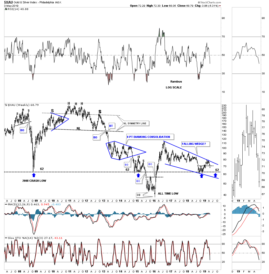
This first chart is a 12 year weekly chart for the XAU which begins with the 2007 small H&S top that led to the crash in 2008. When I first began to post that potential H&S top nobody and I mean nobody wanted to hear about it. The PM complex had been in a raging bull market up to that time so how could there be a H&S top reversal pattern forming. That 2007 H&S top produced the biggest and most vertical decline in the history of the XAU which caught most PM investors off guard. Luckily for those investors that held on during that massive decline, which would have been near impossible, were treated to a reverse symmetry rally back up over the same area on the way down. That 2008 crash low rally produced marginally new highs which turned out to be a massive H&S top which ended the bull market.
I still remember when the 2011 H&S top completed, the impulse move down from the right shoulder high caused panic in the streets and talk of how the PM complex was being manipulated and how unfair it was. My take was totally different as I could see the Chartology that had built out and the most obvious outcome was a collapse in prices as the price action was breaking down form a massive H&S top which was a perfect setup that ended the bull market and ushered in the new bear market. There was no way to know back in 2011 when the head portion was building out that the new bear market would last as long as it has.
Some folks say the bear market ended in January of 2016 for the PM stocks which technically could still be true but the pain and suffering by the precious metals investors up to this point has been much greater than most would have ever imagined eight years or so ago. When you look at this long term chart below there has only been about a seven month rally in 2016 that gave the PM investors any hope at all the the bear market may be over and a new bull market was beginning. In a few months from now it’s going to be a three full years since the top in August of 2016 was completed. The most recent rally that began in September of last years was not an impulse move to the upside but just a counter trend rally within a consolidation pattern.
What is also striking on this 12 year chart for the XAU is that the current price action is now approaching the 2008 crash low again around the 62 area. As you can see the 2008 crash low was tested again in 2015 when the XAU built out a small consolidation pattern right on the 2008 crash low trendline. Then came the low for the bear market in January of 2016 which produced the biggest rally of the 2011 bear market. The third touch of the 2008 crash low happened last year in September. As I mentioned earlier the price action is within striking distance of the 2008 crash low for the fourth time as shown by the blue arrow.
Today the XAU closed the week at 68.79 a mere seven points or so off the 2008 crash low. The reality is the PM complex has been one of the toughest areas to trade and make any real profits in the last eight years or so. I was able to catch maybe half of the 2016 rally for a small profit before I sold out and went to cash after I seen a small H&S top building out. Our current rally phase that began in September of last year I was able to catch several months of that rally before exiting all my PM stocks on April first and second for a modest loss. If one doesn’t get in at the absolute low and get out at the very top in these countertrend rallies within a bear market it’s very hard to lock in any meaningful profits. I know there are many PM stock investors that are still hoping the current downtrend is going to reverse pretty soon to relive the pressure that is growing with each passing day. I’ve been down that road and I didn’t like it one bit as hope becomes your best friend and you become trapped with no way out especially if you didn’t get in at the absolute bottom.
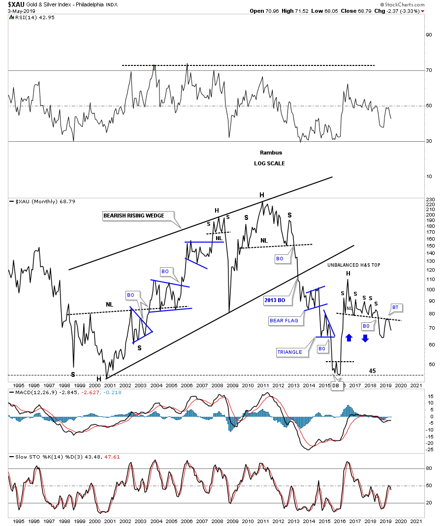
This last chart for tonight is a 25 year monthly line chart for the XAU which shows the 2000 to the 2011 bull market as one big bearish rising wedge. The bottom rail of that bearish rising wedge was broken to the downside during the 2013 hard decline. As you can see when the price action bottomed in January of 2016 the XAU retraced 100% of its bull market. After the 2016 rally phase was over and the correction began the price action has built out a two year unbalanced H&S top with a backtest to the neckline in February of this year. Keep in mind this is a monthly line chart so chart patterns can look a bit different but can still be valid. The bottom line is that if the XAU can trade back above its unbalanced H&S neckline that will negate the H&S top but until that happens the Chartology is suggesting lower prices to come. Above the neckline is bullish and below is bearish.
Have a great weekend and all the best…Rambus