
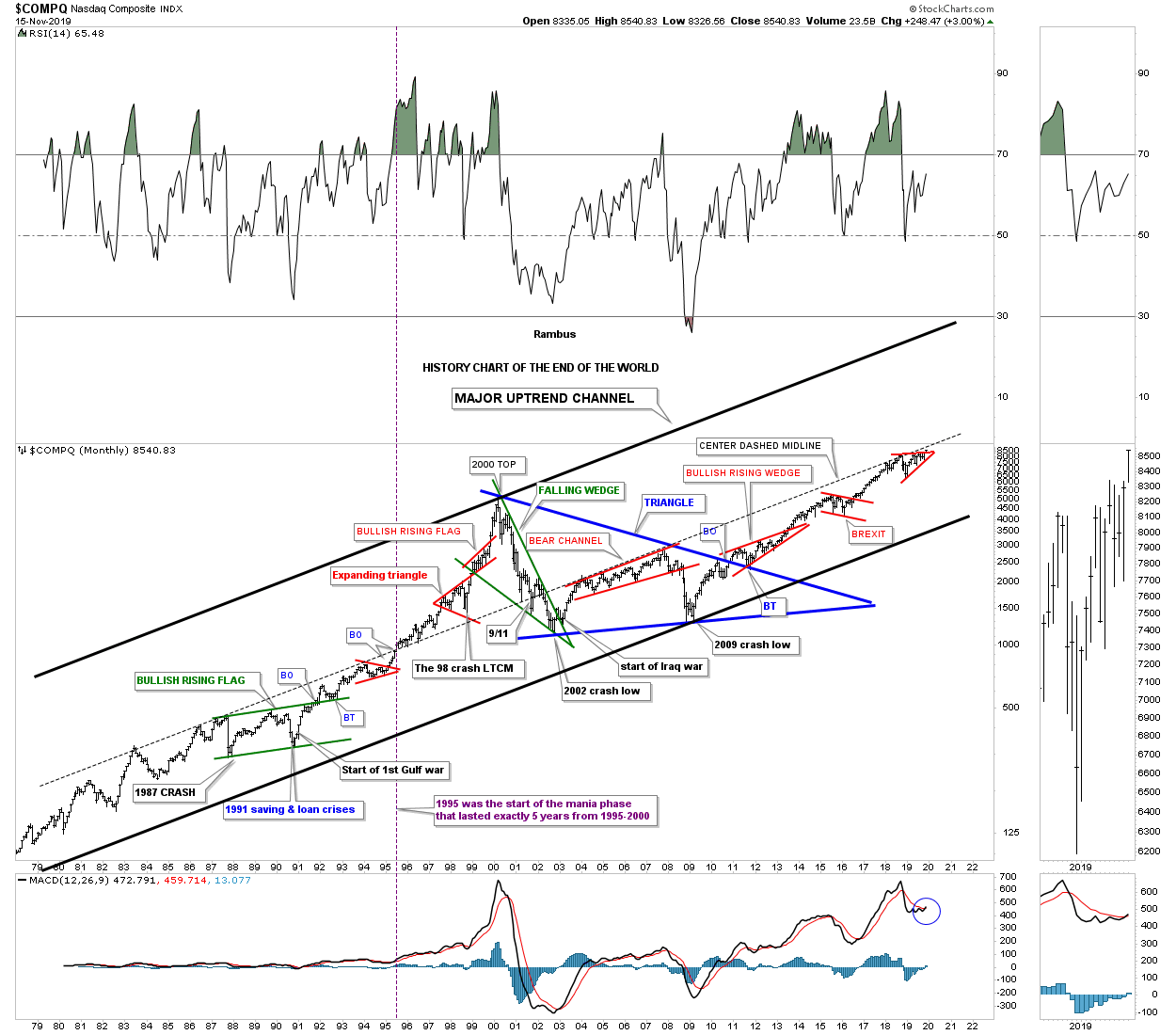
Once a year I try to post this very long term monthly chart for the $COMPQ which I call, “HISTORY CHART OF THE END OF THE WORLD.” I built out this chart many years ago and update it when there is anything of interest to show. The last entry was the BREXIT vote in February of 2016. You my recall the markets were uneasy about the vote, but has been the case in the past it usually marks an important low.
If you look at this chart starting on the left hand side I’ve labeled all the important historical events that felt like the end of the world if you were trading in the markets then. There was one day during the 1987 crash that is still the biggest one day percentage decline in history where the markets were down around 23% or so. To put that into perspective if the INDU were to experienced a 23% one day correction now it would be down around 6400 points.
The COMPQ quickly recovered and rally into the September 1989 high which began another correction caused by the Saving and Loans crisis. If that was’t bad enough a year or so later began the start of the Gulf war which the markets shrugged off as not important. Those 3 history making events created the green bullish rising flag with a nice clean breakout and backtest. Less than 10 years later the COMPQ finally put in its bull market high. Just before the bull market high was established there was one more historical event which most have forgotten about, but at the time the markets were really rattled by the 1998 LTCM, Long Term Capital Management, debacle.
After the 2000 top was completed came the first real bear market since the 1970’s as shown by the green falling wedge. The percentage decline for the COMPQ was massive and it felt like the end of the world back then. Many thought another Great Depression was beginning the would last for years to come. Again, if that wasn’t bad enough came the start of the Iraq war at the bear market low. How could the markets ever rally with all this bad news? The markets did find a way to stabilize and found a way to rally higher into the 2007 housing and banking crises. At the November 2007 high began the infamous bear market decline that this time for sure was going to put the US in the next Great Depression.
As the INDU and the SPX began their great decline taking out their 2002 lows the COMPQ on the other had declined far less because its 2000 to 2002 bear market was much more severe than the INDU and the SPX which produced a clear positive divergence for the tech stocks. Finally in March of 2009 the bear market that was going to last for many years came to an abrupt end and rallied strongly out of that 2009 bear market low creating the biggest bull market of all time that is still going on to this day with one consolidation pattern forming on top of the previous one. Note the 10 year blue triangle consolidation pattern which was needed to consolidate more than 20 years of the last secular bull market. You can also see the clean breakout and backtest to the top rail of that 10 year blue triangle consolidation pattern.That 10 year blue triangle is a halfway pattern between the two secular bull markets with the first one starting in the mid 1970’s and our current one that began at the 2009 low.
There is one last point I would like to make on this chart which I have absolutely no idea if it will play out. Note the center dashed mid line that runs though the center of the uptrend channel. For the most part the price action has traded in the lower channel below the dashed mid line. Back in 1995 the price action broke out above the center dashed midline for the first time which began the acceleration phase or parabolic run into the 2000 top. Looking at the current price action you can see the red consolation pattern that has been forming just below the center dashed mid line for over a year now. Is it possible we could see an acceleration phase to the top rail of the major uptrend channel before our current secular bull market runs it course? That one year red trading range with the price action currently breaking out is strongly suggesting the center dashed mid line is going to give way. Have a great weekend and all the best…Rambus
PS: I’ve updated the portfolios on the sidebar this morning. The Kamikaze and the Gold Stocks portfolio are 100% in cash as of Thursday. I’m going to move the CURE trade back to the leverage portfolio where it needs to be as we raise some cash this week. Also you can see the history for each trade by scrolling down to the bottom which shows where the first entry point was made and the subsequent entry points that followed.