From the March 23rd low in the PM complex we’ve enjoyed the first easy part of this rally that should have many years to run yet. Every bull market will consist of an impulse move followed by a consolidation period, rinse and repeat until the bull market ends with some type of reversal pattern. Normally in a secular bull market the turning points will generally be very large to buildup the energy to advance to new highs.
The current 2nd leg up in the secular PM complex bull market actually began in January of 2016 after the first leg up ran from 2000 to 2011. There was a cyclical bear market within the secular bull market that ran from the 2011 high to the January 2016 low. It’s important to understand which part of a bull market one is in as to not get confused on what may lay ahead.
Tonight I would like to show you some long term quarterly line charts that I use when looking for big chart patterns that usually show up at important long term reversal points that can take years to complete. I usually only post these charts just a couple of times a year as change comes very slowly but when change does come it’s important to pay close attention because the change usually represents a major trend change.
Keep in mind when looking at these long term quarterly line charts that only the quarterly closing price is used which makes the chart patterns not very symmetrical looking. When I do spot a long term chart pattern on the quarterly line chart I will switch it over to a bar chart which will make the patterns a little more clear. Again, it is the major trend we want to trade with unlike a salmon swimming upstream using up all of its energy before it reaches the spawning grounds.
When looking at these charts to follow we still have over 3 weeks of trading yet before these quarterly line charts complete their 2nd quarter results which will then be put into stone. Also, since these are line charts you will be able to see more clearly reverse symmetry. How a stock goes down is often how it can go back up over that same area, which can play an important role in understanding the potential sweet spots where the price action can easily move with little in the way of resistance.
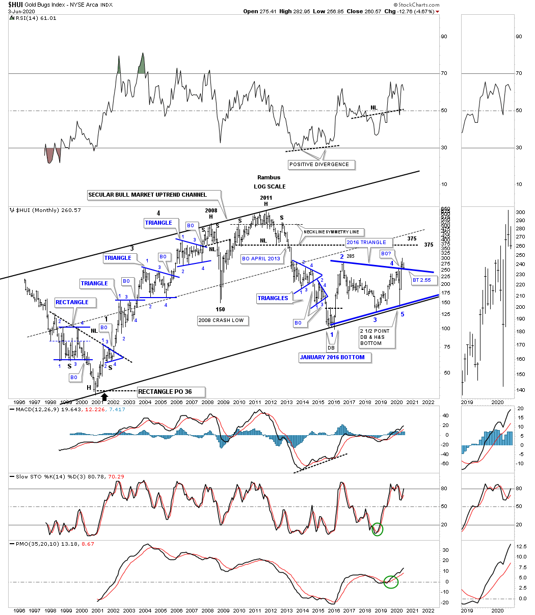
This is the HUI secular 2000 bull market uptrend channel that I will use as reference to the quarterly line charts to follow.
Lets start with the quarterly line chart for the GDM which begins in the early 1990’s. Keep in mind we are just looking for big chart patterns. It took almost 10 years to complete the double H&S bottom which launched the first leg of the secular bull market that ended at the 2011 high. That first leg of the secular bull market ended with the formation of a very symmetrical multi year H&S top, not so much on this quarterly line chart, but on a bar chart. That H&S top led to the bear market that ended at the January 2016 low. From that low the GDM carved out a 7 year H&S bottom reversal pattern with the long term breakout taking place this quarter. The blue arrows show you how reverse symmetry looks. The reason reverse symmetry works is because there were no big consolidation patterns that were made during the long term rallies and declines. If you look at the bear market decline out of the 2011 H&S top you can see a straight line down without any quarterly rallies. Now look at the current breakout taking place above the neckline. As you can see there is little in the way of slowing down any rally until the price action reaches the 2011 H&S top neckline.
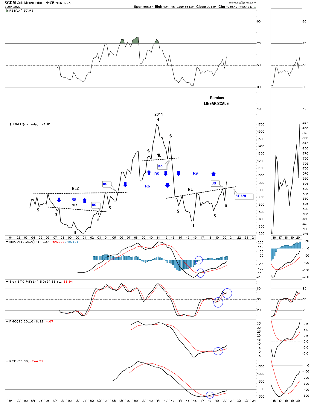
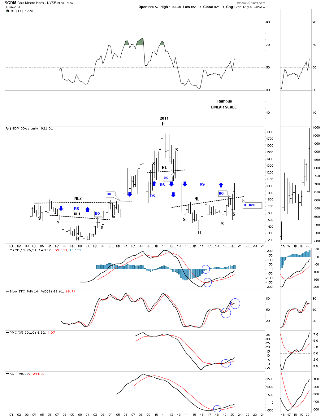
I’m going to show you the exact same chart as the one above but this will be a bar chart so you can see how these two compliment each other.
Next is the quarterly line chart for the HUI which is just beginning its breaking out process.
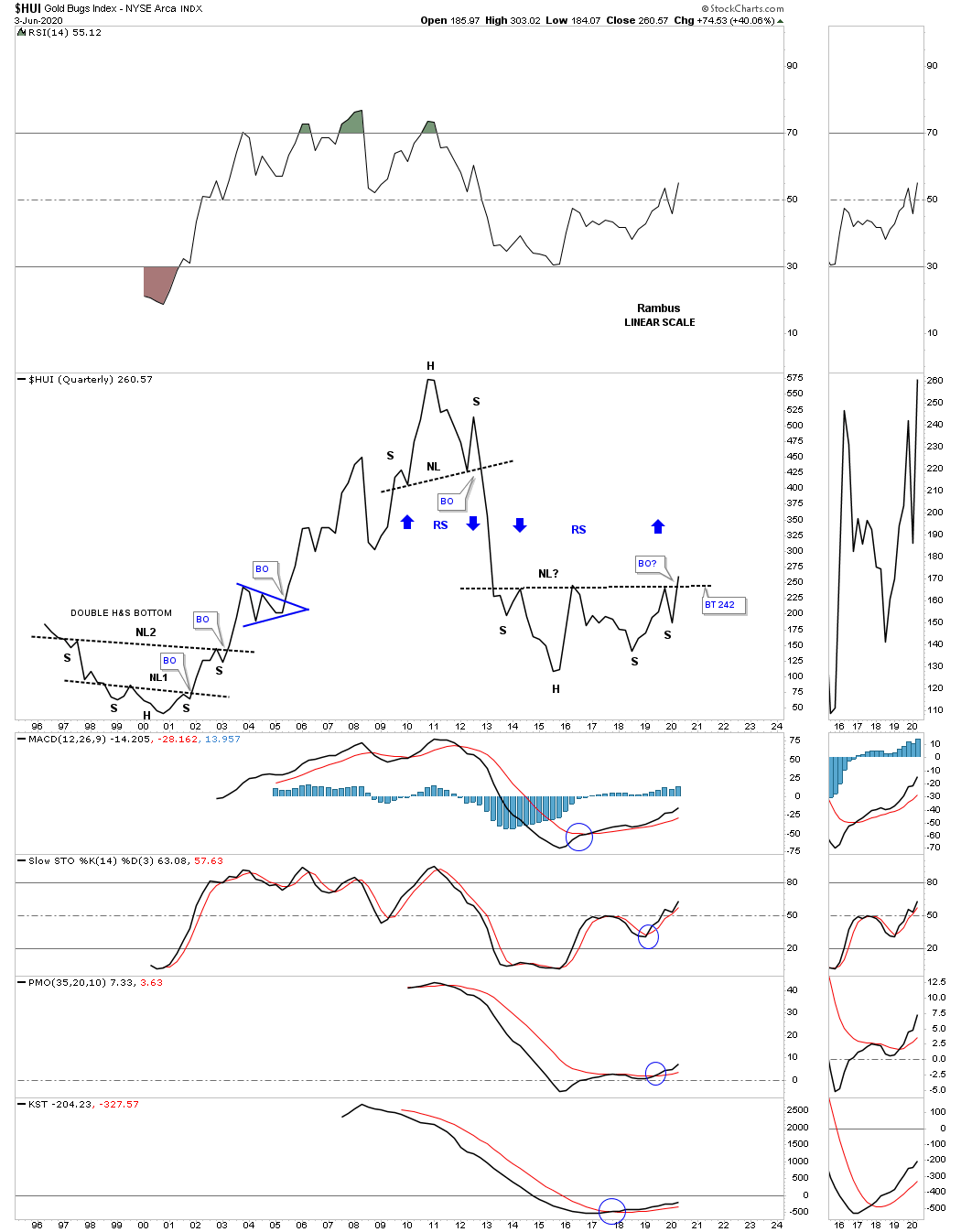
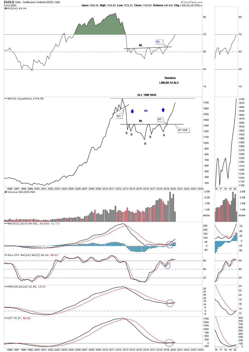
As we all know gold has been the leader during this second phase of the secular bull market. This quarterly line chart should give you a preview of coming attractions. Note how gold reversed symmetry over the same area on the way down as shown by the blue arrows.
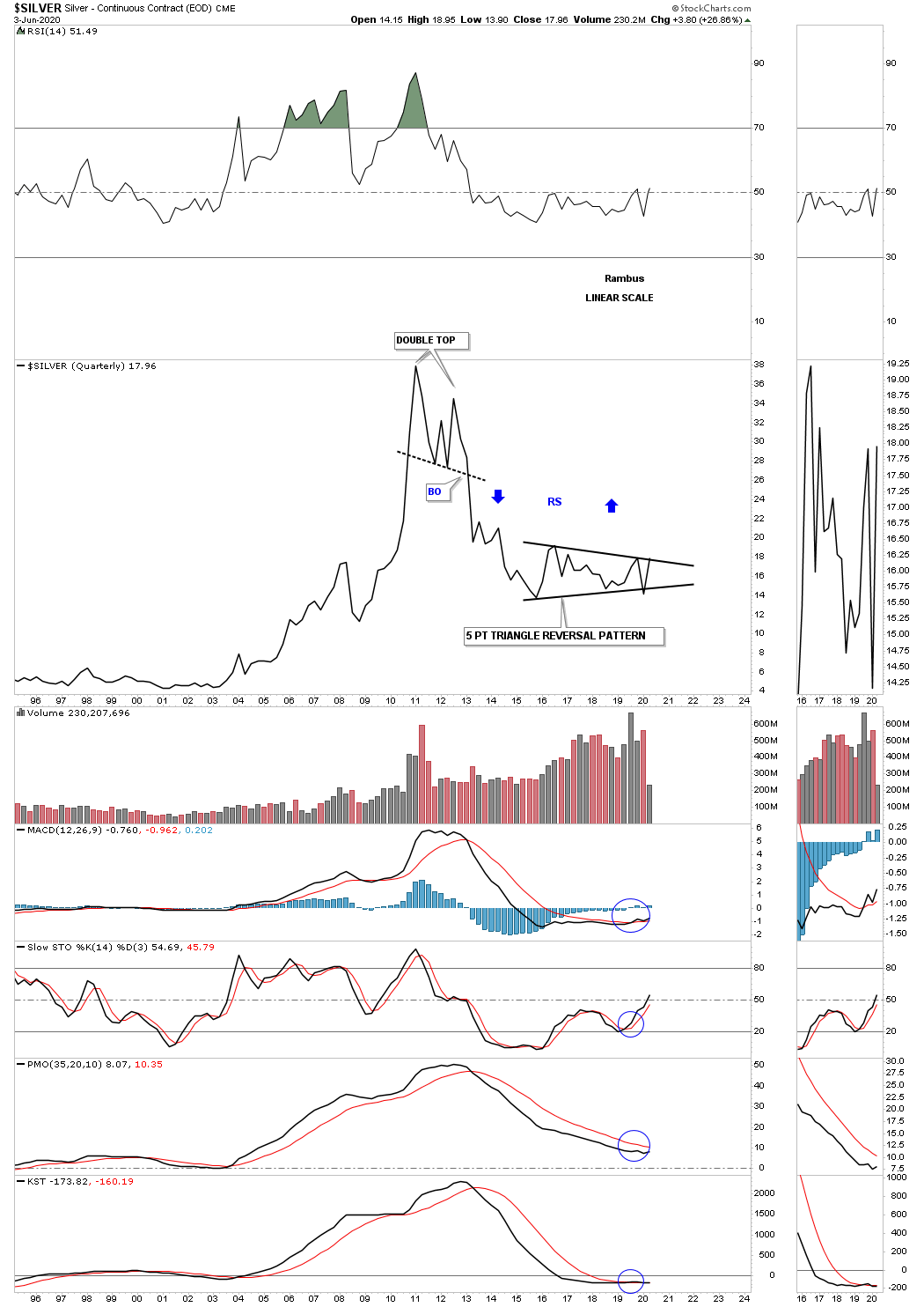
Silver is set up a bit differently than the other areas in the PM complex. As we know silver has been the lagging component within the PM complex. The price action is currently testing the top rail of its 5 point 2016 triangle reversal pattern. A breakout above the top rail will confirm it has joined the second half of the secular bull market in the PM complex.
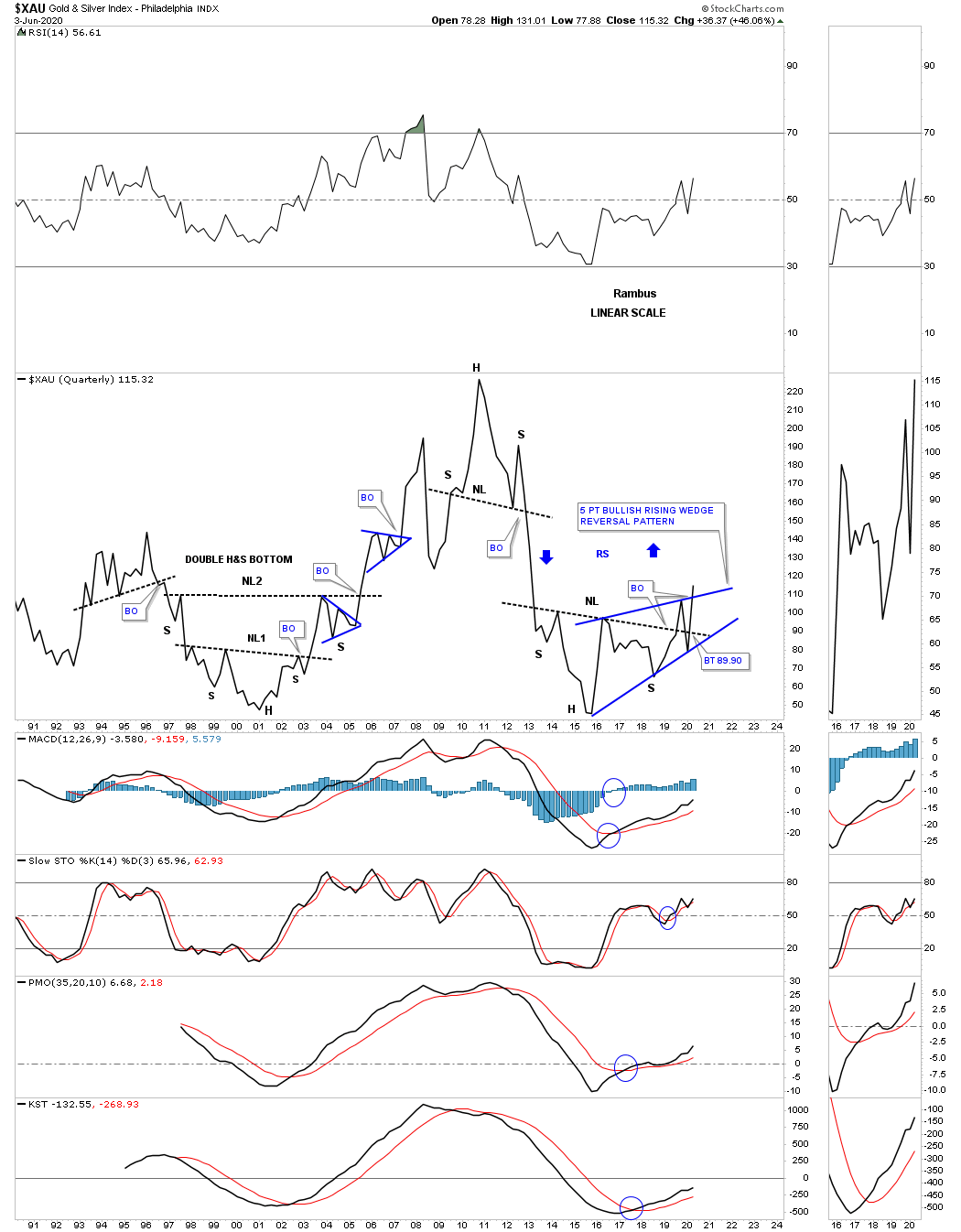
You may have noticed that some of the 2016 H&S bottoms could also be considered a 5 point bullish rising wedge reversal pattern. I have put both pattens on this quarterly line chart for the XAU so you can see both patterns.
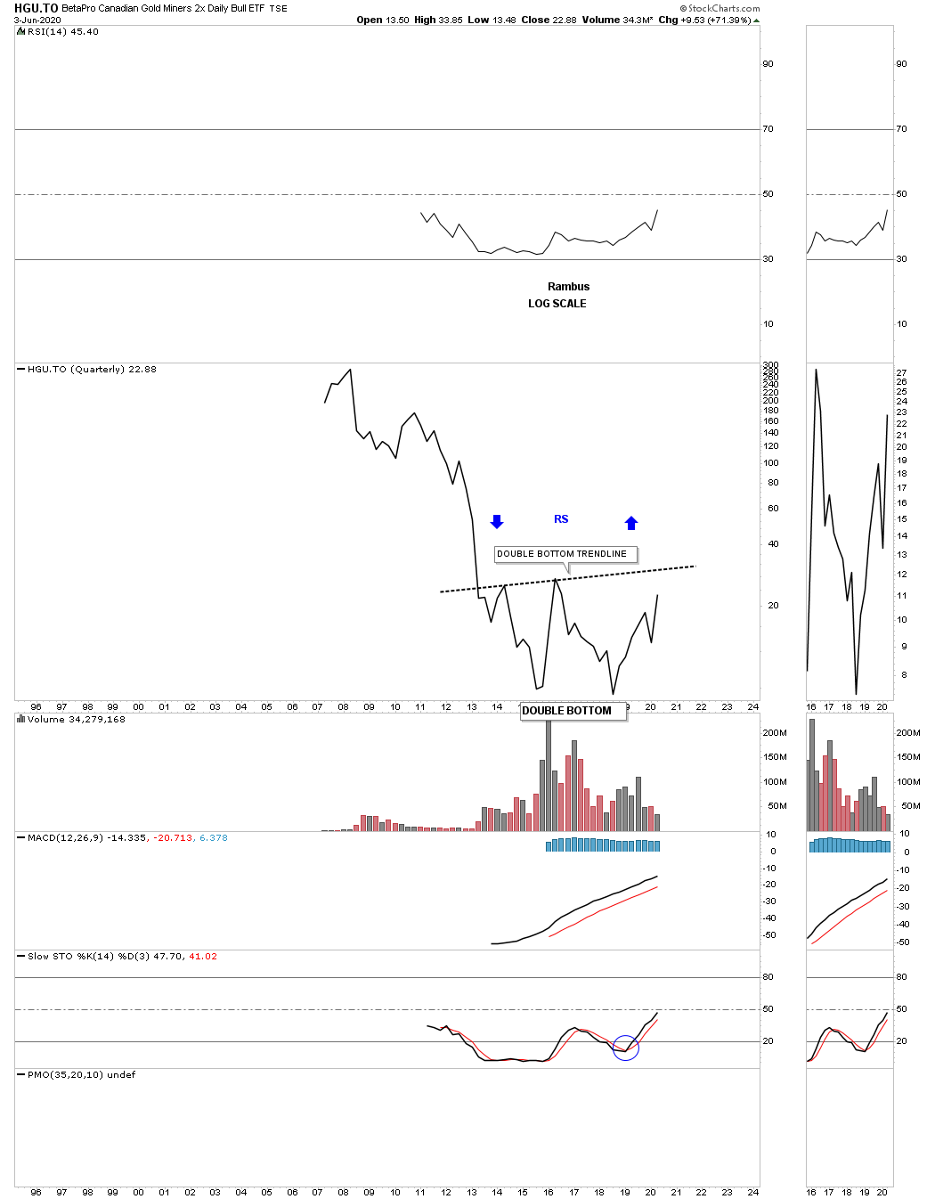
The HGU.TO doesn’t have a lot of history but it appears to be forming a large double bottom reversal pattern.
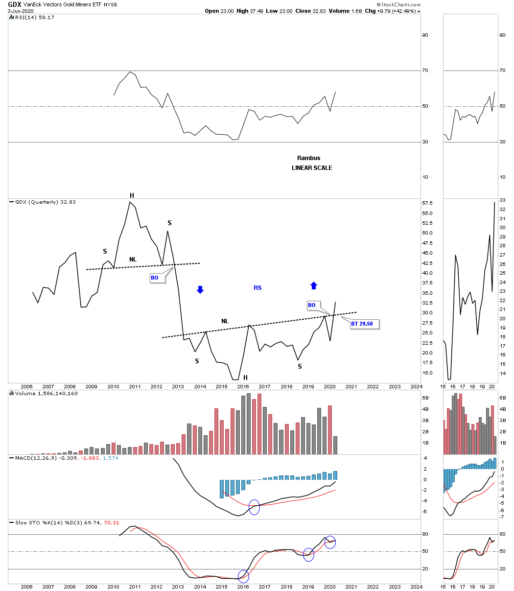
Next is the GDX which looks like many other big bases we’ve looked at tonight with the combo unbalanced H&S bottom with the 5 point bullish rising wedge reversal pattern. Also notice the possible reverse symmetry that lies just above.
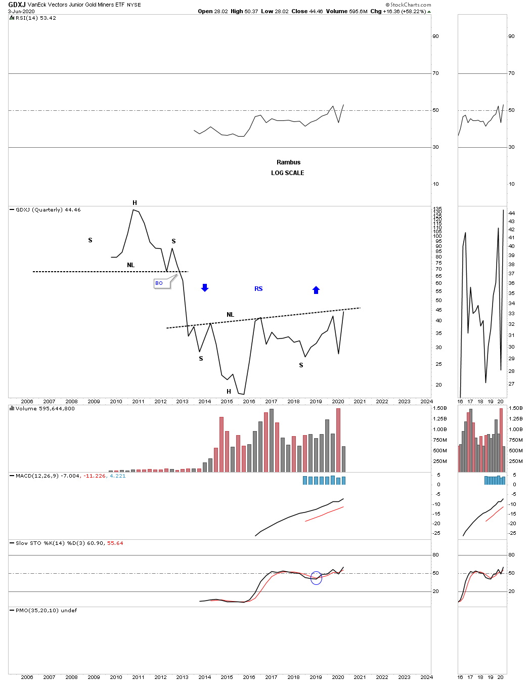
We also know that the GDXJ has been slightly weaker that most of the other PM stock indexes but its now getting close to testing its multi year neckline.
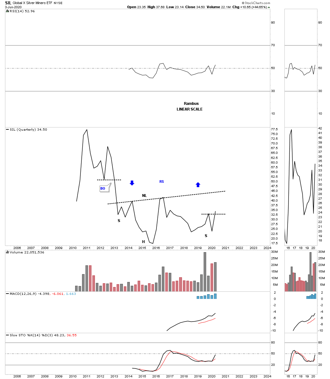
The other weakest component within the PM complex is SIL. If it can close out the month of June right where it is currently trading it will have put in a higher high and higher low which is the first sign of an uptrend.
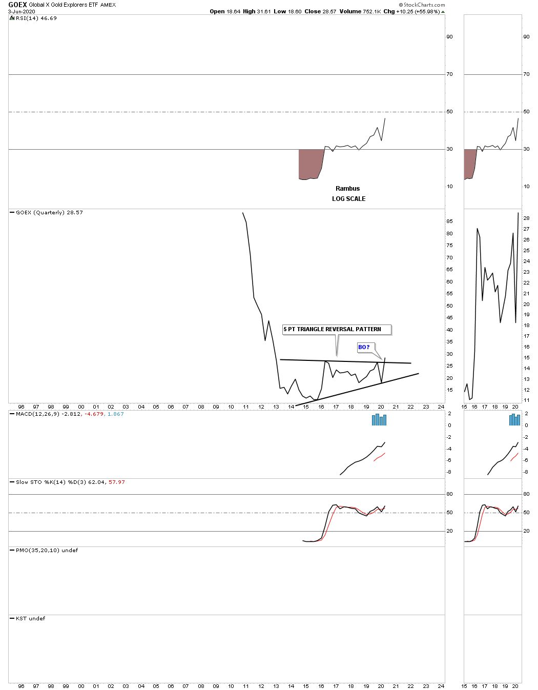
The GOEX is another area within the PM complex which doesn’t have a lot of history but it does have enough to show a 5 point triangle reversal pattern that is beginning to breakout.
There is no such thing as a guarantee when it comes to the stock markets but the closest thing I can say is that I will get the big picture and trend right which is the most important part of trading. Getting the big trend right is half the battle. All the best…Rambus