
I’ve been posting exclusively for the last 2 months on the PM complex as I know that is most of our members main focus. Since the PM complex is now in consolidation mode I would like to take this time to show you the other bull market that has been taking place in the US stock markets. It is important for me personally to be on record as early as possible because it means nothing after the fact. The easiest trade to make is the one you do in hindsight, after the fact, as many like to say, I seen that move coming a mile away, again after it’s already half over.
I got on record on June 22nd of this year when I made a small post on the, Markets Update, that I do at the end of each day.
June 22nd post:
Before we look at today’s charts I would like to give you a short answer on why I’m taking on so many positions in the stock markets. The short answer for now is that I recently had an epiphany moment similar to the one I had on the US dollar back in 2014 when I discovered that massive 11 year base that was a fractal to the one that formed previously that most of you have seen many times.
Currently I’m seeing some patterns setting up in the stock markets that could lead to a very powerful rally the likes of what we’ve never seen before. I realize that many think I’m living in a fantasy land by being bullish on the stock markets which is fine because I don’t want to run with the herd. I want to go where no man has gone before. That sounds like a movie title.
The bottom line is that I need to see a little more price action which could happen fairly quickly over the next couple of weeks to come forward with what I think could happen. The kicker is that the PM stocks will go along for the ride. I’m posting this today so I’ll be on record if indeed what I’m seeing plays out. It will mean nothing after the fact.
So here we are 2 months later on August 23rd and what I was seeing back on June 22nd is still in play. The price action has been working out very well but the time component is lagging a bit taking a little longer than I had anticipated but nothing is broken yet.
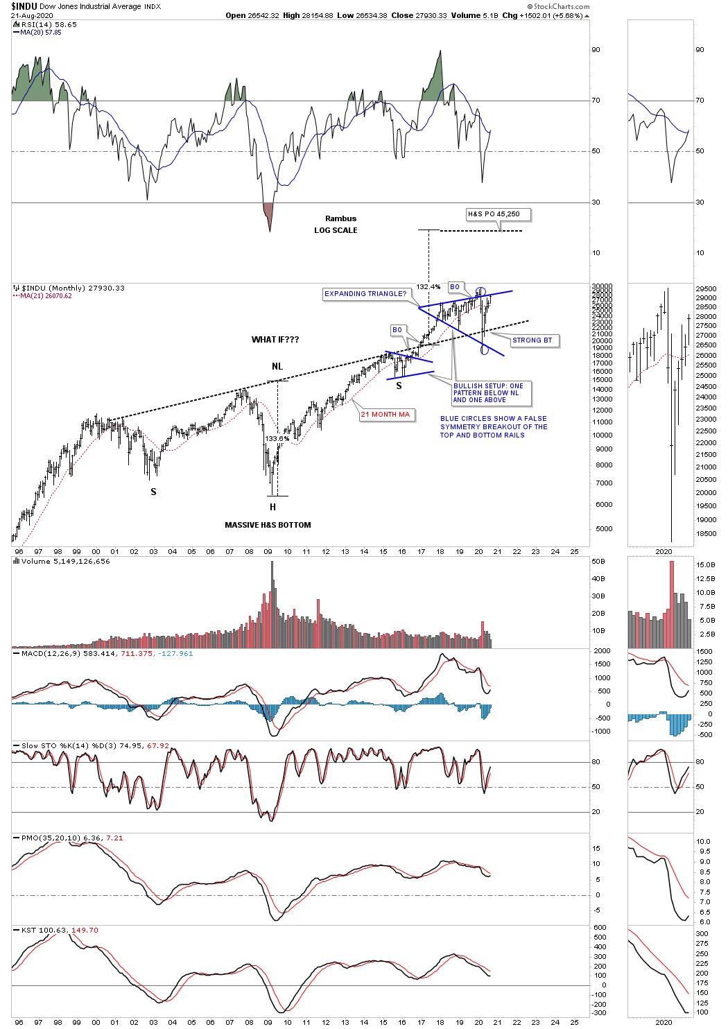
To show you why I still remain bullish on the stock markets we’ll need to start with the long term charts first and then work our way back to the daily charts. If what you are seeing on the short term chart does’t match up with what the long term chart is suggesting then you can start to question the validity of the bull market in our case. For instance if the long term chart is bullish and you see a reversal pattern, H&S or double top building out on a fairly large scale, then a big red flag goes up.
On the other hand if the long term chart is showing bullish price action and you see a H&S or double bottom forming on the smaller timeframe then that helps confirm the big trend or bull market is still in tact.
We currently find ourselves in a very unique environment with 2 secular bull markets going on at the same time, the PM complex and the US stock markets. It gets even more bullish as commodities appear to have ended their multi year bear market 4 months ago in April. In all my years of trading the markets I can’t remember ever seeing so many bull markets simultaneously moving together at one time.
If one is to step back a little and looks at the state of our country right now how much gloomier can it get? The list is a mile long from the 2020 crash caused by the coronavirus, unemployment at record numbers, black lives matter demonstrations in the streets, you get the point? Looking at all this doom and gloom rationally then yes the world as we know it is coming to an end and there is nothing we can do about.
There is one axiom that stands out more than others which has to do with the stock markets and that is to BUY LOW AND SELL HIGH. Another one is to buy when there is blood in the streets which we literally had during the BLM protests. In early February most of the US stock markets were trading at new all time highs with no bearish patterns in sight. Then out of nowhere the stock markets experienced one of the deepest short term bear market in history which ended a month later in March.
Many of you will remember the stock markets had recently broken out of some very beautiful and symmetrical 2018 H&S consolidation patterns and the new impulse to the upside was in full swing again. There are some very rare events that can happen that no one can see until they happen which are called, an act of God or a black swan event.
What happened on 911 was such an event where only the terrorist knew what was about to take place. What the 2020 crash did was to put a speed bump in front of the existing secular bull market that began in 2009. More on this a bit later.
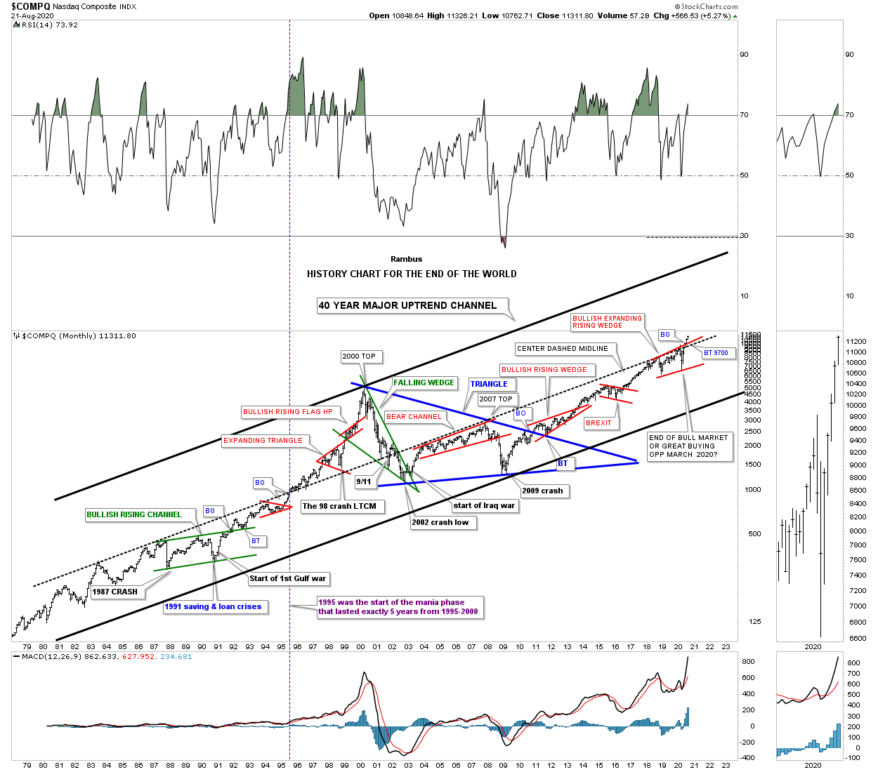
Before we get into the long term charts for the stock markets I would like to start with a 40 year chart for the COMPQ which I call, “The History Chart for the End of the World,” which is a satirical look at all the major events that felt like the end of the world when they took place, but were actually great buying opportunities . Many of you will recognized some of these events if you are old enough. For the younger members these major events felt like the end of the world if you were actually trading back then when they happened. For most of you it will just be an abstract event with no real meaning. For those of you that haven’t traded during one of these, end of the world events, congratulations as you have just experienced your first one. Make sure you put this fairly rare event in your memory bank because you are going to see this again if you survive long enough trading the markets.
I’m not going to spend a lot of time going over this chart as most of you have seen it many times through the years. For those that aren’t familiar with it just start at the bottom left hand side of the chart and follow the price action that shows all the important chart patterns and the events that felt like the end of the world.
There are 2 things I would like to focus on, the black dashed center midline that runs through the middle of the chart and the current price action. First you can see the current price action has broken out of the 2018 bullish expanding rising wedge and is trading at new all time highs which many can’t or won’t except. The second thing I’ve been waiting literally years to happen is for the price action to finally breakout above the black dashed center midline. You can follow that dashed center midline starting at the lower lefthand side of the chart. You will see how well it did its job of holding resistance until its was finally broken to the upside in 1995 which led to the parabolic move that ended the greatest bull market at that time at the 2000 high. You will see how the dashed midline failed to hold support after 911 which led to the bear market low in late 2002. For the last 18 years the COMPQ has failed to trade above that powerful resistance line until just 2 months ago that coincided with the breakout of the 2018 bullish expanding rising wedge.
One last point I would like to make is about the annotation I added in April a month after the March low which reads, The end of the bull market or great buying opportunity. A bit later I’ll show you the chart which strongly suggested to me that it would be a great buying opportunity.
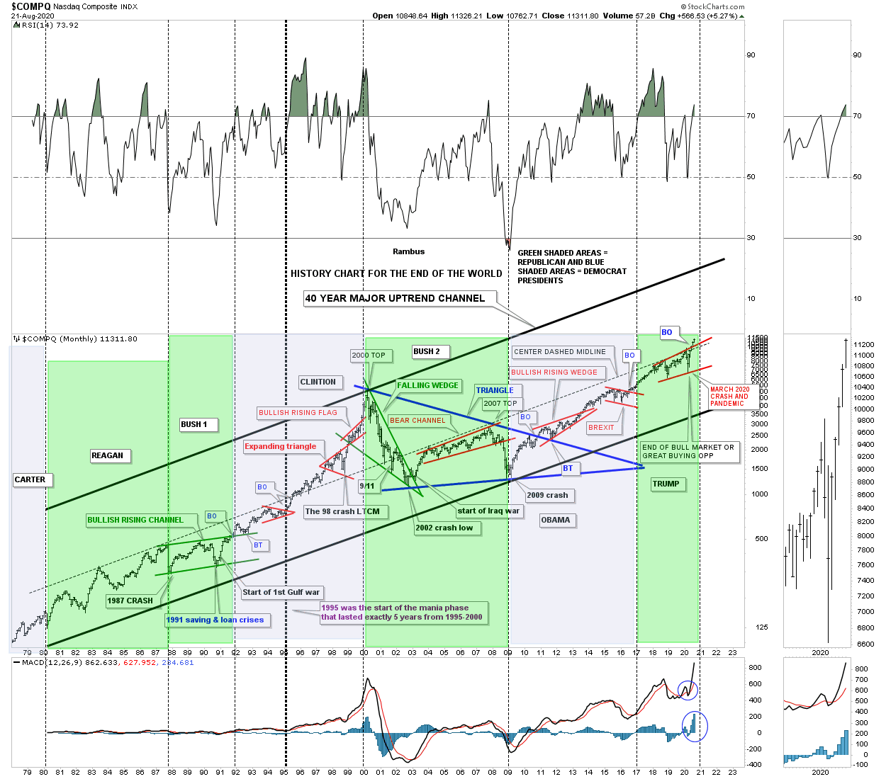
Since the US elections are just around the corner I updated the History Chart for the End of the World above and added the presidential cycles to it so we can see how the stock market did during their time in office which may be surprising to some of you.
Every election cycle the Democrats and Republicans go at each other promising their constituents everything under the sun. You will hear the Democrats say if Trump is elected president for a 2nd term the economy is going to get much worse or we are going to lose our Democracy to name just a few. The Republicans are going to say under a Democratic rule the stock markets are going to crash under the weight of their economic plans for healthcare and other social programs. Many believe if Biden gets elected our country will be no better than the communist system. This is nothing new and happens during every election cycle.
The big question is, does the stock market even care which side is in office? To answer that question lets look at the updated chart for the, History of the End of the World, and see what the markets really thought of each president. I’ll try to make this quick. This chart starts with the end of the Carter administration and the beginning of the Regan era in 1980. You can see the stock markets did pretty well under the Republican president with his reign ending close to the 1987 crash where it was Bush 1’s turn to take charge. During his administration the stock market traded sideways building out the green bullish rising flag which we know from past experience is a very bullish pattern. Since he didn’t get reelected it was time to see who would become the next president, a Republican that was in office for 12 years or a Democrat that hadn’t been in office for 12 years?
After a lot of mud slinging during the 1992 campaign between the Republicans and Democrats the voting public voted in our next president who stayed in power until the secular bull market top in 2000, Clinton. The world didn’t come to an end and we still remained a Democracy. Bush 2 was probably one of the unluckiest presidents of the modern area. As you can see the stock markets were unimpressed with any of his ideas to stimulate the economy no matter what he tried. He came to office right at the 2000 bull market high during the best of times and left office at the bear market low in 2009 which were the worst of times since the 1929 depression.
The 2008 campaign also showed us a whole lot of mud slinging as the world as we knew it was coming to an end with the housing and banking crises still taking the front row seat. Many thought there was no way out and a great depression was going to last for years which many still believe today is going to happen at any time. But as you can see the economy recovered nicely under Obama which produced one of the longest economic recovery in history.
The last election held in 2016 was as close as it could get with Trump winning the Electoral College but losing the popular vote by 3 million. The Democrats said under Trump’s leadership the stock markets were going down and a Great Depression was going to take place. They were right for about a day or two. Once the stock markets adjusted to the new president we saw the 2016 impulse move which was one of the best impulse moves since the the beginning of the bull market in 2009. Note where Trump took office. He took office right at the completion of the 2016 red bull flag which assured the secular bull market was still in tact and he would enjoy a great economy unless an act of God changed all that.
If you are still reading, the point I’m trying to make is that the stock markets don’t give a damn who’s in power a Republican or Democrat. The only thing that matters is where the stock markets are trading in their secular 20 plus year bull market. Since we are only about 10 years into our current secular bull market I’m going to make a bold prediction right now before the election takes place. Whichever party wins the White House in 2020 the secular bull market that began in 2009 is going to go much higher during their presidency. So when you start hearing all the negativity about what the stock markets are going to do from both sides of the isle, take a peak at this long term, History Chart for the End of the World, which shows you the actual truth, not some lie or conspiracy theory which are going to start picking up the pace the closer we get to the election.
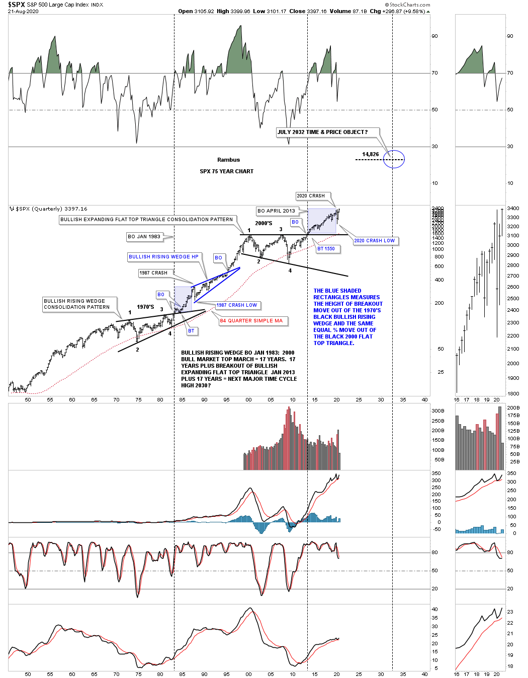
Now that we have that out of the way lets look at some very long term charts for the US stock markets starting with this 75 year quarterly chart for the SPX. Keep in mind when you look at these long term charts that they were built many years ago before the actual breakout of the 2000 flattop expanding triangle. The thing about long term charts is that if you get it right or pretty close initially there is very little work to do to keep them up especially on a quarterly chart.
What this chart is showing you is the long term secular bull markets that are born from a very large trading range or consolidation pattern. Durning the 1970’s the SPX needed to consolidate its last secular bull market by building the 13 year bullish rising wedge consolidation pattern. The one thing we always look for after a breakout is the possible backtest for confirmation the pattern is valid. If you look very closely at the 1983 breakout above the top rail of the bullish rising wedge you can see a perfect backtest before the next secular bull market was launched.
The initial impulse move lasted until the top in 1987 where the biggest one day decline in the history of the stock market occurred which was over 20% and more in some other indexes. Unlike the INDU that had a labored breakout above the top rail of its 2000 Jaws of Life consolidation pattern the SPX wasted no time in completing its major breakout and backtest before beginning its impulse move. As you can see the 1987 crash which seemed like the end of the world and the beginning of a great depression was about to begin. Why was that all there was and no bear market that followed? The reason is the SPX was in its 20 plus year secular bull market nothing more or nothing less.
The blue bullish rising wedge worked out very well as a halfway pattern that gave us a good indication on where to look for either a top or a place to begin another consolidation phase. As it turned out that marked the end of the secular bull market that began at the 1974 low.
After the completion of the previous secular bull market the markets had to consolidate their gains before the next secular bull market could begin. To consolidate its previous gains the SPX formed the 13 year flat top expanding triangle. This time looking at the breakout point the backtest was finished in about one month before the new secular bull market took flight.
What happened next was something I had often wondered could happen if we compared the move out of the black bullish rising wedge to the initial high in 1987 just before the crash. As you can see we got a very similar move out of the 2013 flat top expanding triangle in price but it a little longer in time. The bottom line is that if you compare the 1987 low to the 2020 low you can get a feel for where we are currently trading vs the 1987 low which strongly suggests we still have a long ways to go before this secular bull market is finished. Depending on ones age this could be the last great buying opportunity you may ever have.
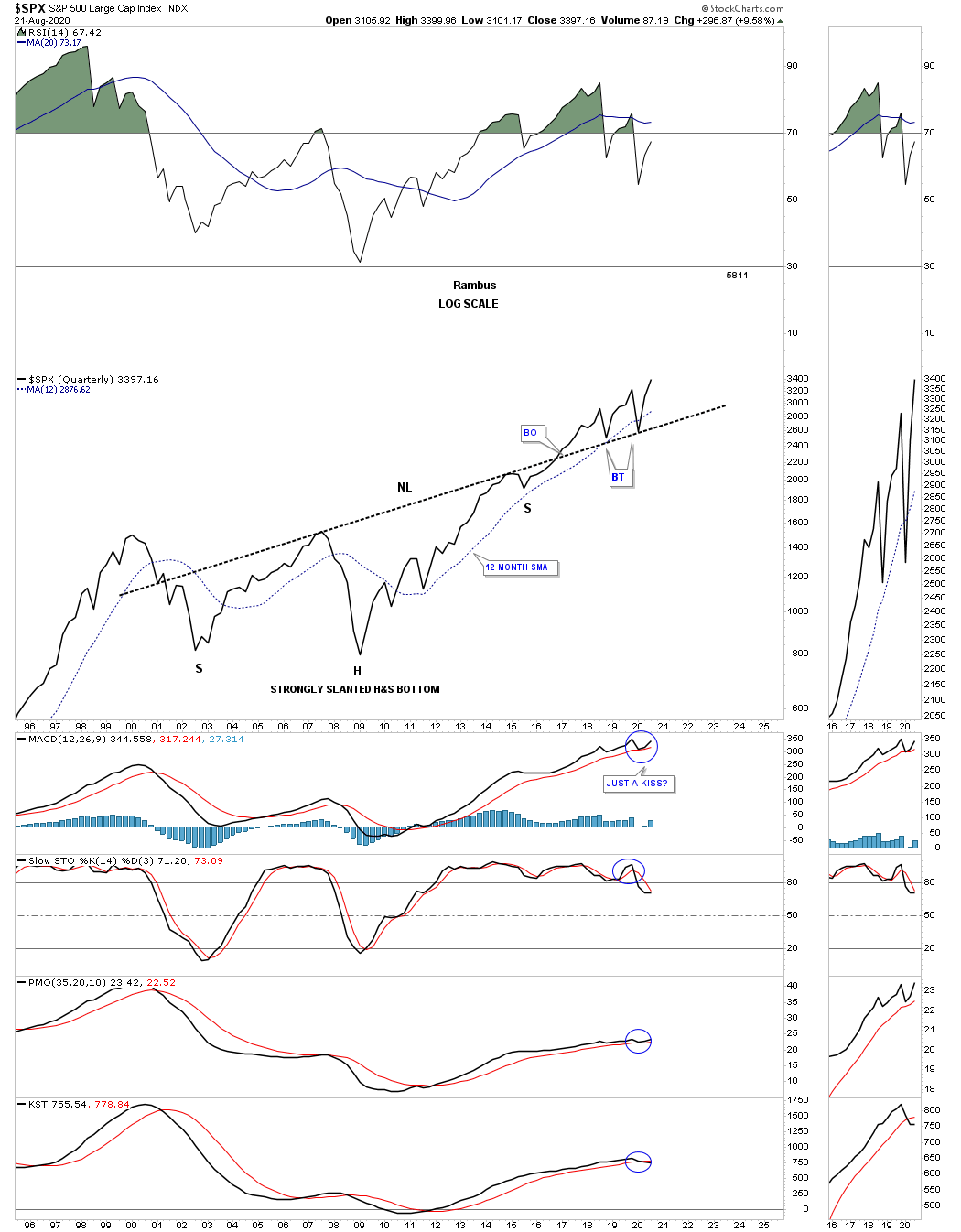
Here is another long term chart I built for the SPX several years ago and didn’t have a lot of confidence in but since it is a long term chart I didn’t have to do any annotating so I kept it in the background. Note where the 2020 crash found support. Is it just a coincidence or something more?
Here is a chart I built for the INDU which has a similar look to the SPX chart above. I often show a bullish setup during the formation of a H&S which consist of one consolation pattern below the neckline which is usually the right shoulder and one that forms above the neckline, in this case the 2018 expanding triangle. Again, note how the neckline held support during the 2020 crash low as the backtest.
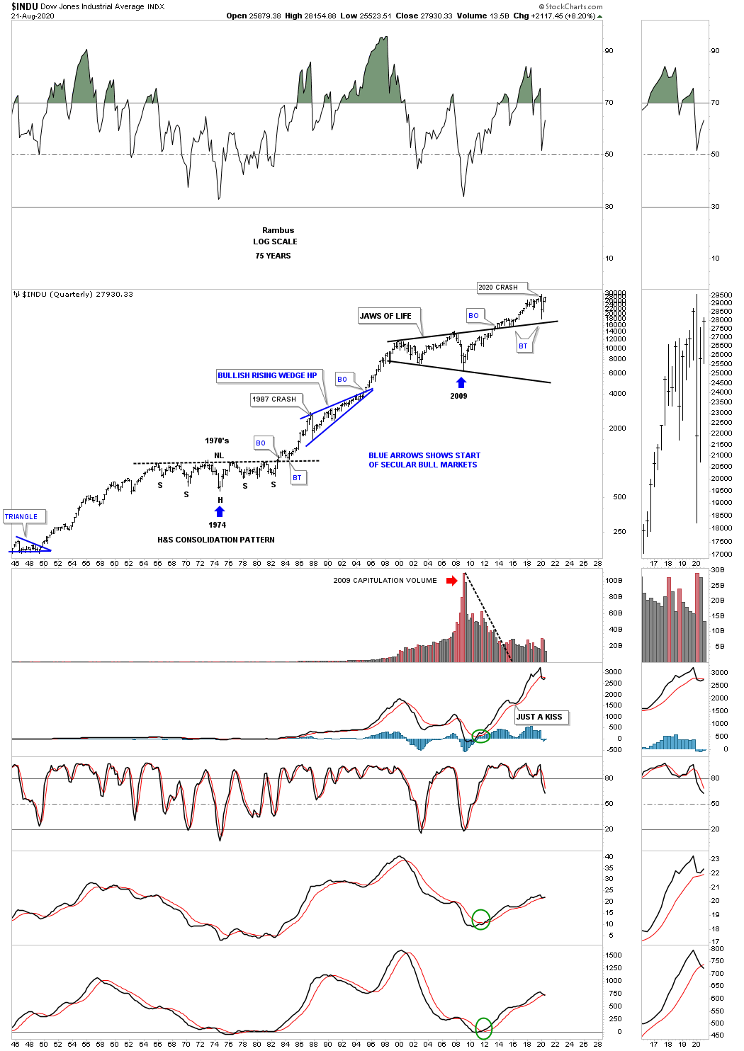
Earlier we looked at the 75 year quarterly chart for the SPX which showed its 2 secular bull markets with a halfway pattern in between. During the 1970’s the INDU built out a very symmetrical H&S consolidation pattern to consolidate the previous secular bull market. Again, note the breakout and backtest to the neckline just before the new secular bull market took off. You can see the same setup as the SPX chart above shows with the initial move going up to the 1987 high just before the crash with the blue bullish rising wedge. This chart shows the infamous, Jaws of Life. As the expanding triangle was under construction most analyst were calling it the Jaws of Death that would lead to a secular bear market. From my perspective I knew that the stock markets had been consolidating for 13 years for a new secular bull market so I kept the faith and let the price action speak to me.
I showed you earlier the breakout and backtest to the top rail of the bullish expanding flat top triangle was short and sweet on the SPX. You can see the breaking out and backtest to the neckline was completely different. Keep in mind this is a quarterly chart so each bar represents one quarter of trading. Note the clean backtest in price but look at the horror show we had to endure before the backtesting process was completed. I remember saying at one point I wasn’t going to post the Jaws of Life chart anymore until we finally began to see the price action really start move higher in a meaning full way. Finally in mid 2016 the INDU began to move higher leaving the Jaws of Life behind for good. What happened during the long drawn out backtest to the top rail ended being the 2016 consolidation pattern that led to the nearly 2 year impulse move into the 2018 high. The last point to make on this chart. Note where the 2020 crash low found support.
This last chart for tonight is a 30 year monthly look at the NDX which represents the 100 biggest tech stocks. There is not as much history as some of the very long term stock market indexes but it does show you the parabolic move into the secular bull market top in 2000 with the red bullish rising flag as a halfway pattern. Unlike the SPX and INDU and some of the other US stock market indexes that took 13 year to complete their massive consolidation patterns the NDX completed its triangle consolidation pattern in just 10 years which was showing relative strength to just about everything else. I’ve been showing you a similar setup in many of the PM stocks we’ve bought where the last reversal point in those very large 2016 trading ranges forms a H&S bottom at the 4th reversal point.
The H&S bottom at the 4th reversal point in the 10 year triangle consolidation pattern is as pretty and symmetrical as any H&S bottom you will ever see. First note how the left shoulder and head formed inside of the 10 year triangle with the right shoulder low forming on the backtest to the top rail. The brown shaded ares shows just how similar the two shoulders were in time and price. Note the clean breakout above the neckline and the perfect backtest. I’m running out of time but we often discuss a bullish setup when we see a consolidation pattern form just below an important resistance line which will give the stock the energy it needs to finally take out that overhead resistance. You can see a perfect example of that looking at the small blue triangle that formed just below the 2000’s bull market high.
For those that have been in denial since the 2009 crash that this bull market is not real because the fundamentals say its to overbought or the PE ratios are too high or 100 different reasons, have missed out on the greatest bull market in the history of the US stock markets. This bull market is just like any other bull market which creates a reversal pattern at the bottom, followed by the initial impulse leg up, followed by another consolidation pattern, followed by another impulse leg up, rinse and repeat. This is as classic as it gets. This bull market is no different than the 10 year bull market the PM complex had from 2000 to 2011. Just go into the Archives and find some long term charts for gold or the HUI.
If nothing major happens in the PM complex between now and Wednesday I will do part 2 which we’ll start focusing in on the shorter term charts. All the best…Rambus
