I’m not going to have a major theme this weekend but more of a general look at some of the different areas that make up the markets. Most will be long term charts so we can get a feel for how some if these different areas have been progressing. Once you are aware of the big picture you can then drill down to the shorter term charts to see if they confirm what the big picture is suggesting. These charts will be presented in no special order.
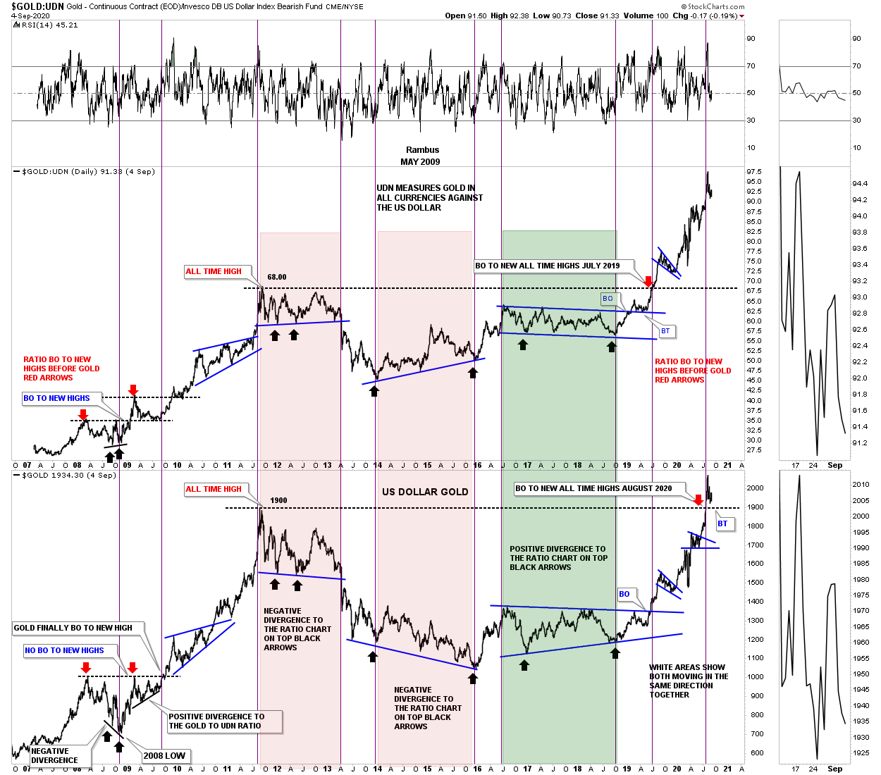
This first chart is a ratio combo chart which has the $Gold:UDN ratio on top with Gold on the bottom. The UDN measures gold against most of the major currencies of the world unlike the US dollar which is more narrowly defined. When the ratio on top is rising that means that gold is rising against most of the important currencies of the world which is bullish. Gold on the bottom chart is measured against the US dollar.
When you first look at this chart the ratio chart on top and gold on the bottom look very similar but there are many divergences where one will outperform the other for a time. Both the ratio chart and Gold topped out together in September of 2011 and began their respective bear markets. Note the big massive divergence that began in 2014 where the ratio ended its bear market while gold in US dollars still had a long ways to fall before it ended its bear market in August of 2016. From the 2016 low they both moved up together which is what you want to see.
Then came the infamous 2016 correction where they both traded sideways until their respective lows in September of 2018, but this time Gold in US dollar made a higher low vs the ratio which was showing gold in US dollars was finally starting to play catch up to the ratio. Since gold in US dollars had a bigger correction the ratio ended up breaking out to new all time highs in mid 2019 while gold in US dollars was just beginning to breakout from its 2016 consolidation pattern. Then finally at the end of July of this year Gold in US dollars finally broke out to new all time highs joining the ratio chart.
Why am I showing you this ratio combo chart? The reason being is that in a strong bull market you want to see gold going up in all the important currencies of the world with each making their own new all time highs. It is kinda like the Dow Theory. If for instance the Transportation Average is making a new high you want to see the Dow also moving into new highs for confirmation the bull market is valid. So when Gold broke out to new all time highs in July along with the ratio that broke out previously that confirmed the bull market in the PM complex is alive and well.
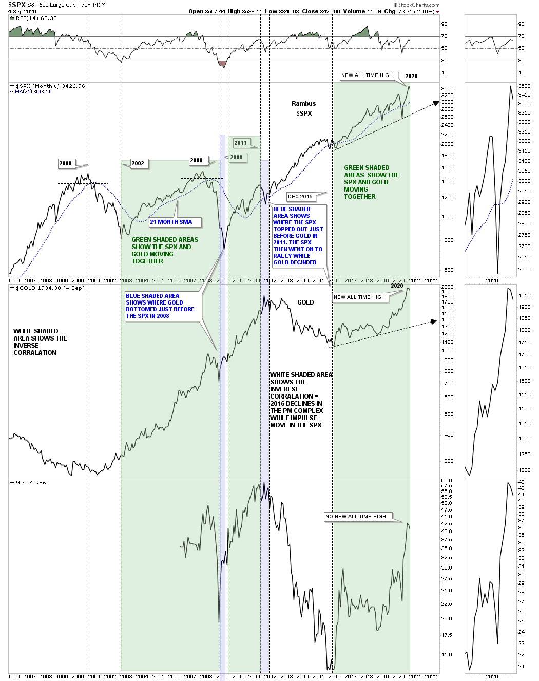
This next chart is a combo chart which has the SPX on top with Gold in the middle and the GDX on the bottom. This combo chart shows you why I’m an equal opportunity trader. I don’t care what sector is in a bull or bear market. I just want to trade the long side in a bull market or the short side in a bear market.
This 25 year monthly chart shows how gold and the SPX can trade together at times and then inversely to each other. The white areas show the inverse look when one is rising and the other is falling at the same time. The green shaded ares shows how they both are moving together. The white area in the middle of the chart is a good example of the inverse look when you want to be trading the bull market in the SPX and leave the PM complex alone which we did. Then came the 2016 low in both the SPX and the PM complex strongly suggesting both were in their respective bull markets. All three have been rising in tandem with the SPX and Gold breaking out to new all time highs together. So until something changes I’m going to continue to call a bull market in the SPX and Gold which is hard for most hardened gold bugs to understand.
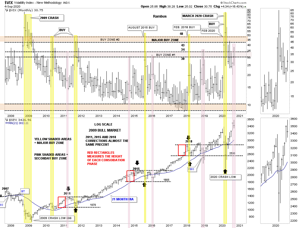
There are many ways that investors like to use the VIX. For me personally I like to use it for important buy signals. Below is a combo chart which has the VIX on top with the SPX below. On the VIX chart on top I have 2 important buy zones for the SPX with the lower pink one being between 30 and 34 and the upper one basically being above 48. You can see the VIX gave a buy signal in March of this year when the VIX traded above 48 which I consider a long term buy signal during the 2009 secular bull market. After falling pretty hard after the March 2020 high the VIX found support around the 20 area until we got the 2 hard down days last Thursday and Friday. The VIX has now rallied back up into the the first buy zone for the SPX.
At this point I have no idea if the VIX is going to rally above 48 for another long term buy signal or if it is already in place. As you can see the yellow shaded areas show it is a good time to go long the SPX with the pink shaded areas suggesting that area is also a good place where an important low could show up. The red boxes on the SPX chart shows the 3 consolidation phases it has had since the bull market began in 2009 on a percentage basis. Both moves below the 2018 trading range were shake out moves. If you recall the SPX bottomed around Christmas Eve in 2018 with a hard move down and then never looked back until of course the 2020 crash.
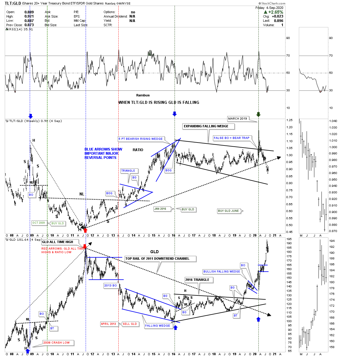
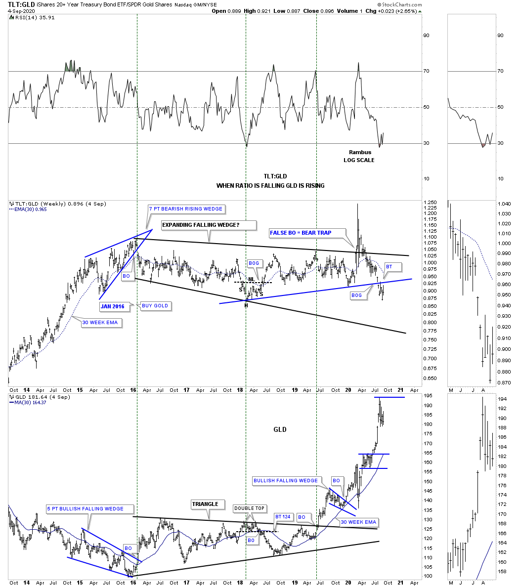
Next is another ratio combo chart we just looked at not to long ago which shows the TLT:GLD ratio on top with the GLD on the bottom. The ratio chart on top shows that when it is falling GLD is rising and vice versa. After the ratio broke out below the bottom rail of its blue trendline GLD had a decent rally. What I’m watching very carefully now is to see if the backtest to the bottom blue rail on the ratio chart is going to hold resistance and if it does that should be very bullish for gold.
Time to get the coals on for our family cookout. Have a great rest of the Labor Day weekend and all the best…Rambus
PS: The very long term perspective.