Tonight I would like to show you some long term charts for Silver which shows that it has a bright future. In the short term is where its problems lie. The thing with big consolidation pattens is, its more of a time thing than a price thing. Many times one can recognize the big picture before it is complete which makes the waiting game even harder. You think you can start to trade inside the consolidation pattern which sometimes you can do if you can catch the reversal points just right. Most of the time though you end up loosing a little, making a little or just breaking even. It always looks easy in hindsight but in real time it is a different story.
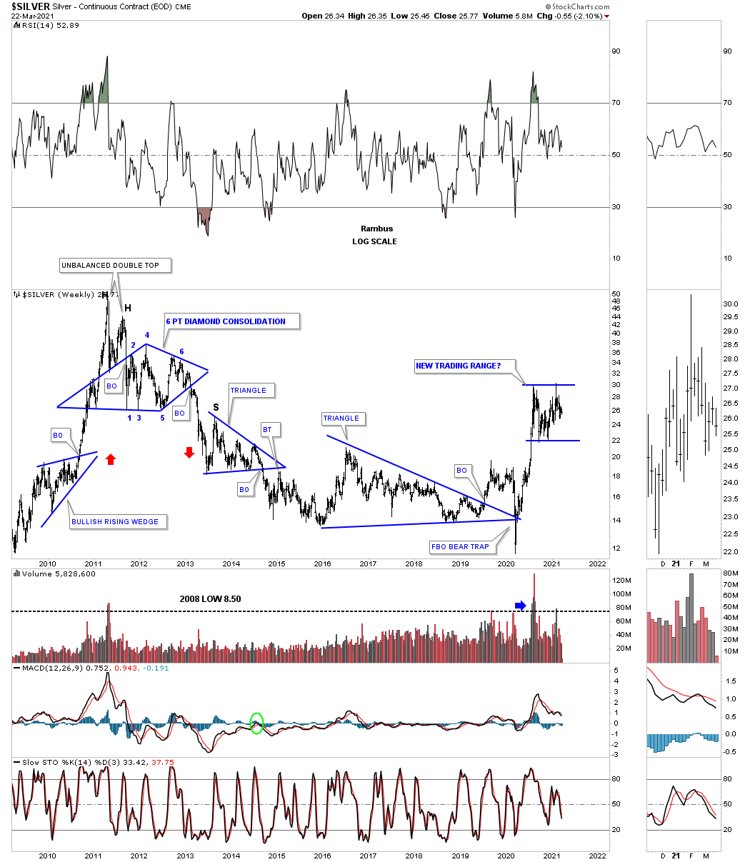
Before we look at the longer term charts lets look at a daily chart we’ve been following since the March 2020 crash low. Like just about everything in the PM complex and the stock markets as well the March 2020 crash produced many H&S bottoms and Silver was no different. Silver’s H&S bottom was a bit unorthodox in that it formed 2 unbalanced H&S bottoms. There was the smaller H&S bottom which was unbalanced with 2 right shoulder and one left shoulder. The bigger H&S bottom produced 2 left shoulder and one right shoulder. Even though it was unbalanced it didn’t affect the price objective which was up to the 34 area.
At that point is when you start to look for a new consolidation pattern to start building out to consolidate its gains and rest. Many times you will see a strong impulse move that can be broken up into 2 or 3 individual smaller rallies with a small consolidation pattern in between. We got the initial rest at reversal point #1 but it didn’t lead to the next impulse leg up after a 3 to 6 week correction. Instead the consolidation pattern began to chop sideways. I’ve been suggesting since the beginning of the year that I thought that Silver looked like it would most likely buildout a rectangle as its consolidation pattern. So price wise that has been right so far but time wise not so much so. As you can see today Silver closed right in the middle of its August trading range which I’ve been calling a rectangle. The looks of this pattern strongly suggests a move down to the 4th reversal point to complete the rectangle is likely.
Since reversal point #3 held it now looks like Silver is forming a H&S top with the price action getting close to the potential neckline. A break below the neckline will ensure a move to the bottom of the rectangle around the 22 area which would be a good low risk entry point and where you would back up the truck as they say.

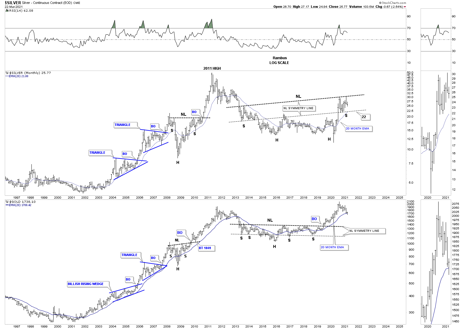
Now we’ll start looking at some long term charts to put that potential rectangle in perspective. This weekly chart shows Silver’s rally into its 2011 top which ended its bull market and led to its bear market that actually didn’t end until the March 2020 crash as that low was the lowest low of the entire 2011 bear market. One can only imagine the pain and suffering a perma Silver bull must have felt during that entire bear market with every little rally seeming like the beginning of the next bull market. How many threw up their hands in discuss at the March 2020 capitulation move not being able to take the pain anymore?
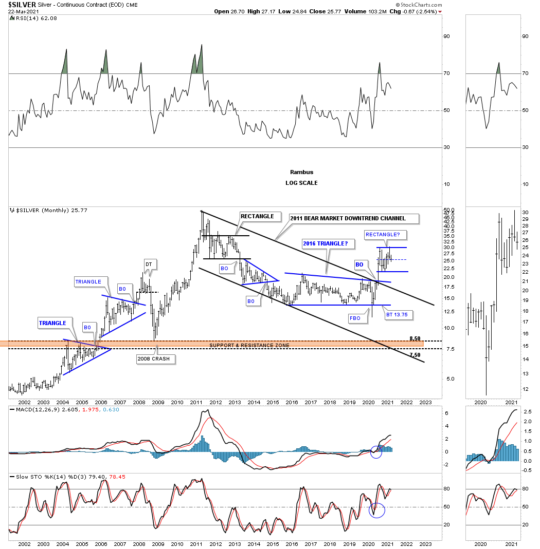
This next long term monthly chart we used during the bear markets year trying to figure out the bear market downtrend. There is always some morphing that takes place before you actually get the downtrend channel that is correct. The bear market could have ended at the last touch of the top trendline of the 2011 downtrend channel but Silver had one more trick up its sleeves, the March 2020 capitulation move that broke below the bottom rail of the 2016 triangle that ended up being a false breakout or a bear trap. As you can see Silver never actually closed below the bottom blue trendline which produced the V bottom. The Silver bulls finally came to life when they were able to take out the 2011 downtrend line and the top rail of the blue triangle in one strong move without as much of a backtest.That rally was hard and fast and Silver needed to consolidate its gains which is the blue rectangle that has been forming since the August 2020 high. There is nothing broken on this chart from a bullish perspective.
This next long term monthly chart shows the internal structure of Silver’s secular bull market that began in 2001. I did make one slight adjustment. Note the bottom rail of the 2011 downtrend that we looked at on the chart above. On this chart I used the March 2020 crash low as the last reversal point which makes the 2011 bear market a bullish falling wedge consolidation pattern of the entire secular bull market which could end up being a halfway pattern as shown by the blue arrows. By tweaking the bottom trendline it also put the center dashed midline in an area that held resistance on Silver’s initial rally out of the Mach 2020 crash low which is another reason why Silver stopped where it did and began to consolidate.
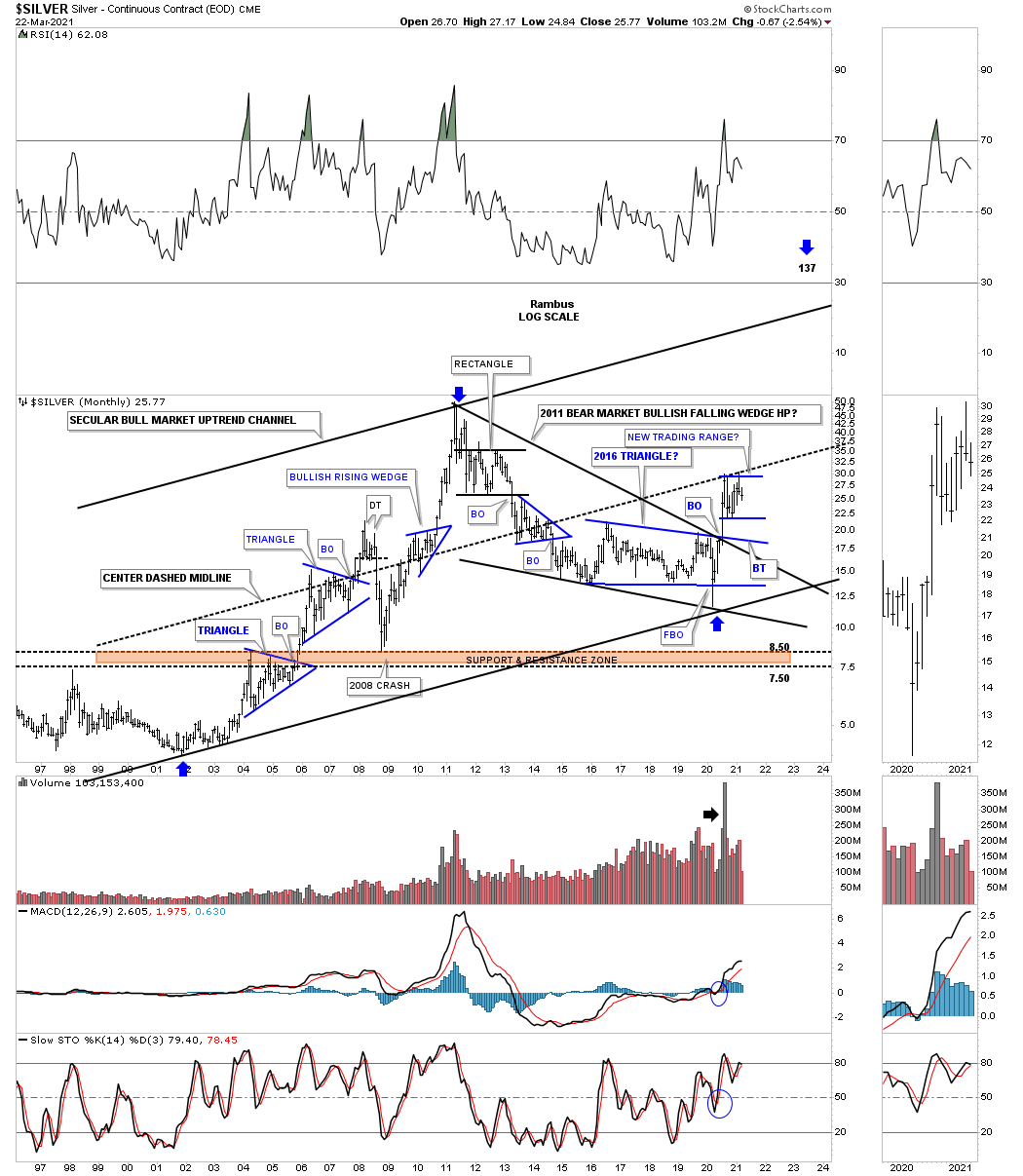
Next is the cleaned up version of the chart from above which shows just its important consolidation patterns. The thin black rectangles are measuring sticks that measure each half of the secular bull market uptrend channel which shows some pretty nice symmetry from that perspective. There is no way to know for certain if Silver will rally at the same angle as the first leg up that ended at the 2011 high but if it is anywhere close there is a long way to go yet in time and price. What is pretty obvious is how much stronger the March 2020 rally was compared to the initial thrust back at the beginning of the secular bull market in 2001. It only took just 3 months for Silver to reach its center dashed midline which was a massive rally anyway you slice it and why Silver needed to rest.

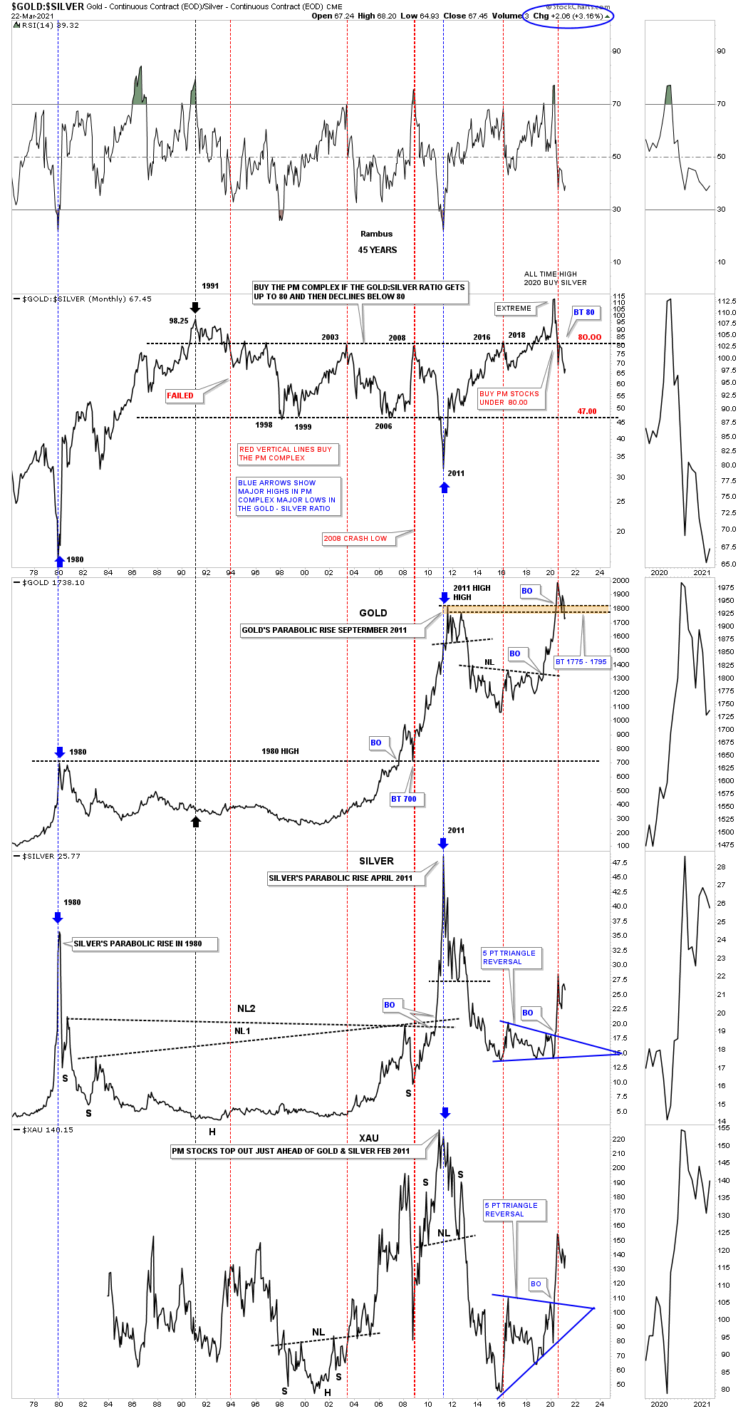
Next is the ratio combo chart we’ve been following which has the GOLD:SILVER ratio on top with Gold, Silver and the XAU below. Normally when the ratio gets over 80 and then declines back below 80 that generally represents a good buying opportunity for the PM stocks. So from this perspective as long as Silver keeps outperforming Gold that should be healthy for the PM stocks as you can see on the XAU chart on the bottom.
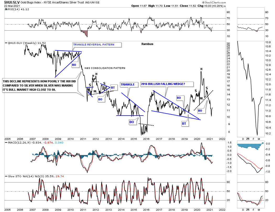
Next is a ratio chart compares the HUI:SLV which is not a pretty picture. What the ratio has going for it is if it can make a higher low on the breakout from the H&S top. This is one reason why I’ve been focusing more on the Silver stocks.
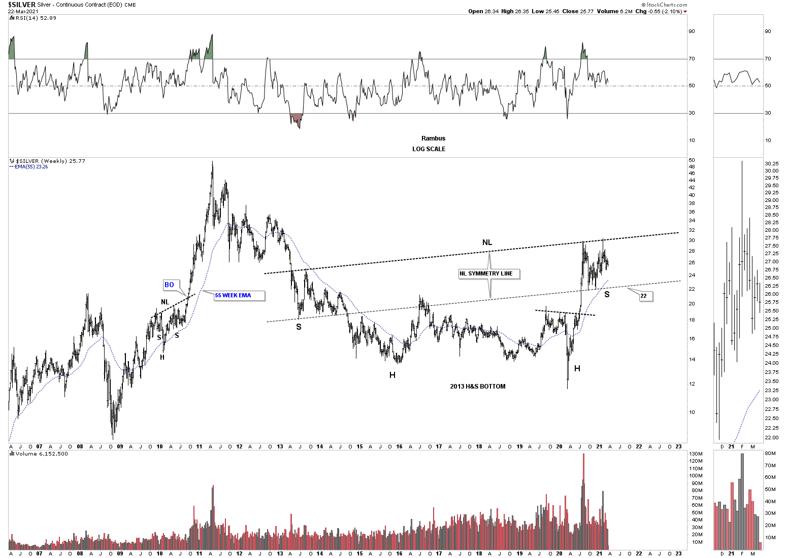
This next chart I’ve never shown you before and gives hope to those that are hopeless when it comes to Silver. As we know Gold led the PM complex out of its bear market in 2016 while everything else lagged behind. Lately Gold has been lagging compared to the PM stock indexes and Silver in general as shown by the ratio combo chart above. What I discovered was a very symmetrical H&S bottom that began to form in 2013 just like Gold when it built out its 2013 H&S bottom.
What is so striking is the symmetry of that massive H&S bottom as shown by the neckline symmetry line. As you probably guessed the right shoulder is the August 2020 rectangle we’ve been following on the charts above. There is no law that says Silver has to trade backdown to the neckline symmetry line around the 22 area but it would be so much more satisfying to see that 4th reversal point put in and the next important impulse move up starts from there.
Note how many times the neckline symmetry line has held support dead on the money starting at the bottom of the left shoulder. Price wise the right shoulder looks perfect but time wise, compared to the left shoulder, it wouldn’t hurt the symmetry to see a little more time pass.
This last chart is a combo chart which has Silver on top and Gold on the bottom. This combo chart compares Gold’s 2013 H&S bottom to Silver’s 2013 H&S bottom. Note how the neckline symmetry line held support for the right shoulders on the Gold chart. The neckline symmetry line has already held support once so far on Silver. Can it do it a second time? All the best…Rambus