In this report I will advance the case that a bottom has finally formed in the precious metals market after a grueling two year bear market. First, I would like to review how the market got to where it is now. Then show the indicators in my gold bottoming system which support the case that a bottom has formed and then finally lay out a strategy going forward.
Genesis of the Bull Market- How we got to where we are
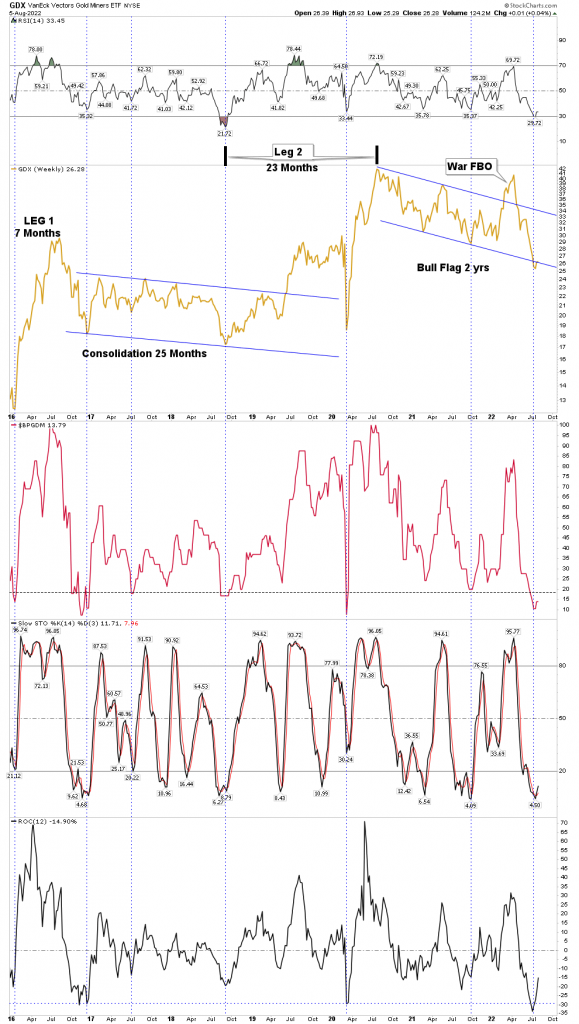
The precious metal stocks (PM) are in a multi cyclical bull market (secular) which started in January 2016. There have been 2 legs up and 2 legs down so far. The third leg up, which will likely be a powerful one, most likely began the third week of July 2022. I would expect it to last between 2-4 years.
Above we see the secular bull market so far. It began with a 7 month cyclical up leg followed by a 25 month consolidation. The next leg up lasted 23 months followed by what appears now as a 2 year cyclical bear market. I began classifying this most recent decline leg as a bear market in Feb 2021 when it was 6 months into the decline because it became evident that the moves down were NOT corrective but in fact distributive. Bear markets distribute positions from the informed to the misinformed (suckers). Until recently, most investors clung to the concept that it was “just” a correction. I think the 90 day brutal decline begun this past April, ends this argument. Clearly, it was distributive in nature, not just a correction.
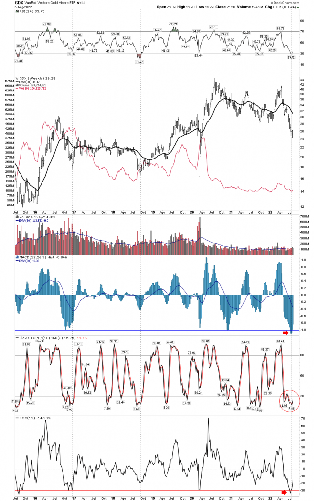
The three series of indicators on the chart above show that this recent decline, in aggregate, was the most extreme pressure packed decline of this entire secular bull market since 2016. The rate of change (ROC) even exceeded the covid crash. The 3 indicators in sum exceeded all other declines. Market sentiment, Stochastic and ROC led to a full-on capitulation… more on that later.
Prior to this secular bull market the sector underwent a 5 year 85% bear market from 2011 to 2016. This cleared the decks of all the dead wood which is why the market was able to vertical launch in the first half of 2016. But this first leg was destined to disappoint, as it ultimately did, because it didn’t unfold like a “real organic” leg should. You know, majors first, mid tier second and finally juniors and green field exploration. No, everything blasted up together, so the market needed a prolonged shake-out to sort through the real stories vs the trash. It took two years to do this. Take a look how FNV did during this period vs NGD and you will see what I am talking about. The market was just doing its job.
Next was the bull leg from Sept 2018 to Aug 2020 where the GDX more than doubled. Covid slapped it down for only a month and then in its last 2 months from mid June to early August it got over heated. I exited most of my positions in early August 2020, however my biggest error was in thinking it just needed time to consolidate before resuming the upside. The red flag waving was the fact that silver accelerated in a vertical blow off. This always happens at the end of a bull market and this bull was now 2 years old. This all should have been obvious to a schooled observer of markets. I recall twitter posts made by silver bugs right after the top in August bragging about buying the first dip and listing the silver stocks they bought. Recall that when one is buying right it never feels good and bragging is usually the last thing one wants to do because he is scared. Knowing the signs were all there, the proper course of action would have been to completely fold ones tent and go on sabbatical. The weekly RSI of the silver/gold ratio peaked at 78 on 3 Aug 2020, which was a clear signal a top was imminent. When this high of an RSI reading is combined with the end game acceleration of the silver price the bull market is ending…it’s time to go fishing.
Recall the month of July 2020, it seemed surreal as silver just wouldn’t stop. Each day it powered higher. ridiculously higher. Here is a chart of Silver From Jun-Aug that summer, it was like bull markets are supposed to be, it was actually fun to be in a bull market. Silver essentially doubled in 2 months- crazy.
But keep in mind the old Warren Buffet quote that “A bull market is like sex, it feels best just before it ends”. That’s the voice that should have been in your head that summer.
Aug 2020-July 2022 The long torturous PM bear market
If you ever wish to study bear markets this has been a classic text book model. Investors refused to believe they were in a bear market until it was 80%-90% over. Bob Thompson has mentioned this phenomenon and we saw it play out. There were 3 to 4 BMR’s with each one getting progressively bigger. Gold bugs bought all the way down and got caught in all the post BMR sell offs. Finally, the last BMR (Apr 2022) sucked in enough investors to provide the fuel for a full-on, full-scale downside collapse which ended in complete capitulation after a 90 day, 50% decline. A classic ending bear market annihilation drive. It ended up being an honest to god full blown cyclical bear market. No, it was not a correction.
Let’s build the case the next bull market has now started
First off, if you are not familiar with Bob Thompson’s mining clock I highly recommend watching this video and signing up for his free clock updates. His comments on the mining clock start at the 40 min mark. Once one understands the concept and sees the timetable you should be able to see why we were not headed for a 2013 like gold crash. Simply stated that’s not where the market is in the clock cycle and the charts depict this.
The Capitulation
I have gone back and looked at all the cyclical PM stock bear markets since the late 1800’s. I have sliced and diced them and you know how long the average bear market was in the gold stocks? 24 months! That’s right, just where the market is right now. So this bear is ending on schedule. So think about what we have witnessed in the past 7 months and particularly 90 days. By mid December last year the juniors had been thoroughly trashed by tax loss selling. It was a particularly brutal catharsis because many investors had big gains in big tech and really needed to offset those gains with something. PM junior portfolios served as an offset to those tech profits and they got pummeled, beaten with a stick. And here is the thing, they never really bounced back in the new year. Once the March BMR peaked in April the market began its annihilation drive, taking stocks down 50% in 3 months. By June another unthinkable wave of selling hit the juniors to the point of total destruction. This was full blown capitulation in the junior sector, there was no longer any doubting if capitulation was here. Then mercilessly the bear went after the only thing left, royalties & majors, It didn’t matter if it was quality or not…. AEM, FNV…offered no quarter. As if the bear wanted to make a final statement or put a cherry on top of his accomplishments, then came July 25th, NEM earnings day. A total wipeout of the largest, most respected miner in the world, down 13% on the day after already losing 41% over the past 90 days. This was full capitulation of the highest order among the big caps, massive volume with an institutional exit of the sector. Full spectrum sequential capitulation in both sentiment and price action.
Think about all of this for a while then ask yourself what more do you want to see? Sure we see inverted H&S objectives for GDX as low as 12, but there is a H&S pattern behind every tree. Do you really think every last bearish objective will be achieved…. seriously?
As Rick Rule said to me recently after I had asked if one of my favorite stocks had bottomed he said “I don’t know, but sometimes it’s just cheap enough”.
Plunger’s Gold Bottoming System Charts
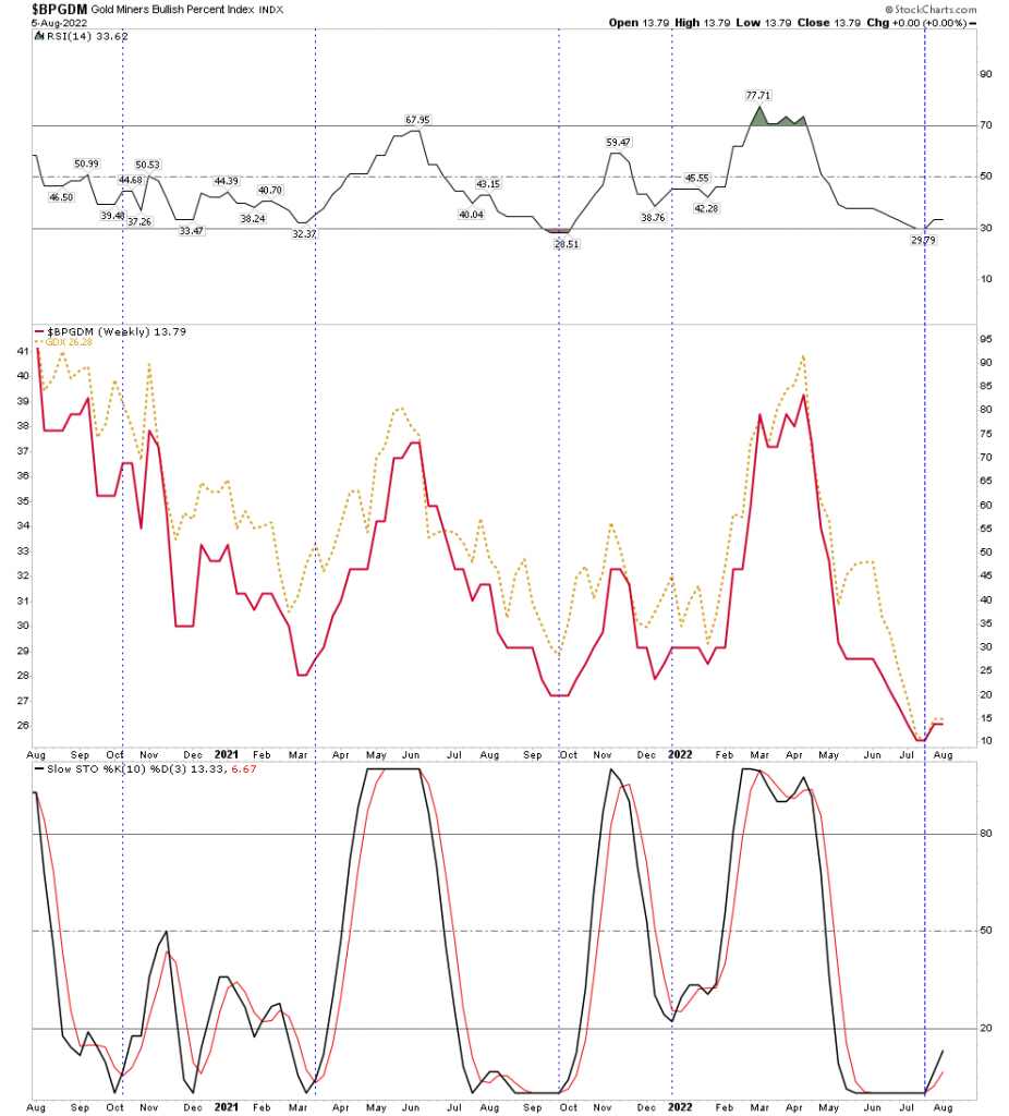
Above we see the gold miner sentiment indicator with the GDX overlayed and the weekly stochastic below. The vertical dashed blue line is drawn when fast stoch crosses slow to the upside. Simple chart and easy to see this is a buy point, but often overlooked. Look how stretched to the downside sentiment was and how long stochastic was flatlined. Also RSI reached the full extension of 29 which is really oversold for a weekly in a secular bull market. It was past due to turn up and it did. A buy point.
BPGDM- Daily Version
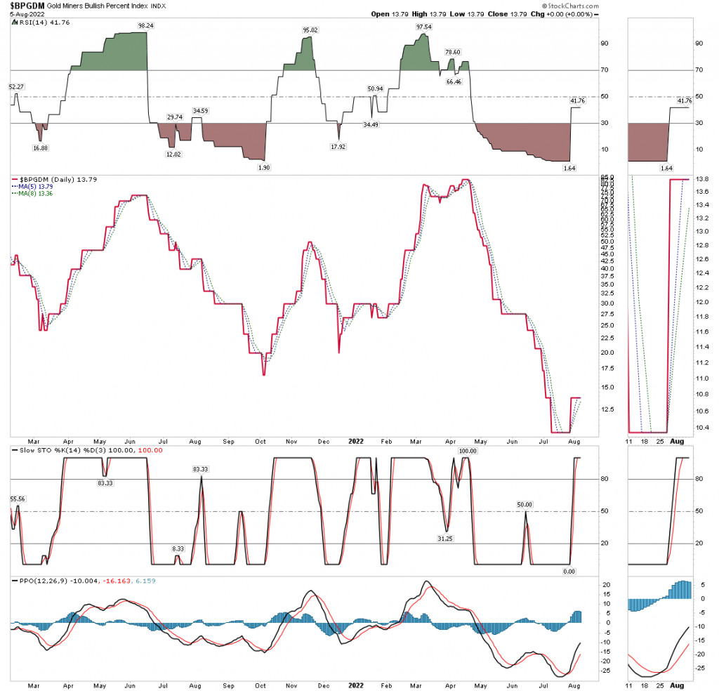
Here is a zoom in on the daily version. Here is the bottom buying criteria: when the BPGDM breaks up through the moving averages and the 5 day crosses above the 8 day it triggers a buy. This occurred on 27 July.
Gold Miners Above The 200 EMA
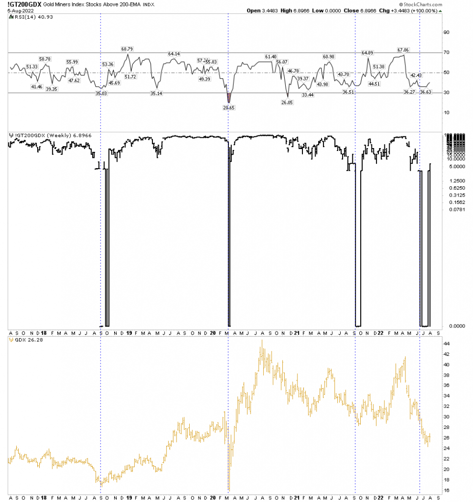
This was a very useful chart in the bottoming process. You can see how stocks above the 200 EMA were zero for the longest time. This showed just how extreme this downside move was. Mathematically, it can’t stay down there forever as moving averages begin declining so I drew the vertical line when stocks first hit 0% above 200 EMA. You can see the current sequence was the longest. Note that it took 6 weeks after stocks hit 0% before the GDX began to rise. In the previous 3 sequences the longest was 2 weeks. Another measure of extreme downside compression.
New High/Low Percentage
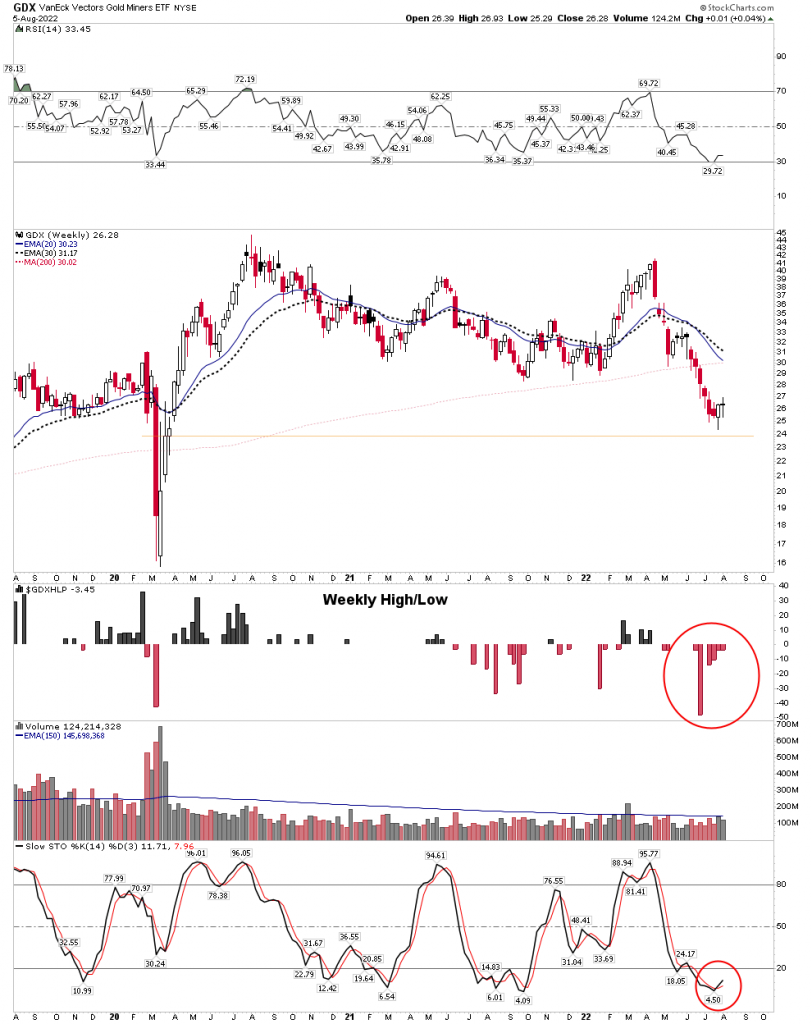
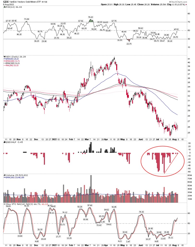
Next let’s turn to both the weekly and daily new high/low percentage. Truly extraordinary, as both exceeded the extremes of the covid crash. On the weekly, up to 50% of stocks hit new lows in the worse week of 27 June. The daily shows 65% of stocks hit new lows on the worse day of 14 July. That’s more than the worse day of the covid crash. Extraordinary high compression lows. This gives spring-back power once the next bounce breaks out.
Weekly
Above: note weekly stochastic curling up now. Expect price acceleration once the 20 level is reached.
Daily
Above: A massive 2-month cluster of new lows reaching 65% in a single day, setting up a compressed spring.
Bollinger Bands-Gold
Weekly:
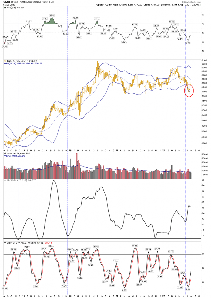
You can see that gold had a 3 week excursion outside its lower Bollinger Band. That is fairly extreme in the context of a secular bull market and indicative of a near term upside reversal. The bands are now widened out from the big downside move. This is another measurement of downside compression likely leading towards a strong reversal.
Monthly BB:
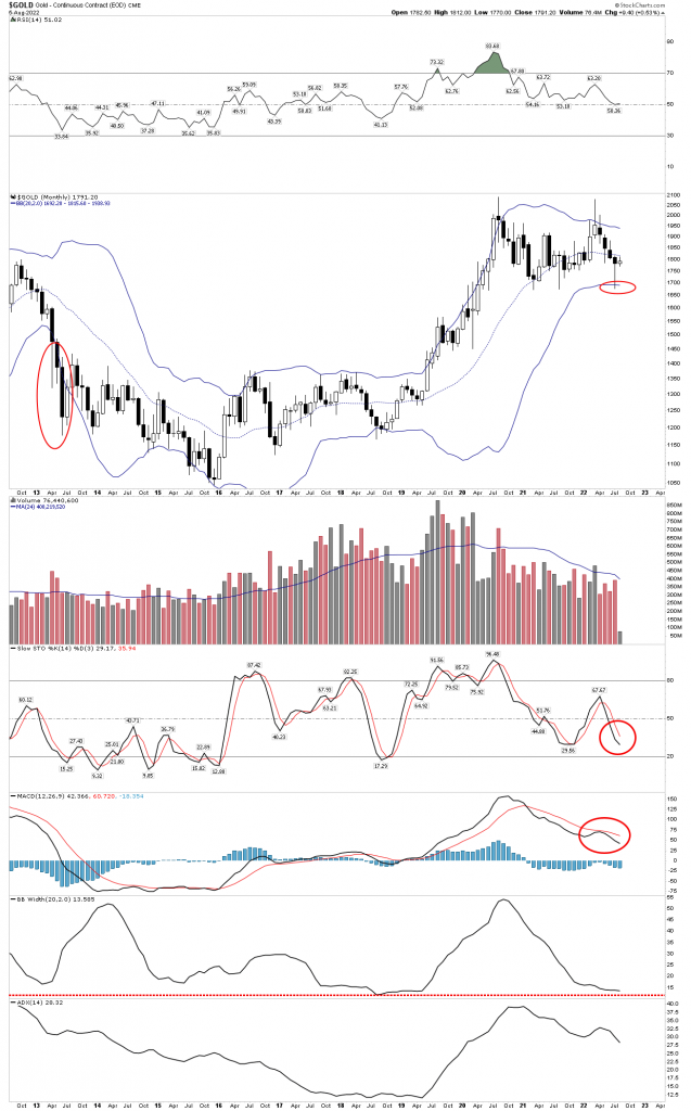
The monthly confirms the concept that this is not 2013 all over again. Note how in 2013 gold ripped down through a declining BB and stayed outside for 4 horrendous months. That’s bear market action indeed. Contrast that with the recent poke below a flat BB. It was like a beachball underwater, it couldn’t stay there and popped right back up. that’s encouraging, however the indicators below make it clear that any bottoming action is going to take a lot of time before a sustained bull market move.
Stochastic and MACD are still in downward configurations so it’s going to take time to reverse this still existing downside momentum. It means there is still an undertow to the market and backing and filling will be the result of it. Don’t expect a steady upside path.
Note however, the BB width indicator. This shows the BB have narrowed to a minimum width indicating a significant move in price is fairly imminent on a monthly basis. If the move is to the upside it would result in the Stochastic and MACD making the turn and support an eventual prolonged move up.
GDX volume and extreme downside compression
This chart below shows in no uncertain terms how compressed GDX had become. First off 10 week average volume is shown by the thin red line overlaid onto price. It is a magnified and shortened scale of the thin blue line over the volume bars. This shows how volume has dried up over the past 2 bear market years. This is what we expect to see in a bear market. The recent up-curl could be the end of this trend.
RSI: I drew vertical lines through the low points in RSI showing where they intersect price at those lows. The recent low of 29.72 is very oversold on a weekly basis.
MACD Histograms: The most extended to the downside of any time in this 7 year secular bull market. More compressing of the spring.
Stochastic: Not a spike low but of longer bottoming duration and now turning up. Breaking through 20 provides confirmation.
ROC: Even exceeded the rapid covid crash
Again, this is all a picture of extreme downside compression of the GDX for a considerable length of time. It is why I expect more upside follow through in the near term. Compressed energy is now being released.
HUI/Gold Ratio
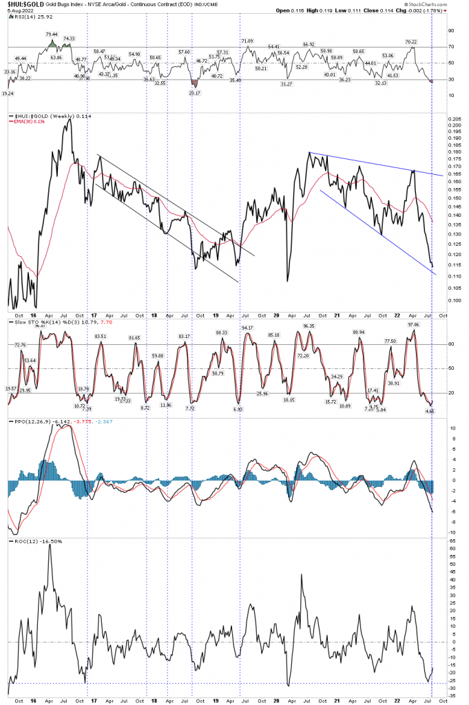
The HUI/Gold ratio is a validation of sorts of an actual bull or bear market in the gold sector. During prolonged uptrends in a bull market gold stocks will outperform gold. It does tend to lag a bit so this chart is telling us we are almost there since the indicators are now reversing. Again we see a picture of extreme extension of the indicators.
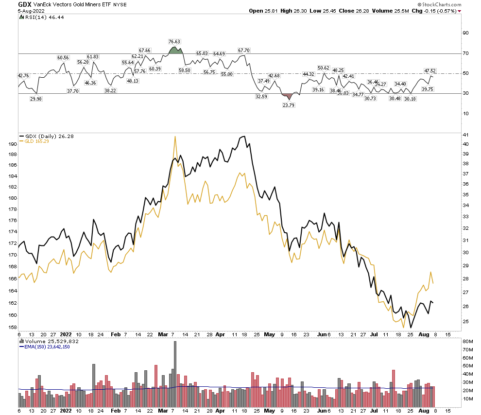
The below chart shows this same dynamic with gold and GDX plotted together. You can see the metal is still leading the stocks. This should eventually change.
Gold Miners Adv/Decline Volume
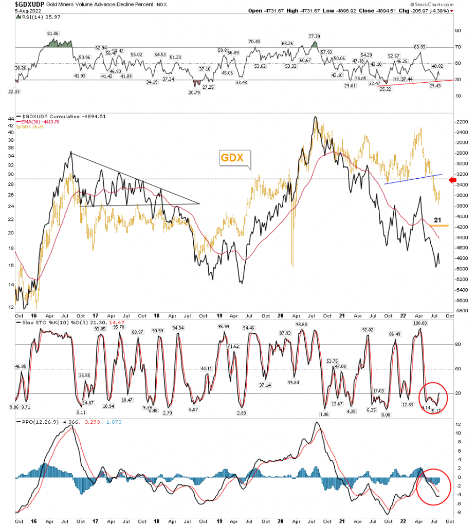
Adv/Decline lines typically lead stock prices, however in the gold sector it doesn’t have this history. It actually tends to lag the GDX and you can see it doing so here. But it is showing signs of a bottom in the Stochastic and PPO indicators, as well as the Adv/Decline line itself.
The 21 posted on the chart is the H&S price objective of the GDX. It may or may not ever achieve it, however the NL shown may be a magnet for a GDX back test which comes in just over 29 where another measured move method is projected for this current rally.
Overall despite being a lagging indicator in GDX the Adv/Decline Volume is a slight positive now with indicators turning upward.
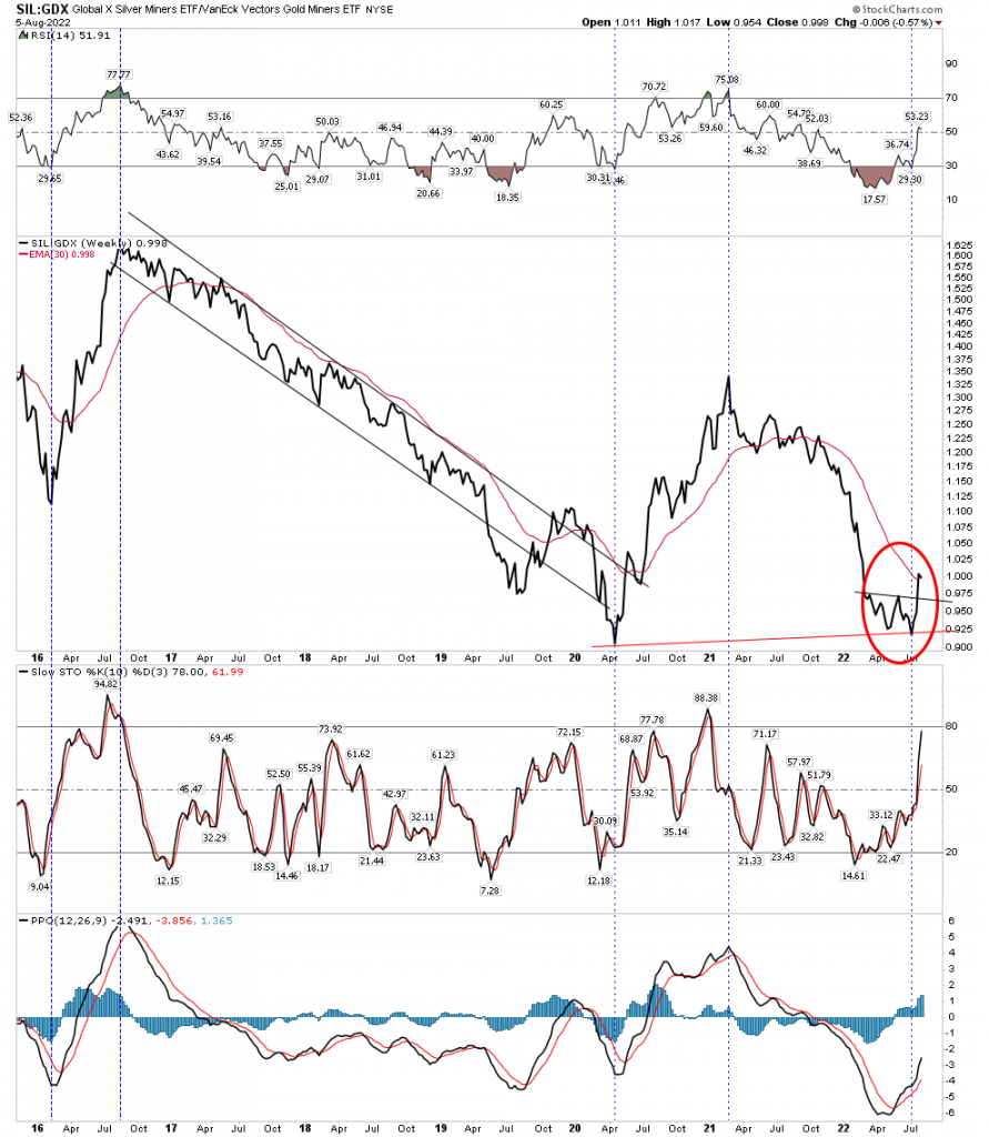
SIL/GDX- Silver stock to gold stock ratio
This is a significant meaningful indicator because it only makes major swings and shows when an upside bull market gets in gear. This is because silver stocks outperform gold stocks once the uptrend is well underway. It has already turned upward after a positive confirmation double bottom. The early turn upwards, I believe, is telegraphing that silver stocks are going to far out run gold stocks in this upcoming bull market. It’s my opinion that this will be due to the Comex silver suppression scheme coming unraveled.
Plunger’s Proprietary PM Buy Signal
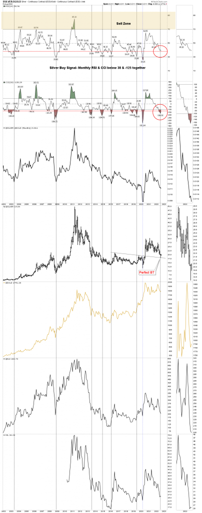
Here is my last gold bottoming system chart. IMO it is the most important and useful chart. It kept me out of the gold stock crash until early July. It is a buy trigger based on the Silver/Gold ratio. (not the gold/silver ratio) I’ve harped about the usefulness of this ratio for years, however I am convinced that not one in a thousand gold investors understands the real usefulness of this ratio. Everyone focuses on the gold/silver ratio and derives just one thing from it being the GSR needs to go down for gold stocks to rise in a bull market. It’s pretty useless analysis, but one hears it all the time.
The silver/gold ratio and its associated monthly RSI & CCI provides highly valuable guidance on whether to be in the market or to simply go fishing. When the weekly RSI approaches 80 it is time to start making your way to the exits and stay out. (Aug 2020) If you ever see it run to over 80 be sure to get out and probably cool your heels for 10 years. That’s extremely valuable sell side advice.
But we are now focused on the buy side trigger. When the monthly RSI closes below 38 while the monthly CCI simultaneously closes below -125 it triggers the initial buy signal.
In the above chart you will see that monthly RSI has not yet closed below 38. However, at the July lows it had gotten down to 37 so technically it did trigger the buy signal. Since it’s a monthly chart it uses the end of month readings. But I would like to see more follow through in this indicator, so I think in the months ahead we will likely see a retest of the lows in the gold stocks and the silver/gold ratio will drop in this process indicating credit stress and then deliver a full blown trigger deep in the low 30’s which will confirm the buy signal.
Now let’s flip it and discuss the Gold/Silver ratio (Metallic Credit Spread)
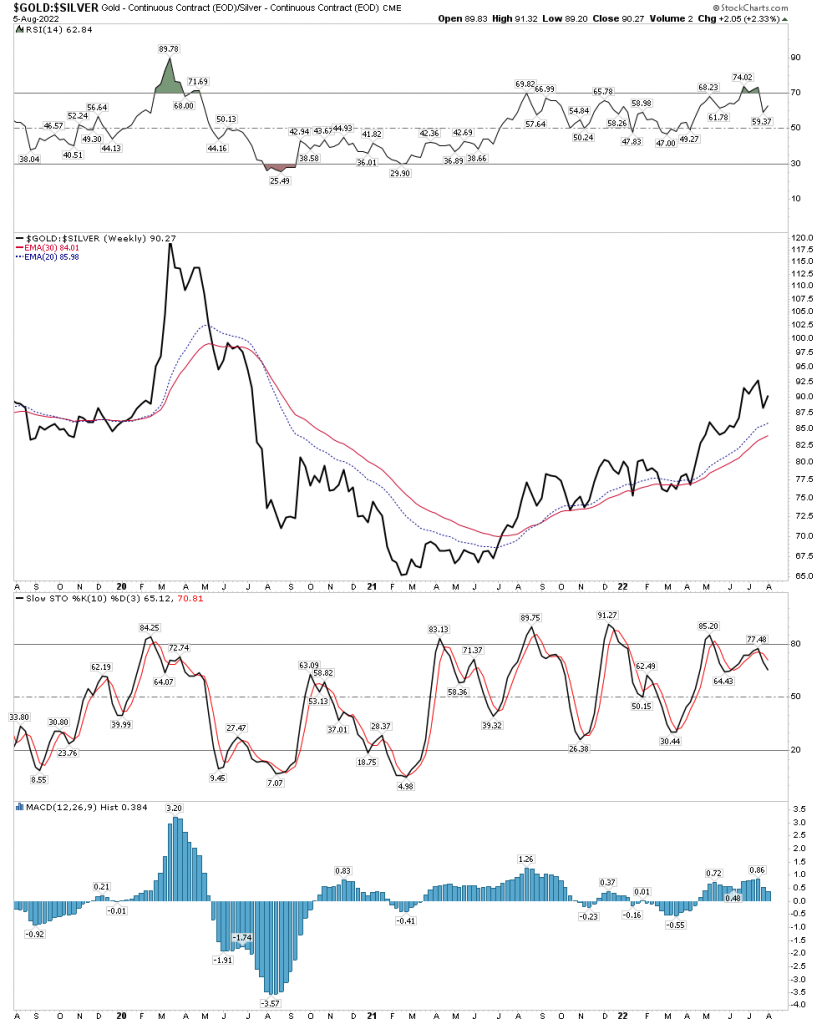
The GSR’s most valuable feature is to forecast credit contractions. This is because the GSR acts like the yield curve does. Since silver is primarily an industrial metal its value declines as industrial activity declines while gold becomes more valued as economic conditions undergo stress. This is because money seeks safe liquidity in a crisis and gold is the ultimate form of safe liquidity. So the GSR rises and this is predictive of a credit contraction.
In the chart below we see the GSR forecasting a credit contraction dead ahead. This will likely cause the FED to pivot which should launch gold higher. You can see by the chart below that this moment is rapidly approaching:
Above can be seen the spike in the GSR during the covid crash. Today the GSR has spent the last 2 years turning the corner and forming a base. It is now rapidly gaining steam for an upside breakout. This breakout will usher in a credit contraction which will be met by a FED pivot and renewed launch of the gold bull market.
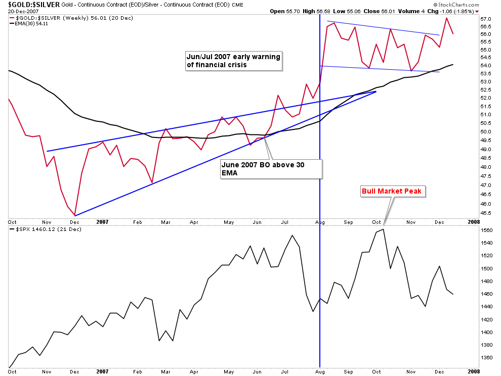
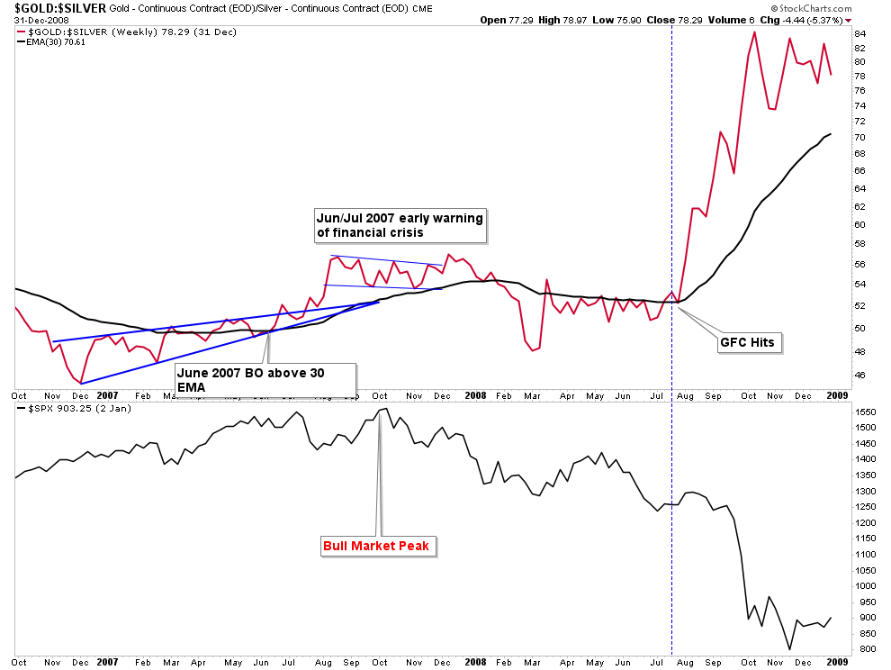
To give you an example of how this works let’s look at the GSR during the GFC of 2007/8.
In the first chart below we see the warm-up phase of the GSR a year before the crisis hit. The GSR is in a steady climb breaking through its 30 W EMA. Then the market peaked, the stage was all set for the crisis.
Now let’s extend this chart out another year. The GSR gains of 2007 consolidated up until July 2008 while the stock market continued to sell off all year. Then the GFC hit and the GSR exploded upward.
Gold/CPI- The engine of a gold bull market
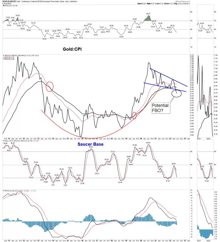
The below long term chart shows the price of gold vs CPI. You can see the obvious bullish set-up here; massive cup & handle. Keep in mind that gold is NOT a coincident indicator. Gold either leads or lags. Gold marches to its own drummer because it’s gold, it doesn’t have pay attention to anything else. It is the center of its own universe. But the chart is clearly bullish and when it does turn up it will be in an upward configuration for years.
Bottoming System Conclusion
In aggregate, the recent low in the gold stocks is the most oversold it has been since the secular bull market began 7 years ago. That super compressed low is likely the low of the 2-year cyclical bear market which began in August 2020. The extent of the compression could lead to a strong upside surge, however the July low is likely to be retested in some form in the months ahead, perhaps in sympathy with a general market sell off.
Strategy- Looking ahead
This weekend I heard a lot of gold market commentary and the consensus view is we are now in a gold market BMR. We are all affected by recency bias and all we have seen for 2 years now is relief rallies and BMR’s followed by wipeouts. I don’t think this current rally is a BMR, it’s the first leg up in a bull market. The evidence points to it as a new cyclical bull market, with legs. Seeing this move as just the next BMR is going to get you sitting on the sidelines watching the bull run away from you. I don’t think the average gold stock investor recognizes that we just saw extreme full blown capitulation within the context of a secular bull market.
But….. the monthly Bollinger Band gold chart I showed above should tell you there is going to be a retest of the low in some form. My number one scenario I think likely to happen is the gold stocks rally for at least another month, then rollover and decline in sympathy with a general market decline. A roll over would be interpreted as the end of the BMR that everyone sees and their exit will be particularly damaging to the PM sector. However, the key takeaway is that it’s not a BMR followed by lower lows, it’s a retest of the lows and most indexes should hold above the July lows.
GDX as the dog and the lesson of GAPS
You may or may not know that the GDX still has one unfilled gap remaining from the covid crash. That narrow gap will be filled if the price can drop down to 23.73. This vicious bear market has given me a lot of new found respect towards price gaps. There is no rule that says gaps must be filled, but I have learned that they are a powerful magnet to price.
In fact gaps represent a form of market scarring to investors. Emotional scarring, and they cry to be filled. When the rather wide GDX 25.94 gap was finally filled after 27 months of crying out, it was filled in a purposeful manner. The market ironed out the gap, back and forth several times over several days before it finally left the scene. Perhaps because it was so wide and left unattended for so long. It seemed like atonement for a crime so long in the past. It was instructive price action.
Back just 3 months prior, filling that gap simply seemed like an impossible task. It seemed proof that gaps don’t have to get filled. So yes, I have gained a new found respect for gaps. In other words, my expectations are that the 23.73 gap will be filled, perhaps in the retest I mentioned above.
Here is the chart of the 8 day sequence back in Apr 2020:
You may be thinking, wait a minute Plunger, if 23.73 is destined to be filled then we didn’t see a bottom after all and this is just a BMR that we are in. No, I think my case has been made in the prior 3,500 words that we have seen a bottom, however some indexes may indeed dip to lower lows in the retest which lays ahead. And GDX will be one of those indexes because it’s such a dog, however the composite group of gold stocks to include GDXJ will successfully test at a higher low.
Here’s why… GDX is made up of a lot of dogs, principally NEM. Keep in mind NEM is the largest and carries the most weight. It’s mines are mostly massive diesel guzzling open pit money holes. Until fuel costs abate these companies will be laggards. Contrast this to companies such as AEM which have mostly underground mines which are primarily powered by government subsidized electrics. Ore is hoisted by electric motors not diesel guzzling trucks. It is why AEM’s costs are under control and the stock is surging off its lows while NEM continues to crater.
So with this in mind, perhaps GDX will fill that gap while the rest of the sector finds a higher low when the inevitable pull back arrives.
Oil Stocks in 2020- our operating model.
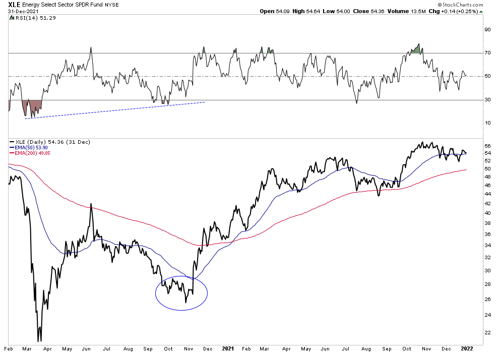
I propose that the way the oil stocks bottomed in 2020 could offer a model of how the gold and silver stocks will build out a permanent base for an extended move. Recall when oil went negative in Apr 2020. The oil stocks (XLE) had already hit their lows in March during the covid crash and put on a powerful advance lasting 2.5 months. But then began to fade for 5 months. They finally found their footing in October in a successful higher low retest. That wasn’t a BMR, that was the start of a new bull market;
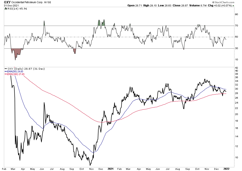
Star performer OXY-could it be today’s NEM?
Look at OXY however, when it did its retest it failed and found a lower low. I suspect NEM could do something similar and drag the GDX down to fill the gap at 23.73 while the sector looks more like XLE did.
At 4,000 words I will call it quits. I wanted to discuss the cause behind the annihilation drive from March to July, and also suggest a few ideas on horses to ride, but we will do it next time.
Editor’s Note
PS Plunger is holding court at the Chartology Forum where he is a Resident for Rambus Members
Answering questions .
To Join the most Dynamic Duo in Precious Metals Analysis . Rambus Chartology ..PMs are tough to trade folks…most of you KNOW this…Trading blind is not a good option
https://rambus1.com/membership-subscription-service-via-paypal/

