It’s been awhile since we last looked at some of the important currencies of the world which are telling us a big story right now. I’ve often mentioned that the bigger the trading range the bigger the move which makes perfect sense if you think about. If one is looking at a minute chart and sees a triangle the move will be relative to the triangle. If you see a triangle on a long term monthly chart the move will be relative on a much bigger time scale.
I built many of the currencies charts to follow, years ago, not knowing if they would play out. In really big trading ranges you can spot a reversal or consolidation pattern sometimes several years in advance and have to wait for the time component to catch up with price. Big chart patterns are very beneficial to understanding the big picture if one is an intermediate or long term investor.
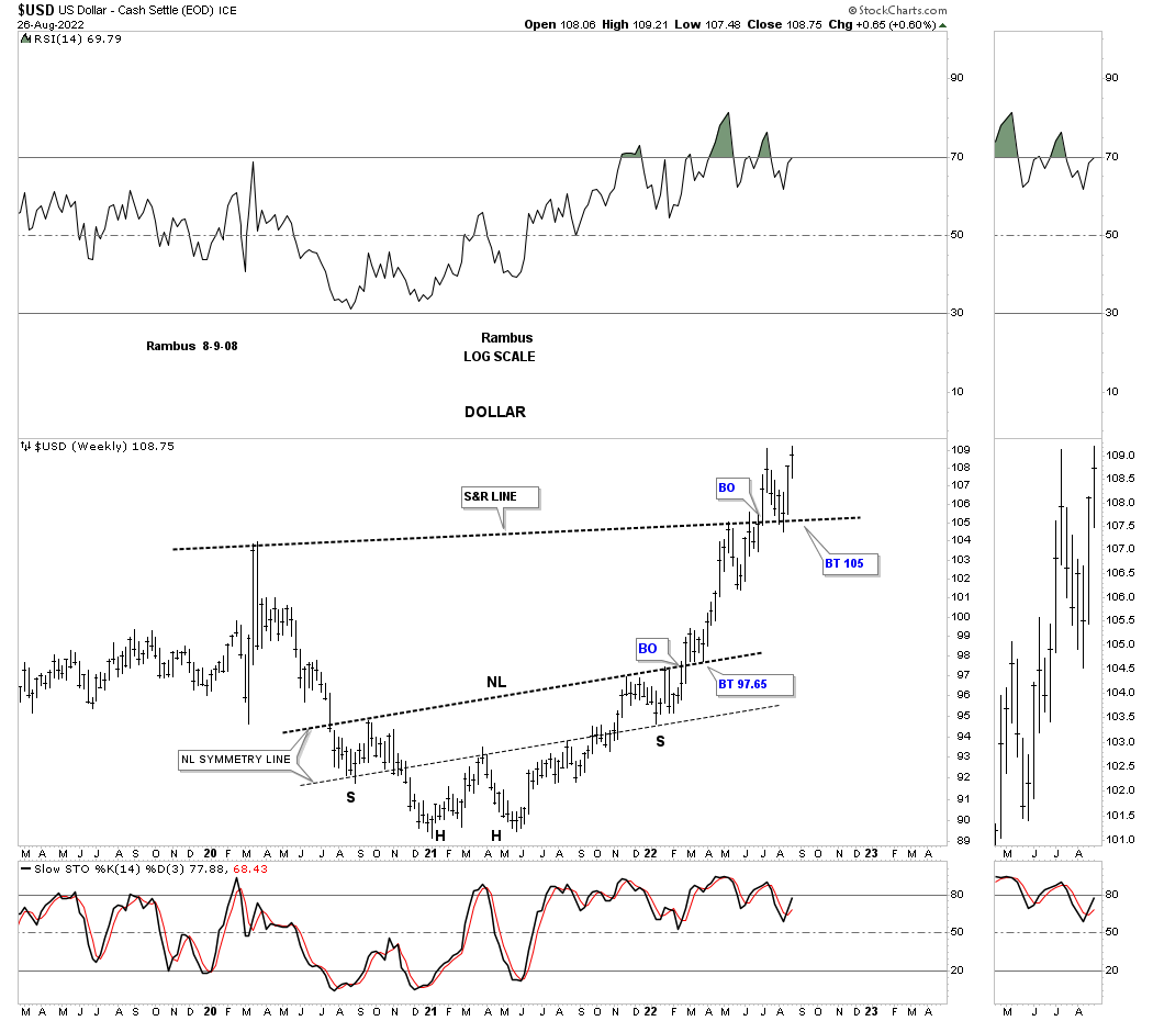
Lets start with with a weekly chart for the US dollar that only goes back to 2019 which shows the upward slanting very symmetrical H&S bottom as shown by the neckline symmetry line. You can see a nice clean breakout and backtest and the impulse move that followed. There was some hesitation at the previous high which is to be expected.
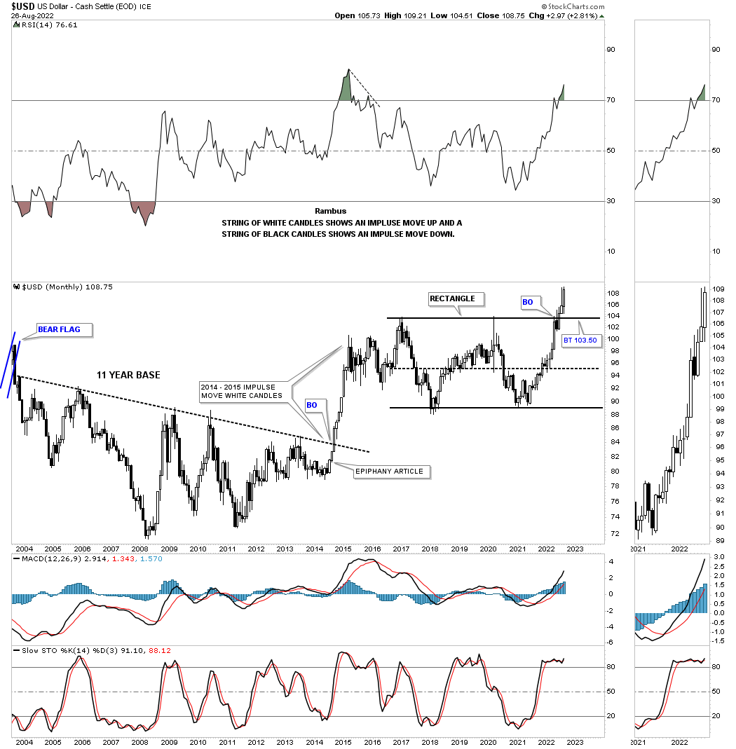
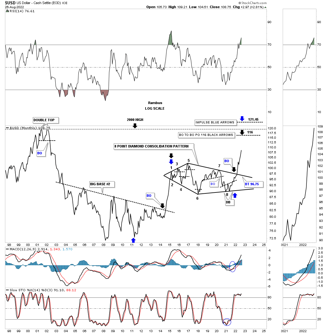
An example of seeing a pattern forming before the breakout can be seen on the long term monthly chart for the US dollar. Back in 2014 I discovered what I called Big Base #2 which took 11 years to form that was a fractal to Big Base #1, not shown on this chart. The annotation that says, Epiphany Article, which I wrote at the time of the epiphany moment I had.
Note all the white candlesticks, all in a row, that formed the impulse move which is a classic look. It took until 2021 to consolidate that massive impulse move. Note all the white candlesticks all in a row out of the 2021 low or 4th reversal point in the black rectangle. When you see a black candlestick form in a strong move it usually represents a small consolidation pattern on the short-term charts.
As you can see the US dollar has had one backtest so far to the top rail which could be all that we may see. That is a big consolidation pattern and will lead to a big move higher in the US dollar.
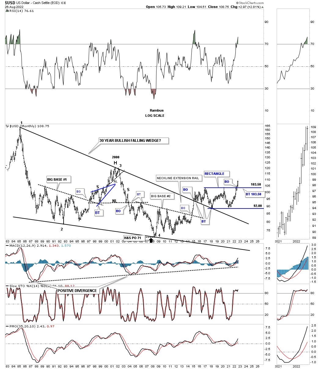
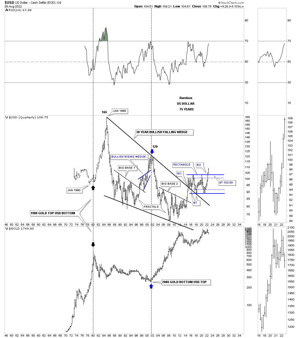
This next long term chart for the US dollar shows a 30 year bullish falling wedge with the top rail being broken as shown on the chart above during that impulse move. Note the 3 separate backtests to the top rail of the 30 year falling wedge which reversed its role to support, once broken to the upside. Now you can see how the rectangle fits into the very big picture.
This chart also shows you Big Base #1 and Big Base #2 which were fractals and took eleven years to form that led to very similar impulse moves. The big difference is that the impulse move out of Big Base #1 led to a reversal pattern after the price objective was reached. Instead of getting a reversal pattern after the impulse move out of Big Base #2 we have gotten a rectangle consolidation pattern which is going to lead the US dollar much higher in the coming years.
I have shown you this rather large 8 point diamond consolidation pattern several times since I discover it on a long term line chart. So far it hasn’t disappointed. As you can see there are several price objective based on two different measuring techniques.
This next chart is a history chart with the US dollar on top and Gold on the bottom. When Gold topped out in 1980 the US dollar was bottoming. At the start of the 2000 to 2011 bull market the US dollar was topping while Gold was bottoming. We know they can both move in the same direction for awhile which is possible, but highly unlikely for long periods of time. With the US dollar just now breaking out of its large rectangle consolation pattern that is going to be a strong headwind for Gold and more than likely commodities in general.
This is just a simple moving average chart which uses the 100, 125 and 150 week moving averages. As you can see when all three moving averages are moving together the trend can last for many years. Late in 2021 all the moving averages became properly aligned and are moving higher together.

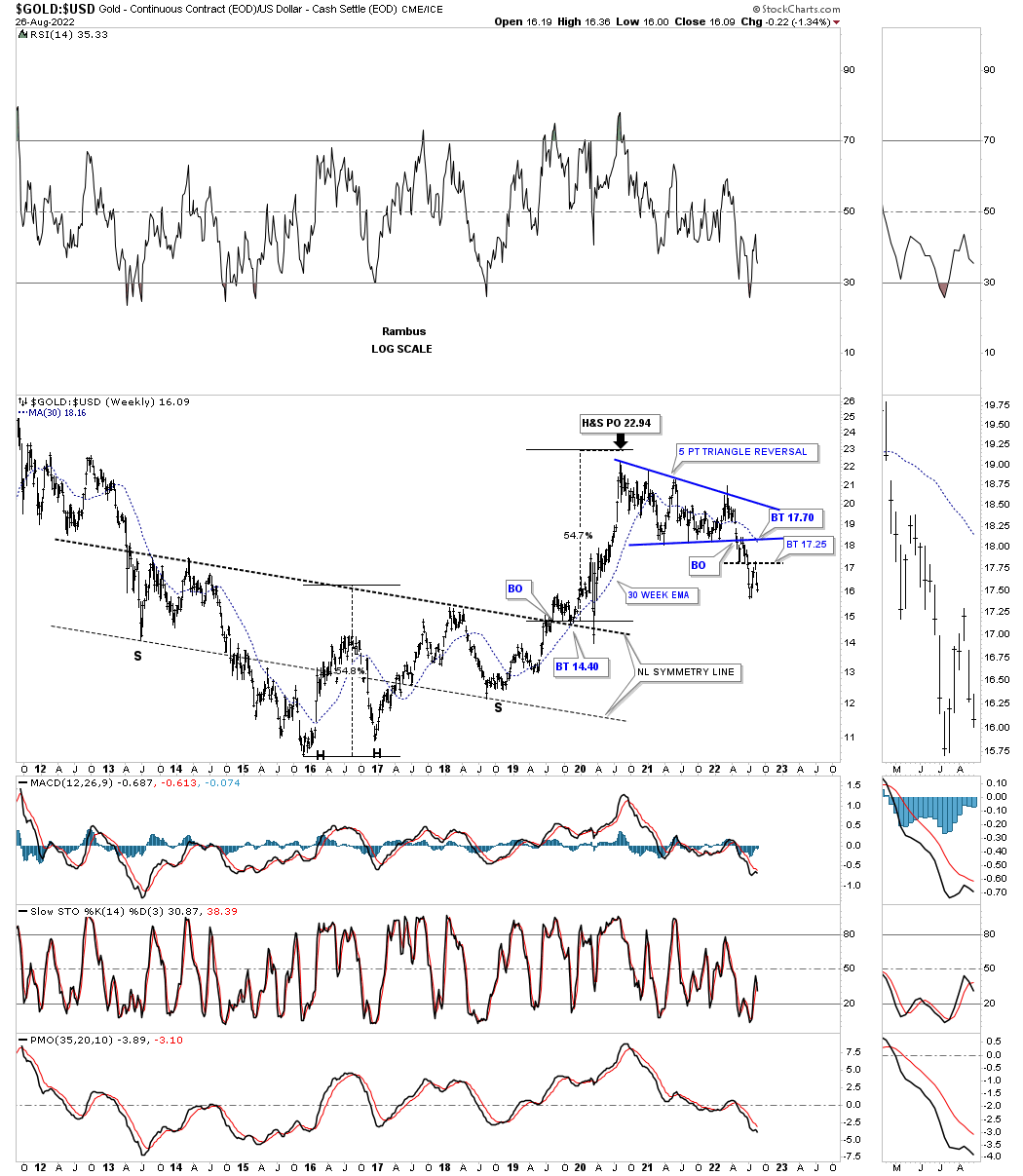
This next chart compares Gold to the US dollar which put in a 5 point triangle reversal pattern that formed after the H&S price objective was achieved. This is not a healthy look for the PM complex.
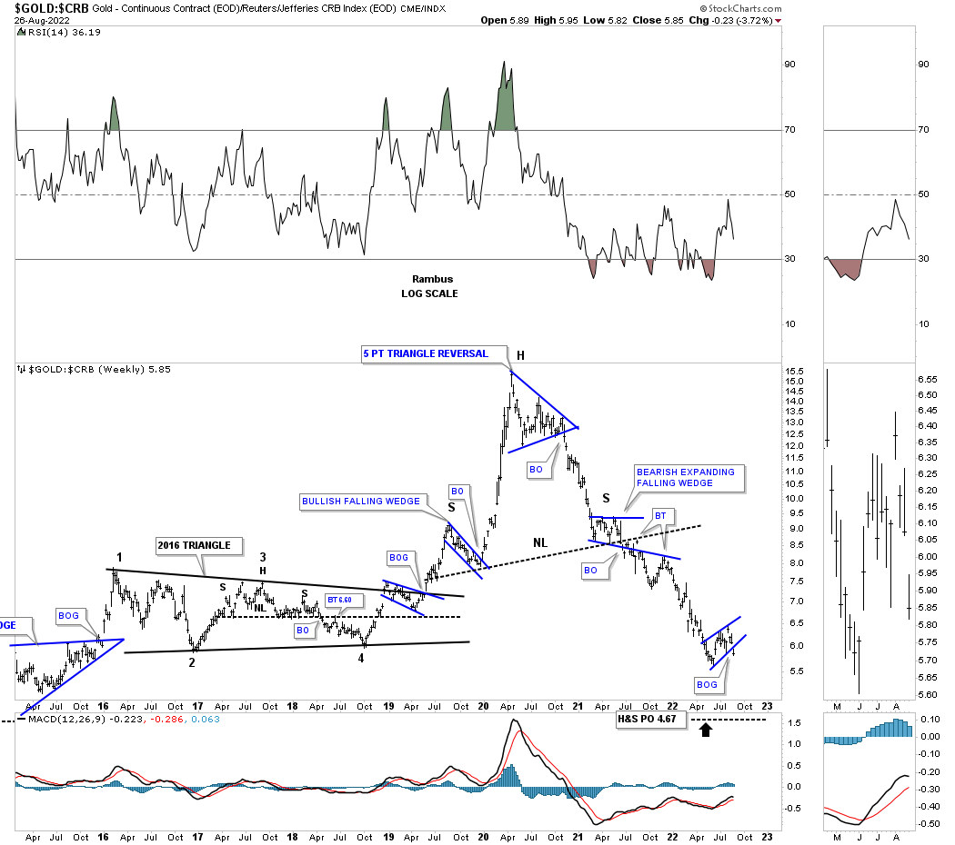
This next chart is a ratio chart which compares Gold to the CRB index. Gold had been kicking the butt of the CRB index for many years until the high in 2020. That is when the CRB and commodities in general bottomed out and began their very strong move higher. As you can see Gold didn’t stand a chance after the blue 5 point triangle formed and then the H&S top. Last week the ratio broke down once again out of the small bearish rising wedge. The H&S top price objective is still a little further down which would be the minimum we should expect.
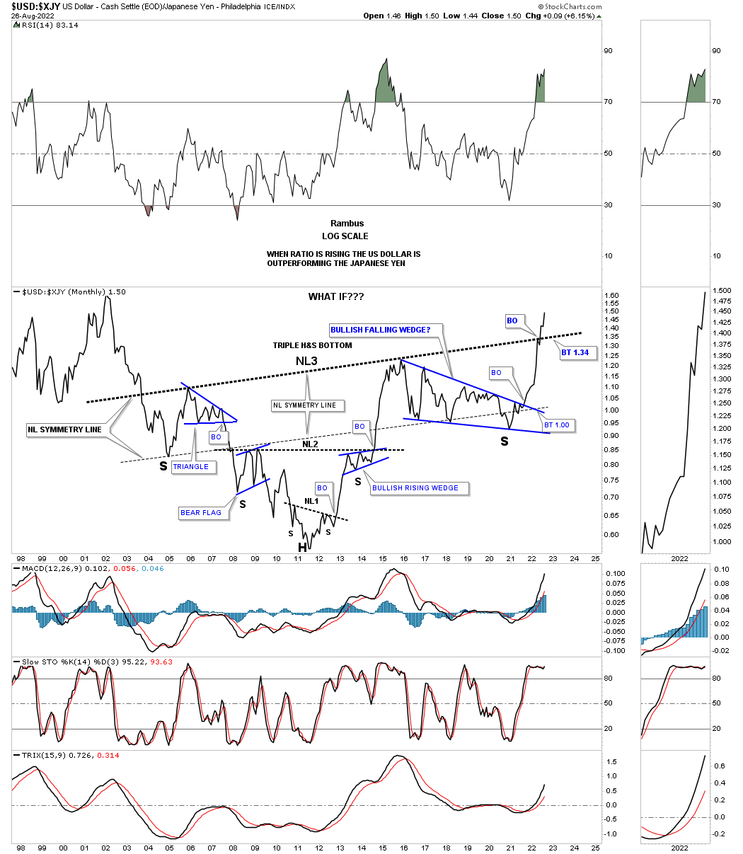
This next ratio chart which compares the US dollar to the XJY was another chart I built years ago after noticing how the US dollar was reversing symmetry back up over the same areas on the way down with three H&S bottoms now in place. As you can see the third neckline was just recently broken with a backtest to the neckline still a possibility.
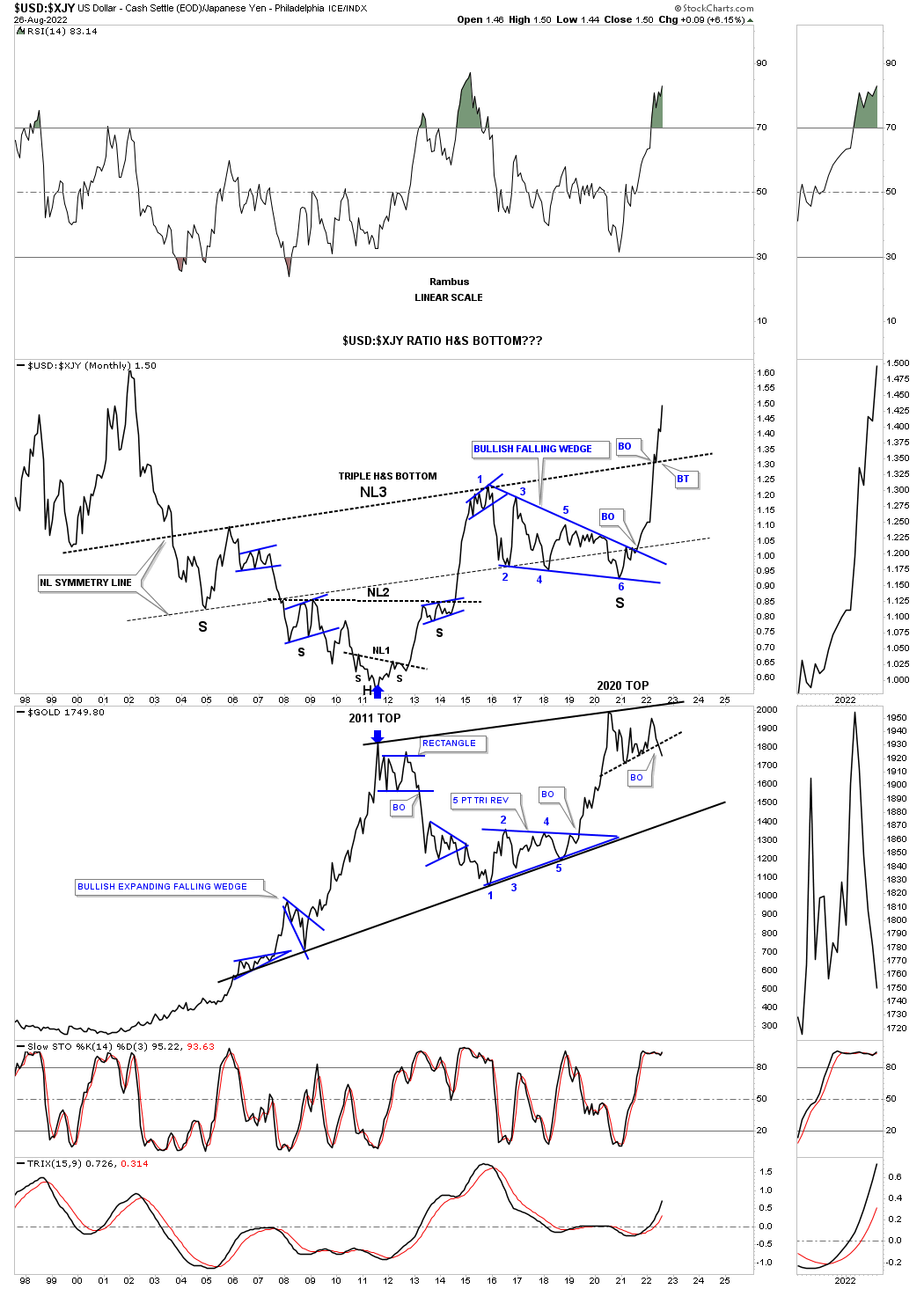
Next is the same ratio chart as the one above, but with gold on the bottom. Normally the ratio on top and gold on the bottom had a pretty strong inverse correlation. Since the 6th reversal point in the blue 6 point falling wedge, right shoulder consolidation pattern, the inverse correlation hasn’t been as strong as in the past. With Gold forming a possible double top the inverse correlation may get back to normal.
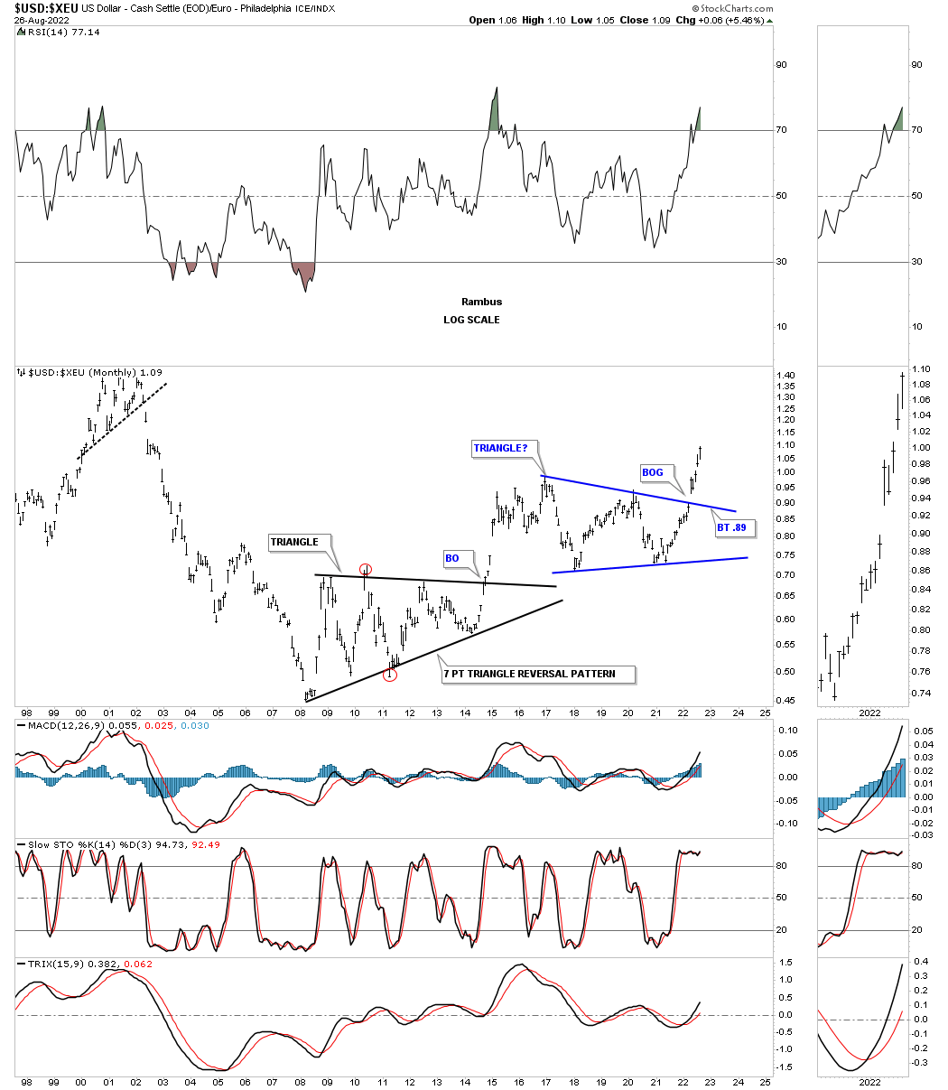
Earlier this year we looked at the US dollar to the XEU which was breaking out form the blue consolation pattern. Note the 7 point black triangle reversal pattern that formed the low for the ratio.
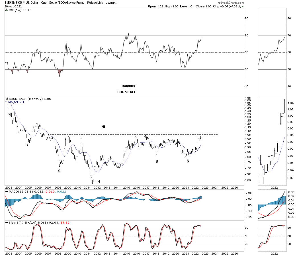
This long term monthly ratio chart compares the US dollar to the XSF, Swiss franc. As you can see the ratio is on the verge of breaking out from a massive H&S bottom.
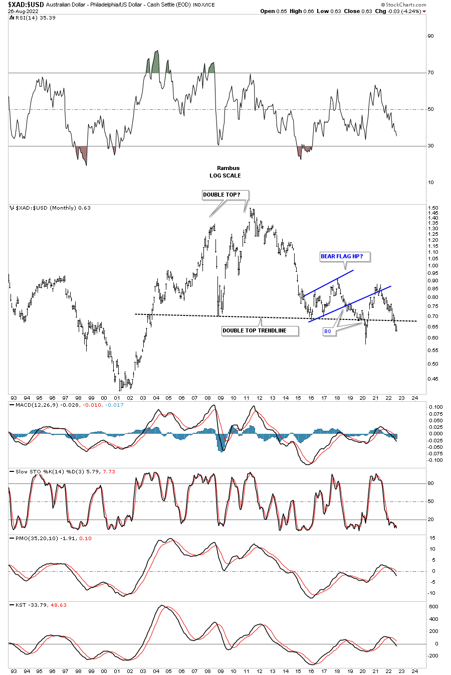
This next ratio chart I compare the XAD, Australian Dollar to the US dollar instead of the other way around. Here you can see the ratio is forming a very large double top reversal pattern.
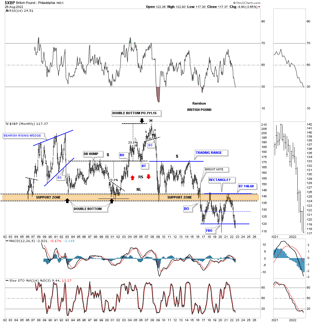
Below is just a simple chart for the XBP, British Pound, which shows its entire history. For most of its life the XBP traded above the brown shaded S&R zone until the BREXIT vote which led to the breaking of major support. As you can see after breaking below the brown shaded S&R zone it has reversed its role to now resistance from below. The XBP has been forming the blue rectangle which is very close to making a new all time low in the history of this currency.
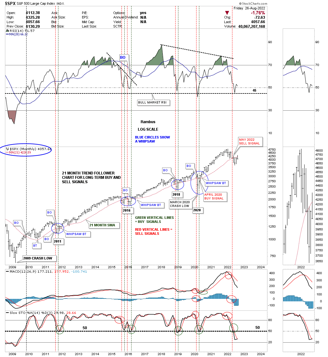
This last chart for tonight is a monthly chart for the SPX which I use the 21 month sma for long term buy and sell signals. As of last Thursdays low it looked like the 21 month sma was going to give us a new buy signal, but Fridays price action was enough to put the SPX back below the 21 month sma. We still have until Wednesday of this week for the SPX to close above the 21 month sma, but it is looking unlikely.
Since the 2009 crash low and the beginning of the secular bull market there have been just a few times that we got a whipsaw which lasted just one month except for the 2015 – 2016 low where we got a double whipsaw. As you can see once the price action trades above the 21 month sma the trend can last a very long time.
I still firmly believe we are in a secular bull market that began at the 2009 low with at least ten years to go which I know sounds ridiculous to most of you but outside of a cyclical bear market, 2011, 2016 and 2020 the secular bull market has remained intact.
The charts I showed you tonight, for many of the important currencies in the world, are strongly suggesting the US dollar is going to be stronger than most investors think possible which will most likely have a negative impact on the PM complex and commodities in general going forward. It won’t be a staight line affair, but the general direction of the US dollar is going to be up, think safe haven. All the best…Rambus
EDITOR’S NOTE :
Here is the genesis of Rambus “Epiphany” Dollar Fractal from way back in 2013 in a post called Dollar Bears Prepare to Hibernate
https://rambus1.com/2013/03/10/dollar-bears-about-to-go-into-hibernation/
Excerpt
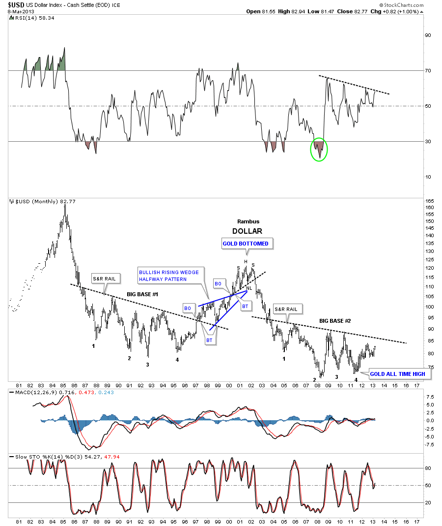
This next chart for the US dollar is a very long term monthly chart that goes all the way back to 1980. Sometimes in charting one can have an Epiphany or an eureka moment where all of a sudden there is clarity beyond what you were initially looking for. I had such a moment with this next chart that has a lot of information on it. First you will see two bases labeled Big Base #1 and Big Base #2. These two bases are uncanny in their similarities. Some might call them fractals. The two bases are almost exactly the same height as well as time. The only real difference between the two bases is at point #3 which was a tad higher on Base #2 whereas in Base #1 it was a little longer. Other than that they are amazingly similar. Note the breakout and backtest from Base #1. If you look real close you can even see a small gap that was made right at the breakout point. The support and resistance rail held on two backtests which told us the S&R rail was hot. Note the blue bullish rising wedge that worked out as a beautiful halfway y pattern. The height of Base #1 also measured out real close to the high where you can see the H&S top. As I said there is alot of information on this chart so I’ll post it right here and carry on with the same chart again a little further down.