Several years ago I built some charts for the PM complex which were not bullish and downright scary if they play out. I believe I just made one post to show what the potential was if the patterns I was seeing came to fruition.
Please keep in mind that I’m still very much a bull and expect the whole PM complex to move substantially higher in the not to distinct future, but I’m also aware that the only rule when it comes to the markets is that there are,”NO RULES”.
We have chosen to play the toughest game on the planet in which to be successful because we are going up against all the greatest traders, hedge fund managers, algorithms and computer programs that can buy and sell stocks in a nano second that want every penny we have and could care less if we go broke. It’s survival of the fittest.
The psychological aspect of this game is even more profound. The old adage to buy low and sell high sounds so simple, but to put it into practice is altogether a different story. I mentioned back at the low in the stock markets on October 27th of last year that I got a phone call out of the blue from my old stock broker friend the day before the low. He had been a stock broker for over 35 years and was worried that the financial system was getting ready to implode and he asked me what I thought. When I told him I was accumulating leveraged eft’s for the stock markets he couldn’t believe it.
He started to rattle off all of the things that every other analyst was talking about on why the end was near and I just listened and let him go on because I wanted to hear it from someone I knew was very well educated and thoughtful in his analysis of the markets. After our conversation ended I told my wife that the bottom was in and it was the very next day.
My point is that it doesn’t make any difference how Intelligent someone is to be successful in the markets because we are all governed by our emotions. You can have the greatest trading system ever designed, but if you can’t pull the trigger when it’s time to buy or sell then it becomes useless. Have a few bad trades back to back and see what that does to your confidence level which we’ve all felt.
Please keep an open mind when you read this Weekend Report. It’s not meant to scare you or make you angry, but to look at a possible scenario to be aware of, nothing more or nothing less.
We will look at the bullish scenario first and then look at the possible bearish scenario just to be cognitive of it.. Keep in mind I built these potential bearish charts several years ago, but they still seem relevant yet.
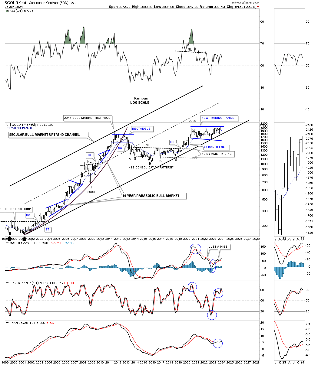
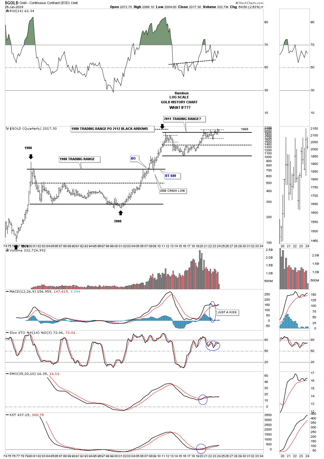
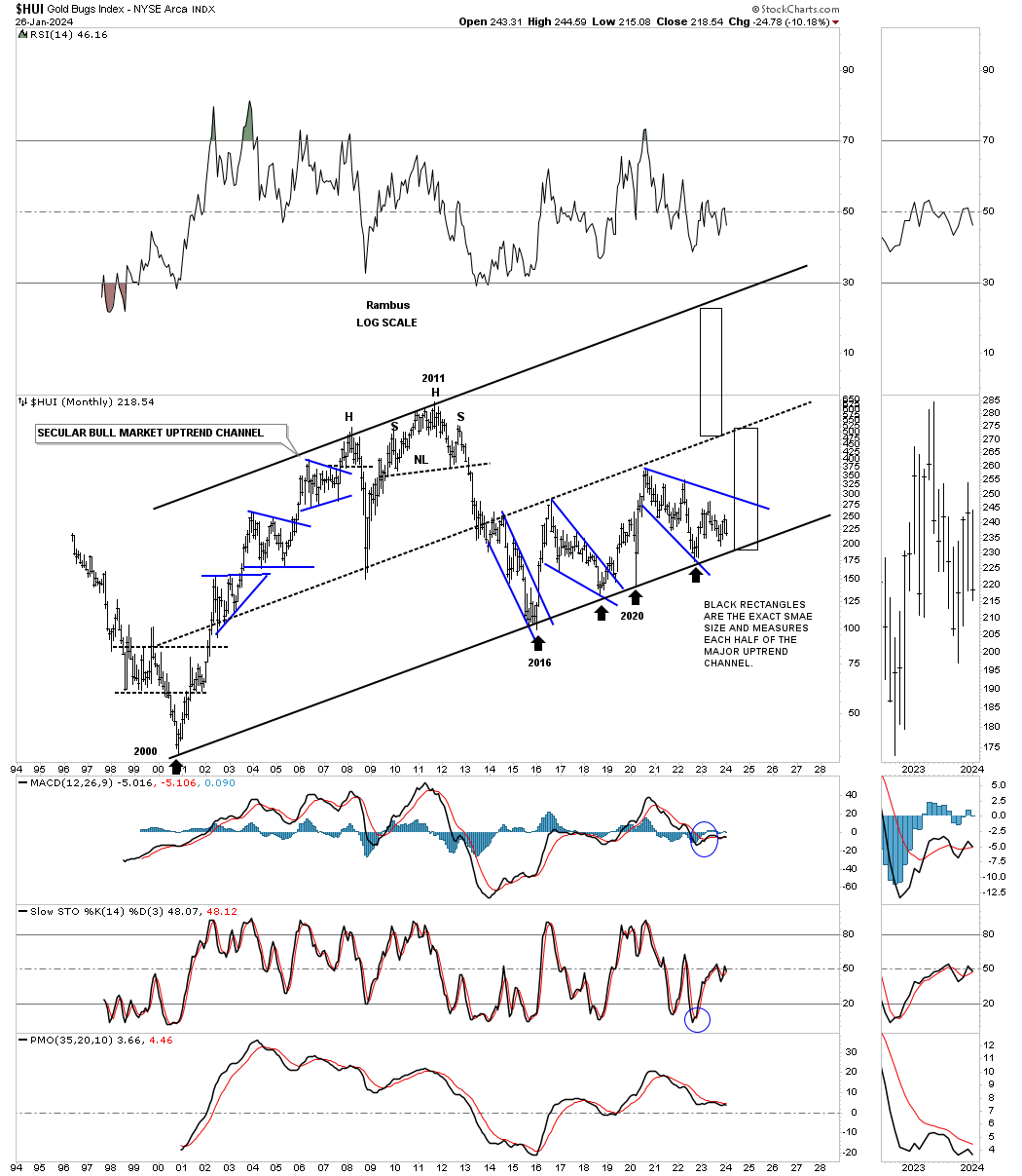
Lets start with Gold as it has been by far the leader when it comes to the PM complex. As you can see this monthly chart shows the secular bull market that began in 2000 and is a very bullish looking chart for the longer term. Price wise the 2020 trading range looks complete, but time wise could we see another trip back down to the bottom trendline of the secular bull market uptrend channel which would still be a very bullish setup, but no fun?
Another very bullish looking chart which shows the 2000 to 2011 bull market with the bear market ending at the head of the 2016 large H&S consolidation pattern. Finally the 2016 H&S consolidation pattern completed its work of reversing the bear market back to a bull market. Recall how long we watched that pattern develop before it came to fruition?
The two black rectangles, the one around the 2000 base and the one around the 2016 H&S consolidation pattern are the exact same size in price and time. If the 2000 base could launch an eleven year bull market then the 2016 base should have enough energy to launch a similar bull market.
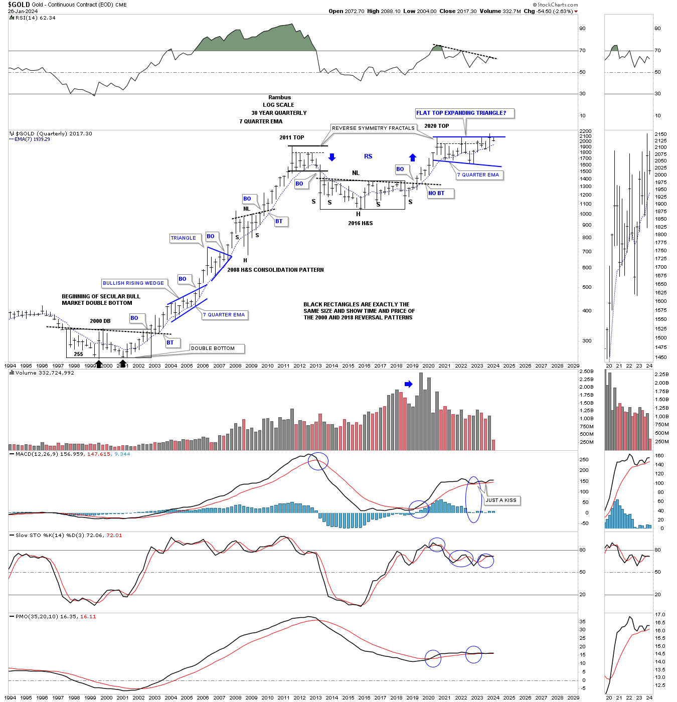
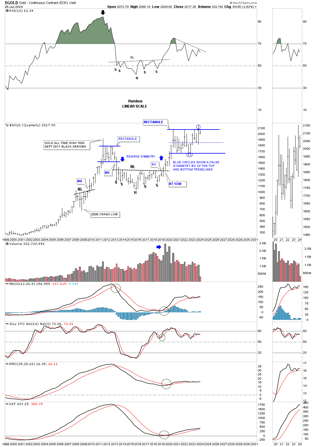
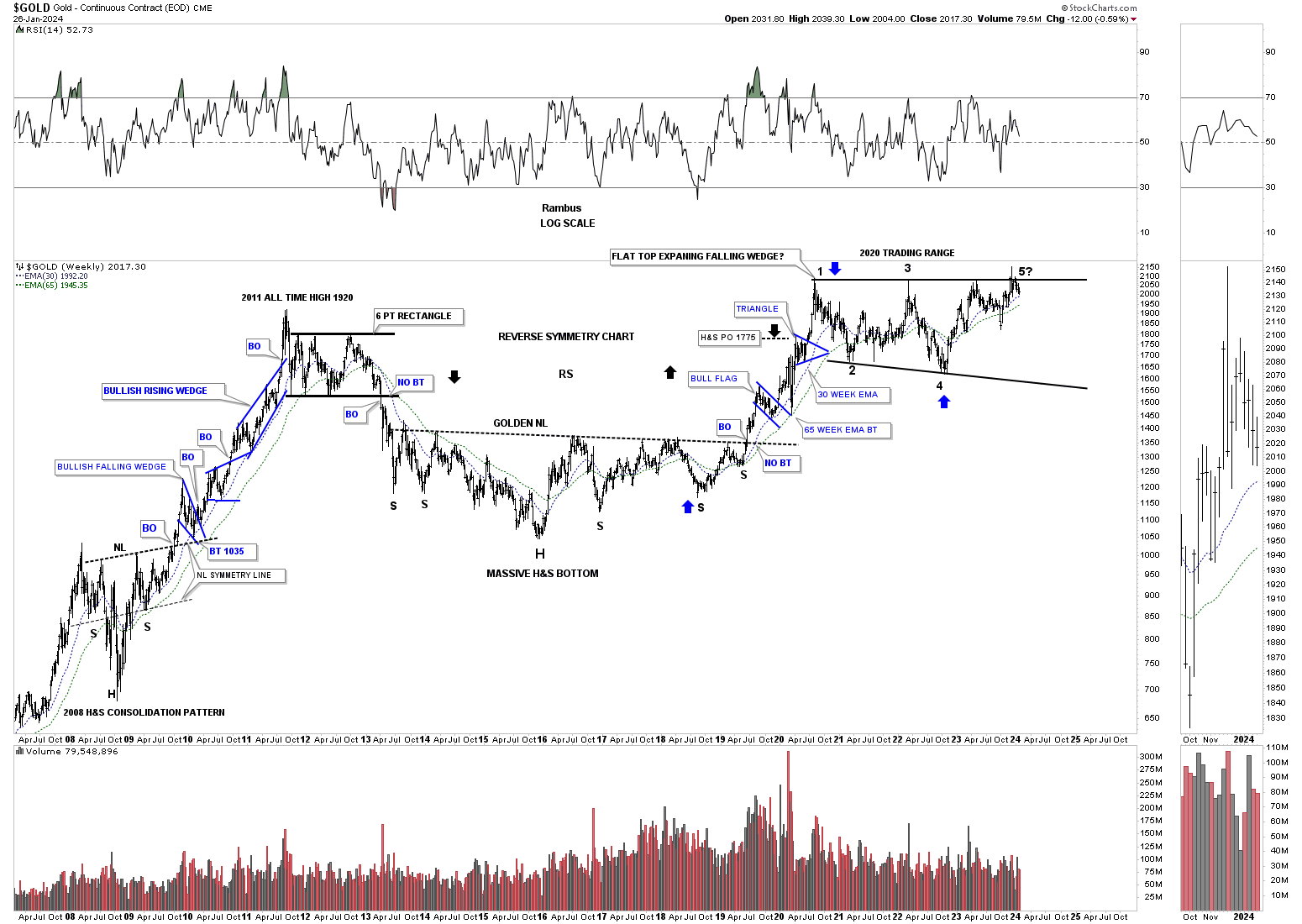
Looking at this long term quarterly chart for Gold shows the price action using a liner scale chart. If you recall we were watching Gold testing the bottom rail of the 2020 trading range at the last reversal point where there was a false breakout below the bottom rail which I labeled as a false breakout or bear trap after the price action rallied back into the what had been a very symmetrical rectangle.
Last quarter we experienced a similar false breakout above the top rail of the 2020 trading range with the price action now trading back inside of the pattern negating the breakout for now. We have looked at many triangles and rectangles which have experienced similar false symmetry breakouts of the top and bottom trendlines as shown by the blue circles below.
This is a little disheartening at the moment because there is no breakout confirmation, but this is a quarterly chart so what will we see at the end of March? What can happen with rectangles when there is a false breakout above the top rail is that the last reversal point can form on the center dashed midline. This is still a great looking chart, but it comes down to time rather than price.
Gold has produced a few spectacular bull markets over the last 50 years or so, but not many. How many could have thought after the vertical bull market into the 1980 high would take 20 years before a true bottom was in place to launch another spectacular bull market that lasted from 2000 to 2011? The current trading range for Gold began at the September 2011 high and it’s now January of 2024 thirteen years and counting.
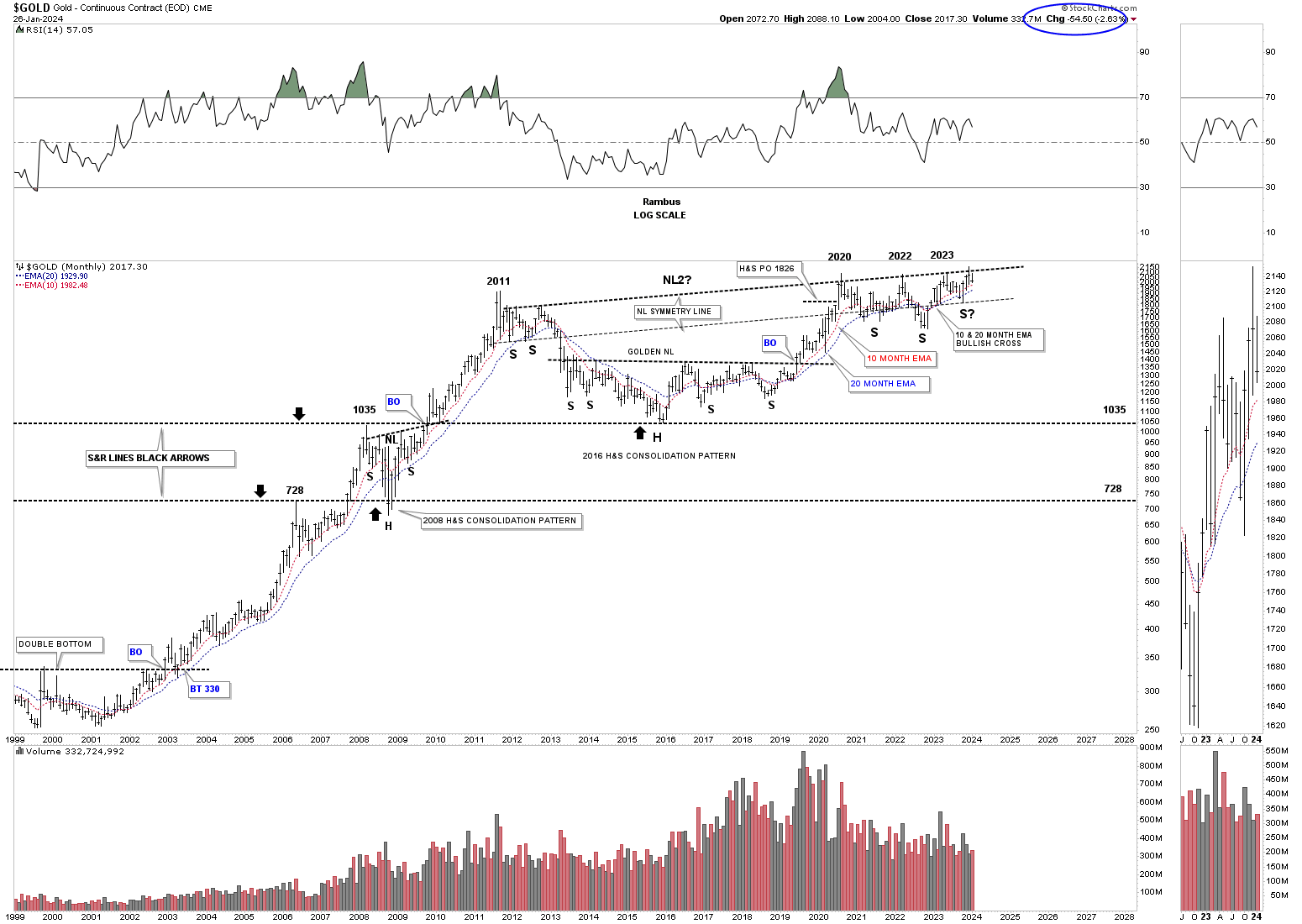
As long as the 10 and 20 month ema’s hold support the bullish scenario is still in play as shown on this monthly chart. They are both still rising nicely and are properly aligned.
Gold has been the strongest area in the PM complex and it shows with the possible NL2 rising. Is it possible the whole trading range between the 2011 high and now is one massive H&S consolidation pattern? Its getting pretty unbalanced if that is going to be the case. Note how many times NL2 has been touched going back to 2011 which is suggesting it is very important.
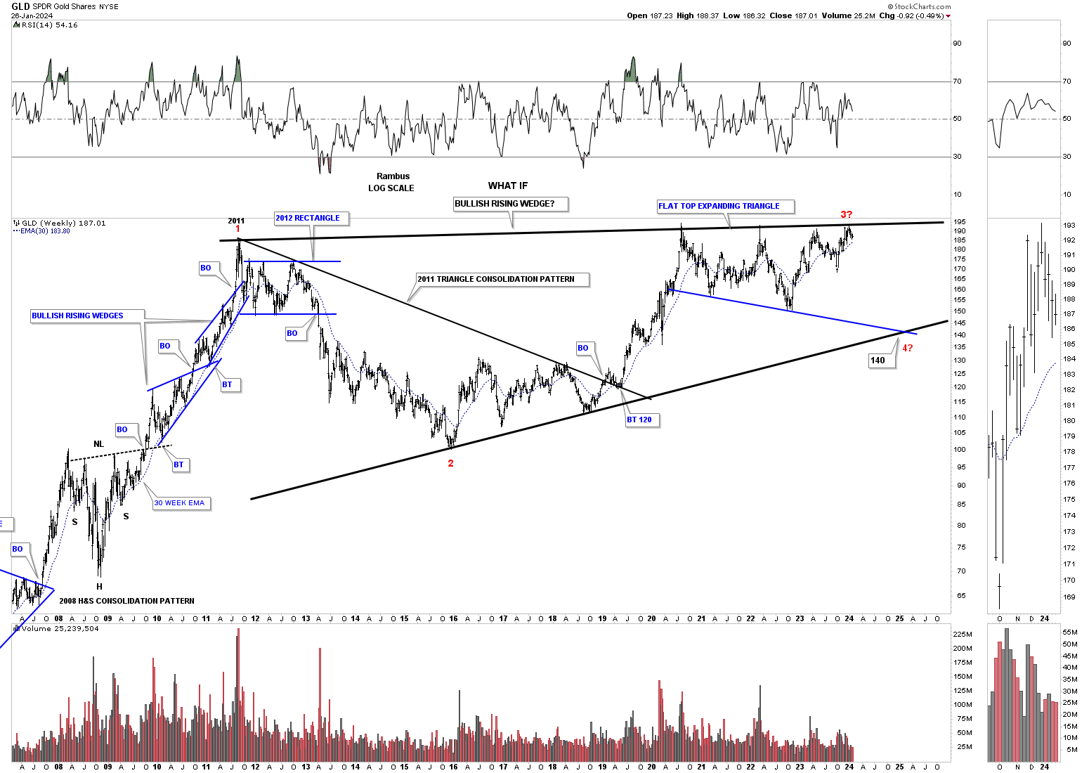
I’ve only shown you this chart for Gold one other time I believe which is still a bullish chart, but not in the short term. If the bulls fail to take out the top rail of the 2011 trendline then there is a possibility that Gold could decline all the way down to the bottom rail of its blue flat top expanding triangle which would intersect with the bottom trendline of a possible very large bullish rising wedge where the 4th reversal point would be found, red numbers.
The PM stock indexes is where the charts can start to look more bearish if a bearish scenario is going to play out.
First is the very bullish scenario which shows the secular bull market for the HUI if the bottom trendline can hold support. Where the HUI is currently trading would be similar to the rally out of the 2000 bear market low with years of bull market action ahead of us.
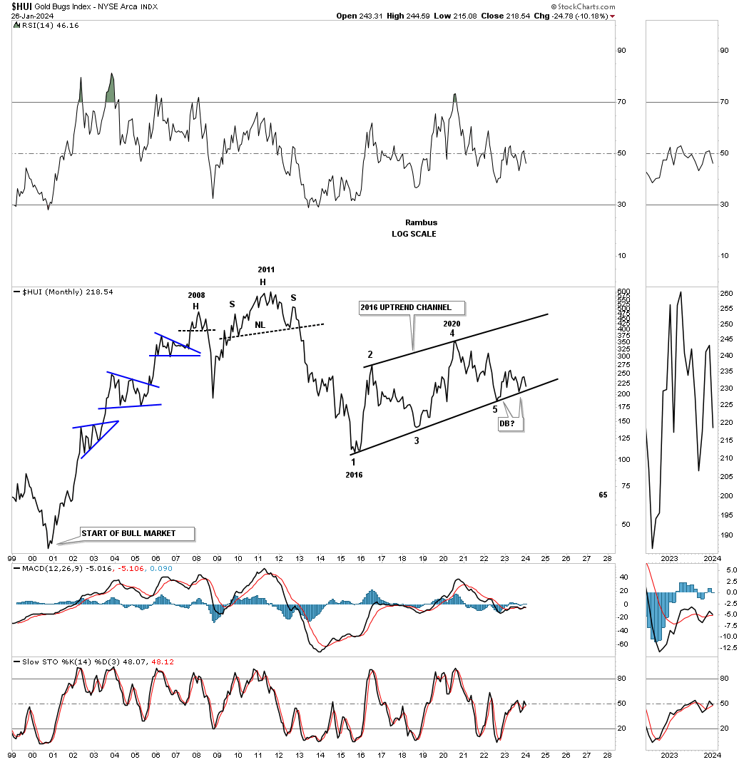
What I’ve done on this long term monthly chart below is removed the lower and upper trendlines of the 2000 bull market uptrend channel as shown on the chart above. Looking at the price action from this perspective can give one a less bullish perspective. Note the 2016 uptrend channel which we have also been following on the weekly combo charts on the Markets Update.
The bullish scenario would be to see the bottom trendline hold support forming a double bottom. As you can see there are four completed reversal points which puts the 2016 uptrend channel into the consolidation pattern category. Since the 2016 uptrend channel is forming below the 2011 high it will need 5 reversal points to be a reversal pattern to the upside.
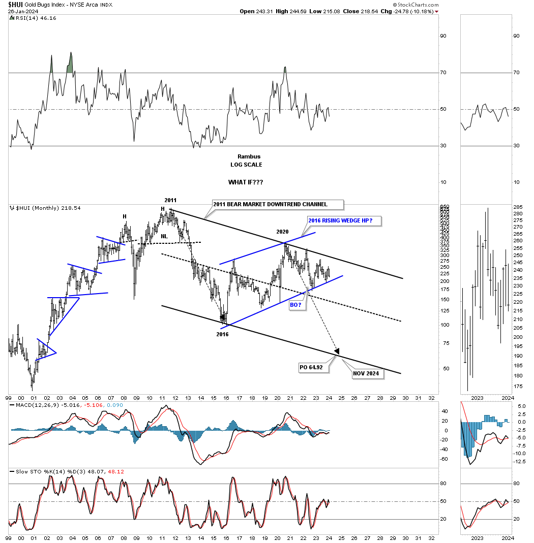
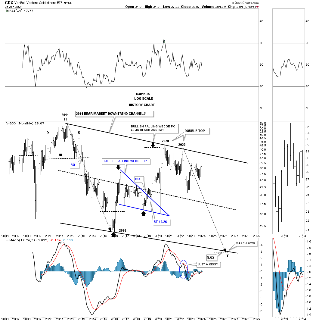
Basically all I did was add the black downtrend lines taken from the 2011 high and made them parallel to each other. The long black arrows measure time and price within the 2011 downtrend channel. I know how ludicrous the price objective is if this scenario plays out, which we won’t know has a chance until the bottom rail of the blue rising wedge gives way. What would the fundamentals be for something of this magnitude to play out? The charts will show us before the fundamentals do.
Next is another possible scenario that I don’t think anyone is contemplating is that the 2011 trading range is one very large triangle consolidation pattern as shown on this monthly chart for the GDX. Again, you can see the blue triangle that is forming in the apex which we’ve also been following on the Markets Update, but this is from a long term perspective.
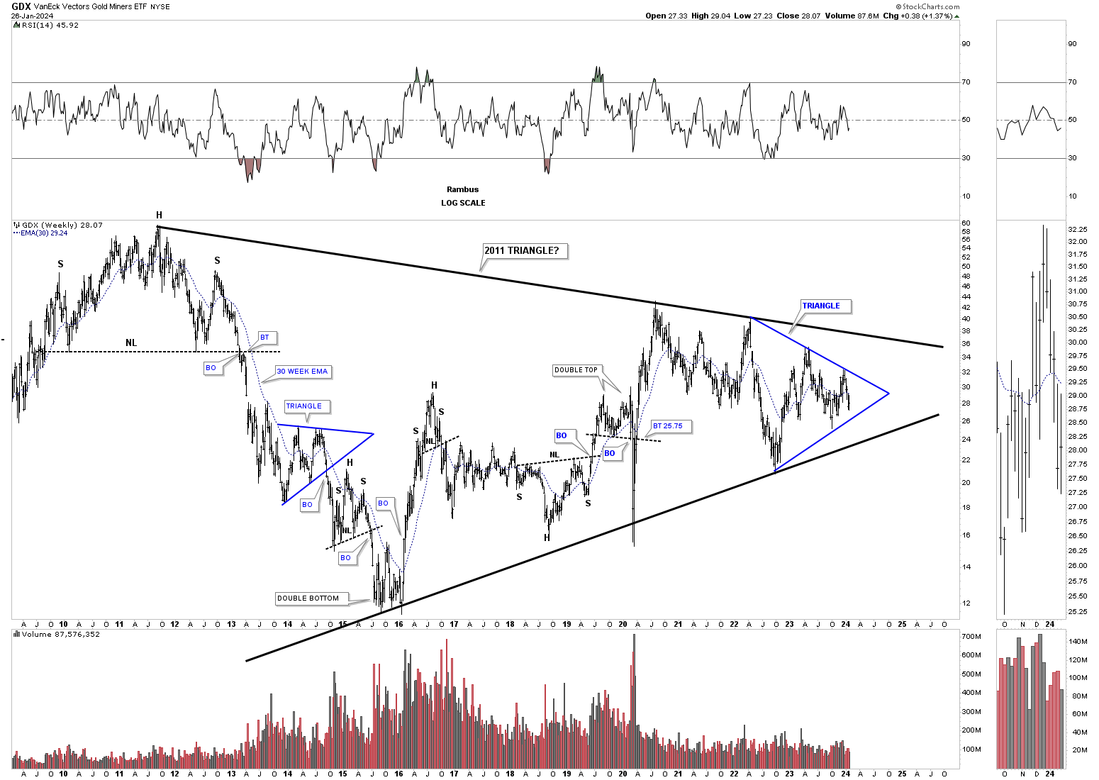
When I first built this possible massive H&S consolidation pattern along with all the other PM stock indexes H&S pattern several years ago the neckline symmetry line was holding support. Now however the right shoulder is getting much larger and sloppy looking.
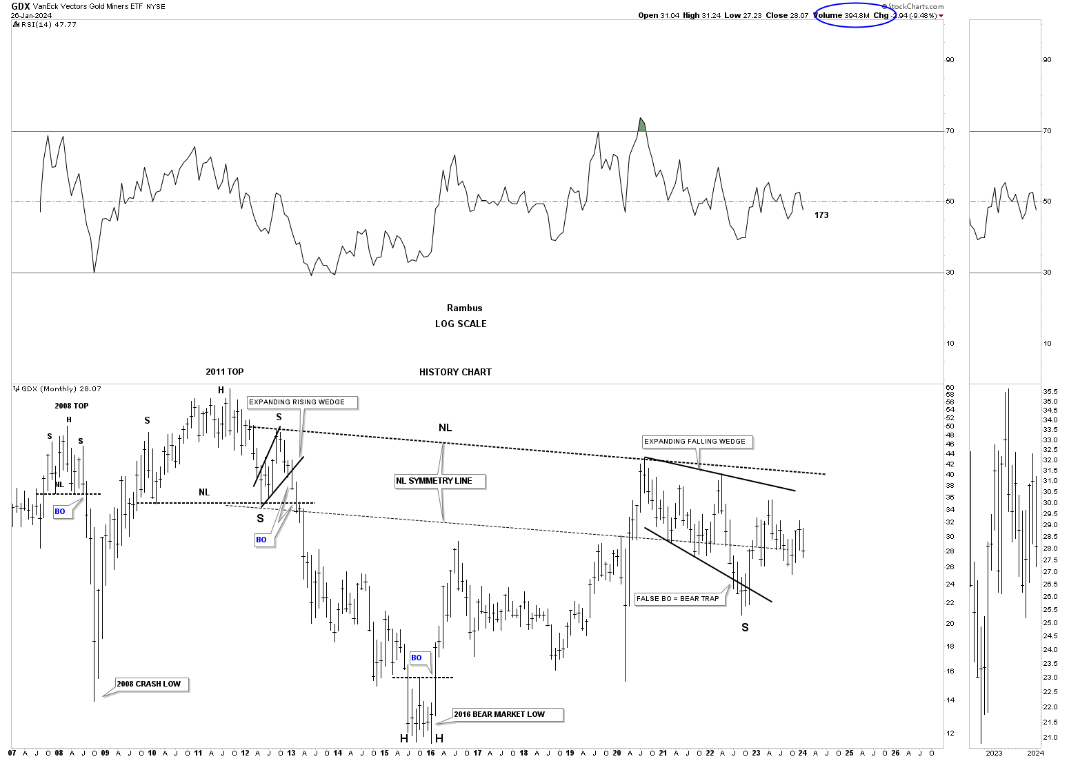
Below is the history chart for the GDX. Note the blue bullish falling wedge in the center of the chart which measured out perfectly and formed the next reversal point on the top trendline. Remember this scenario is only a possibility at this time.
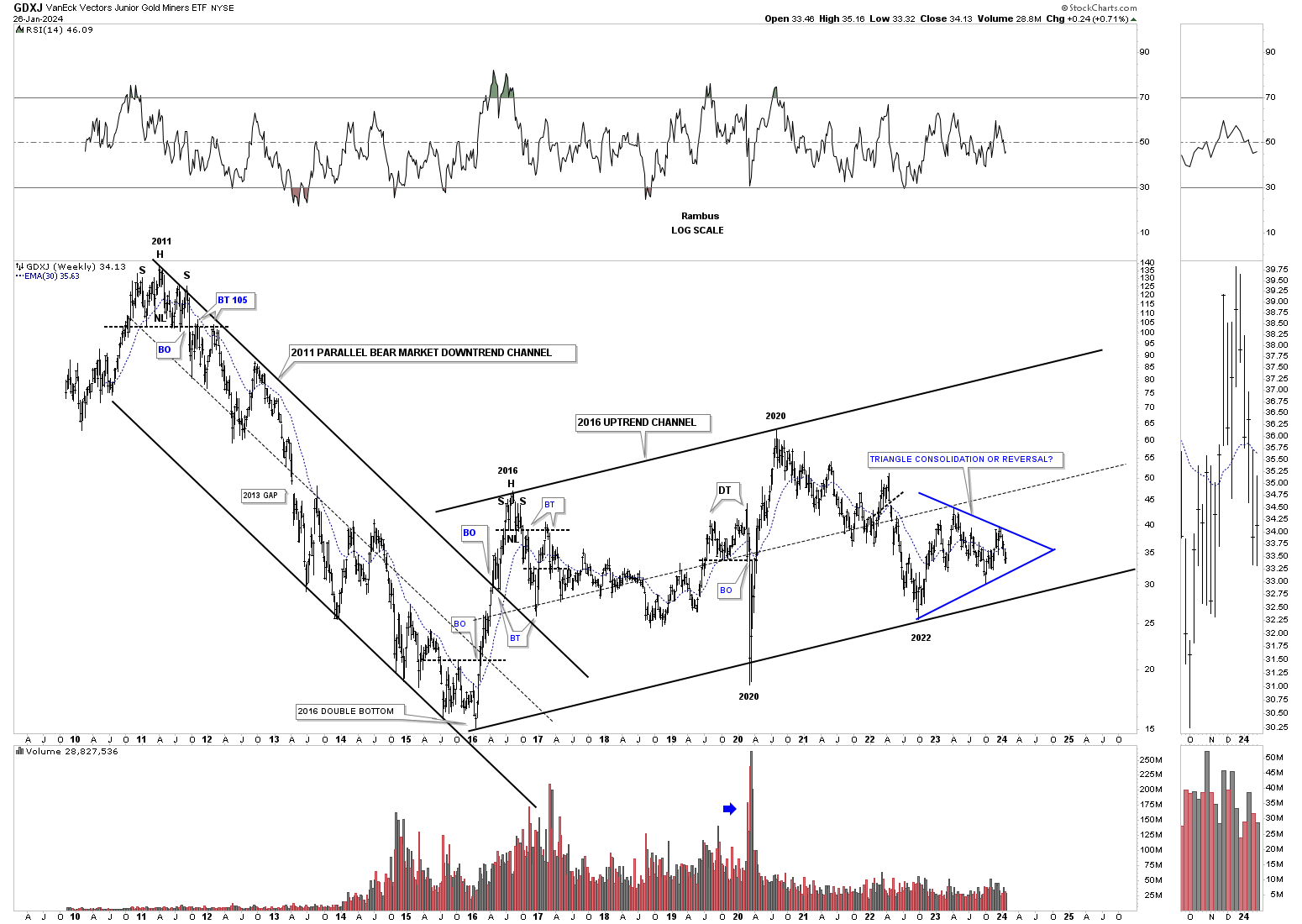
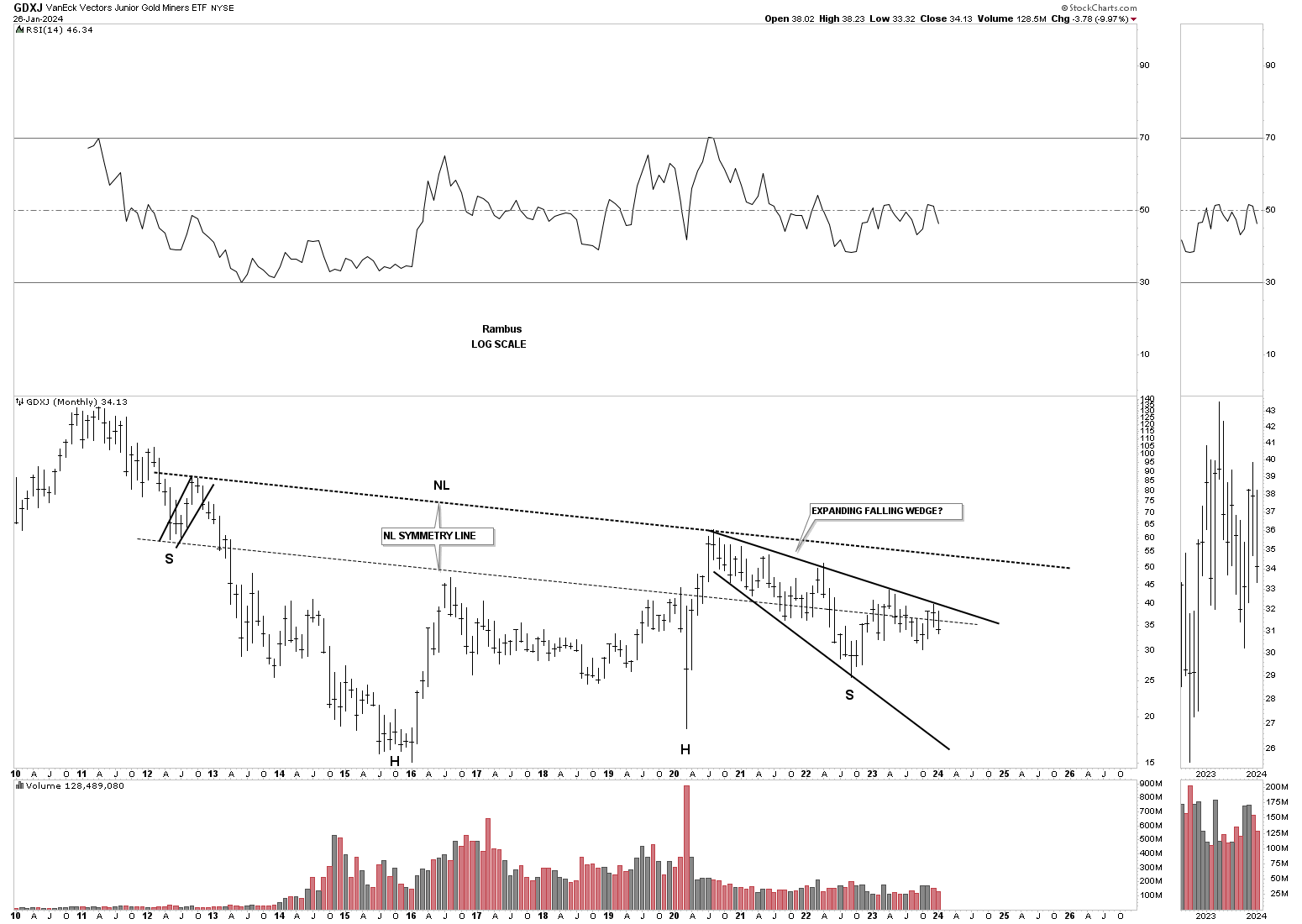
Next is a history chart for the GDXJ which doesn’t have a lot of history yet for long term charts. What you can see is the 2011 bear market downtrend channel and the sideways 2016 rising channel. Here again you can see how the blue triangle is forming inside of the 2016 rising channel which is going to tell us alot on the direction of the breakout.
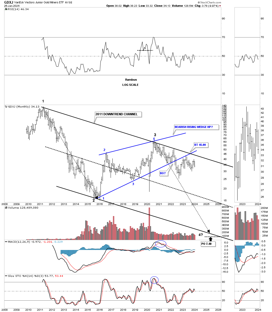
Below is a slightly different look which shows the 2011 downtrend channel with the blue rising wedge with a breakout and backtest. The bottom rail of the 2016 blue rising wedge is not very precise because of the 2020 crash spike so it can be drawn several different ways as shown on the chart above. If the GDXJ could trade above the top rail of the 2011 downtrend line that would go a very long way in negating this possible bearish scenario.
GDXJ’s possible massive H&S bottom with that pesky expanding falling wedge which seems like it has been in play forever making lower lows and lower highs.
Lets move on to Silver and start with a very bullish long term quarterly chart showing its secular bull market uptrend channel. In the charts above I used the long back arrows inside of the downtrend channels to measure time and price. Here you can see the long black arrows measuring time and price within the secular bull market uptrend channel. Note the blue expanding falling wedge which is forming just below the center dashed midline we’ve also been following on the Markets Update. A breakout above the top rail would be a very bullish development for the bulls.
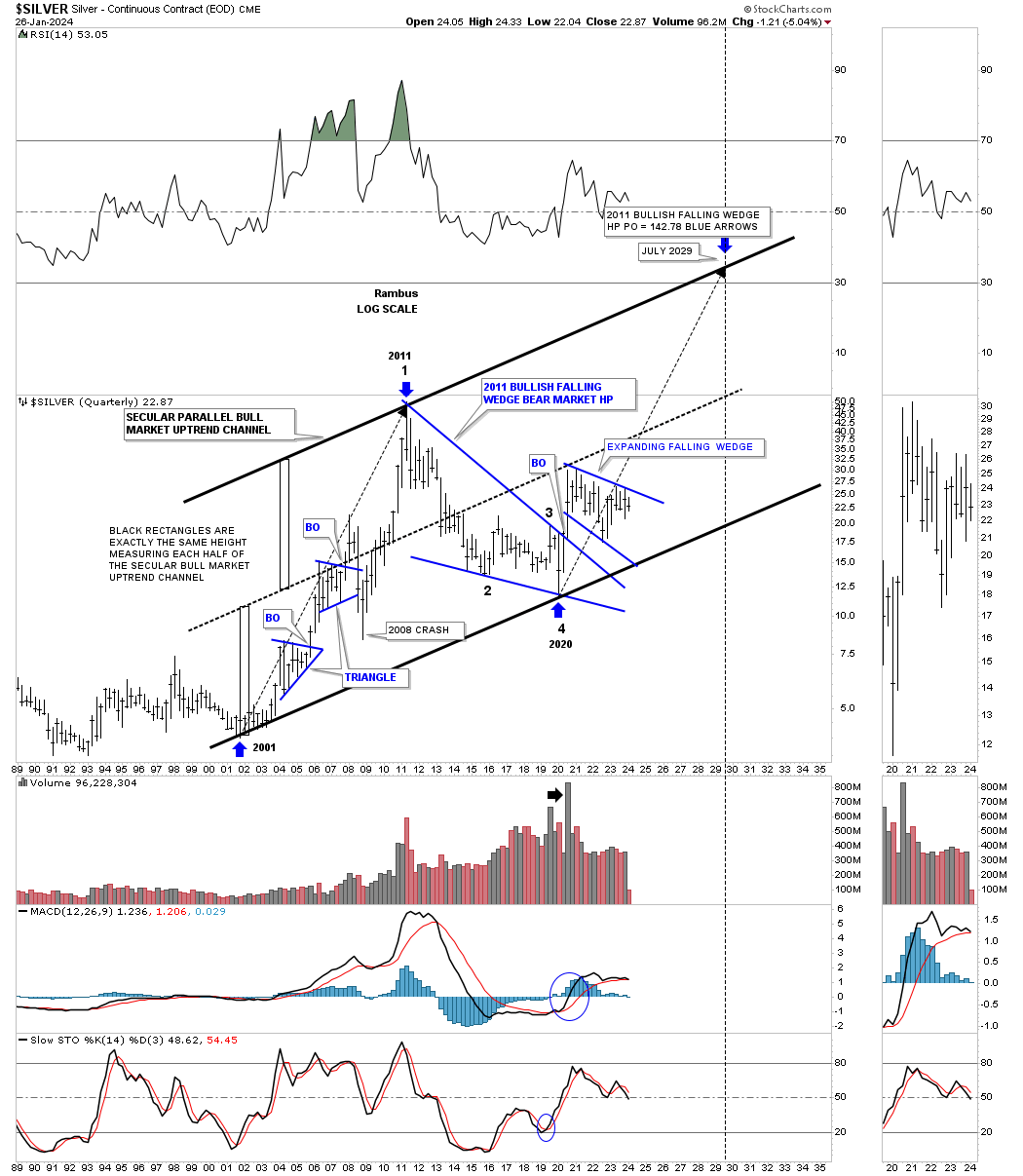
Again, lets switch sides of the bull and bear market scenarios. On this long term chart for Silver I started the top trendline off the 2011 high and made the center dashed midline parallel to it. The bottom trendline isn’t parallel, but slopes up just a bit giving the pattern a falling wedge look.
I believe I mentioned in last Fridays Market Update that SLV was wedging into the apex of its 2020 trading range with the pressure building. I added the black dashed uptrend line that really shows the spring getting wound tighter and tighter from all sides.
Below is the bullish scenario we’ve also been following which shows the H&S consolidation pattern under construction just below the top trendline.
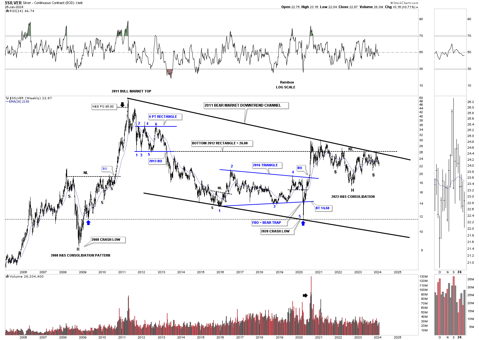
The possible H&S consolidation pattern from the shorter term perspective.
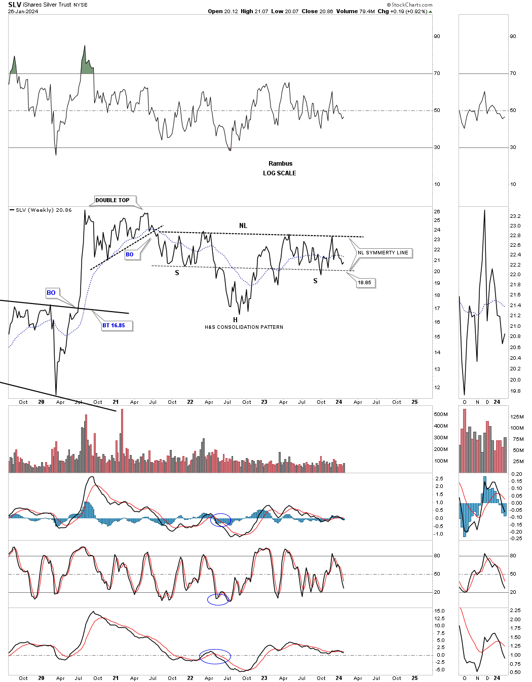
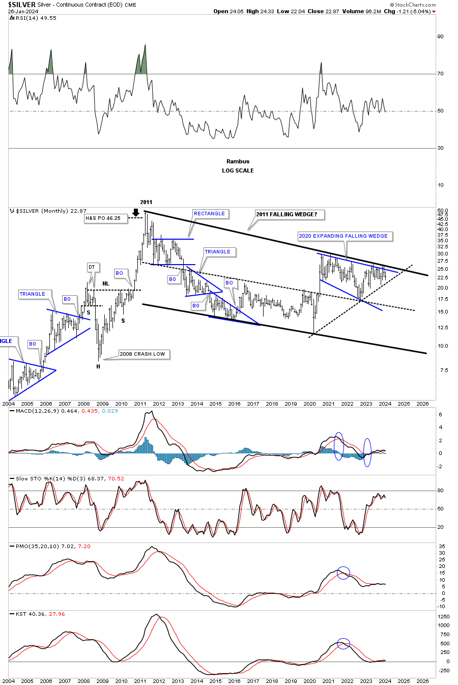
Since its 2011 high SLV formed the massive black bullish falling wedge with four nice clean reversal points. Note the massive breakout move which occurred during the 2020 rally which is what you want to see. Normally you would expect to see a consolidation pattern develop which we have, but it is getting a little long in the tooth and we need to see a breakout in the not too distance future. Nothing broken yet.
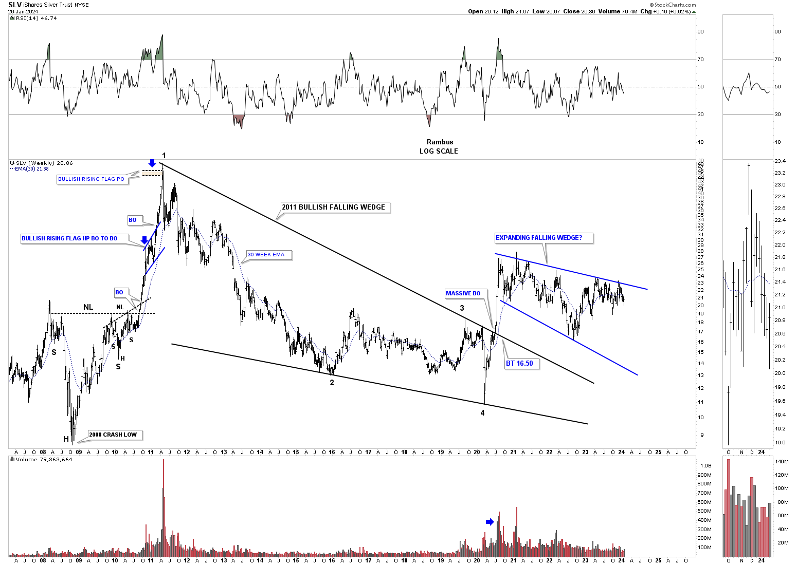
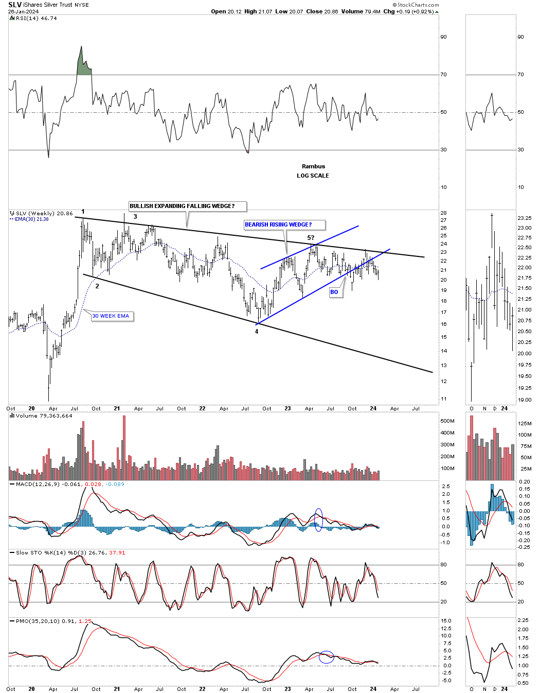
Below is the weekly chart for the expanding falling wedge on the long term monthly chart above. As you can see the top rail has many touches which makes it extremely hot and to be respected. The breakout and backtest to the bottom rail of the small blue rising wedge is sloppy at best. The black 2020 expanding falling wedge is a completed pattern with four completed reversal points. We just need the bulls to take out the top trendline to complete the breaking out process to confirm the pattern.
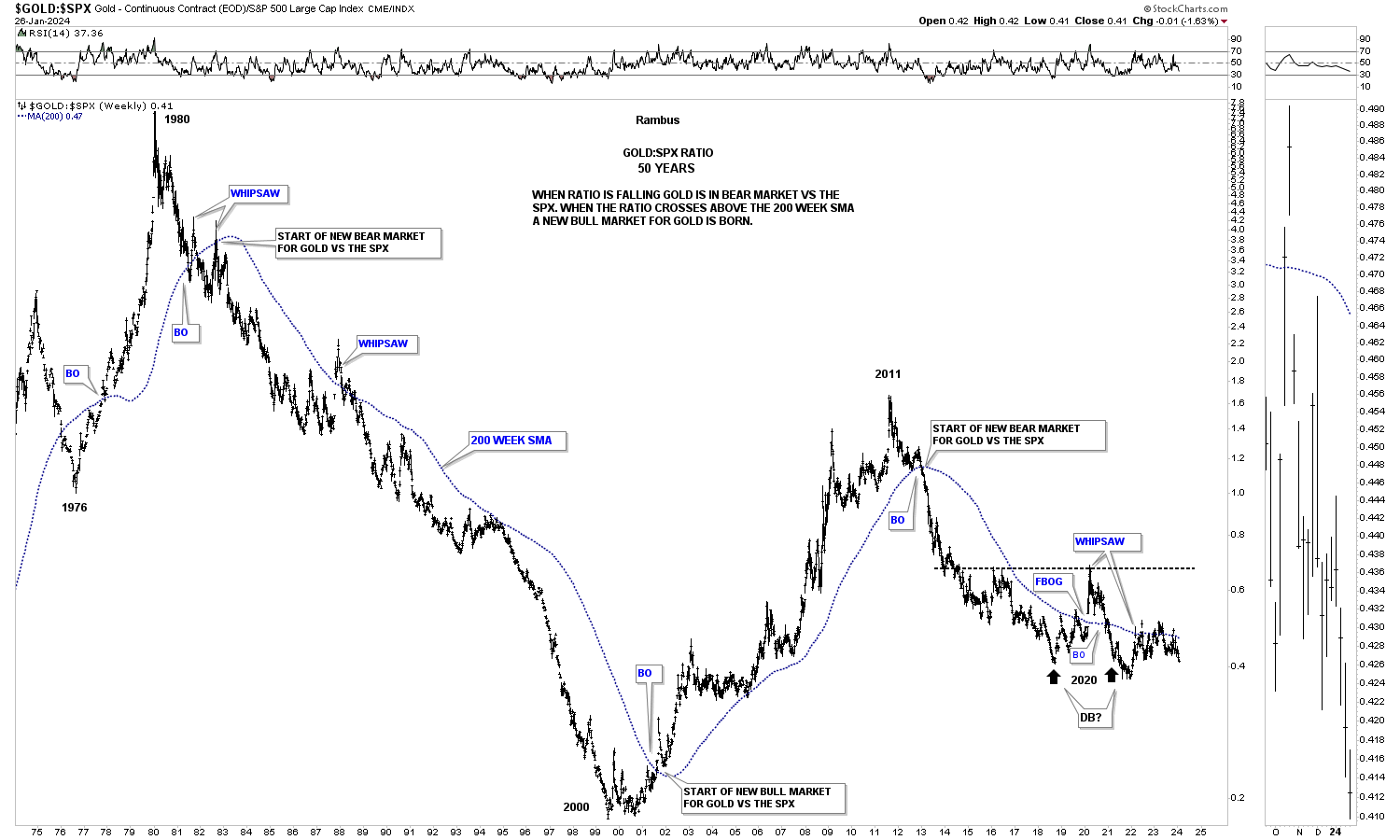
This next chart is a ratio chart which compares Gold to the SPX using the 200 week sma for support and resistance. As you can see it can give long term bullish and bearish signals that can last many years. There was a fairly large whipsaw several years ago when the price action gapped above the 200 week sma, but that buy signal was negated when the ratio closed back below the 200 week sma. Currently the ratio is beginning to make a new lower low not seen since the 2020 low. Keep in mind this chart is comparing Gold to the SPX so when this ratio is falling that means the SPX is outperforming Gold.
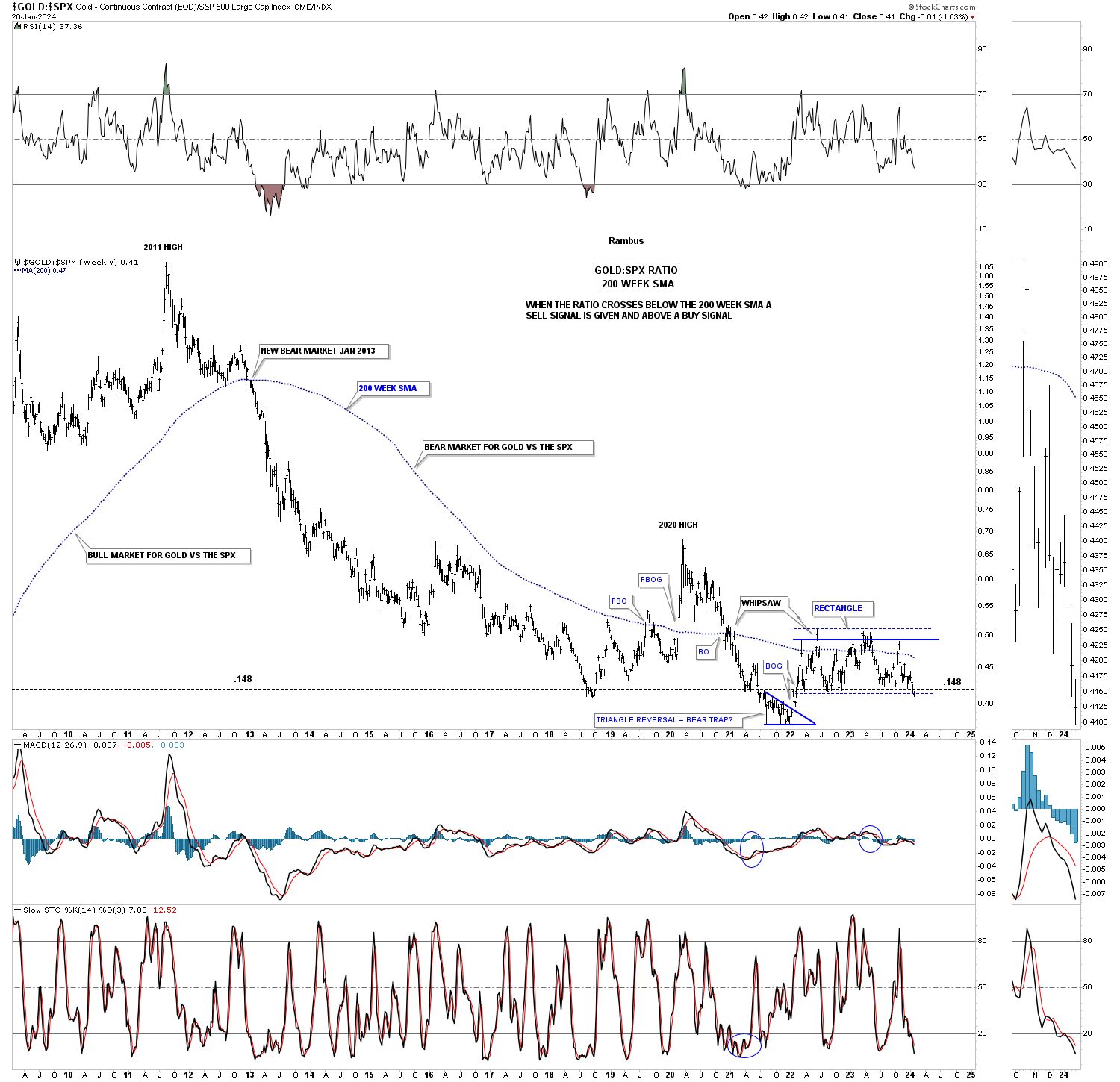
Next is a very long term chart for the Gold:SPX ratio that goes all the way back to 1980 when Gold was massively outperforming the SPX. After that all time high Gold underperformed the SPX for many years until the bottom in 2000 when the bull market ended for the stock markets and began for the PM complex which lasted until 2011. From that 2011 high more than 13 years ago Gold has been struggling to keep pace with SPX as the ratio has been basically trading sideways and is still below the 200 week sma.
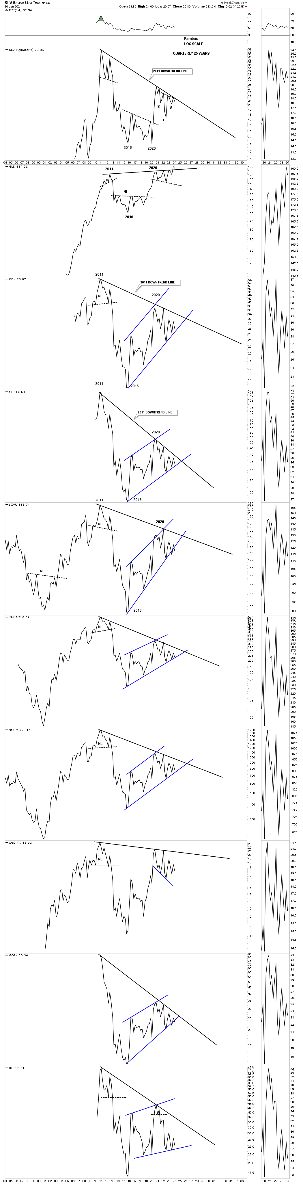
This last chart for tonight is just a simple quarterly line chart. What this chart shows is the top trendline taken from the top in 2011 and the top made in 2020 which is slopping down showing the downtrend which is still in play since 2011 except for Gold which has the only up slopping trendline. If the PM complex can overcome that 2011- 2020 trendline the bear market will be officially over IMHO. As you can see SLV has been testing it many times, but so far has failed to take it out. Hopefully it is just a matter of time.
The bottom line is that I’m still bullish on the PM complex, but just keeping an open mind if things don’t start improving soon. It looks like Silver could be the key to the next important direction for the PM complex. We have several different roadmaps in front of us that should help guide us and give us an important edge in staying on the right side of the PM complex. All the best…Rambus