
When reading the Weekend Report try as hard as you can to keep an open mind to either the bullish or bearish scenario. When the top rail of the 2020 trading range failed a couple of weeks ago that opened up a whole new way to look at the PM complex which I doubt few would even consider the possibilities I’m going to show you. Keep in mind the bullish scenario still has the upper hand but the PM complex is sitting on a knives edge which could go either way.
Even though the top rail of the 2020 trading range has failed, the bottom rail is still holding support which keeps that trading area intact for now. The really big question becomes, what happens if the bottom rail fails to hold and how will that affect the charts going forward? Again, nothing is confirmed either way yet but having a secondary point of view is always important to have because you will be aware of what is taking place before anyone else, and can act accordingly.
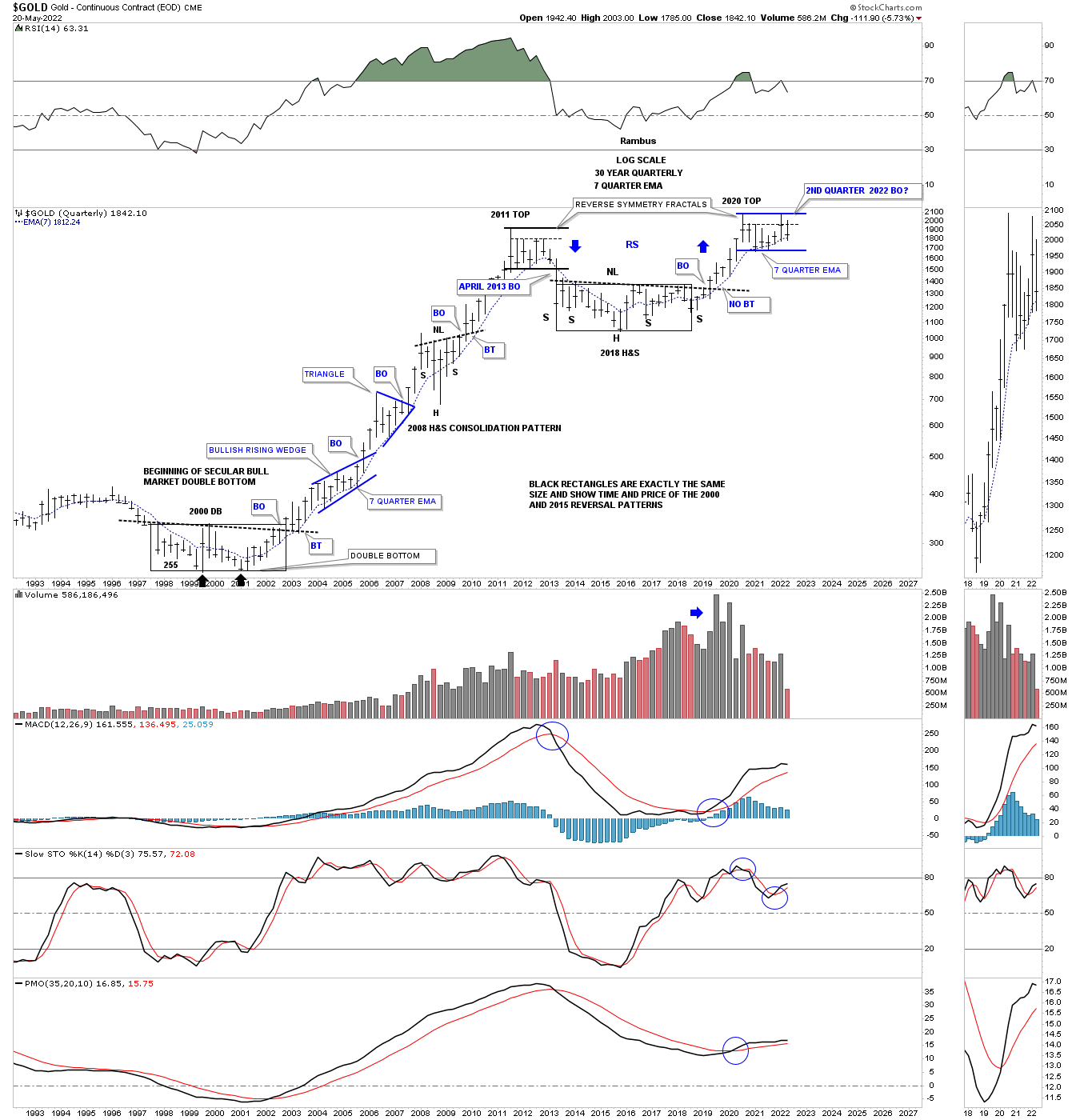
Lets start with this quarterly bar chart for Gold which shows the beautiful 2000 base which led to the bull market that followed the breakout. The bull market was as classic a bull market that you will ever see with one consolidation pattern forming on top of the previous one with a nice strong impulse move between each consolidation pattern.
Toward the end of a bull market the last trading range will look a lot like the next consolidation phase, but instead will be a reversal pattern which ends the bull market. For the PM complex the end came in 2011 which started the first really big correction or bear market.
On this quarterly chart for gold you can see the 2011 high and the decline that followed which ended up forming the very large H&S bottom which matched the big base in time and price to the 2000 base which launched the 11 year bull market. The H&S bottom reached its minimum price objective at 1826.
This is where the beauty of Chartology starts to kick in. Shortly after the 2020 high I started mentioning the possibility that we could see something similar to the 2011 trading range begin to develop because of the strong reverse symmetry we saw on the way up as shown by the blue arrows. As time went on the symmetry of the 2020 trading to the 2011 trading range began to take shape as possible fractals. Price wise the height of each trading range is exactly the same. Time wise the last quarterly bar on the right side of the trading range represents the breakout move below the bottom rail on the 2011 trading range.
Since the 2020 trading range formed in the uptrend I always assumed Gold would breakout to the upside and if the fractals are identical in their structure, the breakout is supposed to take place this quarter which ends at the end of June in about 5 weeks or so. Please keep in mind that fractals are never a tick for tick move and can fail at the very last minute but they do give you something to follow which can help in understanding what is taking place.
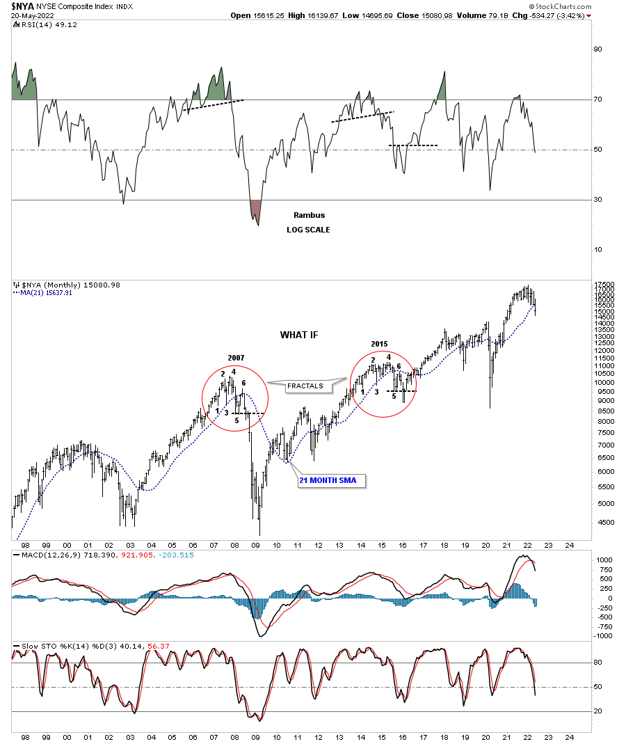
During the 2015 stock market correction I was following a fractal on the NYA comparing it to the 2007 high which led to the 2009 crash low as shown by the red circles. To see how close these two fractals were just compare each number in the 2007 red circle to each corresponding number in the 2015 red circle. It was uncanny how each number would line up again and again right down to reversal #6 which led the 2007 top to the downside. The 6th reversal point on the 2015 fractal slightly broke below the horizontal back dashed S&R line just below reversal point #5 only to reverse hard to the upside instead of the downside. Also note how the price action interacted with the 21 month sma at reversal points #3 and #6. The old adage, a failed pattern can lead to a big move in the opposite direction applies here. Could the Gold fractal above fake us out too?
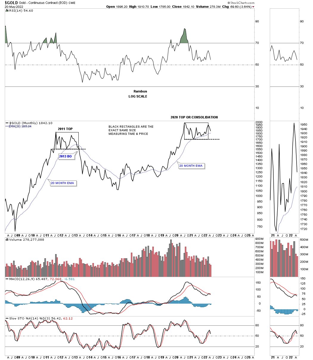
Next is a long term monthly chart for Gold which shows its possible double H&S bottom with the possible right shoulder still under construction. There is also a critical test taking place in regards to the 10 and 20 month ema’s that have done an excellent job of holding support especially during the 2011 bull market with only one failure at the 2008 crash low.
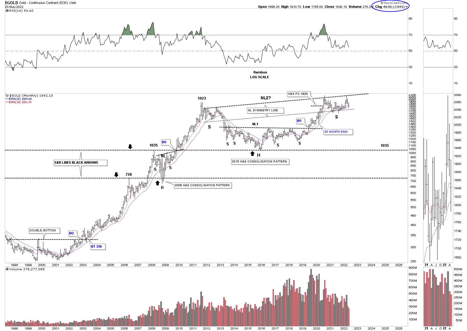
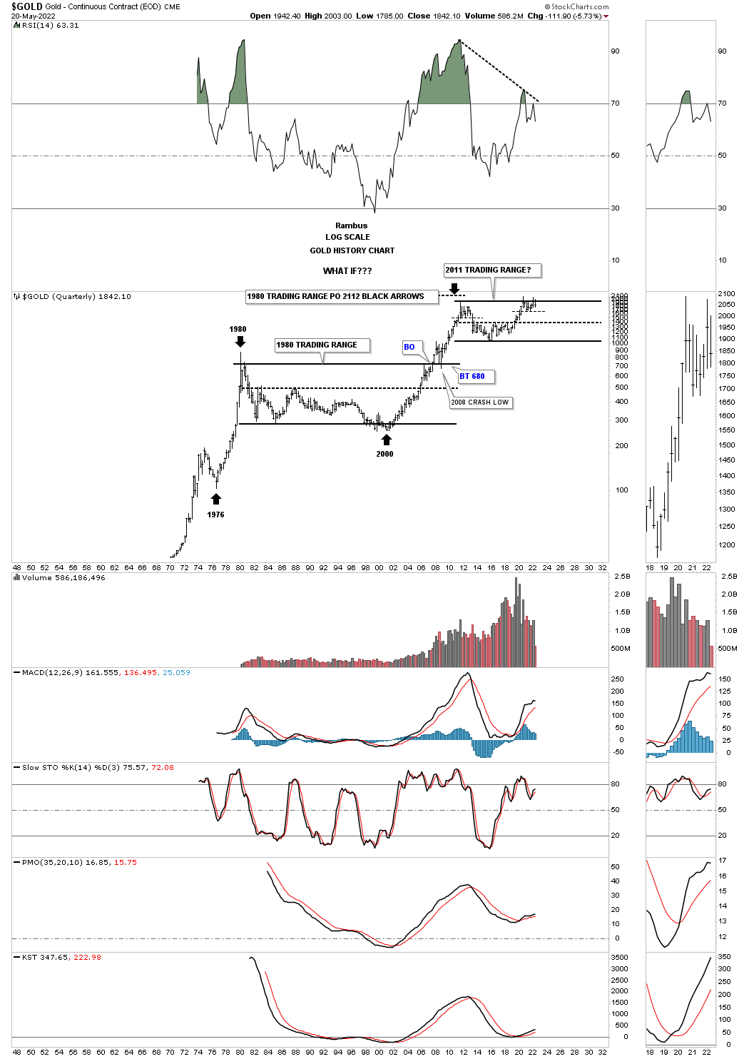
OK, now it is time for the possible bear case. Again, please keep an open mind with no preconceived notions of what Gold must do. After the huge 1980 bull market ended Gold never traded higher than the 1980 high until it finally broke out above the horizontal black trading range in 2007. Note the initial touch of the top rail and then the small decline. That gave Gold the energy to breakout above that massive trading range and then backtested that top rail during the 2008 crash which doesn’t look like much on this chart but for those that lived through it know what I mean.
Is it possible we could see something similar take place over the longer term starting at the 2011 high? Note the big divergence on the RSI.
This next chart shows the 2011 and 2020 fractal from the monthly line chart perspective. Again, you can see the height of these two patterns are the same with the time component and the all important 20 month ema. If you look really close on the long term chart above you can see a thin horizontal dashed line where Gold is currently trading, just below the top rail. Could the 2020 trading range be a double top and not a consolidation pattern?
As you know I’ve been pointing out that the silver area has been one of the weakest areas in the PM complex. Since that vertical move out of the 2020 crash low I have been looking at the trading range as a consolidation pattern until a couple of weeks ago when the price action traded below the bottom rail of the expanding triangle. Its not much of a breakout yet but we’ll see how the backtest goes on a weekly closing basis.
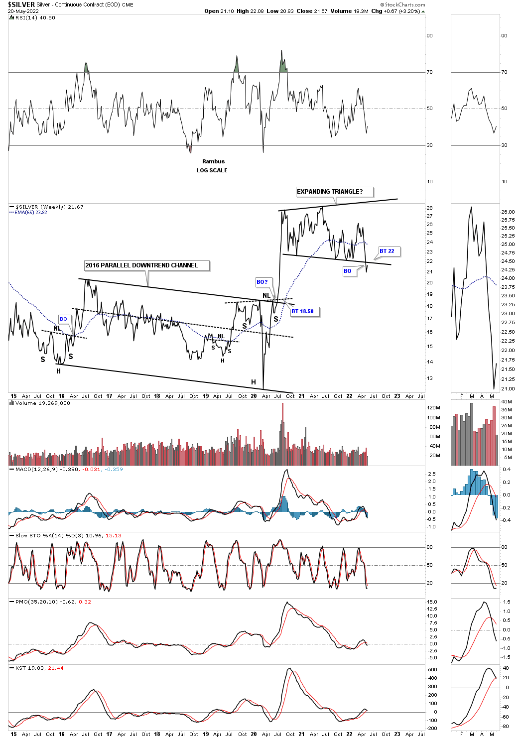
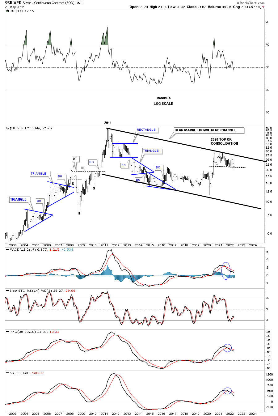
This next chart is a long term quarterly look at Silver and shows the secular bull market uptrend channel with the 2011 blue falling wedge being a halfway pattern to the upside. The long black arrows shows the trajectory of the first bull market leg into the 2011 high and if the 2011 blue falling wedge plays out as a halfway pattern we should see something similar off of the 2016 low as shown by the long black arrow on the right side of the chart for an approximation of a target area.
Shortly after the start of the current blue trading range I pointed out that the 2020 rally had been too strong compared to the rally that started the 2011 bull market and may need time to go sideways for awhile which it has done and is now touching the black rising arrow. The 2011 bull market shows Silver traded below its long black arrow until the parabolic blowoff. The bulls do not want to see the bottom rail of the current blue trading range violated by much or Silver could make another trip to the bottom rail of the secular bull market.

Now it’s time for the bear case. Instead of an uptrend channel as shown on the chart above this chart shows a downtrend channel beginning at the 2011 high. Note how similar the 2011 rectangle trading range is compared to the 2020 trading range. From strictly a support and resistance look the bottom of the 2011 rectangle has been holding resistance to the top of the 2020 trading range with a little overlap. Also note how nicely the top rail of the 2011 falling wedge matches up to the top of the 2020 trading range. I pointed out recently that when the last reversal point in a consolidation pattern fails to make it all the up to the top rail it can be an indication of weakness as shown by the blue circle. Note Silver’s 2008 H&S consolidation pattern which led to the parabolic impulse move into the 2011 top and how close the price objective was.
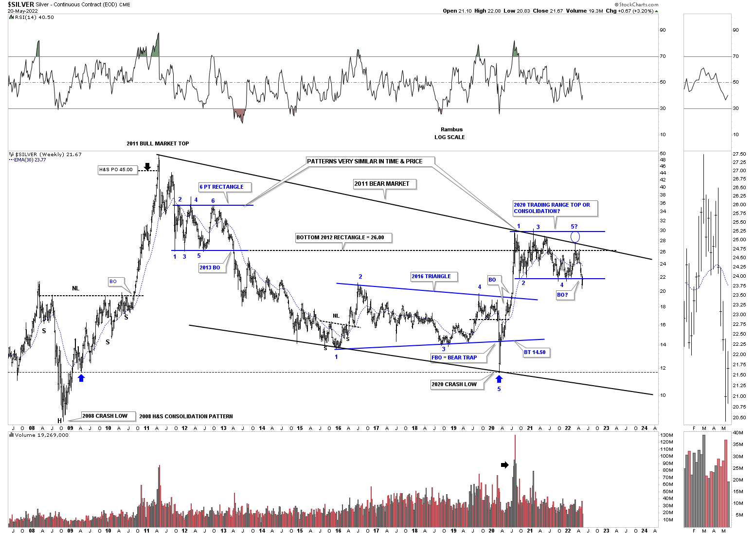
How important is the 2020 trading range forming just below the top rail of the 2011 trading range?
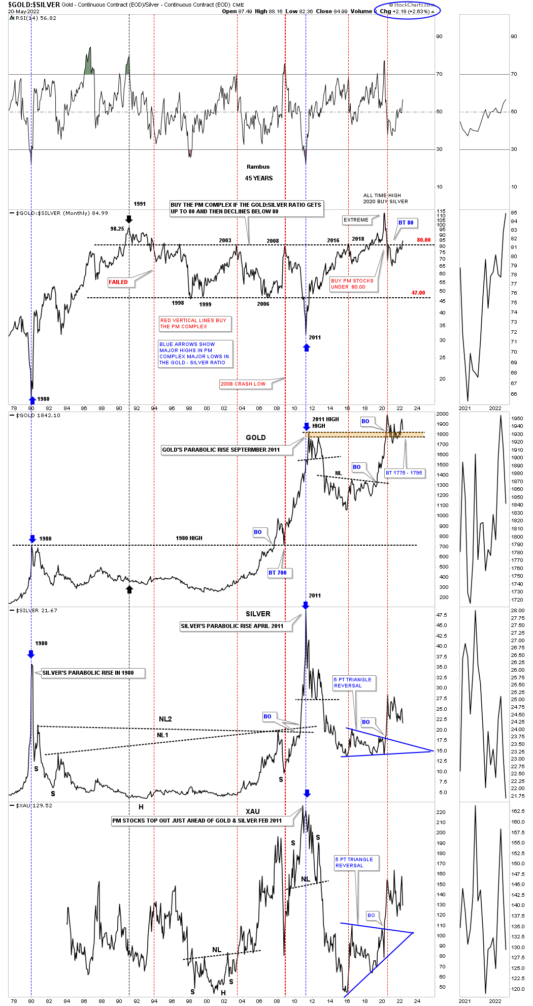
Everyone has their own way of looking at the Gold:Silver ratio. Below is a long term combo chart with the Gold:Silver ratio on top with some of the PM indexes below. Normally it is a good sign for the PM complex in general when the ratio is trading below 80. Recently you can see the ratio has just moved back above 80 which is something to keep an eye on especially with the indexes below.
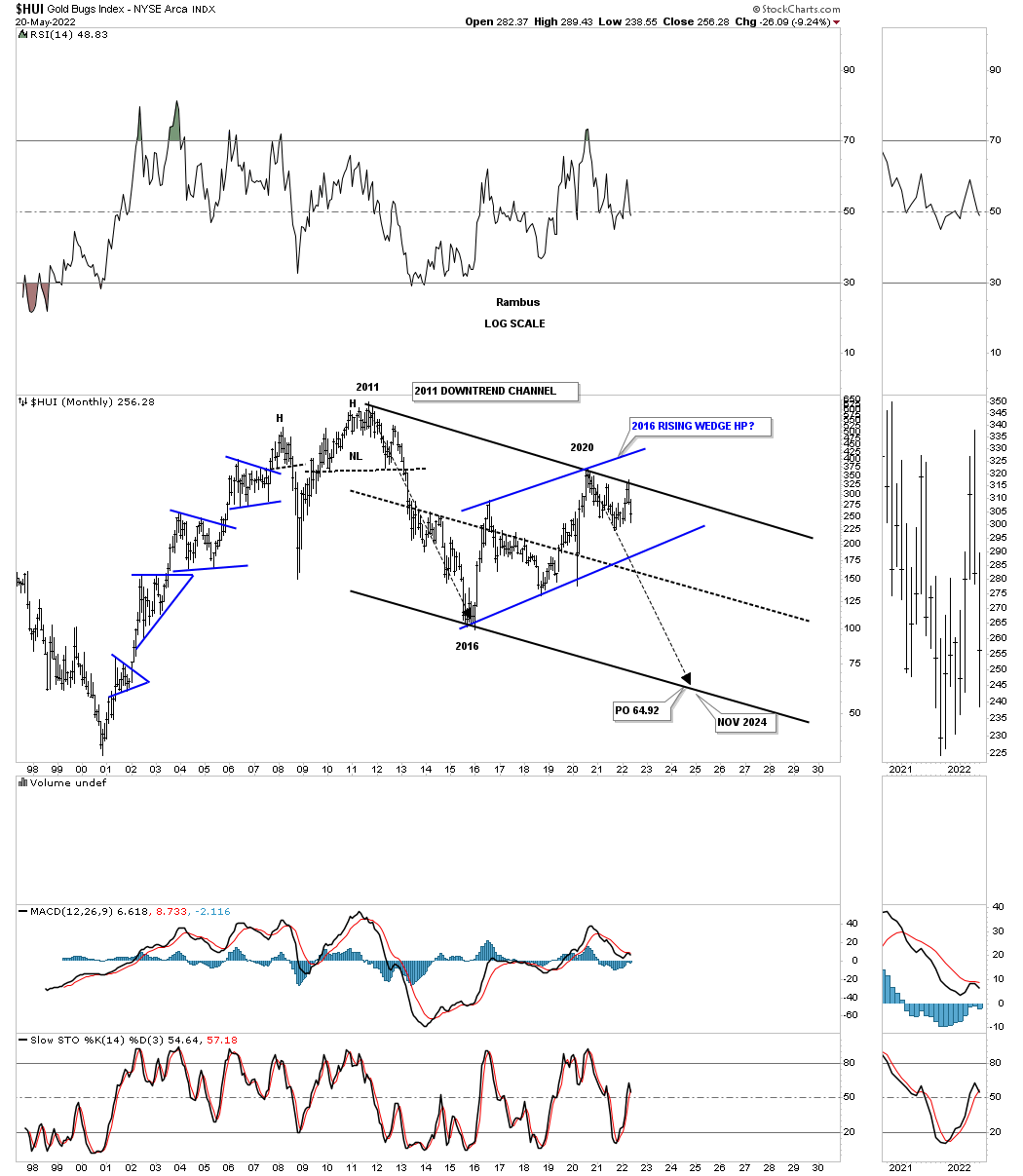
I’ve shown this long term monthly chart for the HUI while the 2011 H&S top was still building out. This history chart shows all the chart patterns from consolidation, reversal and impulse moves since its inception. As you can see the price action is currently backtesting the top rail of the large blue 5 point triangle reversal pattern for the 4th time so we know it is hot.
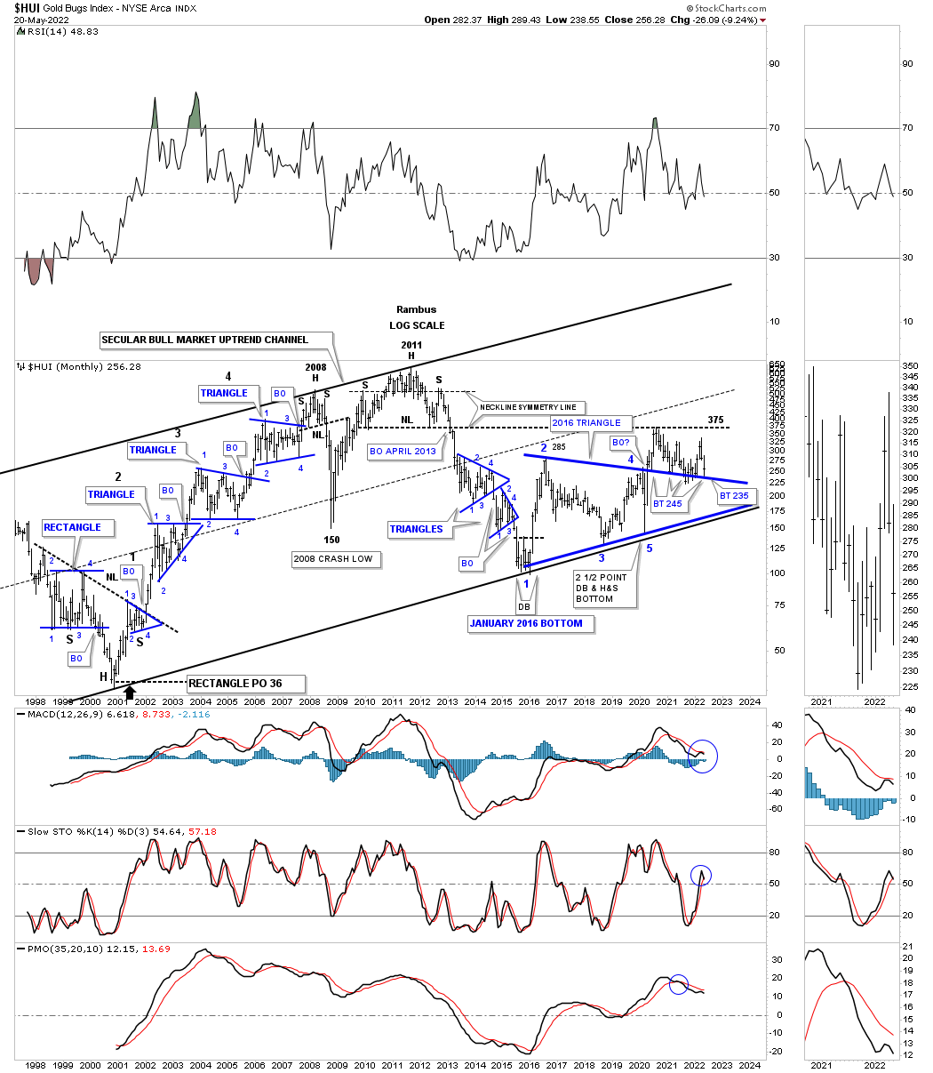
This weekly chart shows the backtest a little more clearly. Note how the neckline extension line held resistance during the 2020 rally which was its first major area of resistance.
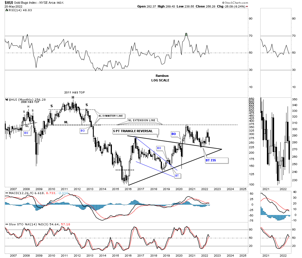
Now for the bearish side of the equation. This weekly line chart shows the important reversal points since the 2016 low. When you connect those reversal points together this is what you get.
There is still a lot of work to do, but if the bottom rail is ever broken to the downside we will end up with a bearish rising wedge, most likely a halfway pattern.
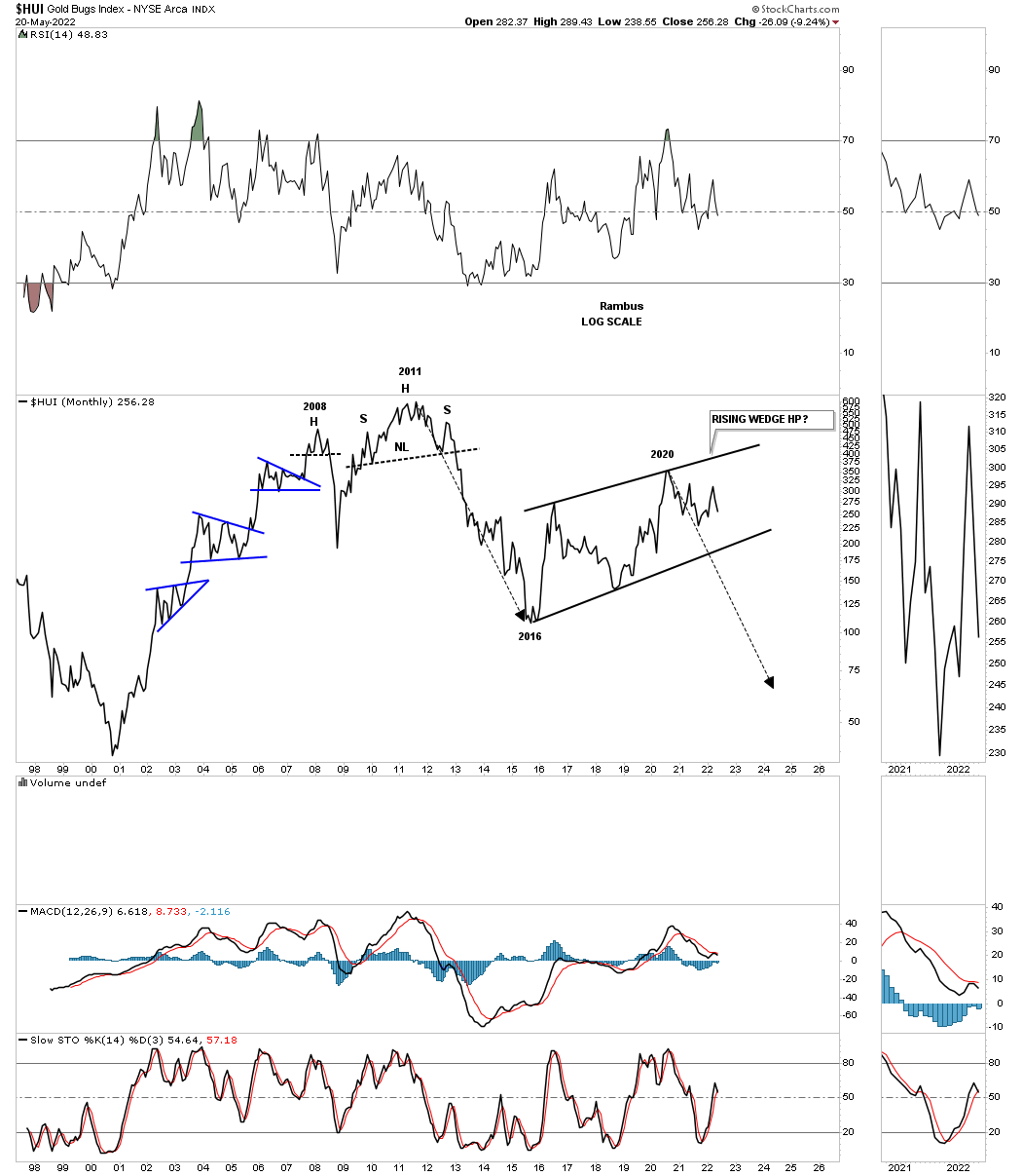
What are the odds?
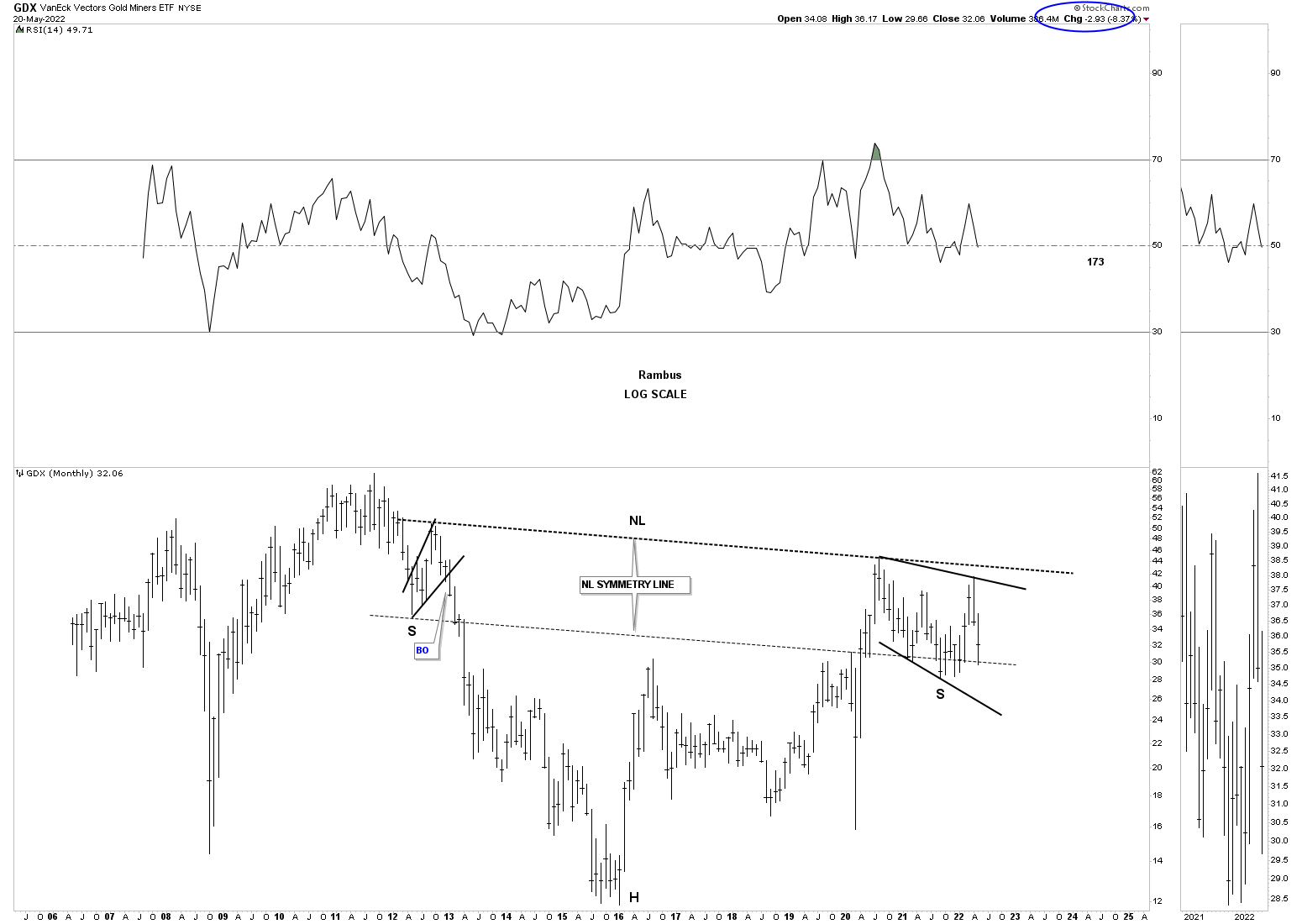
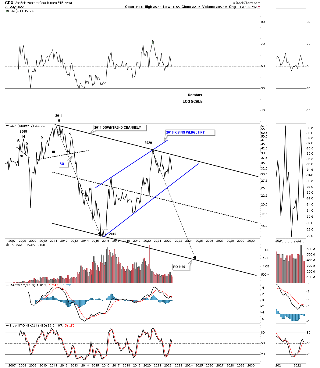
Next is a look at the GDX which has been finding support on the brown shaded S&R zone since the 2020 breakout. So far so good.
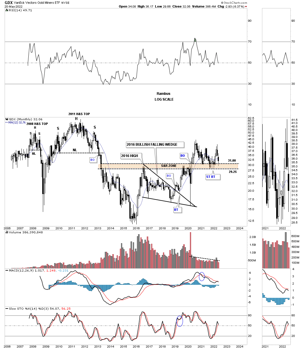
This long term monthly chart shows the potential massive bullish H&S bottom which is still testing its neckline symmetry line. The neckline symmetry line needs to hold support and then we need to see the breakout above the neckline to complete the pattern.
Now the bearish case. Like we’ve seen on many of the charts above there appears to be a downtrend channel starting at the 2011 high. Here again you can see how the top rail of the potential 2011 downtrend channel fits nicely with the top of the 2020 trading range. The MACD at the bottom began to turn up but the crossover failed and the blue hisogram is still trading below the zero line. Close but no cigar.

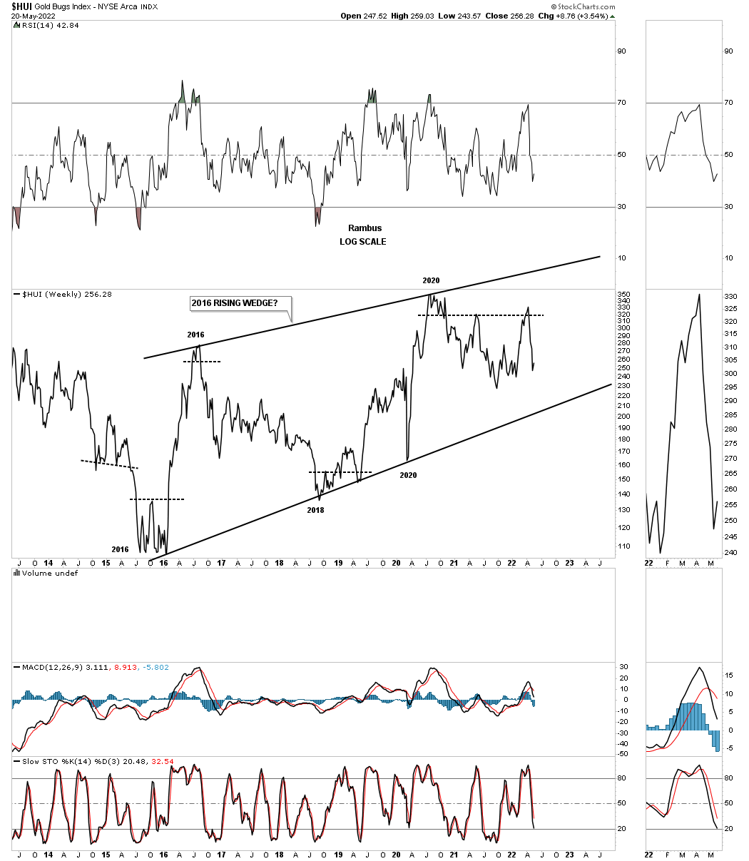
The HUI from the line chart perspective.
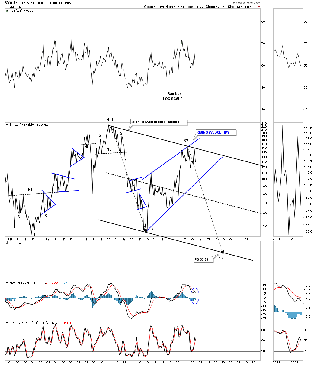
Next is the XAU which is still finding support just above its 2016 trading range.

The potential bearish case.
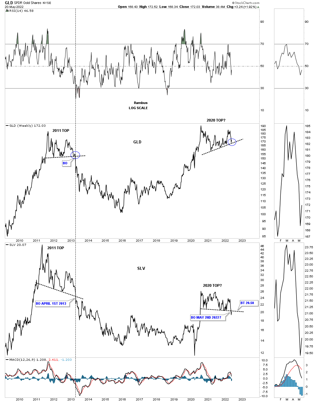
Finally the last chart for tonight. Below is a long term weekly combo line chart which has GLD on top with SLV on the bottom. What caught my attention recently was the bottom rail of GLD’s 2020 trading range. To put it into perspective, note the 2011 top with the slightly up sloping bottom trendline. I put a blue circle around the breakout point to compare the 2011 breakdown to the current 2020 area on its bottom trendline. Note the very small bounce off the bottom rail in 2011 just before the bottom fell out. Are we currently seeing something similar taking place with the bottom rail of the 2020 trading range?
The other feature on this combo chart is the comparison between GLD and SLV in 2011 and 2020. In 2011 GLD’s trendline was sloping up a bit while SLV was sloping hard to the downside. Both broke out to the bottom at the same time.
Now lets look at the 2020 trading range on GLD which is upward sloping while SLV is down sloping which shows a slight breach of the bottom trendline. Is it possible that we could be seeing another topping pattern similar to the 2011 topping pattern?
I mentioned at the beginning of this post that I thought the PM complex was sitting on a knives edge and could go either way. What many of the charts above are showing us is that the top made back in 2011 and the bear market that began at that high is still intact? I think Silver will be our first tell if the backtest can hold resistance. Whatever happens we will know soon enough to take advantage of whatever the PM complex throws our way.
Now you can go back to your regularly scheduled programming. All the best…Rambus
Subscribe :
https://rambus1.com/membership-subscription-service-via-paypal/