Today I would like to update a few charts for the US dollar and the TNX which can play a big role in the markets. It is almost a given that the US dollar is on its way out and interest rates have peaked and are headed back down too much lower levels. That may be true, but the Chartology is suggesting just the opposite is likely to happen from the macro side.
Lets start with a weekly chart for the US dollar we’ve been following over the years which shows the 2017 rectangle that formed off the 2011 low. The last time we looked at this chart the price action was testing the secondary support line taken from the failed blue rectangle on the far left side of the chart. Last week the US dollar closed back above its 30 week ema. You can also see a possible double bottom forming with a positive divergence on the RSI. There is still more work to do, but the US dollar is beginning to show some strength.
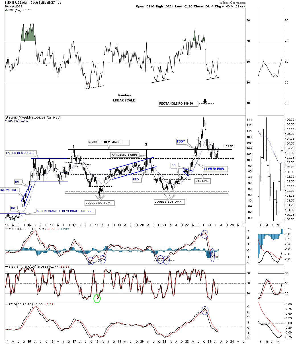
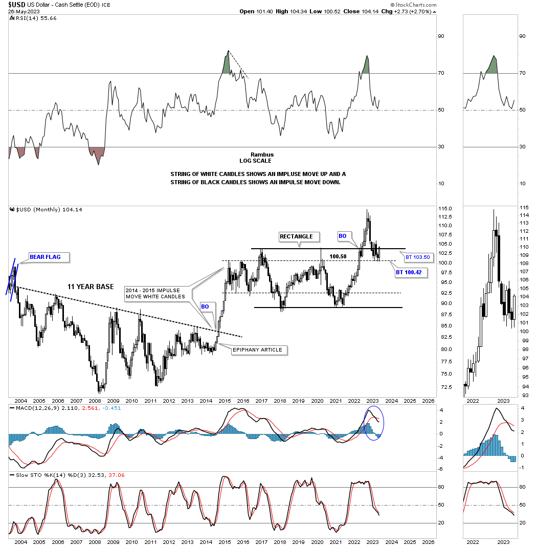
Next is the old epiphany chart which shows the massive breakout from that 11 year base forming a string of white candlesticks all in a row until the top in 2015. That rally out of the 11 year base really hit commodities and the PM complex very hard back then. Now we need to see the US dollar trade above its recent high to establish the beginning of a new uptrend.
The last time we looked at this daily chart the breakout hadn’t happened yet. Again, the RSI is showing a positive divergence along with the MACD.
Next is the old fractal chart which shows an 11 year base made in the 1990’s and the 11 year big base #2 we just looked at on the monthly chart above. As you can see the uptrend channel out of the 2000 low was much steeper than our current one which finally topped out in 2000 which was the beginning of the bull market in the PM complex.
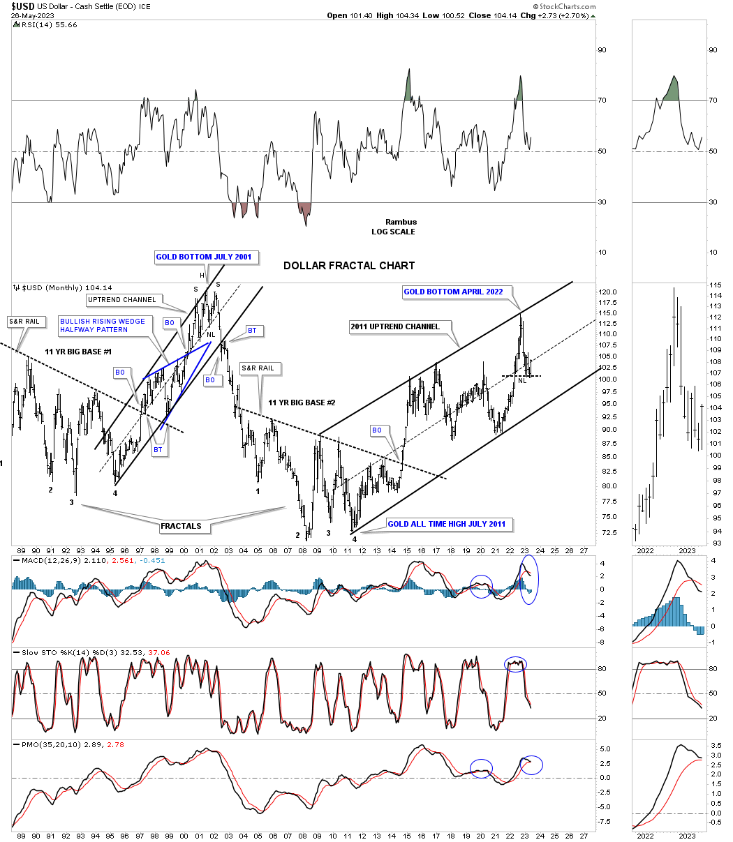
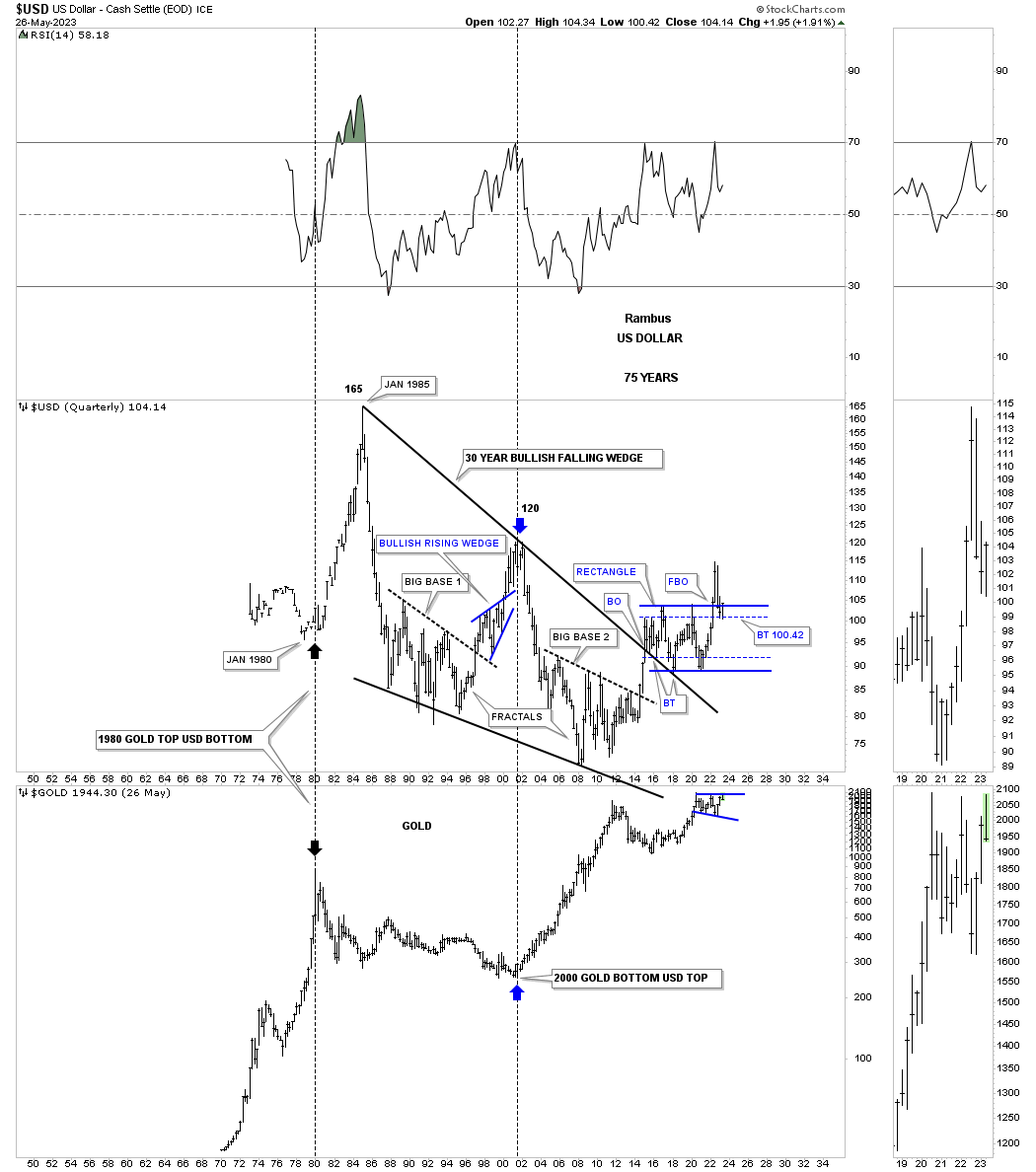
Below is the history chart for the US dollar and Gold. The inverse relationship between the two isn’t perfect, but it does show when one tops the other bottoms and vise versa. We were following that massive bullish falling wedge when big base #2 was still under construction. It took that massive rally out of big base #2 to finally take out the top rail of the 30 year falling wedge. The top trendline has been backtested several times and has held support.
You can clearly see for yourself the critical inflection point taking place right now between the US dollar and Gold as they are both trading at key levels. Whichever direction the breakout takes the other on will move in the opposite direction.
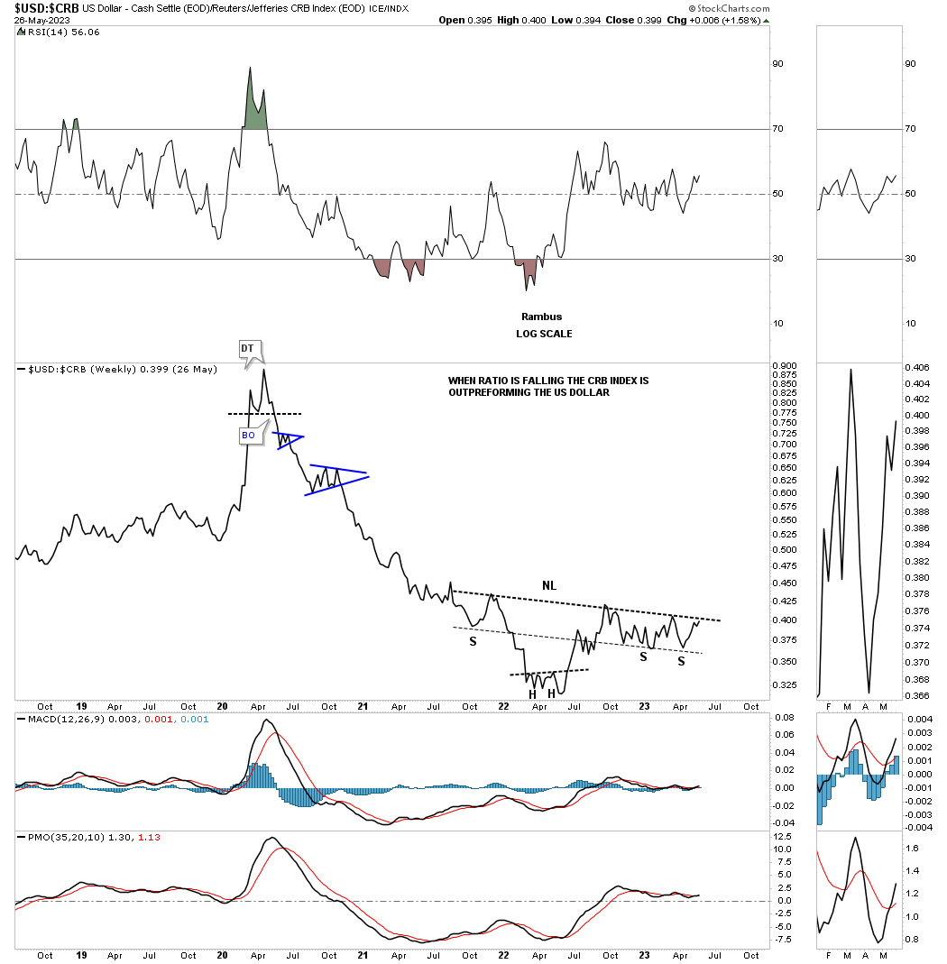
This ratio chart compares the US dollar to the CRB index. From the 2020 high in the ratio the CRB index massively outperformed the US dollar until April of 2022 when the ratio bottomed forming a possible head of an inverse H&S bottom. Again, another critical inflection point to watch closely.
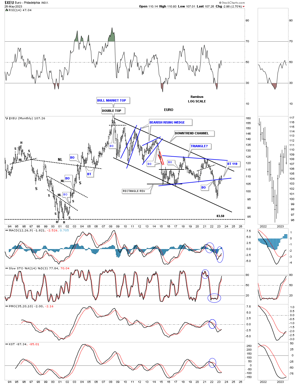
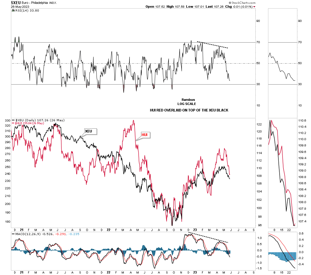
The XEU makes up the biggest part of the US dollar and is important to keep a close eye on when one is trading the PM complex. Earlier we looked at the US dollar’s uptrend channel so it stands to reason that the XEU would be forming a downtrend channel. In early 2022 the price action broke below the bottom rail of the 2015 triangle and is now strongly backtesting if from below.
Below is a simple line chart with the red HUI overlaid on top of the XEU which shows the pretty close positive correlation these two generally have which again is not perfect, but close enough to show important trend changes. You can see how clearly that double top looks on the red HUI we’ve been following each day.
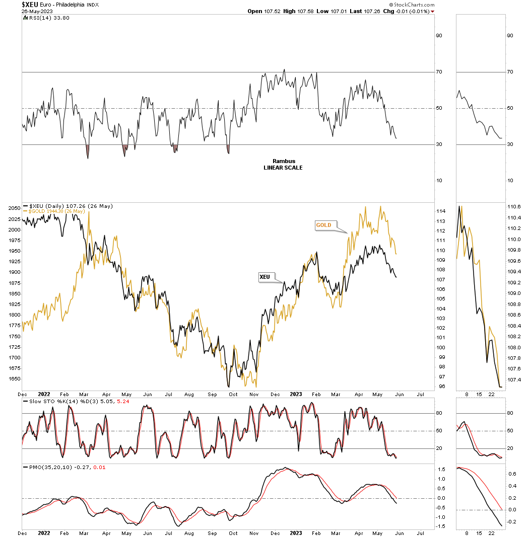
This daily line chart shows Gold overlaid on top of the XEU which shows a closer positive correlation than the HUI above.
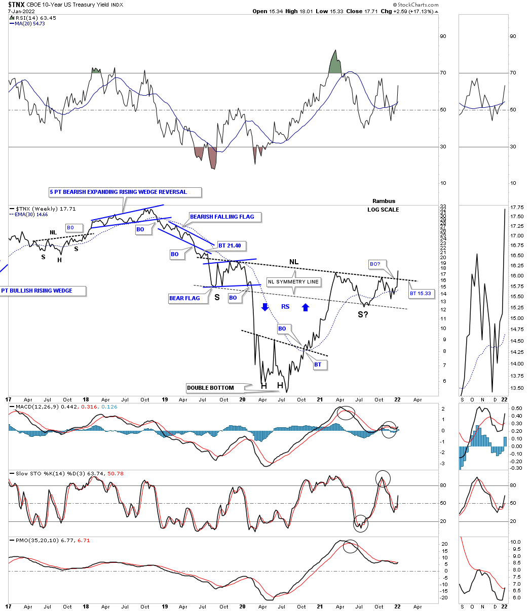
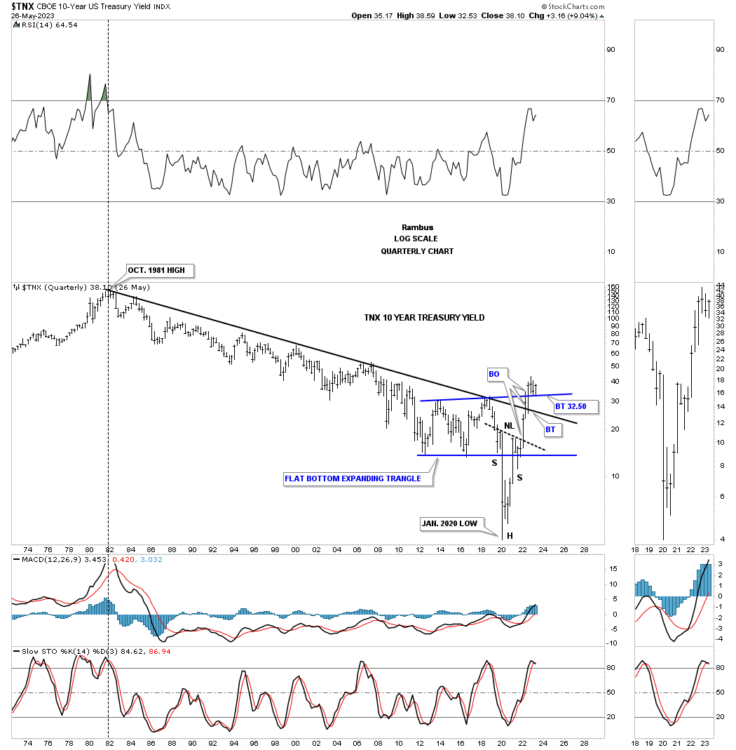
Now I would like to turn your attention to the TNX, 10 year yield. Below is the morphing falling wedge we’ve been following on the Markets Update which shows the price action bottoming earlier this month and is getting close to the top trendline. From the long term perspective this is an incredibly important chart to watch carefully because of its implications for higher interest rates.
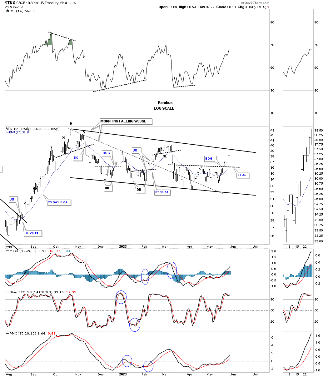
Back in the spring of 2020 the TNX put in an important low that is not just a low, but a 40 year secular bear market low for interest rates. Since the 2020 low the TNX has been moving steadily higher forming one consolidation pattern on top of the previous one. You can see where the falling wedge on the daly chart above fits into the bigger picture.
Next I would like to show you a daily chart for the TNX I posted back in the January 7th 2022 Weekend Report and what that blue triangle, on the chart above, looked like at the time of the breakout.
January 7th 2022: This is what I wrote.
Lets start with interest rates by looking at a daily chart for the TNX, 10 year treasure yield, which is in the process of breaking out from a one year triangle consolidation pattern last week. That one year triangle consolidation pattern is actually the right shoulder of a bigger H&S bottom.
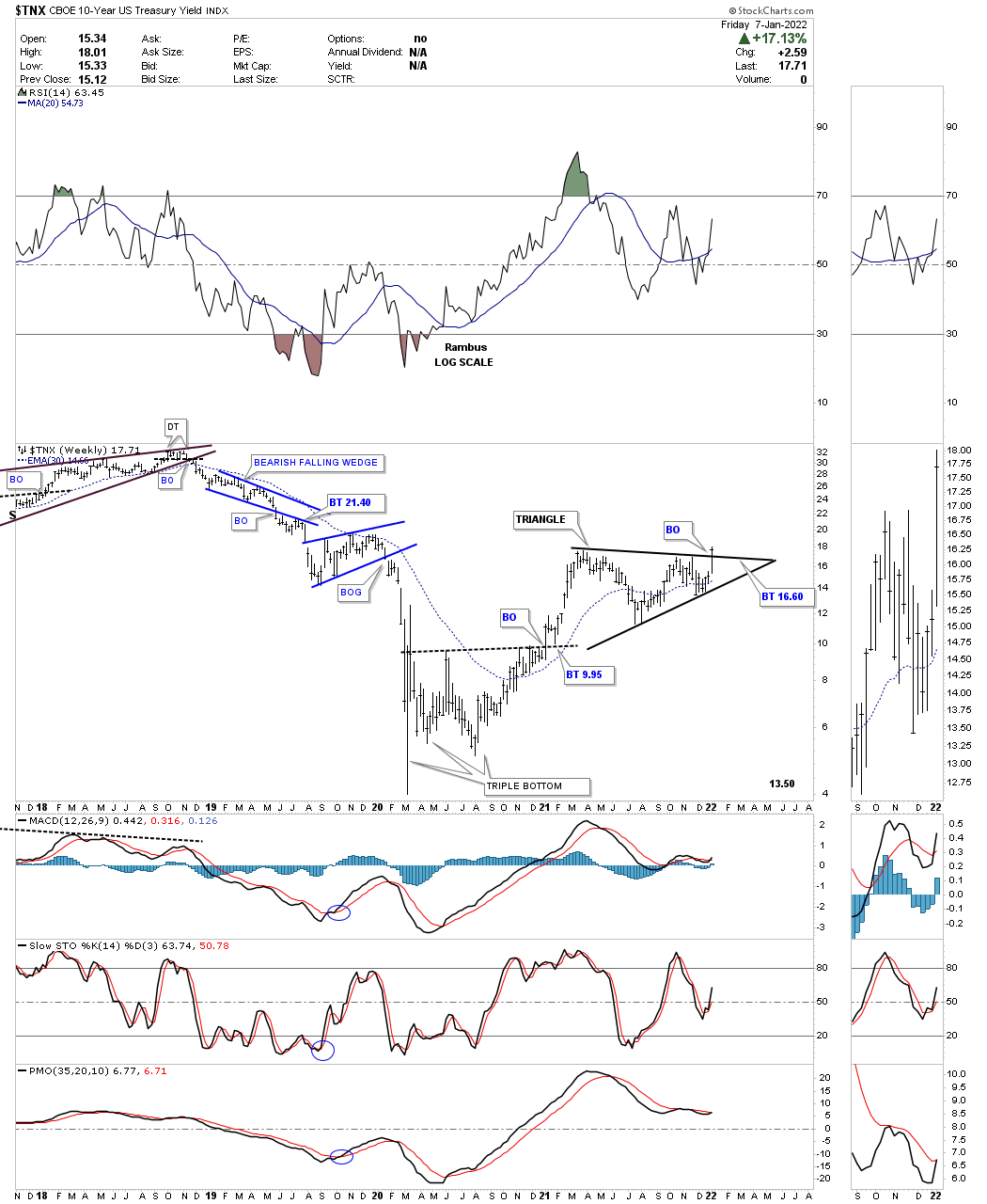
This chart for TNX I posted on January 7th 2022:
This longer term weekly line chart for the TNX shows a pretty large inverse H&S bottom. As you can see the triangle on the daily chart above is the right shoulder for the inverse H&S bottom. The breakout on the daily chart above is also part of the breakout above the neckline, two breakouts for the price of one.
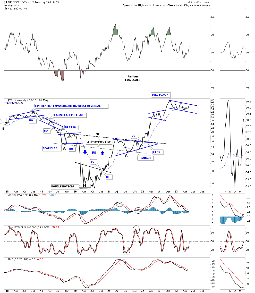
Today May 29, 2023:
This is the current chart for the TNX which shows the triangle I was referring to on the chart above and the two for one breakouts of the top rail of the blue triangle and the neckline. You can see the current trading range at the top of the chart.
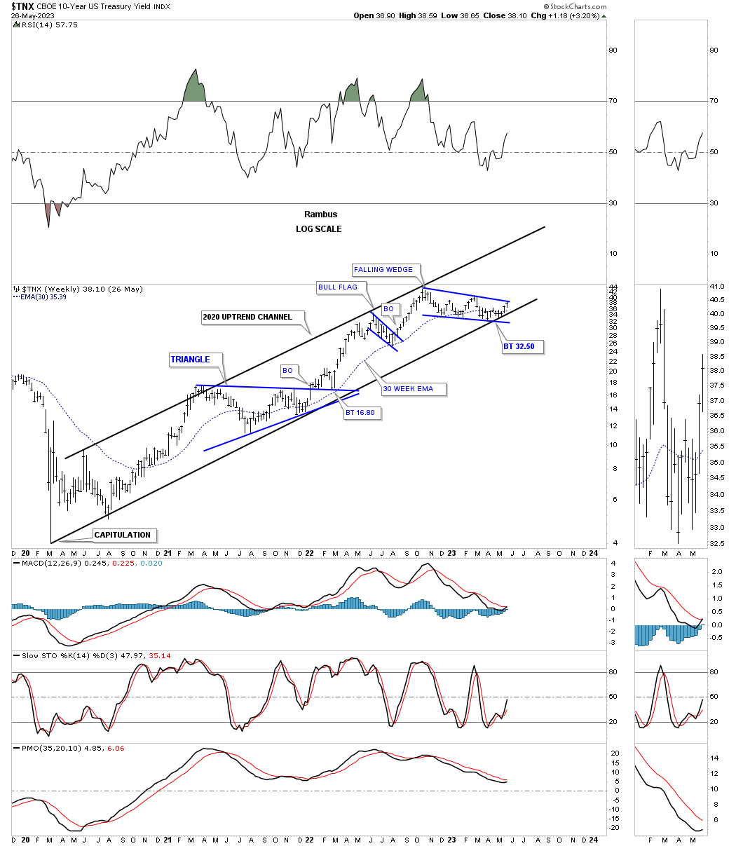
Let’s step back a little further in time and look at the 2020 bottom in interest rates from the weekly bar chart perspective. I’ve shown you many times in the past that when an important trendline is going to be broken that there can be a smaller consolidation pattern that forms just below, just above, or one right in the middle of that trendline. This weekly chart shows the small blue flag forming below the 2018 high and our current falling wedge forming right on top of the 2018 high which is usually a very bullish setup.
Now I would like to show you the very large bottom at the 2020 low for interest rates and the beautiful Chartology that has formed.
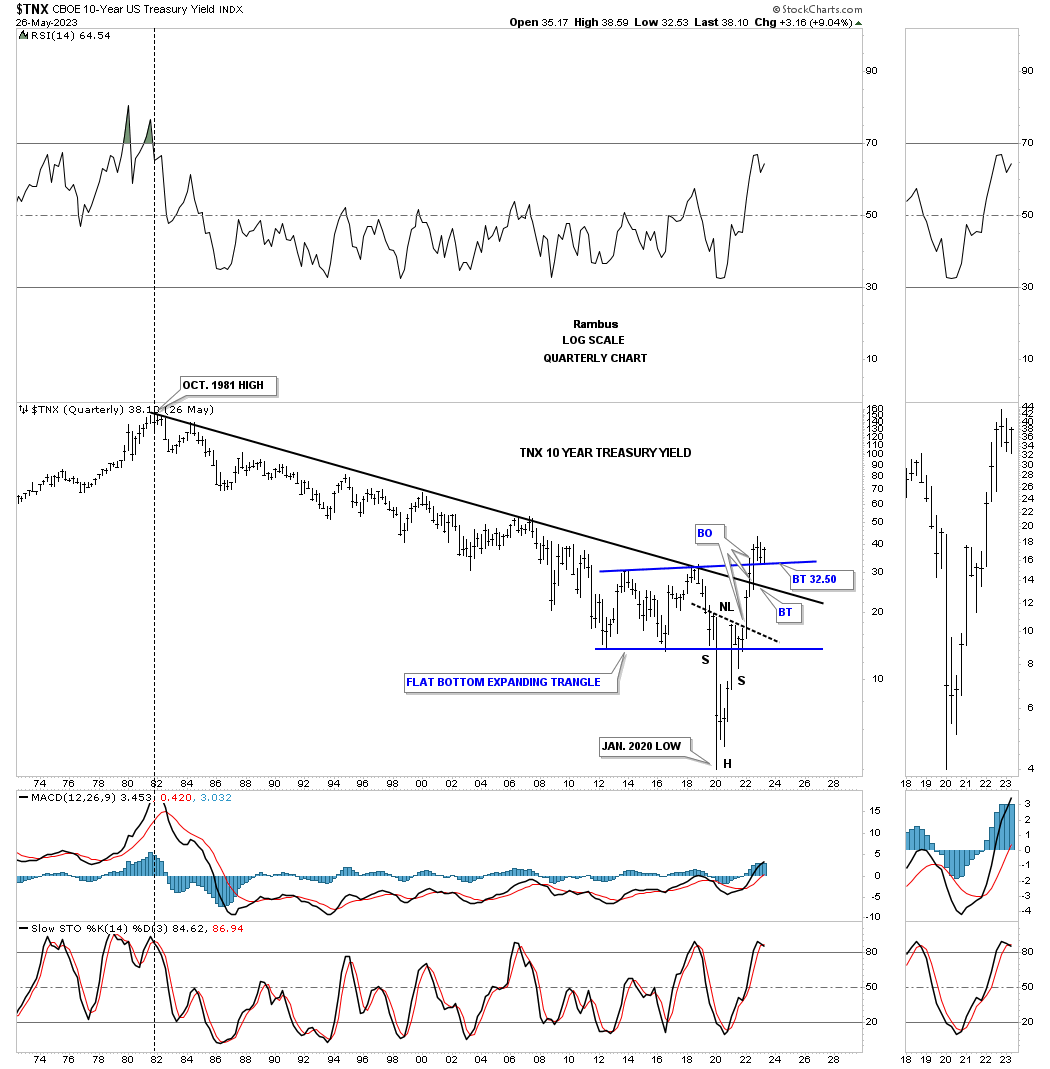
This next chart for TNX is a very long term quarterly look which shows interests rates topping in 1981 and finally bottoming at the 2020 crash low. Note the capitulation dive into the bottom low for interest rates which formed the head of that H&S bottom on the chart above. You can also see how fast interest rates railed off the 2020 low, reversing symmetry up.
Once the H&S neckline was broken to the upside came the next area of resistance which was the top rail of the 1981 downtrend channel which confirmed the bottom was in for interest rates. After backtesting the top rail came the next area to overcome which was the top rail of the blue expanding rising wedge. Since that breakout the TNX has been in backtest mode forming the bullish falling wedge on the daily and weekly charts above.
This is what I wrote on January 7th 2022:
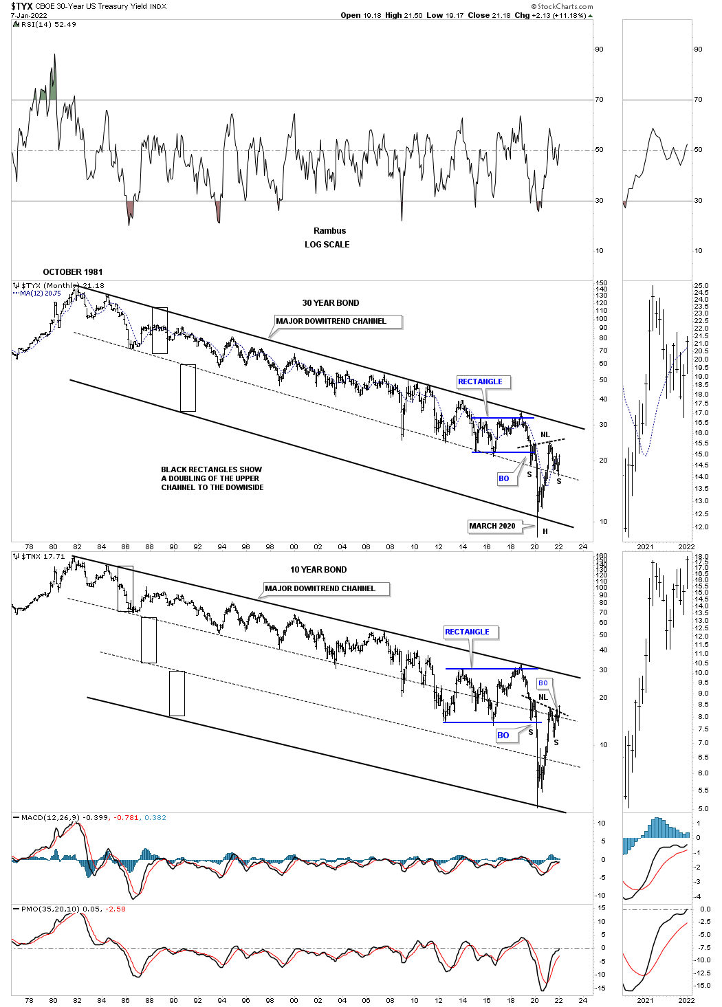
Next is a combo chart which has the TYX, 30 year yield on top with the TNX on the bottom. The black rectangles, that are exactly the same height, measures each trend channel of the 40 year downtrend channel. Note how once the center dashed midline gave way the channel basically doubled in size to the bottom. The TNX formed a third equal channel before putting in its H&S bottom. One could even call the hard move down to the bottom rail a capitulation move because of its magnitude.
The TNX has just broken out from its H&S bottom but the TYX still has more work to do on completing its right shoulder. Again, notice how the center dashed midline held support for the right shoulder low reversing what had been support for most of the 40 year decline to support once again on the breakout and right shoulder low.
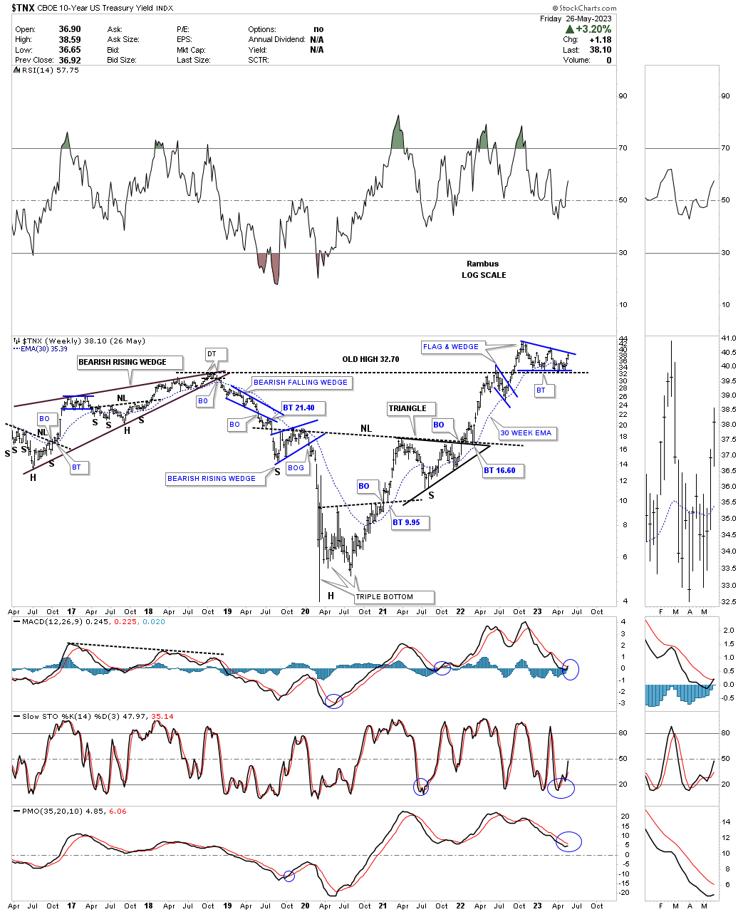
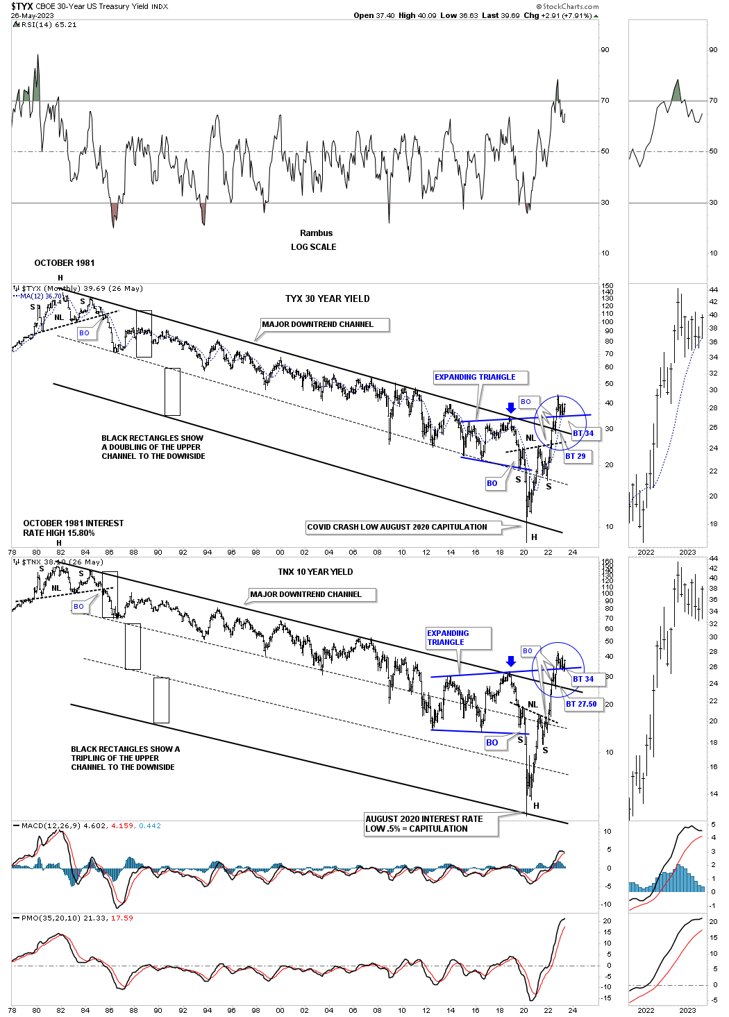
Today May 29th:
When you compare the H&S bottom from the January 7th 2022 Weekend Report to this present H&S bottom you can see the TNX has done a lot of work to get to where it is right now. The TYX and TNX have broken above every resistance line and are now trading close to the top rail of its 8 month falling wedge. A breakout will lead to the next leg higher in interest rates.
This last chart for the TNX is a quarterly bar chart showing the bear market and low for interest rates after a 40 plus year decline. The base is in and the breakouts are completed and the backtesting process is still on going, but the implication of this chart shows that interest rates are going to be headed much higher over time which few want to believe at this time.
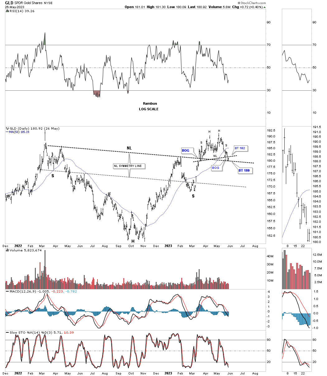
This last chart for today is a daily look at GLD which shows its critical inflection point now in play. As you can see the neckline was backtested late last week. We’ve been following the double top during the week which could also be part of a H&S top. The price action is currently in a ping pong move between both necklines.
Gold has been and is the leader when it comes to the precious metals complex. How this critical inflection point plays out is going to have a big influence on the PM stocks. If the US dollar continues to show strength that will also be a strong headwind for the PM complex. In the near term I’m content to sit on the sideline and wait for something more constructive, from a Chartology perspective, that Gold may give us to work with.
I hope everyone had a great Memorial Day weekend. All the best…Rambus
PS:
This is what I wrote back on June 5th 2022 showing a 200 year chart for the TNX and the long term trends once they become established.
Back in April of this year I did a post on interest rates showing that the multi decade low may be in place. When it comes to interest rates important highs and lows don’t come around very often, but when you see one it is important to pay attention because they will have a big impact on so many things.
This is the chart I showed back on April 14th, 2022.
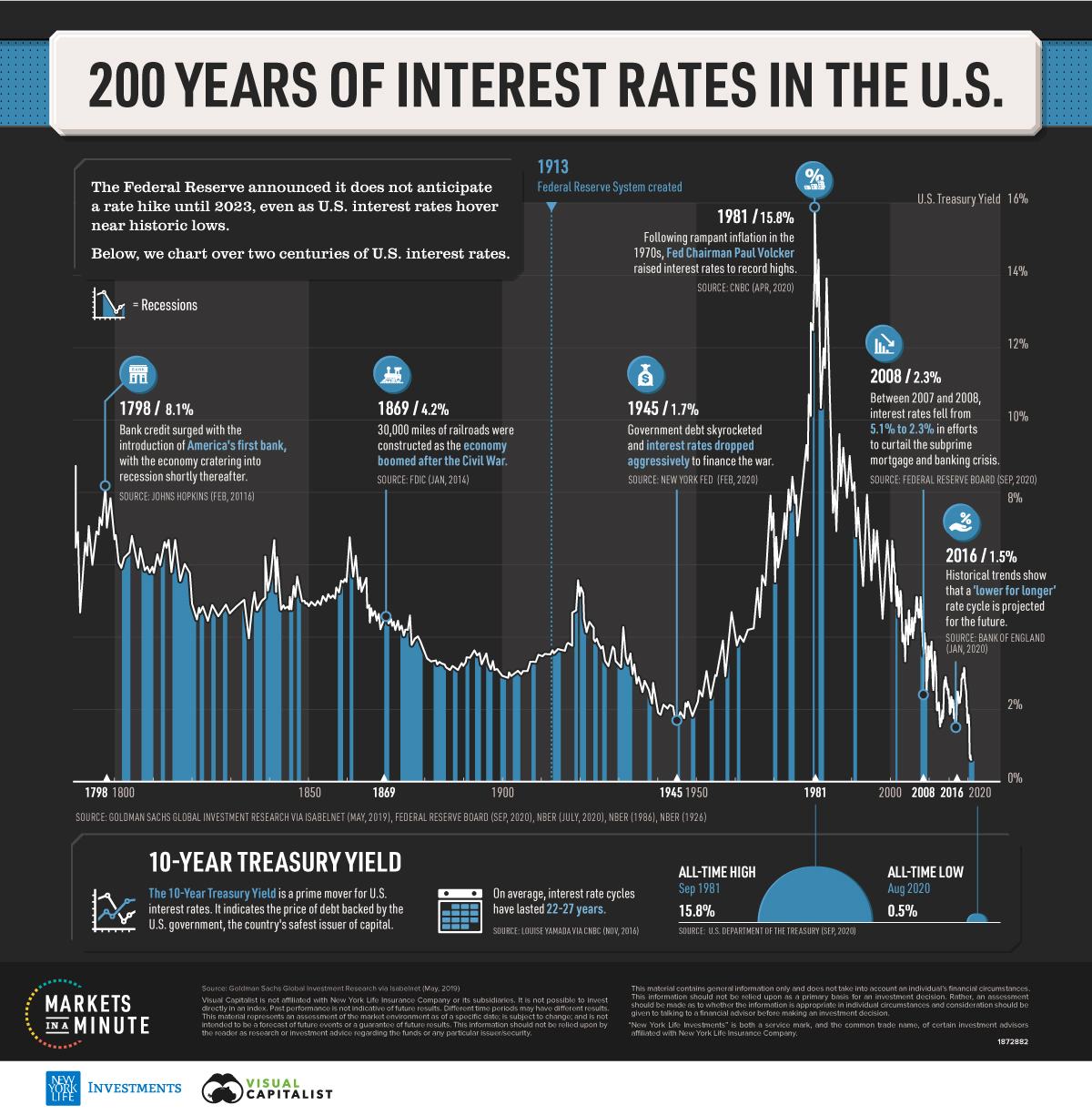
The other important part of the major changes taking place that are going to affect the US and the rest of the world and is still in their infancy are interest rates. Any student of stock market history knows that interest rates can be trend bound for many years before a reversal takes place. Below is a chart for TNX I found that goes back 200 years and shows once a major trend develops, either up or down it can last many years.
Today May 29th:
This 200 year history chart for TNX stops at the August 2020 low at .5%. See the quarterly and monthly charts above for the TNX to see what has transpired over the last couple of years.