We’ve been focusing in on the shorter term charts for the precious metal complex for some time now which is important but we also need to keep a very close eye on the bigger picture as that over rides the shorter term charts. You really have to know the big picture and then work your way back to the shorter term time frames that help confirm what the long terms are saying. Unless your a very short term trader then the long term charts won’t impact your trades that much. By looking at the long term charts they can still give you some clues you can use to help make a decision on where one might look for important support or resistance zones that don’t show up on the minute charts. So for me looking at all the different time frames helps paint a much clearer picture that one can use to trade any time fame they choose. Perspective.
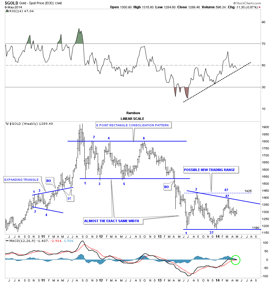
Lets start with a weekly chart of gold that shows the final rally phase into the 2011 all time high at 1920. From that all time high gold has been in a confirmed downtrend after breaking below the bottom rail of the blue 6 point rectangle consolidation. Please note the 6th reversal point on the 22 month blue rectangle at the top of the chart. That was the exact point that started the big impulse move low that took the price action from 1800 to the June bottom at 1175. That huge impulse leg down also took out the bottom rail if the 22 month rectangle in April of last year. That impulse move took about 11 months from start to finish about half the time it took to build the 22 month blue rectangle. There is one really important aspect to that 11 month impulse move down that is the basic principal of a tending market. If you follow every little squiggle from the 6th reversal point on the blue 22 month rectangle to where the impulse leg ended at 1175 you will see gold made a lower low and lower high, at every minor low, during that 11 month decline. Folks this isn’t rocket science but it’s an important fundamental aspect of Chartology. As you can see from the June low made last year gold has been chopping out another consolidation pattern. You can see there is the beginning of the 4th reversal point that could be comparable to the 6th reversal point on that blue 22 month rectangle. There is still a lot of work to do but the potential is setting up that could lead to one last huge impulse move lower before it’s all said and done. If the trendline on the RSI at the top of the chart breaks down that could very well be a strong signal that the next impulse move lower is getting underway. Nothing is definite yet but there are a lot of things to watch to help confirm the big picture that is so important to understand. When you have a game plan you want to see things unfold in a way that fits what what you are seeing. As long as things keep progressing the way they are supposed to don’t fight every little wiggle that will be sure to try and throw you off your game plan.
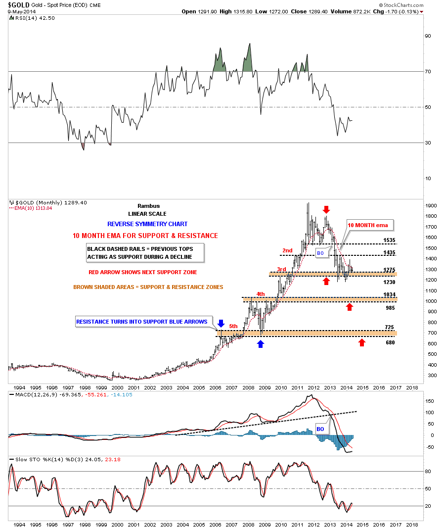
This next chart is the long term monthly chart that shows how important the 10 month ema has been on both sides of the gold move. On the way up it always held support until the 2008 crash. Then during the topping process in 2011 and 2012 is when it started to breakdown again. Sine the second high in 2012 it is back to now hold resistance, just the opposite during the bull market years when it held support. You can see last month gold spiked above the 10 month ema but quickly reversed and closed the month back below it. So far the month of May has tested it once at 1315 and has bounced off. The bear market has shown lower highs and lower lows which is a downtrend. There is no way of getting around it, you have to have higher highs and higher lows to begin a trend reversal and until we see that the downtrend remains intact regardless of all the reasons in the world why gold should be putting in a bottom right here. At some point it will and we’ll see it happen in real time but that time is not yet here.
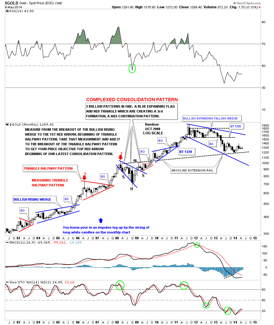
Below is another long term chart of gold I’ve been following through the years that shows all the beautiful chart patterns that formed during the bull market years. This chart shows how the secular bull market could stay intact if the price action doesn’t take out our latest consolidation pattern low, the big blue expanding falling wedge. This chart shows the price of gold could fall pretty low and still be in the confines of the big blue expanding falling wedge, as a consolidation pattern.
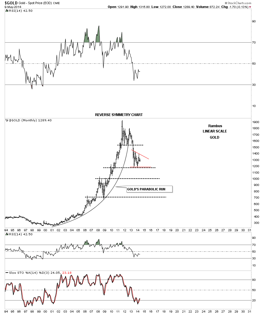
This last chart is for those that think gold didn’t have a parabolic rise off the 2001 low to the 2011 high. Again on the bull side of the chart you can see higher highs and higher lows and on the right of the chart you can see just the opposite lower highs and lower lows. Simple but very powerful.
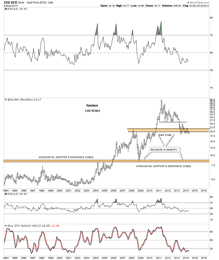
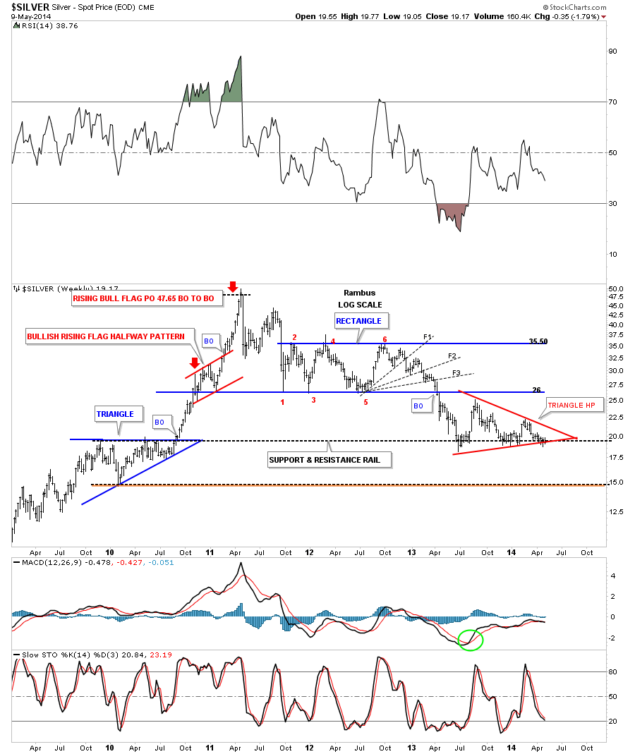
Lets now take a look at silver that shows a similar look to gold but is in a weaker state. You can also see it topped out first in 2011 and has been creating lower highs and lower lows ever since. Note the top brown shaded support and resistance zone that has held support since it broke down in April of 2011. If you look below the top brown shaded support and resistance zone there isn’t a whole of support until silver reaches its old bottom made in 2008.
Below is a chart that is very similar to the gold chart I showed you above.
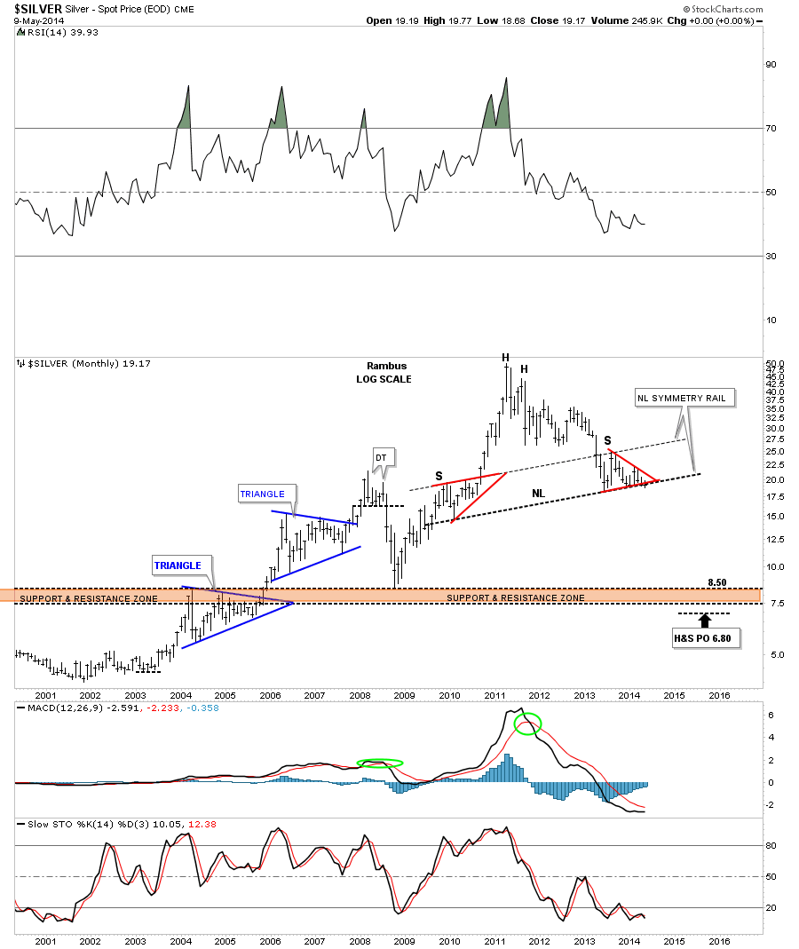
We’ve been following this next long term look at silver for six months or more that is showing us the big picture in a way that no one else is looking at. If you showed this chart to a goldbug he would shoot you on the spot and ask questions later. This chart is blasphemy of the highest degree if you can only look in one direction. The symmetry is absolutely beautiful from the two shoulders being of equal size and the neckline symmetry rail showing us exactly the height for the right shoulder. If this H&S top plays out as expected it will have a price objective down to the lower brown shaded support and resistance zone around the 2008 crash low. When you watch these big patterns play out in real time it seems like an eternity for things to play out. But since I posted this possibility over 6 months or so ago silver has been progressing along according to what I laid out with nothing to tell me this pattern is broken.
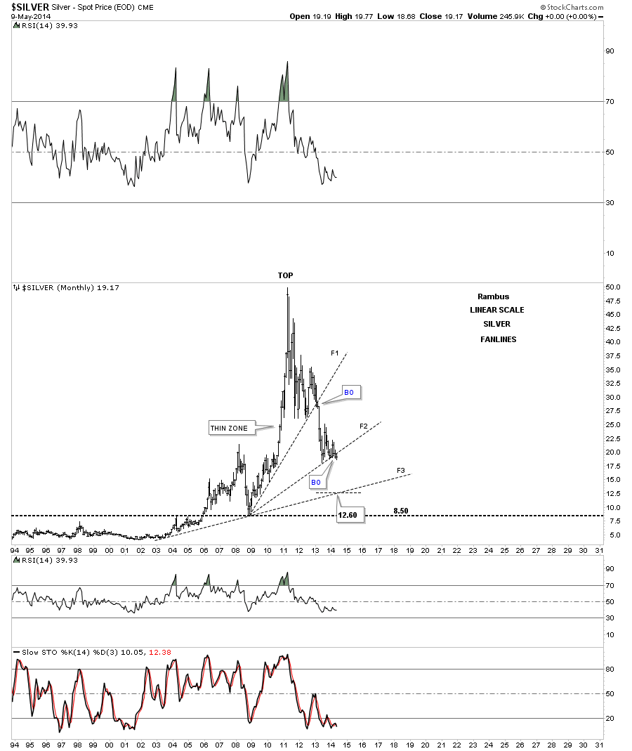
The last chart I would like to show you for silver it its own parabolic run similar to gold’s. Here I’m using fanlines that show support on the way down. Note how decisively fanline #1 was broken to the downside during that April 2011 massive breakout. Silver has been holding support since the June low made last year at flanline #2. If you look real close you can see silver is now breaking below fanline #2 ever so lightly but it is cracking. Depending where silver finds support once it lets go it could find support on fanline #3 around the 12,60 area.
I know how hard it is for most to follow the longer term charts but that’s where the really important information lies. Through the years this is where I have found the confidence to make the biggest return on my investments bar none. Over trading usually gets you into trouble even if you have had a good string of luck but eventually your luck runs out and you are left sitting on the sidelines. As I have stated so many times before , these types of setups don’t come around very often but when they do you have to be ready to take full advantage of the situation once it presents itself.
All the best…Rambus.

