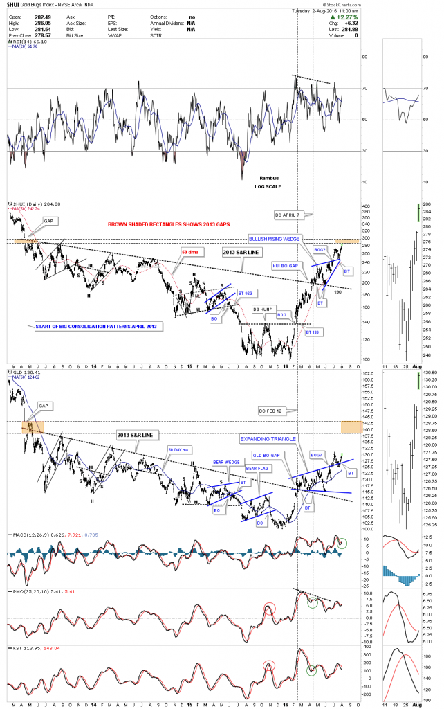
Its been several weeks since we last looked at this combo chart which has the HUI on top and GLD on the bottom. I call this chart the 2013 S&R chart because all the price action below that very important S&R line started to build out after the big gap down in 2013 which many at the time called manipulation but from a Chartology perspective it was a perfect breakout. I’ve been showing the price action below the 2013 S&R line as a bullish falling wedge which is true but when you boil it all down the 2013 S&R line is the most important trendline on this chart, above bullish and below bearish.
The HUI and GLD both broke out above their respective 2013 S&R line at different times with GLD breaking out just ahead of the HUI. They both broke out above their 2013 S&R line with a breakout gap and both had a nice backtest also.
Since the PM complex is in a new bull market it was only a matter of time before each would breakout from their first consolidation pattern to the upside, which was the blue bullish rising wedge on the HUI and the blue expanding triangle on GLD. Again you can see a breakout gap above their respective top rails of their blue consolidations patterns. Once you know the big trend, bull or bear market, the consolidation patterns will breakout in the direction of the prevailing trend. That is an important concept to grasp. Many times a consolidation pattern can morph into a bigger consolidation pattern which will have the same out come as the smaller consolidation pattern. Eventually though the consolidation pattern will finish building out and the next impulse move will begin in the same direction as the previous move.
One last thing to recognize on this combo chart below. Note how much stronger the HUI is vs GLD if you go back to the 2013 gap area. The HUI is currently testing the bottom of the gap while GLD is still significantly below its 2013 gap area. This ties into the thesis I’ve been showing you on the ratio combo charts that are showing this time the PM stocks are finally going to have their day in the sun after 20 years of under performing gold.
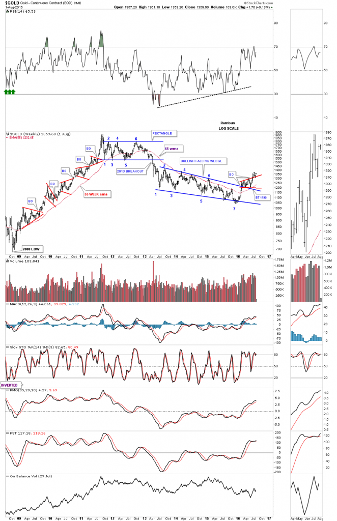
Below is a long term weekly chart which puts everything in perspective. First, you can see the big breakout below the bottom rail of the six point blue rectangle consolidation back in 2013 which many called manipulation at the time but it was a clear breakout from a very well defined six point rectangle consolidation pattern.
Then there is the three year seven point bullish falling wedge reversal pattern. It’s a reversal pattern because it has an odd number of reversal points.
Lastly you can see the little red expanding triangle that has been forming on the top rail of the bullish falling wedge which we know from past experience is usually a bullish setup. More confirmation will be given when gold makes a new higher high made just several weeks ago.


