.
In this Weekend Report I would like to show you some charts on a potential very bullish setup that maybe in play for the US stock markets right now. If you recall back on November 19, The Wednesday Report, I showed you some critically important support zones that needed to hold if this was just going to be a minor correction from the big rally off the October low. Let’s visit a few of those charts and see how they panned out.
Wednesday Report: Nov 19
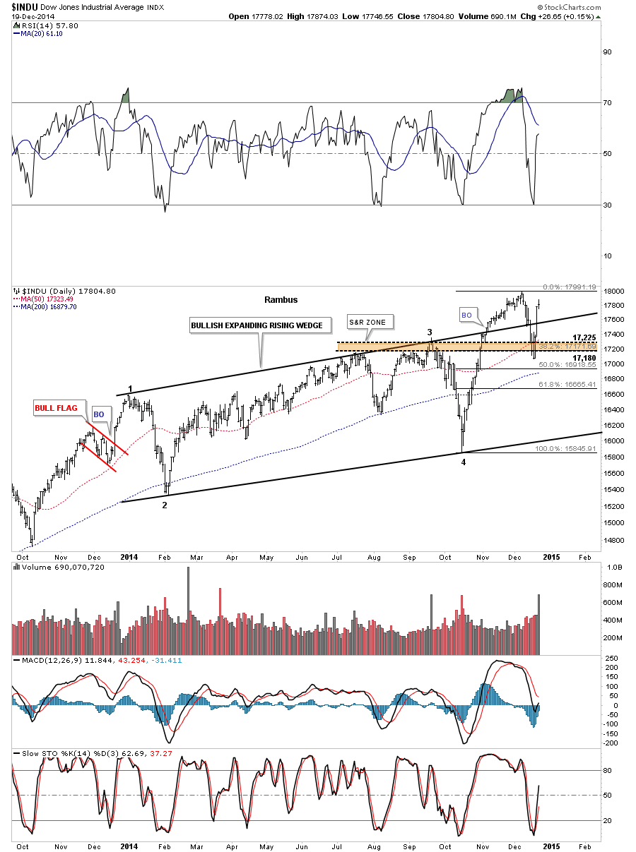
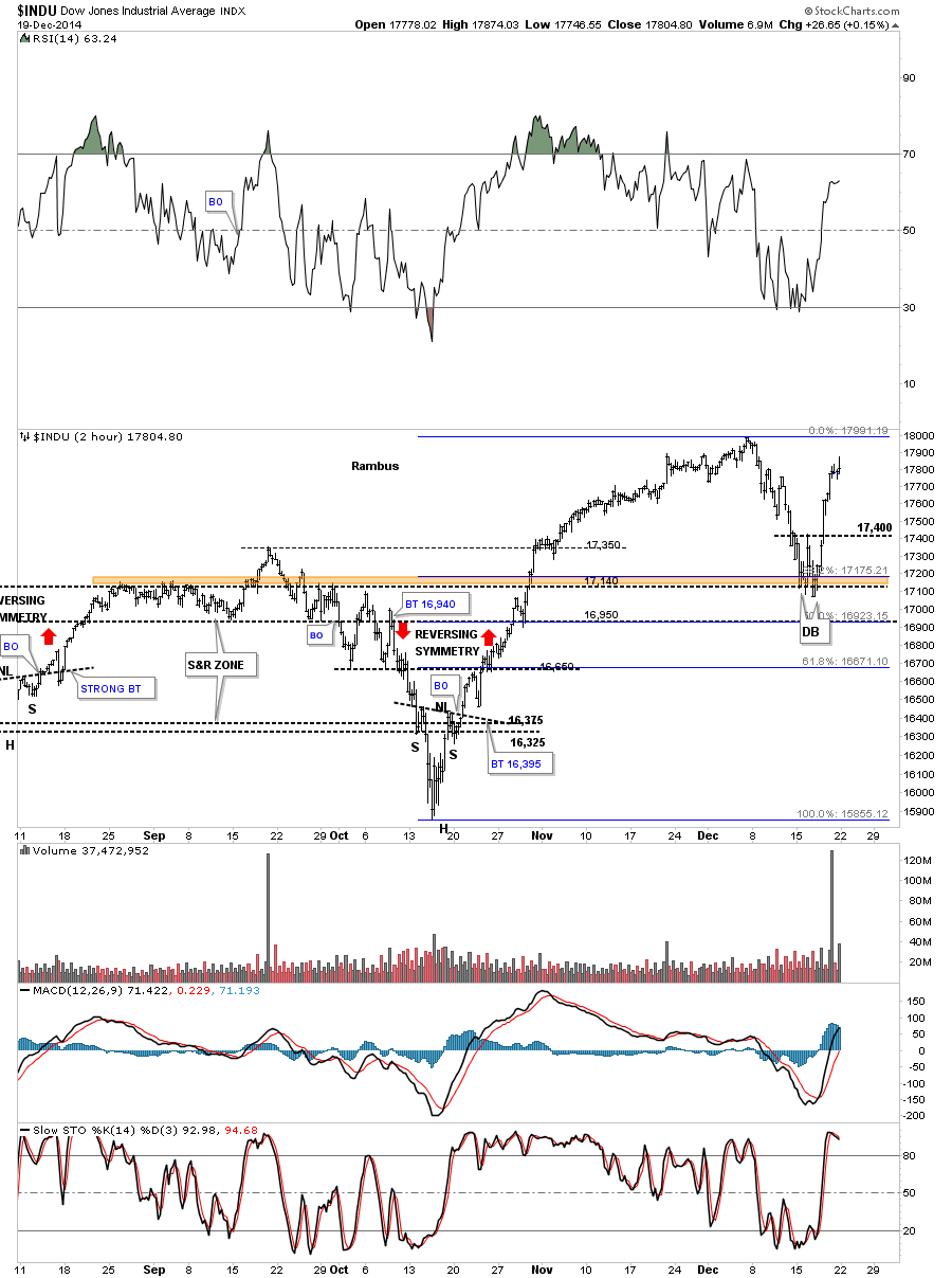
The first chart we’ll look at is the INDU that shows the price action breaking below the top rail of the expanding rising wedge which I viewed as a negative. The real support I was looking for was the brown shaded support and resistance zone that is based on the previous highs made in July and September of this year. What had been resistance should now turn into support which you can see was the case. The 38% retrace and 50 dma also came into play right there as well. As you can see the INDU has now traded back above the top rail of the expanding rising wedge which I’m going to call the backtest as a, strong backtest, until something tells me differently.
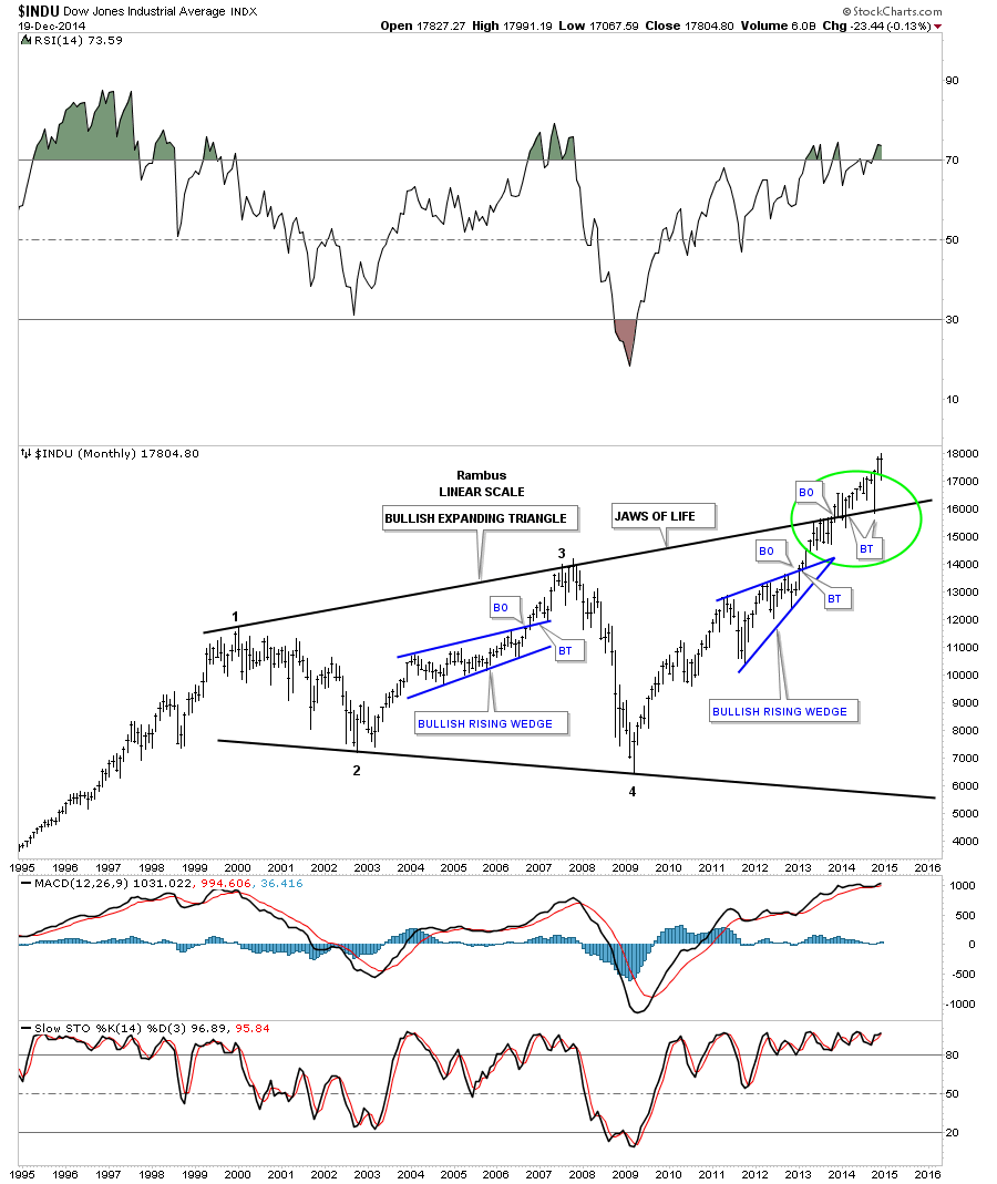
I know many don’t believe in the longer term prospects for the stock markets but the long term charts are saying something totally different IMHO. Below is the long term monthly chart for the INDU which shows the expanding triangle that I’m calling the JAWS of LIFE. Note the long bar that bactested the top rail of the expanding triangle just three months ago during the October correction. That was one critical backtest that confirms for me the top rail is hot and the new impulse move is underway. There’s still a week or so of trading before the monthly bar for December can be put into stone. Unless things really change over the next few weeks this is a very bullish looking chart to me.
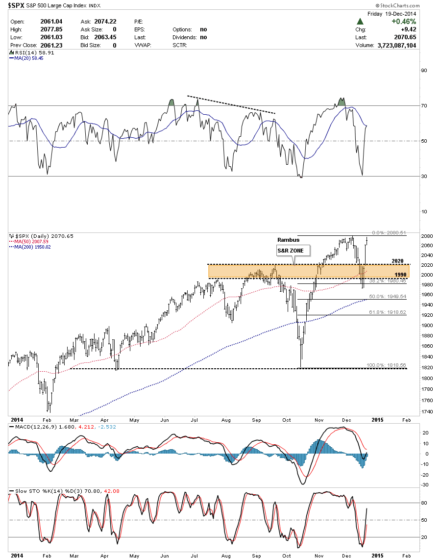
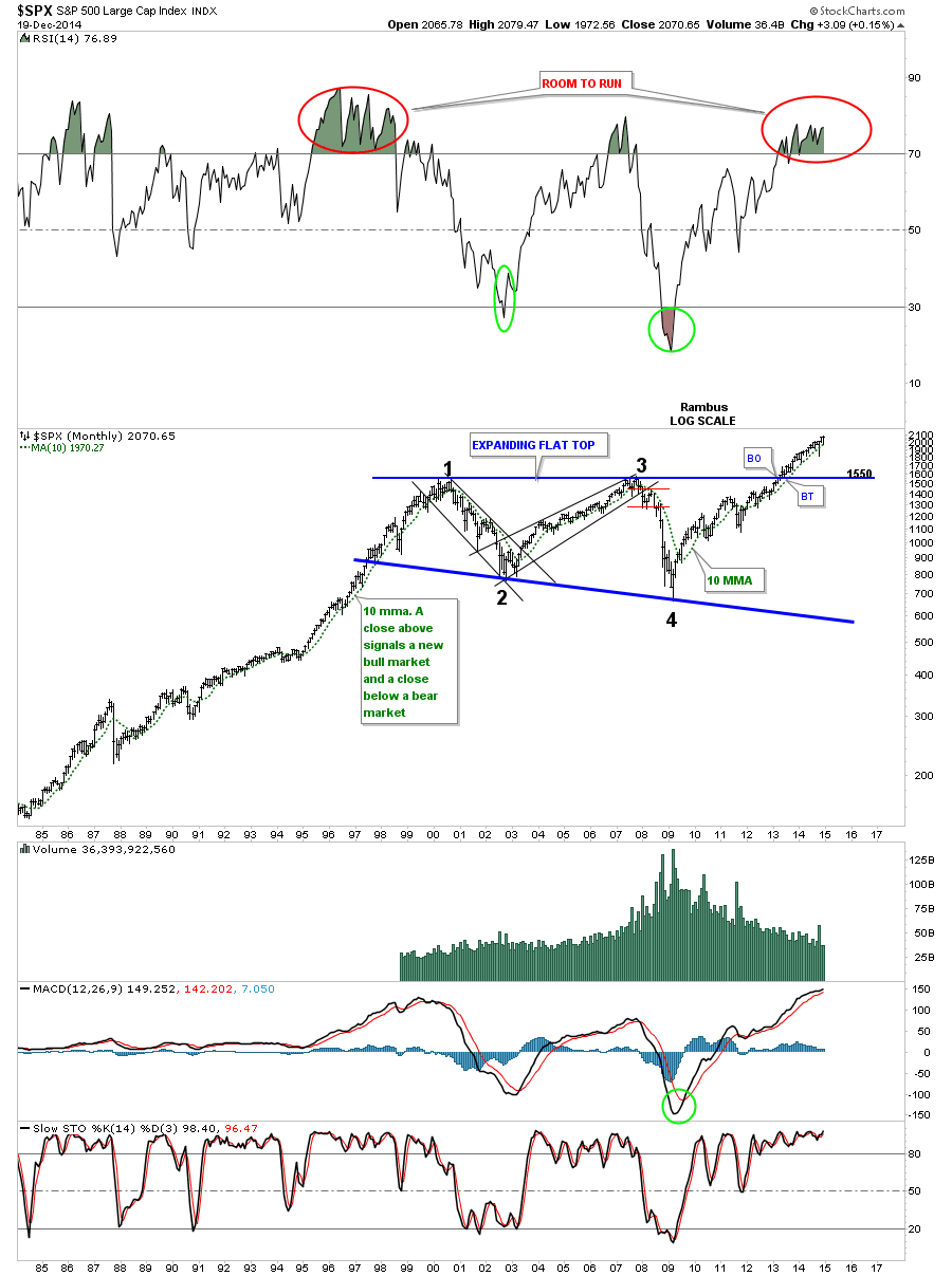
I won’t go into a lot of detail but the daily chart for the SPX shows how the brown shaded S&R zone held support just like the INDU.
Below is a long term monthly chart for the SPX that shows it built out a flat top triangle as its massive consolidation pattern. Since the top rail is horizontal the breakout came much earlier than the INDU’s breakout. Note the RSI at the top of the chart and how long it can stay in overbought territory.
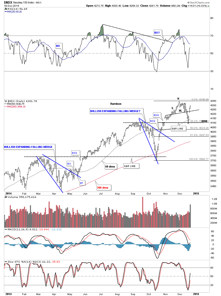
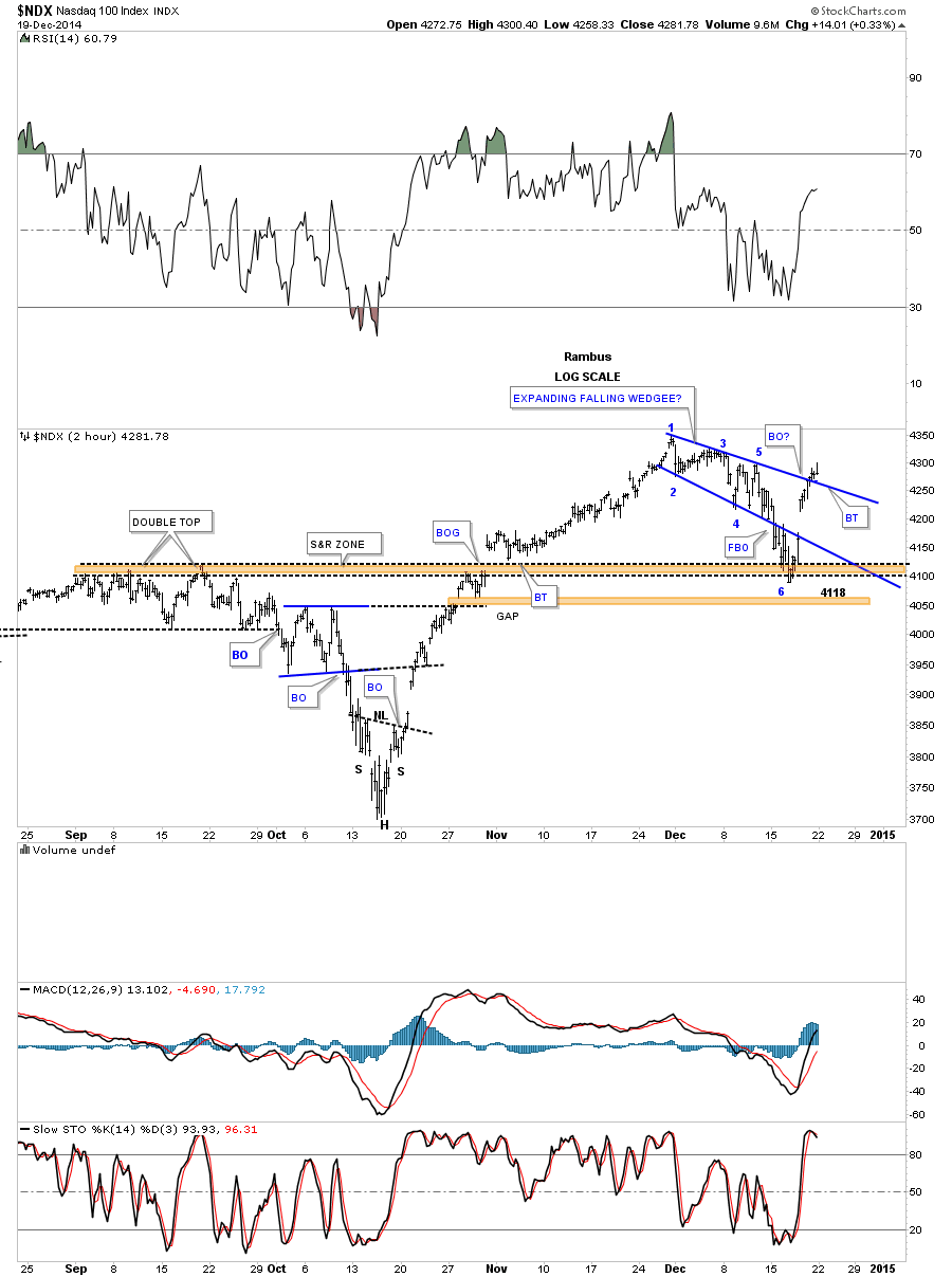
The daily chart for the NDX shows the similar support setup that the INDU and SPX had. Here you can see support that 4100 did in fact hold at the previous high made in September, the 38% retrace and the 50 dma all coming into play.
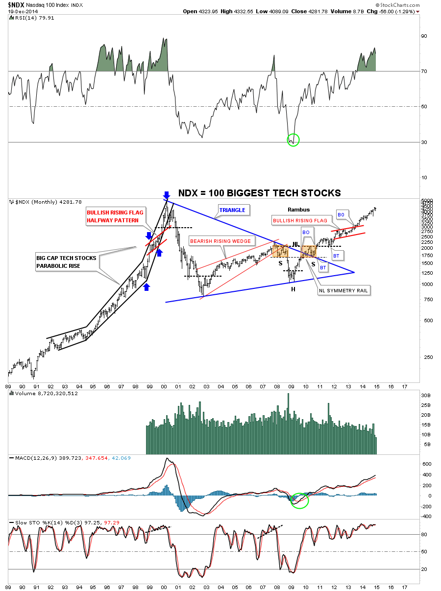
Below is the long term monthly chart for the NDX 100 that shows the massive blue triangle consolidation pattern that broke out in 2009. Note the beautiful Chartology that appeared at the end of the big blue triangle consolidation pattern. I have shown you how H&S patterns can form on wedges and flags when the left shoulder and head forms inside the pattern and the right shoulder forms as the backtest to the top rail, in this case of the blue triangle. Note how steep the rally phase was from 1995 to the 2000 bull market high back then compared to our recent price action. I expect we will see similar steepening of our current rally as time goes on. One last note on the chart below which shows the red bullish rising flag that formed at the halfway point of the finally run to the bull market high as shown by the blue arrows.
Lets turn our attention to the RUT 2000 that has a totally different short term setup compared to the charts above. On Tuesday of this week when the correction was at its strongest I showed you this daily chart for the RUT that showed how it broke below the bottom rail of the blue rectangle but found support on the top rail of the much bigger bullish expanding falling wedge. Normally you have to give the benefit of a doubt to the bigger chart pattern in a situation like this. As long as the top rail held support that was still a bullish setup. On the other hand if the top black rail had failed then that would have called into question the whole bullish scenario at that time. Note the breakout gap of the blue rectangle that occurred on Thursday. This chart shows a good example of how one has to be flexible in their thought process and follow the price action.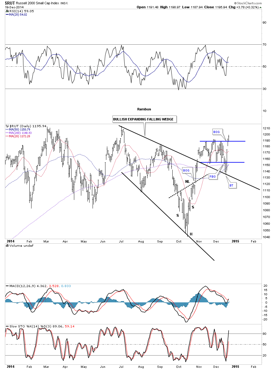
The weekly chart for the RUT is getting a lot more bullish as we approach the top rail of that big one year blue rectangle consolidation pattern. It seems like the RUT likes to fake us out with its false breakouts. Notice the one at the bottom of the blue rectangle. I showed you a H&S bottom on the NDX long term monthly chart that finished off that massive triangle consolidation pattern. There is one on this weekly chart for the RUT that is building out toward the end of the blue rectangle consolidation pattern. It doesn’t get any better than this if you’re looking for a big pattern to finish building out, than to see a H&S bottom in this case, form at the tail end of the blue rectangle.
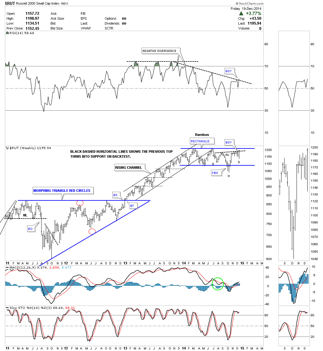
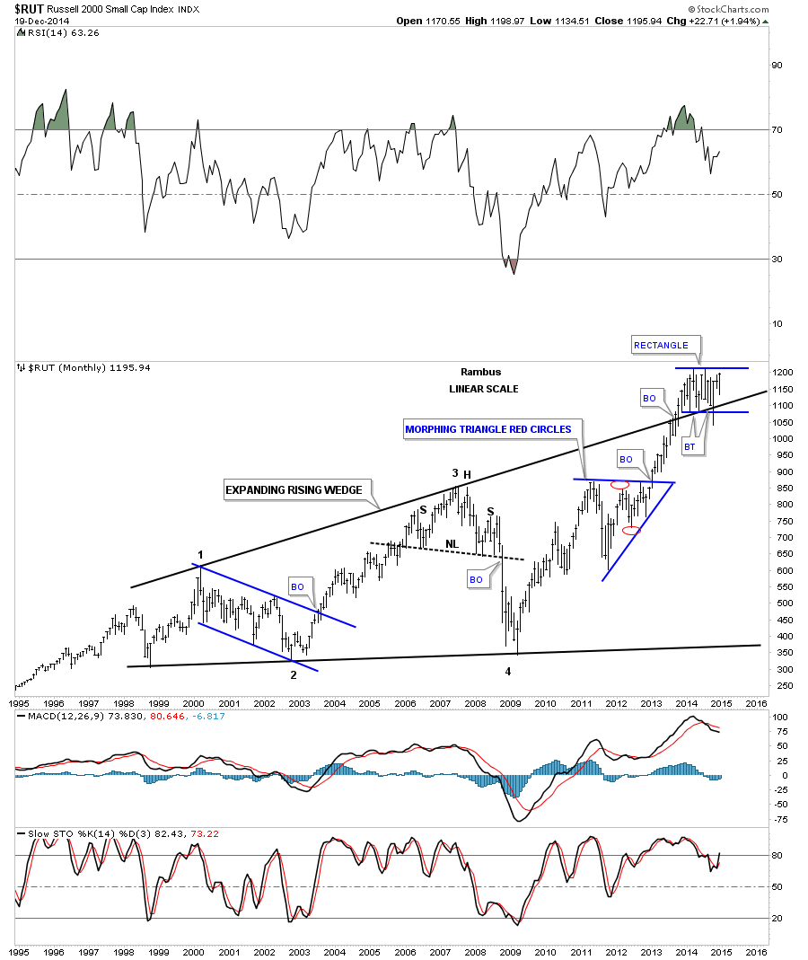
As I’m trying to paint a bullish picture for the short term and the longer term lets look at the monthly chart for the RUT 2000 that has a similar setup to the INDU. This monthly chart shows the RUT breaking above the top rail of its massive expanding rising wedge consolidation pattern and forming that blue rectangle that we just looked at on the chart above. Note how it’s forming right on the top rail of the massive expanding rising wedge. Again this is perfect Chartology. One last note on the monthly chart below. During the October correction the RUT broke below the bottom of the blue rectangle and the top rail of the massive expanding rising wedge, as a false breakout move. It quickly reversed direction and is now trading well above the top black rail which I view as strongly bullish. The bears had their chance but couldn’t capitalize on it. When you look at the chart patterns on this long term chart for the RUT put yourself in a similar spot, just below an important trendline, as shown by the current blue rectangle, to see what took place when the chart pattern broke out. That includes the neckline on the H&S top that broke down. The point is we should expect a very large move that should last at least a year or longer. The timing couldn’t be better for those looking to establish long term positions.
Now I want to show you the meat and potatoes of this Weekend Report by looking at the shorter term charts for the INDU, SPX, NDX and the RUT and what may lie ahead for the very short term. First I consider the rally off of the October correction low as a very important landmark for the breakout move to the next level in the stock markets. If this is the case then we should see some good follow through to the upside.
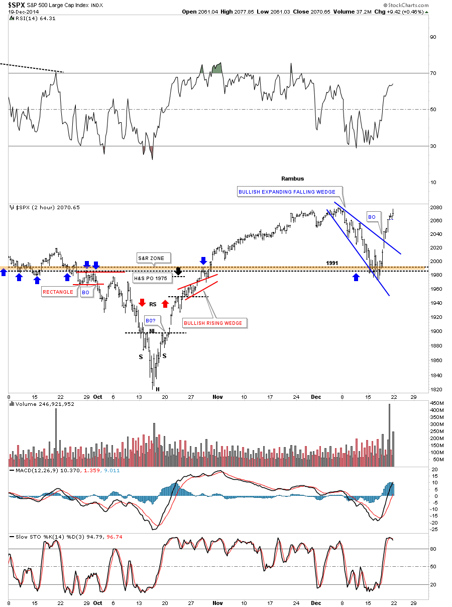
I’m going to start with the SPX 2 hour chart that has a nice looking bullish expanding falling wedge that found support right where we wanted to see it which tells us we’re on the right track. Many times in a fast move up one can label that move up as a flag pole. The rally off of the October low to the December high would be the flag pole with the blue expanding falling wedge as the flag flying at half mast. If this is truly taking place right now we should see a move that is equal in time and price to the rally off the October low to the December high leaving the blue expanding falling wedge showing up as a halfway pattern. Below is the 2 hour chart for the SPX.
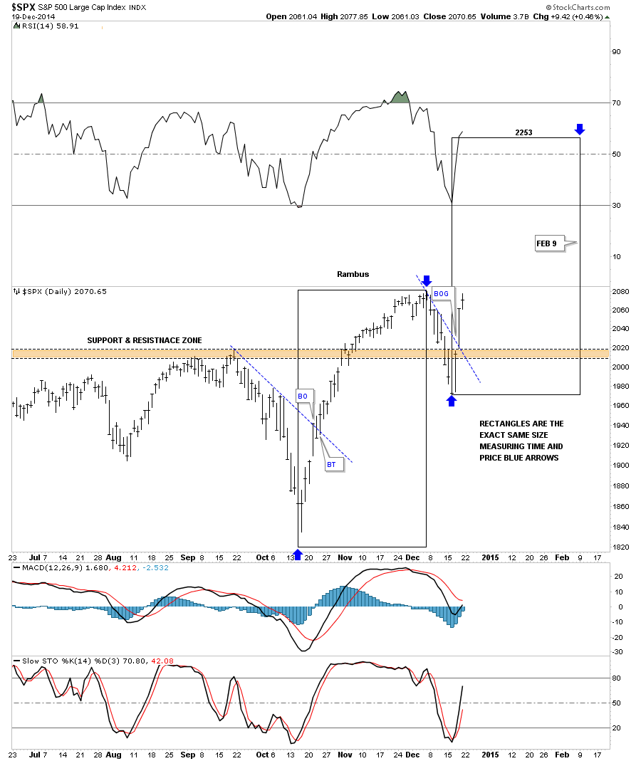
Below is a daily chart for the SPX that shows two black rectangles that measures time and price as shown by the blue arrows which would be using the impulse method of finding our price objective. One thing is for sure. This move will have to start this week and be just as strong as the October to December rally. Anything less would call this potential very bullish setup into question.
Below is a 2 hour chart for the INDU that shows it found support right where we wanted to see it come in and is now reversing symmetry back up. As you can see it’s at a points where we may see a little hesitation before moving higher.
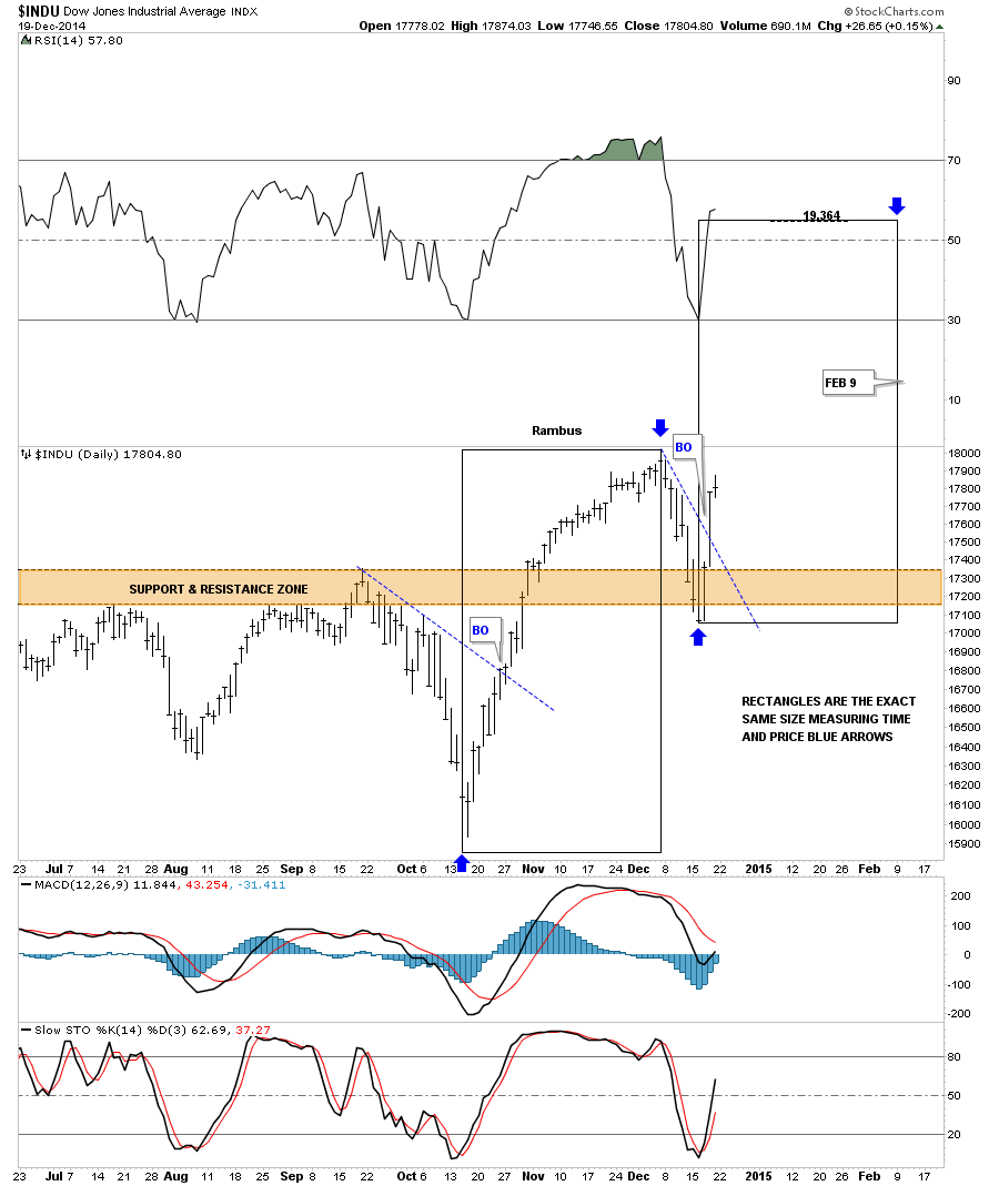
Below is a daily chart for the INDU that shows the possible time and price if this scenario works out.
The 2 hour chart for the NDX 100 threw us a curve ball this past week when it broke below the bottom rail of its falling expanding wedge. Friday it broke back above the top blue rail in a show of strength even though it’s lagging a bit in here. It did find support where it needed to be found at 4100.
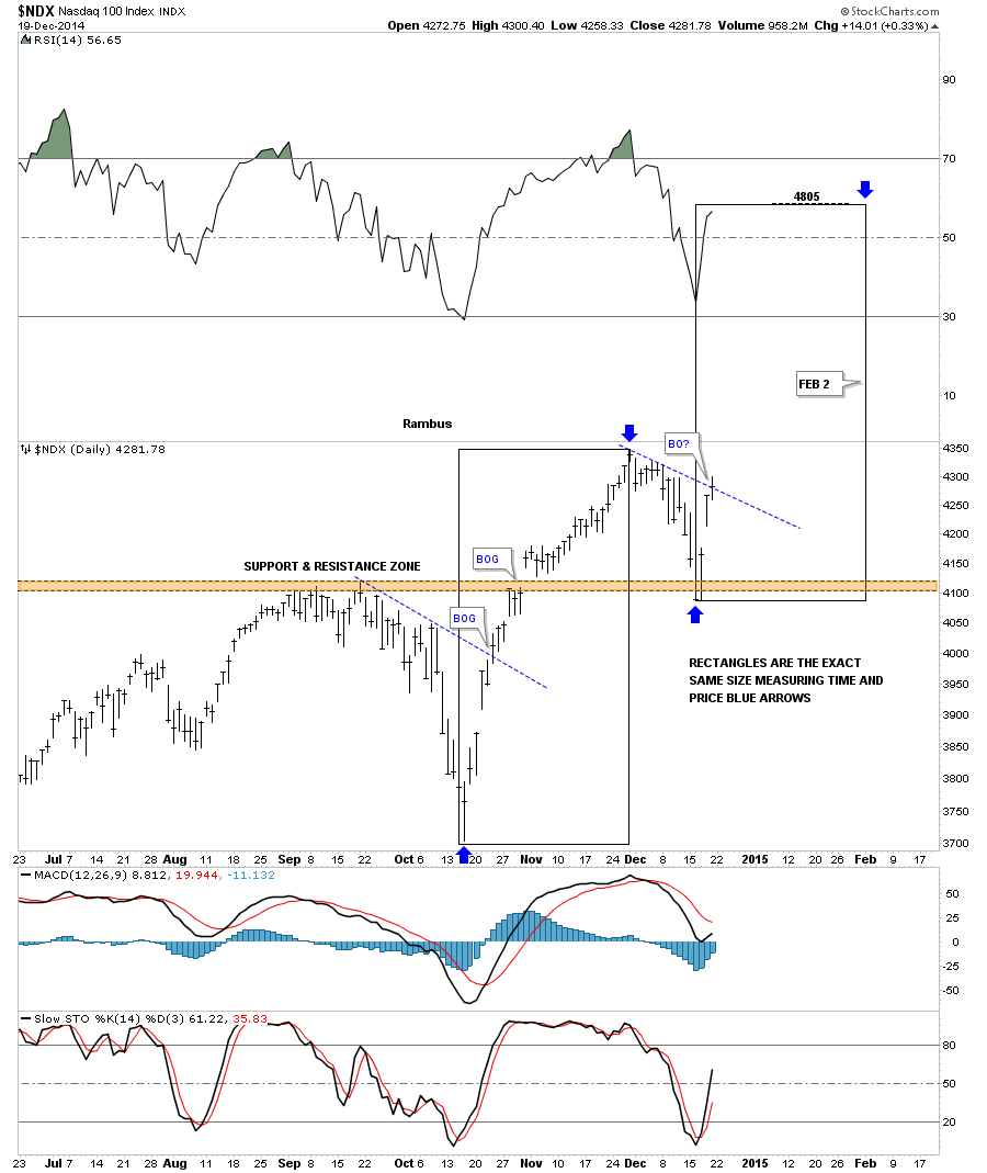
The daily chart for the NDX shows it’s just breaking above its S&R line on Friday. The black rectangles shows the time and price objective for the second leg higher if this setup takes place.
Actually the RUT 2000 is the real reason why I think this potential big rally can take place. As you know the small caps have been under preforming the big caps for awhile now. This daily chart for the RUS shows a 6 point flat top expanding triangle consolidation pattern that broke out on Thursday of last week with a breakout gap. A backtest would come in at the top of the flat top expanding triangle at 1188 or so.
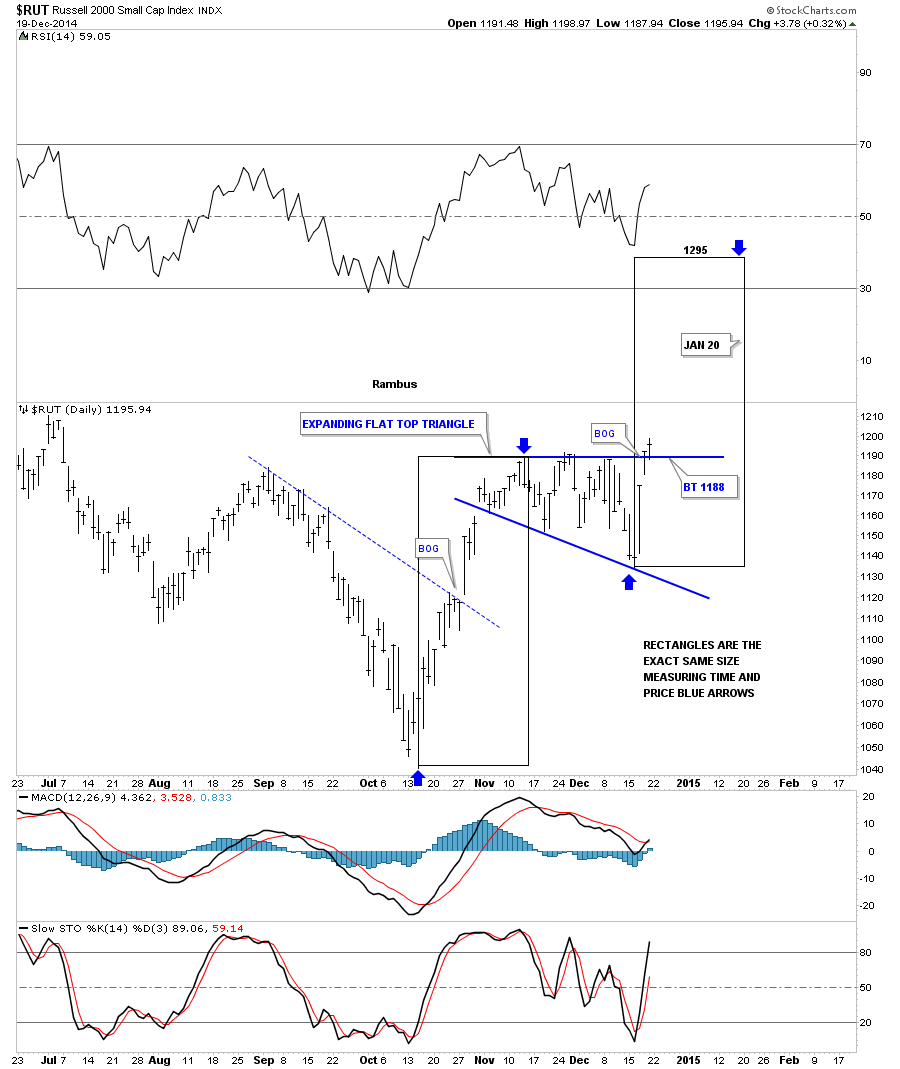
One thing about this trade is we won’t have to wait long to know if this setup is going to work. We should see a similar move off the October low to the December high which is pretty straight up. The first thing we’ll need to see is for the different sectors, we discussed above, to make new highs right away. Any correction should be very short and only show up on the minute charts. What I’m describing here is for the short term. Those big consolidation patterns, that I showed you on the monthly charts above, is where the big money will be made IMHO but it won’t be easy.
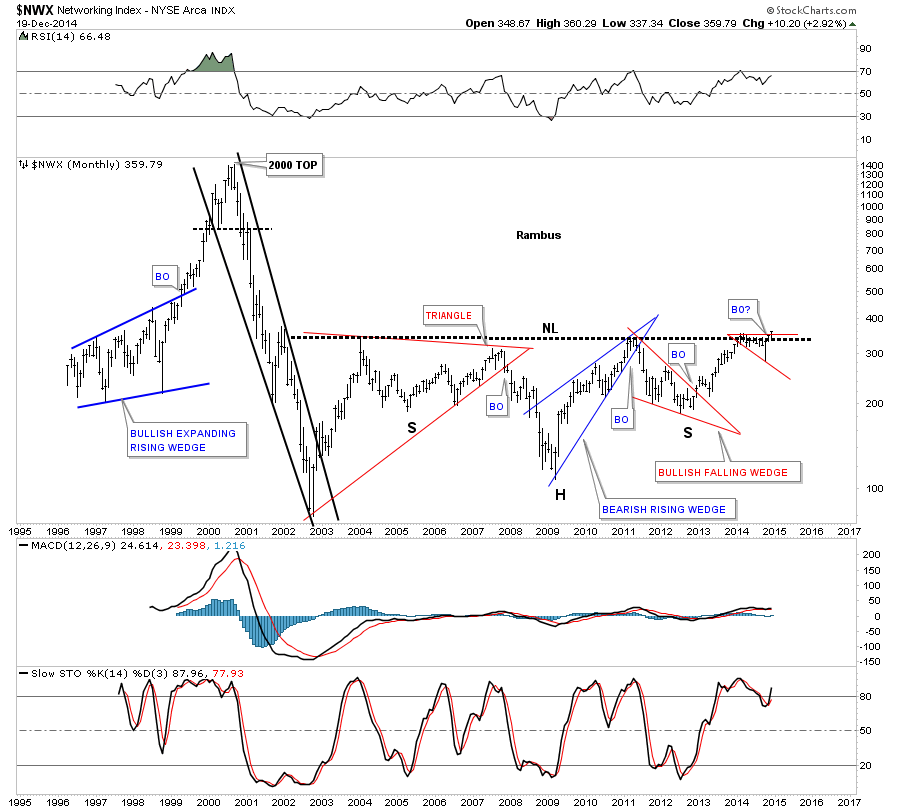
I will show you this week some of the big multi year consolidation patterns that are forming on many individual stocks that made big moves back in the tech bubble that have been laying dormant but are waking up. Below is a sector that has been lagging the rest of the tech sectors but looks like it’s coming to life now. If one is looking for bargains this would be a good place to start looking. Below is a weekly chart for the $NWX, networking stocks, that just broke out of a bullish expanding falling wedge and backtested the top rail this week.
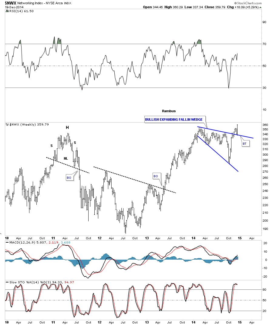
Guess where that bullish expanding falling wedge is located on the long term monthly chart for the NWX? It as formed just below the long term neckline which as I have shown you many times in the past is a bullish setup. It’s taking out two important lines in one shot. Think rotation in tech stocks which will drive the next leg higher in this sector. All the best…Rambus