The Light at the End of the HUI

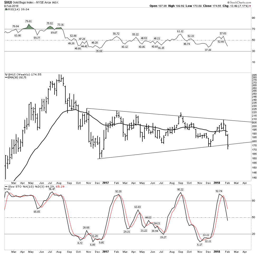
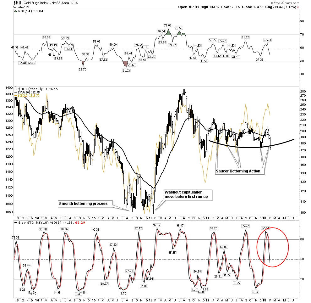
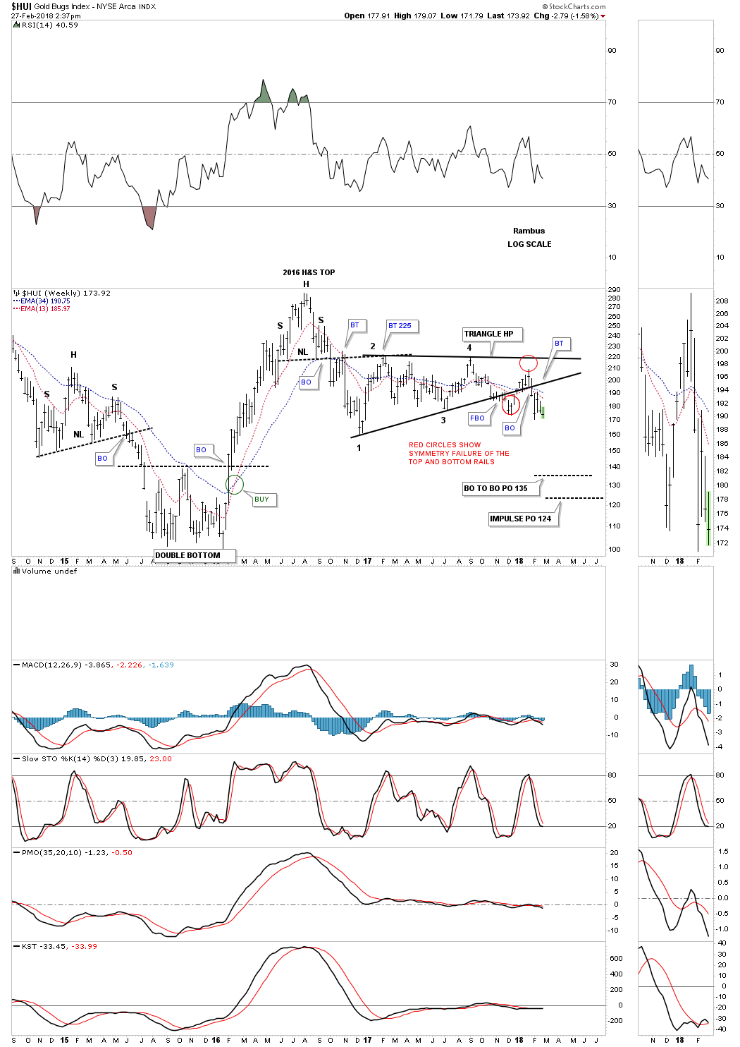
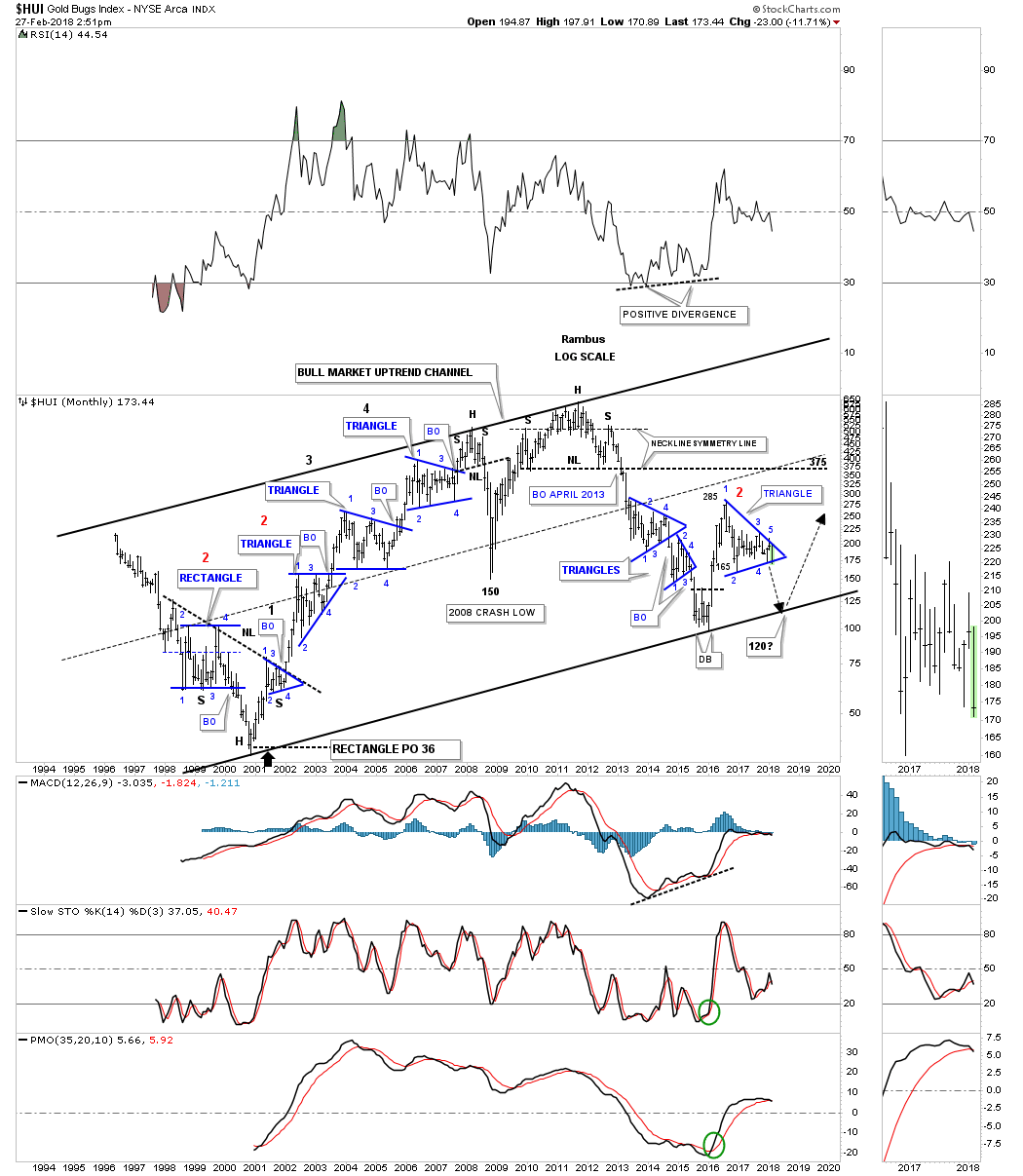
I’m going to use this long term weekly chart for the HUI as a proxy for the other PM stock indexes. This chart also shows you why I’ve remained very cautious on any PM stock rally.

What we know for sure is that the HUI rallied strongly out of its January 2016 low to the August 2016 high which was very impressive. At the time it looked like the initial impulse move in a brand new bull market which was a welcomed sight after 5 years of bear market price action. At the 2016 top is where we should have expected some type of consolidation pattern to start building out to consolidate that massive gain, but what we got is not what we wanted to see.

I remember taking some flack from several newsletter writers when I posted a possible H&S top in place. I was told that everyone and their brother could see that H&S top so it would fail, the new bull market was born and that was that. From my perspective that H&S top formed exactly where one would expect to see a reversal pattern form which is at the end of a big move. If the bull market was truly underway the HUI should have started to chop sideways creating a consolidation pattern instead of a reversal pattern.

After the neckline gave way there was a 5 week backtest to the underside of the neckline that confirmed for me the H&S top was valid and correct. After the backtest was complete the first impulse leg down took about 8 weeks to complete. That low is marked by reversal point #1 at the beginning of our current triangle trading range. Note how the neckline also held resistance on the second backtest at reversal point #2 again adding more confirmation the neckline was hot and to be respected.

Another thing we know for sure is that the HUI has been chopping sideways for over a year now consolidating that first impulse leg down. The markets usually don’t make it easy to see the real picture until well after the fact. As you can see our current one year triangle had a false breakout below the bottom rail and then a rally back into the triangle which at the time negated the breakout to the downside. Discipline dictates that you have to respect the fact that when the price action closed back inside the triangle that we had a false breakout and to start looking at the top rail for resistance.

We have looked at many triangle patterns in the past that morphed into a bigger triangle. The red circles show how our current triangle has morphed into a slightly larger triangle. Sometimes we see a symmetry false breakout of the top and bottom rails which are about the same amount. On the HUI we have a symmetry false breakout below the bottom rail with the counter trend rally failing to make it all the way up to the top rail of the triangle trading range. If you take the false symmetry red circle below the bottom rail and added it to the failed rally high you will see a complete reversal which we could be label as a 5th and 6th reversal point.

After the failed rally attempt back inside the triangle the HUI declined once again closing below the bottom rail which puts the triangle back into the consolidation pattern to the downside category. The first thing I’ll be looking for is for the HUI to make a lower low for confirmation the impulse move down is in progress.

I have two price objectives based on two different measuring techniques I use. The first one is the breakout to breakout method which would give us a price objective down to the  135 area. The impulse method gives us a price objective down to the 124 area. So far our current impulse leg down is only about 2 weeks in the making. If we are truly beginning the next impulse leg down it should be fast a furious into the price objectives.

I know this isn’t what most of you want to hear, but this is what the charts are strongly suggesting. If I’ve said this once I’ve said it a million times, “the only rule in the stock market is that there are no rules.”

In a perfect Chartology world a decline down to the bottom rail of the major uptrend channel, around the 120 area, would be just what the doctor ordered. That type of move would shake out all the weak hands and lay the groundwork for the resumption of the secular bull market that began in 2000. After nearly seven years of bear market price action we may now be witnessing the light at the end of the tunnel.

Wednesday Night Report- It’s time to get serious about silver!

Tonight I would like to step back and take a serious look at silver.  I believe the chartology is beginning to speak to us that this is a huge opportunity that is setting up right now for those who can be a little patient. But first let’s take a quick look at todays market.

That’s a screen shot I took off of the lead headline on Drudge today, so the public now knows…the cats out of the bag.  That’s right you heard it here first as weeks ago this theme was outlined and made clear that it was coming our way in a hurry.  The PM markets responded accordingly.

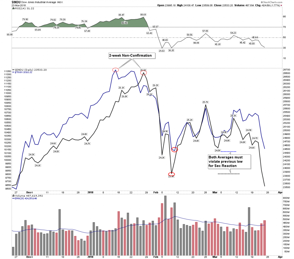
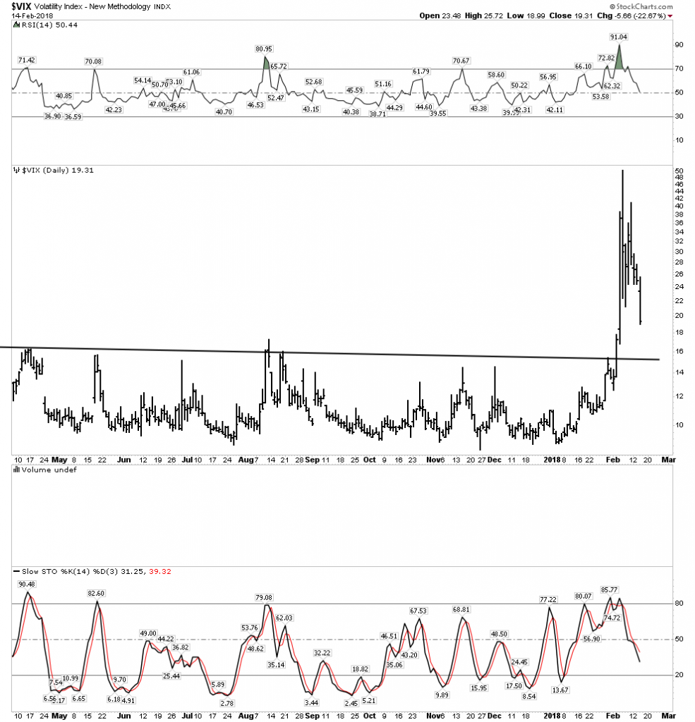
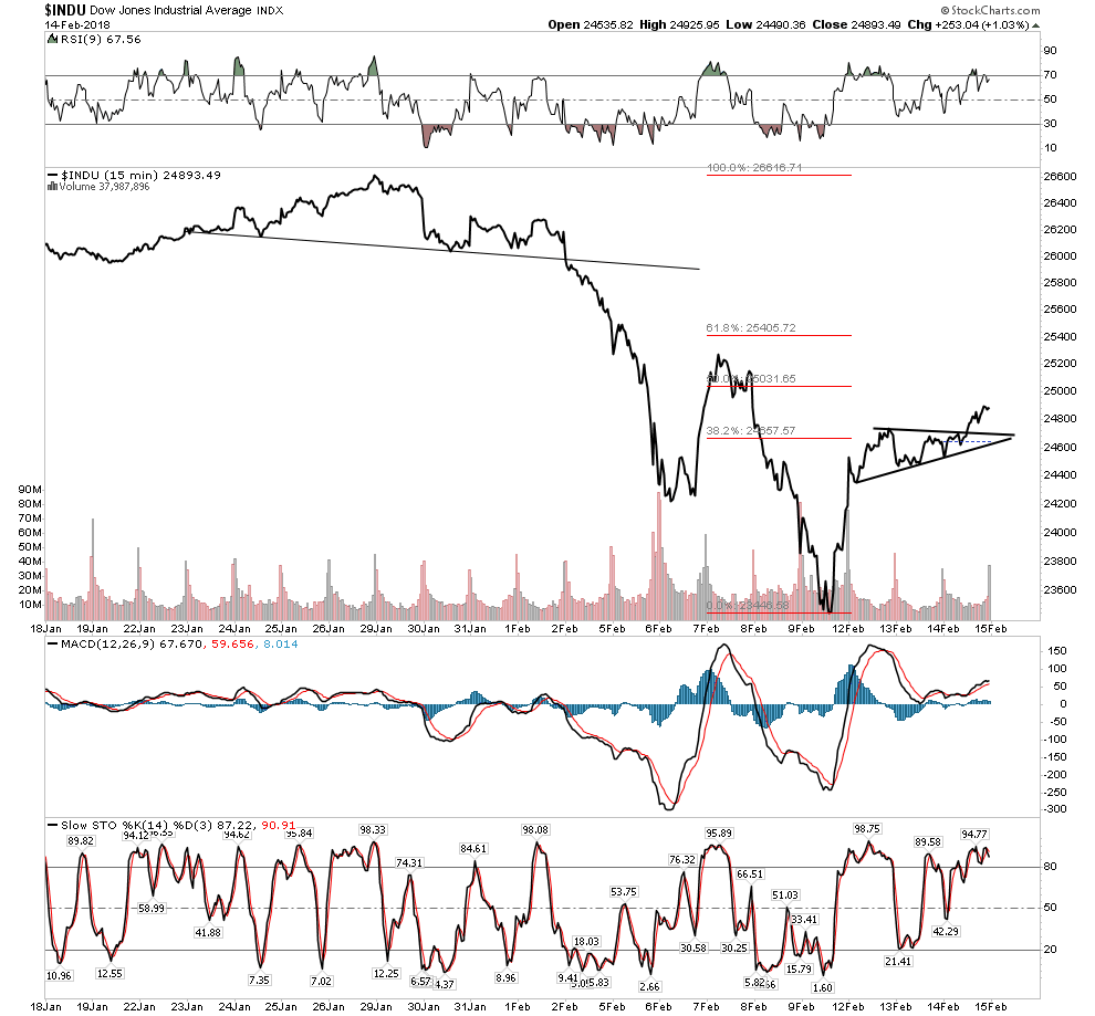
In the weekend report it was pointed out that we should all keep out eye on the VIX.  If the VIX stayed elevated expect more trouble for the stock market, it it dropped below 20 then we could expect the market to have a decent rally or even recover its losses of the past 10 days.  Well today we got the move below 20 and the market is starting to look a bit better as the chart below shows.

Dow– Note the mini break above the consolidation

I have made my opinion clear that the general stock market could  regroup and recover, but I am not interested in playing it. I see too much opportunity in the upcoming bull market in the PMs and the resource sector.

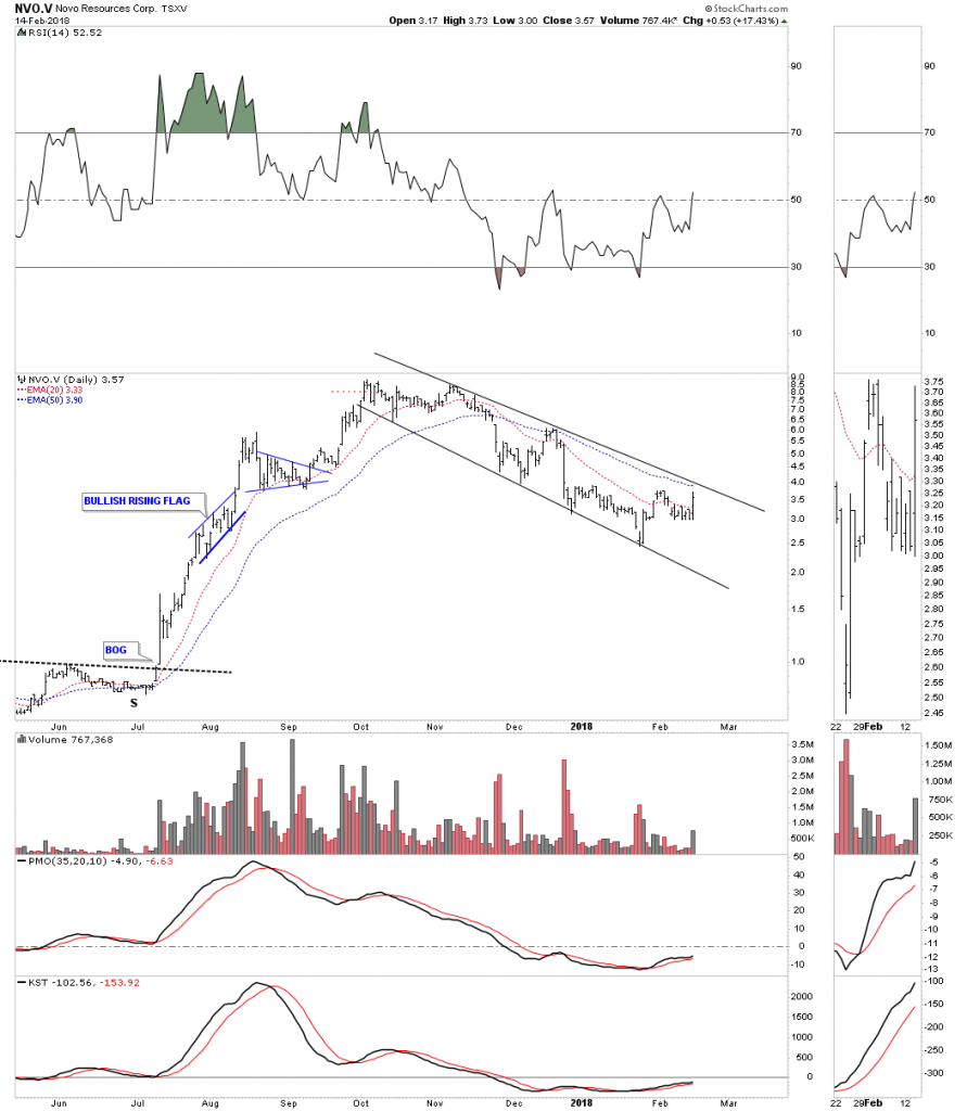
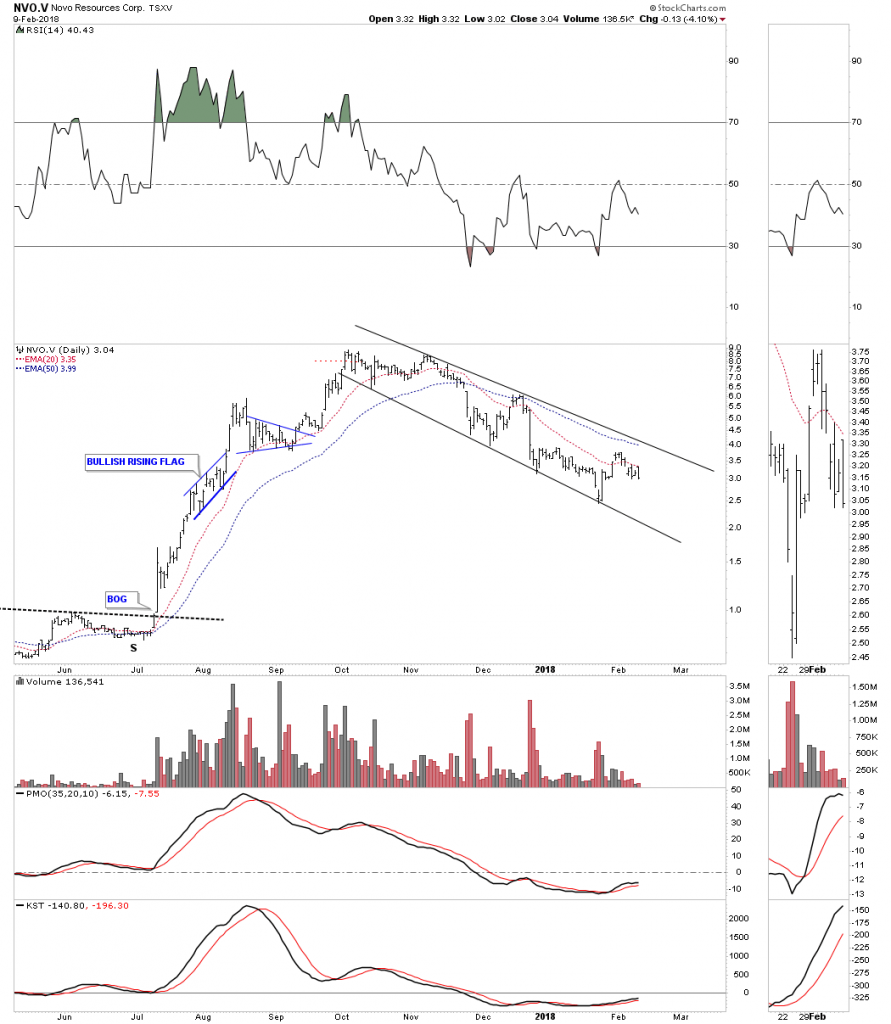
Novo Wakes Up

Another little surprise today was Novo resources busting a move.  Again the weekend report noted that it appeared that the worse may be over and it was prepping to reverse its trend and start heading higher.  Hopefully it will have the legs to break above the channel in the chart below.

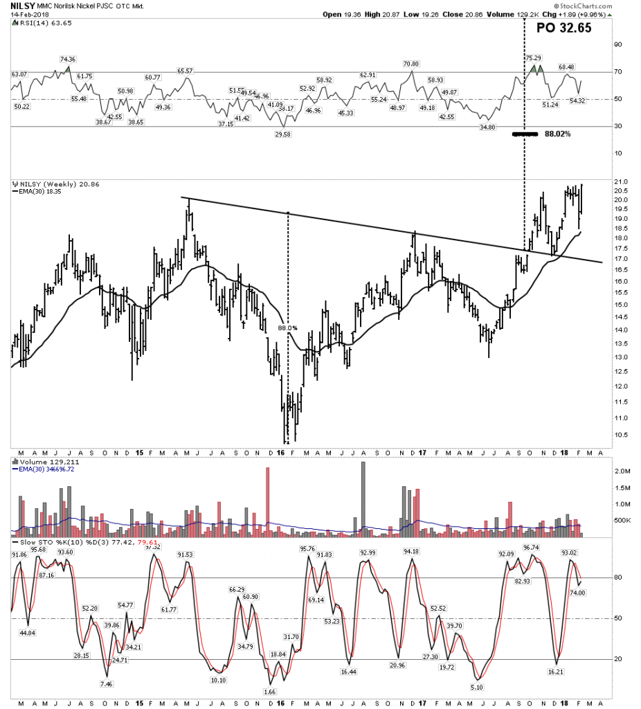
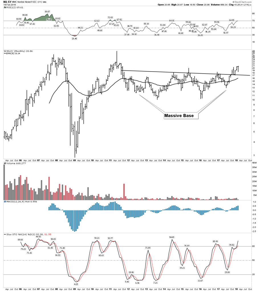
Norilsk wasted no time today to reassert itself.  This is our little core nickel play considered a safe way to play the battery metal EV theme.

Big Base=Big Move

Getting Serious About Silver

I have to tell you that this realization has just hit me like a 2X4 in the head.  Frankly it is totally counter to my understanding of the fundamentals of silver and how it fits in the big picture of the sequence of which asset classes perform first in a new bull market.  It has always been my understanding that silver is the latecomer to the party.  That’s the way it has been in the past.  After all silver is chiefly an industrial metal since its traditional monetary role has faded. So when an economy enters a recession silver should weaken right?  After the devastating bear market from 1929-1932 silver actually bottomed 6 months after the DOW.  Whereas the DOW completed its 89% decline in July 1932 silver continued declining until Dec 1932.  When the gold stocks bottomed in Jan 2016 the silver stocks severely lagged the gold stocks for the first 6 weeks of the rally.

So it’s normal that silver comes along later and puts in its big gains once the market gets going. That’s the consensus since that’s how it has been in the past.  But here is the value of chartology… it tells us real time if something different is happening.  It appears to me that the silver stocks are getting ready to begin their advance in the next phase of the bull market.  They actually appear very bullish as they have the appearance of being in the later phase of their consolidation of the big move of their phase I advance.

The Most Important Trait of a Successful InvestorPatience

This past week I noticed several comments on the forum expressing frustration that the PM stocks were not acting like they were “supposed” to.  Inflation goes up the PM stocks should immediately respond also.  When the stock market goes down gold stocks are supposed to go up- right?  Let me just say that we all need to have some patience.  These things take time, we can’t be in the instant gratification business.  In the future I plan on writing a piece explaining the dynamics of what makes the gold stocks run in a bull market.  But for now let’s just trust the charts and see what they are saying:

Gold & Silver- actually what we would expect

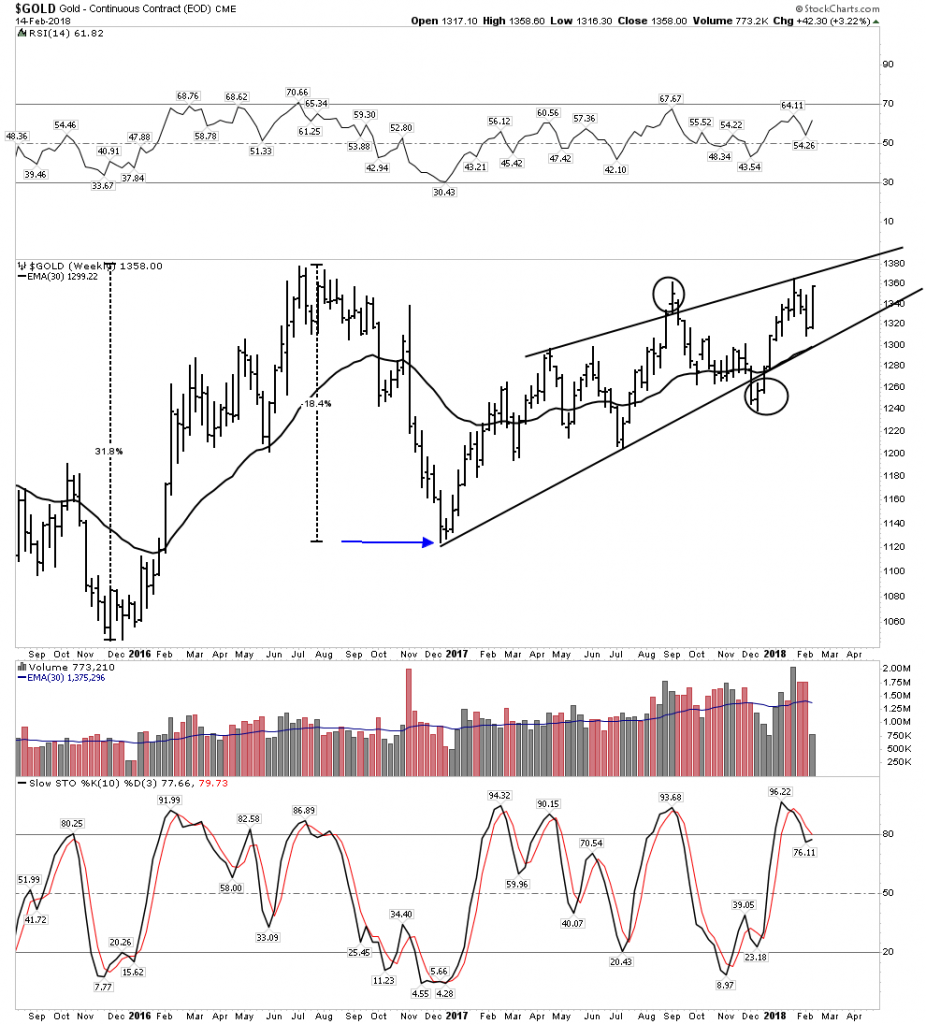
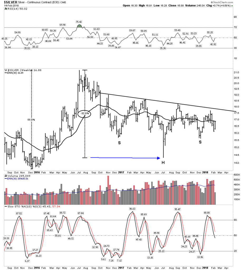
We have discussed before that gold and silver began their bull market in Dec 2015.  They both had a great phase I rally into late July 2016.  Gold then corrected and consolidated this move over the next 6 months and put in its correction bottom in December 2016. That was an 18.6% decline.  It then began Phase II of its bull market where it remains today.  Silver also peaked in July 2016, but it took an entire year, until July 2017 to correct the first leg up.  That correction or consolidation gave back 32.6% of its first leg up.  It appears silver is now in the early stages of its bull market phase II.  Therefore we can see these metals have performed as we would have expected.  Gold rallied 31% whereas the more volatile silver rallied 55%.  When the corrections came gold lost 18.6% in 6 months while silver lost 32.6% in 12 months.  This is classic behavior.

Silver…Playing catch-up, but getting ready to romp.

One more thing, We are in a real bull market here, although early stages.  It’s the real deal, just look at the thin blue volume line on both charts representing the 30 W EMA of volume.  It is in a constant expansion.  Volume rises in a real bull market.  It is noteworthy that volume has slowly declined in the S&P over the past 9 years….hmm…

It’s Time to Wake-Up and Smell The Coffee

But here is where we need to sit up and pay attention.  The silver stocks now appear as a group to be ready to finish the correction they have been in for the past 18 months.  Where I have been content to think the bottom in these stocks will likely come during the seasonal doldrums of late summer where the PMs usually go to sleep, it appears to me the turn up may be sooner than that.

The Long Term Monthly Charts- The big picture jumps right off the page

After the decline of most stocks over the past 2 weeks the daily chart patterns of the silver stocks look particularly gruesome.  Looking at these charts does not motivate one to go right out and buy these things.  Frankly they are downright ugly.

But here is the thing…When one looks at the monthly charts some of these patterns simply jump right off the page and say buy me now!

MAG Silver

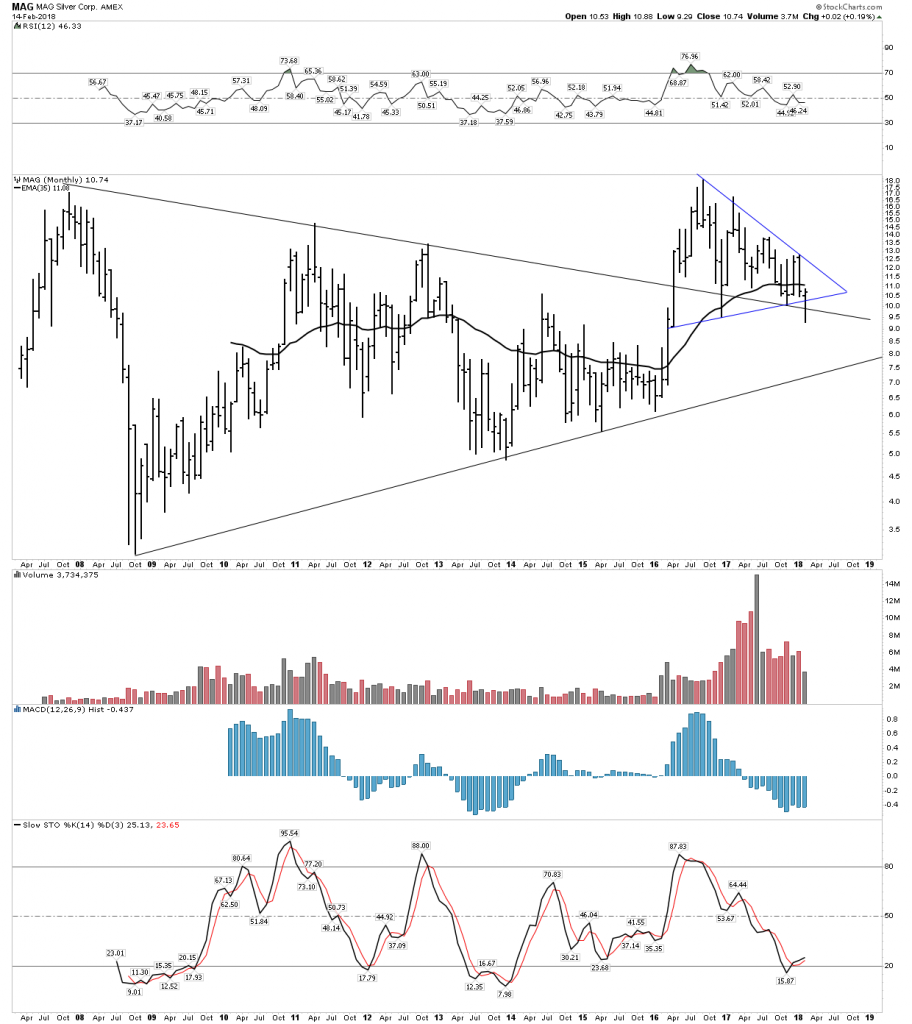
Mag was named my Blue Ribbon silver pick in the year end edition.  In the chart below we take a long term 10 year monthly look at MAG. OMG is this a thing of beauty!  Understand the principle of coiled energy and when it is released it powers a move.  It coiled energy for 7 years inside of that big triangle. The BT to its breakout of its horizontal triangle has been on going for two years now.  Furthermore the recent drop below the upper triangle line is likely a classic wash out move just before it launches on its power drive.  IMO the chartology here is telling us this is a perfect entry position.

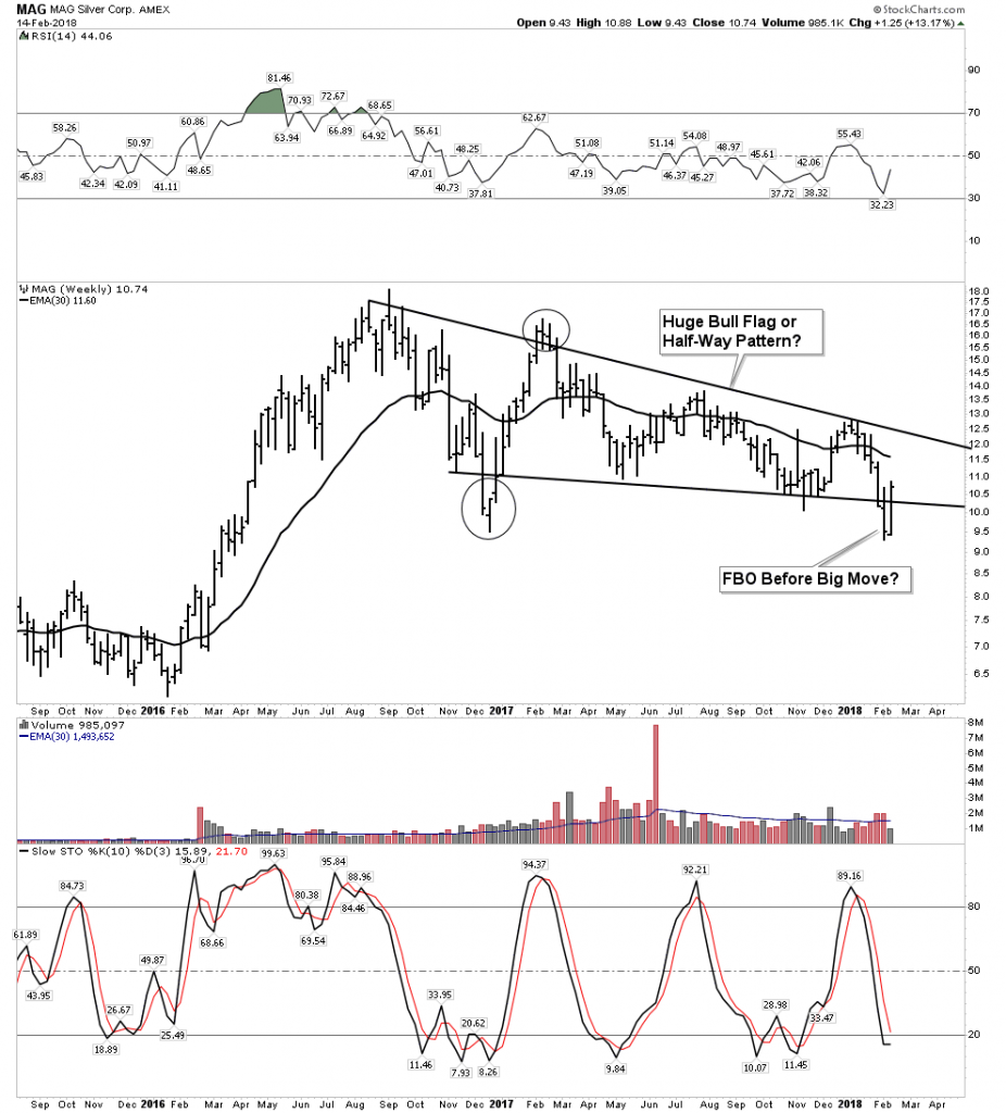
Looking at the weekly chart we have to ask could this simply be a half-way pattern?  When MAG was began it was Dr. Peter Megaw purpose to find a silver deposit that would be profitable at $4 silver since that was back in the early 2000’s before silver made its advance.  MAG is super grade.

Fortuna- Monthly

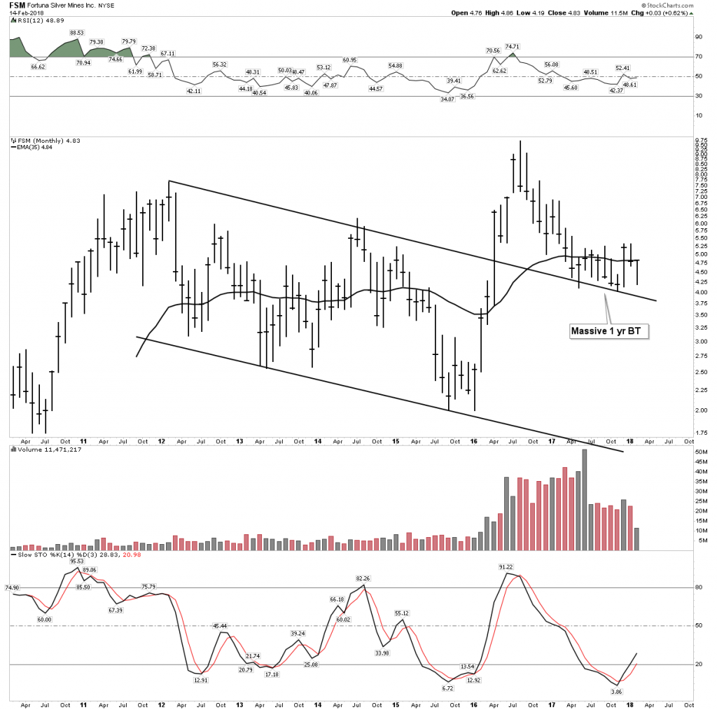
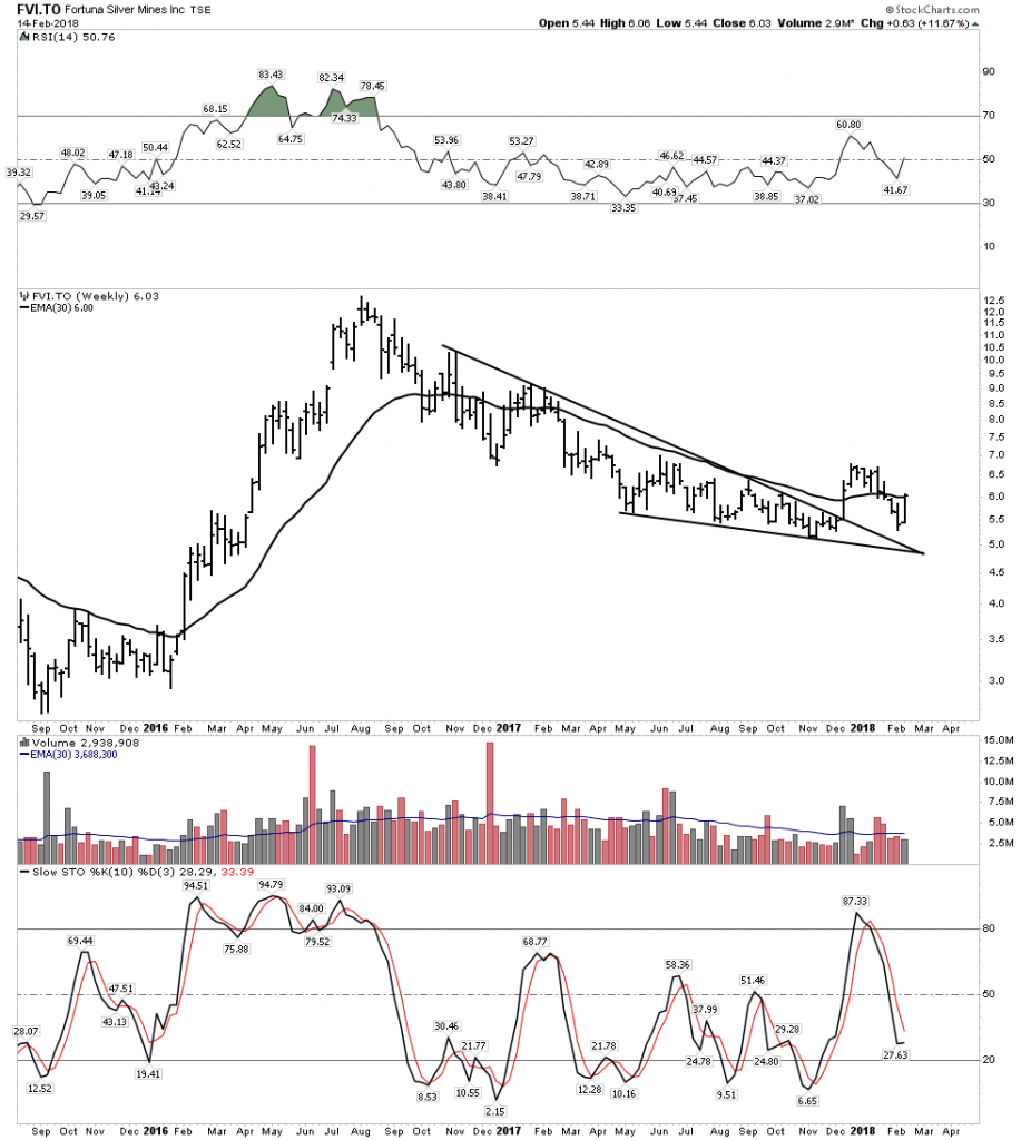
Again here we have a long term chart that jumps right off the page at you.  Fortuna has bored me to death over the past year.  Well now I understand why, it is simply taking its time to build its BT base and getting into stronger hands for the big move ahead.

Fortuna Weekly:

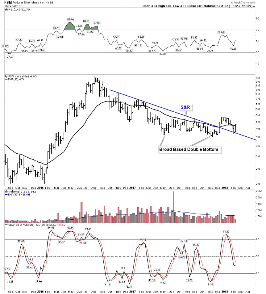
Fortuna not only has silver but has massive high grade zinc.  Zinc will come into its own this year.  Note today it broke above its 30 W EMA….nice.

Pan American– Ross Beaties Powerhouse

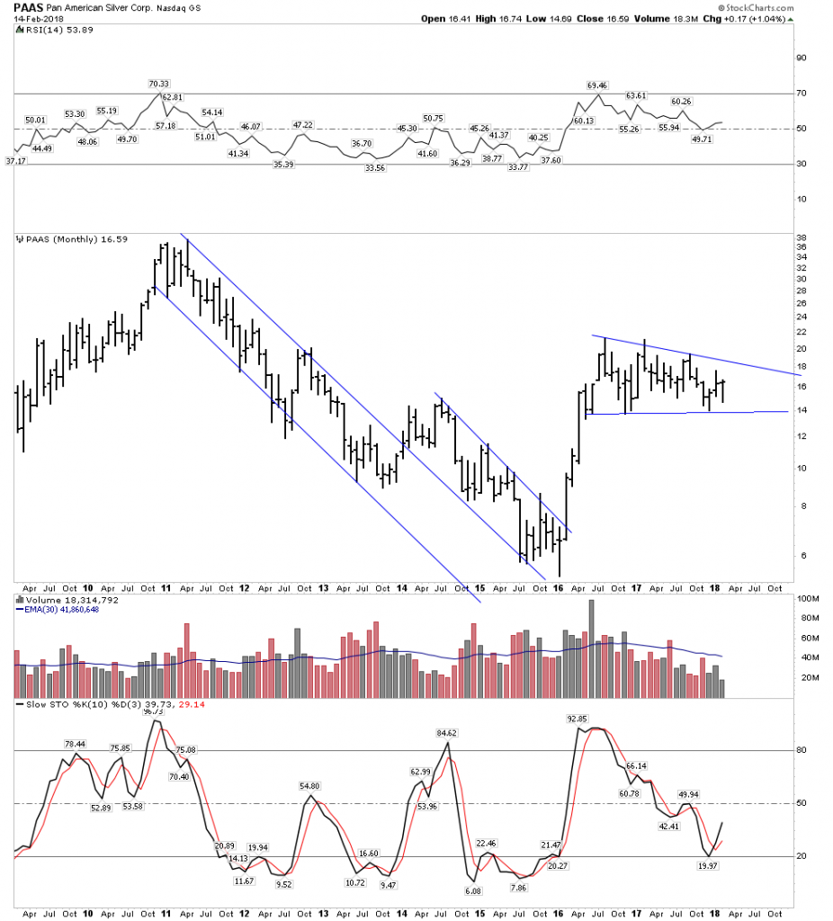
The monthly on PAAS shows a nice bull flag consolidation.  It has been going for just under two years, when it breaks out they have lot’s of upside leverage:

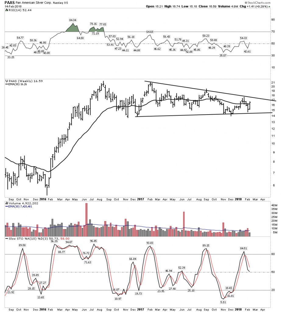
The Weekly shows the resistance to giving up any ground.

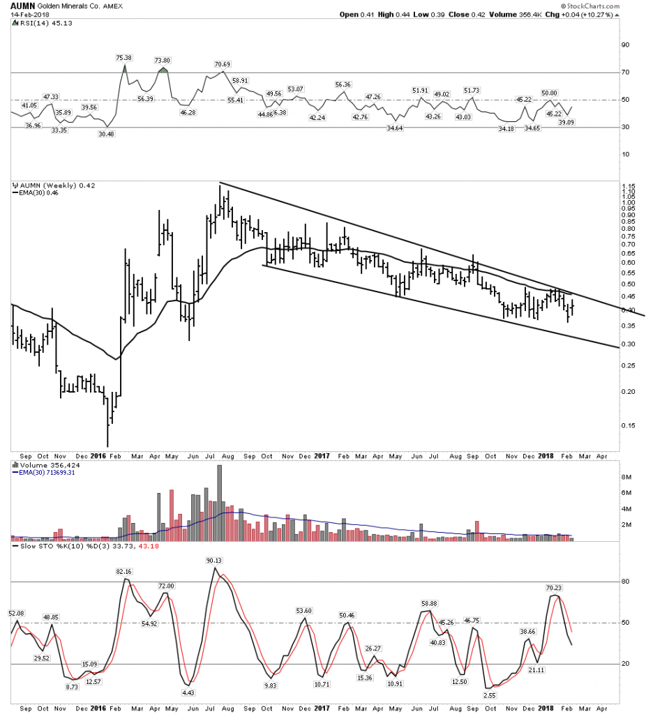
Again I am not going to be displaying the daily charts as the noise in them detracts from the big picture.  Below I will show numerous weekly charts of silver companies that are in different stages of finishing up their long correction.  You can see that there remains little time remaining before the big move begins:

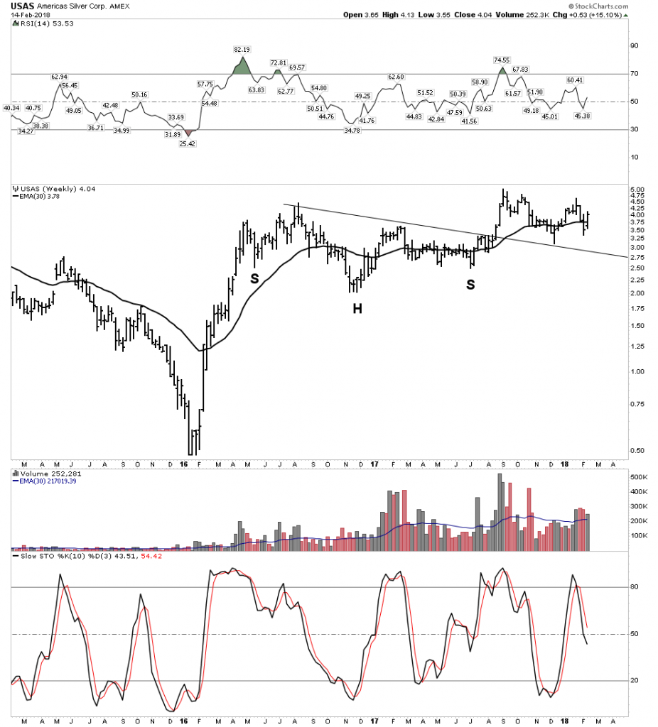
USAS superb:

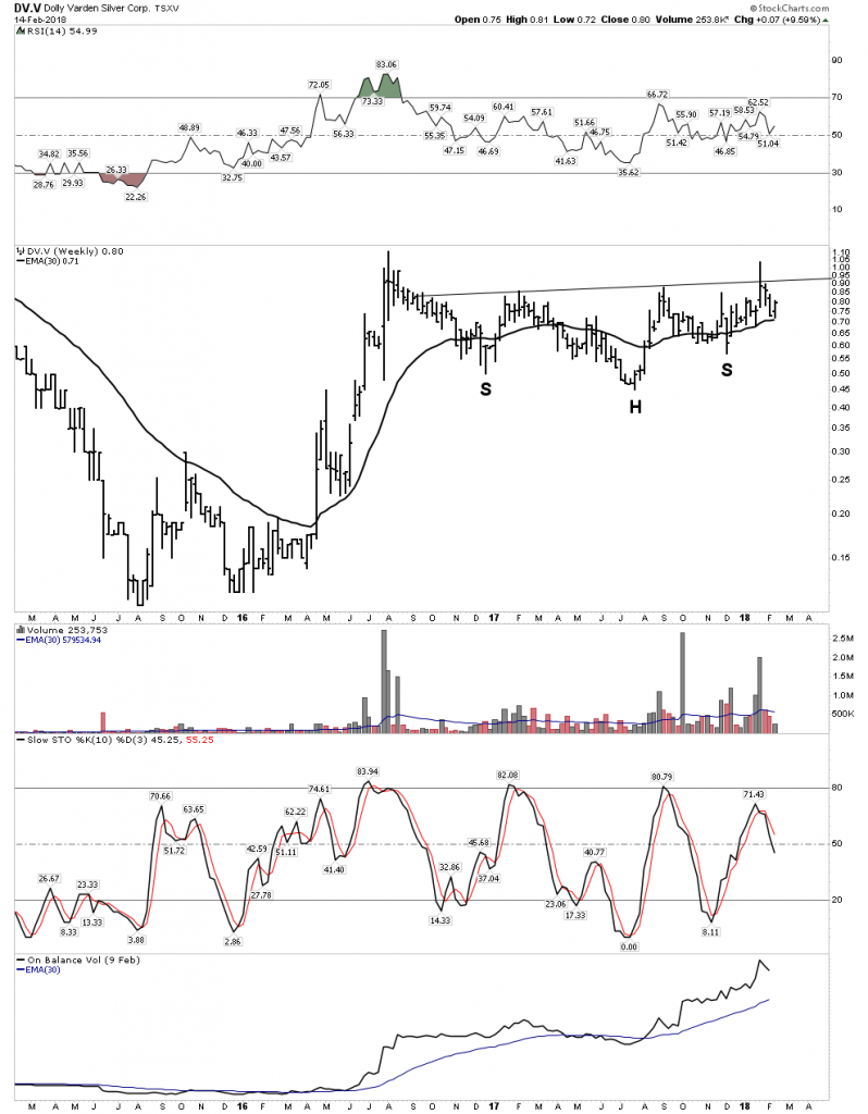
DV– My personal favorite after MAG

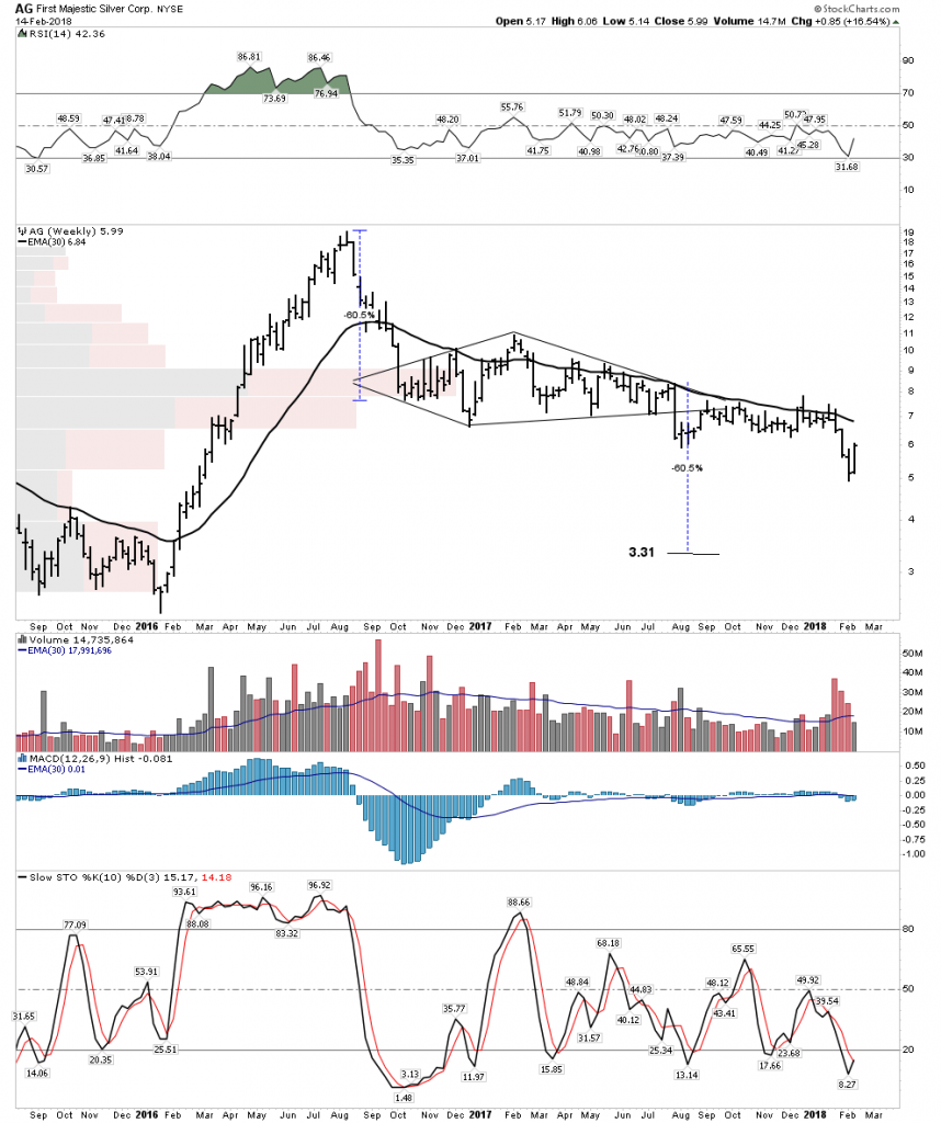
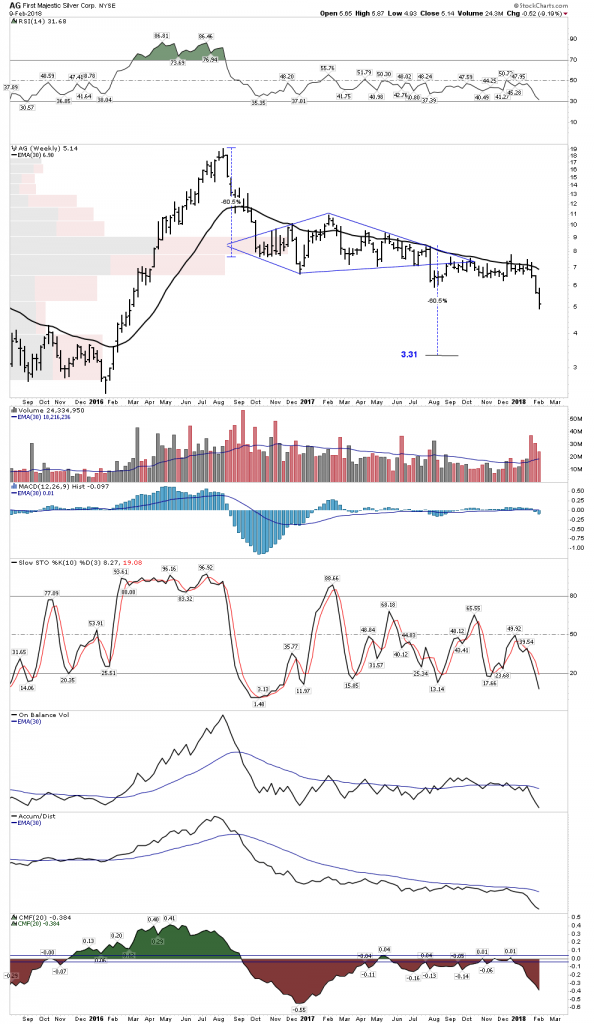
AG  Another big primary producer. Maybe it will never reach 3.31

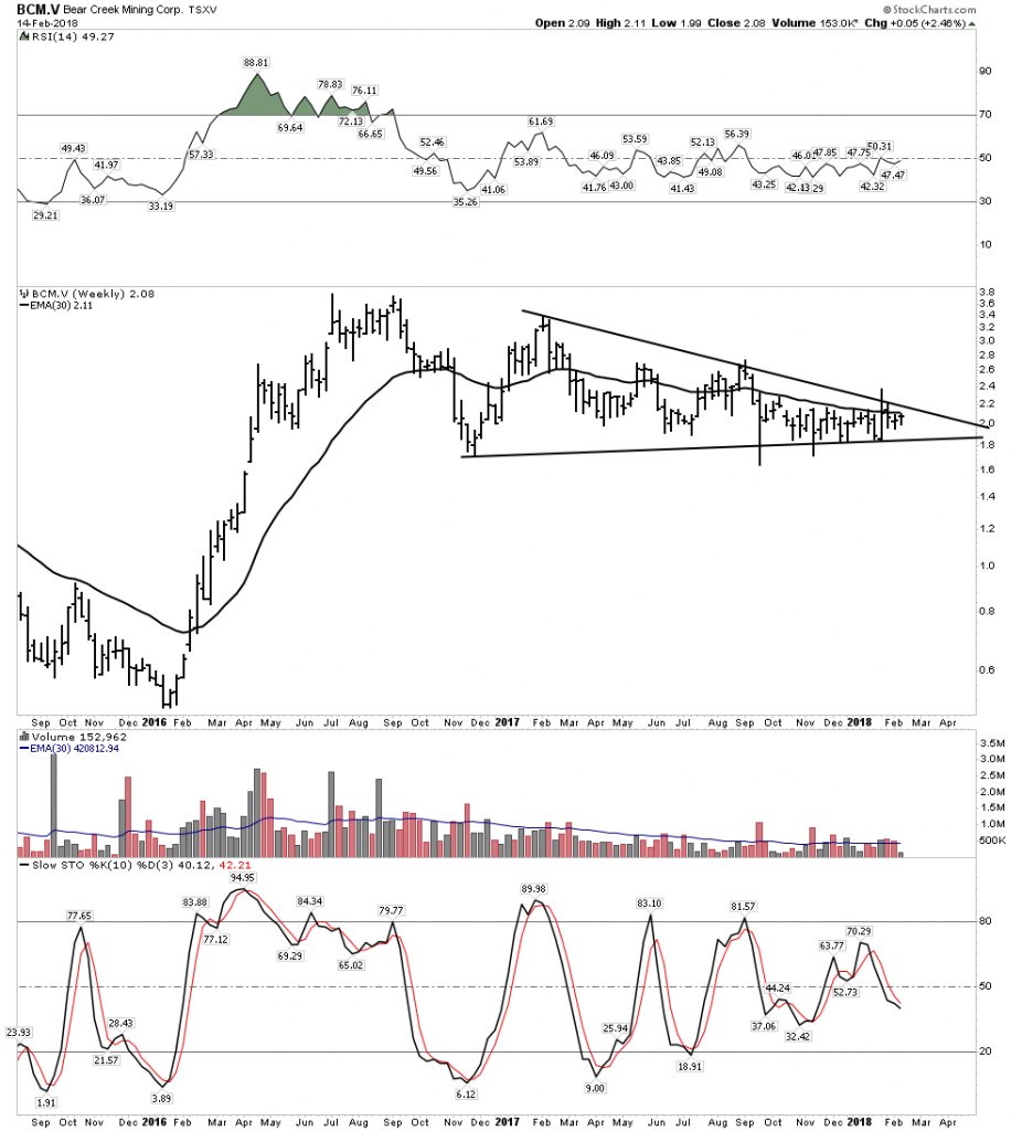
BCM– Super Leverage

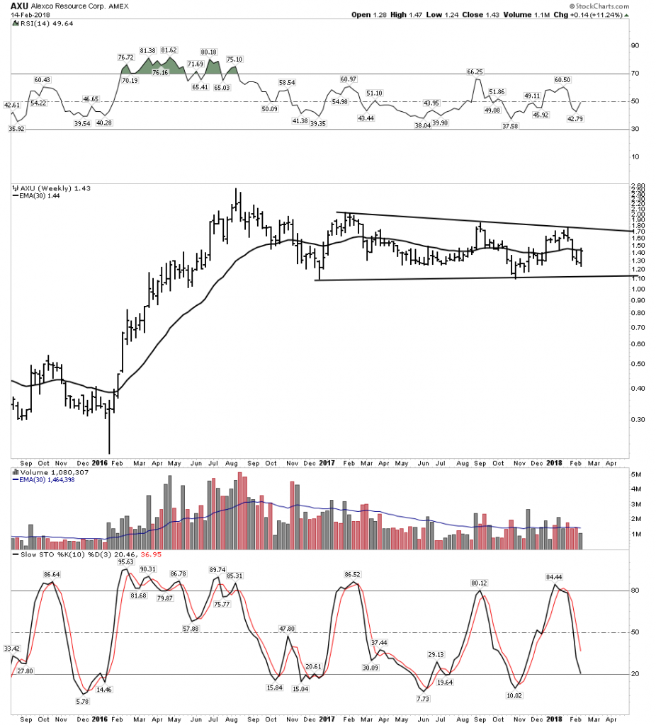
AXU High Grade

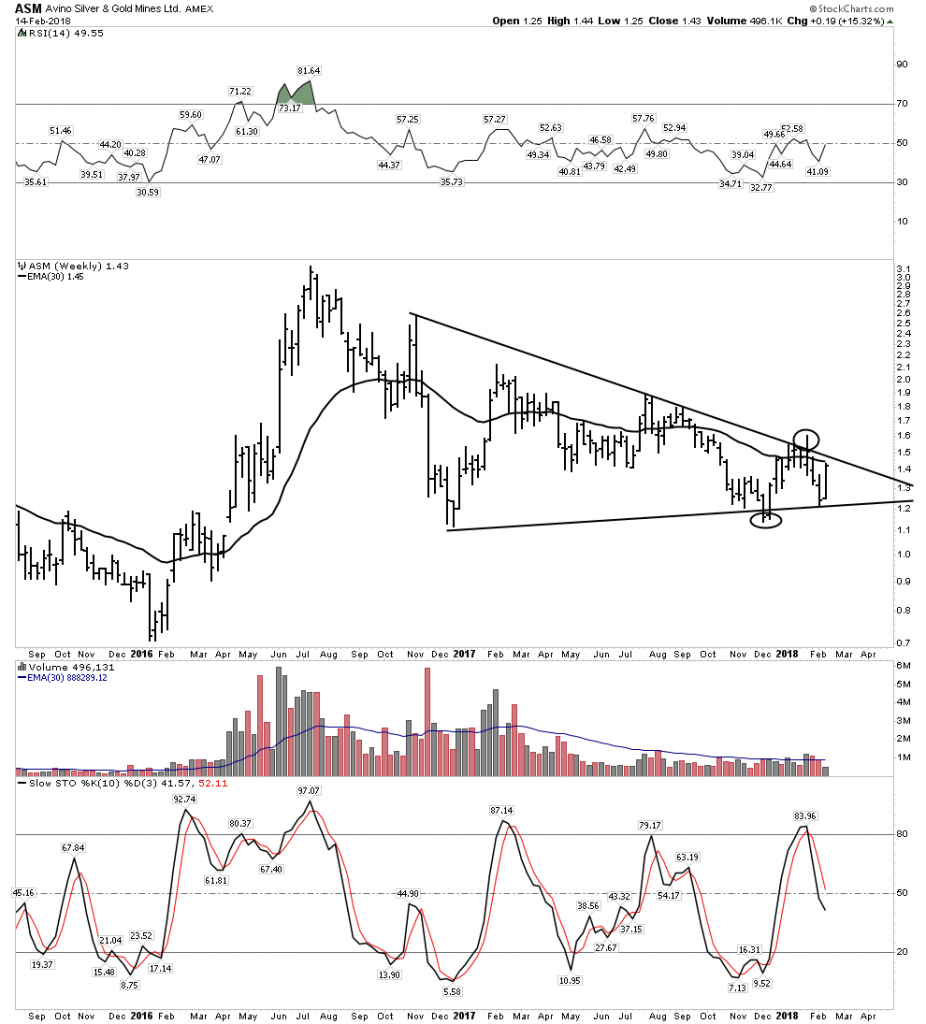
ASM– The Spanish called this “Mountain of Silver”

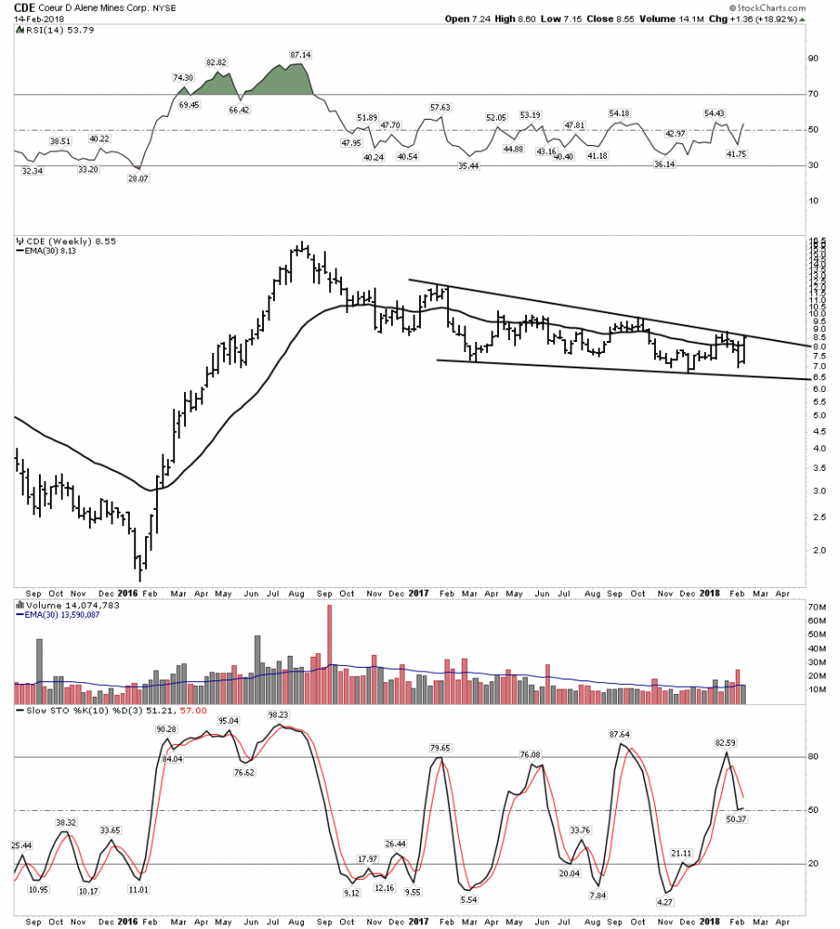
CDE-used to be the crap company of the sector… Times have changed.

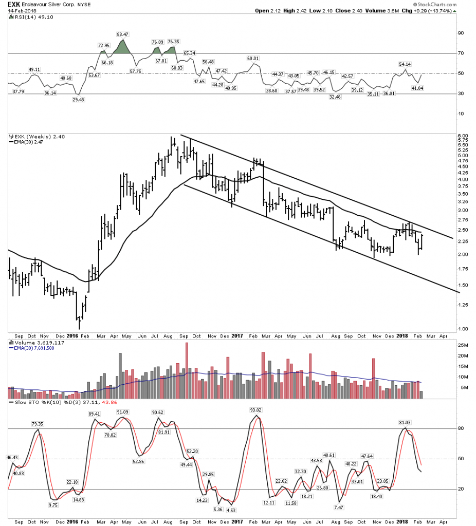
EXK– Solid Mgt.

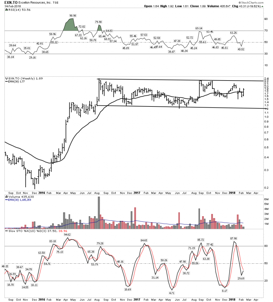
EXN– This is a large holding of Eric Sprott

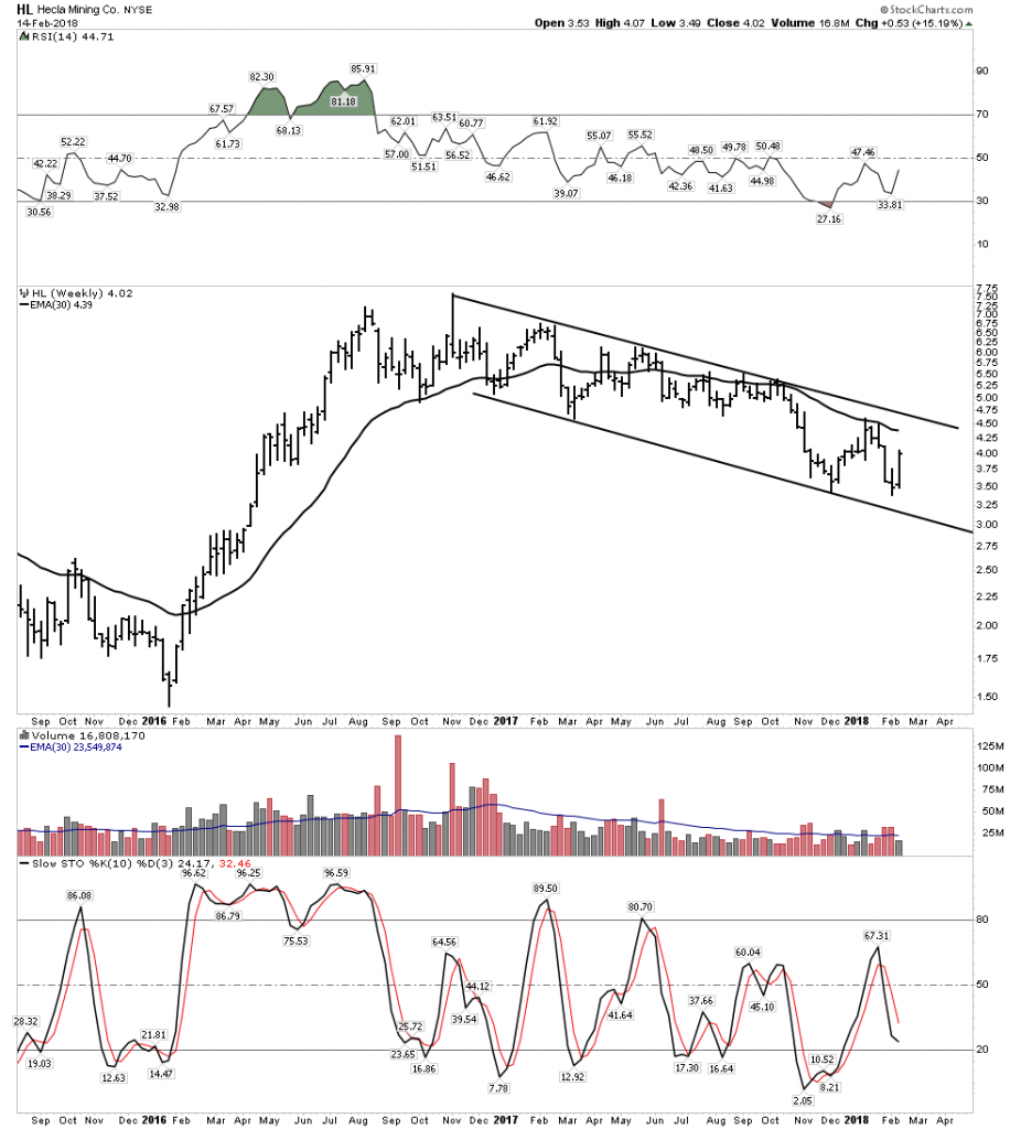
HL Big Name Producer

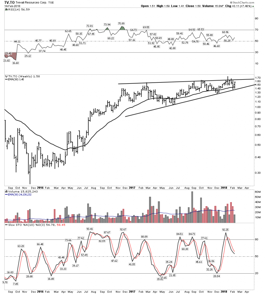
TV– Little known but on the move

One of the key things to remind oneself of is that over the past 2 weeks with the markets crashing all around, these stocks have remained in their consolidation patterns.  No technical damage on the weekly charts.  This is very encouraging and speaks to the case that these stocks have absorbed all the punishment intact and they are in stronger hands now.  They are ready to advance.  I ask you can you say the same for the average stock in the S&P 500?

Weekend Report-The Topping Process Begins. The Bubble Finds its Pin.

Volatility has now returned to the stock market after a hibernation of several years. An explosion of volatility normally is indicative of a change of trend. The recent signals transmitted by this market have been classic  and has been telling us that we have entered the final topping process of this extended and stretched economic cycle.  The trading over the past 7 market sessions fit a classic pattern of market panic which corrects  the excesses of a market which just completed an upside climax and had been without correction for close to two years.  I believe this panic is now over and the muscle memory of buy the dip will now reassert itself.  That however does not mean good times will continue as the froth has now been blown off of the bubble.

Anecdotal signs of a market top have been flashing loud and clear now for the past 6 months. Since last summer the public has finally embraced this market and over the last 3 months have been recklessly plunging head long into it. Complacency reigns supreme so that after last Friday’s 666 point drop even the superstitious remained complacent.

Complacency exists due to the lack of any meaningful correction over the past 2 years and valuation levels set records with the S&P 500 trading at 26X earnings and the Russell 2000 at 150X earnings. With interest rates now in an established uptrend we now have a bubble in search of a pin…looks like it may have just found it.

We have noted before that the month of January often accommodates market tops. Gold in 1980,  the DOW in 1973 and the Nikkei in 1990 are stand out examples. With the Deep State spying scandal now reaching critical mass the similarities to the Watergate bear market of 1973-1974 have become undeniable.  The scandal reaching critical mass means it will now have to run its course to completion,  exerting a cancerous effect upon the market.

The Bloated Market Exhausts itself

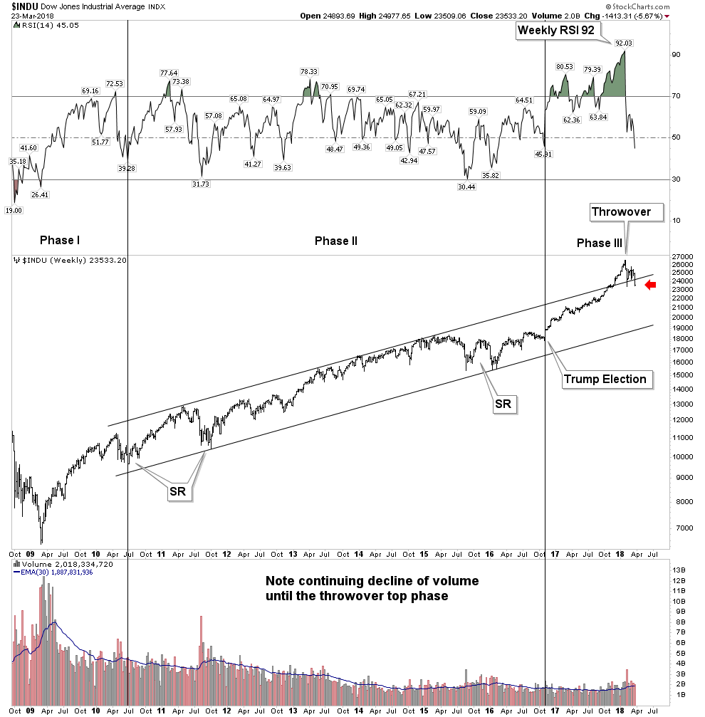
After putting in 15 consecutive months of higher lows and two years of closes above its 50-week moving average it began to feel like the market would never go down again.  After prolonged rises such as this when a correction finally comes around it can unfold quite violently as this one indeed has. Most investors actually have no idea just how extended this market had become. In late December I wrote the piece on how the DOW had entered a throw over top. Throw overs such as the DOW in 1929, Nikkei 1990 and Gold 2011 where shown. We now see the resolution of the current throw over is shaping up like others in the past.

1929 Throwover Top
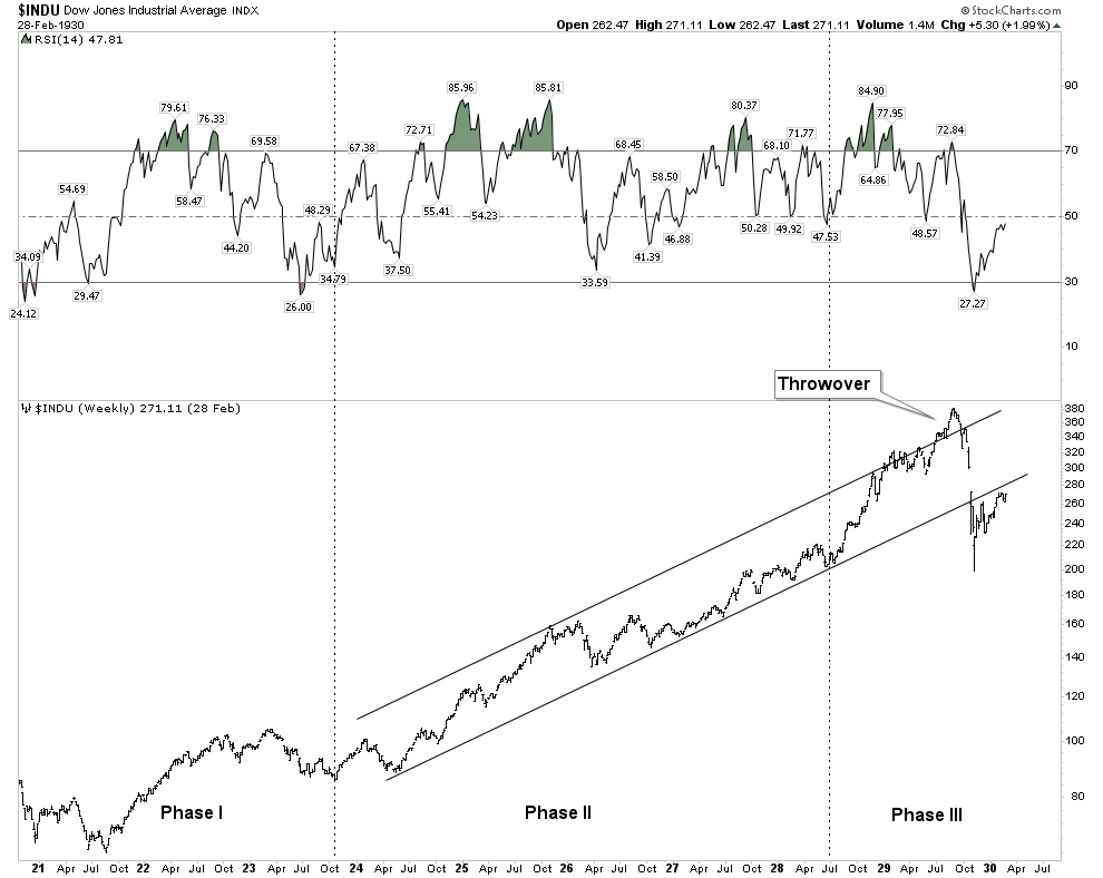
Note how in 1929 RSI peaked at the beginning of the year and the market was able to continue to advance until Sept 1929.  This argues that today’s market should eventually be able to regroup and make a renewed assault at the existing highs.  No guarantees that it will, but in the past momentum has peaked before price, not with price.

2018 Throwover Top

It is important that price immediately close up above the upper trend line or the 1929 example could develop. There is so much residual momentum in this market that it could resume its march back up towards its January highs.
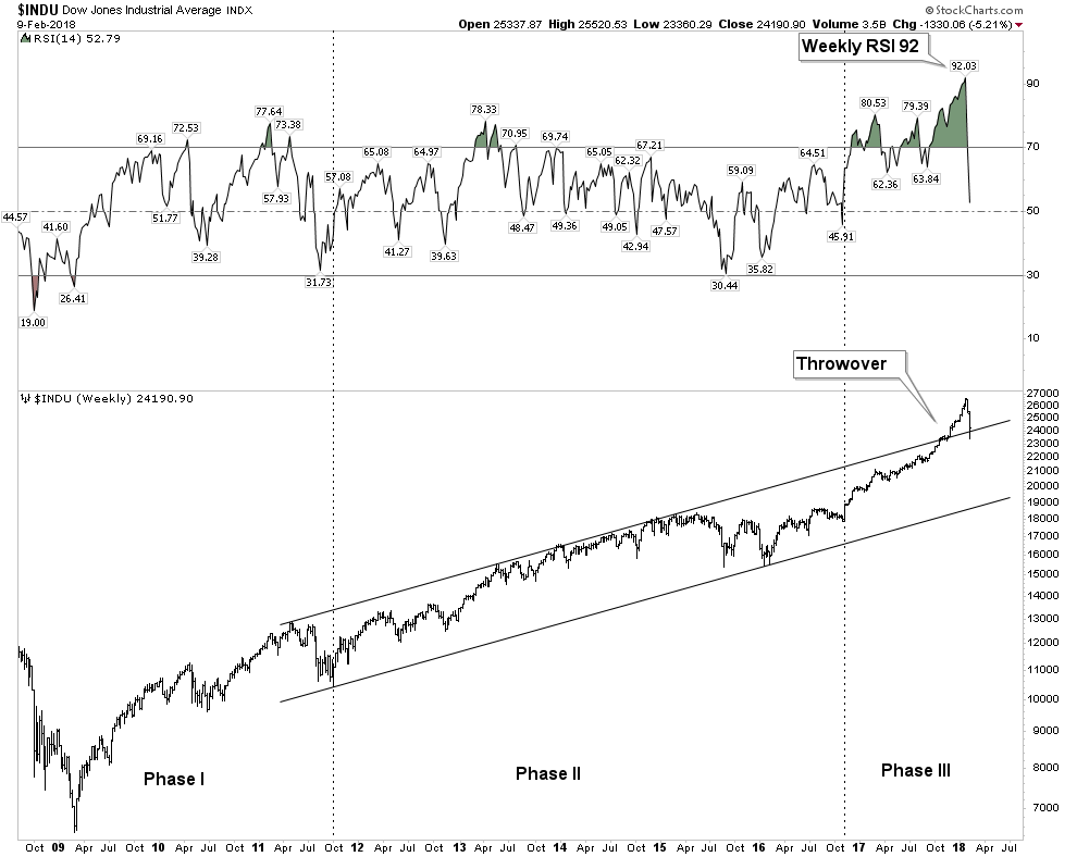
Upside Momentum- Just How Crazy it Had Become

When reviewing the RSI of this market it simply had become insane.  How crazy?  100 year flood plain crazy.  The below chart shows how ridiculous the upside thrust of the last few months had become.  Weekly RSI had reached 94- that is simply INSANE.  The NASDAQ back in the Dot-Com mania only reached 84 and surely you remember how nuts that was.
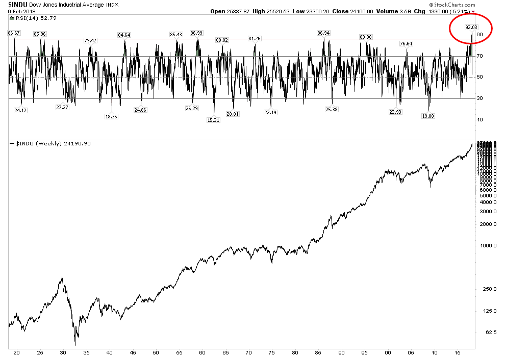
The Phase III mania top

What we just experienced over the past 3-6 months was a phase III mania top. It fully expressed itself in the throwover.  The retail public finally came in and threw caution to the wind.  It is the final bull run that excites the imagination, however precious little money is made from entering the market at these times, but the bull mania is contagious and it is precisely these times that lambs rush to the marketplace and of course eventually to the slaughter. No money is made, or at least banked in the climatic months of a great bull episode. Serious money is coined by purchases made in bad times, not by chasing fading rainbows of a mature advance.  But that is just what we witnessed.  Just as winter follows summer, bear markets follow bull markets and the seasons continue.

BITCOIN- The Cherry on the top of the Everything Bubble

That is the best description of the bitcoin phenomenon I have seen.  Bitcoin started out as an alternative currency in response to the reckless money printing and debt monetization of the central banks.  It was a legitimate libertarian attempt to address the issues of currency store of value and oppressive sovereign banking.  Just like what happens to all people who get close to Hillary Clinton central bank money printing corrupts everything as well.  Bitcoin morphed into a risk asset not a currency due to its violent volatility.  Its store of value function has been trashed and the inherent flaw of its blockchain has been revealed to be massive electrical consumption.

If bitcoin doesn’t function as a currency what can explain its moonshot rise?  It is best explained as an unintended consequence of easy-money monetary venting.  Like skyrocketing art prices for the rich, bitcoin became the preferred vehicle of money flows of the young tech savvy libertarian crowd.  Simply another case of excess money printing having to go somewhere.  It has now had a quick 70% drop, but holders are still holding as there has not yet been any capitulation.  This argues for lower prices ahead.

The slaughter of the cyptos is part of the process of wiping the froth off the top of the everything bubble.  This marginal investor class has now lost a lot of money and that money is not coming back into the market since it’s gone to money heaven.  So when the stock market resumes its advance there will be less juice in the system to fuel its rise.  It is significant that bitcoin, the most speculative asset in this bubble, peaked in the historic topping window of Dec-Jan. The peaking of the cherry on the top of the everything bubble symbolizes that its over.
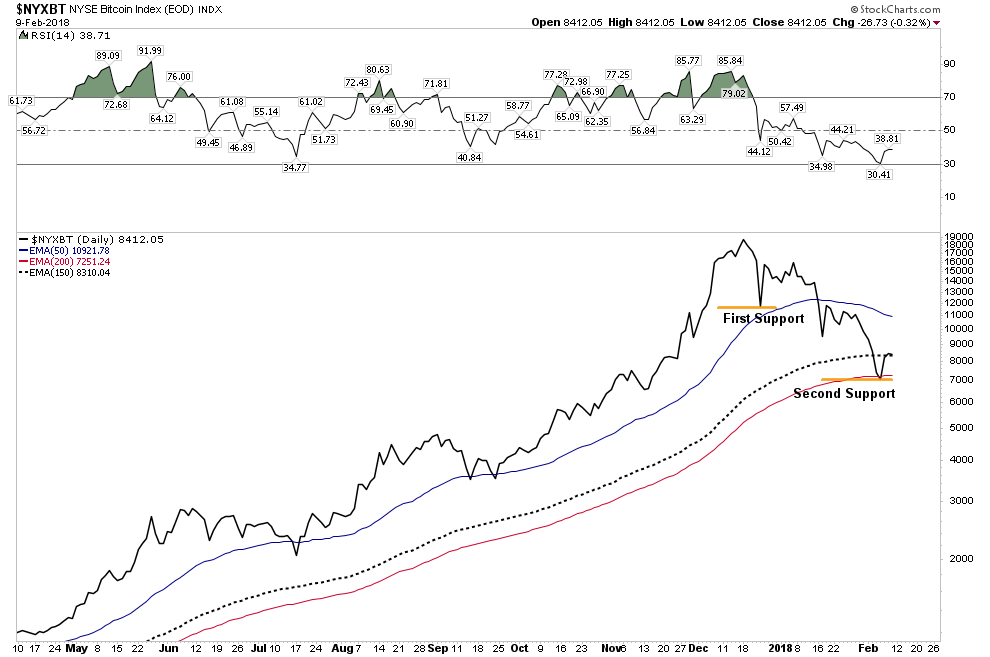
The Topping Process has Begun

The above commentary is not saying the market goes straight down from here in a bear market.  There is too much upside momentum remaining to do that. Over the past week we experienced a violent correction, but it was a classic shakeout type decline. Bear markets are slow grinding declines, the action of the past week was like a fast burning prairie fire, more typical of a correction. A clean out of the Johnny come latelys.

The Structure of Panic

A typical panic will have at least 4 hard down days with a 1-2 day relief rally in the middle of the down sequence. The pressure relief day typically comes after the second hard down day.  The decline then resumes and the 3rd down day is typically the scariest.  Finally during the 4th hard down day within the panic period an upside reversal occurs and the panic is over.  This “typical” model was mentioned in the forum early in the week and is precisely what actually unfolded.  Since 1000 point swings in the DOW have characterized this panic, one could continue to expect after shocks, however I believe the worst is over and buy the dip muscle memory will now come in.  The buy the dip habit wont go away until well into phase II of the bear after plungers have been burned enough to say “no mas”.

In the current action below note the described classic sequence with the pressure relief day.  Also note the positive divergence in the RSI hinting it may be over:
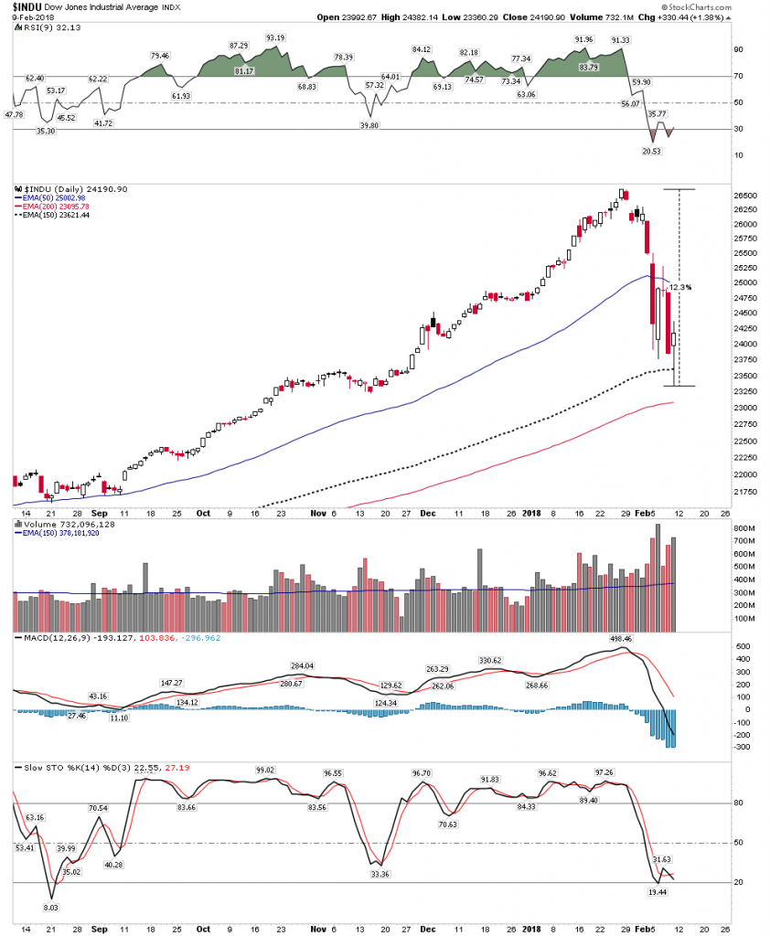
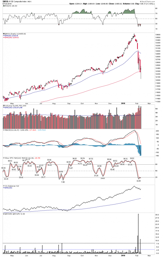
Below we see the extreme Down vs Up Volume bar on the bottom indicator which usually means a reversal is imminent:
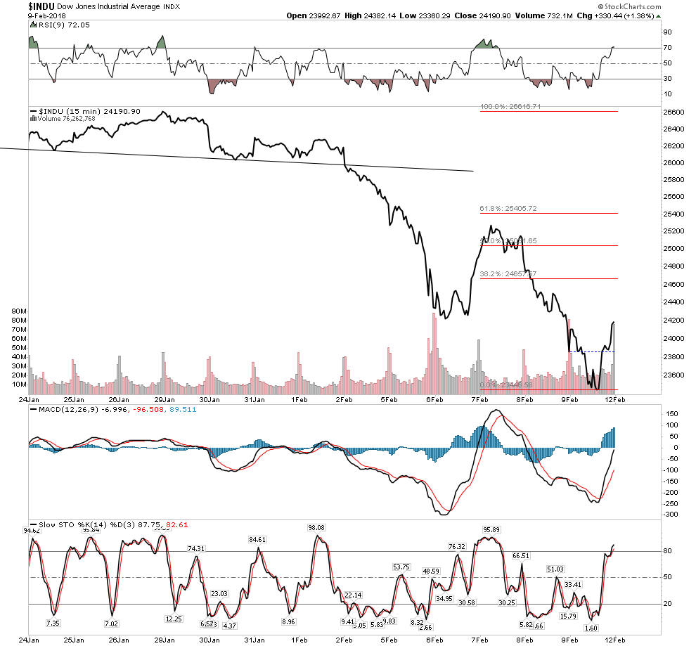
The line chart shows a fledgling inverse H&S bottom starting to build out.
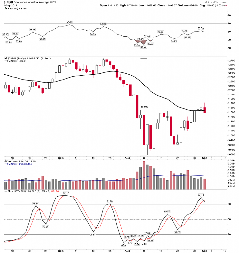
Below we see three past examples of violent froth removing corrections which did not closely follow the classic model.  Their amplitudes were slightly larger than the current correction.
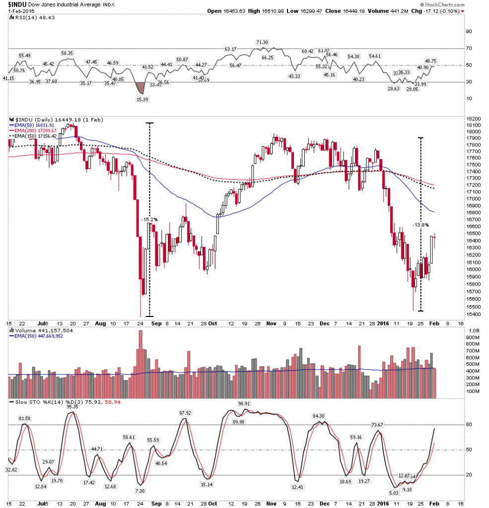
Two in a row:
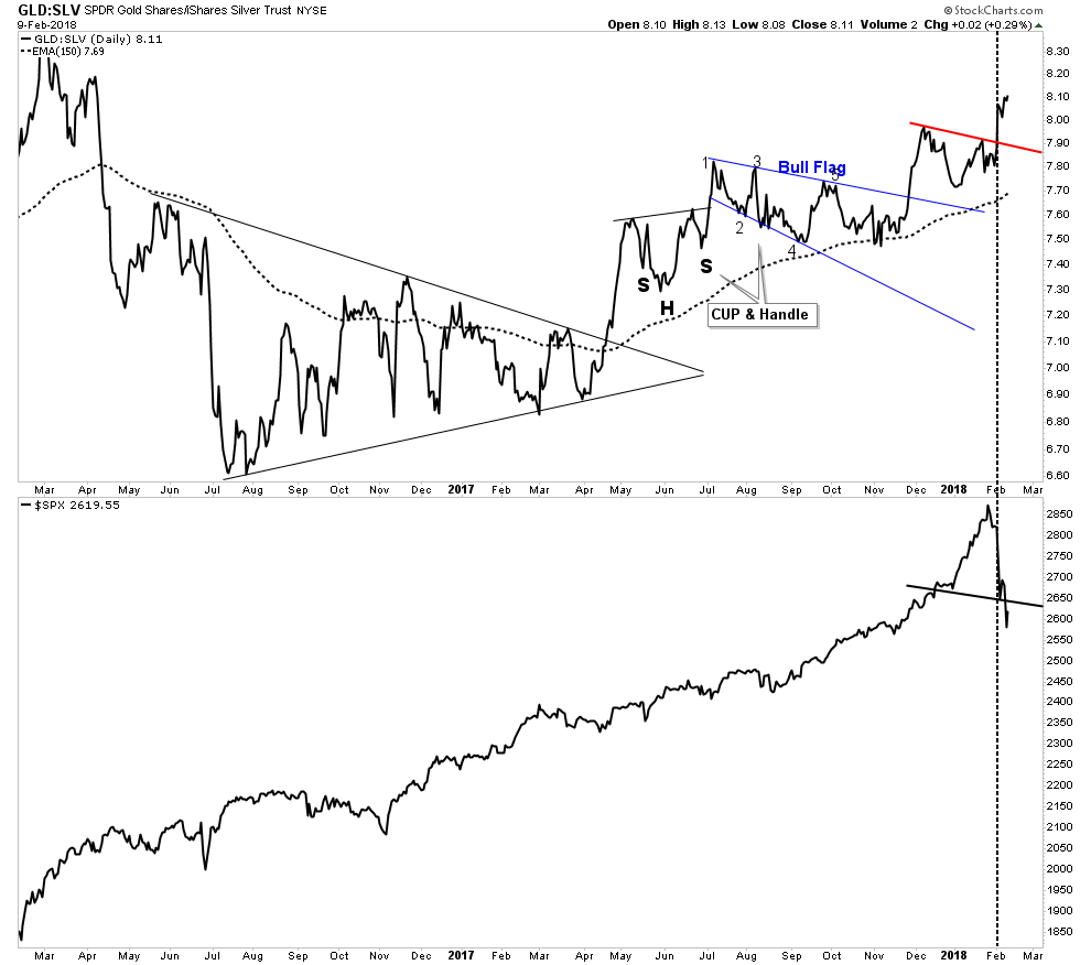
Gold Silver ratio announces trouble ahead.

This indicator has been steadily building since last April.  Eventually the credit stress it was reflecting would reach a breaking point which it did this past week.   We can see the clean break above the NL as the market imploded.  One troubling thing here is how it shows the S&P in a broken H&S signaling it may want to go lower.
The Story of the VIX

For the past 6-7 years speculators have been cleaning up collecting dimes in front of a steam roller by staying short the VIX using the vehicle of the XIV  (VIX spelled backwards) which is an inverse ETF of the VIX.  It worked great until this week when the steam roller decided to shift into high gear without telling the speculators.  Mr. Market decided to take away ALL of their dimes stored over the past 7 years- in one day!
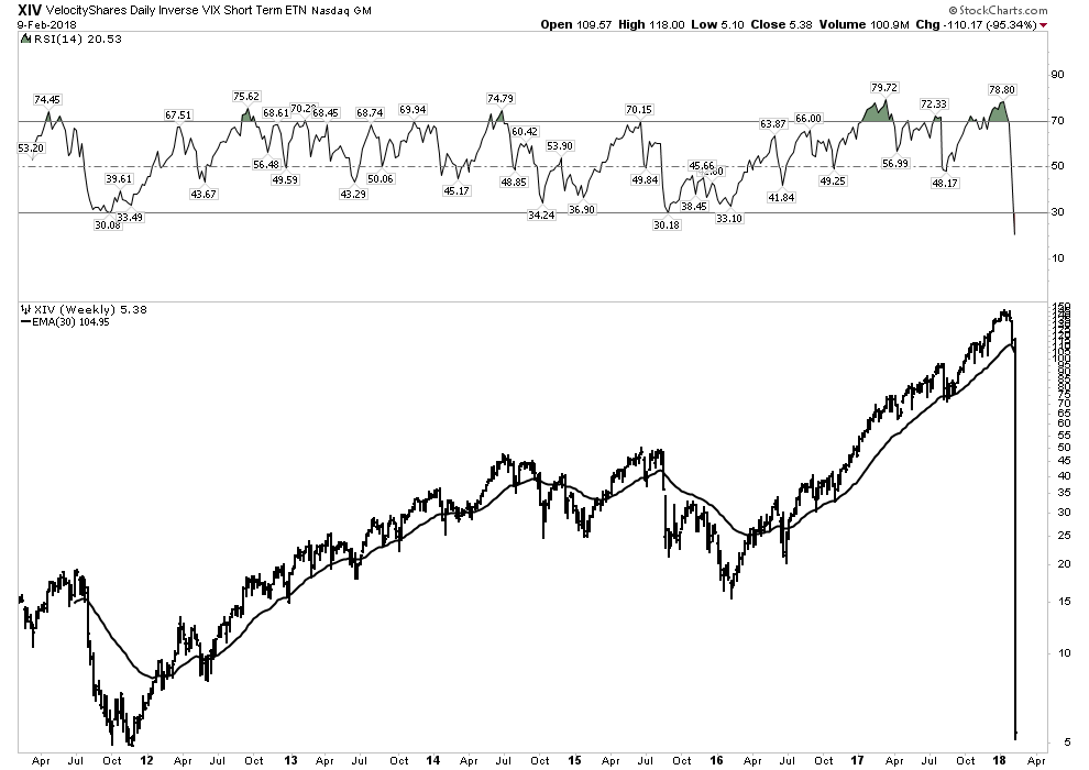
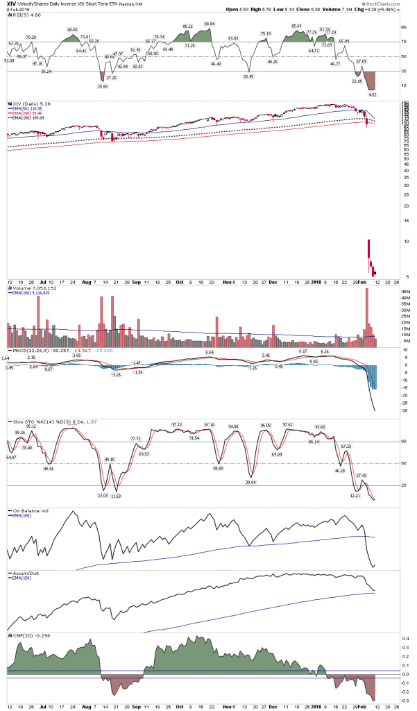
The daily XIV- No one got out alive. 90% losses minimum for everyone- The gap insured there was no escape for anyone.
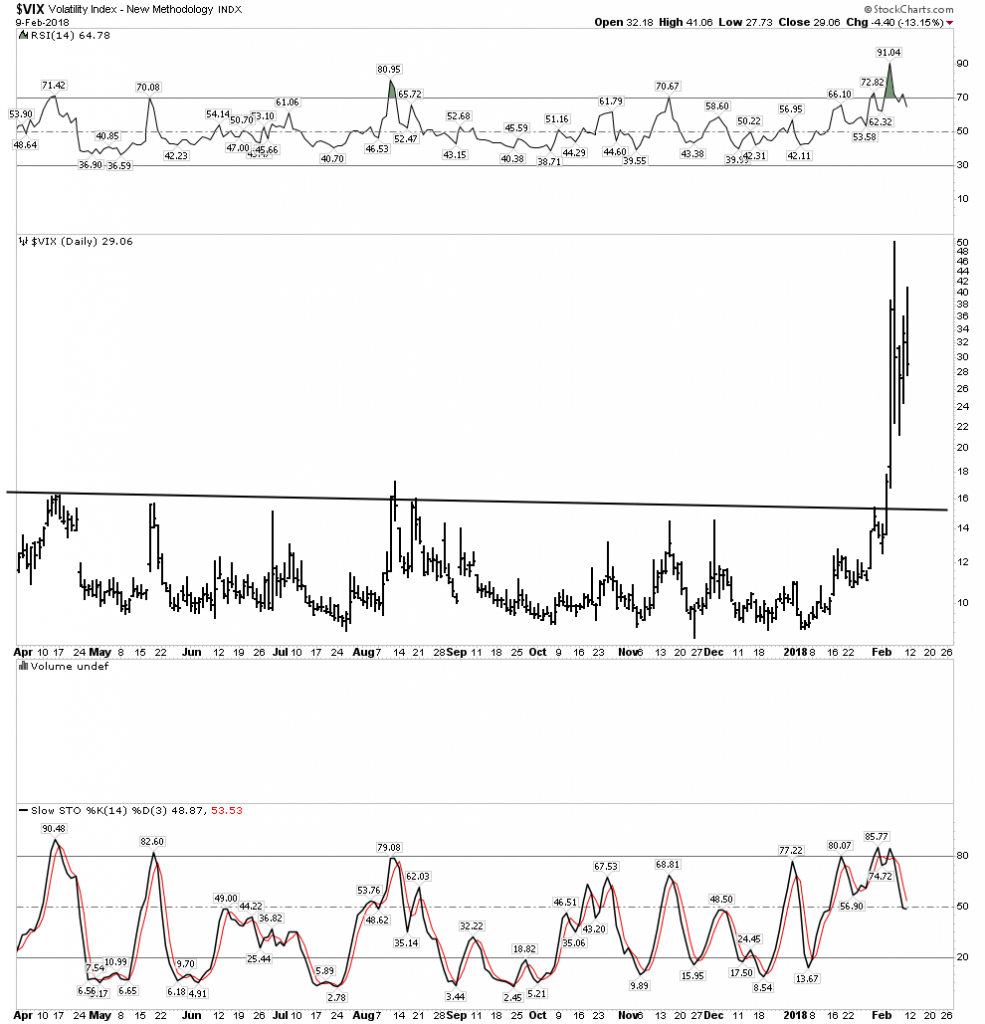
The VIX simply exploded and has stayed elevated which puts the entire market at risk since blown out VIX traders may need to sell good stocks to cover their losses.
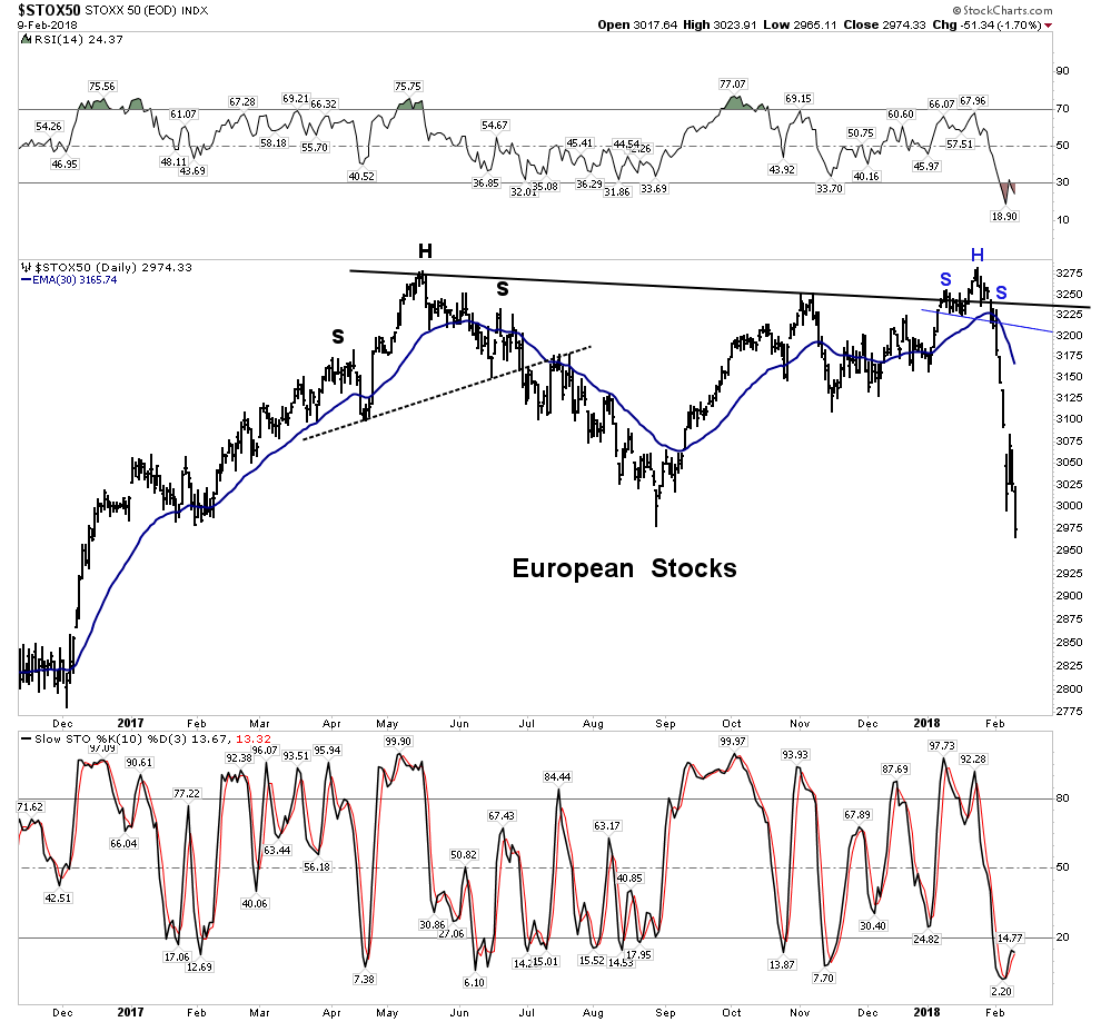
Is Europe the Tell?

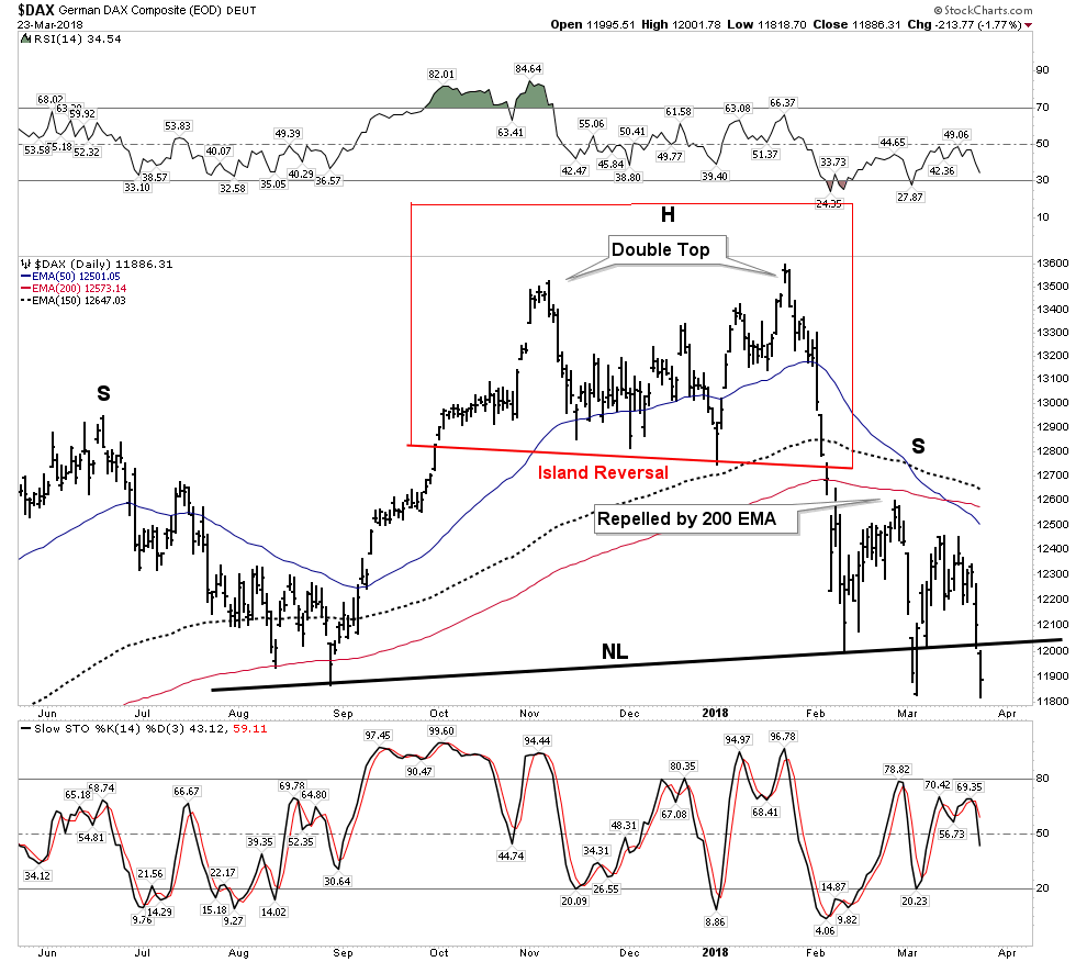
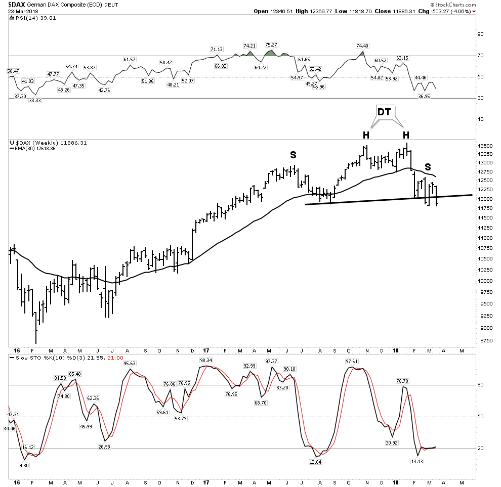
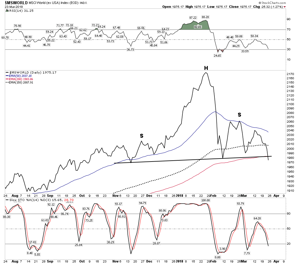
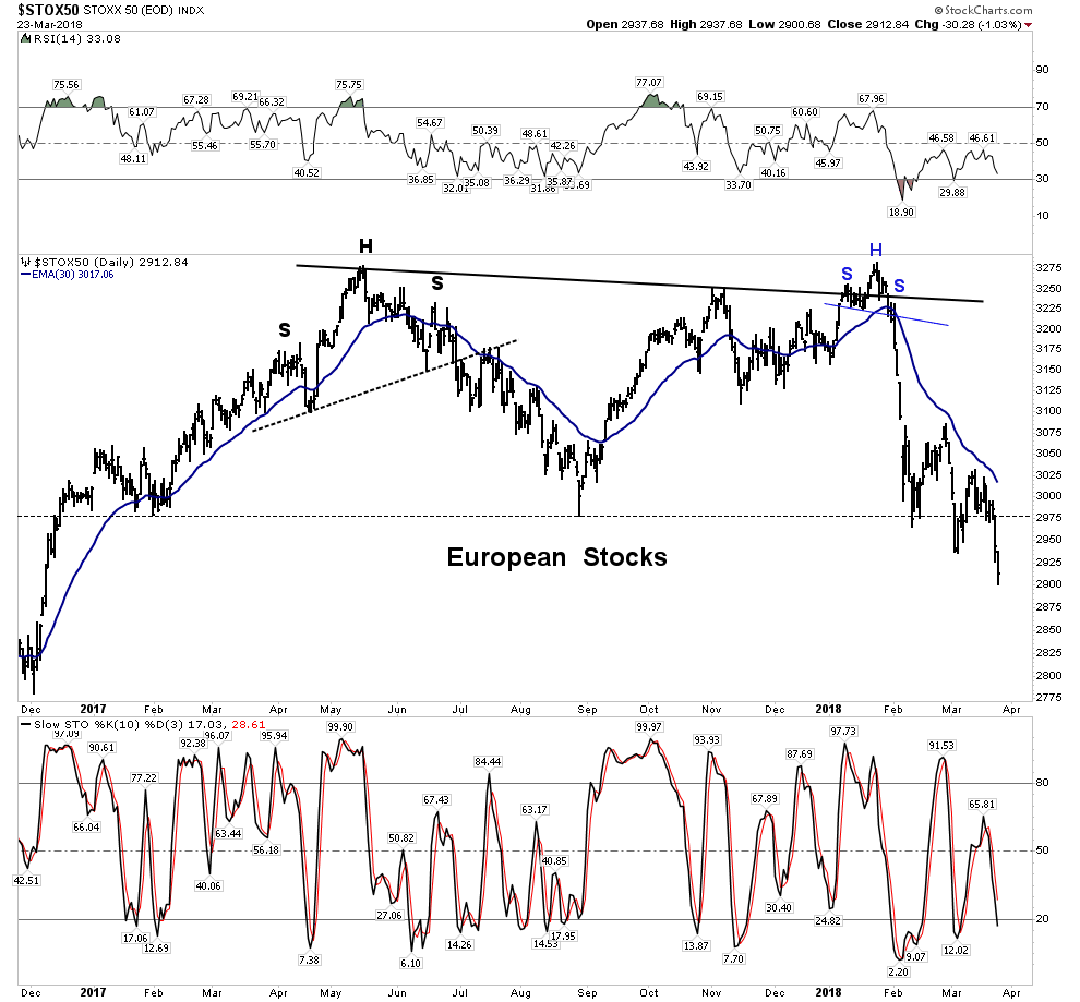
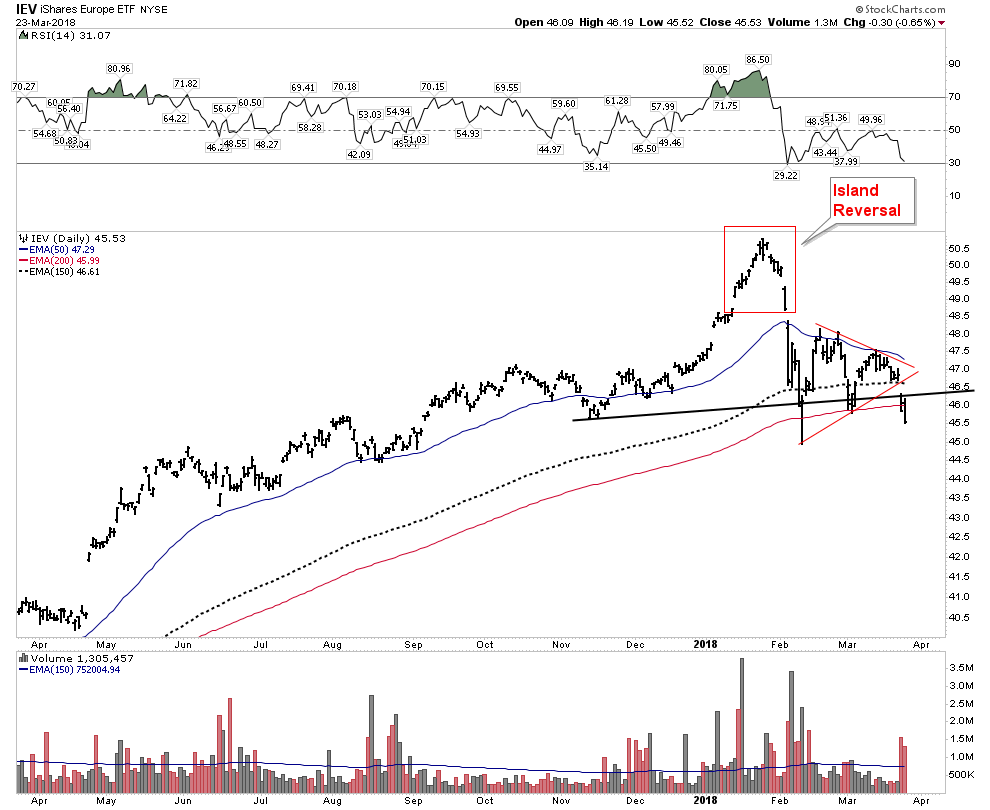
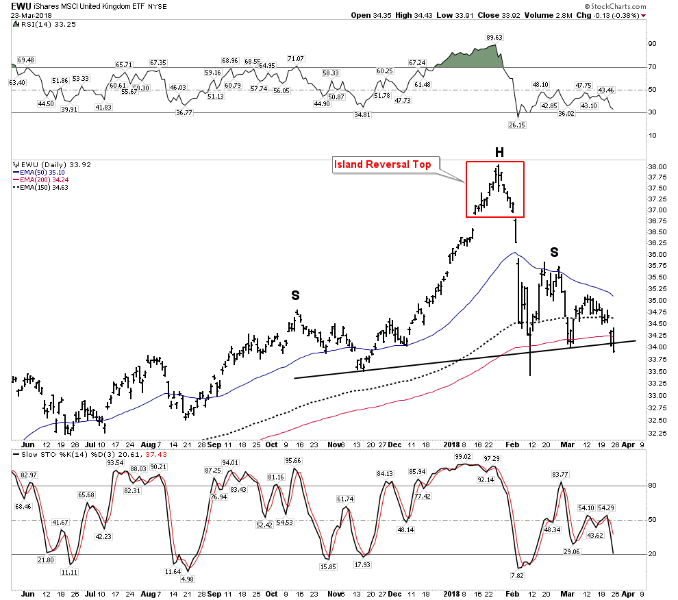
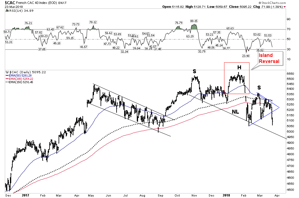
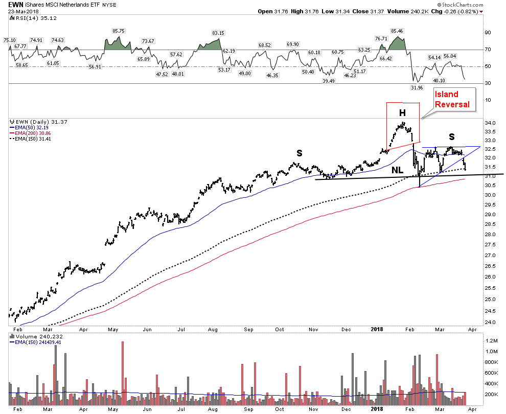
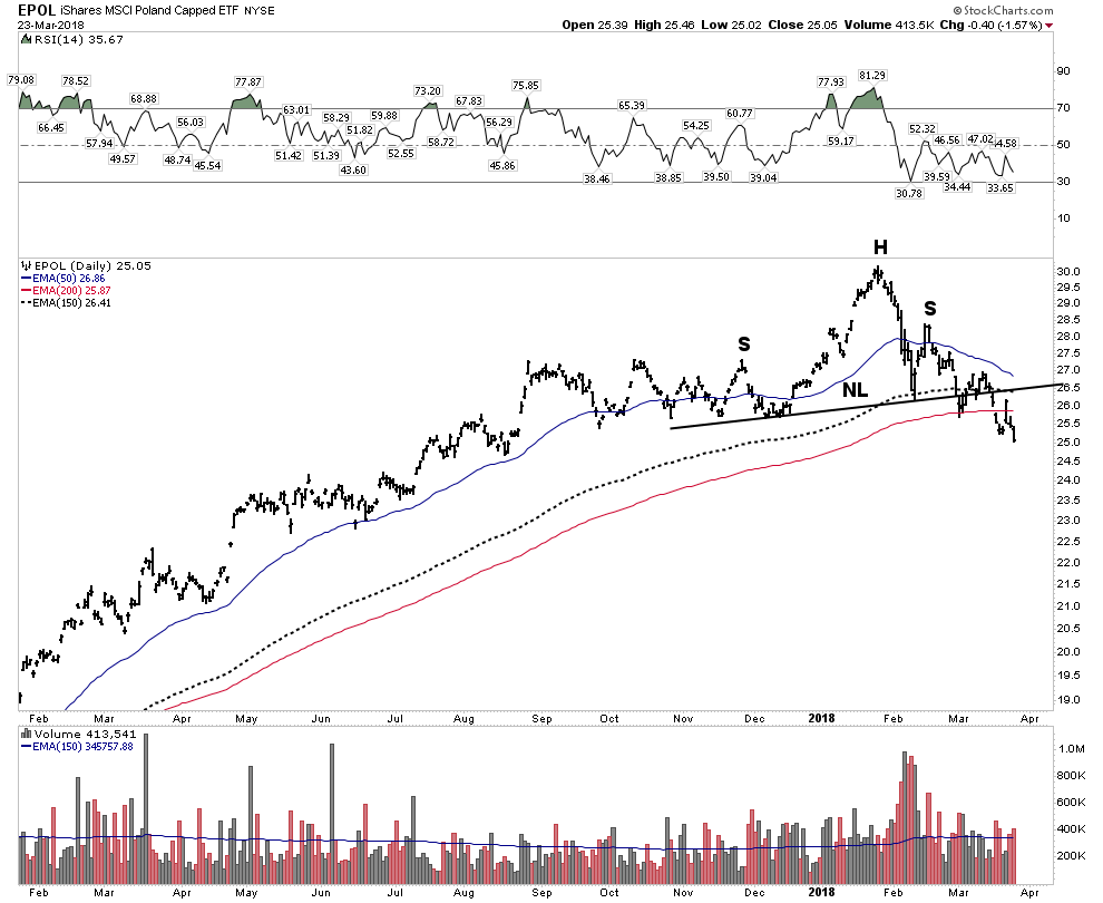
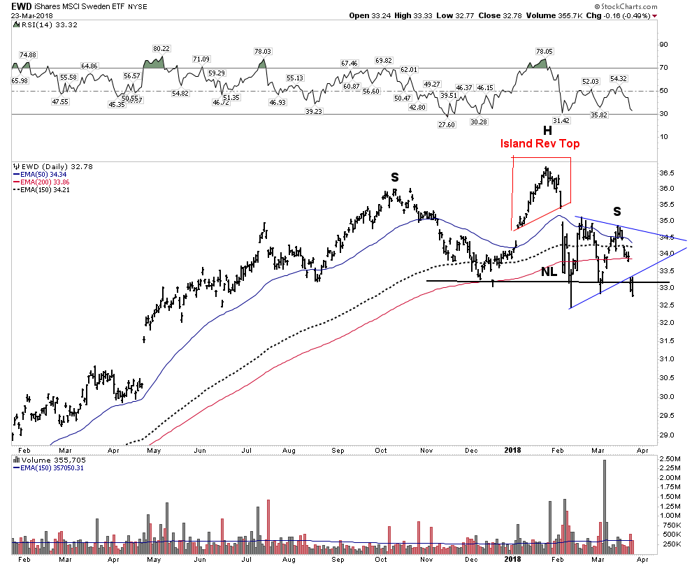
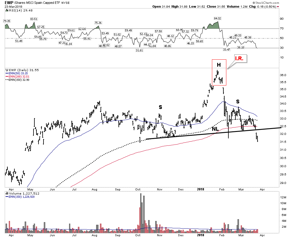
The European stock market put in a suspicious looking top last May.  It looked done to me, however it put on an impressive recovery.  Turns out it was a head fake.  The double top it just put in simply looks disastrous… an implosion.  Avoid the continent across the pond- it’s a flame out.
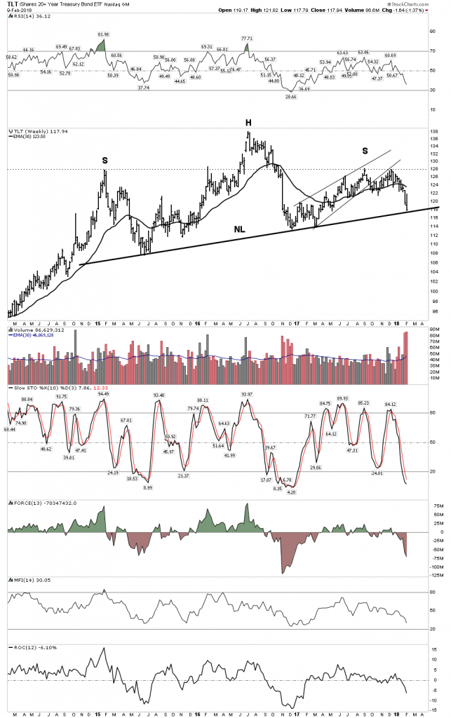
Interest Rate Indicators

The everything bubble is supported by depression level interest rates.  Without these rock bottom rates the bubble would implode upon itself.  As rates go down long term cash flows become more valuable.  This encourages long term investment which depends on these lower rates.  Once rates begin to rise these projects become marginalized and uneconomic.  This triggers the recession.  The TLT appears at a critical juncture.  If it violates its neckline mayhem will break out in the market and the economy.
The risk now is the monetary alchemy going on in Washington.  Tax cuts combined with increased spending fly in the face of reduced treasury purchases by the FED, China and Japan.  That’s a recipe for higher rates.

The Economy is headed for good old fashionedYIELD SHOCK

So the pin is higher rates.  Back in February 1928  the FED began raising rates and finally succeeded in bursting the bubble in September 1929.  Our FED has been slowly raising rates for 2 years now and what we saw last week was the pin coming in contact with the bubble. In addition to rising rates, the FED is on track to withdraw $1Trillion out of the economy over the next year- Hold on as that’s called Quantitative Tightening.

But the below interest rate indicators suggest that the recession still remains off into the future.  Using the past as a guide these charts indicate not until late this year or 2019.
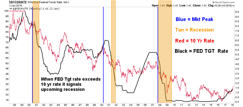
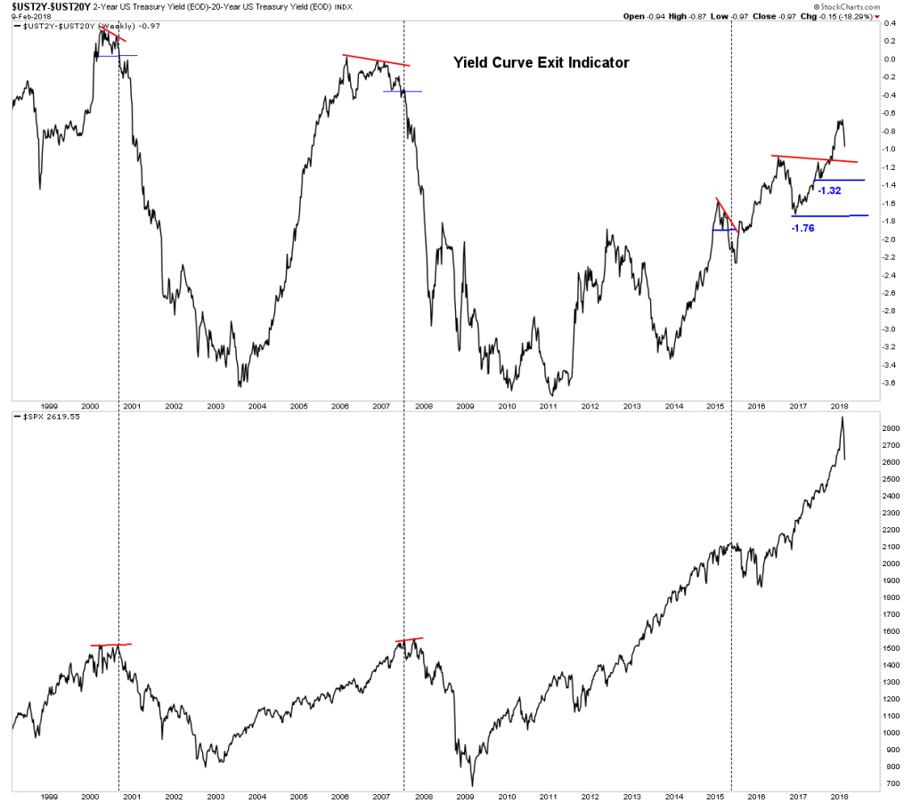
Interest rate spreads

The exit indicator below is saying NOT to exit the market at this time as the sell signal comes in at 1.32.
Gold- Bottoming Action Hanging by a Thread

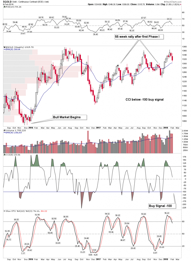
The rally in the gold stocks which started in early December imploded this week. There was a decent chance it could have lasted another month but succumbed to the overall market decline.  After all gold stocks are stocks too.  The bigger picture to review is not the stocks, but gold itself.  Gold began its bull market in December 2015.  In the past 42 years gold has had 6 bull markets. In those bull markets the rally coming after the first correction following the first leg up has lasted 58, 61, 55, 55, and 64 weeks long.  Our current rally since December 2016 lasted 55 weeks so its par for the course.  We can now expect a retrenchment followed by the resumption of Phase II of the bull in gold.  In the chart below the classic buy point will be when the CCI reaches the -100 level as depicted.  Once this entry occurs gold should resume its phase II.  Phase II is the longest phase where the public eventually comes to understand the bull and wants in.
Gold could have a visit into the upper $1200 range
Anything above $1230 remains a healthy backtest- Shake’m out.
It’s been a long hard road of base building:
Big Picture Saucer Bottom

Keep the big picture in mind.  Gold is building out a solid foundation to support a massive powerful move.  Big Bases = Big Moves
The Gold Stocks

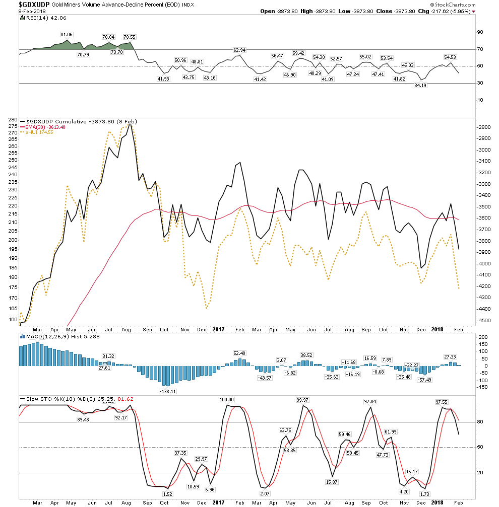
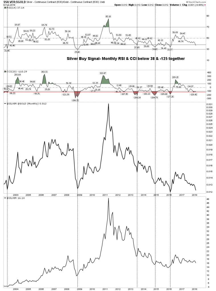
My silver/gold stock buy indicator just entered the buy zone for the first time in two years.  The last buy signal was the great buying opportunity of Jan 2016.  Note it is now back in the buy zone, but it has not triggered a buy signal yet.  It must turn up to trigger a buy.  But its important to know its ready to go
We need to combine the above trigger indicator with my gold bottoming system for a launch signal.  As of now the gold bottoming system is NOT on a buy.

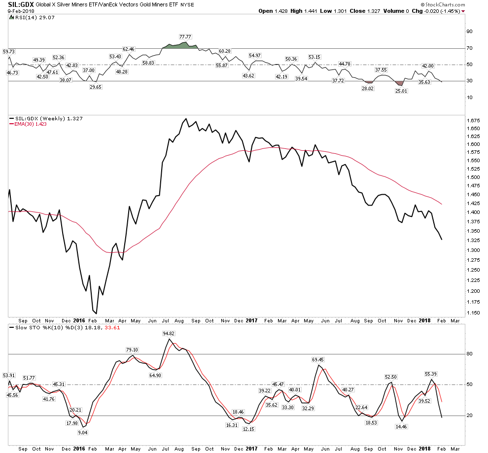
The most important indicator in the system, the HUI:GOLD ratio, is not green as you can see below:
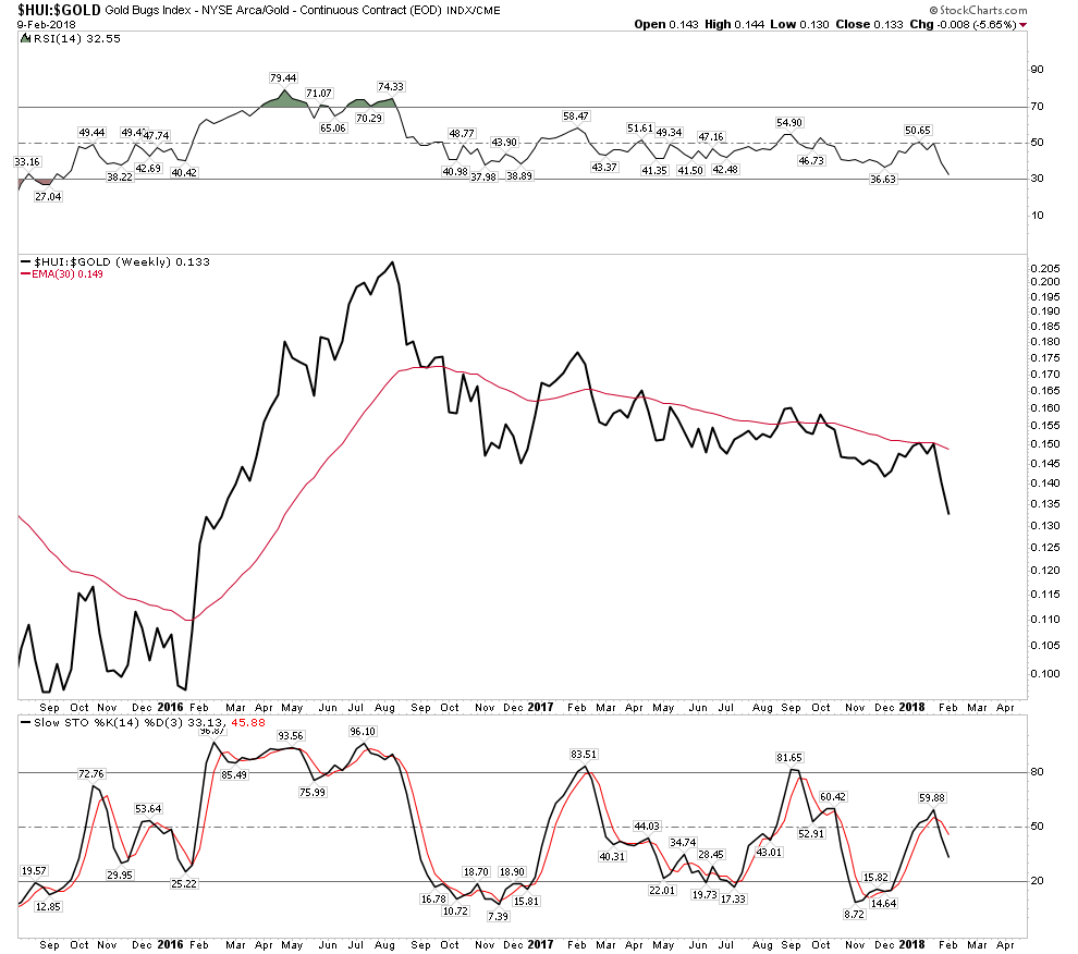
Negative Configurations:
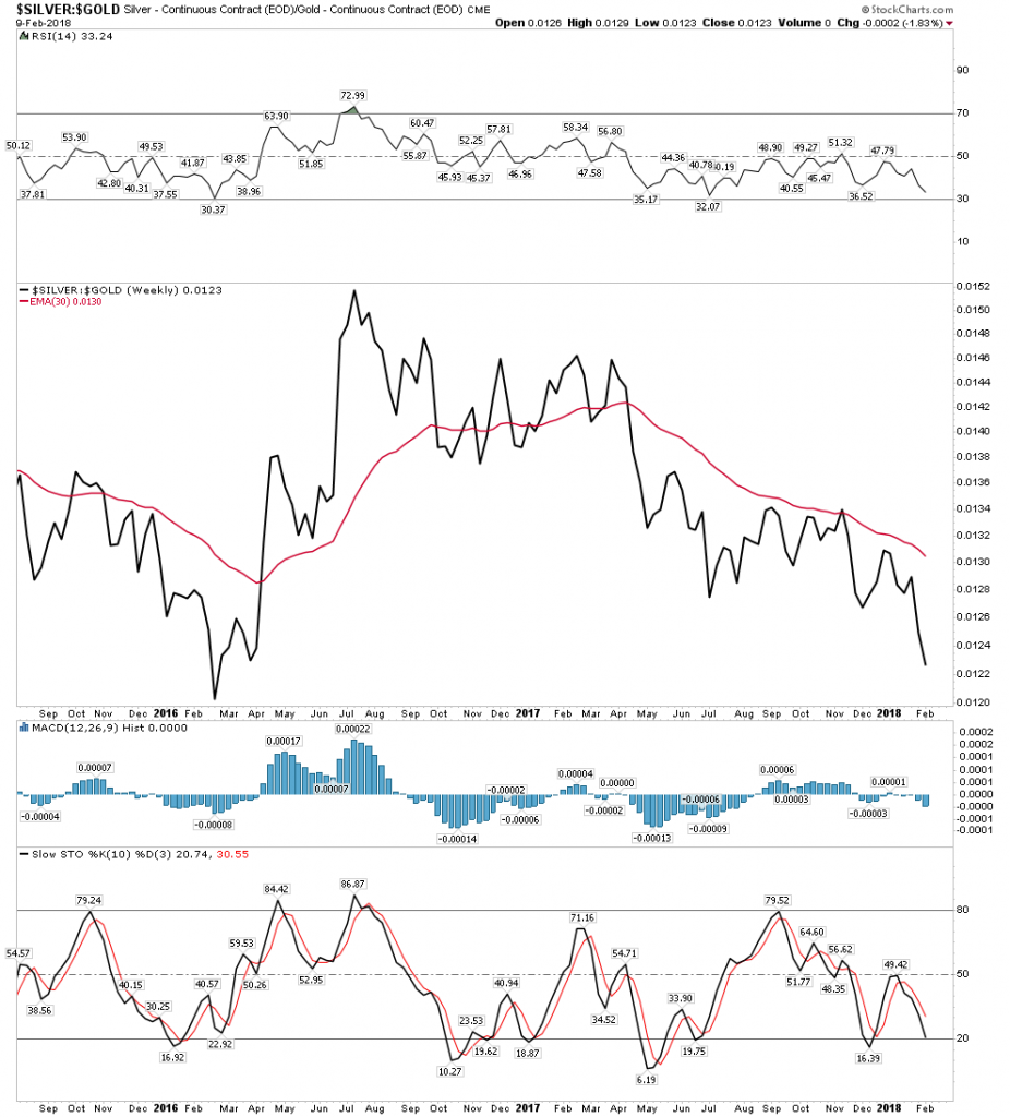
The only positive signal:
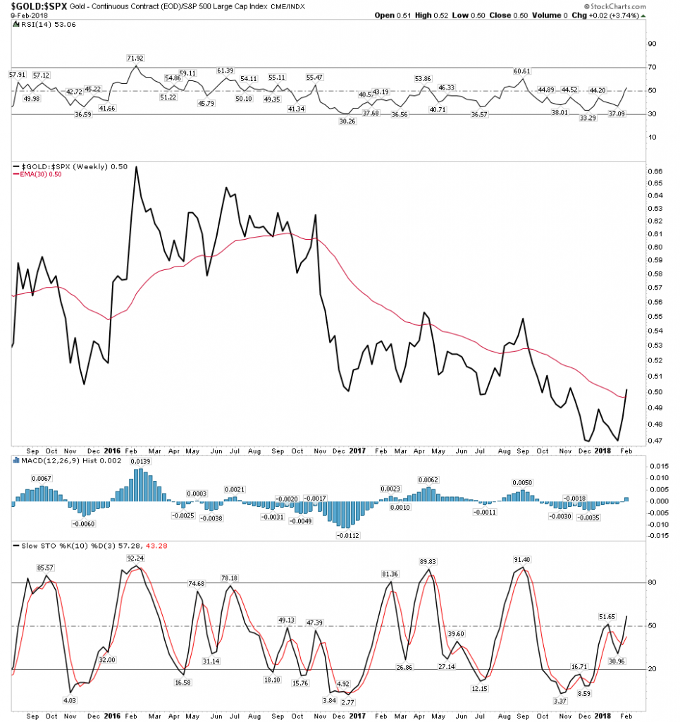
The gold stock indexes are stressed and putting out mixed signals.
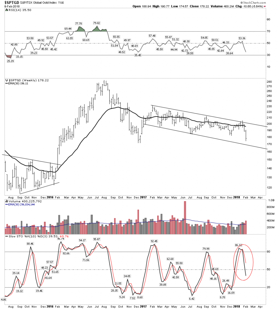
They are hanging by a thread and stochastics indicate further to go to the downside before they turn around, but I think they are buyable here.  Sure you are not likely to nail the bottom, but we are getting near the end of Phase I in the stocks whereas gold appears to have already entered Phase II. When Phase II arrives in the stocks they will likely explode out of the gate. I am starting to nibble with fresh money now.

Commodities

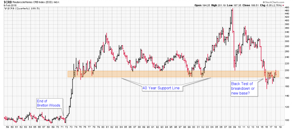
Commodities paint an interesting picture. They are presently at a critical juncture as can be  seen on both of these charts. Below we see on the daily chart a strong backtest of the S&R line and the 150 EMA (30W EMA).  Will it hold and resume its advance?
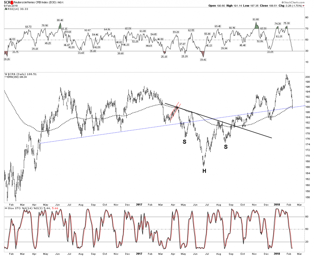
The super long term 70 Year Quarterly chart shows it chewing its way through overhead resistance.  It is easy to see two possible polar opposite outcomes here.  First if we entered into a nasty recession demand could fall off and it could resume its free fall through the thinly traded area.  Yes, it’s conceivable it could go all the way down.  That would be a deflationary disaster.  On the other hand if it managed to chew its way all the way through over head resistance it could run up 50% rather quickly.  This would deliver an inflationary shock to the economy.  In support of this outcome here is an interesting tidbit: In the past 500 years commodity prices never went down more than 3 years in a row until 2011 where they went down 5 YEARS in a row!  That’s like a compressed spring ready to launch.
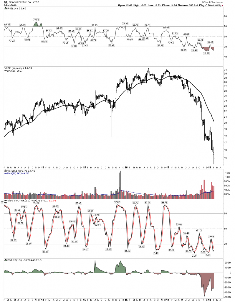
DOW DISASTERS

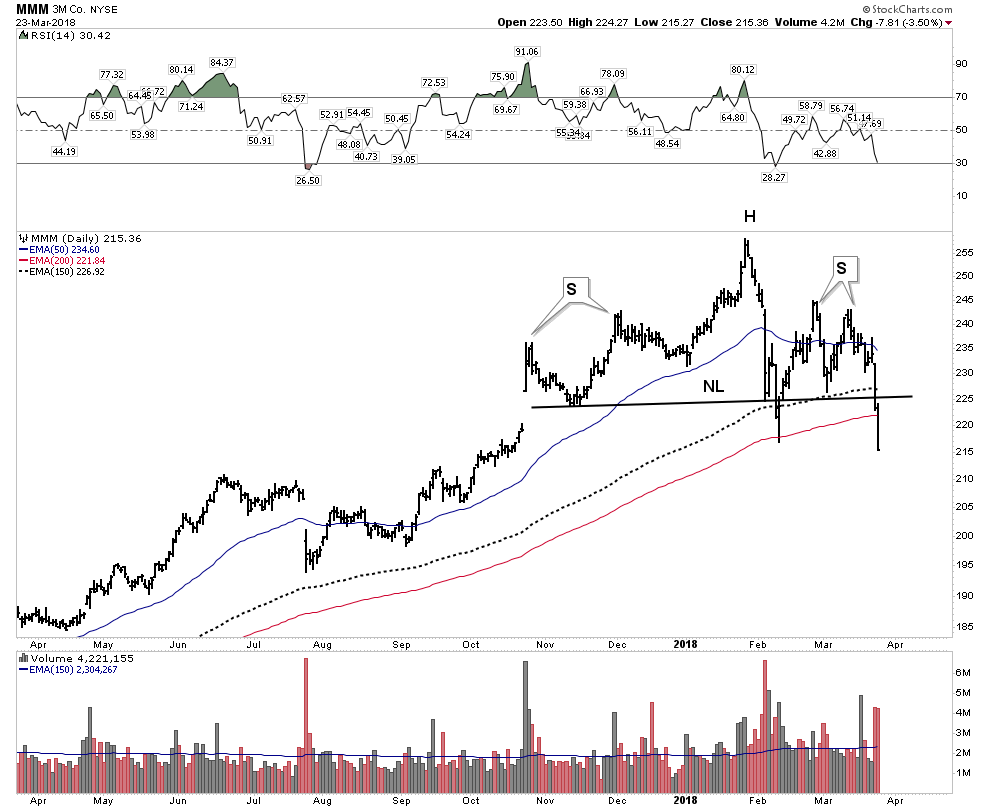
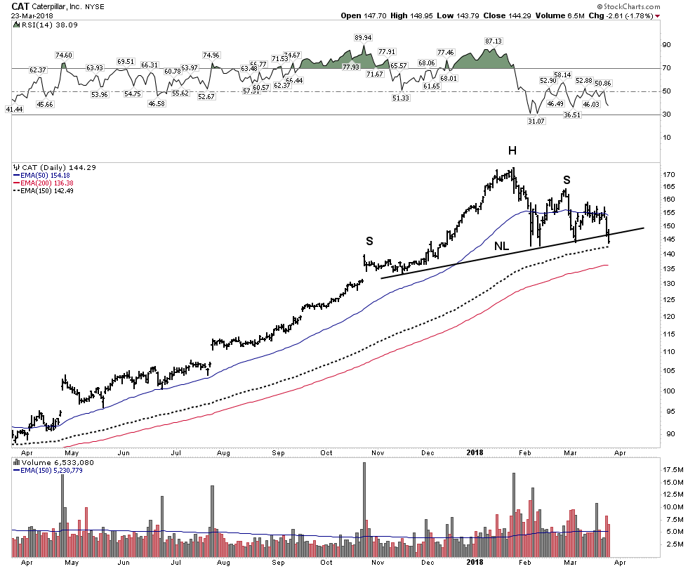
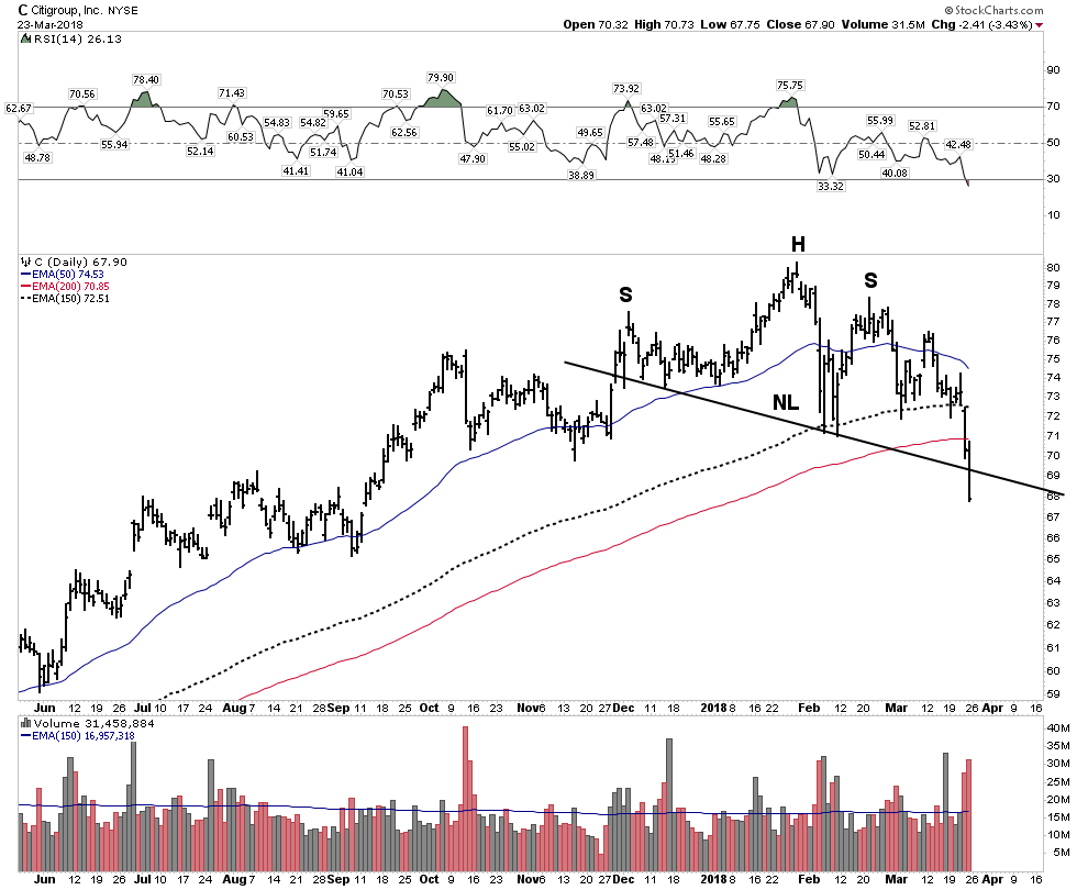
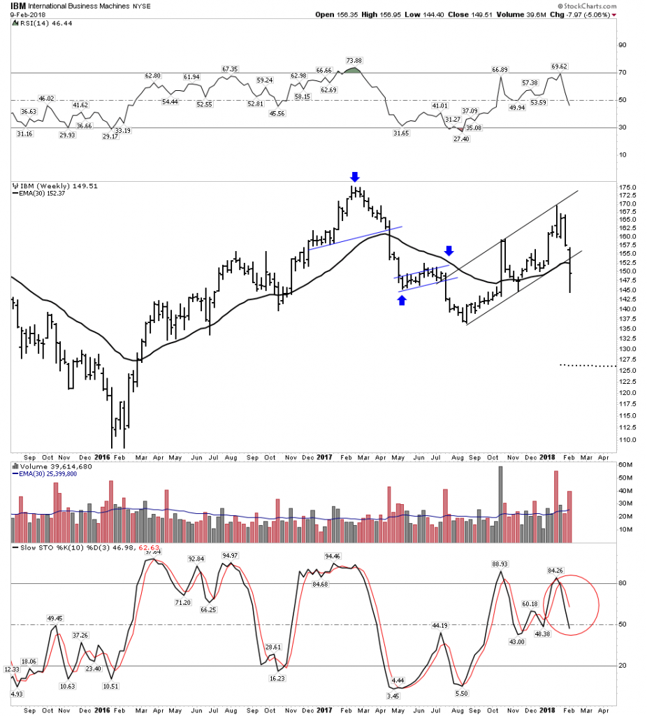
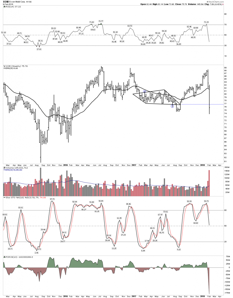
These big American blue chip stocks look down-right ugly.  This is the core of industrial America.  Could it be telling us something?

GE– Remember when this was America’s premier company.
IBM- Failing top?
XOM– In virtually every ETF
Plungers Core Portfolio

Here are just some of the stocks in my core portfolio:

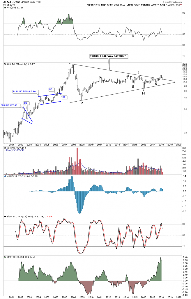
Altius– Performing well in a market shakeout- Intact
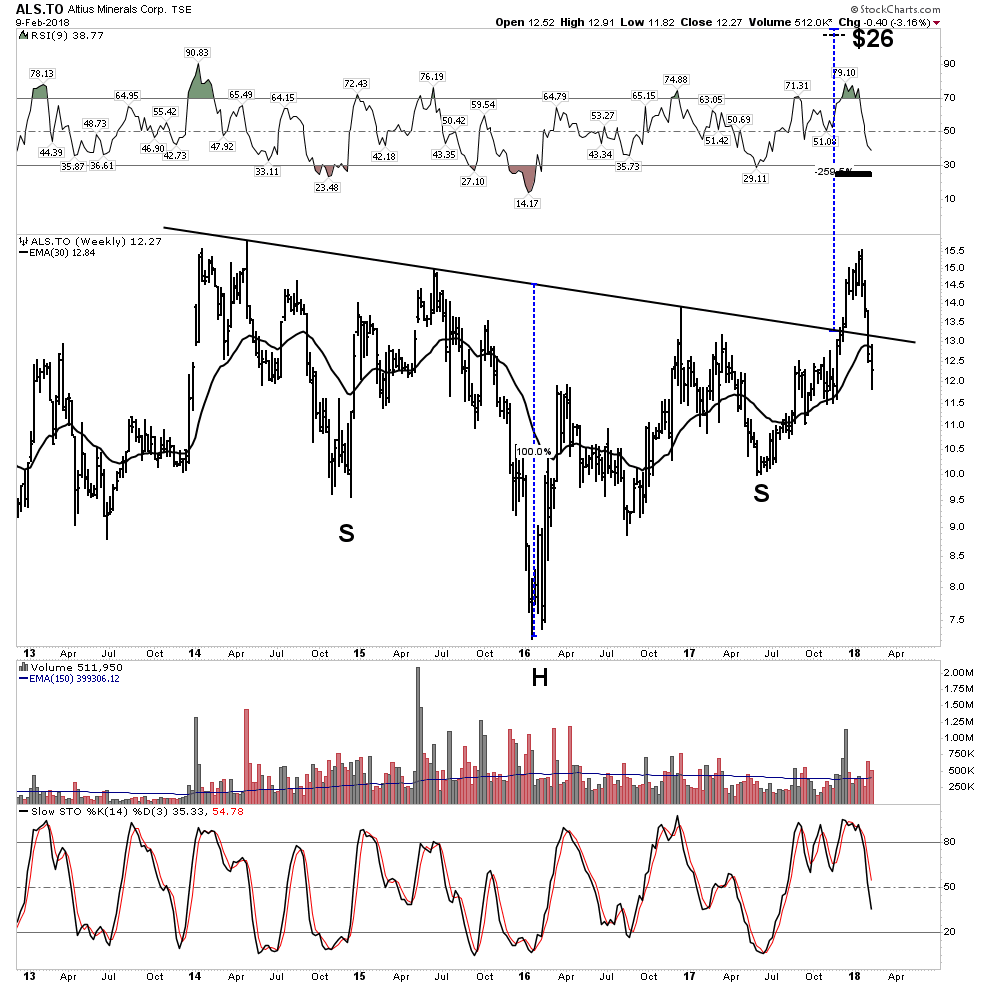
Strong backtest
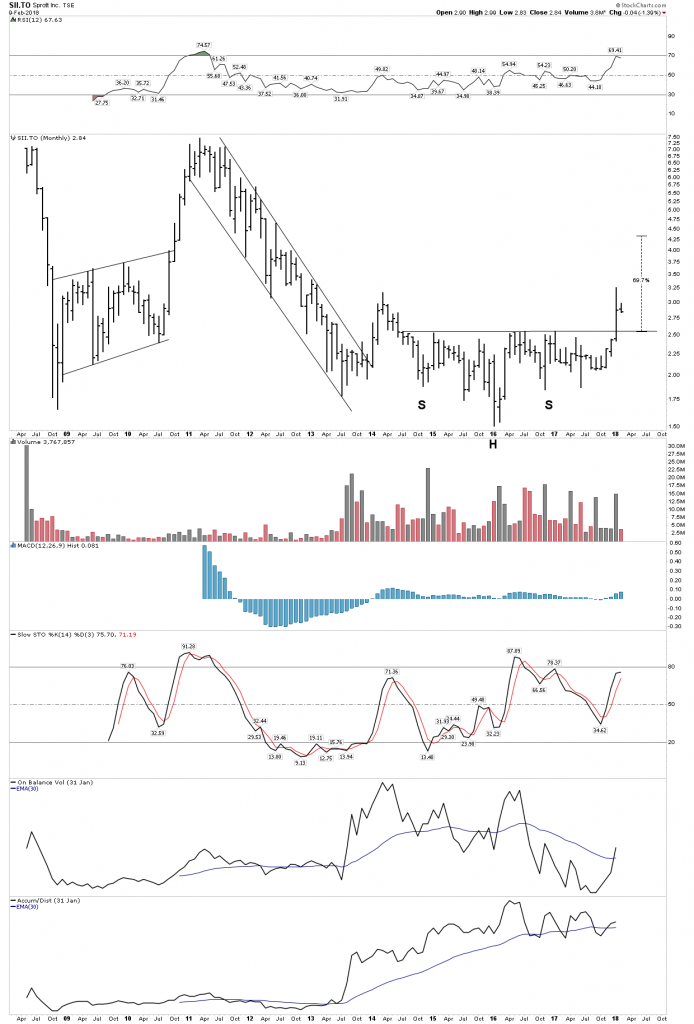
Sprott– Correction?  What correction.
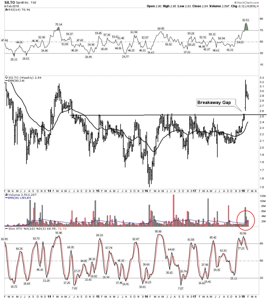
SII – Daily
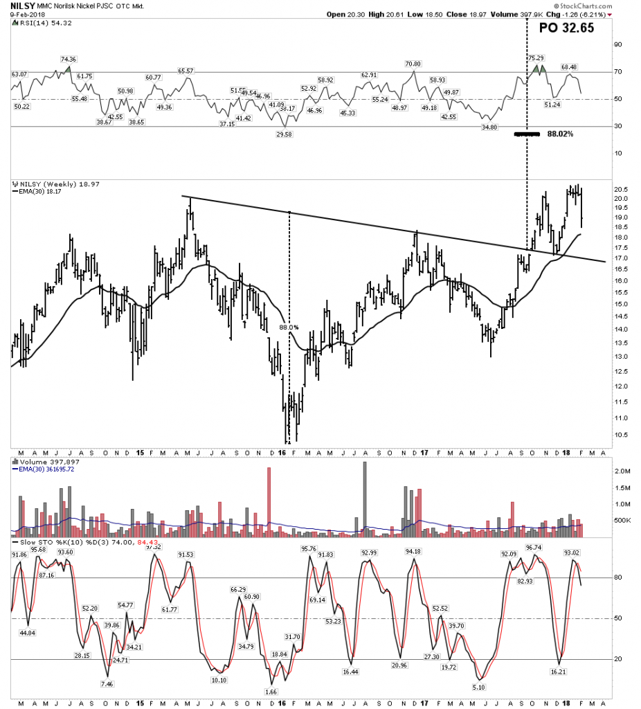
Norilsk– Solid as stainless steel

BT in progress
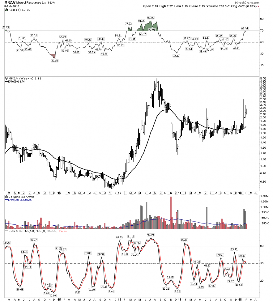
Mirasol – Well positioned for the upcoming bull market
Other Non-Core Stocks

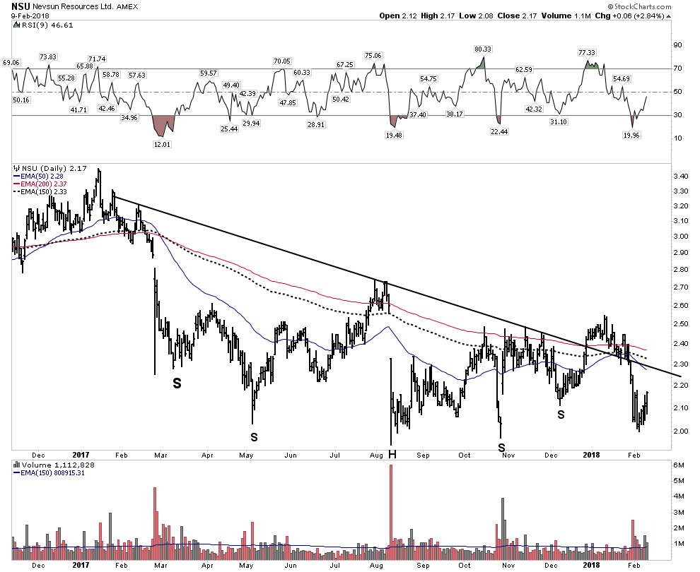
NSU– Struggling, but incredible value.  Give it time.
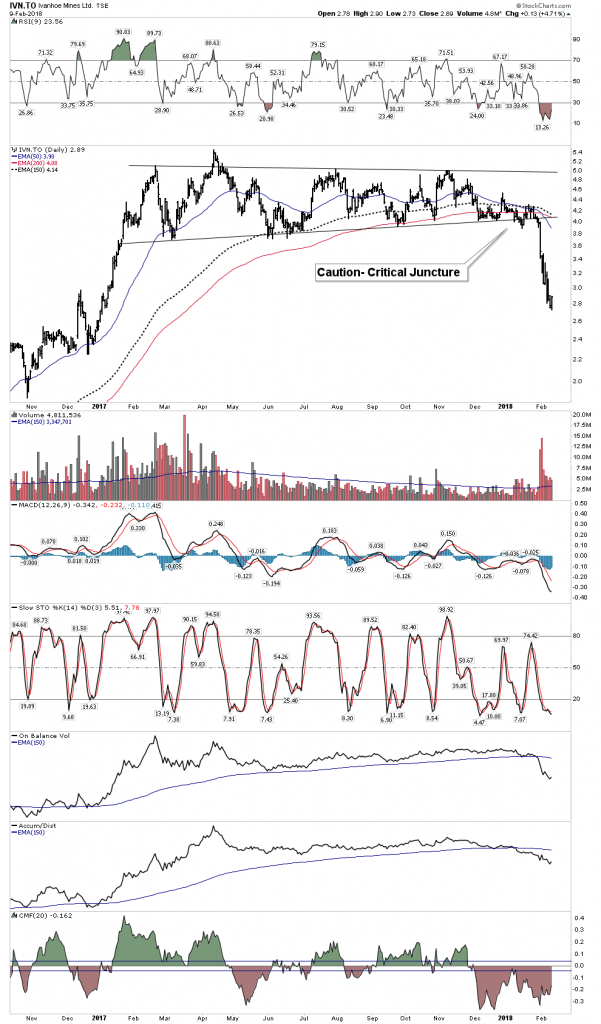
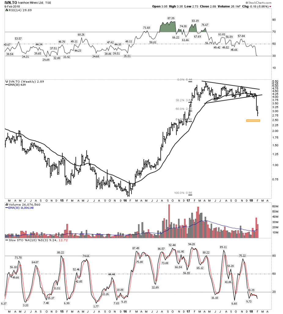
Ivanhoe– Now nibbling at that well telegraphed Gentleman’s Entry.
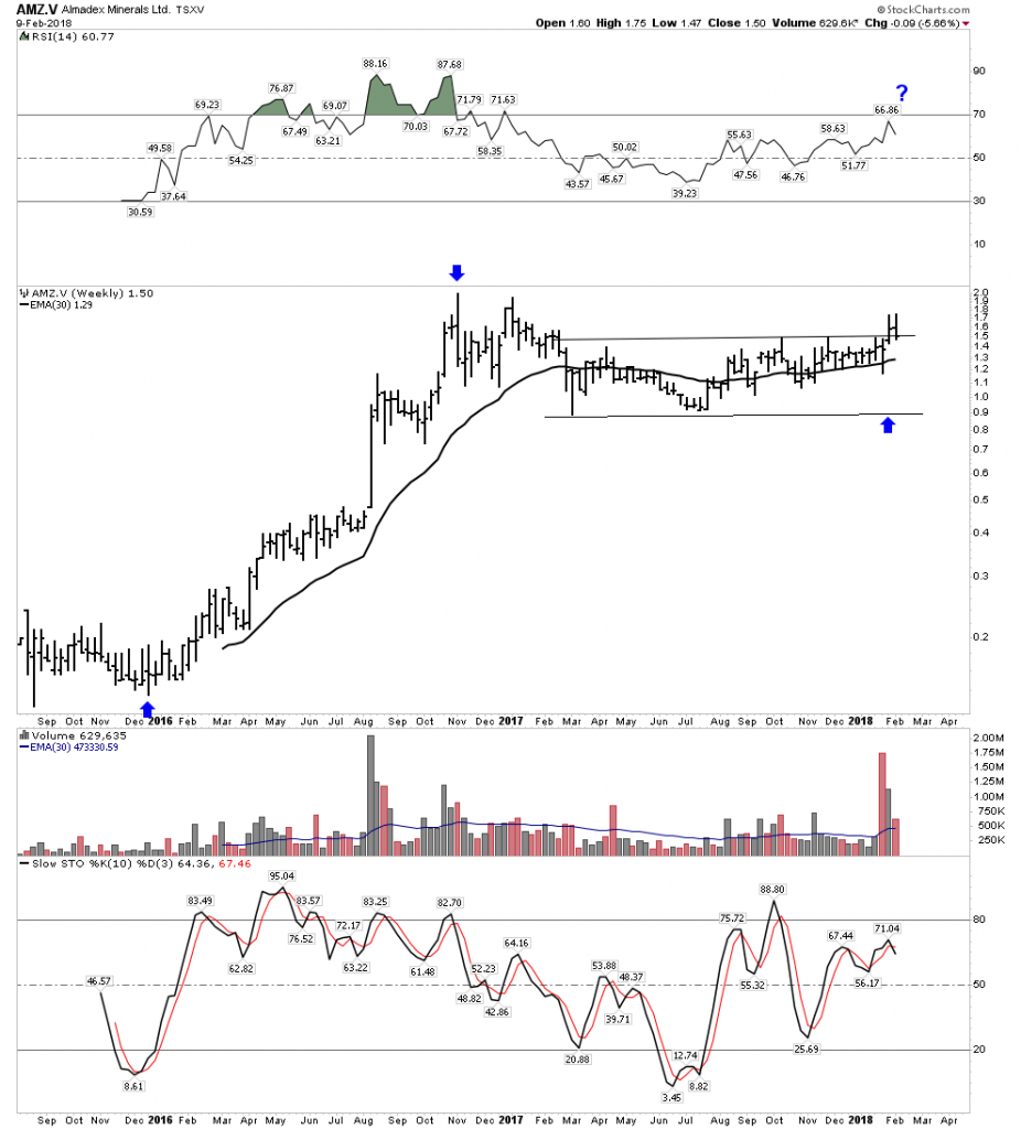
AMZ- Acting very well
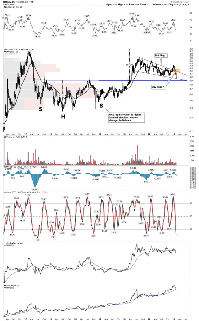
ROXG– Nice buy point
Novo– Inverse H&S inside the channel?
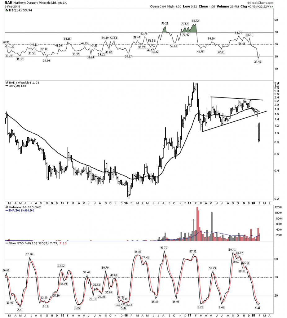
Bad Boys

NAK- It was looking so promising.
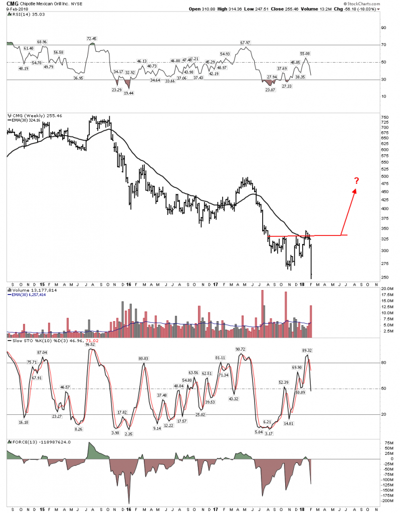
CMG- Will it ever be ready for prime time?
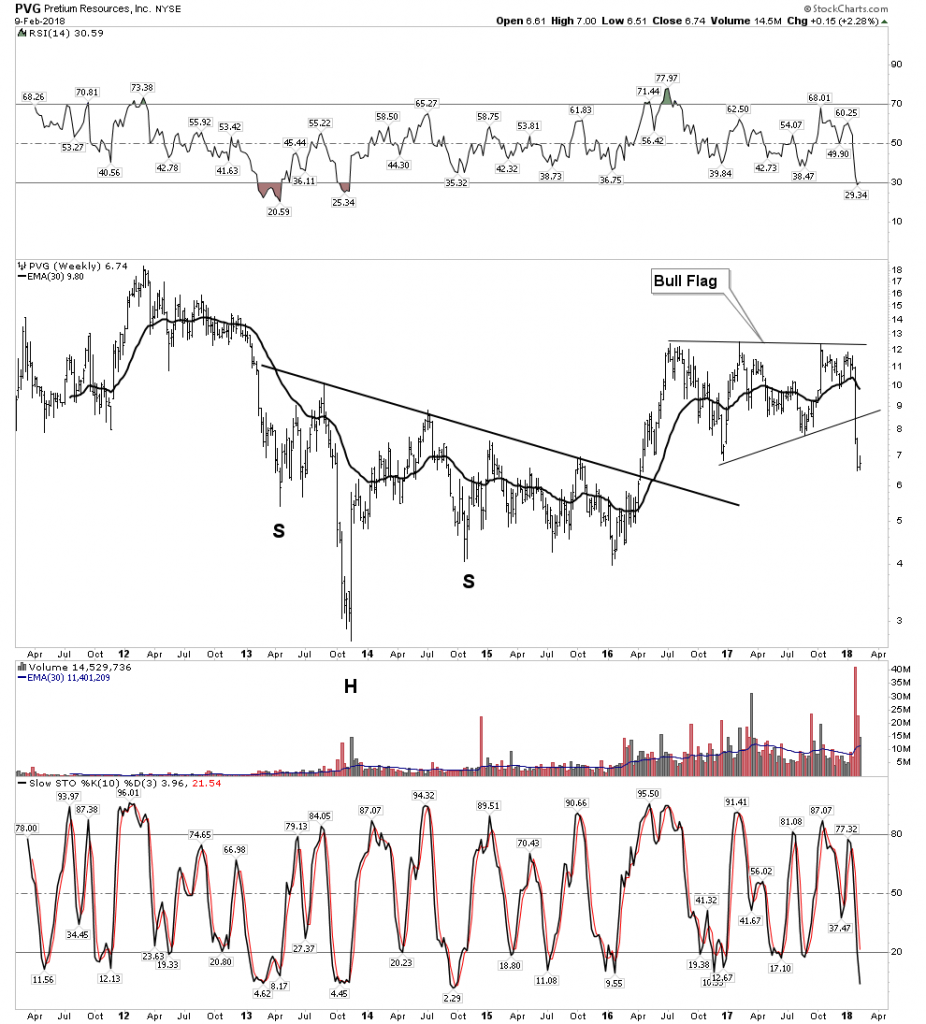
PVG- Such potential…buy on blind faith?
AG– What if this plunged to $3.50 and you could buy it there?  Back up the truck.
In Summary:

This has been a great week.  Why?  Because it provides us a marker in the ground.  We know where we are now within the bull/bear cycle. We are in the end zone.  The market going up relentlessly every day over the past 3 months was disconcerting and nuts. The over throw tells us it was a speculative blow off, an upside climax.  Climaxes can’t last forever and It finally met reality… that’s good, gravity finally asserted itself.   The market can regroup and rise again, but this showed us the end is nigh.  The froth of the everything bubble got blown off and if it does rally to its old high it will no longer have the juice nor conviction it had before.  Some investors who were hurt by this downdraft are now scared and will use the rally to escape partially intact.  Recall that retiring baby boomers can’t afford to get crushed again and this correction serves to bring them back down to reality.  The ending process now can proceed.  The market could still see higher highs, but it will become more narrow and the adv/decline will start to fade. The great thing is we know what comes next.  Eventually the market succumbs to a ruthless bear market and the gold sector resumes its next phase of its bull.

This knowledge is golden… It was a great week.

Wednesday Report…Consolidation Time ( The Easy Trade has Ended)

Before we look at tonights chart I would like to reiterate once more that we have traded one of the best bull markets runs in history. There was hardly a time over the last year or so that the stock markets were down more than 2 or 3 days in a row. It seemed like everyday I would log on to Stock Charts in the morning the SPX would always be up 3 to 5 points. It was just a steady move higher with little volatility.

Last Friday that nice gentle uptrend we had grown accustomed to came to an exciting climax. What we are experiencing right now is the beginning of some volatility that is going to take some time to get back under control. Think of dropping a super ball off the top of the Empire State building. First you get a really big bounce followed by a big decline then another bounce that is less strong with the next bounce getting weaker. At some point the initial volatility will be reduced back into normal price action.

During those volatile swings we should see some type of consolidation pattern build out that will be unrecognizable in the beginning, but as time passes it will slowly show itself. We know where the top of the new trading range is, but the bottom still needs some confirmation that Tuesday’s low is in fact the low for this next consolidation phase.

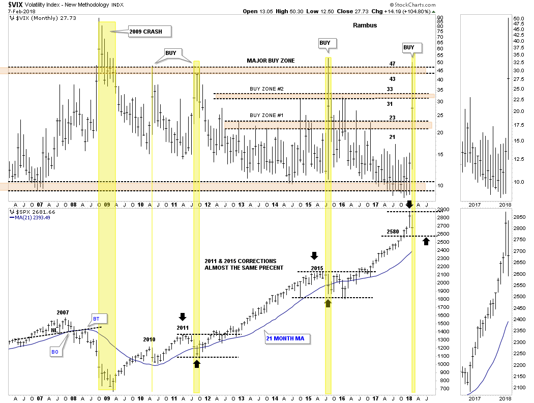
Lets start by looking at the 12 year monthly combo chart which has the VIX on top and the SPX on the bottom. When we looked at this chart on Monday night the VIX still hadn’t reached the 43 to 47 area which has shown us in the past where an important low on the SPX was. Tuesday we got the spike into the major buy zone which is strongly suggesting an important low is in place.

That being said a new trading range should develop to consolidate our previous impulse move up similar to what happened in 2011 and 2015. As you can see the VIX spike nailed the low, but there was a lot of chopping action before then next impulse leg up began which is how markets are supposed to work. The spike in the VIX marked the low in 2010, but it still took several months of bouncing along the bottom before the SPX rallied into the 2011 high. Even the 2011 VIX spike took the SPX three months of chopping around the bottom before the next impulse started.

It’s possible that the SPX could just reverse back up and takeout January’s high, but that would be the exception and not the rule. The horizontal black dashed lines show the 2011, 2015 and now our 2018 trading range that are all the same height. At this point in time I think it’s going to be more of a time thing than anything else as far the sideways price action goes.

This next chart is a daily combo chart we’ve been following for some of the US stock market indexes which is showing some interesting price action. I have mentioned many times in the past that an important trendline never dies, it just slowly fades away. From February to September of last year most of the US stock market indexes built out a bullish rising wedge formation. Normally during a corrective phase support can be found on top of a preceding consolidation pattern.

What I did on this combo chart was to extend the top rail of the rising wedges to see if they were still hot. In most cases they held initial support. Currently all the US stock market indexes are all trading above their top rails with the RUT being the weakest which is trading right on top of its top rail extension. It would be painful, but I wouldn’t be surprised if the top rails were backtested once more for good measure. If they held again that would be a very bullish setup.

This next chart is the weekly combo chart we’ve also been following which has the all important 30 week ema on it. This week the 30 week ema was tested on all the indexes except for the tech indexes, the COMPQ and the NDX, which came very close to testing their 30 week ema. It’s been well over a year on many of these stock market indexes  when the 30 week ema was last tested. So we can now add two more layers of support, the 30 week ema, the top rail of the bullish rising wedges to go with the spike on the VIX above 47.

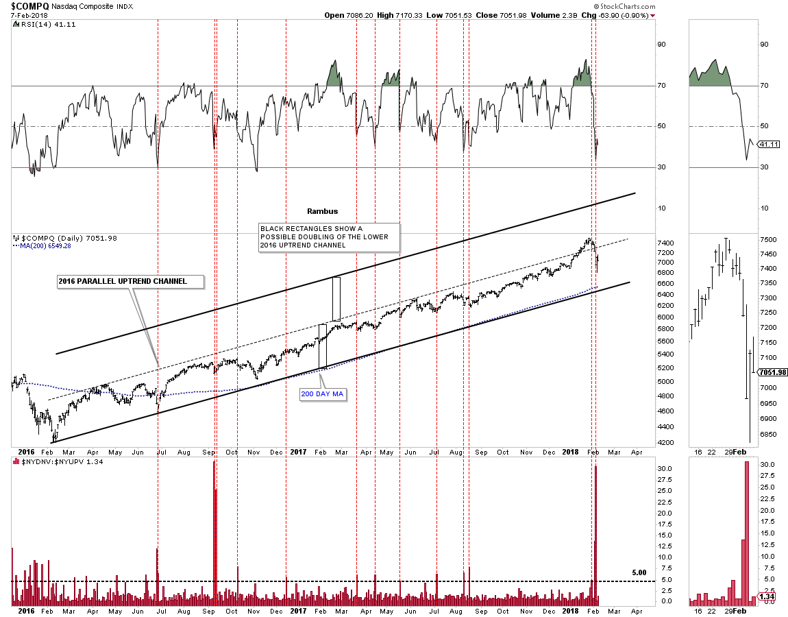
Next, lets look at some of the 2016 uptrend channels with the down to up volume chart below it, starting with the COMPQ. Normally when the down to up volume rises to 5.00 we are beginning to see some strong selling taking place which can start the bottoming process. The last time we had a massive spike in the down to up volume chart like we had on Monday was way back in September of 2015, which began the sideways trading range. Note how the 200 day moving average has formed the bottom trendline of the 2016 uptrend channel. Also note how the down to up volume spike looks on the RSI at the top of the chart.

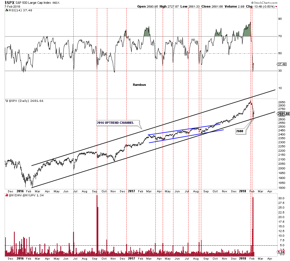
Below is the 2 year daily chart for the SPX which shows its 2016 bull market uptrend channel with the price action testing the bottom rail with the high, down to up volume spike on Monday.

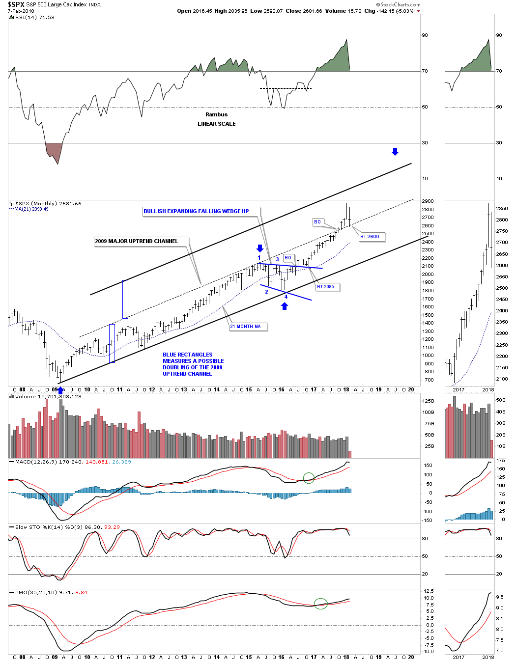
Below is a long term monthly chart for the SPX which shows its 2009 bull market uptrend channel. If the original 2009 bull market uptrend channel below the dashed mid line is in the process of doubling then I would like to see the dashed mid line hold support around the 2600 area.

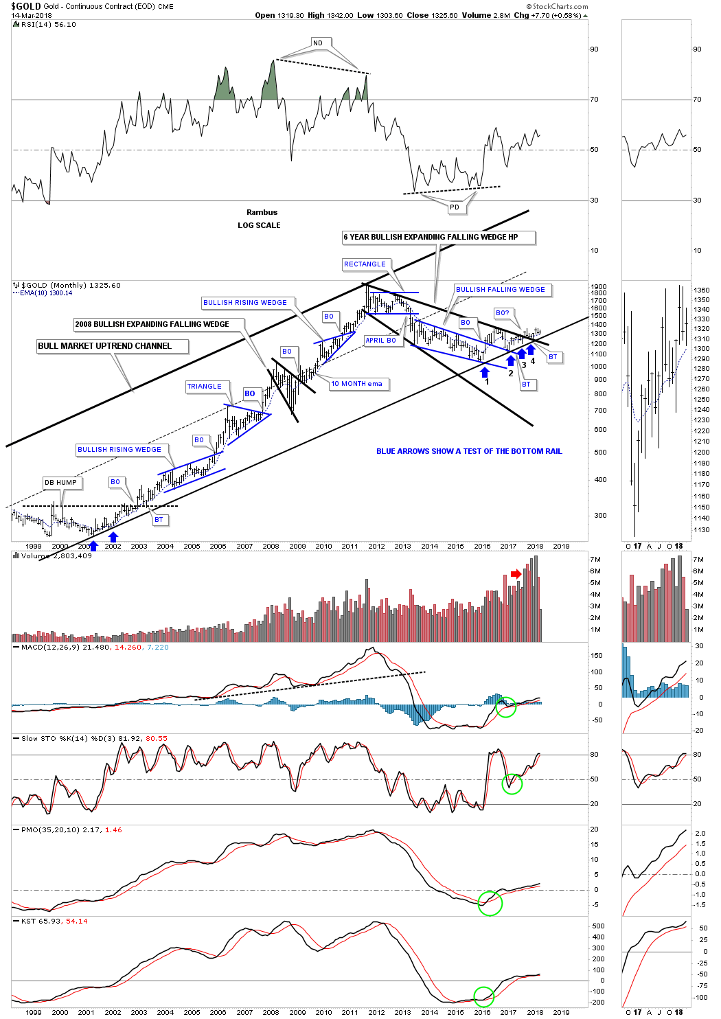
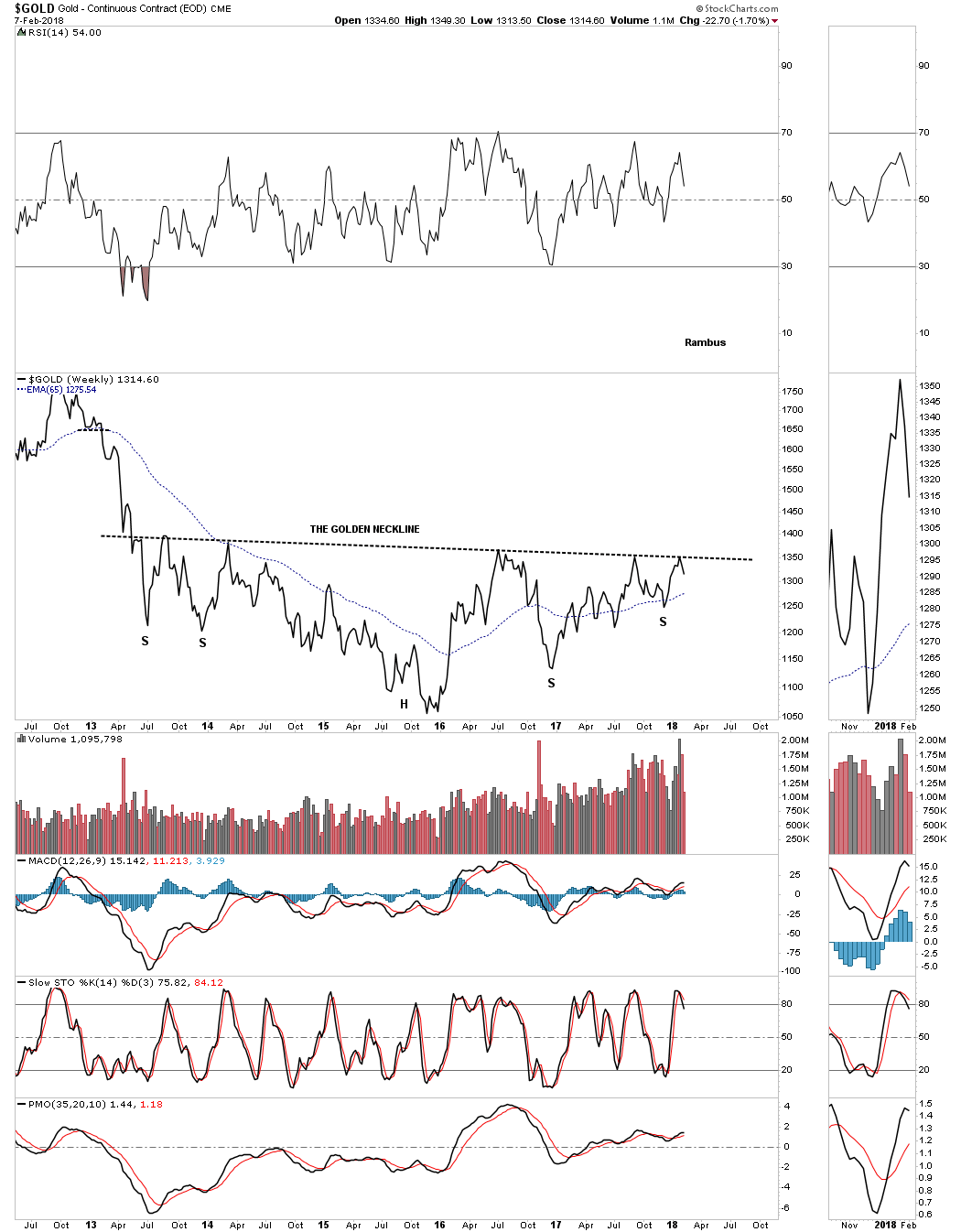
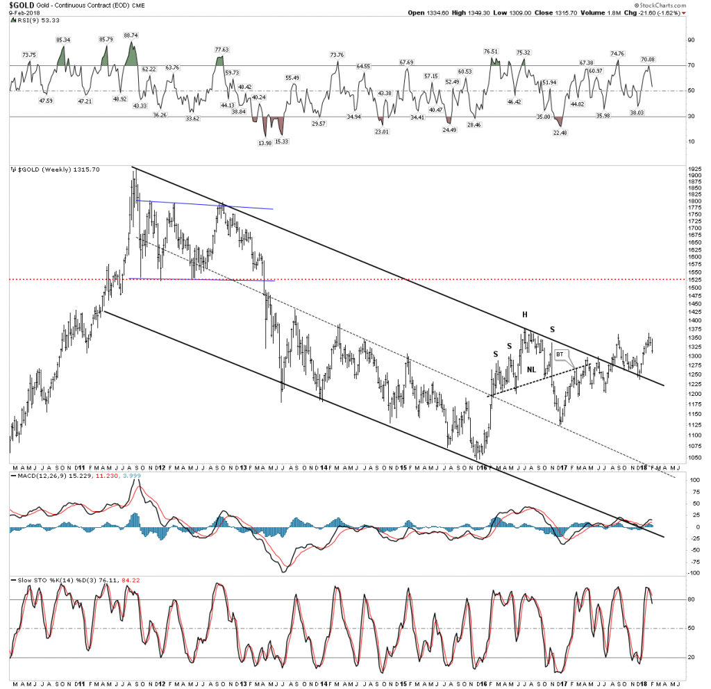
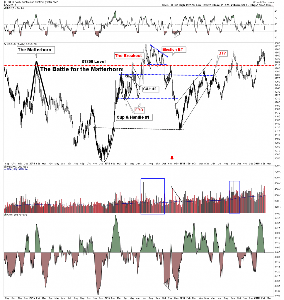
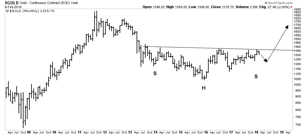
I’ve been so focused on the stock markets I haven’t had much time to look at the PM complex. Until gold can take out the golden neckline the bear market is still in force. That neckline is still holding resistance this week.

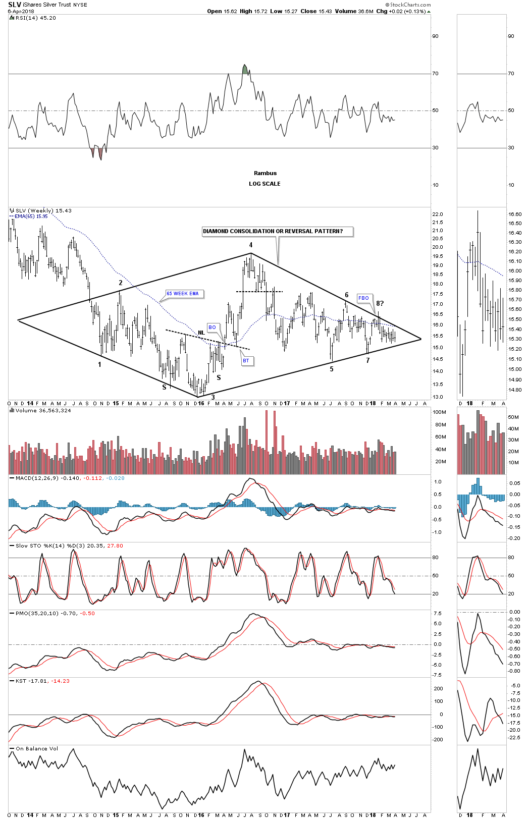
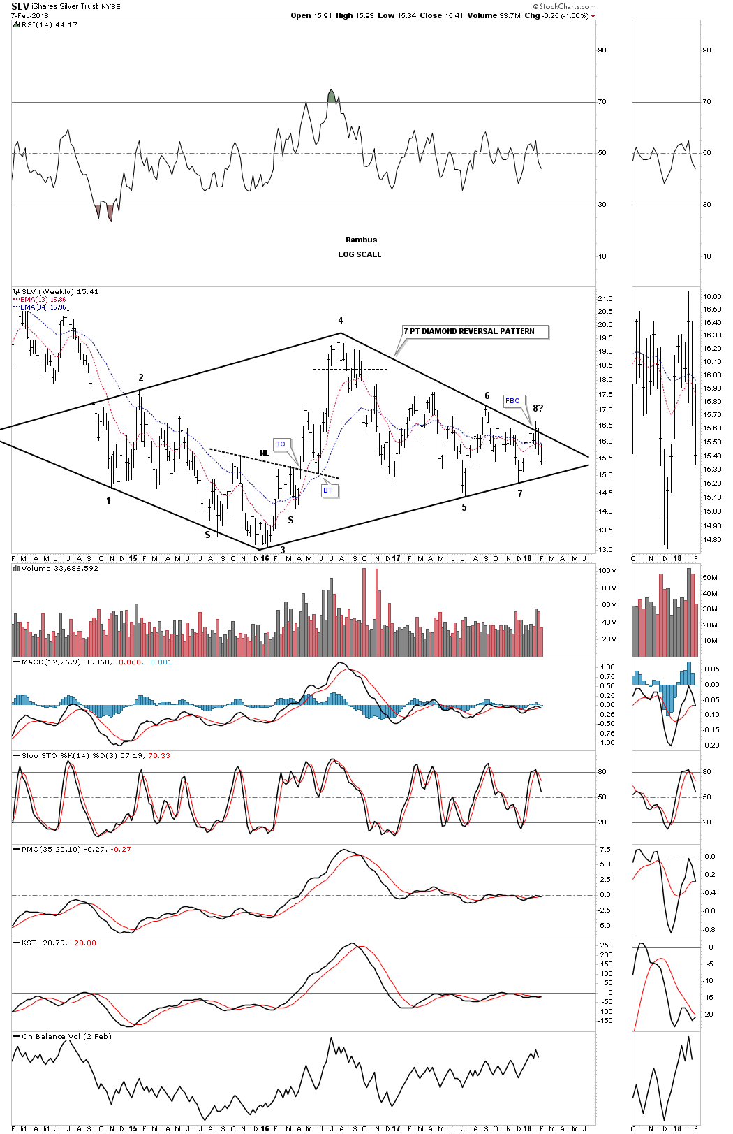
Three weeks ago it looked like SLV had a decent chance to finally breakout from that three plus year diamond pattern. When the price action hit the top rail that completed the seventh reversal point which would have put the diamond into the reversal category to the upside. The failure to breakout now put the price action into a possible 8th reversal point which would be a consolidation pattern to the downside if the bottom rail gives way. As you can see the price action is getting more compressed as the chopping action into the apex continues.

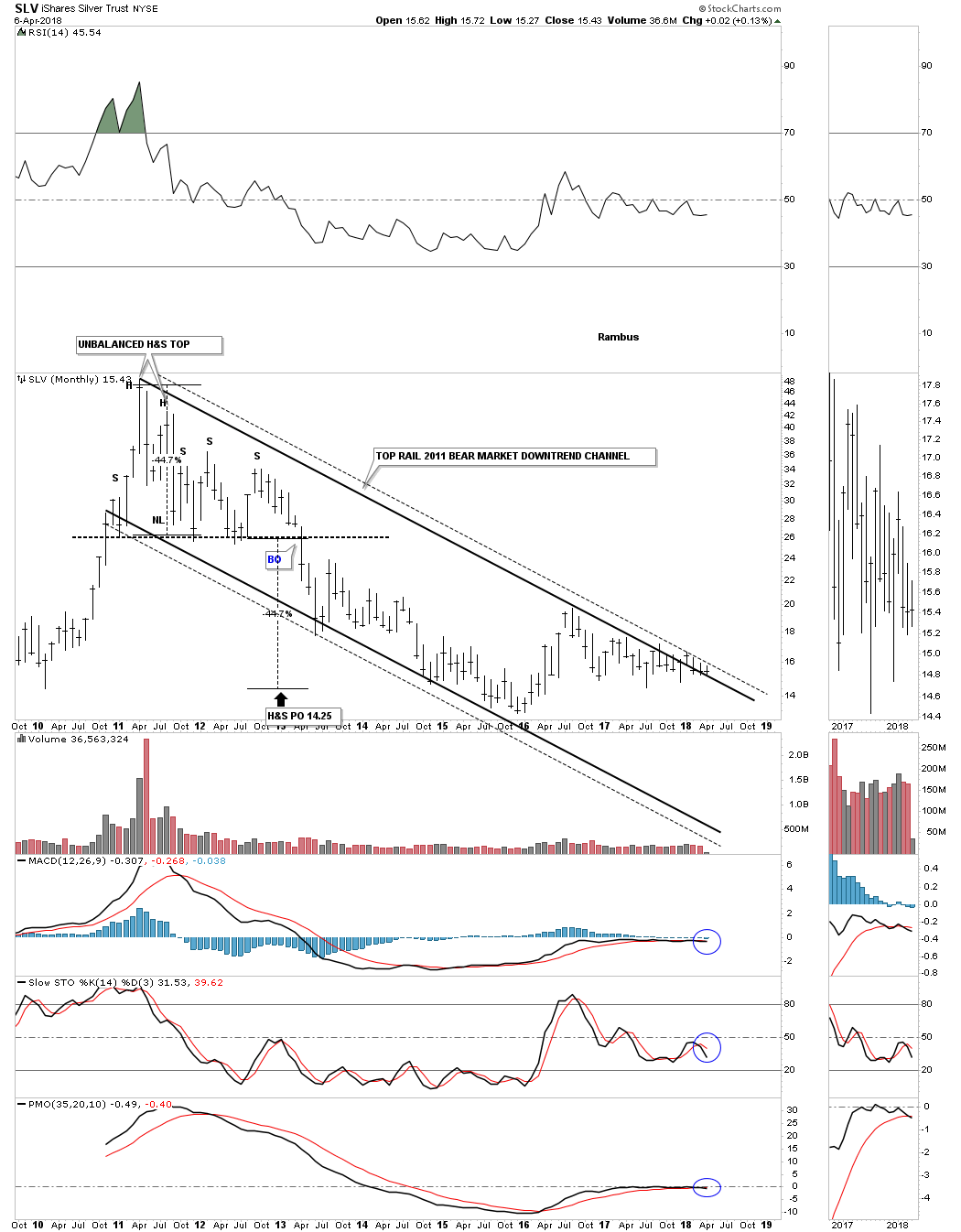
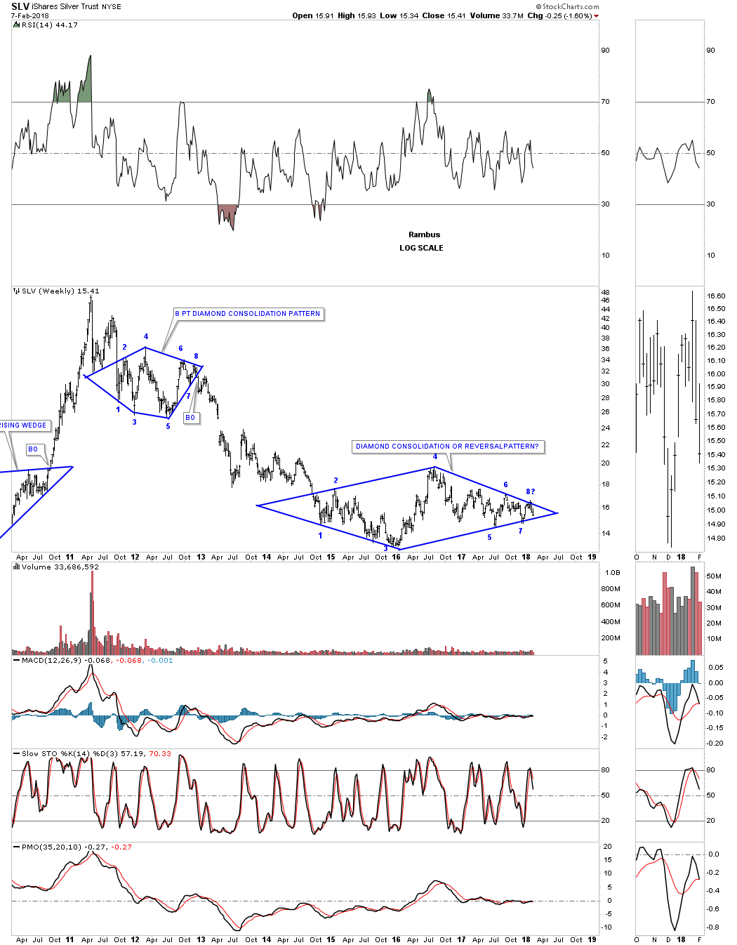
This long term weekly chart puts our current diamond in perspective. The million dollar question is what direction will the diamond breakout?

The easy part of our bull market in stocks is now over. Now the hard part starts. The volatility is going to be insane for awhile and that will drive most investors nuts. Understanding what is happening can relieve some of the pressure, but the markets are made up of emotions which is hard to control for most investors. Greed will trump fear every time. All the best…Rambus

EBAY Update…

I’ve been patiently waiting for EBAY to breakout from its 18 month bullish rising wedge. Today it finally broke out with a huge breakout gap. If it backtests the neckline at some point in time around the 41.60 area I will take a position.

The weekly chart puts the bullish rising wedge in perspective.

EBAY built out a massive double H&S bottom that launched its bull market. Big patterns lead to big moves. This stock was born in the 1990’s and was one of the leaders back then. Maybe it will take on a leadership role once again.

GLD Update…

I mentioned the other day that we needed to watch the price action when GLD hit the top rail of its 2 year triangle. We just got the initial hit and now the reaction back down. We now know the top rail is still hot. The key now is to see how the reaction goes. So far this is normal behavior.

GDXJ Update…Breaking Out

Today the GDXJ is breaking out above its neckline. Again I was looking for a little more chopping action between the neckline and the neckline symmetry line before the breakout, but so far it’s not happening. I’m going to take my second position and buy 150 shares at the market at 35.34 with the sell/stop at 33.31 for now. A backtest to the neckline would come in around the 35.10 for a slightly lower risk entry point.

Below is a longer term daily chart which shows the price action since the August 2016 high as a big morphing triangle consolidation pattern as shown by the red circles. The 6th reversal point has formed the H&S bottom which we’ve seen in other big consideration patterns is generally a very bullish setup.

Weekend Report-The Next Long Term Investment Cycle…How to position oneself.

My past two weekend reports have armed the investor with ideas for the coming year 2018.  This week’s report summarizes those ideas, updates the current PM rally and adds more ideas to the list.  It is important to understand the driving force which will fuel the coming bull market in precious metals so I lay it out. I will then focus on what I consider the best risk/reward Precious Metals Royalty company… Sandstorm Gold Royalties.

Previous reports have detailed that we are in the end game of this Economic expansion and bull market in stocks. Numerous interest rate indicators suggest the economy and stock market have further to go before they peak as it appears likely the expansion has about 12-18 months remaining. During this time the FED plans to allow the economy to run HOT with inflation exceeding its 2% target. Mind you this will not be the “good” kind of inflation as it is likely to manifest itself as stag-flation. Think 1970’s.

Eventually the FED will be forced to respond to the threat of galloping inflation by raising rates which will result in pricking the bubble. That’s when things get very interesting, we will pick this theme up below, but first let’s analyze the current rally in gold and PM stocks.

GOLD- Puts in an Isolated Low

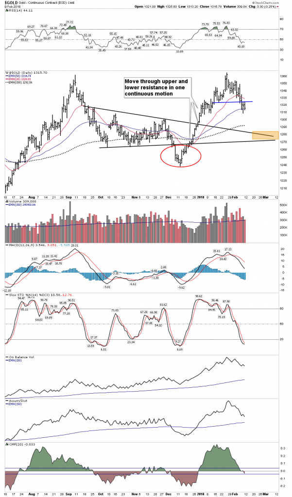
On 12 December gold put in a low of $1238 USD. The tell was the previous days volume was the lowest since August 7th. Very few sellers were willing to sell at that depressed price while others simply stayed home.  Furthermore, the COT was generating a major buy signal as commercials used early December to cover their shorts and retail longs finally gave up and sold their long positions. In the chart below we see how gold underwent a 2-week power dive from late November to early December, slicing down through its horizontal contracting triangle.

This breakdown was a capitulation move which can now be seen as an isolated low.  Gold was now primed for a sling shot move which then ripped up through upper and lower resistance lines without pause in one continuous motion. This past week it paused in a consolidation of the 4-week move but Friday broke out above above it.  The consolidation lasted 2 weeks and can be considered an upward running consolidation.

I do not believe this is the beginning of Phase II in gold’s bull market which started in Dec 2015, however one cannot know for sure this early.  It is my assessment that it is simply just another rally within an on going correction of the upside move from Dec 2015-Aug 2016. It is however, a tradable rally which is likely now approaching it’s halfway point.  Late February to early March would be appropriate timeframes for it to end. If this is how it actually unfolds I will be taking profits at that time.

So here is what to look for: The 2-week running consolidation now appears to be over as of Friday. During  that consolidation it was essential that any pullback not be any deeper than 50% of the initial move. That level is $1282 as can be seen on the FIB retracements. A daily close below this level aborts the rally. These type of rallies off of isolated lows typically last on average  9 weeks plus or minus 3. That would bracket an interval from 18 Jan-15 Mar.  If the dashed running correction bull flag I have drawn resolves into an upside breakout this would be a markedly strong move and could point towards a measured move slightly above $1400.  After Friday’s action this appears to be the case.

As always I defer to Rambus’ exceptional charts of the PM sector, but I also post my own below to show a different approach to compliment his work.

Weekly Global Gold Index- Shaping up for an end around apex breakout?

Daily Global Gold Index- Surged right up through the 200 & 150 EMA in one day:

GDX- Friday’s action shows the move resuming:

The USD

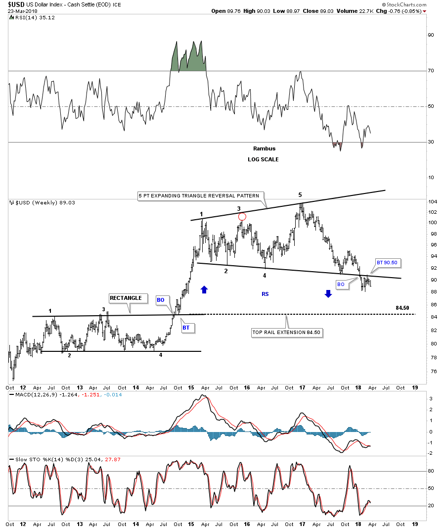
Yes, we all know the ultimate destination for the USD is to lose its status as the world reserve currency and to become simply a regional currency as the British Pound is today. But how it gets there no one really knows. It is my understanding that before it loses its reserve status it will undergo a rally of strength during the post bubble contraction phase after the bubble bursts. I have forecast that the bubble begins to burst within 1-2 years.

Below we see a chart of the USD from 1989-1991 where it reversed a 2 year bear market with another example of an isolated bottom. The pattern we see has similarities to what the current bear market in the dollar shows today.  Note the prolonged accelerated decline and the bounce up to the 30 W EMA. This average then repelled three weekly price bars before the price resumed downward. The USD then went on to violate the previous low and put in an isolated low.

The current chart of the USD has a similar appearance. If the same outcome were to occur it would support the scenario of the gold rally I have described above. Over the next two months a breakdown below previous lows would juice the gold price, perhaps above $1400. However, a bottom in the USD followed by a renewed uptrend would likely crush the existing gold rally.  We will be keeping an eye on this as a possible outcome.

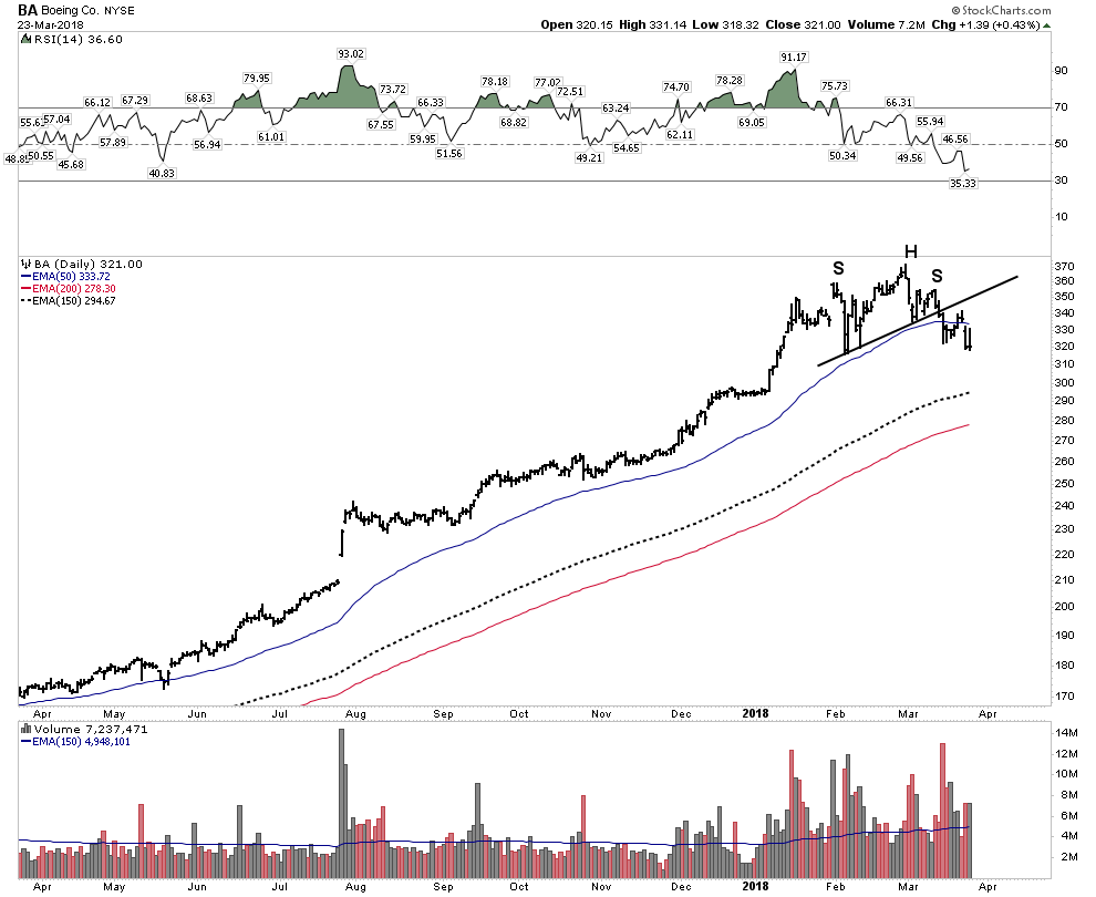
Boeing (BA) is it starting to sniff out a USD devaluation?

Boeing has a historic pattern of declining after the Paris Airshow in June, similar to mining stocks declining after PDAC. Therefore I attempted to short Boeing last summer at the time of the airshow. It was a short-lived unsuccessful trade. Judging by the huge rally in the stock one would think their earnings are going vertical as well, however they are not. So what’s behind the parabolic rise in the stock?  Maybe it’s the market sniffing out an eventual devaluation of the USD?  Boeing more than any company would profit from such an event. Their product pricing would then have a huge advantage over Air Bus or Bombardier.

Put Your Macro Hat Back On- The Fuel for The Upcoming Bull Market in Gold.

The transition of the USD from the world’s reserve currency to a regional currency will be wildly bullish for gold and the mining stocks.

Gold is historically undervalued relative to the US Government’s outstanding debt position. When these debt obligations are finally resolved either through default, inflation or renegotiation, gold will become the prime asset that collateralizes the FEDs balance sheet since the value of its existing collateral made up of its bonds will be diminished. This process will cause gold to rise to levels which the general public cannot remotely conceive of today.

In the next financial crisis gold will serve the role which the CDO fulfilled in the last crisis in 2008. As debts imploded the short sellers used the CDOs as their vehicles to capture the trade.  However, those CDOs didn’t move until the crisis was well developed. This is why the characters in the movie The Big Short underwent prolonged pain before their accounts finally rose. I suspect gold may perform the same way, with its vertical rise not arriving until late in the sequence since its price is principally determined through paper instruments. However, once the paper is swept away the spring tension will be released. This means that its rise should be instantaneous and could occur literally overnight. This is what occurred in 1934 when FDR reset the gold price and its why one needs to be in the trade early on.  Keep in mind that central banks create not only bubbles, but they also create anti-bubbles. The foremost anti-bubble in the world today is of course gold. When the compressed spring gets released in the next crisis it will be too late to acquire a position.

Inflation is Coming

Recall the visual picture of massive FED QE analogous to record snowfall in the mountains. It’s not a problem to valley dwellers until the temperature rises. A warming economy (increased monetary velocity) has the same effect, it releases the stored up credit in the economy. Let’s look at another visual picture that portrays the process of  FED money printing:

A man in the shower initially turns on the water only to get a trickle of cold water.  So he turns the knob up a notch…more water, but still cold. He turns it some more…still cold. Finally he turns it all the way and eventually gets scalded with gushing hot water. This is what the FED has done with each QE program, unsatisfied with the result they continued turning the knob. Recall the last turn was called QE to infinity… no different than the man in the shower turning it full hot.

We can now see their efforts unfolding in the charts, the Chartology has set up, inflation is getting ready to bust out. Eventually the FED will respond to it and will prick the bubble.

A 1929 Review- Past is Prologue

1925– The FED believed they had abolished panics (sound familiar) so they lowered rates which ignited the boom phase of the bull market. This was done to accommodate the British in their need to stem the flow of gold out of England due to Churchill pegging the gold price too low at the pre-war exchange rate.

1926– Commerce Secretary Herbert Hoover warned of the danger of excessive speculation and excess use of credit.

1927– Benjamin Strong, NY FED chairman again helped the British by lowering USD rates to 3.5% to strengthen the British Pound. He literally referred to this as “administering a coup de whiskey” to the stock market. It indeed worked!

1928– With speculation getting out of hand by February 1928 the FED changed policy and began raising interest rates.

1929– Paul Warburg, prominent banker, warned that “speculative overexpansion invariably ends in overcontraction and distress”.
The FED was not able to reign in the excesses as they had now taken on a life of their own. With no remedy provided by any authority the excessive speculation was left to produce its own cure.

The bursting…by August 1929 the FED had raised rates over the past 19 months by 2.5% thus reaching 6.0% This 2.5% rise served to prick the bubble. There was no other outright visible catalyst for the crash of 1929.  The overheated, over indebted edifice simply began it implode onto itself.

Other historical bubbles such as the British Railway boom had its bubble pricked in 1845 by the Bank of England when they raised rates from 2.5% to 3%. The worst depression in USA history began with the bursting of the railroad bubble in 1873. The country had been engaged in speculation for the past 13 years leaving it with mountains of bonds that came crashing down ushering in a 20 year depression.

The point here is that prolonged excessive speculation leads to contractions. The FED has been enabling rampant speculation since the mid 1980’s starting with Michael Milken’s bond orgy.

The FED has been intent on blowing a bubble to induce speculation. This plan is revealed in the below quote taken from FED minutes by none other than the new FED chairman Jerome Powell in this rather shocking revelation:

Almost say?

Von Mises made clear that a credit bubble can have only one resolution: liquidation. The historical record bears this out and gold is the only asset one can count on to rise during such liquidation. Credit bubbles run in cycles and they inevitably end. Our keynesian overlords have blown this bubble beyond all historical boundaries. It will deflate, however this time the process could entail an inflationary outcome due to the purposeful devaluation of the USD.

Preparing for the next 10 years

It is now time to prepare for the next cycle. One can ride the tiger of the current stock market and try to jump off at the top, but as I have said…good luck with that, Sir Issac Newton tried that in the South Sea Bubble and lost everything.  I prefer to start positioning early with long term buy and hold assets. This requires one to take on non-consensus positions and eventually be proven right. I have said it before, I want everyone to agree with me, only later.

Whenever the next crisis comes it will undoubtedly include a contraction in the economy and the stock market.  It’s not really hard to imagine how the FED will react. Quite simply, they will buy everything that is not bolted down. The government cannot survive a 1930’s style deflationary contraction.  Such a contraction would lead to a loss of legitimacy since the government will not be able to fulfill their promises and obligations. The promises of medicare, social security and other social spending can only be met through rising tax receipts. They can accomplish this through inflation which solves their problems. So we see that once the crisis arrives the FED will not choose to fight inflation, instead they will surrender to it.

Portfolio Construction

So what should we own in this coming environment?  We need to own investments that have intrinsic or tangible value. Assets that will go up with inflation without lifting a finger. This is an investment sector that has been out of favor for almost 40 years now. Beginning in 1980 the cycle slowly turned away from this sector and began to favor financial assets over tangible assets. That cycle is about to turn again. Let’s look at how one successful team navigated the transition last time from tangible assets to financial assets. Sid Bass and Richard Rainwater were friends and classmates getting an MBA together at Stanford. Throughout the second half of the 1970’s they minted money together investing in the oil sector, however by 1980 Rainwater realized a change was coming. He saw the transition from tangible assets to financial assets and began positioning for the change early. Rainwater didn’t believe in broad diversification he stated “You only have so many good ideas in life, why not put your money in what you really believe?”. And so they did, putting all of their eggs in one basket buying a controlling interest in Disney. They turned their $50 million starter position into $5 Billion.

This 40 year cycle is about to change back to favor tangible assets over financial assets. As the USD is intentionally devalued as a means of solving its debt problem the tangibles will provide a store of value that financial assets cannot. We want to own investments which will flourish in this environment.

Core Positions- Royalty companies

The reason the royalties should be the core of ones portfolio in this environment is because of their financial efficiency and ability to perform in an inflationary environment. It has been said that Warren Buffet is NOT a stock picking genius. Instead, his genius lies in his ability to obtain capital at a negative cost basis. He does this through owning insurance companies. There is a reason that insurance companies have been across-the-board top performers for the past 40 years: their business model is financially efficient. They acquire capital often at a negative cost. If their underwriters do their job correctly the company retains the premiums which becomes their capital base. The same principle applies to the resource royalty stocks as their capital costs are less than the miners and their business model is financially efficient.

Royalties have low over heads and fixed costs of production. Unlike the miners who are subject to increasing input costs the royalties have predetermined set costs for their metal production. This affords them unbelievable leverage in an inflationary environment.

Altius Minerals– This company has been covered extensively before and it embraces this business model and is currently rising in an impressive impulse move. Since my last report Altius has reported an increase in earnings of 81% over the previous year and increased the dividend 33%. This is a coffee can stock… put it away and forget about it.

Monthly- Could the Triangle be a Halfway move?

Weekly- The Impulse Move Continues

Sandstorm Gold Royalties

I named SAND as my #1 gold pick for 2018. It has the optimal risk reward balance of all the gold stocks IMO. Its CEO Noland Watson is assembling a resource and a team that will make this company a prominent player in the upcoming bull market. Noland was an industry prodigy graduating from college at 19 years old and dictated his own terms in his first job working as the direct assistant for the CEO of a major mining conglomerate. He was in the room for all the deals that this company closed.  He moved on to become the CFO of Silver Wheaton and then struck out on his own with start-up Sandstorm. Sandstorm had a great start but then disaster struck for the boy genius. A few of the larger sized deals they had done blew up and the stock got smashed. What I love about all of this is that Noland got hammered then survived. Rick Rule has told me that the reason for the downfall was because Noland wouldn’t listen to his geologists counsel when he did these deals, He thought he knew better than them. There is nothing better than for a young man to have his comeuppance, as a life changing failure which teaches a little humility.  I believe he has learned and is much better equipped to run this company after this schooling.

What I like about Noland is he is a no-BS kind of guy. He doesn’t suffer fools gladly. He is on a mission to build Sandstorm into a world class royalty company.  Another reason the royalty model is so efficient is because like insurance companies their cost of capital is cheaper than the miners. This is what makes it all work as they can access capital cheaper than the miners and invest it into them. Also their earnings are assigned a higher PE than the miners.

For these reasons the royalties should form the core of ones portfolio in the upcoming bull market.

Below the daily chart of SAND shows the current consolidation resembling the gold chart at the top of this report.  If price breaks above the bull flag running correction it has a measured move as depicted at the top of the chart up to $6.50.

The weekly chart below depicts it making a nice back test holding support this past week. You can see a measured move above the NL measures to the peak of June 2014.
Back in April 2017 the stock got crushed when they announced their purchase of the Mariana Resources discovery in Turkey.  Initially the market didn’t understand the deal and thought it outside the business model of SAND.  Investors, however have come to understand the incredible advantage of owning this claim and the role it will play in Sandstorm’s future. The Hot Maden deposit is a 14 g/t resource with plenty of upside discovery potential. This is the best discovery in the gold sector in years. The mine should begin producing in the year 2020. Recall that S-curve analysis shows companies get re-rated as they get closer to production. So the year 2020 should be right in the sweet spot of the beginning of the next financial crisis and Sandstorm brings on new high grade production. This is one of the reasons I see this stock in the vicinity of $25 once production begins. By 2022 Sandstorm production should be about 130,000 ounces, with production costs virtually fixed.

Osisko (OR)- Another Royalty for the Core Portfolio

Simply put Osisko is a machine… Cranking out projects and spin offs faster than one can keep track of.  If you have ever watched Sean Rosen present he impresses as the most knowledgable in the business.  Recall he likes to say “wealth is created at the drill bit, everything else is just a derisking operation”.  If Sandstorm’s Turkey exposure gives you pause then Osisko is a great alternative since they are focused on North America.

Over the past 4 years since their IPO the stock has been chiseling out a broad base…remember big bases support big moves:

Friday’s one day move in Osisko was impressive.  Now with all gaps filled it is ready to go:

Franco Nevada and Royal Gold

These are the blue chips of the group and will serve you well, however I prefer not to hold them as I see Sandstorm and Osisko delivering much more bang for the buck in a bull market.

Noteworthy Stocks in the resource sector:

Roxgold (ROGX.to)

This one now looks ready to go. Having spent the past 18 months consolidating its break above the NL.  It appears to have completed all of its technical work and is now poised to move higher.

Orezone (ORE.v)

The below monthly chart really shows this stock is on the move. Orezone was one of the most likely to be taken over blue ribbon picks in my EOY report.

Pretium (PVG)

The recent decline which shows up on a daily chart was due to Bob Quartermain playing take-over hardball. He is holding out for a higher price and one of the suiters walked away. But make no mistake, technically this stock is getting ready to rock.
Arch Coal (ARCH)

This stock is developing a head of steam and is continuing to power forward. Earnings is what is driving it.
Chipotle (CMG)

The chart is taking the form of a turnaround bottom. A break above the NL would be the initial buy signal.

Uranium Energy Corp (UEC)

A low risk entry point if it survives a successful BT of the top line. When do we ever get a low risk entry in the uraniums? Well here it is…this is an opportunity.

Ivanhoe Mines (IVN.to)- An approaching accident?

The Blue Ribbon edition suggested that this may be the year for the Ivanhoe “Gentleman’s Entry”. Holding onto this level looks to be getting more and more precarious. Look out below?

Long Way Down:

Pan Orient Energy (POE.v)

This also appears to be in a low risk sweet spot. Weekly stochastics are just starting to curl up. An oil strike would rocket this stock.

Turquoise Hill (TRQ)

Copper Monster TRQ is doing all the right things from a chart perspective.

Monthly shows it poised for a breakout:

The key to success in the next cycle is to know your companies and to get there early. Once the market starts moving there will be huge initial gains eliminating any chance of a near bottom entry. It’s time to saddle up and ignore the naysayers.

GLD Update..Bear Market.Reversal Watch

Just a quick update on GLD which is showing the price action approaching the top rail of its triangle trading range which should be around the 127.50 area. Many times during the formation of a 5 point triangle reversal pattern the price action will fail to make it all the way down to the 5th reversal point which suggests the bulls are eager to get positioned. A touch of the top rail will complete the 5th reversal point technically putting the triangle into the reversal category to the upside.

What we have to do now is to see how the price action interact with the top rail. Most likely we should see a reaction backdown initially that could be very shallow if it’s time for the triangle to complete. If the bulls are really fired up we could see a gap above the top rail which would be very bullish.

If this is the end of the bear market we need to see some type of reversal pattern build out or several reversal patterns for that matter. If the triangle ends up completing its 5th reversal point that would be a reversal pattern. As you know there is a very large H&S bottom that is also building out.

The possible 5 year H&S bottom.