Plunger has accepted an offer from Sir Rambus to do some of the Weekend Reports.
Who is Plunger >? See his bio at the end of the Post.
……………………………………………………………..
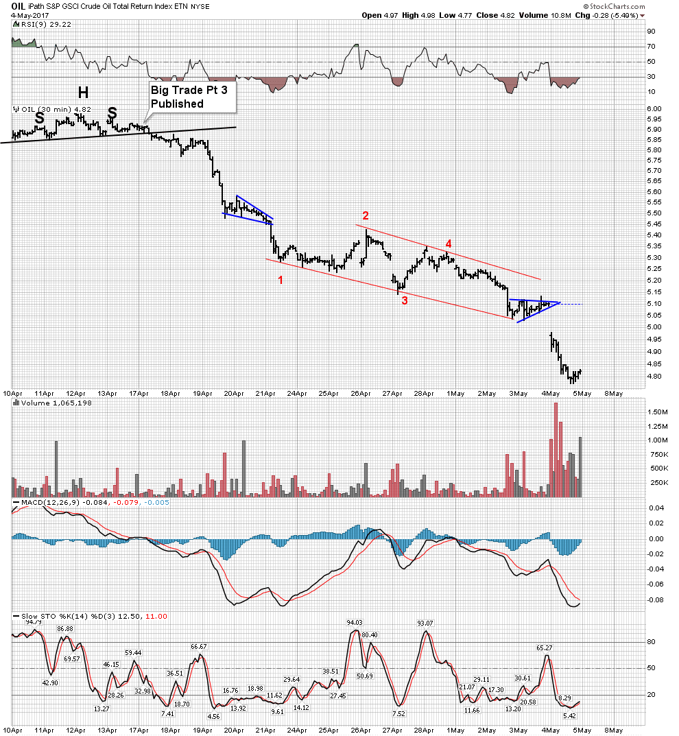
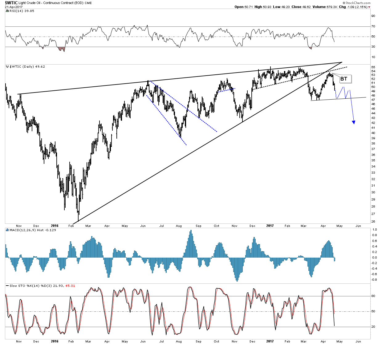
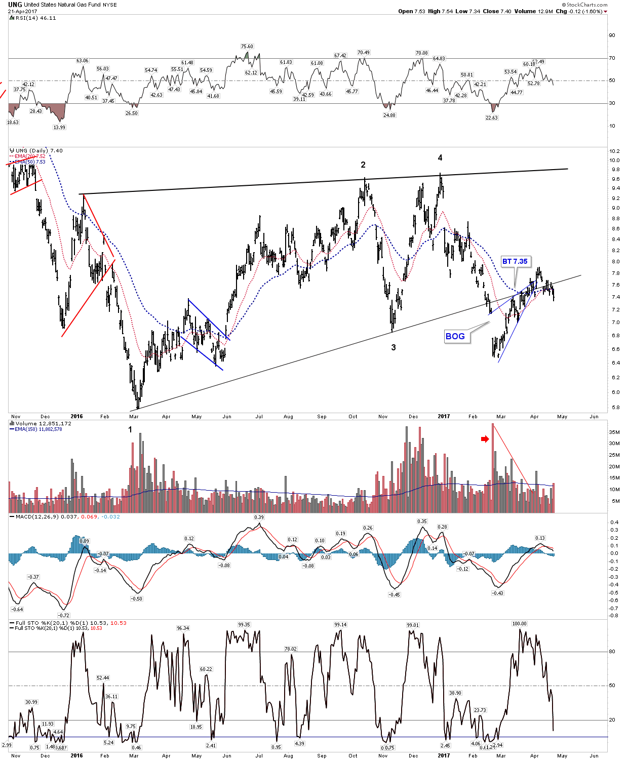
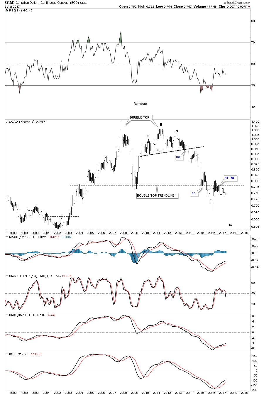
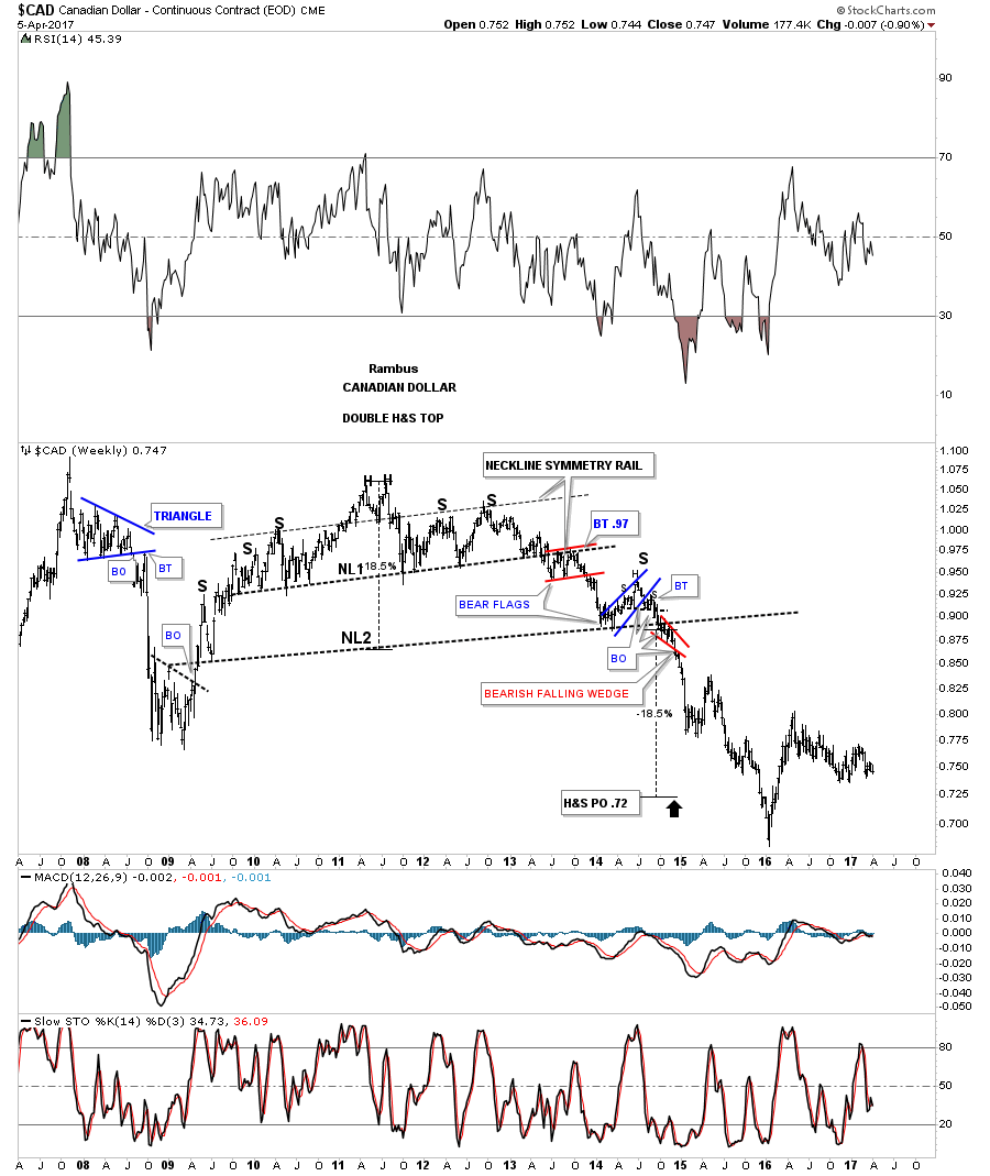
This weekend I would like to take a look at uranium to see if its ready for prime time, but first I thought it appropriate to review the Big Trade- “Plungers Trade of the Year”, in light of this past week’s fireworks. After the Big Trade let’s take a quick look at NATGAS, the PM sector then move onto uranium.
It ain’t bragging if it’s true- Will Rogers
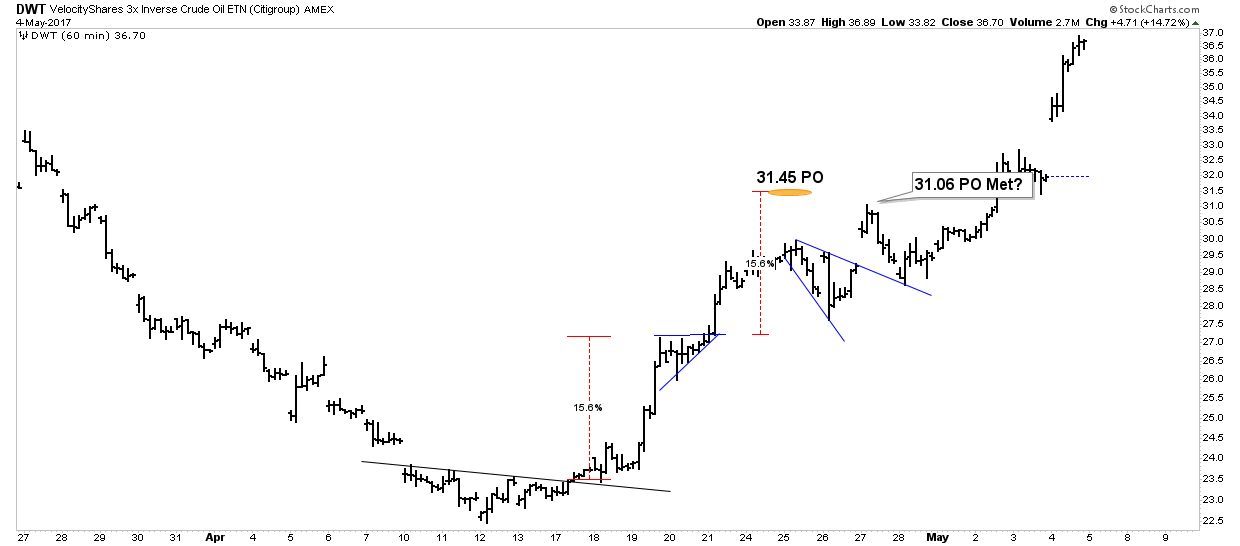
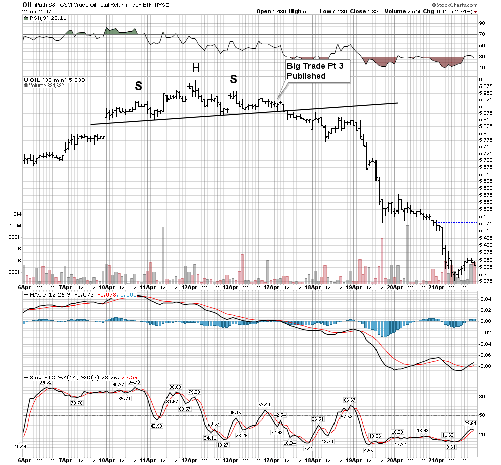
Last weekend I published Plunger’s Big Trade in a 3-part series. Part III which introduced the oil short trade was published just as the market opened on Monday. So anyone following the post had the logic of the trade and enough time to think about it to take a position when the final idea was published. It turned out timely as the market immediately started to move in the direction of the trade. Below is a summary of the vehicles I used to execute the trade and its one week after published returns:
UWT- short- 26.1%
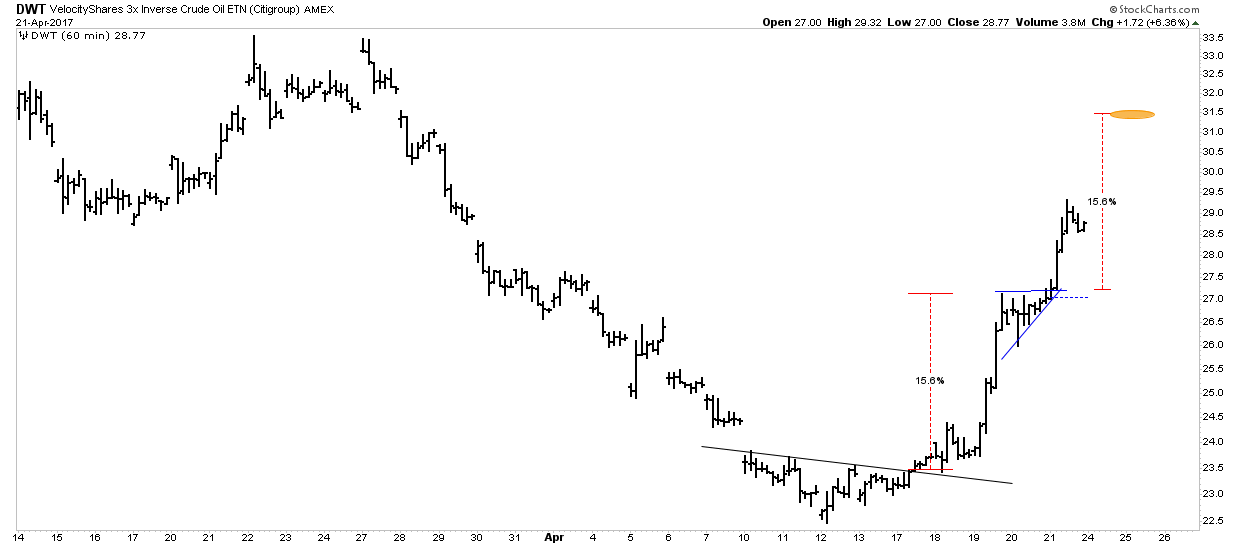
DWT- long – 24.0%
SCO July 17 30 -call- 61.4%
USO Jan 18 7 -Bear call spread- 17.6%
This is the 5-day return for the vehicles I used for the trade. It’s my view that this move has much further to go. So we are in a good position for further gains. Be Right-Sit Tight.
So here is my next forecast….No I will even make it a guarantee:
I will never have a more timely, first week higher return idea going forward in any future market recommendations. So there you have it, its all downhill from here knights. The best is upon us and future recommendations will never live up to this one!
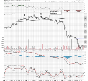
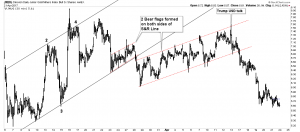
The Big Trade
Here is the weeks action. As I said it doesn’t get any better than this…. Note we got short just above the NL prior to the fall. I rushed this thing into publication because one could see this coming. Once the NL got violated it took until the next day to do its BT so there was plenty of time to reconsider and get into position. On Day #3 the deluge began.
As I mentioned in the original report don’t dismiss the small percentage moves we are talking about here as leveraged instruments generated large end moves.
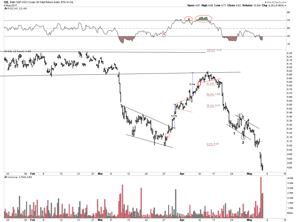
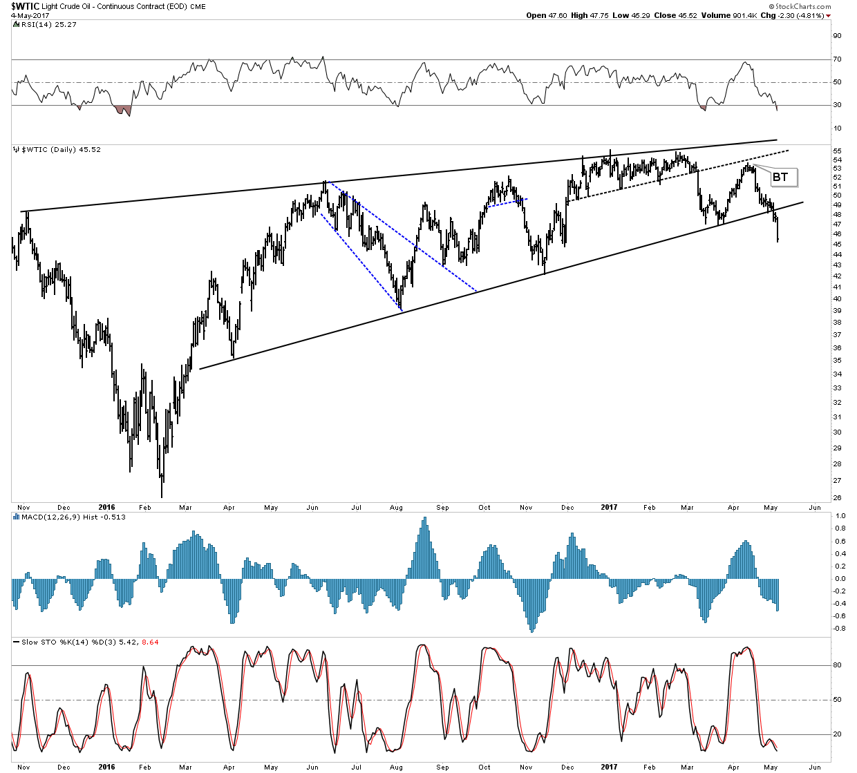
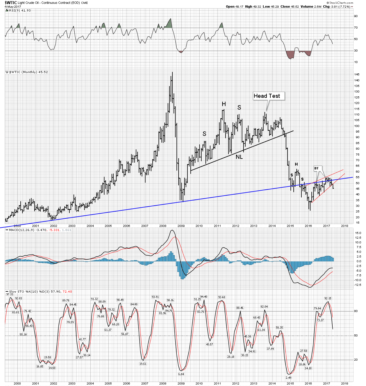
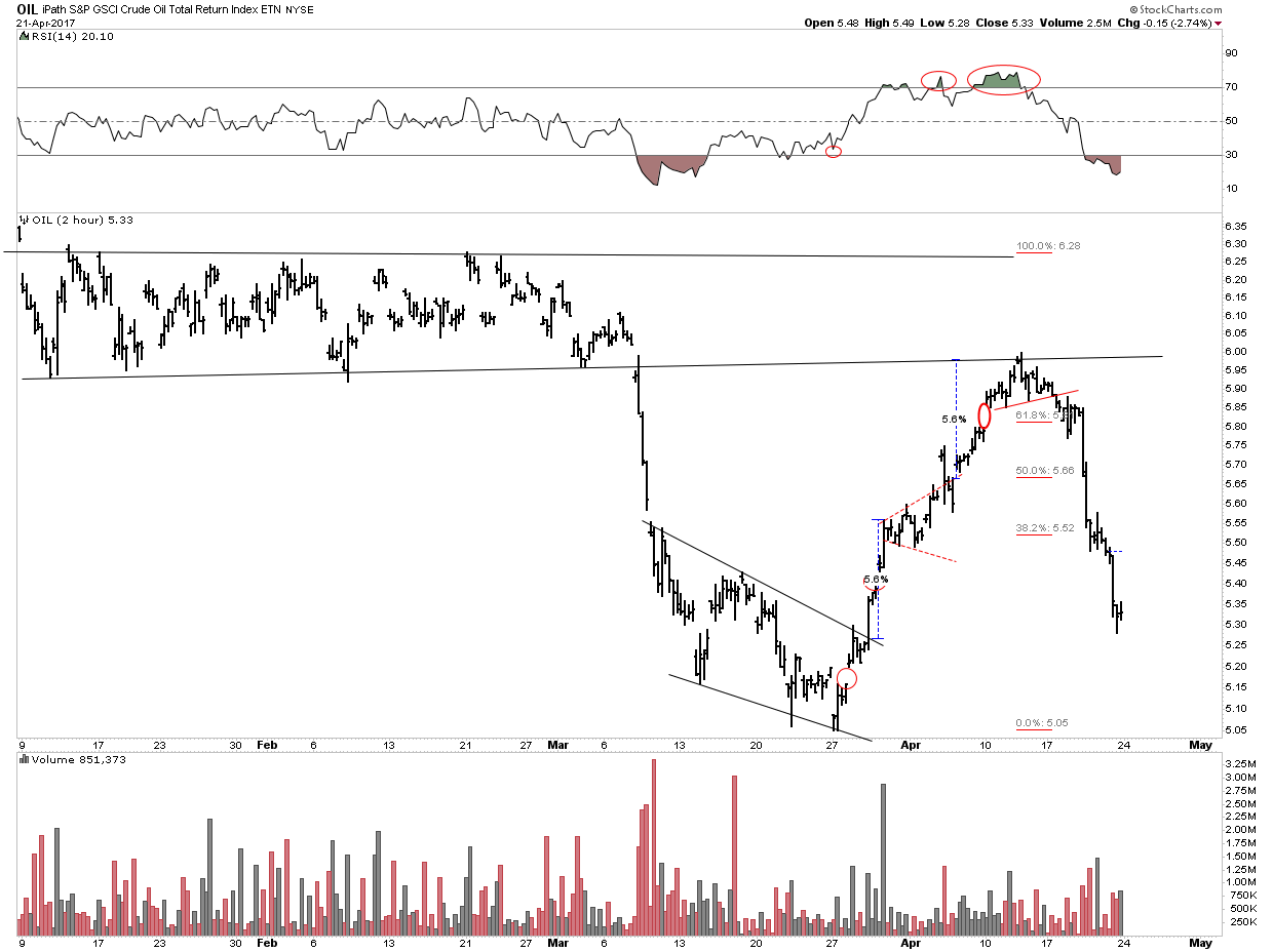
Next we see the one year retracement and trade chart. Significantly we broke the 150 EMA to the downside. Price seems to be respecting resistance levels
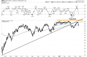
Oil seems to be close to finishing up the initial move which may end at the bottom of the range. In the next chart we see how oil completed its measured move to the upside on the way up to resistance. The second chart shows the potential measured move objectives in DWT the inverse 3X ETF.
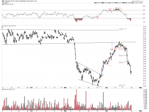
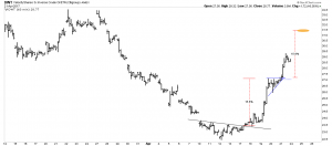
Now we look at the big move potential. Could oil fall all the way to the bottom and then some? Answer: Go back and read the report. The 3 Part Series can be found by clicking on the Last 100 on the sidebar here.
Below I speculate how it could take shape:

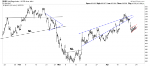
NATGAS- the other energy complex (the widow maker)
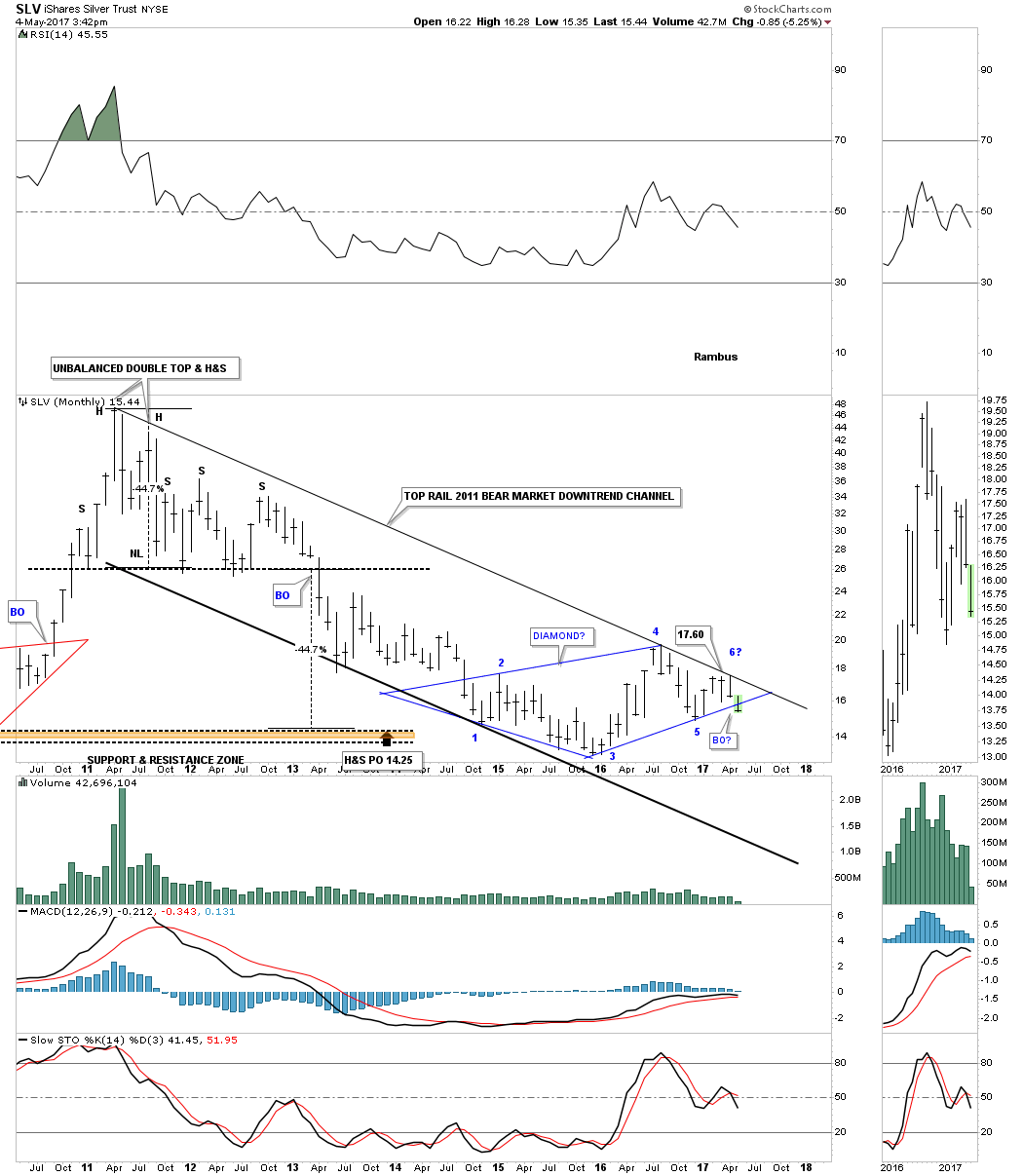
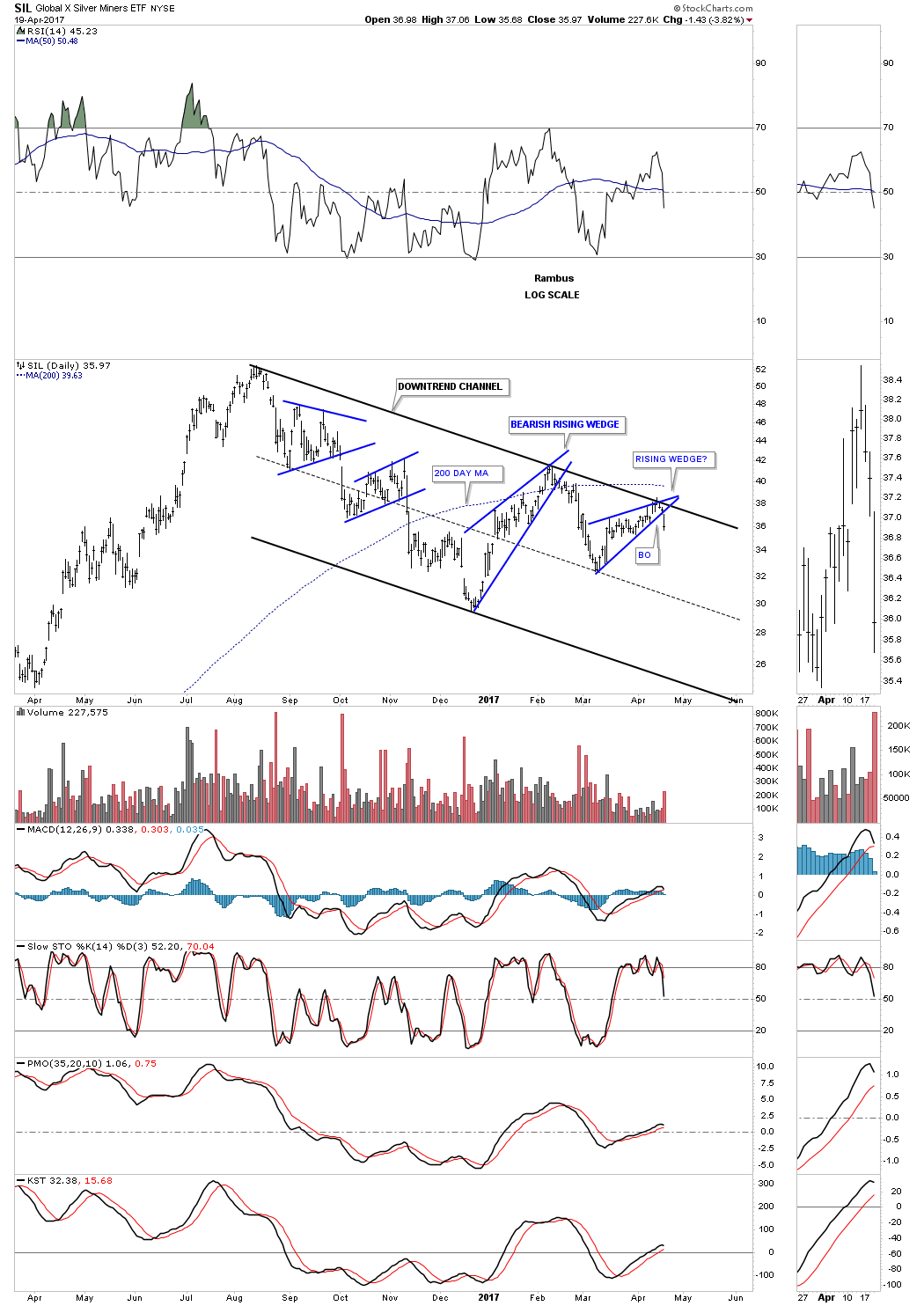
It appears NATGAS has finally succumbed to gravity and the prolonged incessant backtest may have finally completed. Throughout the week Rambus kept us updated on this and below I show my interpretation of the short term move. It’s consistent with Rambus’ view but its a different way to look at it. I see a diamond formation after the initial break out of the rising wedge. Also while still in the wedge it built out a Prominent H&S. I try not to see a H&S behind every bush, but this one was staring us in the face.
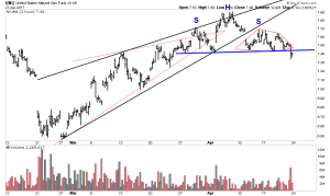
Here is the long term and intermediate picture and how the shorter view fits in:
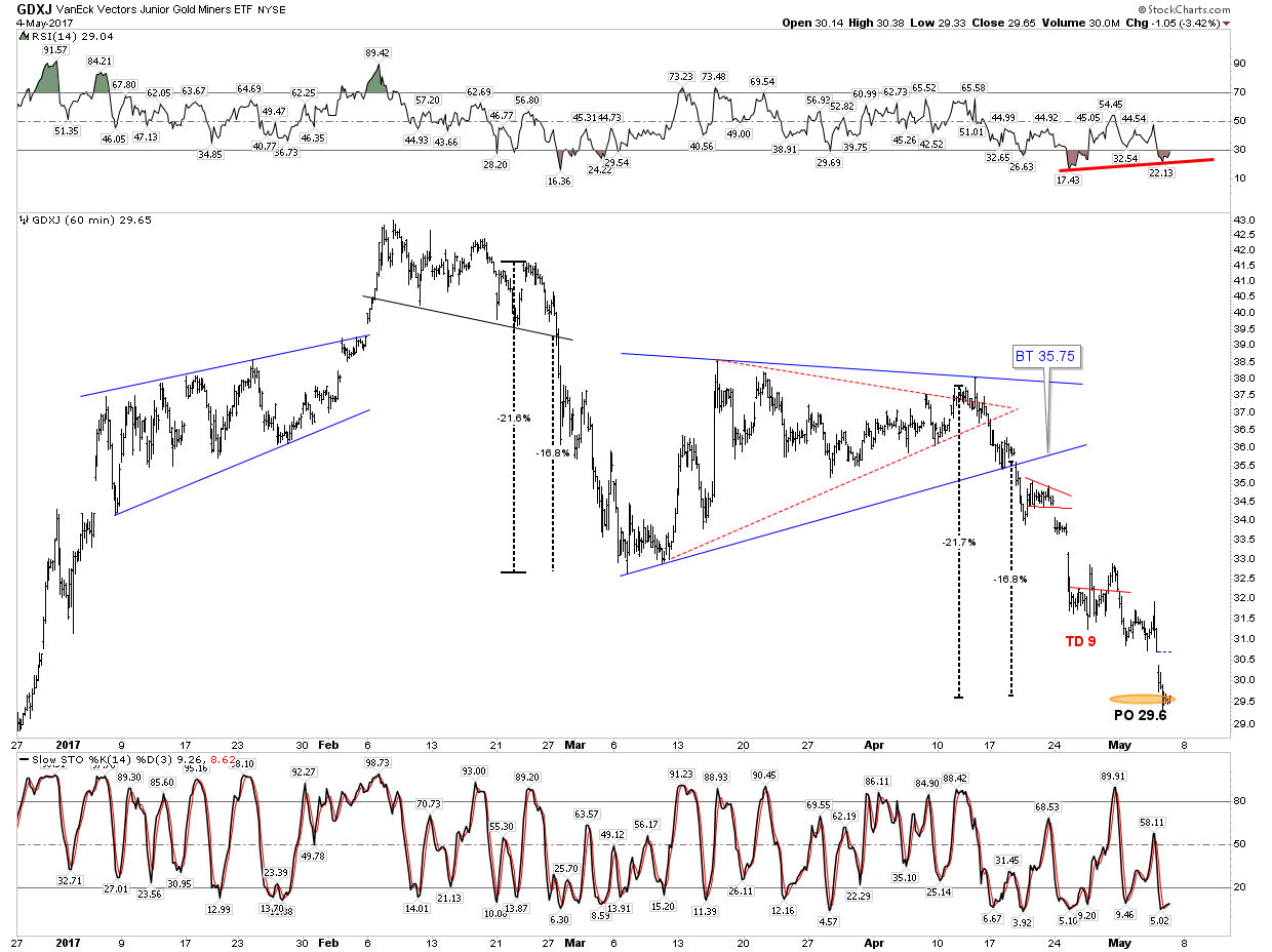
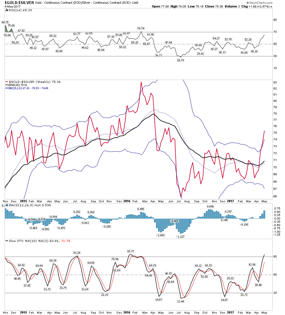
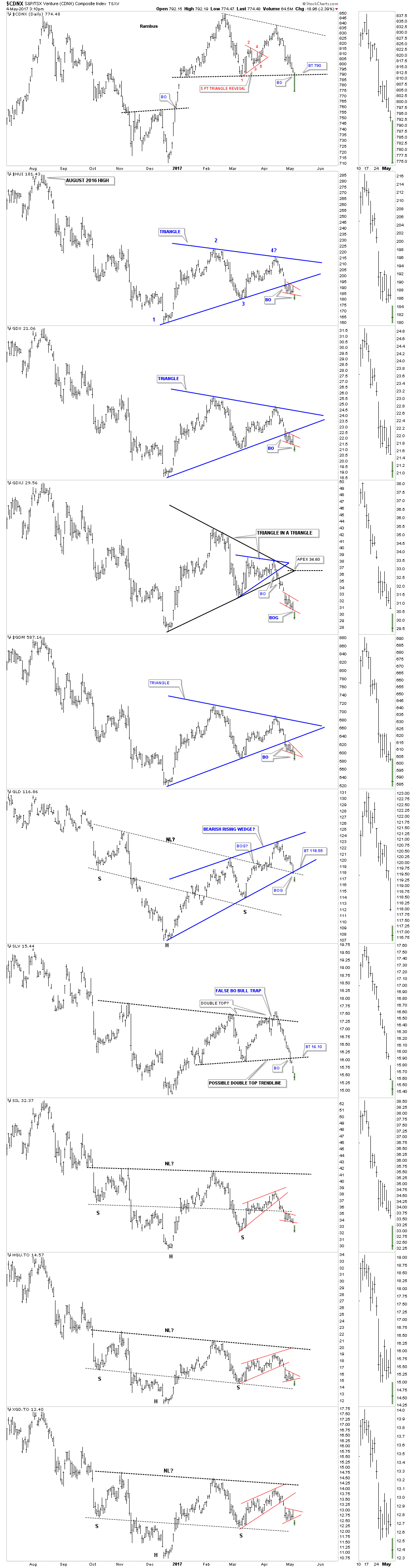
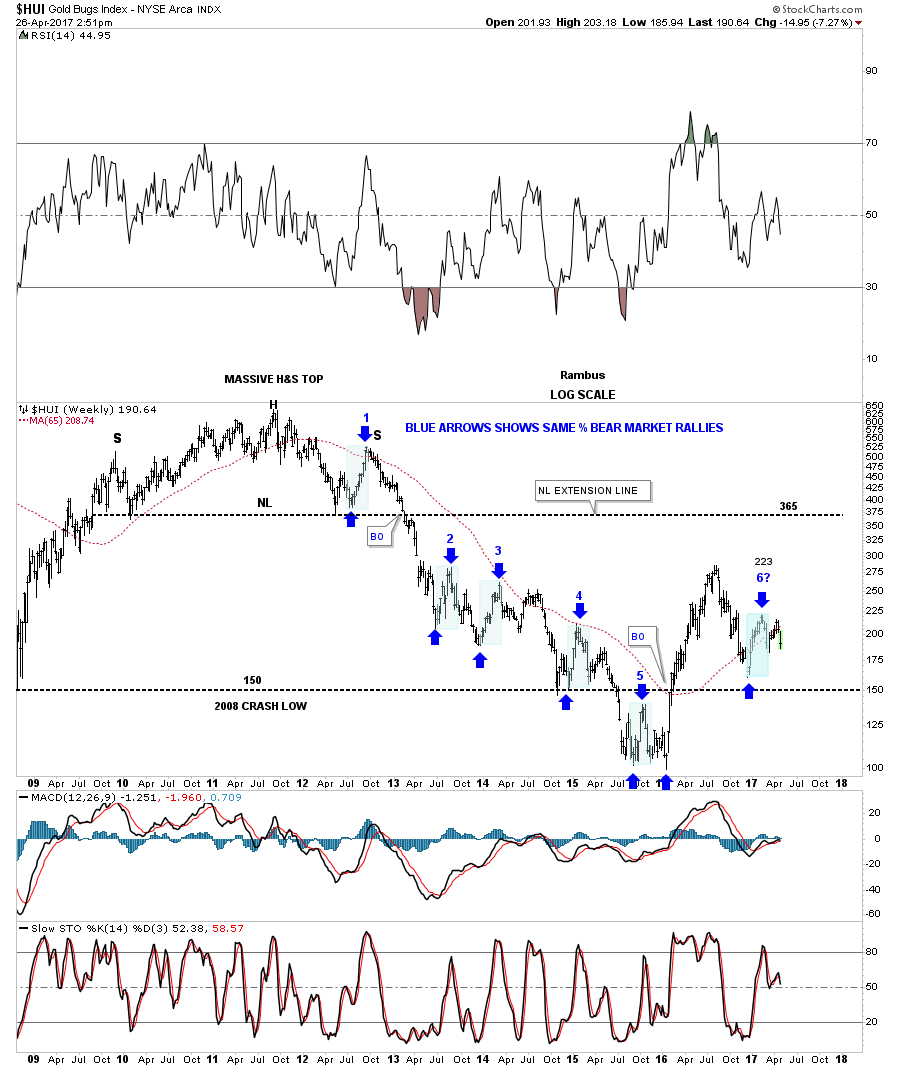
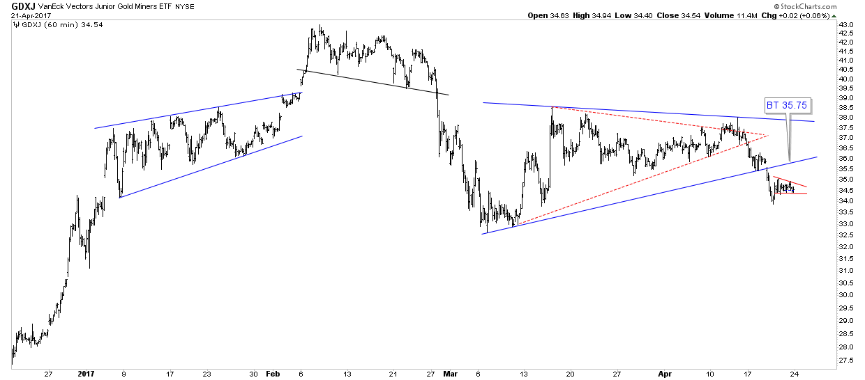
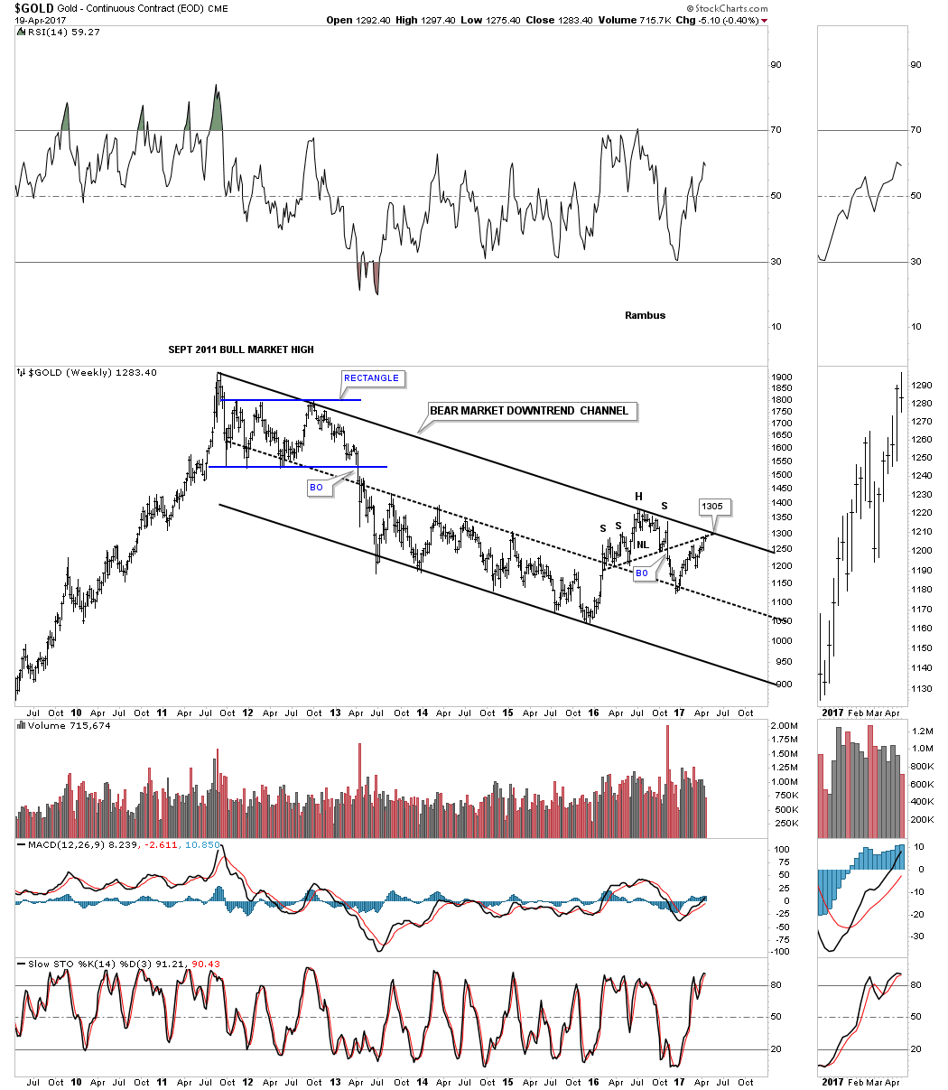
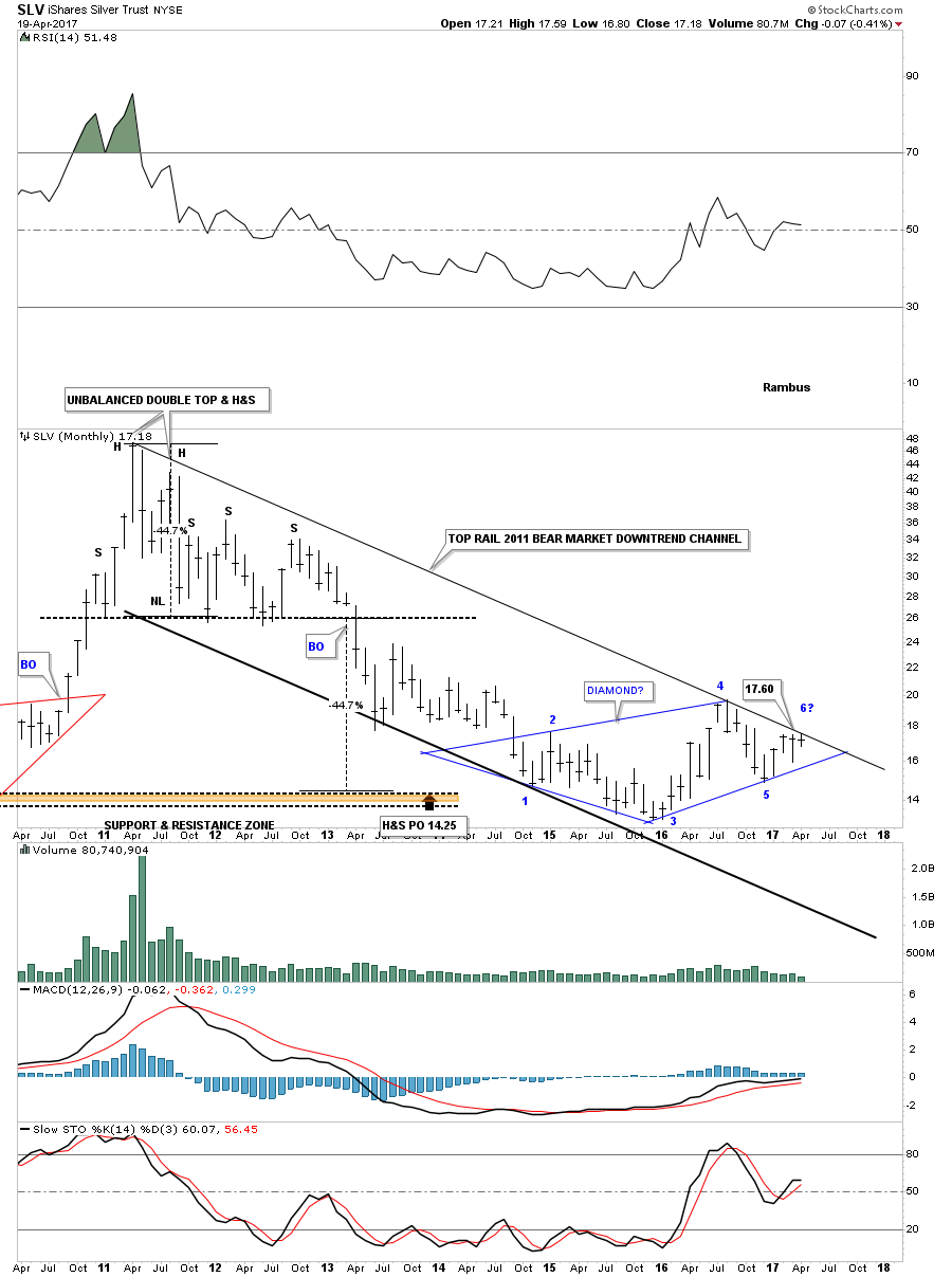
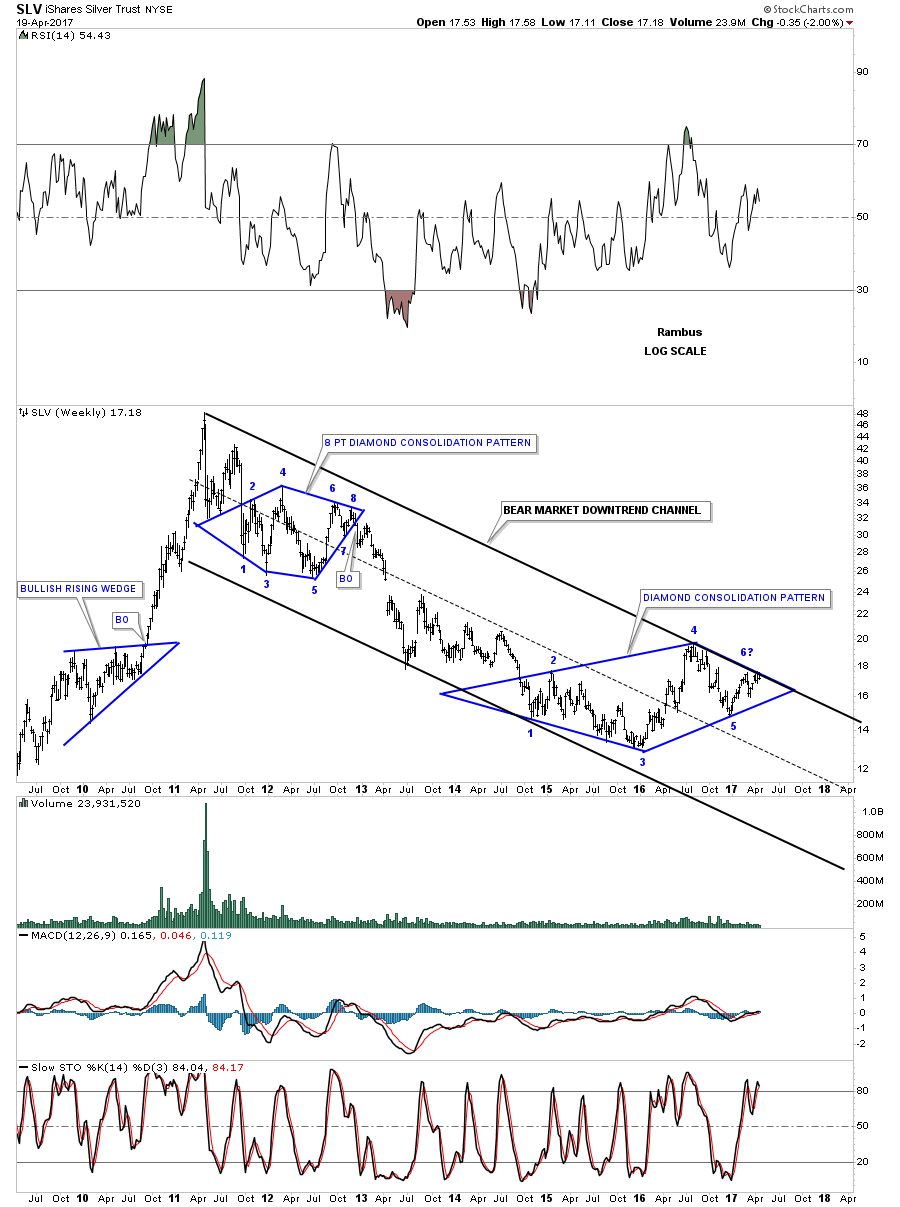
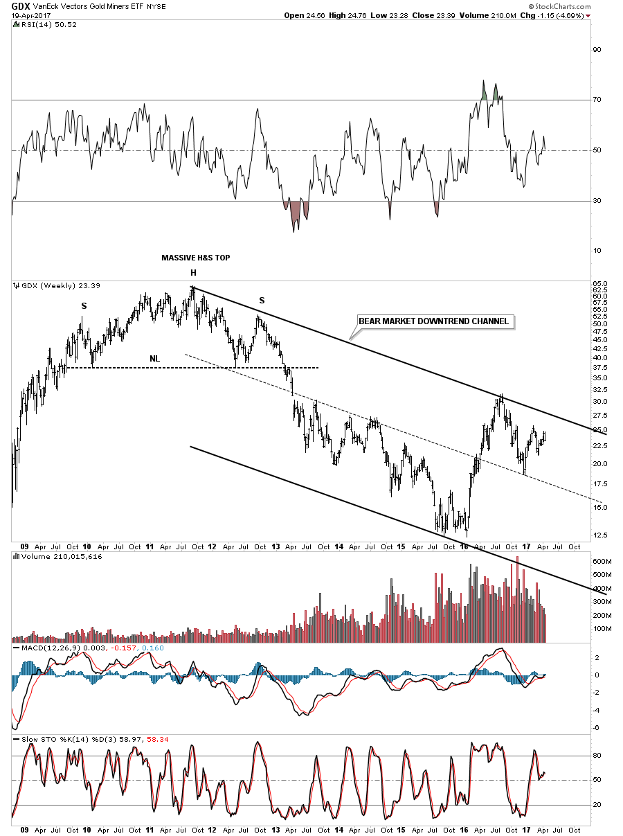
The Gold Space.
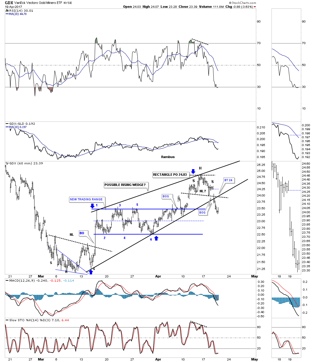
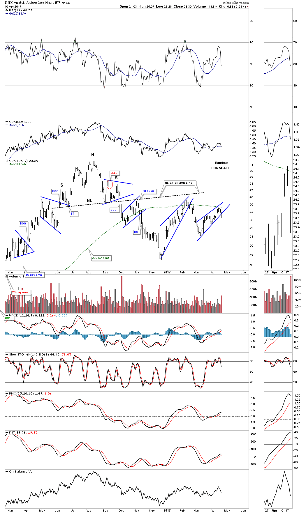
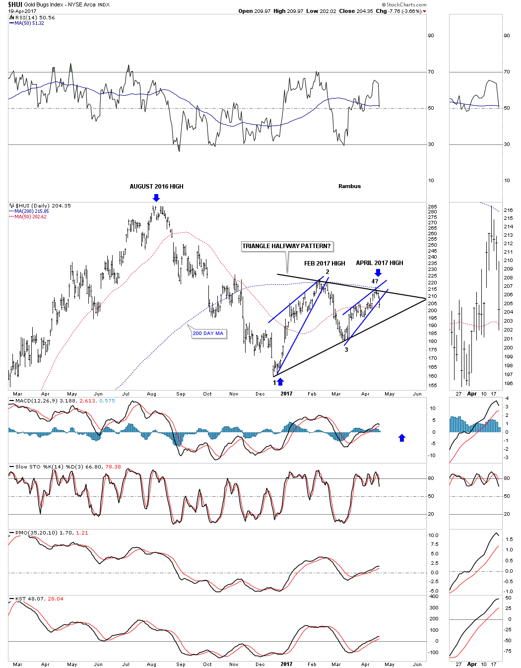
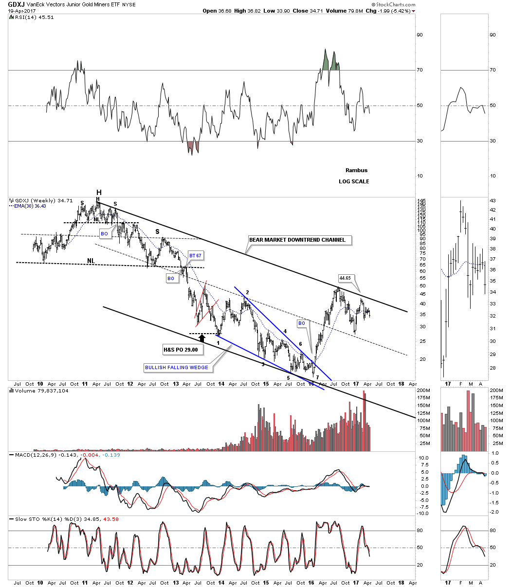
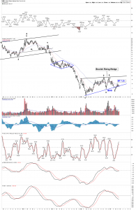
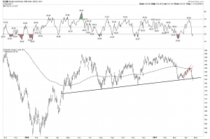
I really prefer not to short the PM space because at heart I am a reformed Goldbug. But I have learned, and I have the scars to prove it, that its better to make money than hold onto a religious view. So if there is an obvious set-up, even if its bearish, I will take it. That’s what I saw over the past 2 months and posted at the Chartology Forum. So as the expression goes…”he saw his opportunity and he took it”. I was short the JNUG and the JNUG only. I preferred to short JNUG rather than buy JDST as it was to be a fairly long duration trade and wanted to align decay in my favor. It may cap my return (max 100%) but puts odds more in my favor. I have since covered the majority of the short and am somewhat agnostic. Overall I interpret the charts as bearish and I retain the short, but in smaller size. I prefer other opportunities such as Oil short, GAS short, CMG ( Chipotle) long.
Short JNUG was a great trade and remember respect those bear flags!
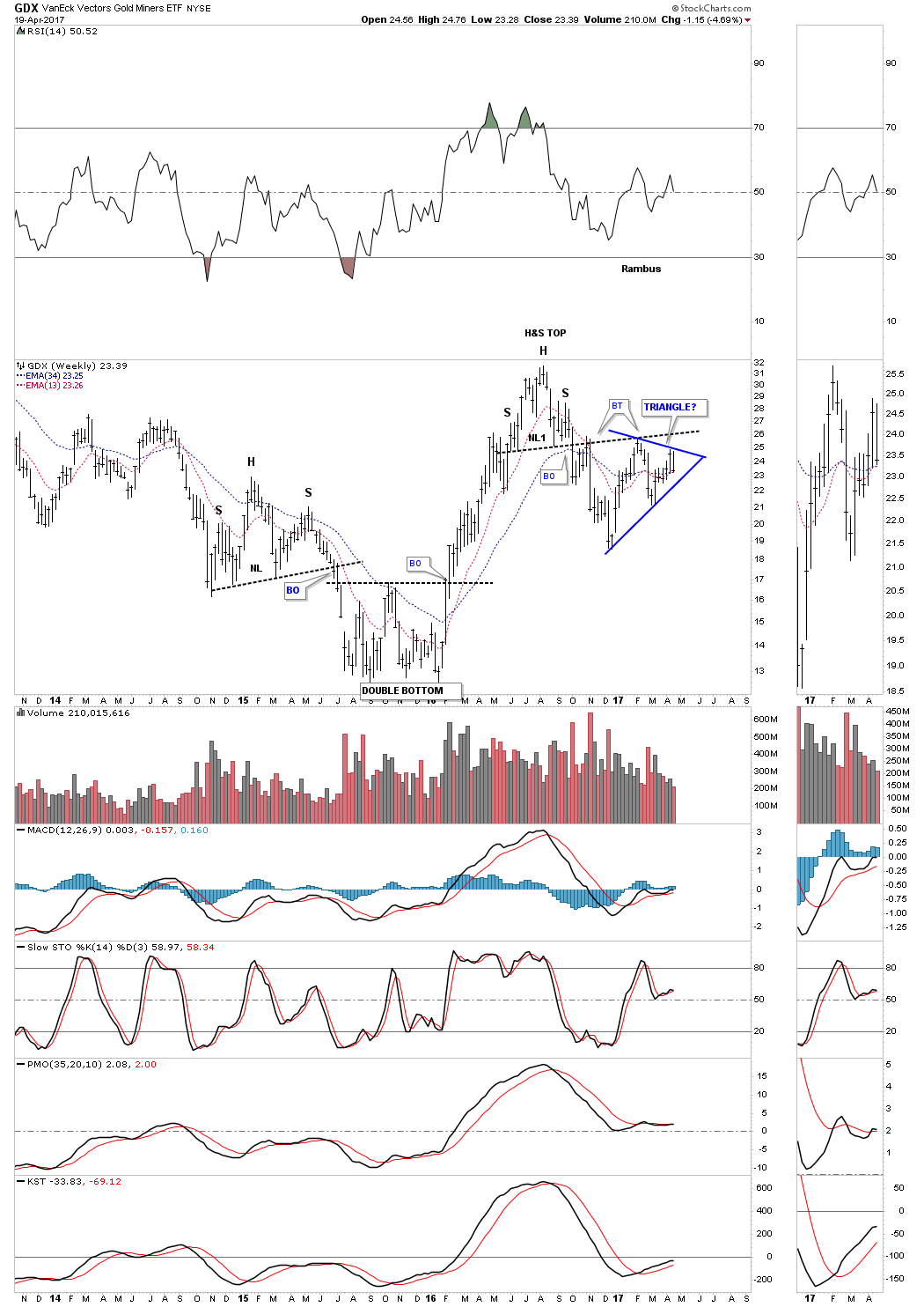
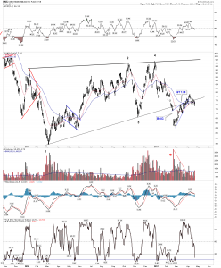
The chief reason I covered the majority of my JNUG short was I was expecting a back test up to the triangle as shown below. But no way would I go long, as take a look what a measured move to the downside would do. I am still bearish on the sector.


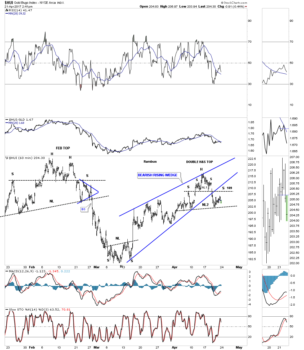
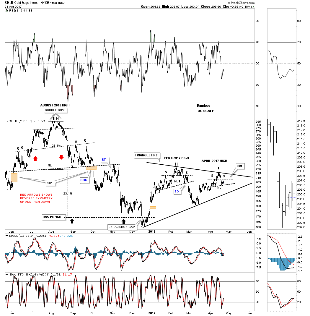
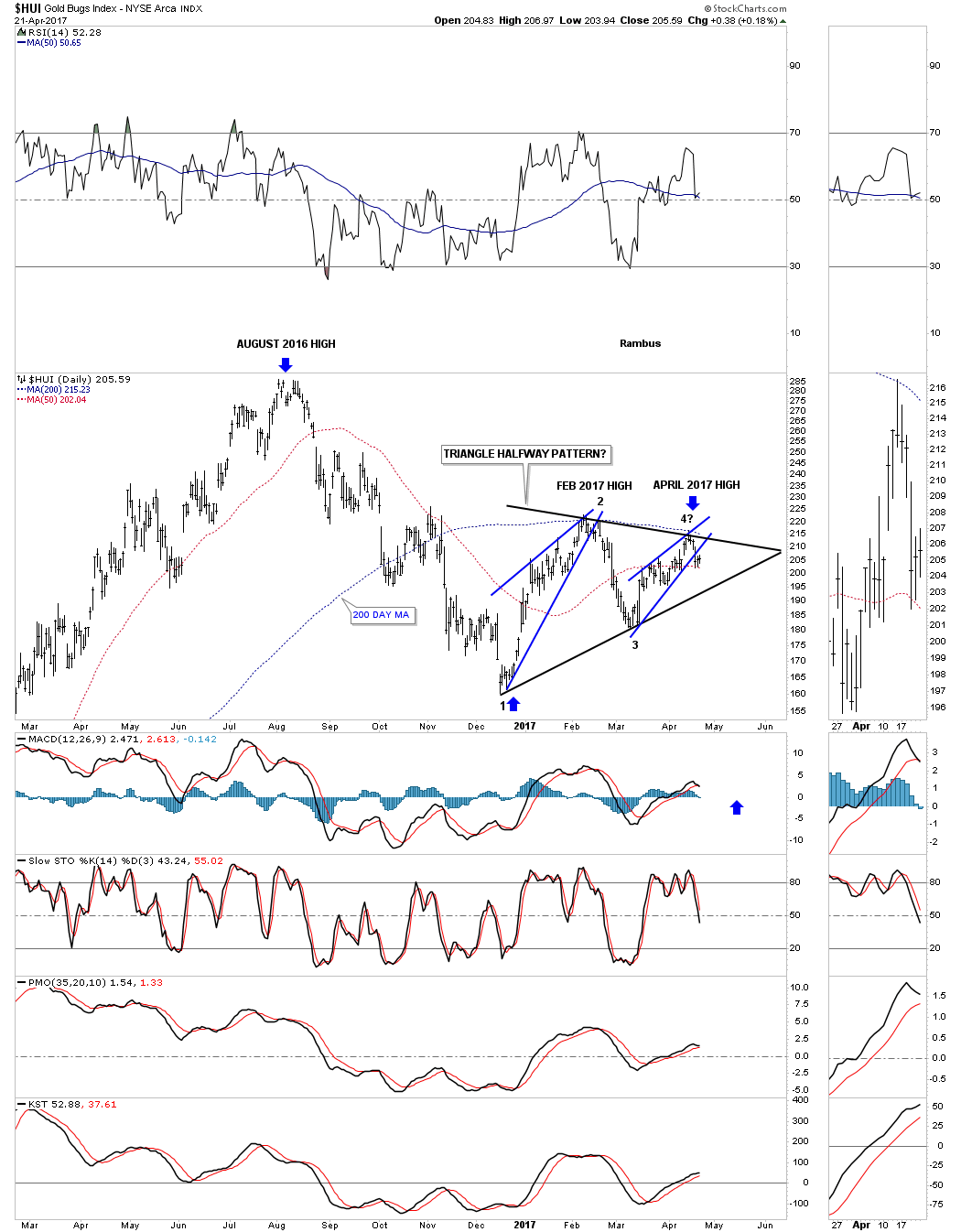
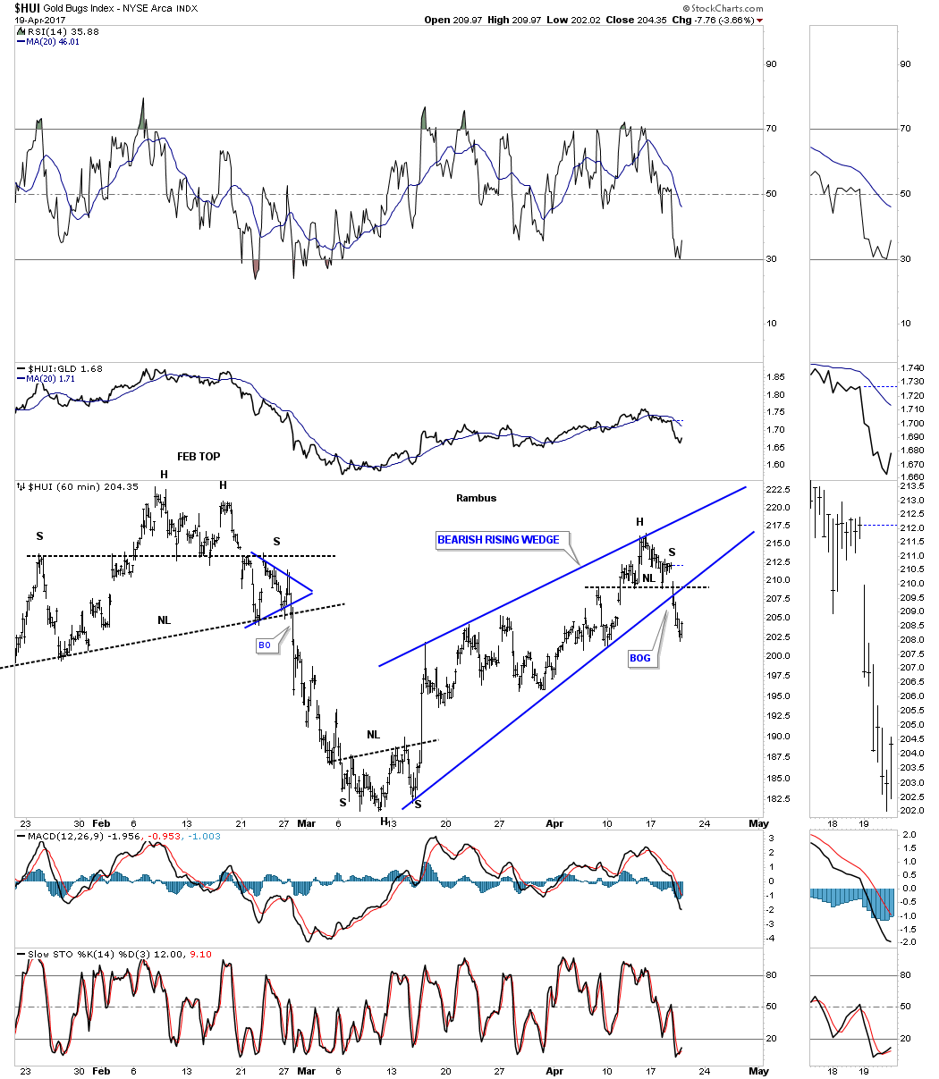
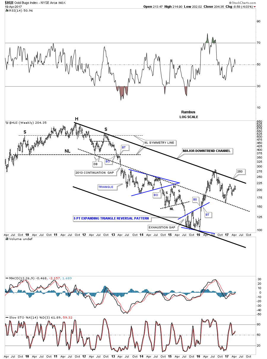
Here is the HUI….let’s just say it is sobering with that little red bear flag.
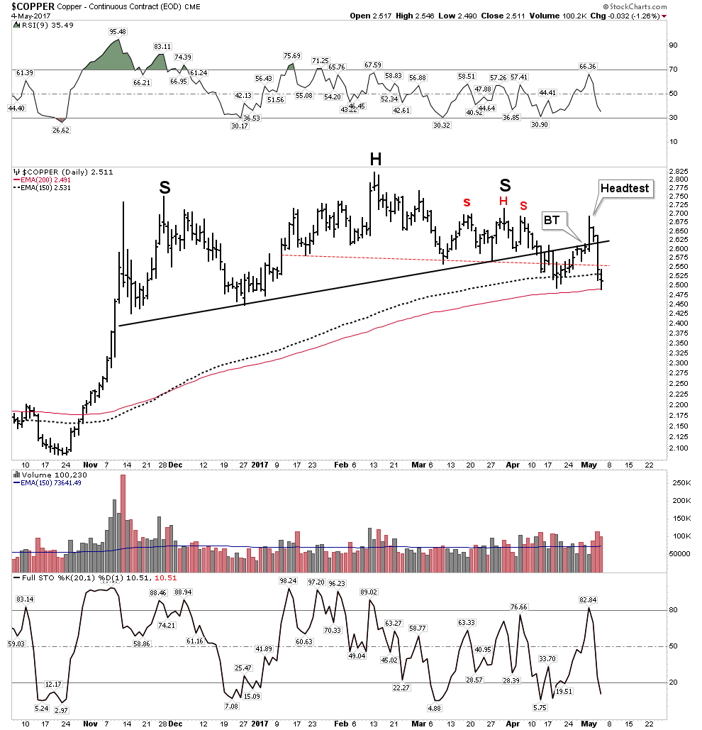
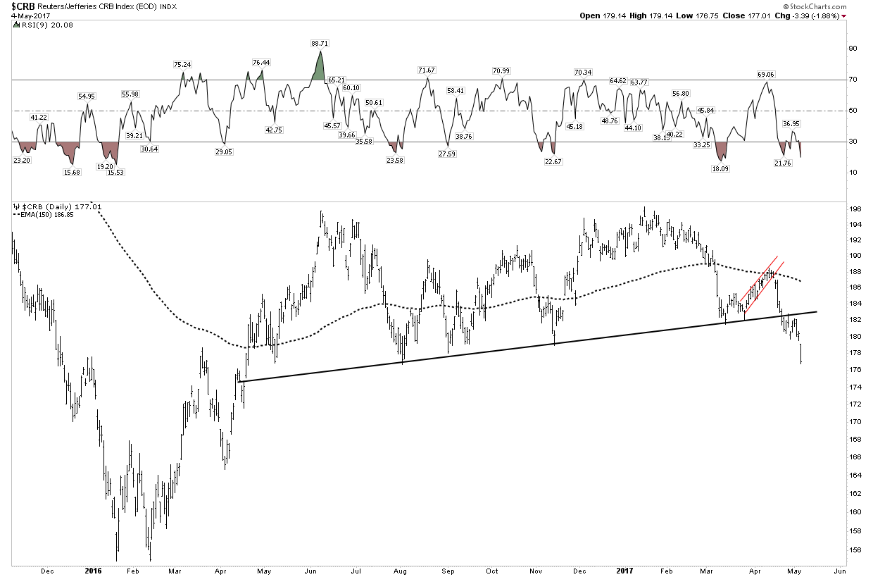
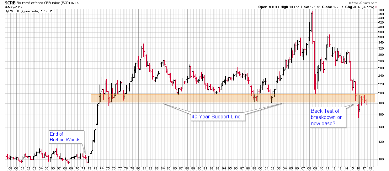
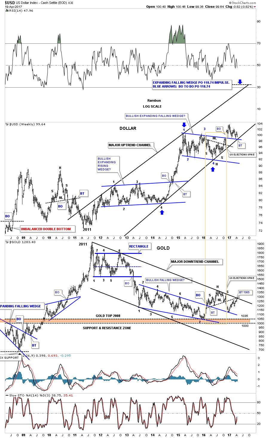
Finally, remember I stated that the CRB ( Commodity Index) was starting to give me the he-be jeebies?
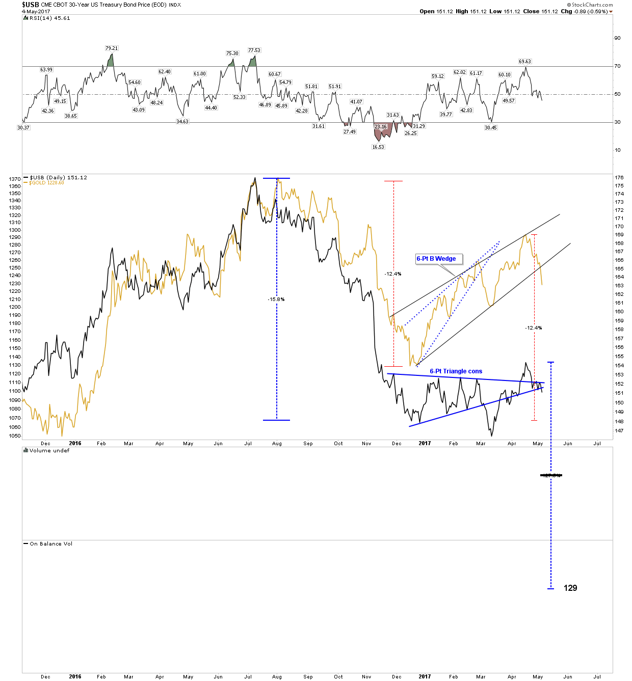
Well take a look at this broad average and ask yourself what it portends? Keep in mind what happened to oil this week and that copper violated its NL also. And then there is that thing about the USD and how it has NOT broken down. Honestly the USD is the only signal we have not yet received that an unwind may be upon us. The USD is still in the process of consolidation and test. If it breaks out above in a move of strength we will know for sure commodities are headed lower. That’s the final signal.
Uranium-Building cause for its ultimate bull market
Silver stocks are the most volatile stocks on the Planet- Uranium stocks are the most volatile stocks in the Universe -Plunger
You may be familiar with the arguments for uranium: On-demand base load power in a world of flaky green, part time environmental solutions. And its true, nuclear power is an essential building block to our electrical power grid that’s available 24/7 rain or shine. But will we ever have a bull market? When will uranium’s time come? Its been locked in a 10-year brutal -90% bear market in the stocks. Is uranium terminal or is it one of the greatest investing opportunities…well….in the Universe?
I will argue it is a classic case of a non-substitutable power source poised to make you a fortune if you can play it right. After all uranium is probably the most hated, despised, out of favor investment class in the world. That’s right even more than dirty coal. Incidentally, without this industry 20% of America would sit in the dark in their unheated homes, wondering why they can’t charge their i-phones. If uranium prices, currently about $25/lb don’t increase to around $70/lb within 5 years , supply will dry up and the doomsday scenario above will actually happen. My bet is a higher price is the more likely outcome.
Name me an industry that has gone down 6 years in a row? Coal? Gold? …. go ahead I am waiting… That’s right the only one is Uranium. After 5-years the stocks in the coal and gold sectors rocketed in rallies greater than 100%. Uranium is past due simply on its statistical basis. But I will argue that its due for much more than a flash in the pan rally. Its statistically due for a bull market and the evidence points this way as well. So let’s review where we are:
We have a 6-year -90% plus equity bear market in an industry critical to maintaining our way of life which is also essential to our energy security. The uranium price is so depressed that it will require a near tripling of price to bring in new investment to develop production to fill the supply-demand gap which will exist 5 years down the road.
Stated differently, imagine after a 5-year gold bear market where the stocks were down 90% what would happen to stock prices if gold were to rise to $3,000 within 5-years. What percent gains could one expect in gold stocks after such a move? That’s the analogy that is appropriate and gives a sense of what may lie ahead. So let’s take a closer look at the dynamics in play then look at a few of the likely winners in the sector.
Uranium – The best risk-reward investment in our lifetimes
Pretty bold statement, but it’s the result of a 10-year secular bear market in an industry that is absolutely essential to our way of life. It’s a sure thing, but still misunderstood, thus why its so undervalued. It’s really just an issue of timing. I prefer a top down approach where we first study the history of an industry. Below is a chart of the uranium sector post WWII. We see both real and nominal uranium price and production levels of the industry. We can see how the two secular bull markets played out up until the current day.
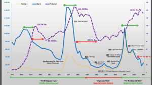
Bull # I- Late 1940’s- 1950’s. This era was dominated by the nuclear arms race where there were few publicly traded companies. It was a defense build-up without nuclear power generation being much of a factor. But we can see the build up in productive capacity and the real price of uranium reach about $118 in todays inflation adjusted money. Note the 20-year bear market that followed.
Bull # II- 1970-79 This bull was driven by the concept of uranium as a substitute for oil. Uranium went from $3-42. An increase of a factor of 14X. Also note that price went to $170 inflation adjusted. This bull market finally ended, as most do, with new capacity production overwhelming supply. It didn’t help when Three Mile Island drove a spike through the heart of the sector. And just for good measure 6 years later Chernobyl finished the job by bringing the risks of the sector to the forefront. Yet, again new found supply led to another 20-year bear market in uranium. By 2000 price finally bottomed at $8 from the $42 nominal peak 20 years earlier ($170 peak CPI adjusted). These below cost prices finally led to production being curtailed and the start of the next bull market.
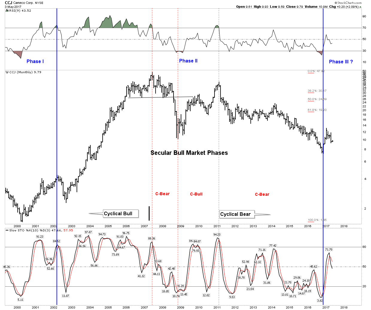
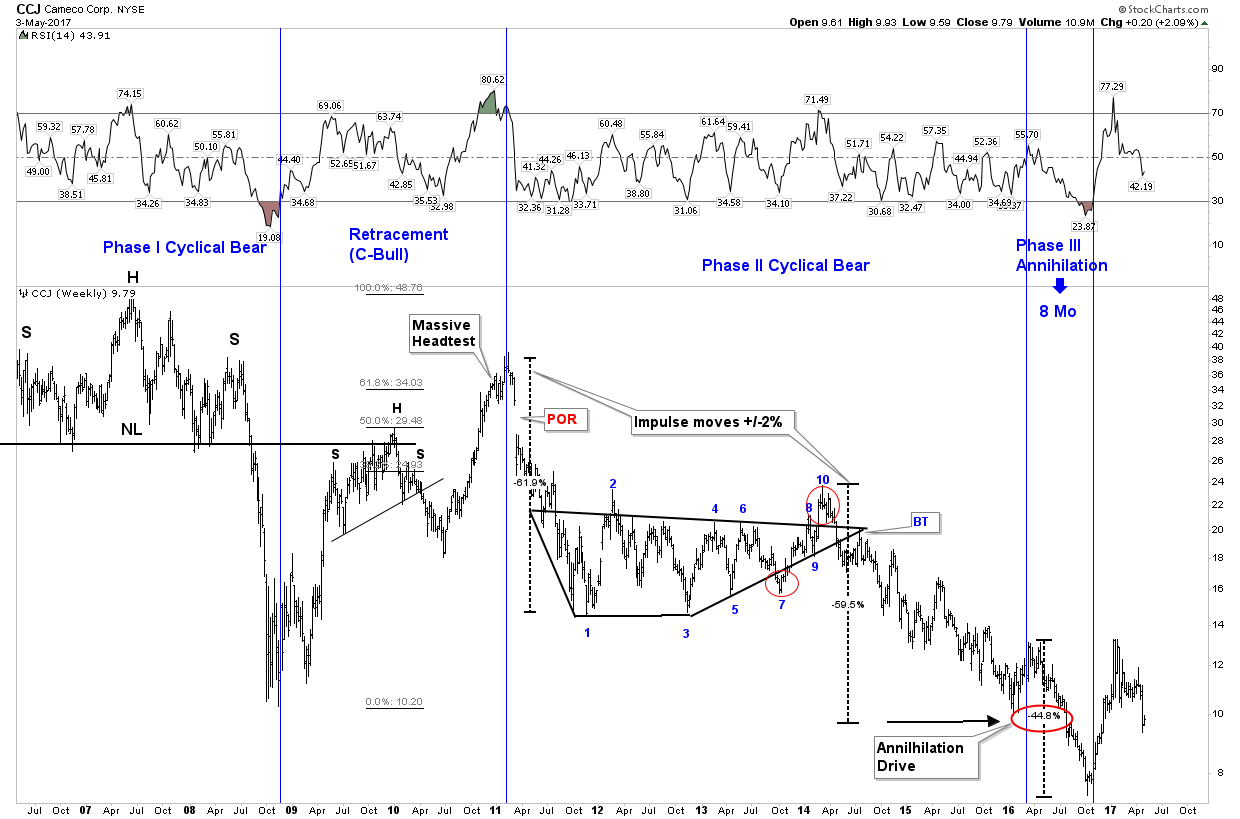
Bull # III- 2000-current. From 2000-2007 uranium increased from $8-over $100. Since then we have had a 10-year brutal bear market. It is my interpretation that this is a cyclical bear within the context of a secular bull market which began in 2000. It is essentially the same concept as the gold bull that started in 2000 as well. The run into 2008 was over played due to cheap credit allowing hedge funds to lever up the sector. The China narrative also led to overblown expectations. In 2008 hedge fund liquidation began as price broke down through $70 and after the crash the recovery was reversed by Fukushima and major mine shutdowns by Cameco. The current bear market I interpret as a severe bear within the context of a long wave secular bull market- but it sure is painful.
The Bull Case- Supply/Demand dynamics.
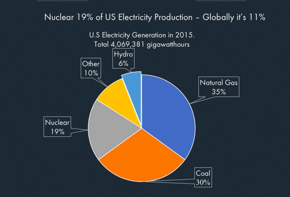
In the USA nuclear makes up 19% of electrical power. In a world of shrinking coal, nuclear becomes essential. So one can see the energy mix relies heavily on uranium. It’s not going away.

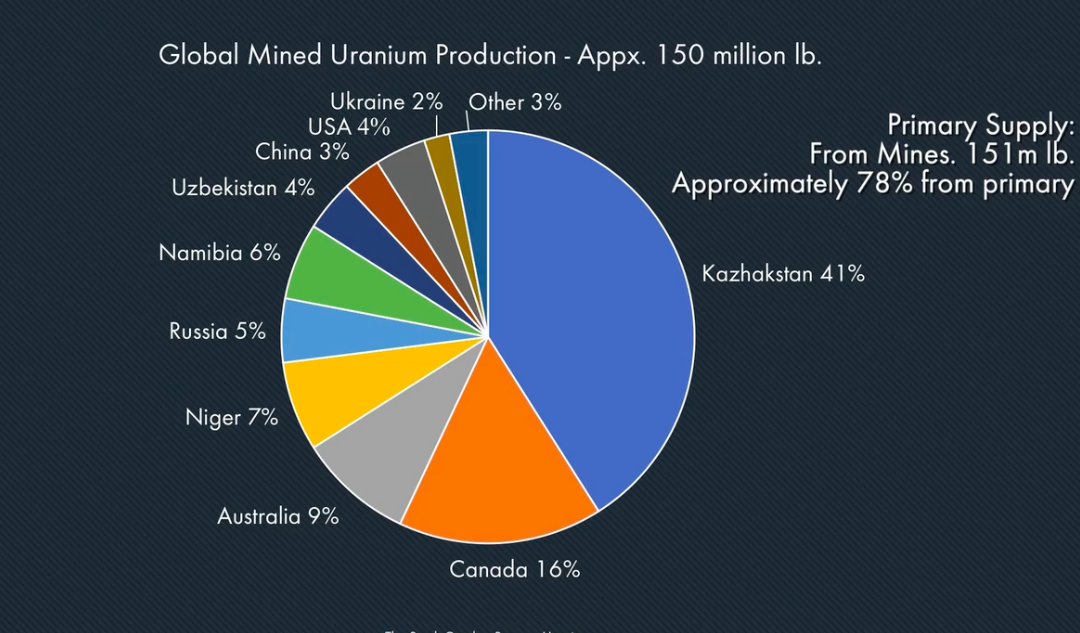
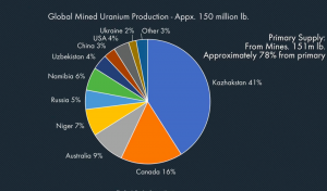
But what is really shocking is that 50% of that uranium comes from Russian controlled sources. Even more revealing is that the US only produces 5% of what it consumes. The easy fix for this of just getting more from Canada is not possible since Canadian production is tied up by long term contracts with India and China. So the supply sourcing issue is a problem. The Russians have cornered the market, its a building crisis, and getting worse.
The Cost Curve
Average cost of production is considered $65/lb. Market price $20-25. The market is responding by cutting back on production, just as it did in the year 2000 which kicked off the next bull market. Kazakhstan, which produces 41% of world supply is cutting 10% thus taking 4% world production off the market while Cameco is cutting 20%, removing another 4% off the market. These suppliers realize they can’t make up for losses through volume. So at this point in the cycle after the commodity has dropped 80% and the stocks 90% the lowest cost producers are cutting back production and the number of companies in the sector has gone from 500 to 40.
Production & Supply /Demand
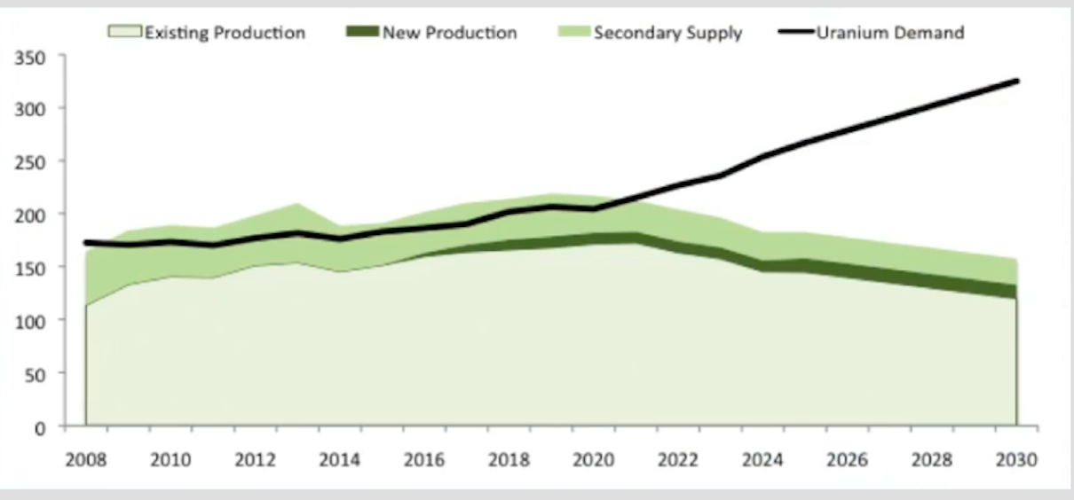
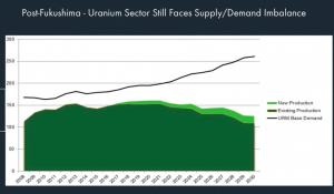
The below chart shows production and supply. It shows the market being over supplied until the year 2021. Note also that without secondary supply (weapons blending, Sovereign dumping) we would already be in a supply deficit situation.
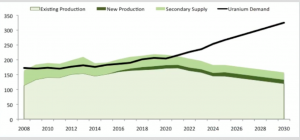
The next chart shows where the market sits without secondary production. So ask yourself this, how long would it take for the market to react to an announcement of a secondary supply policy change? The analogy would be if world oil supply was 15% less than demand and it was made-up through withdrawals from the strategic petroleum reserve what would happen if one day the government announced it was to cease withdrawals. What would happen to oil that day? It’s really the same story.
China Smog Story
No doubt you have heard about it, but until you have been there you really can’t experience the visceral disgust of what China has done to its air. (Our air) When one literally cannot see one city block due to the oppressive smog one realizes the policy of China growth at any cost has gone too far. China realizes this too and is now determined to fix it. A core tenant to the fix is nuclear power.
Future Demand
World electrical demand should increase 2-3% per year until 2030. Much of this demand is slated to be met through the building of nuclear power plants. Presently there are 450 plants in the world. 60 are under construction with another 168-233 under planning and development. Simply stated, supply must vastly increase to power this plan and the uranium price must significantly increase to encourage this new supply. The Japan shutdown will eventually bring 42 of its 54 reactors back into operation so its permanent impact will be relatively insignificant.
Utilities Purchasing Cycle
Legacy contracts are now beginning to expire. Utilities are 20% un-supplied for the year 2020 and 40% un-supplied for 2025. Typically utilities acquire stockpiles and like to have their contracts settled 3-4 years ahead of delivery. This is necessary to insure their supply pipeline is not interrupted. But here is the thing, investment to develop new supply will not be coaxed into the industry without a uranium price over approximately $80. That’s where the picture of citizens sitting in the dark with dead i-phones come in. It’s not likely going to happen, therefore the uranium price goes up.
The Uranium Wild Card
The case for a bull market in uranium is essentially built into the cake. It’s just a question of the timing. But there is a wild card factor that could turn this bull into the equivalent of a power ball win. That’s the case of the uranium geopolitical wild card.
Russia controls 65% of world production, and 45% of enrichment. The USA consumes 50 million pounds a year, yet only produces 3m lbs. It imports 95% of its consumption and we mentioned all current supply is already contracted for. The USA is totally dependent on outside sources for its energy security.
Russia owns the uranium chessboard and we are playing chess with the most accomplished chess master in the world, V Putin. Ask yourself how has the trend of international relations been going for the past few years? George “W” was right when he said he looked into Putin’s eyes and saw his soul, its just he saw the ruse. Now we see the Russian nationalist that he is and in his world Russia comes first at all costs. Maybe you ought to start hedging your bets and start right now taking a position in the future of energy production be it uranium, wind or solar.
When one considers that the entire market cap of all the US producing uranium companies is less than the market cap of Shake Shack, just maybe there is a bargain out there for forward thinking investors.
Patience is the key.
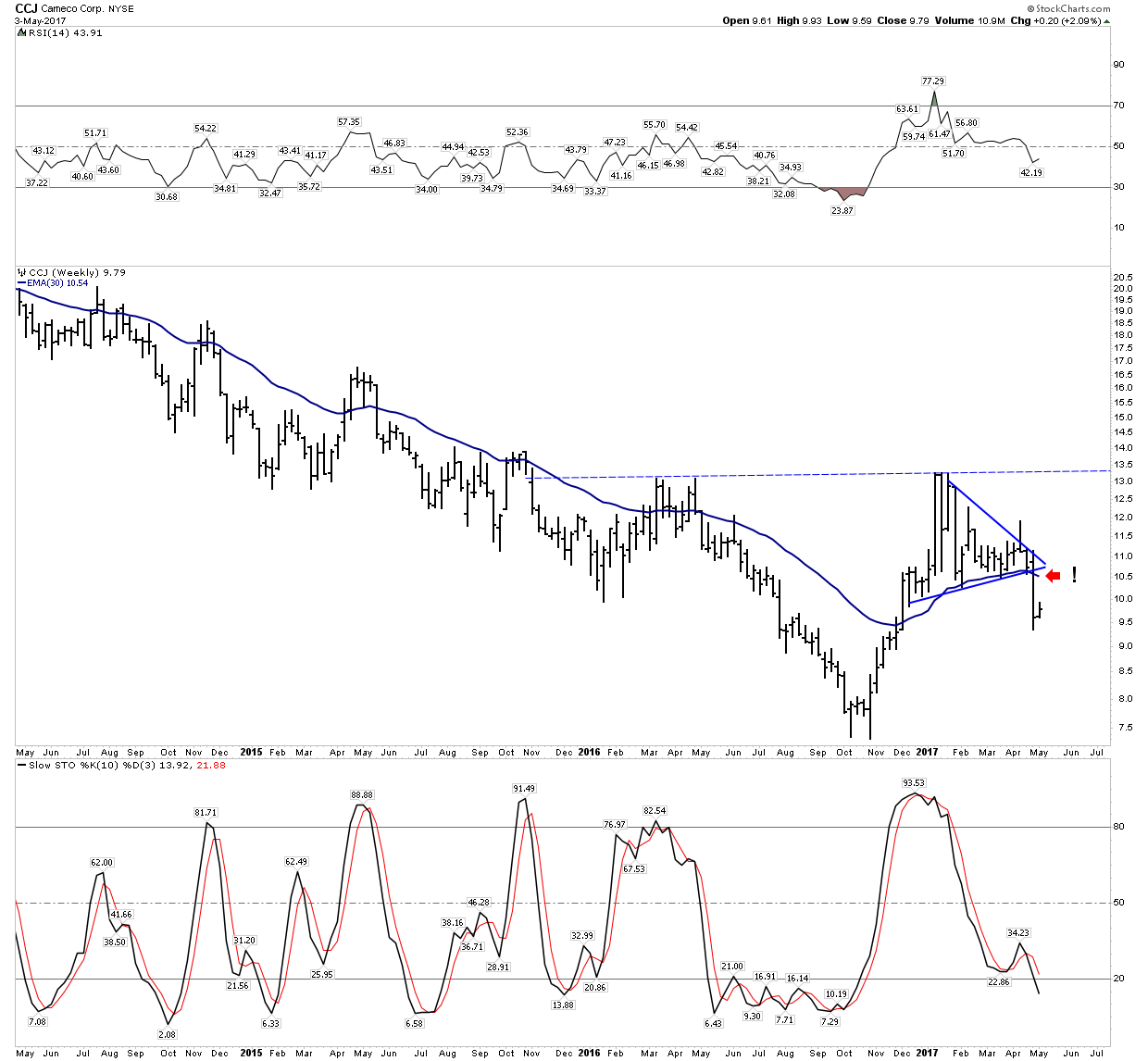
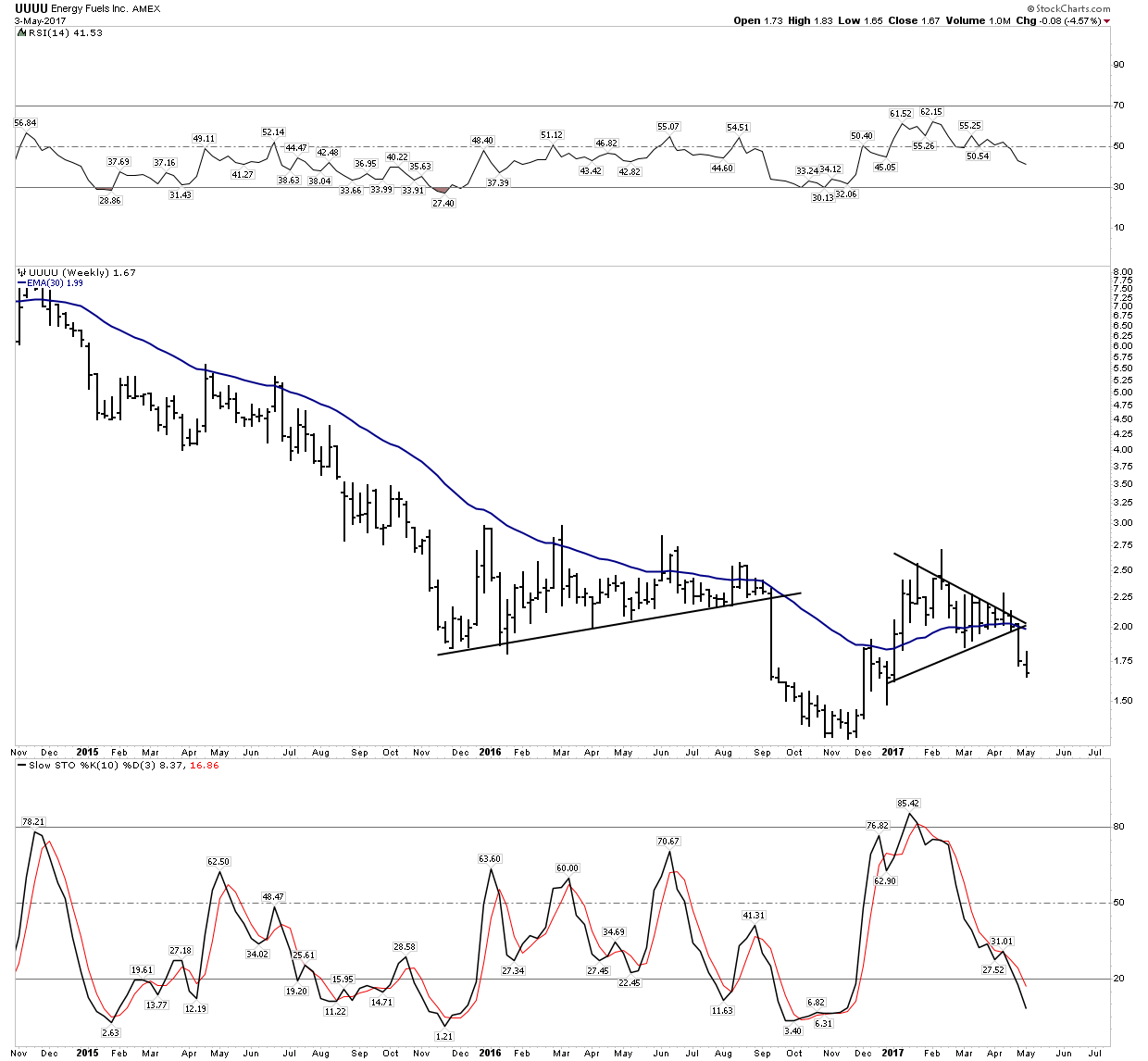
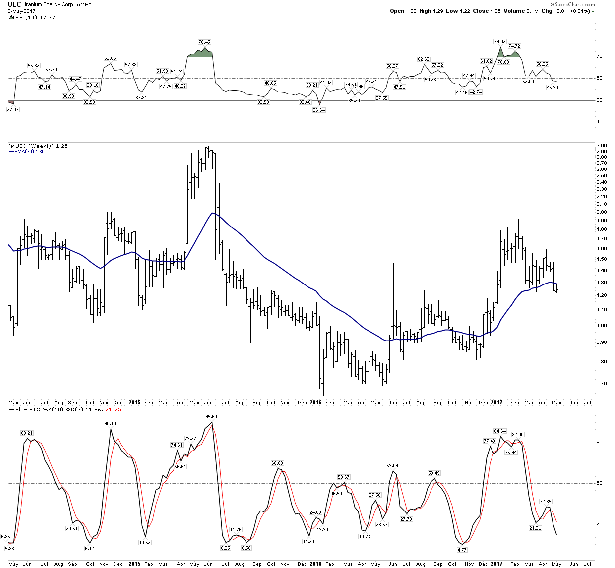
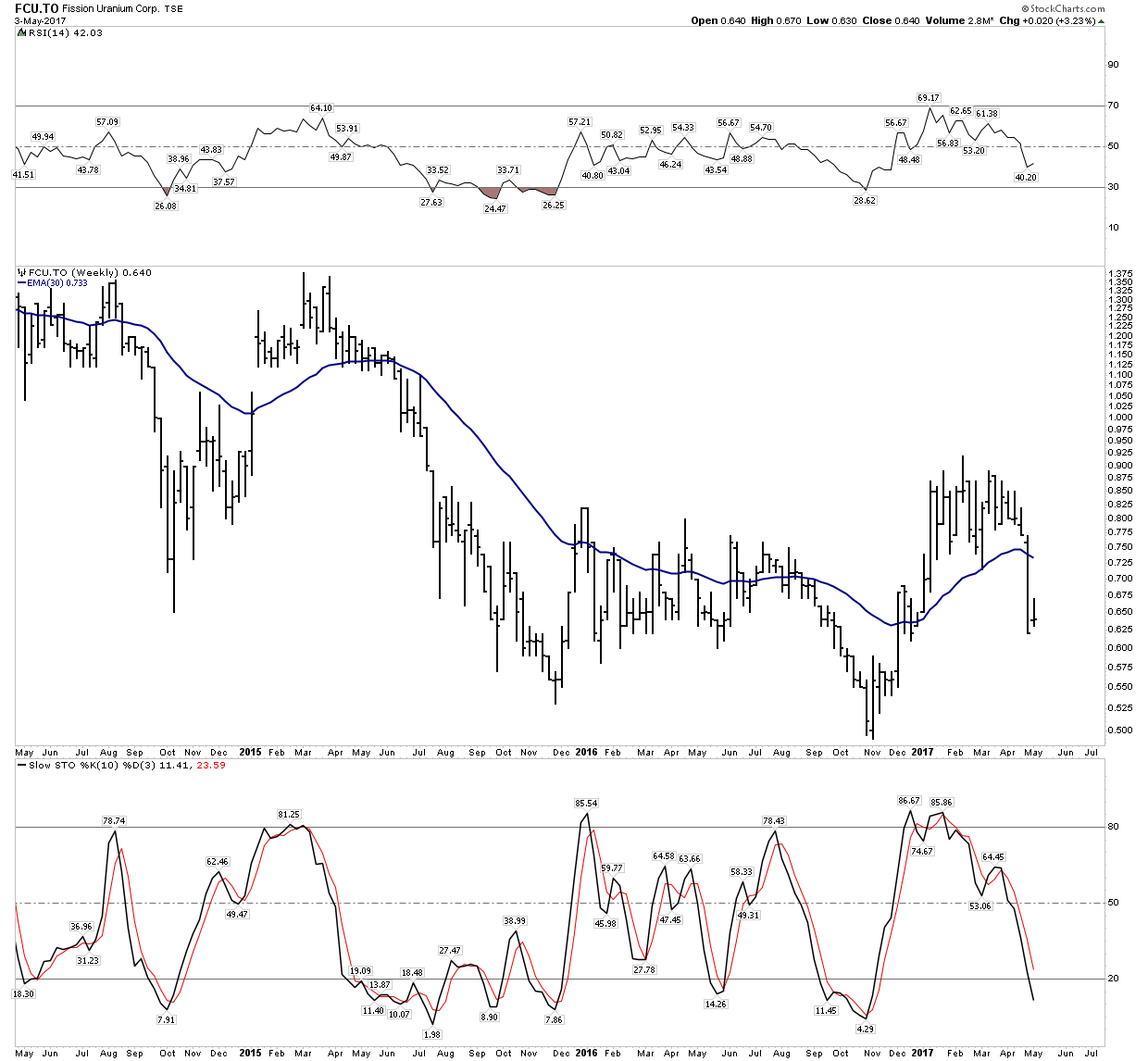
So the future bull is pretty easy to see, but as I said its just a matter of timing. Since its such a volatile sector it can be pretty painful to ride the ups and downs. So are we there yet? I don’t really know, but I do know each day the risk reward improves. When do markets start discounting the favorable conditions? 6-months, 1-year…5-years? Again, don’t know so we revert to what Mr. Weinstein has to say. Best I can do is to apply his method. Last autumn may have very well been the bottom, but I would not pile in right now as the sector is in a somewhat precarious position. Last week many stocks dipped slightly below their 30 W EMA. It’s a bit touch and go actually. Take your time as we may just still be in stage 1 of a bottoming process. Before we can have more confidence we need to see a sector backtest to the 30 EMA and then for the average to start moving up. We are not there yet.
In Part II I will do analysis on our top uranium picks….Be sure not to miss it!
Editor’s Note:
Rambus has asked Plunger to become a regular contributor at Rambus Chartology.
https://rambus1.com/
Members will now have Two of the best analysts on the Planet (Universe ?) for the price of One .
Welcome to Rambus Chartology Sir Plunger
Plunger’s Bio (at Talk Markets)
http://www.talkmarkets.com/contributor/Plunger#