Weekend Report…The “End of the World” History Chart

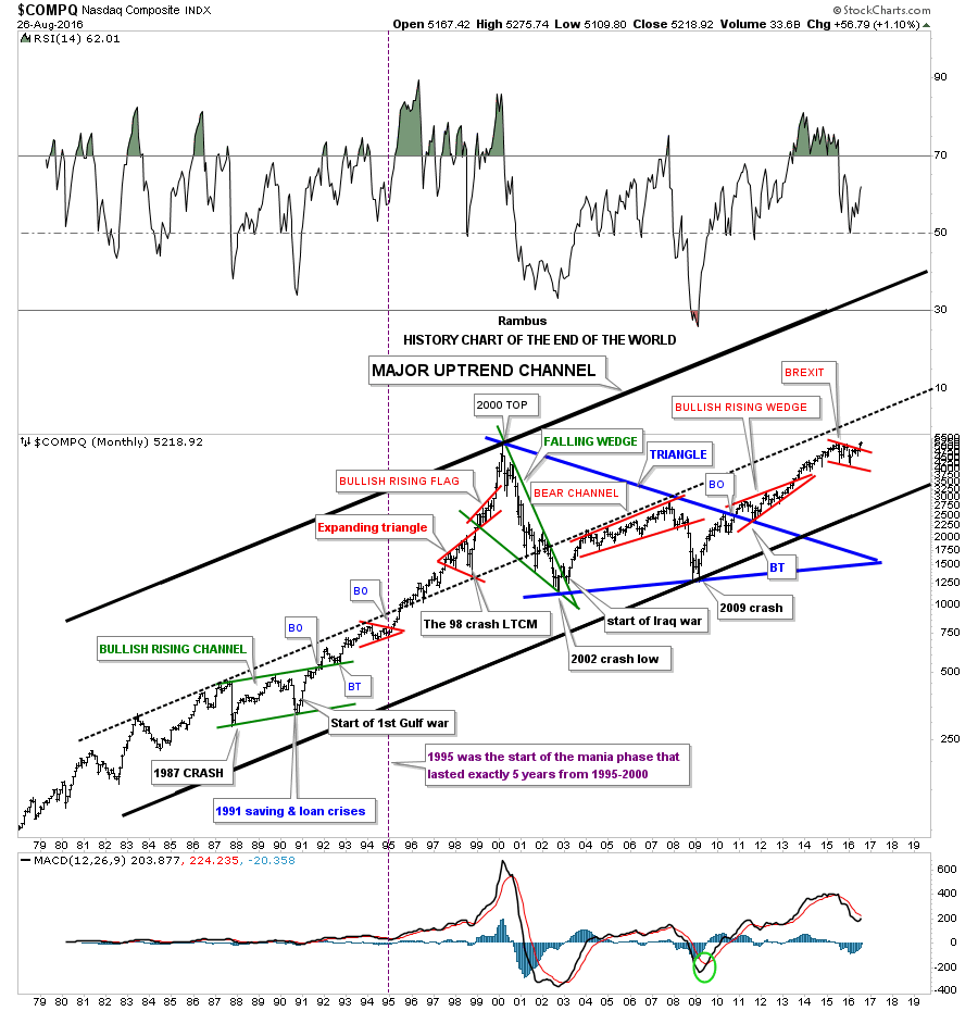
Tonight I would like to show you a long term 40 year monthly chart for the $COMPQ which I call the history chart. Some of you were not even born when some of these significance events happened. At the time they seemed significant enough that most thought the end of the world as we knew it was near. Some of the older members will remember some of these events like they just happened yesterday.

I was personally involved in the stock market during each one of these times, and I can assure you it did feel like the world was coming to an end.  When one observes some of these stock market events from a distance they hardly matter in the big picture. Perspective is everything.

Take the 1987 crash for instance. The $INDU was down over 500 points in a single day, but in 1987 that was over a 20% drop.The world didn’t come to an end and the markets began to rally off that historic low for several years. Then in 1991 there was the savings and loan crisis, and the market crashed again on the magnitude of the 1987 crash but this time it took a little longer to complete the move down. Also what made the 1991 low so dramatic, besides the saving and loans crises, was the start of the first Gulf war.

I still remember most of the analyst were taking about what could happen to the stock market if the war didn’t go well. Crash was the most widely used term back then as no one really knew what would happen as the US was going up against the 5th largest army in the world. After the first night of bombing, it was very clear the next day that the  Iraqi army was no match for the US. That was the first time I heard the word smart bomb. As you can see on the chart below the 1987 crash low, and the 1991 low, marked the two lower reversal points in the green bullish rising channel. That green bullish rising channel or flag really was the beginning of one of the biggest bull markets in history for the $COMPQ – tech stocks.

How many remember the LTCM, Long Term Capital Management debacle which occurred in 1998? It’s only a blimp on this chart, but at the time the word crash was being thrown around as no one knew what would happen. What happened was the continuation of the parabolic run from 1995 to the bull market high in 2000.

In March of 2000 the great bull market was over and one of the strongest bear markets for the $COMPQ began. Many tech stocks  that were bid up to astronomical levels during the mania phase went bankrupt . The bull market in the $COMPQ ended in 2000 at 5200 and just over two years or so later it crashed all the way down to 1100 before the bear market ended. It didn’t help that 9 11 2001 happened in the middle of this crash however that bear market low was also accompanied by the second Iraqi war.That massive bear market, which seemed like the end of the world back then, was actually the beginning of the ten year blue triangle consolidation pattern.

The last reversal point in the ten year blue triangle consolidation pattern was another end of the word event that most investors still haven’t gotten over yet, which was the 2009 housing bubble crash low. Only the great depression compared to it. That 10 year blue triangle consolidation completed in late 2010 with a nice clean breakout and backtest. That was over seven years ago and the markets haven’t looked back.

The last consolidation pattern on this chart is the red bull flag which I labeled as the BREXIT pattern. This little shakeout was very mild compared to some from the past. Maybe this little red bull flag is going to finally be the pattern that is going to end the world as we know it, but from a Chartology perspective it looks just like another consolidation pattern in the ongoing major bull market uptrend channel.

Maybe I’m being to optimistic but I don’t see the end of the world coming anytime soon, but just the opposite. I believe we’re entering into a new period of human ingenuity where technology is going to change the way we live from biotechnology, green energy, robotics, nano technology, artificial intelligence, super computers that will make today’s computers look like slide rulers from the past, space travel and exploration, and a host of other things that the best science fiction writers haven’t even thought of yet.

This is all possible because of the bull market that started in 1982, which in hindsight was the birth of the information age. Many tech stocks during that bull market went up multiple times of their initial public offerings and had many splits. If only some of our precious metals stocks, over the course of the now 16 year secular bull market had moved even a fraction of what some of the tech stocks did back then, it would be an amazing sight to behold.

COMPQ HISTORY

One never knows when a black swan event may strike that turns our civilization into a Mad Max society. Maybe tomorrow or in 5 years, 20 years or maybe never. My point is I’m not going to live my life waiting for a Mad Max event that may or may not happen. There are enough people out there that will keep a close eye on it if does happen. I’m more interested in what the future holds and how society and the economy progresses moving forward.

I’m not painting a world without problems as that would be foolish. Since the beginning of time human society has moved two steps forward and one step back always gaining a little ground each time to get to where we are today. I realize that many members are fearful that the world monetary system is  going to implode any day now but we have been hearing a variation on this theme from the doom and gloomers  for as long as I have been alive. I grew up in the Vietnam era. Now if that didn’t feel like the end of the world I don’t know what does. And before that my early childhood was during the depths of the cold war (think backyard bomb shelters). These times make the present seem like a walk in the park.  Regardless of what many of the naysayers may think on how bad everything is today, I can’t think of a better time to be alive than the present. I see a future that will astound us in what the human species will achieve. Good or bad changes will come whether we like it or not.

I’m hopeful society will benefit from the changes that are going to take place, just as we have benefited from all the previous changes that happened before us. To leave this world just a tad better than when we entered it would be a great accomplishment. For me personally the future looks bright and full of wonder on what will be achieved by the human race. You may call me naive, ignorant or whatever else you want, but I’m going to embrace the future with eyes wide open. All the best…Rambus

.


UUP Update…A very Important Pattern to Watch

The other day I showed you this 2 hour chart for the UUP (US Dollar ETF)  which had completed an expanding rising wedge pattern when the price action hit the bottom rail at 5? which completed the pattern. The pattern was completed at that time but we still don’t know if it will be a consolidation pattern to the downside or if the UUP can rally back up and through the top rail which would make it a 5 point reversal pattern to the upside as it has formed in the downtrend.

I speculated on a possible H&S pattern forming inside the expanding rising wedge drawing a horizontal line from the top of the left shoulder to the right side of the pattern, looking for a possible high for the right shoulder using the red letters to make it easier to see what I was trying to convey. So far that possible high for the right shoulder is still in play. If and it’s still a big if yet, if the H&S neckline / bottom rail of the expanding rising wedge gets broken to the downside, we’ll have two consolidation patterns in one.

UUP 2 HOUR

The daily chart for the UUP shows why this potential expanding rising wedge / H&S pattern is so critical to the big picture. As you can see the combo pattern has formed right on top of the brown shaded S&R zone. For those folks that have been with us for several years will remember when the US dollar finally broke out of the multi year base  and began that very strong impulse move up which you can see on the left side of this daily chart.

During that strong impulse move up all the important currencies of the world along with most commodities got taken to the woodshed for a beating. As we’ve seen in the past, when you see a consolidation pattern pointing in the same direction of the trend and not against it, that is usually a very good indication you’re in a strong impulse move. Note the blue bullish rising wedge that formed during the 2014 – 2015 impulse move up.

What makes our present situation so interesting is that if the combo expanding rising wedge / H&S pattern turns out to be a consolidation pattern, then we can expect to see a strong move down over the same area during that strong impulse move up in 2014 – 2015 as show the red arrows which I call reverse symmetry. Why that would be so important is because we should see the currencies and commodities, that were affect by the US dollar on the way up, should now see them move inversely to the US dollar which would be up as the US dollar goes down.

Keep in mind the current pattern is still building out for the UUP with no confirmation yet on which way the eventual breakout may occur but we have something tangible to keep a close eye for more clues that will eventually show us the way.

UUP DAILY

Wednesday Report…HUI Corrections ..Simply Amazing

Sometimes a stock will do something that makes you scratch your head in wonderment. There usually isn’t any rhyme or reason why it happens but it works until it doesn’t. Usually though by the time you finally figure out a certain sequence or a fractal type situation it will change just when you want it to work the most.

I was going over some old charts from the bear market years in the PM complex that I haven’t looked at in quite awhile and came across this old weekly chart for the $HUI. I updated it this afternoon to make it current. If this chart doesn’t make you scratch your head in amazement then I don’t know what will. Again it is what it is until it isn’t.

Below is an eight and a half year weekly chart for the $HUI in log scale. You will see ten rectangles that just measures height and not time. The blue arrows shows the bear market rallies and the red arrows shows the bull market declines.

Starting at the 2008 crash low at 150 you can see there were three corrections up to the left shoulder high as shown by the red arrows and rectangles. The HUI continued to rally all the way up to the 2011 top which ended up forming the head of that massive H&S top. The first decline down from what eventually became the head of the H&S top, fell just shy of reaching the bottom of the rectangle before the next rally took hold. That rallied failed to take out the precious high and made a lower high which was the actual beginning of the five year bear market that followed. Once the price action fell below the bottom of red rectangle #4 the HUI made a lower low for the first time since the 2008 bull market began. The new bear market was underway.

During the course of the bear market years there were five bear market rallies that were all exactly the same percentage move up as shown by the blue arrows and rectangles. When the HUI broke above the top of blue rectangle #5, at the bottom of the chart at 137.40, that showed a major change of character. That was the fist time since the 2011 top that the HUI made a higher high and broke the sequence of bear market rallies. That failure then led to one of the strongest bull market rallies in history for the HUI.

Now on to the present which shows the bull market rally and our first correction taking place since the January low of this year. I have to ask the question, what are the odds that the current red rectangle is going to show us the low for this first correction around the 200 area? Keep in mind all these same sized rectangles are showing us the size of the move in price but not time. What this means is that once the low is set that should be the low for this correction but time wise it could still take many weeks to complete the correction.

The brown shaded area shows where a confluence of support comes in at the 2013 S&R line, the top of blue rectangle #4 at 205 and the 50 week ema currently at 202. So price wise it looks like the low for the first correction is just below at the 200 area which would be a good place to pick up a few more shares of your favorite PM stock. All the best…Rambus

hui percentage


GDX Update…The First Consolidation Pattern

I’m going to use the GDX as a proxy for the rest of the PM stock indexes. I can now say with a fair amount of confidence that the first consolidation phase is taking place. Lets start with just a simple daily chart for the GDX which is showing a small unbalanced double top with the right high being higher than the left high. Five days ago the price action gapped below the double top trendline and last Friday the GDX backtested the double top trendline from below. The price objective for the unbalanced double top is down to the 24.50 area.

This is how the beginning phase of a consolidation pattern begins to build out. In fairly large consolidation patterns there is generally a small reversal pattern that forms at the reversal points within whatever consolidation pattern ends up building out. This small double top is likely to be the the start of the first reversal point down. The double top price objective down to the 24.50 area would be a minimum decline we should expect before the GDX finds support and begins the next rally back up to the top of the new trading range around the the 32 area. If a triangle is forming then the price action won’t make all the way back up to the top before the bears take over again.This would  be labeled as the start of reversal point #3. Then one more move back down to the bottom of the trading range where ever reversal point #2 is located where we should see the fourth reversal point begin to form.

GDX DAY 1

This next daily chart for the GDX is a longer term look which shows the previous small blue consolidation patterns that formed the first impulse move up. What we have to work with right now is the completed small double top and its price objective down to the 24.50 area. It’s possible the GDX could go lower than the double top price objective before the price action reverses back up. The 24.50 area would be the minimum price objective to start the second reversal point back up to the top of the new trading range. Also there is still no way to know what type of consolidation pattern may build out but whatever the pattern, it will have a minimum of four reversal points.

Also whatever consolidation pattern builds out will be much bigger than any of the smaller consolation patterns that formed during the first impulse move up. Something else to keep in mind if you’re feeling beaten down for not selling at the exact high. Once this consolidation pattern is finished building out it will most likely be a halfway pattern to the upside. A rally similar to the first impulse move up in time and price will take the GDX to the next level higher where we should see another consolidation pattern form.

GDX DAY 2 LONGER TERM

This next daily chart for the GDX shows the fib retracements. The double top and the 38% retrace of the first impulse move up would be around the 24.50 area. A 50% retrace would be down to the 22.00 area.

gdx fib

Below is a long term monthly chart for the HUI I posted recently which shows all the consolidation patterns that formed during the bull market years and how our possible consolidation pattern may look. Normally, but not always, the first reversal point down can produce the strongest move within a consolidation pattern. As the consolidation pattern builds out the swings can become less volatile as the bulls and the bears get tired of beating on each other and volume usually tappers off. Once we can establish the reversal point #2 low, there is a good chance that that low will mark the low of  the consolidation pattern especially in a bull market. Establishing the first two reversal points in a consolidation pattern can then open up the door for a couple of short term swing trades within the consolidation pattern which will still have to form the 3rd and 4th reversal points. If you plan on shorting within the consolidation zone don’t get greedy as the reversals back up are just as strong the reversals down.

HUI MANY CONSOLDAITON

HUI Update…

You may have noticed I haven’t posted many short term charts for the PM stock indexes. The reason being most folks tend to start freaking out if the market goes against them for a short period of time. Looking at the longer term charts is much more relaxing and keeps things in perspective.

With that said below is a 2 hour chart for the HUI that begins at the start of the bull market at the end of January of this year. Horizontal support and resistance zones are much more important than angled trendlines. The lower brown shaded S&R zone is taken from the triangle high and the first low after the breakout. There was a quick initial backtest to the top of the S&R zone in April which suggested the S&R zone was important. The S&R zone was tested one more time in May when the next leg up began.

We have a similar setup right now on the upper S&R zone which runs between 240 and 246. It was backtested once in June. At this point nothing is broken in regards to the bull market which began in January. The first sign of weakness would be if we see the present S&R zone fail to hold support. That would suggest a deeper correction in the new bull market is probably at hand.

HUI 2 HOUR


Late Friday Night Charts…Precious Metals Markets : Zoom Out

When looking at the short term minute charts things look very volatile in the precious metals complex but the further you look back in time the less volatile the price action becomes. If one is a day trader then the minute charts are the ones to focus in on but if you’re an intermediate term trader perspective is everything.

Looking at the five year weekly combo chart below the precious metals complex has been building out a beautiful uptrend since the January 2016 low. There is nothing on any of these three charts that suggests a top is in place and it’s time to sell.  The thin black dashed horizontal lines taken from the previous highs is our first line in the sand for support. Note the left side of the chart and how the thin black dashed horizontal lines held resistance when they were broken to the downside which is bear market action. What we have since January is bull market price action.

If one had tried to buy any of these three sectors during the impulse move down out of the 2012 top to the June 2013 low for a counter trend rally, they would have been crushed like a bug against the windshield of a car. Even if I gave you the exact low could you have reversed back to the short side in time to protect any of the small profits you may have made? Looking at the price action since the January 2016 low, how many traders do you think have won big shorting this new bull market?

The golden rule is, don’t buy a bear market and don’t short a bull market. There are always exceptions to the rule but for the little guy, that doesn’t understand how the markets work,  it’s like taking candy from a baby , for those that truly understand how the most difficult game on the planet works.

hui combo falling wedge

Below is the inverse H&S combo chart for the HUI, GLD and SLV. Think of the necklines as your line in the sand, above is bullish and below is bearish. Until they’re breached to the downside I have to remain a bull and everything else is noise. It doesn’t have to be complicated.  Have a great weekend and all the best…Rambus

hui h&s


USDU …An Important Perspective on the US Dollar

We started following this US dollar index about a year or so ago which has a more equal weighting of different currencies than the $USD. Even though I don’t post it much this Alternative US dollar index has some very interesting Chartology on it which may be giving us an important clue as to the intentions of the Dollar .

If you recall the Standard US dollar index ($USD) was testing a major inflection point in May around the 92 area earlier this year. It did finally bottom but left some unfinished business behind. This is the daily chart I was following at the time for the USDU which shows the H&S top in place and the decline that took the price action down to the low at the 25.50 area. From that low the USDU began a decent rally but couldn’t trade above the neckline extension line at reversal point #2 before the bears took charge again. The bulls were able to stop the decline at reversal point #3 and a laborious rally took the USDU back up to the top of the trading range where the neckline extension line came into play again along with the 200 day moving average.

Reversal point #4 started the next decline back down to the bottom rail of what we can now call a triangle that has four completed reversal points when the price action hit the bottom rail recently. The bulls were able to only put in a modest rally over next four days when the bears took charge again. As you can see, yesterday the bears were able to break the bottom rail of the blue triangle and today that was followed by a large gap down. When you’re following a well defined chart pattern and you see a gap over an important trendline that generally signals the pattern is finished building. It’s never 100% but generally that is a good sign.

aaa udu

As always it’s important to put the consolidation pattern in perspective to see how it fits into the bigger picture. The weekly chart below shows the potential of what might be happening. As you can see the blue triangle is breaking down this week which may very well be the right shoulder of a much bigger H&S reversal pattern with the big neckline #2 being part of a double H&S top.

The next thing we’ll be watching very closely is how the price action interacts with big neckline #2. There is a good possibility that we could see a ping pong move between NL# 2 and the bottom rail of the blue triangle consolidation pattern as shown by the black arrows. That’s what I would expect to happen but there is no way to know ahead of time. So now we can watch the price action and let it tell us what it wants to do by the way it trades between the neckline and the bottom rail of the blue triangle. If the bears are really in charge and the bulls are extremely weak then we could see a breakout gap below neckline #2. At least we have something concrete to work with now.

One last note on the weekly chart below. I’ve added two red arrows that shows how this index could reverse symmetry back down if this big H&S top plays out. How the price action went up is often how it comes back down over the same area when there was a strong move with small or no consolidation patterns that formed. Stay tuned. If this pattern plays out we could be witnessing a large trend reversal in the most important chart on the planet .

USDS

HUI Impulse Update…

Below is a monthly candlestick chart for the HUI which is made up of black and white candlesticks. When you see a string of black candlesticks all in a row you know you’re in a strong impulse move down and when you see a string of white candlesticks all in a row you know you’re in a strong impulse move up.

Note the four white candlesticks all in a row from the January low made this year. If you see a black candlestick that forms during a strong impulse move up, many times it will show up on the daily chart as some kind of consolidation pattern. The black candle formed right on top of the 2013 support and resistance line that had reversed its role from resistance to support on the backtest.

The higher this initial impulse move goes up before a good correction takes hold, will have a direct impact on the consolidation patterns and impulse moves that will follow down the road. This first impulse leg up is giving us previews of coming attractions. The higher and stronger the better.

candle

Wednesday Report…The Chartology of the Dow Jones Industrial Average ..A Case for Optimism

Lets start off by taking an indepth look at the INDU as a proxy for the other US stock markets. A year ago this month the INDU put in an important low which has held support. A very strong rally ensued which took the INDU up to the 17,975 area where it topped out and began another strong decline. This next decline ended in the same area as the August 2015 low and formed a double bottom which is a reversal pattern.

The next rally phase took out the previous high by 200 points up to 18,167 where the next decline began, but this time the bears could only push the price action down to the 17,330 area which looked like it might be an important low. Then came the infamous BREXIT vote which made a slightly lower low with the INDU closing that day below the 200 day moving average. If you recall markets from all over the world were tanking hard but that decline ended just as fast as it began.

This first daily chart is just a simple look at the price action I described above, with one trendline which I’m calling a support and resistance line, above is bullish and below is bearish. That simple S&R line could also be called a double bottom trendline, which would be a five month double bottom reversal pattern.

INDU DAY 1

Next lets put some Chartology on the daily chart to see what chart patterns are building out. First notice the brown shaded S&R zone at the top of the chart, which is the all time high. Looking to the upper left hand corner of the chart you can see the INDU broke out above the brown shaded S&R zone and backtested from above.

Next there are two double bottoms. There is the big five month double bottom and then there is the smaller double bottom which formed earlier this year. The double bottom that formed earlier this year formed a double head of a H&S bottom formation.

The left shoulder formed a seven point bearish falling flag reversal pattern while the right shoulder formed the blue bullish expanding falling wedge consolidation pattern. We can connect the highs for each pattern which gives us a neckline. A month ago the INDU broke out above the top rail of the blue expanding falling wedge and then took out the neckline and the brown shaded S&R zone. Last week we got a backtest to the neckline which held initial support and we got a pop. As you can see there were three important resistance lines that were all broken to the upside as shown by the BO symbol with one complete backtest. It’s possible we could see a second backtest which may form a small consolidation pattern on top of the neckline. So far nothing is broken.

INDU DAY 2

This next daily chart shows three separate price objectives based on the Chartology. First without using the neckline and just using the blue expanding falling wedge as a halfway pattern, the price objective would be to the 19,725 area as shown by the blue arrows, which is called the impulse method. The second price objective is called the breakout to breakout method, which measures the distance from the breakout point of the small double bottom to the first reversal point in the blue expanding falling wedge. The measurement is then added to the breakout point of the blue expanding falling wedge which gives us a price objective in the same general area as the impulse method, which is not that unusual.

The third price objective is based on the height of the H&S bottom which is up to the 20,875 area. I know at this point in time it seems impossible, but when we look at the longer term charts it doesn’t seem so far fetched.

INDU DAY 3 PO

This next chart is a five year weekly look at the INDU which puts the price action on the daily charts above in perspective. There is a bigger chart pattern which is a one year black triangle consolidation pattern. If it wasn’t for the BREXIT vote the backtest to the top rail of the black triangle would have been dead on the money. So again nothing is broken at this point as long as the neckline holds support if it gets backtested again. Most are looking at this one year trading range as a reversal area for the bull market that began in the spring of 2009. It may very well be, but to get things started to the downside the neckline will have to be broken first.

INDU WEEKLY 1

This next long term weekly chart for the INDU goes all the way back to the 2007 bull market high and the inverse H&S bottom that formed during the 2009 crash low, and the bull market that followed. From a Chartology perspective our current blue one year triangle looks more like a consolidation pattern than a reversal pattern. Time will tell.

INDU WEKLY 2

This next chart is a 20 year monthly chart which shows how the bull market that began in 2009 reversed symmetry back up until the price action traded above the old bull market high made in 2007. How many could have imagined during the 2009 crash that the INDU would be trading above 18,000 in 2015?

INDU MONTHLY 1

Below is another 20 year look at the INDU which shows the one year triangle forming on the top rail of the Jaws of Life consolidation pattern.

indu monthly bar jaws

The 40 year quarterly line chart shows a beautiful breakout and backtest to the top rail of 13 year bullish expanding Jaws of Life consolidation pattern.

indy quarterly line

I would like to leave you to ponder this last chart for tonight which is a 75 year quarterly chart for the INDU. Many who study and invest in the stock markets live in a negative world. All they can see is the world is a mess and we are about to go into a black hole at any time . This attitude seems especially prevalent amongst those most interested in the Gold Markets.

But  for those that can think outside of the box these charts are suggesting  the future looks bright. Technology is going to change our world in more ways than one could ever imagine. It’s never going to be a perfect world, but we’re living in the best of times regardless of all the naysayers IMHO.

All the best…Rambus

indu quaerly massive 1942