Two Hour Line Charts…

Below are some 2 hour line chart for some of the US stock markets. Most have a bearish rising wedge which have broken below their bottom trendlines. Where the first reversal point begins, at the August low, is the minimum price objective these bearish rising wedges should achieve. Some of these rising wedge may also be the right shoulder of a big H&S topping pattern.

The COMPQ 2 hour.

compq

INDU 2 hour chart.

INDU 2 HOUR

NDX 2 hour chart.

ndx 2hou

NYA 2 hour chart.

NYA 2

SPX 2 hour chart.

spx  2 hour

JDST Trade Setup…

JDST looks like it’s forming a triangle consolidation pattern. I’m going to take an initial small position right here and buy 1500 shares at the market at 9.02 with the sell/stop just below the bottom trendline at 7.10. If JDST breaks above the top rail of the possible triangle consolidation pattern I will take another position.

jdst buy #5

DUST Trade Setup…

DUST has been finding support on a trendline that started to form at the head of an inverse H&S that began the rally in DUST. As you can see I’ve labeled the possible fourth reversal point with a question mark which is just beginning if the bottom trendline holds support. The bottom trendline will also be my line in the sand, above positive and below negative. I’m going to take an initial small position and buy 650 shares at the market at 23.75 with the sell/stop just below the bottom rail at 20.96.

DUST BUY

Gold Update…

Its been awhile since I last showed you this long term weekly chart for gold, linear scale, that shows gold’s parallel downtrend channel. Yesterday gold got to withing about 15 points of hitting the top rail of the downtrend channel.

gold downtrend 1

Below is the same chart but with a little less time on it so you can see the most recent price action a little closer. Note the H&S consolidation pattern that formed just below the top rail of the downtrend channel and the neckline that intersects with that top rail at 1170 or so. Those are two very important resistance lines to keep an eye.

GOLD DOWNTREND 2

XBI Update….

The long term weekly line chart for the XBI, biotech etf, shows a H&S top if the price action closes below the neckline today.

XBI WEE

BIS is a 2 X short the biotech’s etf which shows it’s forming a possible inverse H&S bottom. The left shoulder was a bear rectangle and when the bottom rail gave way the head was formed. Now BIS is approaching the possible neckline. Symmetry suggests the right shoulder may need a little more work but if the neckline gives way a nice bottom should be in place for the BIS.

BIS DAY

HUI & GOLD Combo Chart…

Below is the long term combo chart we’ve been following for a very long time now. Longer term member will remember the bottom rails of both of the 2 1/2 year consolidation patterns that seemed like they would never give way. Finally in July of this year they both simultaneously gapped below the bottom rail of their respective trendlines. Since the big breakout gap both have been building out a small consolidation pattern with HUI building out its possible bearish falling mostly below the bottom rail. Gold on the other hand is building out its small consolidation pattern right on the bottom rail of its bearish falling wedge. Keep in mind both of these small blue consolidation patterns are not complete yet and won’t be until they break below their bottom trendlines. The fourth reversal point is always the hardest to spot in real time. It’s only after the fact that it will stick out like a sore thumb. Note how the 50 dma and the top rail of the HUI’s possible bearish falling wedge are parallel to each other.

hui gld combo

GDXJ Update….

Below is a weekly chart that shows how horizontal support reverses its role and turns into resistance once it’s broken to the downside as shown by the horizontal black dashed lines and blue arrows. The horizontal S&R line at the bottom of the chart shows the 22.70 area has been tested several times so far. Since the 2011 top you can see a series of lower highs and lower lows through out this bear market. The first really bullish setup would be if the GDXJ could close above the 29.50 area.

gdxj weekly

SPX Update…

Below is the daily chart for the SPX we looked at yesterday which shows the bearish rising wedge. If the bearish rising wedge plays out as a halfway pattern the price objective would be down to the 1792 area. That would also mean the neckline would be broken on the potential big H&S top.

SPX DAY

The next chart for the SPX we also looked at yesterday which shows the potential neckline coming into play around the 1870 area.

spx day h7s

INDU Update…

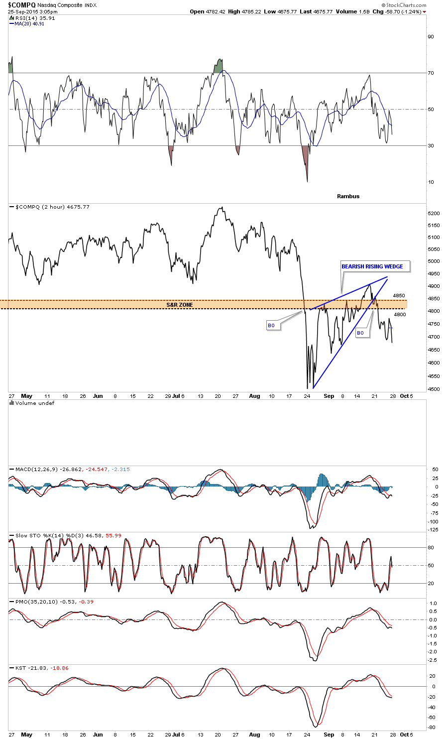
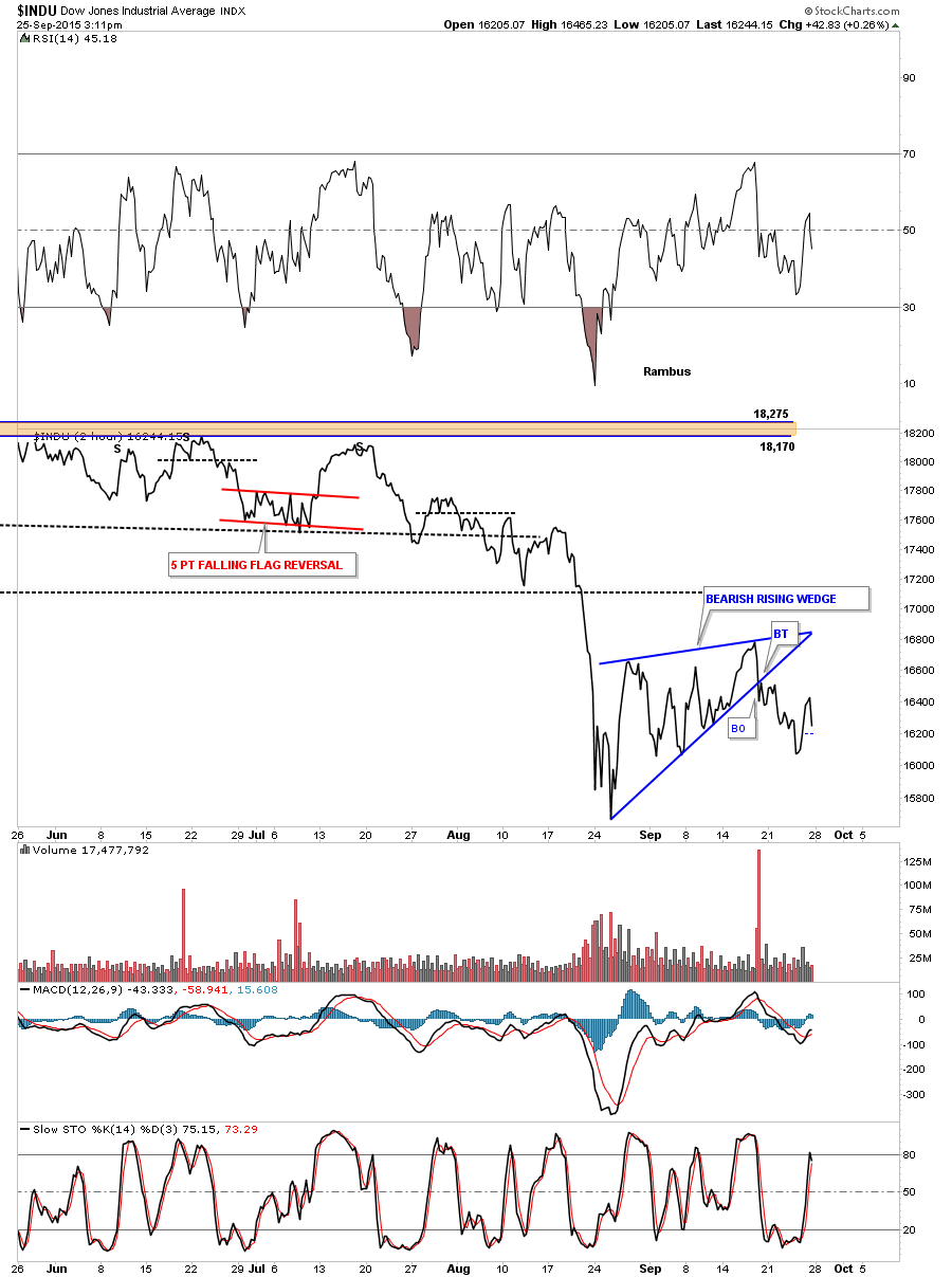
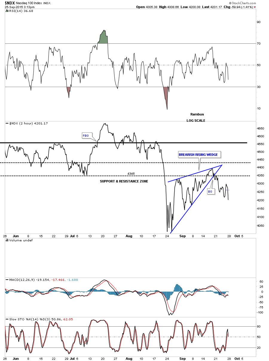
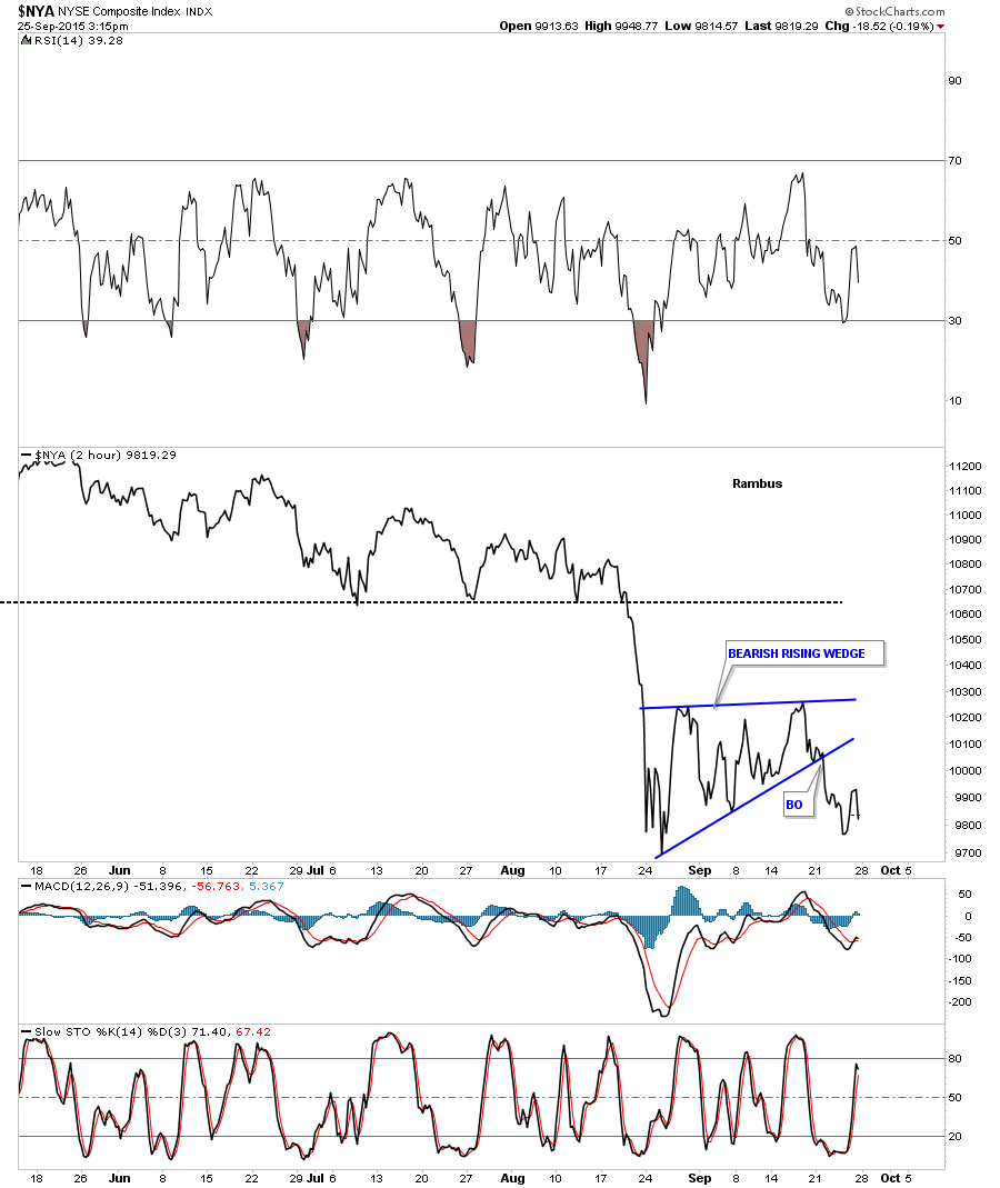
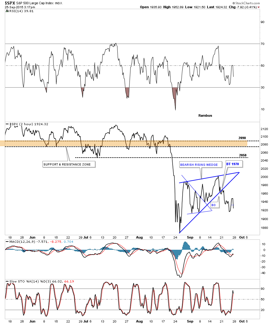
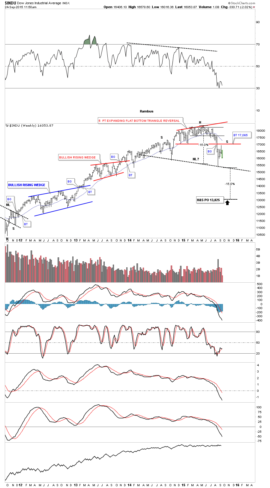
The small trading range since the August low was kind of sloppy in its development but the true picture has emerged. Last Friday it cracked the bottom rail of a bearish rising wedge with the backtest this past Monday. The INDU is now in its third day of its new impulse move down. At this point in time the price objective for a falling wedge is to where it began to form which would be the August low. On the other hand it could also be a halfway pattern which would show up between the two impulse moves. The first impulse move led into the bottom of the bearish rising wedge and the second impulse move would be measured from the last reversal point in the blue bearish rising wedge. The August low is going to be very important for several reasons. If it continues to hold support that would nullify a potential big H&S top. If it gives way then the new bear market will be born.

indu day

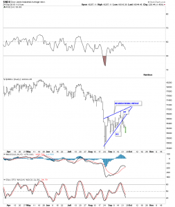
The weekly chart below shows the potential H&S top and the initial price objective if the neckline gives way.

INDU WEEKLY

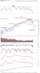
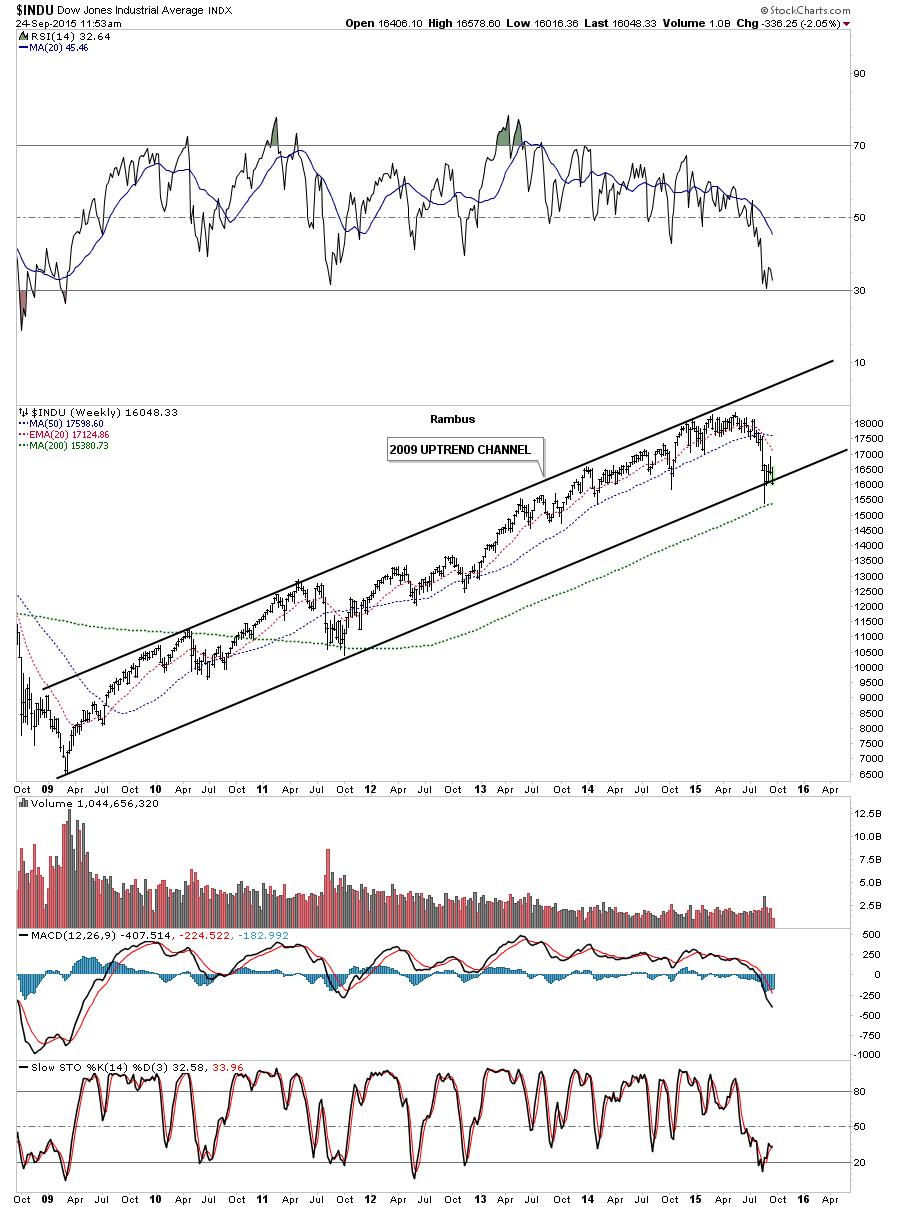
Another long term weekly chart for the INDU shows its uptrend channel that began to form at the 2009 crash low. As you can see the August low broke the bottom rail but found support at the 200 week moving average which is around the 15,380 area. A lot of important long terms trendlines are being tested.

indu weekly uptrd