Hello : My Name is Fullgoldcrown and I am a Goldoholic .
This is a Recap of Rambus Charts (with his commentary) showing what he is Seeing in the PM Stocks . (FEB 23 2013)
Since Rambus was the First to see this Huge Head and Shoulders Pattern developing in The PM
Miners Indices , there have been a plethora of naysayers , lead by other PM Market Technical Analysts.
The main theme of this negative reaction to this Huge Head and Shoulders Pattern is that
It is Too Big to be considered a valid pattern ….ie TOO BIG TO FAIL !
This is just one of many examples :
from an Recent Article by XXXXXX (CMT)
“Simply put, empirical results show that a H&S formation spanning a multi-year period most likely is NOT a H&S formation at all. The reasoning is also quite simple as a typical topping process or distribution does not normally take such a long time to take shape. In order words, it does not make much sense for strong hands to use several years to sell into strength in anticipation of a major reversal!”
……………………………………
Now to the Rambus Charts and Commentary :
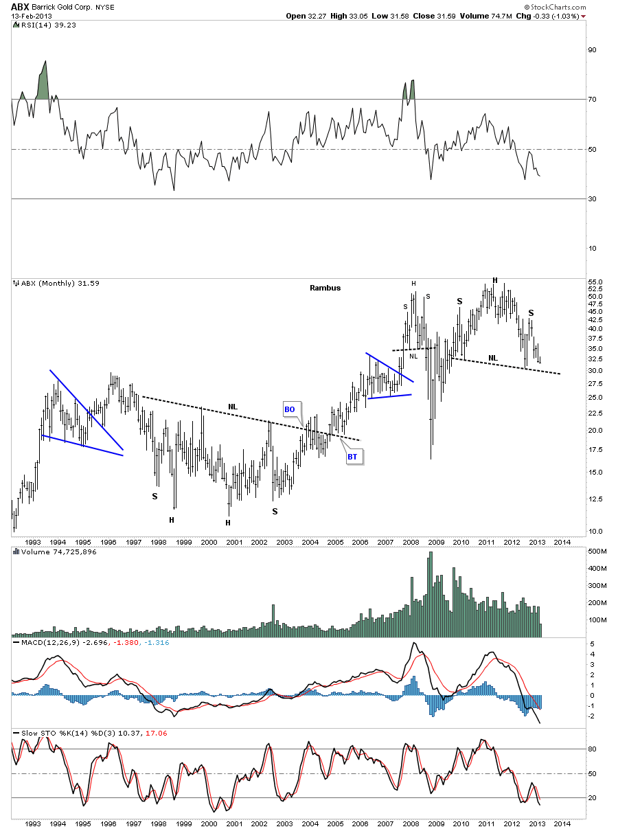
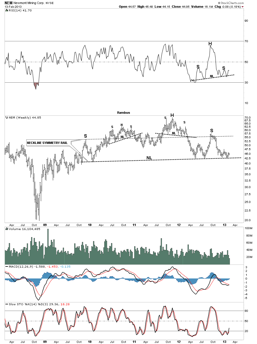
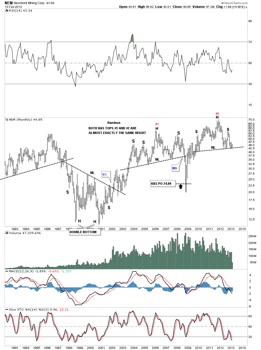
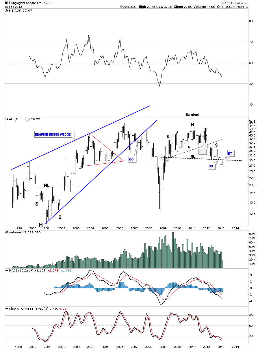
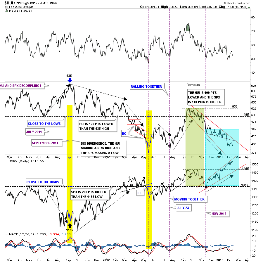
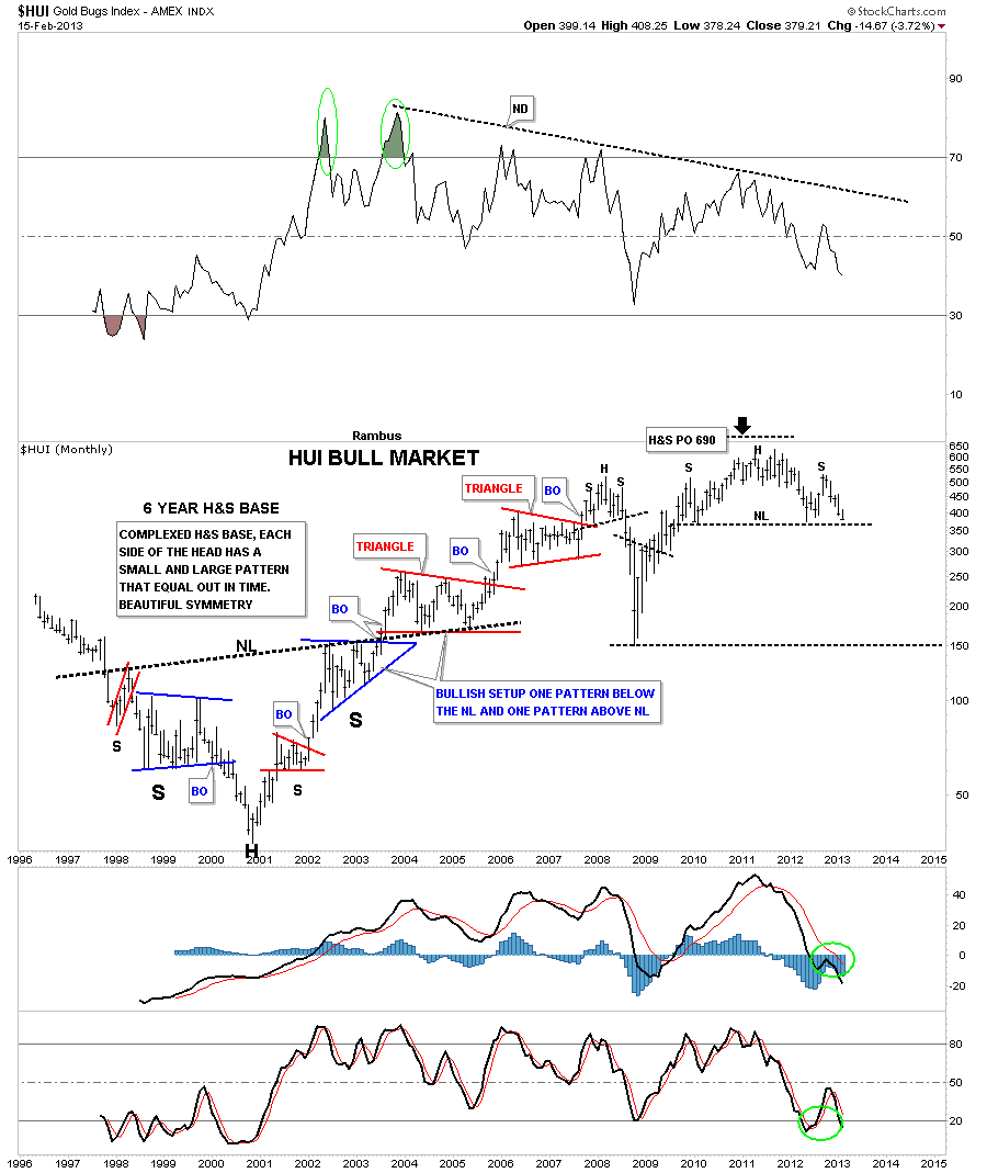
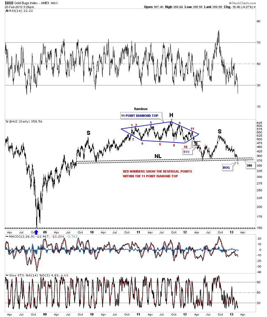
First The Chart of the Whole PM Bull Market to date that has everybody up in Arms (Monthly HUI)
……………………….
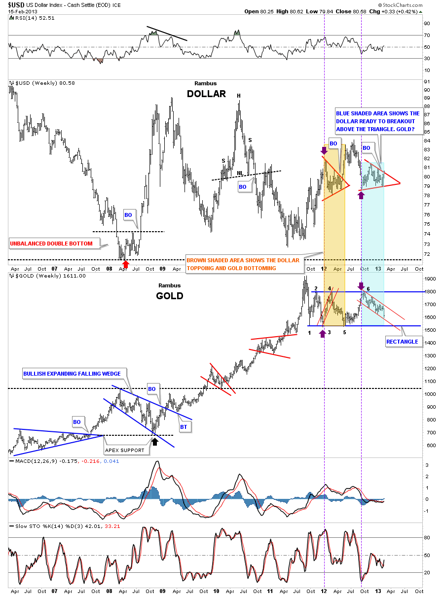
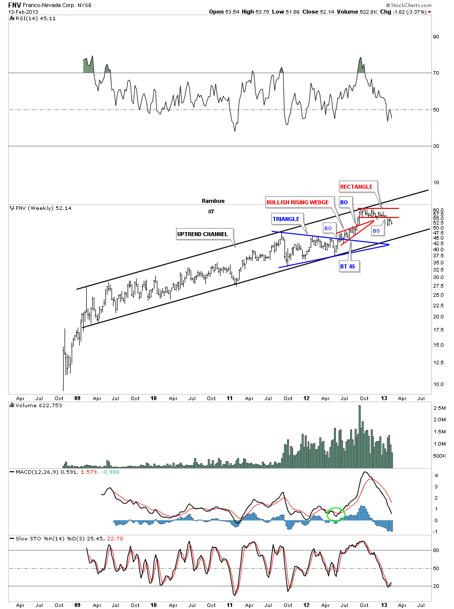
Chart #1
What Do YOU See ? February 15 2013
“Beauty is In the Eye of the Beholder” ..English Proverb
Tonight I want to show you a long term monthly chart for the HUI. It seems there is alot of disbelief that if a H&S pattern is too big that it some how makes it invalid or not to be trusted. I’m curious how that rumor ever got started? Nothing could be further from the truth IMHO.
Below is a monthly chart of the HUI that shows a massive 6 year inverse, complex H&S base, that launched the bull market for the precious metals stocks back in 2001. There is a certain beauty that 6 year H&S base has that most wouldn’t recognize. If you look on each side of the Head you will see two chart patterns, one large blue formation and one small red formation. They are positioned just the opposite on each side of the head. This doesn’t change the time component as the left and right shoulders measures out very close to each other. At the very top of the chart you can see what that big 6 year H&S based measured to. As you can see it measured up to 690 which was just a tad higher than the actual all time high.
The Chartology of the entire chart is one of beauty and symmetry which some will see and others won’t. They say beauty is in the eye of the beholder. What do you see?
………………………………………..
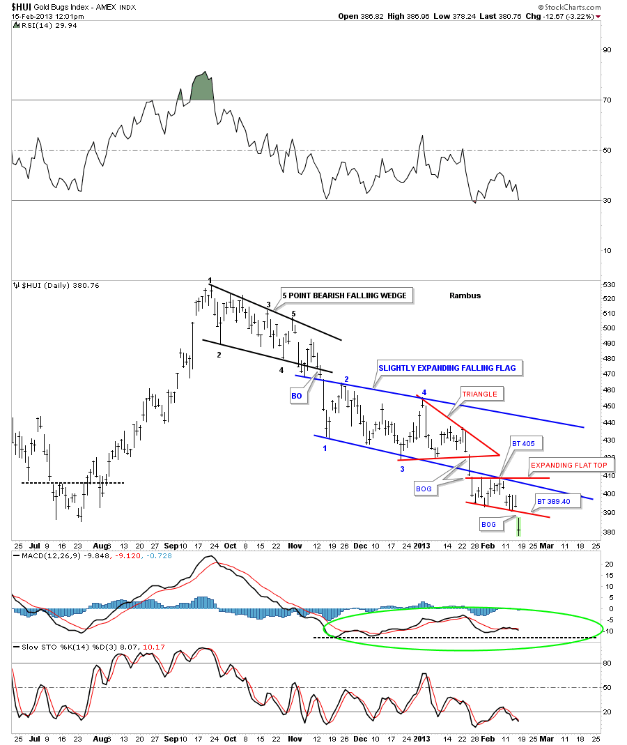
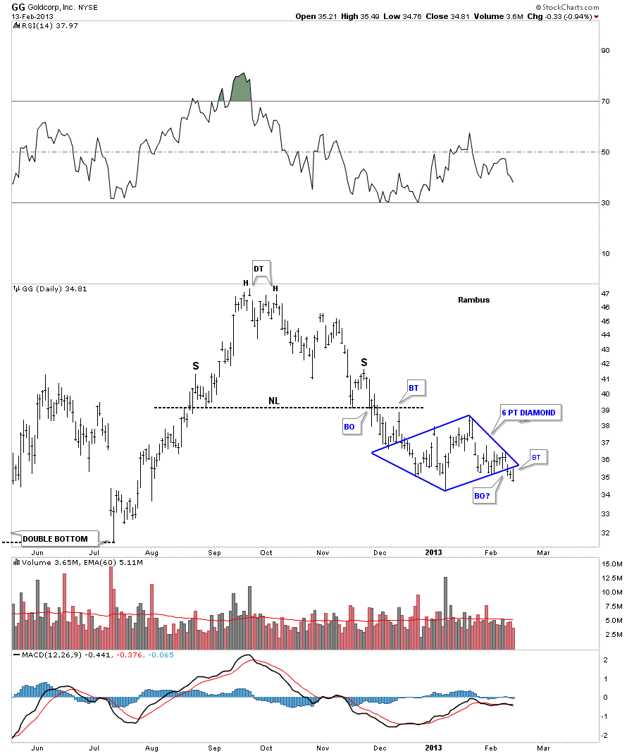
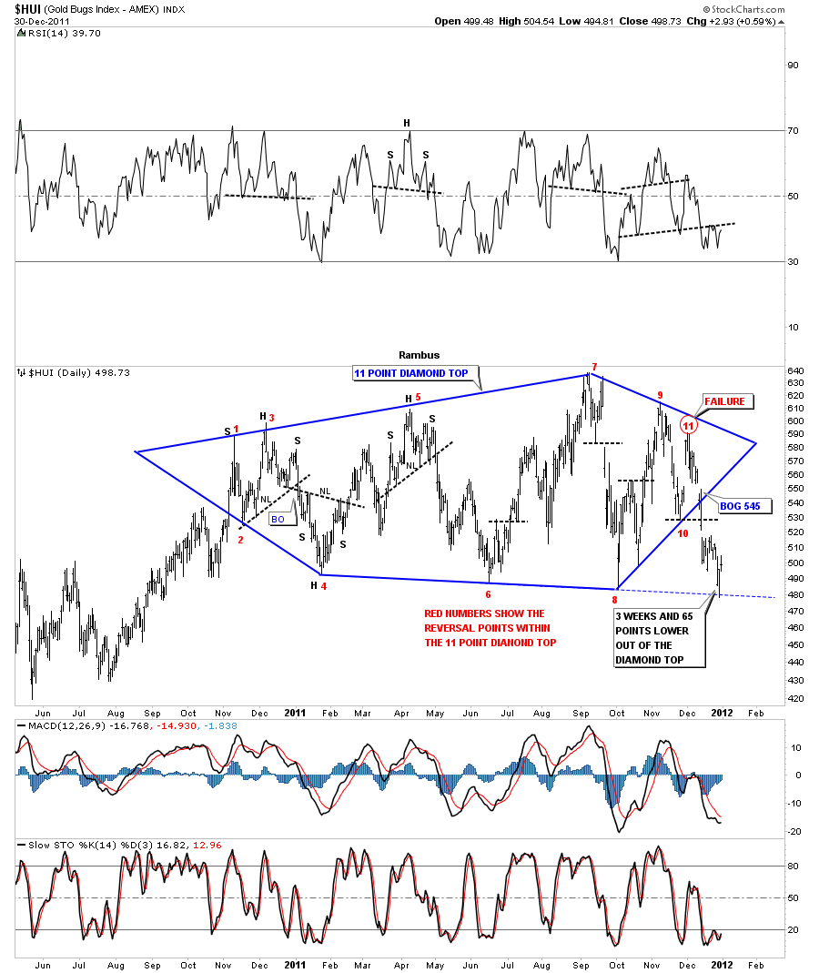
Next is a New Years Eve Rambus Special which showed the 11 Point Diamond Reversal Pattern which presently forms the Monster Head of the Pattern…This Chart was produced Dec 30 2012
Chart #2: Diamond in the Rough
……………………………………….
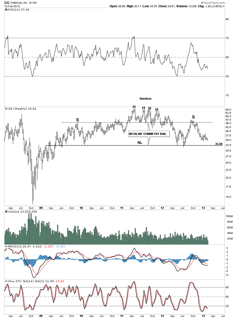
Fast Forward to Today (February 22 2013)
Lets look at one more example that you won’t find anywhere else except here at Rambus Chartology. You can see two reversal patterns, the 11 point Diamond that is actually the head portion of the much bigger H&S top that few believe is for real. The other pattern is the massive H&S top. Its good that few believe this pattern is authentic because everyone can’t exit at the same time. The lower it goes the more people will begin to understand what is actually happening but it will be too late to take action and they will most likely ride the whole thing down or sell into any counter trend rally that will occur thus putting a ceiling above the price action. I hope these examples help you understand what I mean when I talk about odd and even numbered chart patterns.
Chart 3: Nervous Breakdown !
………………………………………
Now just in case you are tempted to dismiss or SHOOT the Messanger here is a a compilation of some calls that should Prove his credentials. Its called “What If” and its Rambus Incredible Call for a HUI crash in 2008 well before the fact !
EDITOR’S NOTE: WHEN DONE READING THIS LINK REMEMBER TO CLICK THE BACK BUTTON TO GET BACK AND READ THE REST OF THIS POST
………………………………….
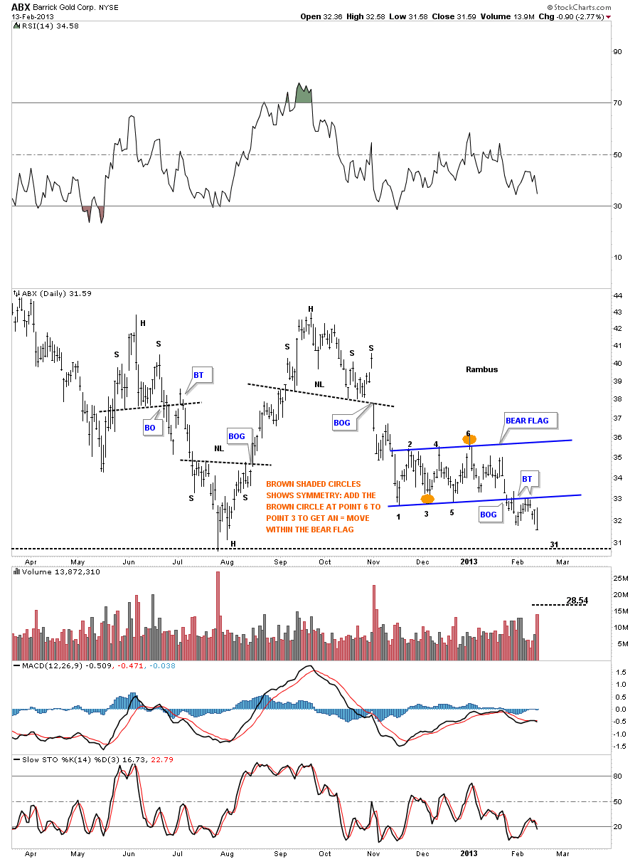
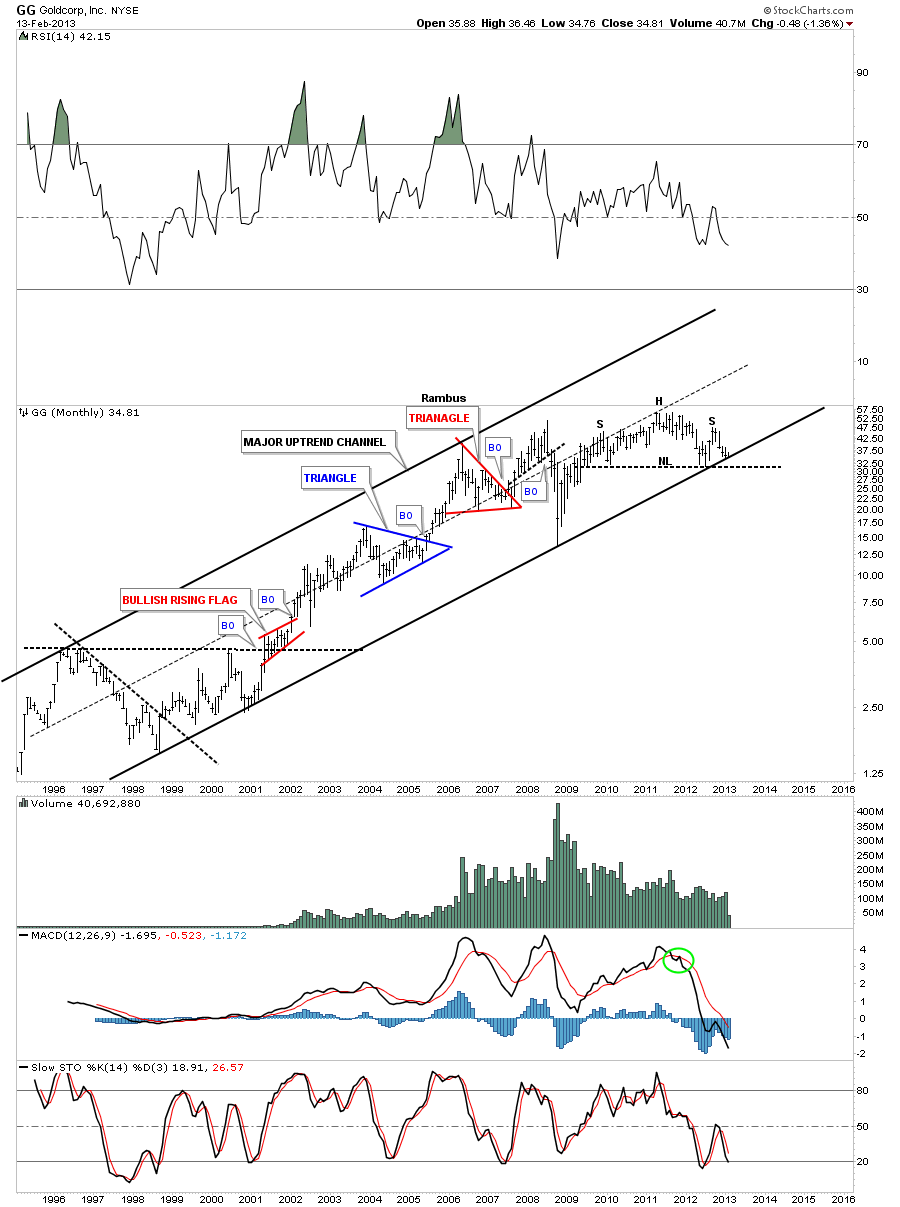
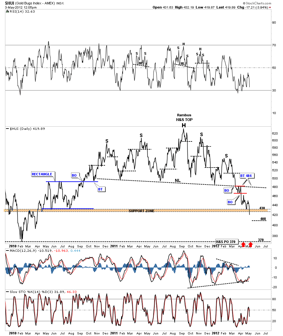
And here is a chart from May 3 2012 (9 months ago) ..that was predictive of the plunge to the eventual neckline
of this HUGE Head and Shoulders Pattern
Chart 4 Look Out Below
………………………………….
This bottom of course was followed by a Wonderful Bullish run from August to September 2012 to form the right shoulder top at 530
Rambus Subscribers were all in NUGT from early August until this run ran out of steam
………………………….
OK
Its Friday Nite February 22 2013 . The week that just passed was Devestating for gold bulls and featured what seems to be a capitulatory crash in all things PM . Searching the Web for some Hope , This Gold Permabull has found it . Amongst the wreckage of dreams and portfolios, bullish bottom callers abound. The following well seasoned and respected analysts again join in a chorus called
“THE BOTTOM is In”
Just Initials …to protect the guilty 🙂
1 A H : Gold Capitulation
2 Dave N : Mandatory rebound to at least Gold 1610 Imminent
3 T D S: We’re Headed Dramatically Higher; To Levels Few Can Even Consider
4 Jeb H : Keep Your Head When Investing In Precious Metals
5 B M : Capitulation
6 M H : Gold Bear Trap Is Sprung
7 Gold and Silver Worlds :Gold & Silver Prices Drop Into Severely Oversold Area
8 CEO Technician :Huge Buying Opportunity Setting Up in Gold
9 (Deleted) : Time to Buy Precious Metals Now
10 W Y : Carving a Reversed Head and Shoulders Instead
11 J N :A Golden Opportunity With Miners
12 Ch V : Gold & Silver Nearing MAJOR Long-Term Support
13 T C : Major Top In Stocks & Major Bottom In Gold
14 D L :The Current Currency Crisis will Ultimately
Lead to Higher Gold Prices
15 P R :”Summing up, support lines are in play for two out of three of this article’s gold charts and it’s likely that a local bottom has indeed formed. Additionally, RSI levels indicate an oversold situation. The outlook for gold from here is bullish”
As a Staunch Permagoldbug of some 20 years…I have seen the lean times (pre 2001) (2008) and the Fast Times (Gold 1900)…and I really really hope and pray these esteemed Gold Analysts are right !
Many of them however have been calling for a Bottom for quite some time
They cite : Extremes in Bearish Sentiment , Extremes in Commitment of Traders , Extremes in Momentum Indicators , Extremes in Fundamentals , Fractals , Cycles , Elliot Waves and a host of other reasons that I desperately want to believe !
However there is that one lonely nagging voice in the wilderness calling…”Its all in the Chartology”
And this time I am not going to shoot that messanger as I did in 2008 !
Rambus always tells his subscribers :
The only Rule in the PM Markets is “There are No Rules”
So anything is possible
Perhaps this will turn out to be a Bear Trap
If So , I know that Rambus (Dave from the Ozark Mountains in Arkansas)
will be able to spot it in the Charts and turn on a dime and go long
But For Now…The Charts are Shouting “Breakdown in the Precious Metals Stocks !”
And We Better believe what we see !
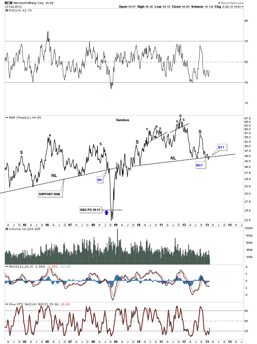
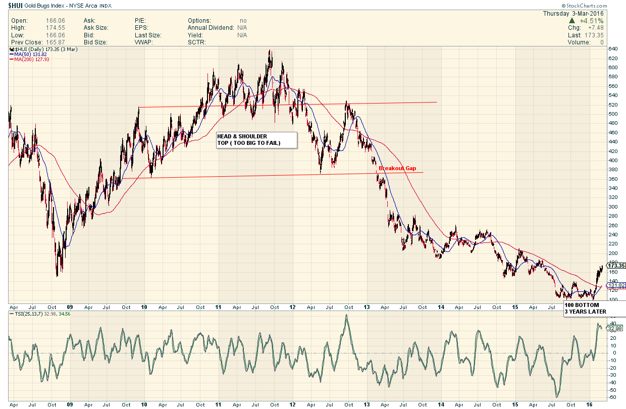
HERE IS HOW THE HUI WENT AFTER THAT TOO BIG TO FAIL POST WAS MADE…
………………………….
Now The Last Word from tour Self Taught Chartology Professor :
Before we move on to the subscribers questions at the forum lets take a moment and talk about a game plan going forward. Right now we find ourselves in a very unique situation in regards to the precious metals complex. There are a few times in an investor’s life where the big picture shows itself so clearly. My experience has taught me that when I see such a setup, that is this rare, the best course of action is to sit tight and don’t attempt to trade the small swings. As some of you are finding out, that have sold their 3 X etf’s, thinking gold or the precious metals stocks can’t go any lower and are ready for a bounce, may find it hard to get back in. Yes you took a nice little profit but you lost sight of the big picture. The big picture is where the big money is going to be made. Chances are if you want to get back in you will be finding yourself chasing the price action hoping and waiting for a counter trend rally that may or may not happen. Positioning is everything in the markets.
We are lucky to be in the position we find ourselves in right now. We have alot of wiggle room if there is a short covering rally that will knock your socks off. Everyone who has been calling a bottom over the last year or so will be telling you the bottoms in and the bull market is taking off again. My view is that when we do finally get a short covering rally, that will look like the bull market is stating anew, that would be the time to sell any reaming precious metals stocks you own and to use any strength to add to your Kamikaze trades or short positions.
I’m still amazed how many investors can ride a losing position down day after day but when they have a winning position they will sell out at the drop of a hat. The old wall street adage: Cut our looses and let you profits ride, easier said than done but very important concept to grasp.
I have shown you countless H&S top patterns that are just beginning to breakdown especially in the big cap sector. I’m showing you these big multi year H&S patterns to give you an idea that this decline isn’t going to be a one day wonder. Its going to take many months or longer for these big tops to play out. I can guarantee you that the volatility is going to be insane at times and your emotions will get the better of you. I have said this before, this will be the easiest and the hardest time you will have holding on to your short positions. The easiest because you don’t have to do anything except sell when we approach the bottom. The hardest because your emotions will get in the way when you read something someone wrote that say the PM stocks can’t go any lower because of this indicator or that the PM stocks haven’t been this oversold in history or what ever the reason is and you will bail to relieve the pressure.
Please keep in mind this isn’t a child’s game we are playing. When you put your hard earned money into the markets you are going up against the brightest minds and best trading systems in the world. They want your money and they could care less what excuse you give when you hand over your hard earned capital to them. You can use the excuse the markets are manipulated is why you lost or countless other excuse for not succeeding. They don’t care, they just want your money. Period!!!!!! One has to take responsibility for their success and failures and not do the blame game as that is counter productive. With that said lets move on to some subscriber questions.
All the Best
Rambus
EDITOR’S NOTE : CLICK THE BACK BUTTON TO GO BACK TO GOLDTENT AND FINISH READING THIS POST