There is a lot to go over tonight in regards to commodities and the precious metals complex. A while back I wrote a report on the commodities in general getting ready for the next possible leg down which will fuel the deflationary pressures that really took hold last about this time. That’s when the US dollar finally broke out of its massive base and charged higher topping out in March of this year and has been consolidating those gains ever since. Lets start by looking at the big base the US dollar broke out of last year at this time and the strong impulse move up as shown by the string of white candlesticks. That’s what a strong impulse move looks like when all the pent up energy finally has a change to escape. That powerful impulse move out of that big base was strong enough to take out a very long term trendline going all the way back to 1985 or so. That thirty year top rail of the bullish falling wedge has now reversed it role to what had been resistance to now support during this consolidation phase the US dollar has been going through since March of this year.
Below is a 15 year combo chart that has the US dollar on top and gold on the bottom. Notice how the US dollar is reversing symmetry back up based on the decline that started at the 2000 top as shown by the blue arrows. Once the dollar takes out our current high the next area I’ll be looking some resistance to show up will be the 108 area. This combo chart also shows you the big positive divergence the US dollar had with gold which was the first real big clue for me that the dollar was ready to rumble. Note the low for the US dollar in 2008 and the high for gold which was normal at the time. From that point in 2008 gold almost double in price but the US dollar actually made a higher low vs the 2008 low. That’s what really got my attention. Note the last bar on the monthly gold chart which is now trading below the previous lows of the last two years. They say a picture is worth a thousand words but I think this combo chart is worth a whole lot more.
Knowing what the commodities did during the US dollar’s big impulse move out of that big base, lets review some of the commodities indexes I showed you a while back, when I suggested the the other shoe maybe getting ready to drop in regards to the ongoing deflationary spiral. The first chart is a daily look at the CRB index which gapped out of an eight point diamond consolidation pattern. It’s now approaching the low made back in March.
Stepping back about four years or so you can see how the diamond consolidation pattern fits into the big decline. I’m viewing this diamond consolidation pattern as a halfway pattern to the downside. Notice the decline that occurred during the first impulse move down out of the big black triangle. I expect a similar move to take place that matches the first leg down in time and price. It doesn’t have to be exactly the same but we can use it as a guide to let us know where we’re at once the impulse move breaks the March low.
Below is a long term monthly candlestick chart which shows us the massive H&S top the CRB built out before the first impulse move down I showed you on the daily chart above. The diamond, red circle, has formed on a very important support and resistance zone, brown shaded area. As I have shown you many times in the past a stock will make a small consolidation pattern just above an important support and resistance line before it finally breaks it. The moment of truth has now arrived for the CRB index. One last note on this long term monthly chart for the CRB index. With the US dollar’s monthly candlestick chart I showed you a string of white candlesticks in its strong impulse move up. Here you can see this monthly chart for the CRB index shows a string of black candlesticks during its first impulse move down showing us the inverse correlation is alive and well.
Another commodities index I follow is the $GNX commodities index. This index bottomed out a bit earlier than the CRB index as it first bottomed in February of this year. This daily chart has some very nice Chartology which is showing us a seven month black bear flag that is made up of bullish rising wedge and a triangle reversal pattern. The breakout from the bottom rail of the bear flag was picture perfect with a nice clean backtest.
The long term daily chart for the GNX puts the bear flag in perspective within the context of the big move down out of the black triangle. Longer term members should remember the little blue bearish falling flag that formed roughly at the halfway point in the first impulse move down that was also showing up on most of the currencies at the time. I know it seems impossible that we could experience another leg down equal to the first impulse move down with the blue bear flag showing up somewhere in the middle but until something changes this scenario this is my game plan.
Now I would like to show you some charts for the energy sector to give you a feel on how we maybe just at the halfway point in this next deflationary episode. The first chart is daily look at the $SPEN which is the SPX 500 energy sector chart. As you can see it bottomed out in December of last year and has consolidated that decline by building out a seven month bear flag. Again it had a perfect breakout and backtest before moving making new lows for this move.
To put the bear flag in perspective we need to look at the weekly chart. The blue arrows shows how I measured for the price objective which I call the impulse method.
The $XOI, oil index, shows a bearish rising wedge complete with breakout and no backtest.
The very long term monthly chart for the XOI shows you just how dire the situation is for the index. The bearish rising wedge I showed you on the weekly chart above is just the backtest to the bottom rail of a massive bearish rising wedge reversal pattern. Note how the bottom rail of the blue bearish rising wedge held support for six years but once it was broken to the downside it reversed its role to resistance that held for six months or so.
Before we move on to some precious metals charts I would like to show you one more chart that is just starting to breakdown and that is the XES, oil service index. It has formed a flat bottom triangle consolidation pattern and has just recently broken below the bottom rail which is leading the oil sector lower as it’s making new lows for this move.
Now I would like to update you on some the precious metals stocks we’ve been following very closely. The first chart is a weekly look at gold that shows the parallel downtrend channel with the black and pink rectangles that measures time and price. I’ve been saying, in order to keep the symmetry going vs the impulse move out of the 2013 six point blue rectangle, I would like to see our current blue bearish falling wedge break the bottom rail by the middle of July. After two years of consolidating that first impulse move down gold finally broke below the bottom rail of its bearish falling wedge halfway pattern on Monday of this week with a nice breakout bar. I can’t rule out a backtest to the bottom rail but if we do get one it should come in around the 1110 area. Long term members know that I’ve been waiting for this breakout for a very long time.
We still have two more days to trade yet but this weekly line chart shows the breakout that is underway. A weekly closing below the bottom rail would be very positive.
The very long term monthly chart for gold shows the massive H&S top that actually started to build out in 2010 and broke below the neckline just over a year ago and has been in backtest mode until recently. You can see the price action is now starting to fall away from the neckline now beginning its impulse move down to the possible brown shaded support and resistance zone. From a Chartology perspective the massive H&S top is a classic. Note how the left shoulder and head formed inside the expanding rising wedge, which was the bull market. Once the bottom rail was broken to the downside the backtest formed the right shoulder which we watched in real time what seems like an eternity ago.
The monthly chart for silver shows a similar massive H&S top to match golds. It has some beautiful symmetry as shown by the neckline symmetry rail that shows the height for the left and right shoulders. The last time I posted this chart I said I would expect silver reaches the brown shaded support and resistance zone. But the price objective shows an even lower possibility .
This next chart is a combo chart that I’ve been posting about once a week or so so you could follow the price action in real time. As you can see both the HUI and gGLD both broke below the bottom rails of their two year consolidation patterns this week with a big breakout gap. I wish I could rule out a backtest to the bottom rail but it’s still a possibility.
Below is a weekly chart for the HUI which is showing a possible bearish falling wedge which gapped below the bottom rail this week adding another clue to the possible validity of this potential halfway pattern. A backtest would come in around the 121.25 area for confirmation if the bottom rail is the real deal. I have taken a great deal of flak over the years from chartists who insist there is no such thing as a bearish falling wedge . As I have pointed out many times , these down sloping patterns Do often breakout in the direction of the trend . They appear in strong moving markets . To review you can read this Post , which is buried in the Timeless Tutorials section “Wedges , Facts and Fictions ” http://rambus1.com/?p=9256 Now see below a very interesting chartology pattern , The Bearish Falling Wedge . This one is made up of several contributing patterns . As the saying goes The Whole is greater than the sum of its parts .
Just so you know that I’m not totally crazy for thinking the HUI could be building out a bearish falling wedge halfway pattern below it the 2008 crash in the HUI. Note the double H&S top that led to the 2008 crash. After forming the little red bear flag halfway pattern the price declined down to its price objective at 253, first blue arrow point up, which was the first reversal point in the blue bearish falling wedge consolidation pattern. Note how volatile the price action was when the blue bearish falling wedge was building out. The breakout was and backtest were right on the money which led to the ultimate bottom. Is history going to repeat again?
I have just enough time to update you on several PM stocks that are building out their own bearish falling wedges. Keep in mind that bigger chart patterns can be made up of several smaller ones when you look at these charts. GG formed a blue bearish rising wedge which broke down and then built out a H&S consolidation pattern which shows a potential bearish falling wedge that broke below the bottom rail this week along with the HUI.
The monthly look for perspective which shows GG trading right on the 2008 crash low.
The weekly chart for DPM.to shows the price action sitting right on the bottom rail of its bearish falling wedge.
AUY broke out of its red bearish falling wedge about a month ago after forming a bigger blue bearish falling wedge last year.
The monthly chart for AUY for perspective.
EDR.TO is testing the bottom rail of its possible bearish falling wedge.
GLDX is testing the bottom rail of its potential bearish falling wedge.
SIL cracked the bottom rail of its potential bearish falling wedge this week.
The long term monthly chart for perspective.
All these charts above should give you a feel for what maybe taking place right here and now in the commodities complex. It appears to me that the second leg down is now underway. Outside of a possible backtest in some cases most of the consolidation patterns have already broken down. We’re living in interesting times to say the least. All the best…Rambus
Category Archives: public
Wednesday Report…The Great Deflation Round 2 .
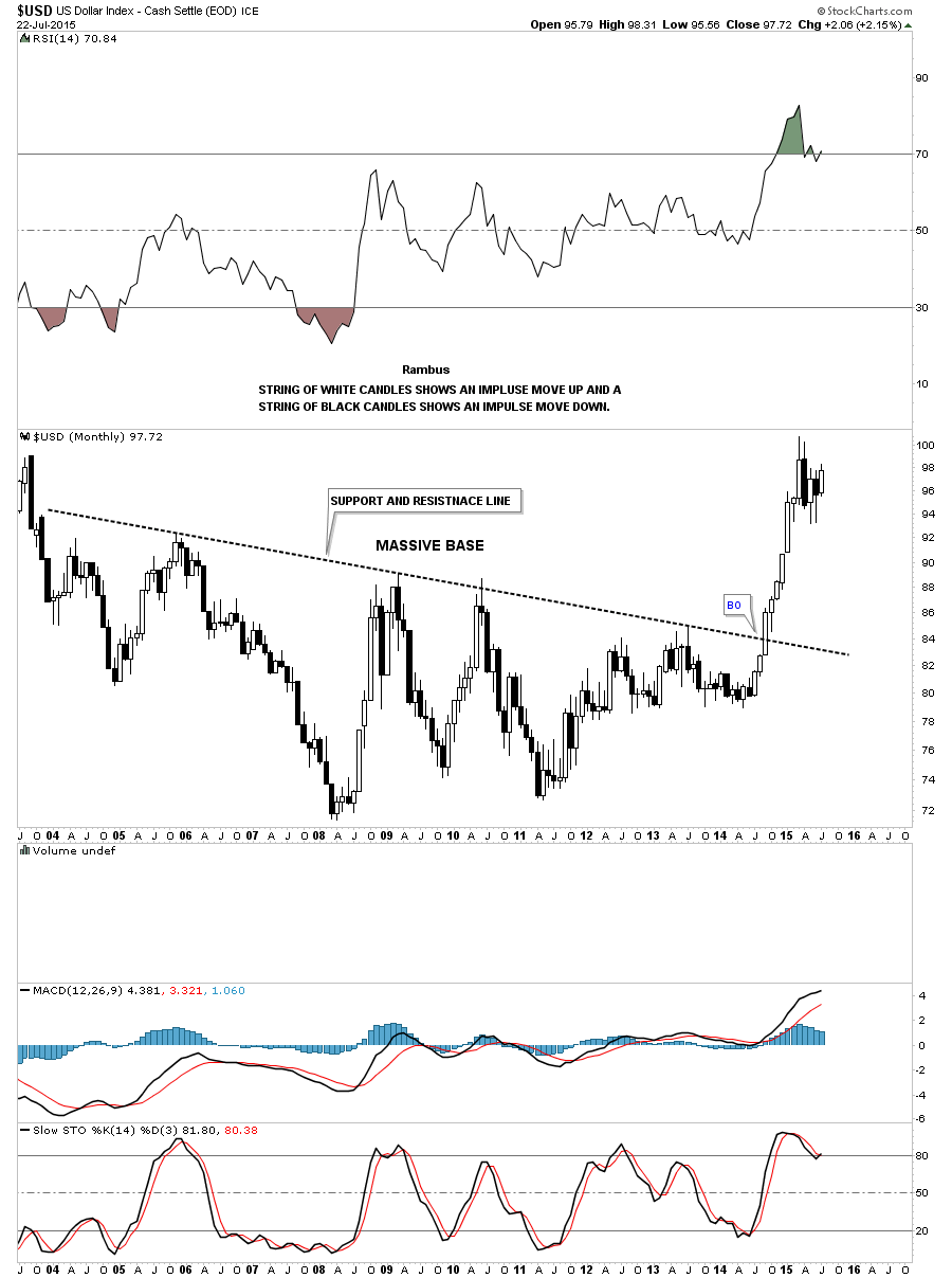
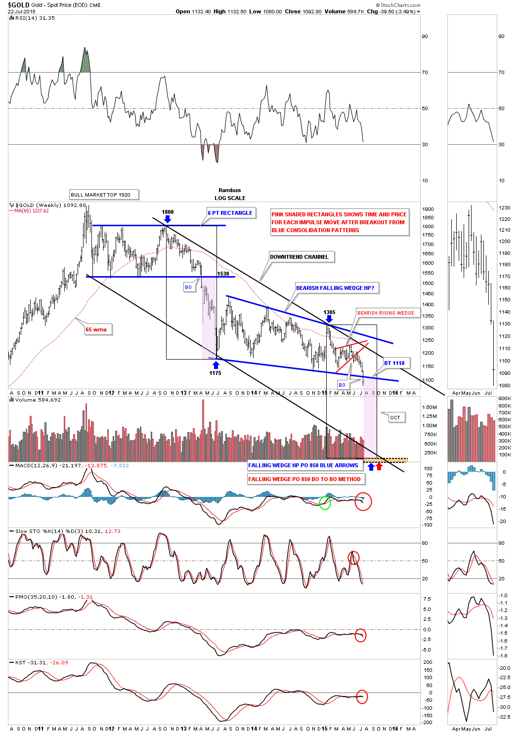
In tonight’s report I would like to show you some charts that could be telling us that the second shoe maybe getting close to dropping in the on going deflation scenario that really started to take hold last year at this time. If you recall the US dollar broke out of a massive base and with most commodities following lower. Commodities have been consolidating for most of 2015 chopping out some decent sideways trading ranges. In order to really get this second leg going to the downside, for commodities, the US dollar is the key component that needs to breakout topside.
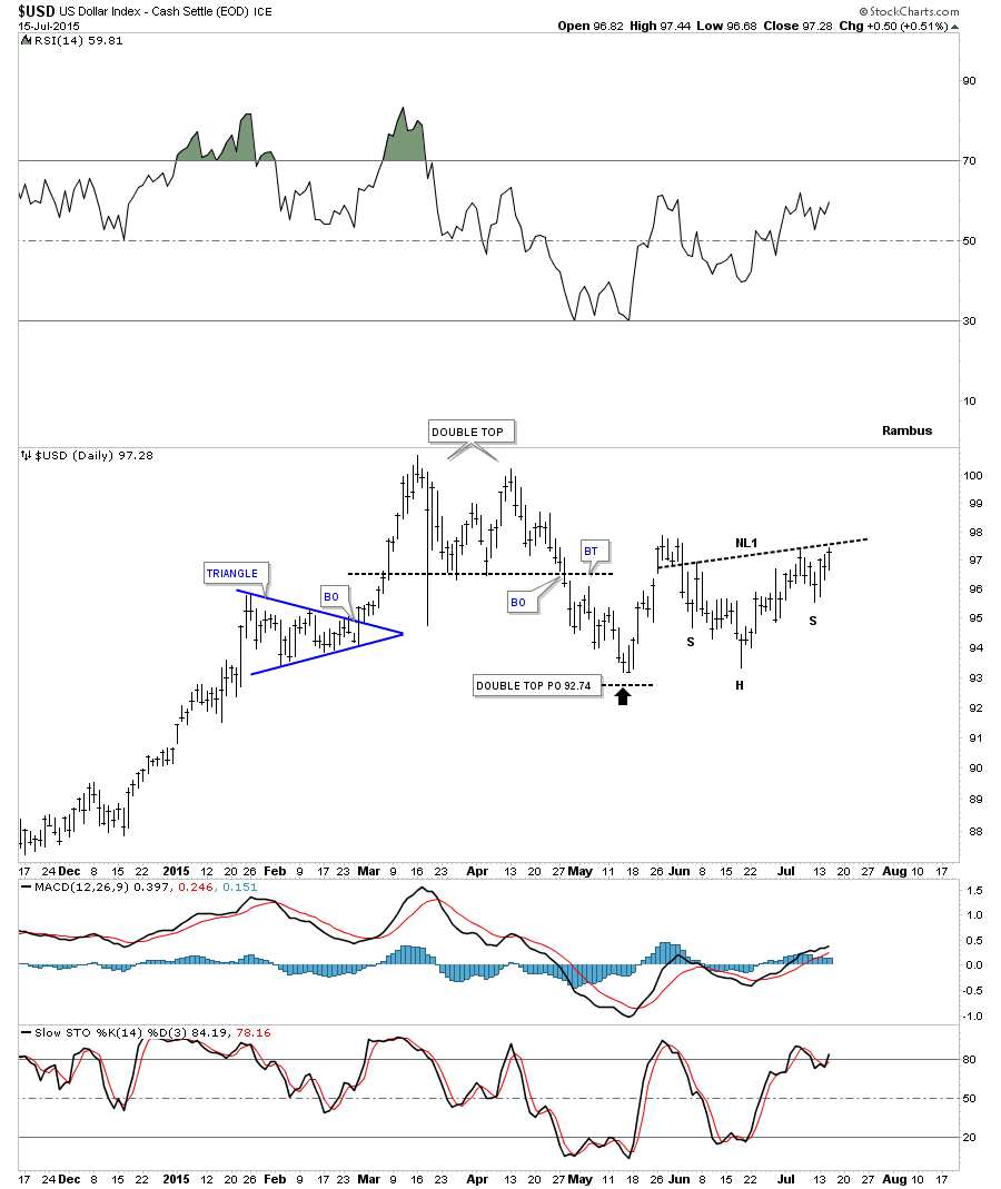
The first chart tonight will be of the US dollar which topped out in March of this year creating a double top reversal pattern. After nearly reaching the price objective in May the dollar had a good bounce only to come back down to the previous low around the 93 area in the middle of June which I could make a case for a double bottom. The low on the right side of the potential double botttom has been carving out an inverse H&S bottom with today’s price action touching the possible neckline. Needless to say this is a critically important point right here and now for the US dollar.
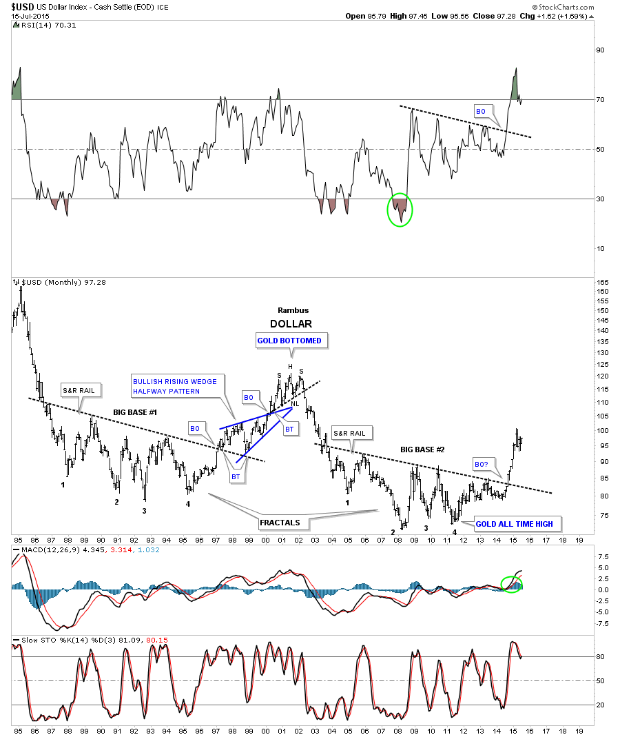
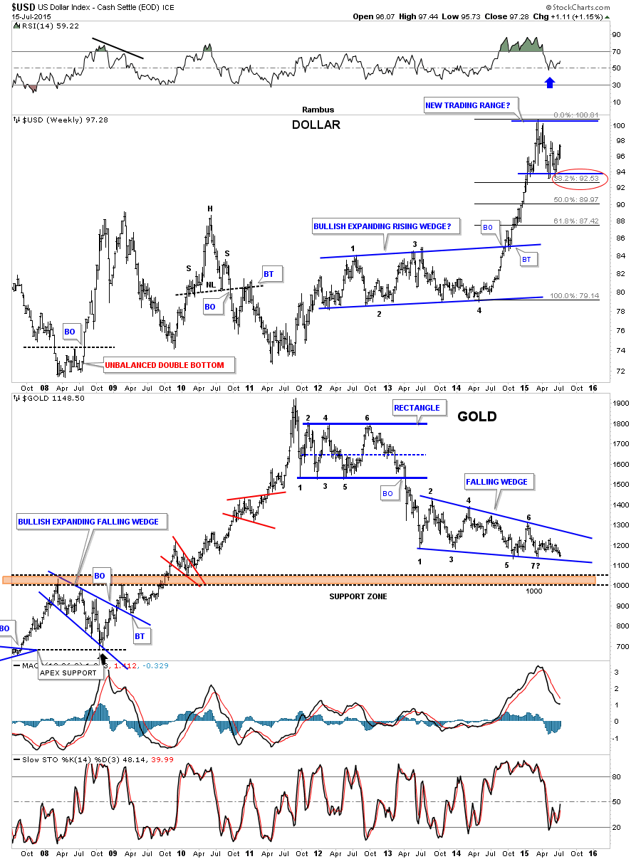
Below is another longer term daily chart for the US dollar that shows the big impulse move up that started in July of last year that we followed right from the beginning. Note the smaller red consolidation patterns that made up that strong impulse move up. Also note how much bigger the blue expanding falling wedge is compared to any of the smaller red consolidation patterns. This tells us that the potential blue expanding falling wedge will most likely be a halfway pattern that will separate the first impulse move up from the second impulse move up that maybe is just now getting started. This is the pattern I’ve been showing you on the UUP chart. We’ll know in the next day or two if the breakout and backtest to the top blue rail of the expanding falling wedge is valid. So far so good.
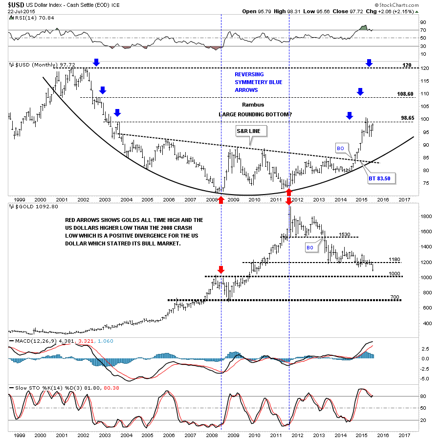
This next chart is a very long term monthly look that shows the two fractal bases that are uncanny in their appearance to each other. You can see the massive rally that the US dollar had once all the pressure was released from the big base #2 last year.
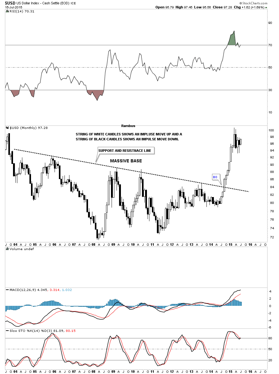
This next monthly chart for the US dollar zeros in on the big base #2 using candlesticks. When you see a string of white candlesticks all in a row, especially on a monthly chart, you know you’re in an impulse move up and when you see a string of black candlesticks all in a row you know you’re in an impulse move down. If the US dollar can close out the month of July in a strong move we’ll see our first white candle which is needed to start an impulse move higher.
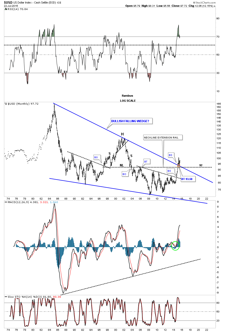
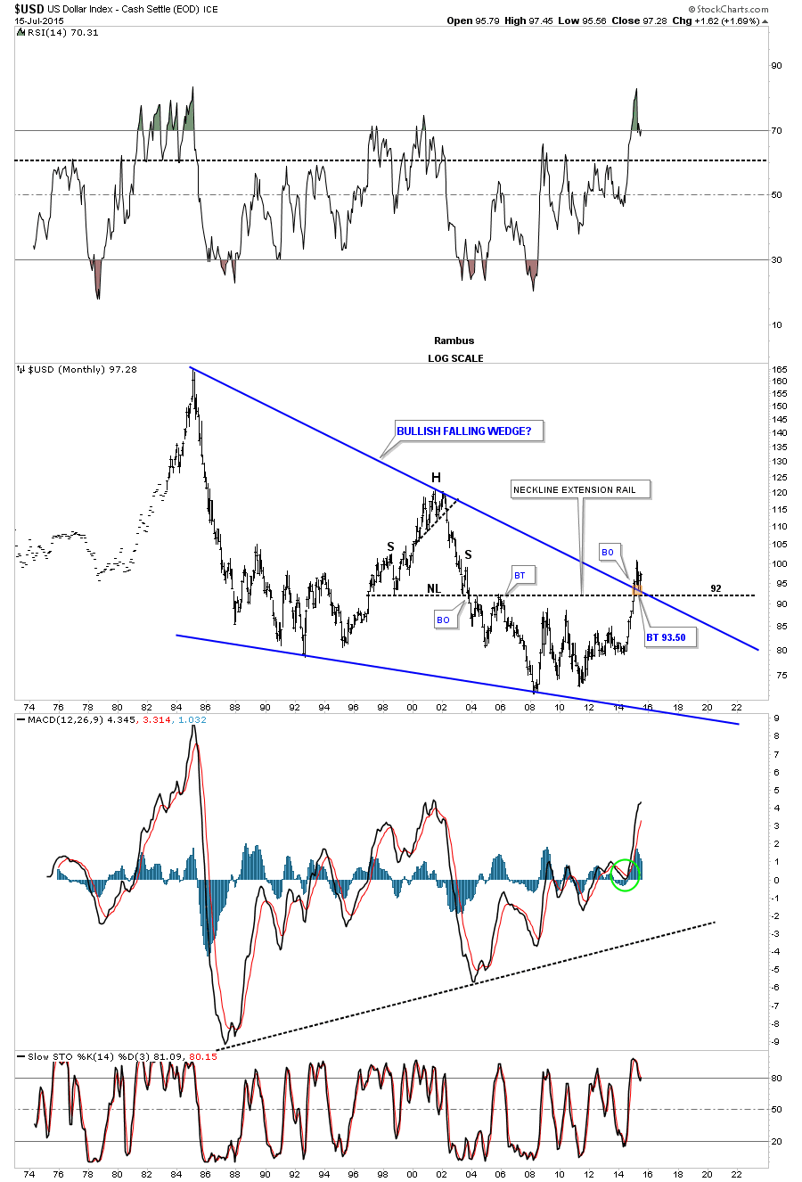
Lets look at one last long term chart for the US dollar that shows the massive bullish falling wedge pattern. If you recall I said to look for support on the backtest to the top blue rail as shown by the little brown box. Worst case scenario would be a test of the neckline extension rail just slightly lower at 92 or so. The top blue rail has done it job so far holding support.
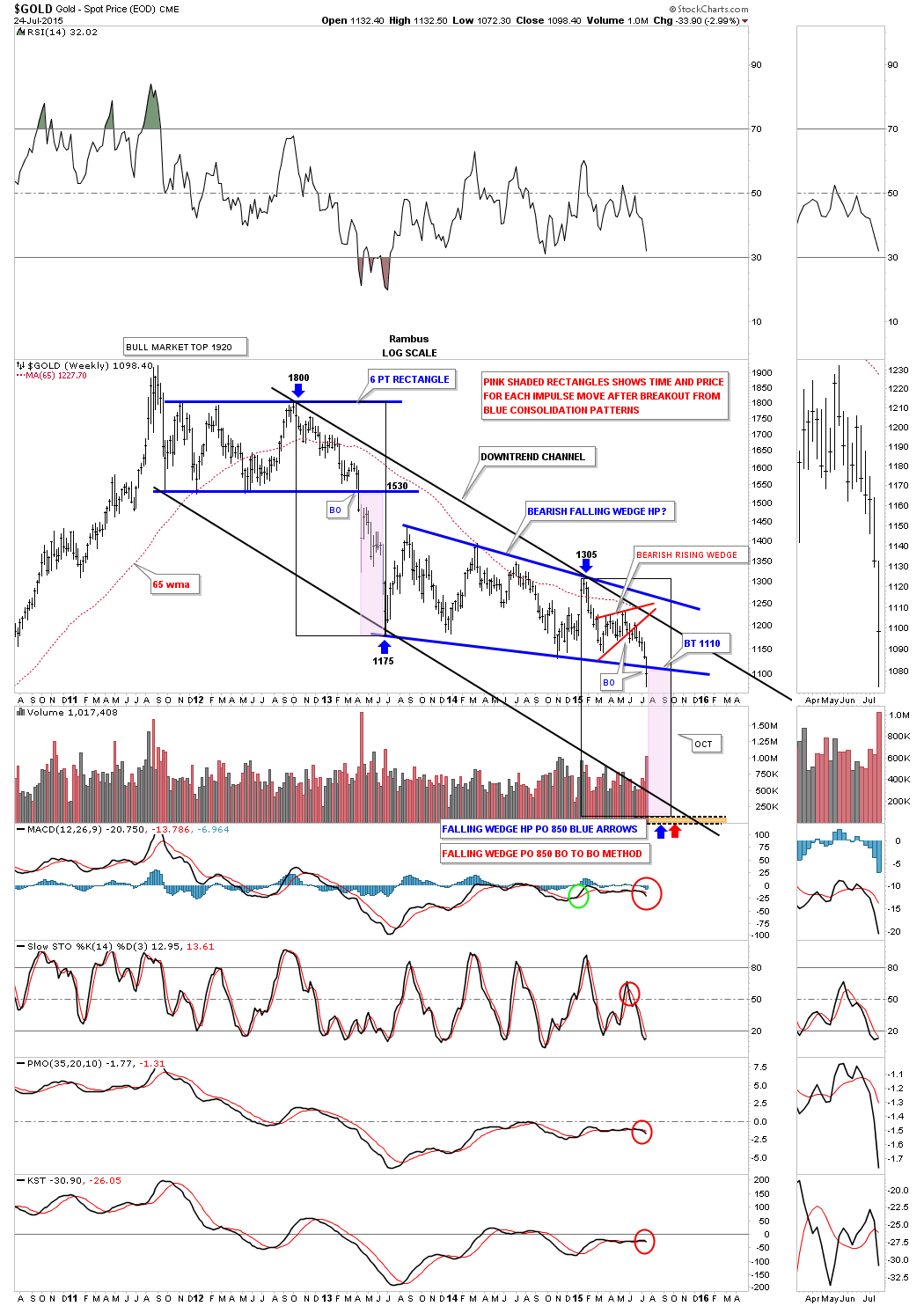
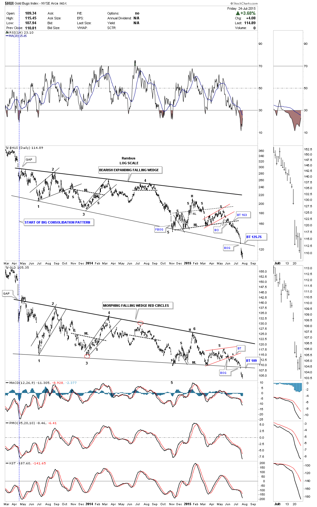
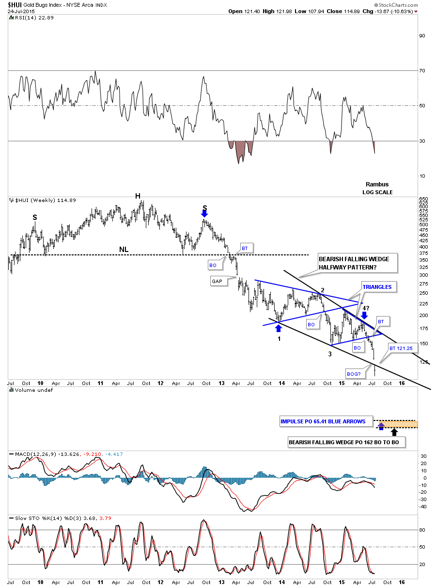
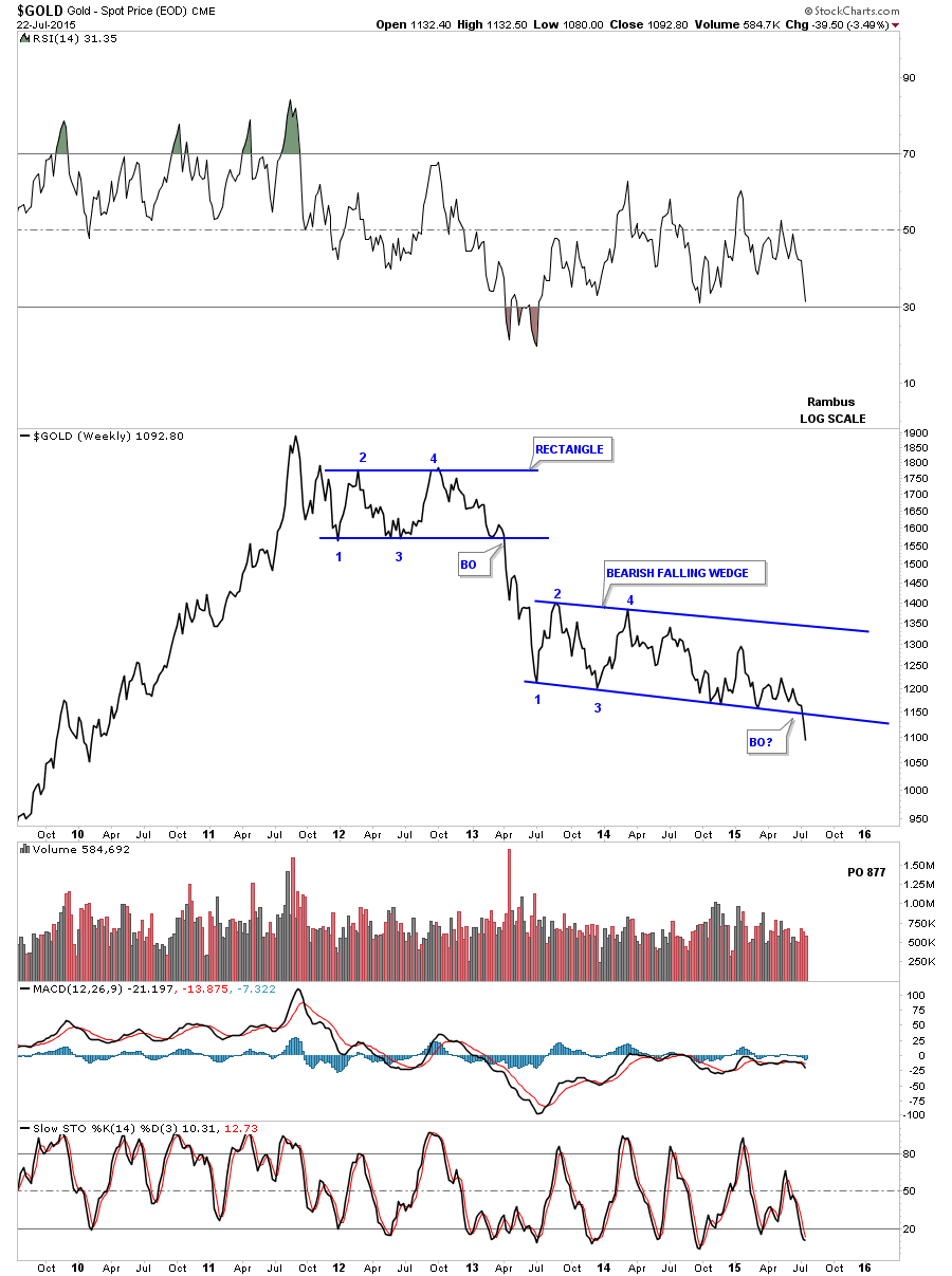
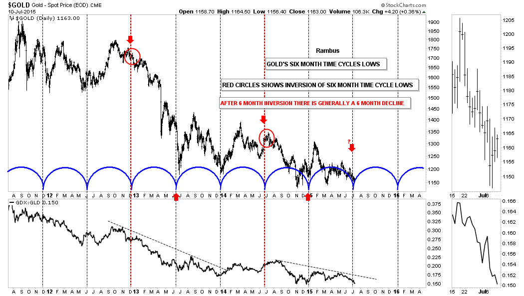
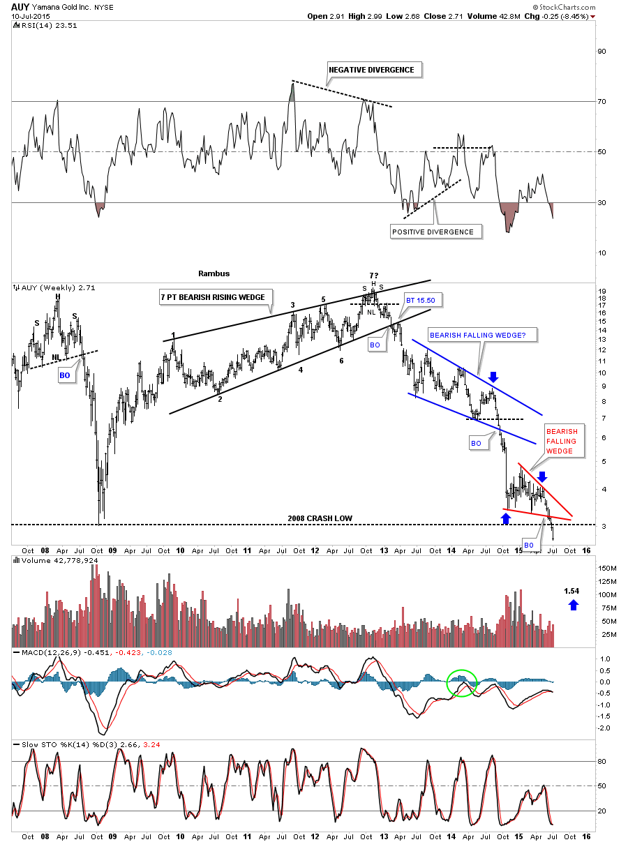
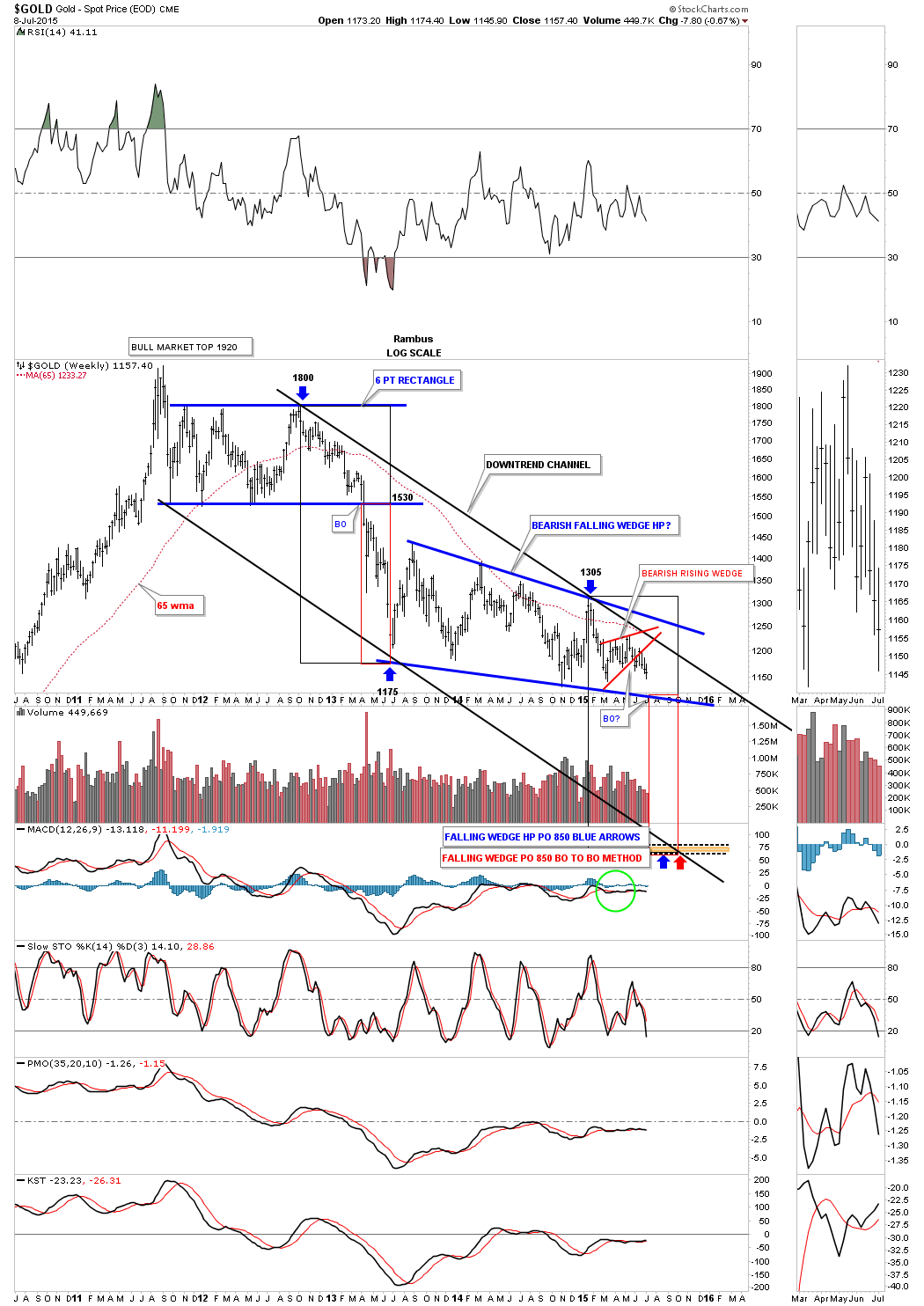
Below is a combo chart that has the US dollar on top and gold on the bottom. The US dollar had about a 38% correction off of its most recent high while gold has just kept plugging along forming the two year falling wedge consolidation pattern. One thing that should stand out for you is how gold has made a series of lower lows and lower highs since it’s bear market began almost four year ago. Note just the opposite price action on the left side of the chart during the bull market years where gold made a series of higher highs and higher lows.
Next lets look at a few important currencies that may help in giving us some clues about a possible US dollar bottom and move higher. The XAD, Australian dollar, which is a commodities base currency has broken down from a H&S consolidation pattern accompanied with a breakout gap.
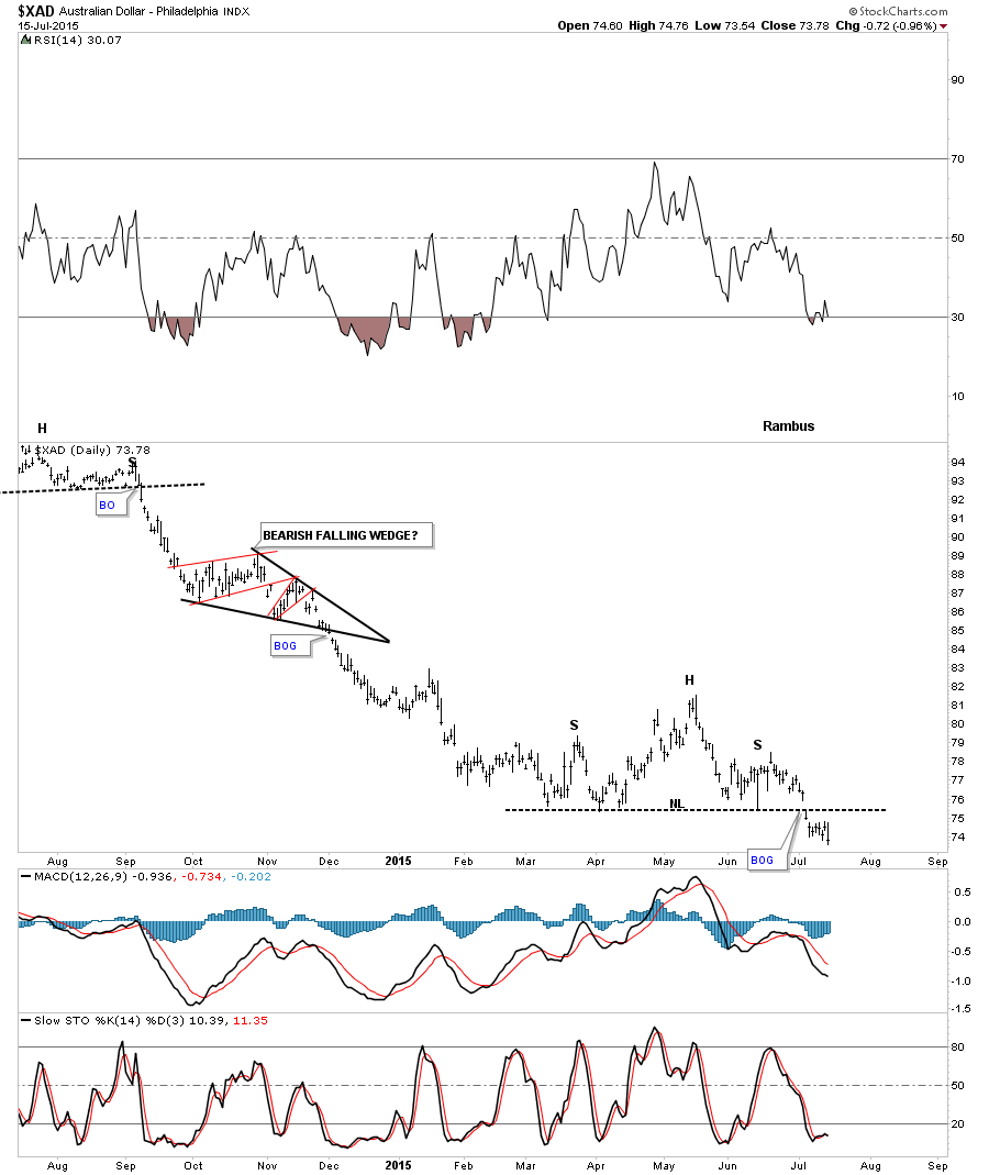
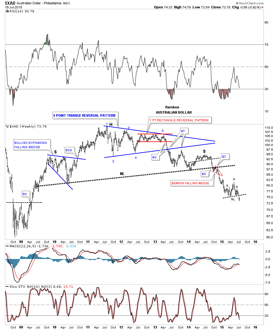
The weekly chart for the XAD shows the H&S as a consolidation pattern within the major impulse move down out of the massive H&S topping pattern. The H&S consolidation pattern has been just a pause to refresh before moving lower which it’s now doing.
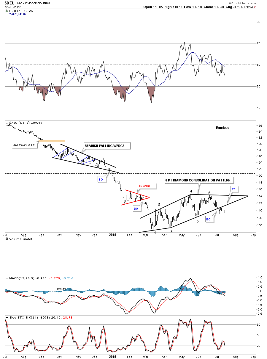
The XEU is the biggest component for the US dollar so it should give us some clues to help us understand what is going on with the US dollar. The daily chart below shows a six point Diamond consolidation pattern that has been forming since the low in March of this year. After a strong backtest that left behind an island reversal pattern it looks like the breakout is starting to gain some traction.
The XJY is another important currency which shows it broke down from a rectangle consolidation pattern several weeks ago with a strong backtest that also left behind an island reversal pattern.
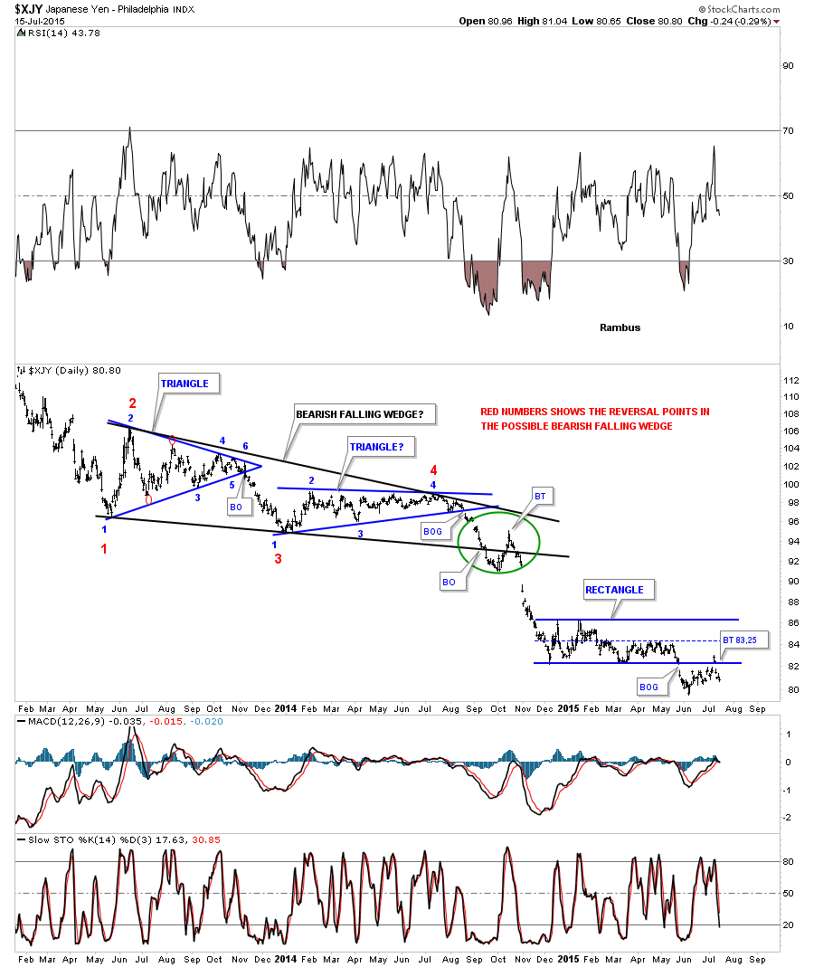
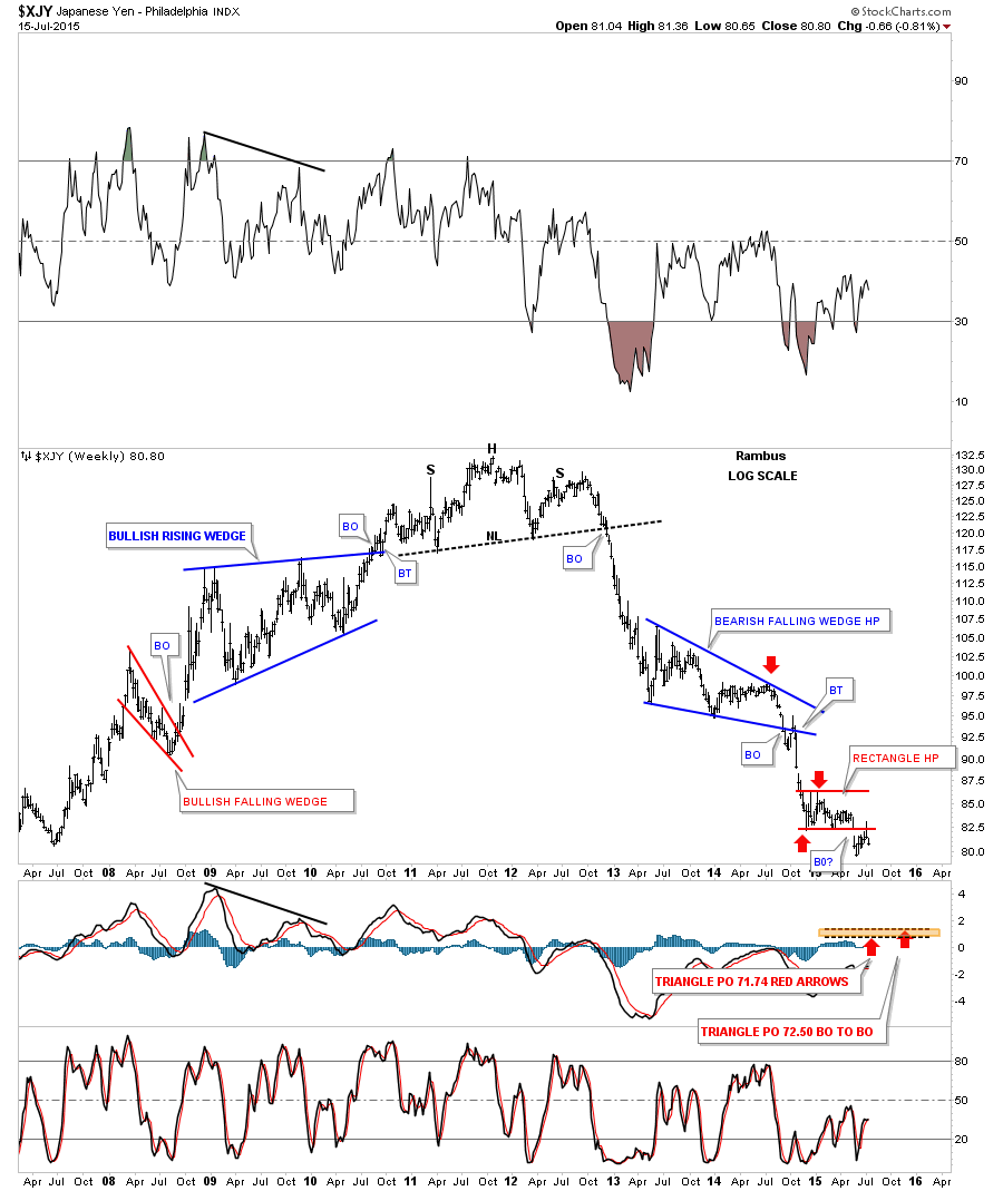
The long term weekly chart for the XJY shows its bear market decline and the little red rectangle consolidation pattern that has formed as just, Another Brick in the Wall.
Lets look at one last currency which will be the XSF. As you can see it has built out a strongly slanted H&S consolidation pattern which broke below the neckline with a breakout gap about two weeks ago. The backtest was completed last Friday with today’s move making a new low for this move down from the right shoulder high.
By looking at the different currencies we can see that they have been consolidating since the March low of this year and have broken out from those consolidation patterns within the last two weeks or so with a backtest in most cases. Keep in mind these consolidation patterns formed after a very strong decline which is what you want to see in a strong impulse moves down that can be made up of several small consolidation patterns. After you see the third small consolidation pattern form in an strong impulse move you know you’re getting close to the end.
During the last impulse move down the commodities also matched the currencies in weakness almost tic for tic. Lets look at a few different commodities and see if they’re showing a similar setup to some of the currencies we just looked at above.
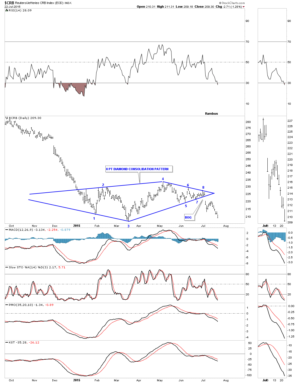
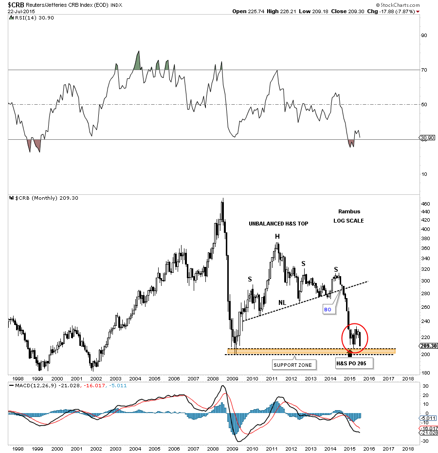
Below is a daily chart for the CRB index which is showing us a five point triangle reversal pattern after a very small rally off of the initial February low. The breakout was accompanied by a big breakout gap but the backtest failed to reach the bottom rail of the black triangle reversal pattern. It’s a reversal pattern pattern because it formed within the uptrend. Had the CRB broken out above the top black rail it would have been a four point consolidation pattern. Reversal patterns have an odd number of reversal point and consolidation patterns have an even number of reversal points.
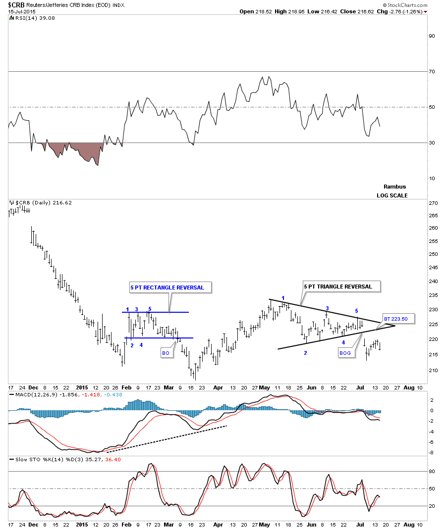
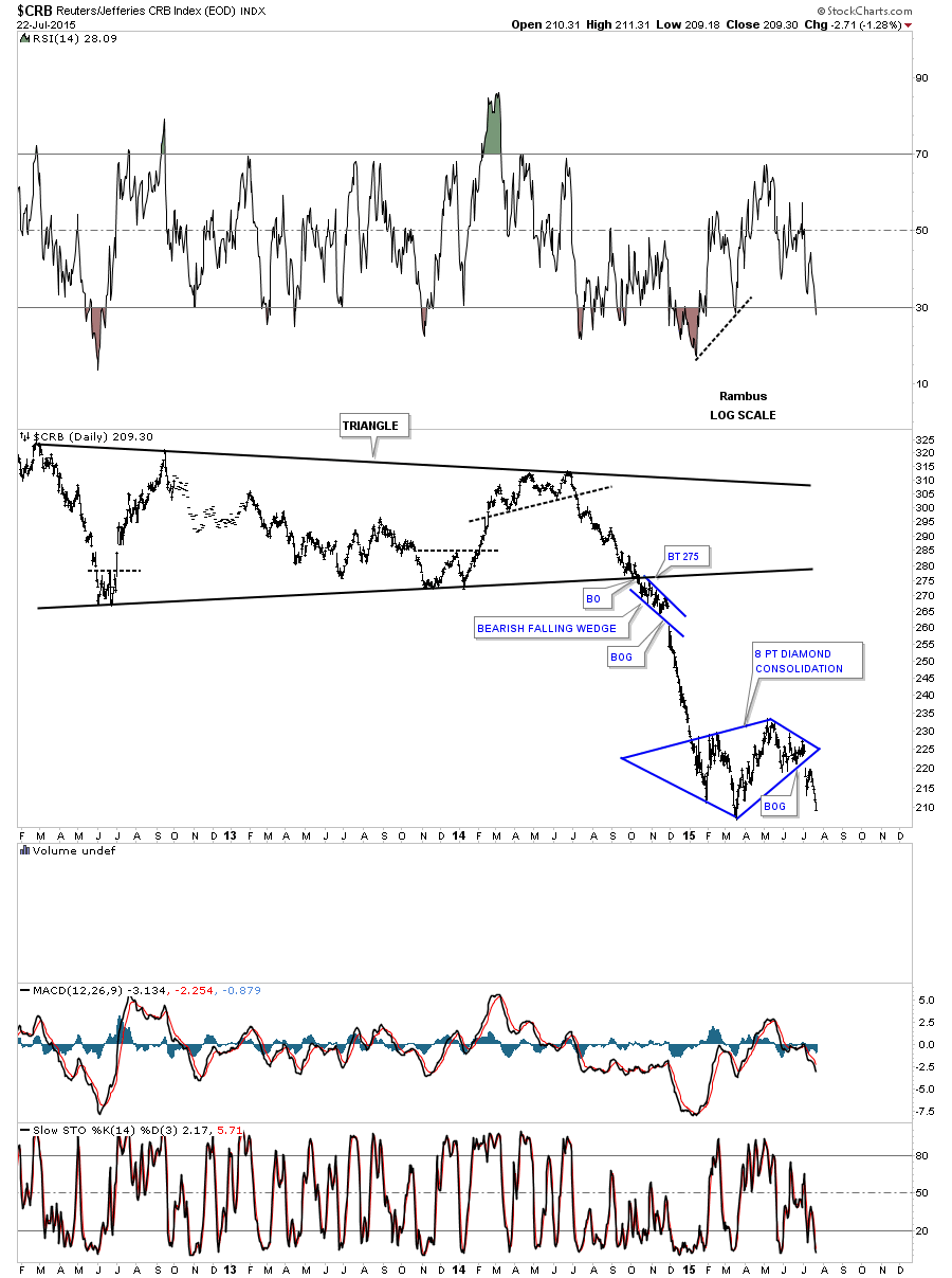
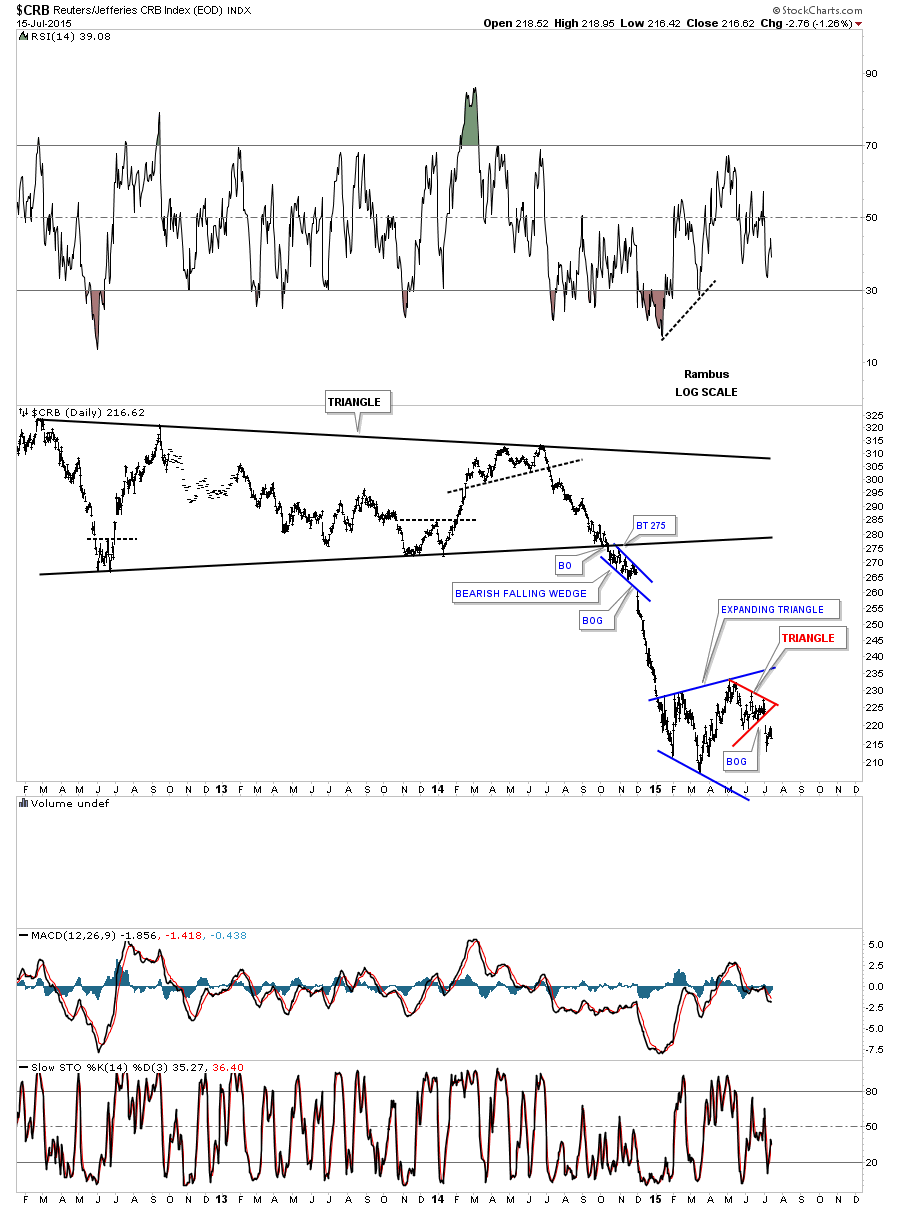
This long term daily chart for the CRB index shows its first impulse leg down when it broke out of the huge triangle reversal pattern. It has been consolidating in the blue expanding triangle which shows a lot of volatility.
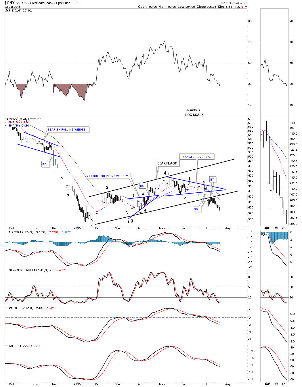
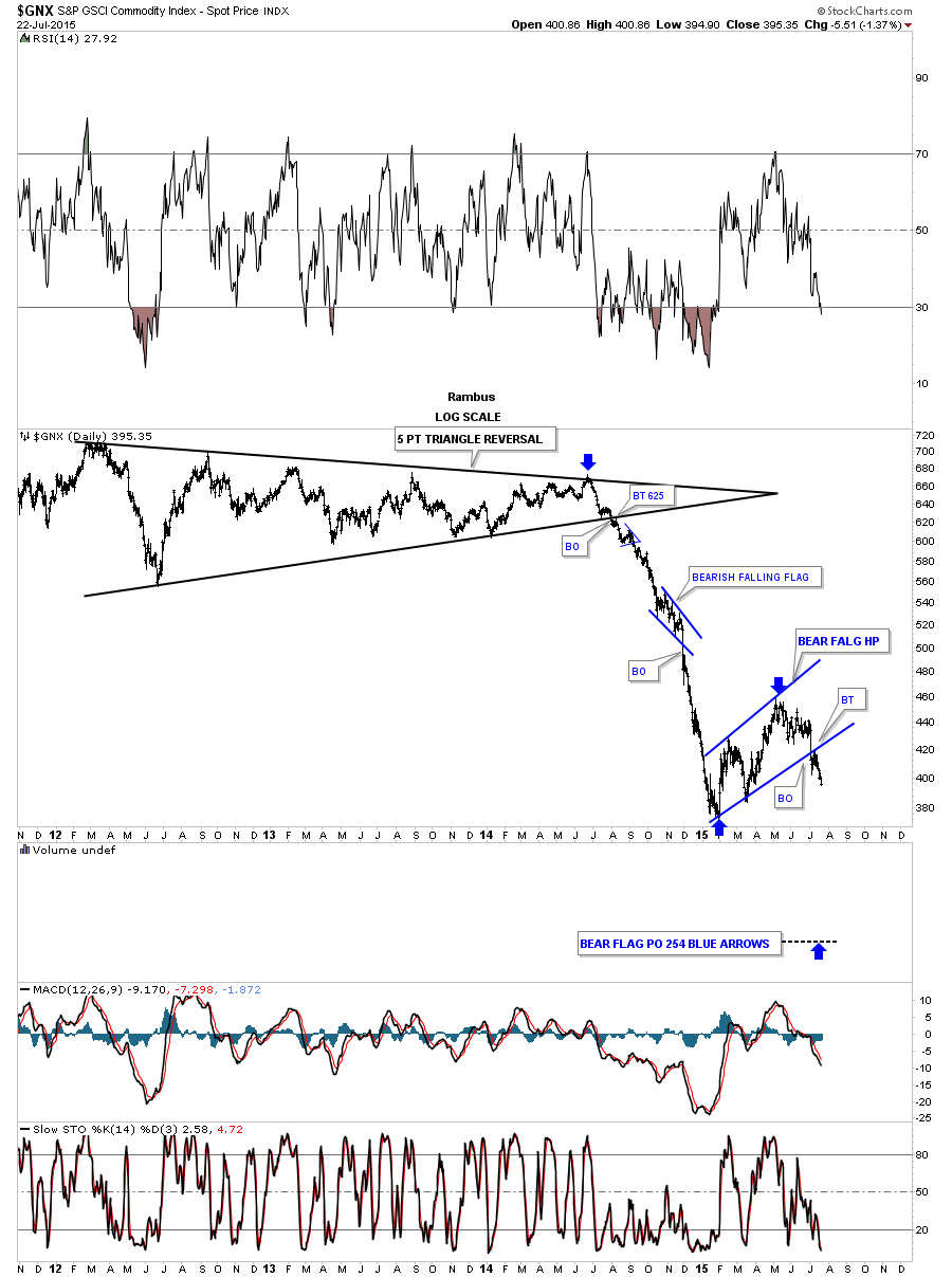
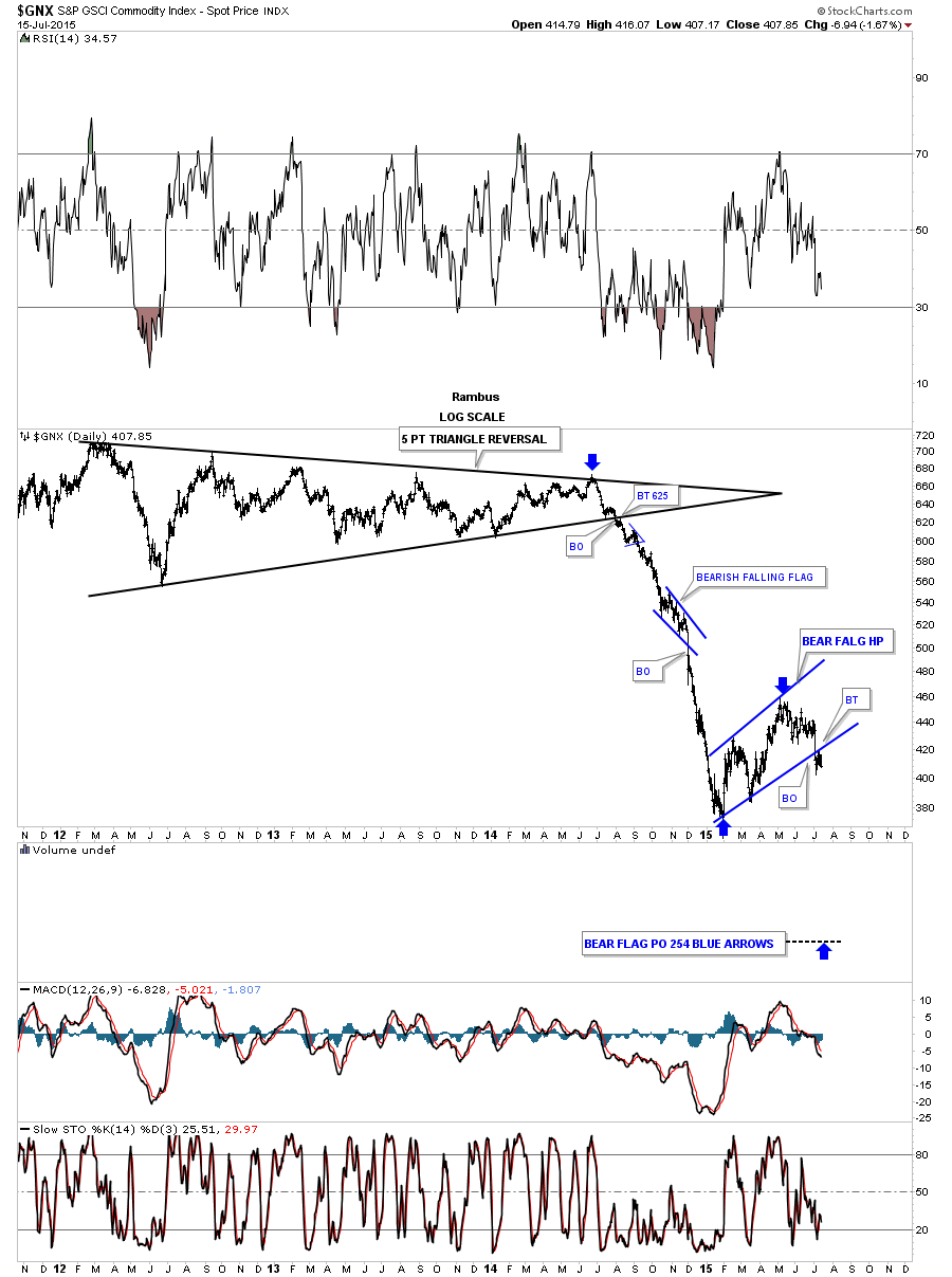
The GNX is another commodities index that is showing some very nice Chartology. The two blue patterns are making a much bigger black bear flag that had a nice clean breakout and backtest.
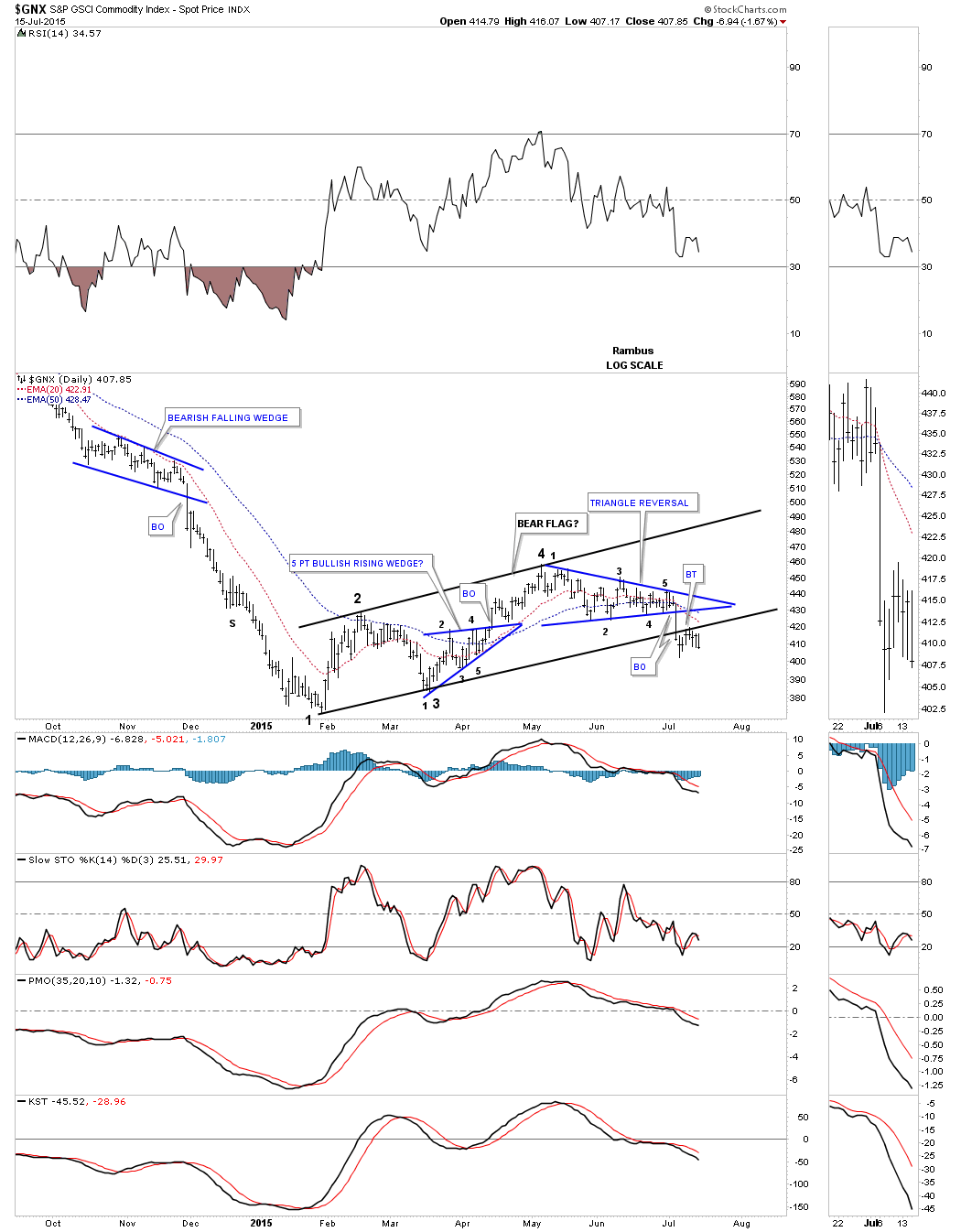
The very long term daily chart shows the first impulse leg down that had a blue bearish falling wedge that showed up about the halfway point. Now the GNX has been building out a much larger blue bear flag that is more normal looking to most chartists as it slopes up against the trend unlike the bearish falling wedge that slopes down in the same direction of the trend.
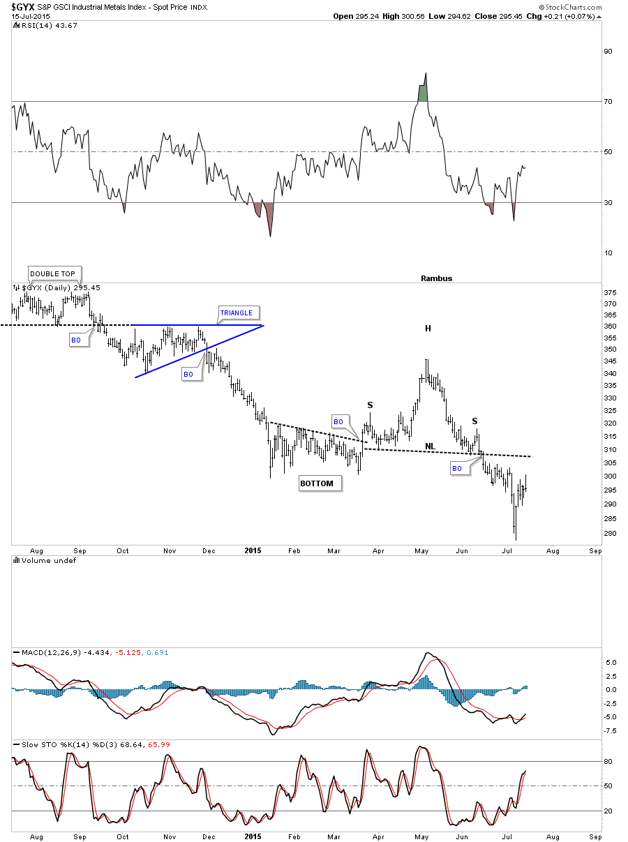
The GYX is an industrial metals index that broke down from a H&S consolidation pattern back in the middle of June.
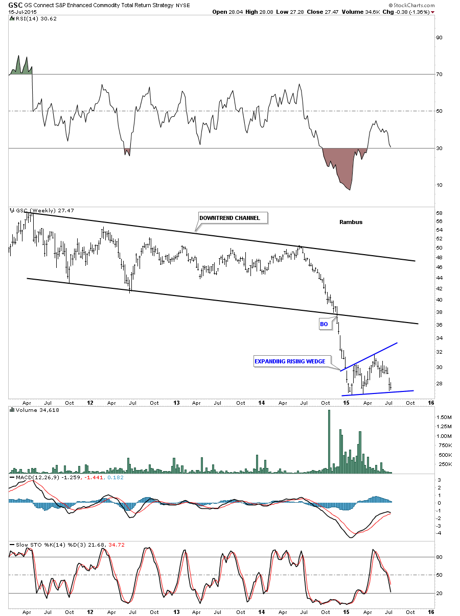
The GSC is another commodities index that has been building out an expanding rising wedge pattern since the first of the year.
Lets finish up by looking at the most important commodity on the planet, oil. When oil initial found support at the 42 area this past spring it looked like it was setting up for a very strong rebound. It formed a nice double bottom which then morphed into what looked line a very symmetrical H&S bottom as shown by the brown rectangles. The breakout failed to gain any momentum to the upside and began to trade sideways which still wasn’t the end of the world yet. The end of the world came when the sideways trading range turned out to be a five point rectangle reversal pattern which broke to the downside with a huge breakout gap. For the last two weeks or so it has been trading in a very tight trading range as shown by the red rectangle.
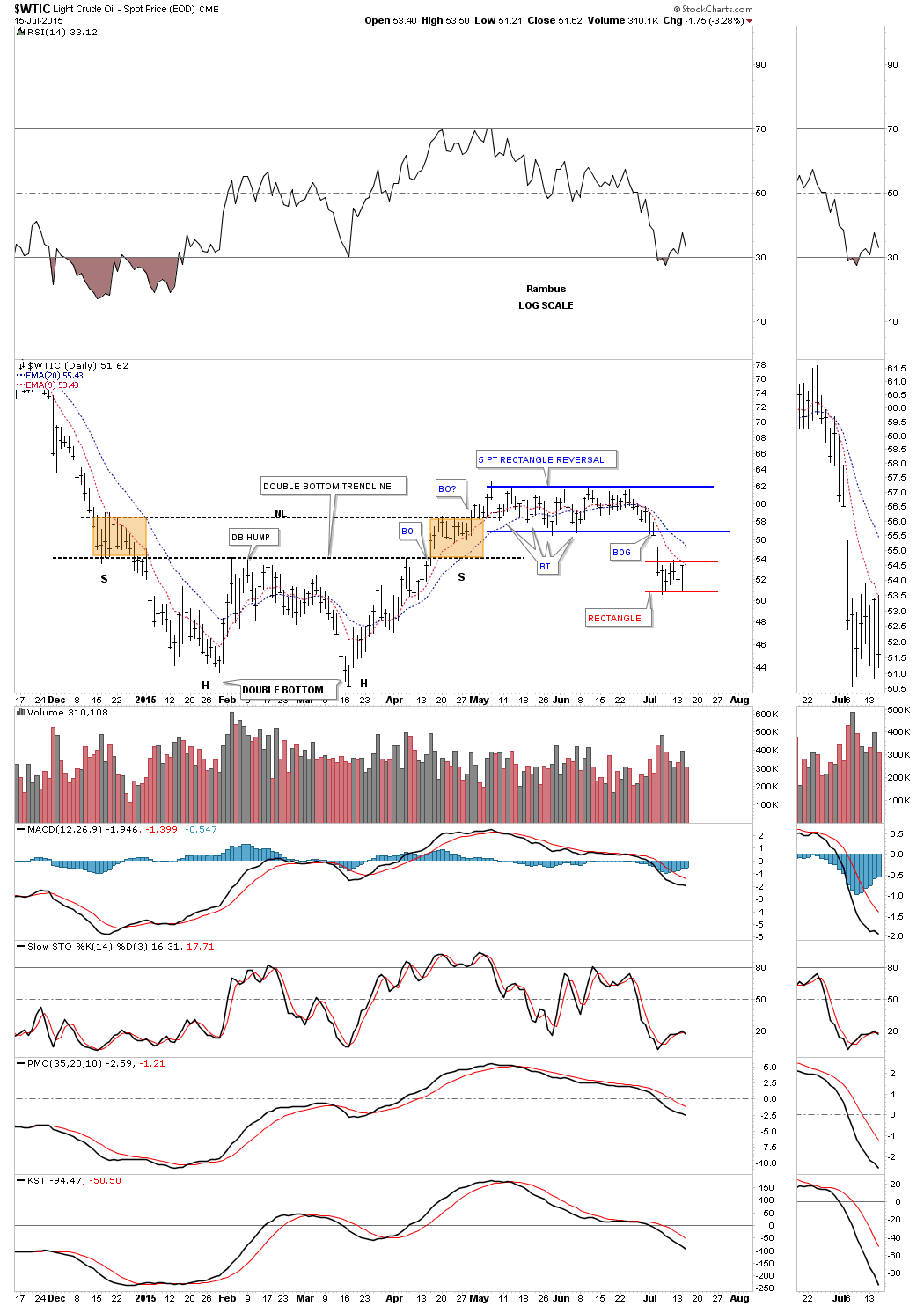
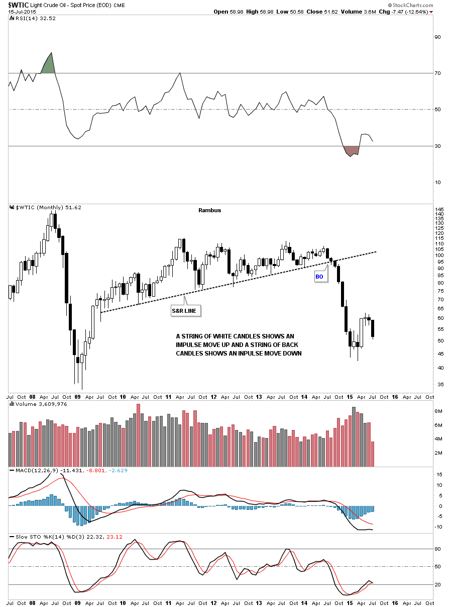
The monthly chart shows the string of black candlesticks that accompanied the first impulse leg down. If we can get a black candlestick for the month of July it will be the second one in a row which would mark a good start for the next possible impulse move down.
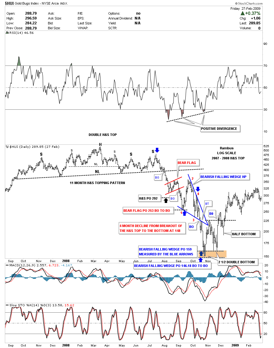
This last chart for tonight shows you the double bottom that formed back in 2008 – 2009 which led to a big rally. Note how the backtest held back then, red circle. If we compare our recent double bottom to the 2008 double bottom they look similar at first glance. There is a big difference tho and that is the current double bottom gapped back below the double bottom hump with a big gap. It still maybe a little early to say yet but our current double bottom looks more like a failed double bottom at this time.
The bottom line is that I’m seeing some of the same setups that marked the beginning of the last major impulse move down that started last year about this time. Most of all the currencies are breaking down from five month consolidation patterns while the commodities are breaking down from slightly bigger consolidation patterns along with the precious metals stocks. If this is true we’re on the cusp of an other deflationary move down of similar magnitude of the one from last year. Stay tuned as things are really starting to get interesting. All the best…Rambus
Weekend Report…Gold’s Peculiar 6 Month Cycles .
In this Weekend Report I’m going to show you some more of the same precious metals stocks we’ve been following as more are joining the impulse move to the downside adding confirmation. Unlike the US stocks markets that have been trading sideways since the December high of last year, the precious metals stocks are in a confirmed impulse move down and that’s where the real money is made.
Before we get into the individual precious metal stocks I know a lot of folks follow the six month time cycles for gold which has a good track record for finding a good low to buy. There is defiantly a six month cycle bottom but sometimes it inverts meaning it will be a top instead of a bottom. As it stands right now we are at the point where the six month time cycle is due. On the three year chart below is the six month time cycles that I have followed for many years which shows this time of the year is often a good place to take a position. Also on this six month time cycles chart you will see two inverted six month time cycles that show, instead of making a low, gold was making a high, red arrows. When that six month cycle bottom inverts gold generally will decline for close to six months, red circles. Our current situation is shown by the last red arrow on the right hand side of the chart with the question mark.
The next chart for gold shows the six month time cycles going back to the 2008 crash low. From the crash low in 2008 to the bull market top in 2011 you could bet the farm that the six month time cycle bottom was going to come into play. Along with the Chartology at the time, red consolidation pattern, that near parabolic rally was a whole lot easier to play than our four year bear market that is punctuated by just two consolidation patterns so far, the blue two year rectangle at the top of the chart and our current two year falling wedge pattern that still hasn’t broken down yet. This six month time cycle is slightly different than the one above by a few weeks or so.
Shortly after I became aware of the bull market in the precious metals stocks in the spring of 2002 everyone was taking about the six month time cycle for gold. As I was curious I built out my own chart for the HUI which also shows the six month time cycles. It quickly became apparent to me that there was something to the six month time cycles for the PM complex. When I began working on the six month cycle bottoms for the HUI I had an epiphany moment similar to the one I had on the US dollar when I first discovered the two huge fractal bottoms that long term members will remember. Keep in mind we are taking about the middle of 2003 when I discovered what I call, THE SEQUENTIAL 6 MONTH TIME CYCLES, for the lack of a better name.
When I looked at the bull market that begun in 2000 for the HUI the six month time cycle stuck out like a sore thumb. The chart below is a static chart that goes from 2000 to the 2008 H&S top. The thin black vertical lines are the six month time cycles and the heavy thick vertical lines are the sequential six month time cycles tops. What I discovered back then was each six month cycle top was growing further apart by six months. Note the first impulse move up in the HUI’s brand new bull market, marked with the red A. That rally lasted six months before the first consolidation pattern was built. Now notice there are two six month time cycles between the tops at A and B with one thin black vertical line showing a six month cycle low within the red triangle. Next you have the rally to the sequential six month cycle top at C which is made up of three six month time cycles before the next consolidation pattern started to build out.
Now we’re entering into the fourth sequential six month time cycle. Note the reversal points within the red triangle that shows each reversal point came during the smaller six month time cycle. This sequential six month time cycle was actually off by six months as shown by D? which should have been the next top. I clearly remember thinking at the time, what did this mean, as the HUI wasn’t following the script as it had before. I still knew the smaller six month time cycles were dominate and the Chartology suggested that the HUI was breaking out of a two year triangle consolidation pattern so I held on. The blue arrows shows that impulse move that lasted one year and ended at the first reversal point in the red triangle within the 5th sequential six month cycle.The fifth sequential six month top ended during the formation of the 2008 H&S top. It didn’t nail the top to a tee but again with Chartology on my side I could see the H&S top forming and mentioned it at a website I was posting on at the time. I’m not going to mention anyone’s name Sir Fullgoldcrown, but at that time nobody and I mean nobody was looking for a serious correction back then. I believe I took more flack for calling that H&S top than any other top I’ve ever called.
Editor’s Note:
One last note on the chart below. Notice where the 2008 crash low stopped, right on a six month time cycle that launched the sixth sequential cycle top which I will show you after this chart.
This next chart starts where the last chart above left off. The sixth sequential cycle top was now three years long with the sequential six month cycle top due in May of 2011 point F on the chart below. Again notice the smaller thin vertical lines which mark the smaller six month time cycles within the massive H&S top.
That brings us up to the seventh sequential six month time cycle top. This was the first major failure for the sequential cycle tops at G which also marks the smaller six month time cycle low that came last year in November. The smaller six month time cycle marked the beginning of our latest consolidation phase that I believed ended at the April high of this year. Earlier in the bull market the six month time cycles were usually in May and November but for the last several years October and April have marked the six month cycles.
One last very important note on the chart below. Notice where the next six month time cycle comes into play. Does October of 2015 ring a bell? If we see the HUI falling in to the October time frame I think there will be initially a strong bounce that may mark the end of the bear market and the beginning of a bottoming formation that will take some time to develop. How long is anyone’s guess but the initial bounce off a bottom is usually very strong. Think of a super ball. The first bounce will be the highest and strongest.
This last chart for the HUI shows the complete sequential six month time cycles going all the way back to the beginning of the bull market in 2000 to the present. I’ve always said the precious complex creates some of the best chart patterns and symmetry of all different descriptions that you just don’t find everywhere. That is one reason I’ve never believed in the manipulation theories. If the precious metals complex was being manipulated then I believe you would have very ugly Chartology along with cycles and symmetry. Nature strives for symmetry and we are just a part of nature creating these chart patterns.
Now I would like to update you on some of the PM stocks I’ve been showing you over the last month or so that are showing us what is actually happening under the surface. I have place some price objectives at the bottom of the charts so we can get a feel for when this next low, that I’m expecting in October, to occur.
Lets start with ABX which is now testing the bottom rail its blue rectangle consolidation pattern.
Anyone who has bought ABX over the last 20 years is underwater.
Is AEM building out a double top at reversal point #7?
AGQ is a silver etf that is in the process of backtesting its neckline.
ASA is following through to the downside after breaking out from its red triangle consolidation pattern just two weeks ago.
The monthly chart for ASA shows just how critical this area is right here. Note all the previous lows going all the way back to 2003.
ASM is still working its way lower after breaking out from a H&S top.
AU is moving lower after backtesting the bottom rail of its blue triangle consolidation pattern.
AUY is breaking below its 2008 crash low after breaking out from the red bearish falling wedge.
These are only the PM Stocks starting with and “A” But one can get the idea .The rest of the Multitude of PM Miner’s Charts that I follow will be posted in a separate post for Subscribers :
The reason I’m spending so much time and energy showing you all these precious metals stocks is to give you confidence that the impulse move is for real. It doesn’t take a rocket scientist to see all these consolidation patterns breaking down from the November low from last year. We are in an impulse move down in the precious metals stocks that has a very good chance to run until October / November of this year. That’s still another three to four months away and will be right at a year which is normal for the pm stocks. Go back and look at the HUI time cycles charts I posted earlier. You will see several of the big impulse moves up and out of the red consolidation patterns that took to close a year to complete. These types moves don’t come around everyday.
When you’re looking at your minute charts and start to get nervous on a small pattern that might be forming see how it relates to the big picture that I just showed you on all these stocks above. The big picture trumps the minute charts in the long run. This impulse move still has much further to run before it runs out of gas per all the consolidation patterns that are just now breaking out to the downside. October / November is a reasonable time for this impulse move to finish. I hope we all end up at the finish line together… All the best…Rambus
All the best
Rambus
Late Friday Night Charts…US Stock Markets and the AWCI
Tonight I would like to update you on some of the US stock markets we looked at this morning. For the most part the support and resistance lines held pretty well today considering all the volatility. Starting with the INDU the S&R line held resistance today but the 200 dma is still holding support so we have a standoff taking place. So far all the volatility has been held in check below the support and resistance line which is telling us it’s an important trendline. The best way to look at the S&R line is to think of it as support when the price action is trading above it and resistance when the price action is trading below it. It’s a well defined line in the sand.
The longer term daily chat for the INDU is showing the price action dropping below the S&R line which should now reverse its role from what had been support to now resistance. For the last three years or so the INDU has completed one consolidating pattern on top the the next , creating an uptrend , which is a bull market.
After breaking below the S&R line two weeks ago it is still holding resistance. It won’t take long before we know what next direction this index wants to go.
The ACWI is an all word stock market that broken down from a possible double H&S top and is now in the process of backtesting the upper H&S #1 neckline from below which could very well be the right shoulder of a double H&S top.
The compq has been trading in an 8 month rising channel formation touching the bottom rail this past week.
The long term daily chart for the NDX100 shows it breaking down from the blue 5 point triangle reversal pattern this week.
The NYA has broken down from a 5 month H&S top that has broken the neckline and is now it backtesting process.
The RUT has been building out a 7 month rising channel formation with a breakout and backtest taking place right now.
I am watching the ACWI For clues the Stock Markets are making an important top .
It seems like next week is going to be an important time to see how all these backtests that have going on now for several weeks play out. Have a great weekend…Rambus
Stock Market Updates…
This week has been very volatile in the US stock markets as you well know. The volatility started two weeks ago when the Dow dropped 350 points on a Monday I believe. That decline broke an important support and resistance line that had held support since March. This volatility has taken place just below that important support and resistance line which so far is holding as the backtest. The indicators are still bearish for the most part.
Below is another daily chart for the Dow which is showing the 200 dma. I also added a short term price objective if this important support and resistance line holds as the backtest. From top to bottom it would give the Dow about a 7% correction at a minimum. The December and February lows would actually be the next area of support around the 17,050 area.
The long term daily chart for the Dow shows how the breakout and backtest looks along with the 200 dma.
The daily chart for the SPX shows the big breakout day from two weeks ago and the backtest that has been taking place.
The daily chart for the COMPQ shows a similar setup to the Dow and SPX and is strongly backtesting its support and resistance line today as well.
Wednesday Report…Precious Metals : The Game Plan
Tonight I would like to update you on some precious metals charts we’ve been following very closely to shed some light on where we’re at and where we maybe heading. When investing in the markets we need to have a game plan to follow so that we know when the game changes we have to change. As long as the game plan is working you stick with it until you’ve reached your price objectives or the trend changes.
Believe me it’s not at all easy to follow a game plan. There are things that happen to a stock or market on a daily basis, that we have no control over, that can affect our thinking. Without a game plan to follow we are at the mercy of every little wiggle a stock makes. One has to have a certain amount of confidence in whatever trading system they use to be able to ride out the wiggles that can whipsaw you to death if you act on every move a stock makes.
Getting the initial position to stick is one of the hardest things to do because it’s impossible to buy the absolute bottom. A stock or market will move two steps forward and one step back in an uptrend. It’s that one step back that tends to get you if you didn’t buy the actual low. So usually, at the beginning of a trade, many times you’ll find yourself with a small loss to deal with. If you got the trend right it will generally fix itself and your small loss will finally turn into the gain you’re originally looking for.
Lets now look at some precious metals stocks to see if our original game plan is still working. Below is a chart for the $BPGDM that shows the GDX on top and the BPGDM on the bottom. The last time I showed you this combo chart the GDX still hadn’t broken the neckline yet and the BPGDM chart on the bottom was stuck at 23.33 I believe. As you can see the GDX has broken below its neckline and the BPGDM has moved lower and is now trading at 16.67 which means that only 16.67% of gold mining stocks, on a point and figure chart, are on a buy signal. Note the alinement that now shows the BPGDM is leading the way lower with the faster 5 dma next and the 8 dma last. This is the setup you want to see in a downtrend.
The next chart is a long term daily look at the CDNX index which was just starting to break below the bottom rail of the blue triangle consolidation pattern the last time we looked at it. As you can see it’s now starting to pick up some steam to the downside confirming the small caps are in trouble.
This next chart is a daily look at the GDM which shows the combo triangle / H&S consolidation pattern that started to form at the November low from last year. It’s easy to see in hindsight now how all the pieces of the puzzle fit together. Note the breakout from the triangle, black solid trendline, eight days ago was quickly followed by the breakout below the neckline three days later. This past Monday was the backtest day that tested the neckline. This chart shows you the game play we’ve been following since May which is still working according to the Chartology. If for some unexpected reason the price action starts trading above the neckline and the bottom rail of the black rectangle then the game plan will have changed and I will have to adapt to what the chart is saying at that time. So far so good.
The indicator chart shows all the inductors are bearish at this time.
Some of you may remember this daily chart for GDM which is showing the blue morphing rising wedge that caused a little trouble back when it was forming. The red marks shows how it morphed into a slightly larger bearish rising wedge with a false breakout of the top dashed trendline and then an equal false breakout of the bottom dashed trendline that represents the original bearish rising wedge. The solid blue trendlines ended being the pattern I was looking for. Note the breakout through the bottom rail of the blue bearish rising wedge and the backtest that lasted about a week before the price action began to decline in earnest. That little move helped confirm the game plan for me at the time. It looks just like another little wiggle to most folks but for me it was a serious piece of the puzzle.
Below is a long term daily line chart that shows gold on top and silver on the bottom. The black dashed trendline down at the bottom right hand side of the chart finally shows silver cracking that important trendline / NL while gold is still testing its own black dashed trendline. It has taken awhile but this chart is still confirming the game plan. There is still a lot of room for the RSI indicator at the top of the chart to move lower.
Below is a daily chart for gold that shows its most important moving averages which are all above the most recent price action confirming the game plan. If we were to see gold start trading above some of these important moving averages then I would have to start to reconsider the game plan but for now there is nothing broken.
This next chart for gold shows the downtrend channel I’ve been trying to show you once a week so that you can follow the Chartology as it’s developing in real time. The black and red rectangles measures time and price for each impulse move. I’ve been saying that I would like to see the price action testing the bottom rail of the blue bearish falling wedge by the middle of July. The reason for that is because that is when gold broke below the bottom rail of it big six point blue rectangle back in 2013 and the red rectangle measured that impulse move down. The red rectangle at the bottom right hand side of the chart is the exact same size that shows where we may look for a low in time and price. It’s not mandatory that gold hits the bottom rail of the blue falling wedge in the middle of July but time wise it would be some nice symmetry if it did.
I’ve been showing you this long term monthly chart for gold shortly after it broke down from the bearish expanding rising wedge almost two years ago. Longer term members may remember when I added the neckline extension rail that is taken from the 2008 H&S consolidation pattern and extended it out in time to the right hand side of the chart. The symmetry was just too pretty to ignore as shown by the neckline symmetry rails. They’re all the exact same angle which shows the bottoms of the left and right shoulders of the 2008 H&S consolidation pattern, which is also the same angle for the neckline, which also shows the highs for the left and right shoulders of the massive H&S top and its neckline. The breaking and backtesting process has been going on for close to a year now but this is a massive H&S top that is in play as big patterns take a lot time to develop. Now it’s getting time for gold to break to new lows since its bear market began in September of 2011. That will confirm the game plan.
I don’t show Platinum very often but it’s part of the game plan. Below is a long term monthly chart that shows its multi year blue rectangle. It then formed the smaller red rectangle and is now making new yearly lows.
Platinum weekly chart.
This next chart is a daily line chart for silver that shows it breaking below its neckline. If you look really close you can see a tiny little backtest to the neckline. It’s possible we see another backtest to the neckline but the fact that it has broken below the neckline tells us we’re on the right track.
As with gold silver to has a massive H&S top in place. It too has some very nice symmetry as show by the neckline symmetry rail which shows the height for the left and right shoulders. My game plan is to shoot for the brown shaded support and resistance zone. If silver makes it that low I’ll be satisfied.
I have many more charts I could show you but I would like to end this Wednesday report by looking at the GDXJ. Below is the two hour chart we’ve been following that shows the blue bearish rising wedge with a H&S top.
Below is a long term daily chart which shows the previous consolidation pattern, the bearish rising wedge at the top of the chart. The H&S top I showed you on the two hour chart above is the fourth reversal point in the new bearish falling wedge at reversal point #4. Note the impulse move down from the blue bearish rising wedge at the top of the chart that also had a H&S top at its fourth reversal point. Our current blue bearish falling wedge would give us a price objective down toward the 12 area as shown by the blue arrows.
This long term monthly chart shows how our current blue bearish falling wedge fits into the bigger picture.
When you look at all the individual precious metals stocks I’ve been posting that are breaking out from their seven month consolidation patterns along with these charts above the game plan is still clearly in affect. It’s possible it could change at anytime but until that time comes I have to go with the game plan that has been working. All the best…Rambus
DBC Update…A CLASSIC Head and Shoulders Breakout
INDU Update…
Aside
We are getting a test of the low from the big decline last Monday which is to be expected as many times it takes multiple tests before support really sticks. This is now the moment of truth as this low needs to hold support or a bigger decline can be expected. There is the 200 dma, the time cycle low and the very high volume spike from last Monday, in the down to up volume chart, that are showing this could be an important low.
The down to up volume chart shows the low from last Monday had a very large capitulation spike that was the highest since 2012 or so.
The GDXJ : Impulse Move Pending
The GDXJ is at an important inflection point right here and now. As you can see it’s sitting right on the neckline of a small H&S top that has formed at the fourth reversal point on the potential bearish falling wedge. A break of the neckline will almost assure a move down to the bottom blue rail of the falling wedge at a minimum.
The long term weekly chart shows the two blue consolidation patterns with the lower one being the possible bearish falling wedge we looked at on the chart above. Note the 4th reversal point in the top pattern, the bearish rising wedge, and the decline that followed. The fourth reversal point in the lower bearish falling wedge may very well be the beginning of the next impulse move down similar to the fourth reversal point in the bearish rising wedge. If that is true this move down is just getting started. The blue arrows measures the price objective down to the 12.69 area which would cut the GDXJ in half from the current level.
The daily chart for the GDX shows it has now broken below the bottom rail of the black triangle using the bar chart. Notice it formed a small H&S top at its fourth reversal point similar to what the GDXJ is doing right now. When you compare this daily chart for the GDX to the GDXJ chart above the GDX big caps are leading the way lower. Maybe the small caps will play catch up as they are lower on a percentage basis today.