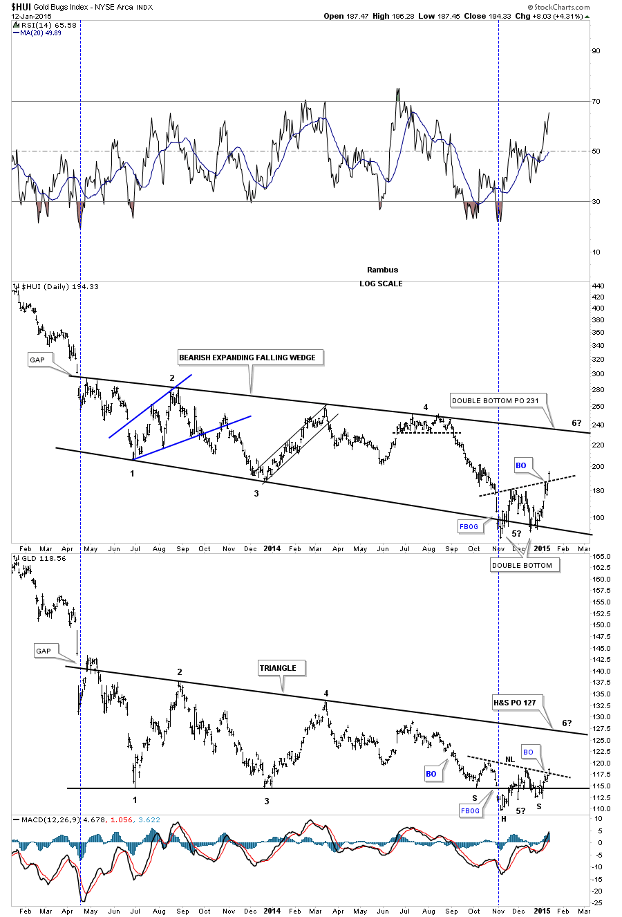
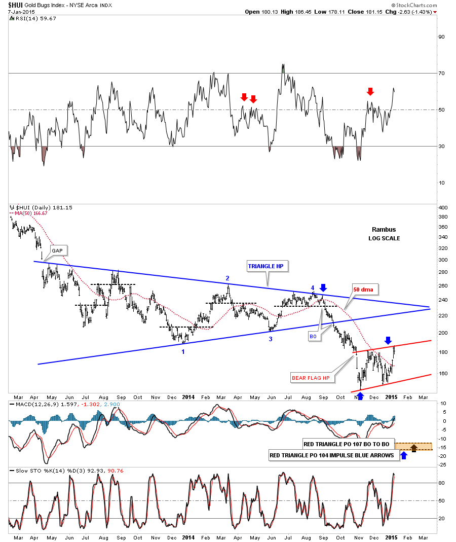
Tonight I would like to look at the precious metals complex and see how things are moving along. Consolidating would be an understatement. The PM complex has been in a very large consolidation pattern going all the way back to the June 2012 low where the HUI, GLD and SLV all bottomed together. From that low all three have been chopping in a falling type pattern making lower lows and lower highs. The combo chart below shows the three distinct but slightly different 18 month consolidation patterns starting at the June of 2013 low. The top chart shows the HUI that has yet to put in a 6th reversal point in it’s big consolidation pattern. It doesn’t have to have a 6th reversal point as it already has enough but if it does the top rail would come in around the 240 area. If you look at the last four weekly bars you can see the closing price for each week are very close to each other meaning there has been very little headway being made either up or down aggravating the bulls and bears alike. Also the 18 month consolidation pattern is expanding unlike GLD which is falling and contracting and SLV which has a triangle. The GLD chart in the middle shows the price action touching the top rail completing the last reversal point number six and falling away. SLV on the bottom chart has been clearly the weakest of the three as it broke out of its triangle in September of last year. Three weeks ago SLV paid a visit to the bottom rail of its triangle as a backtest and is falling away. So we have the HUI in no mans land right now with GLD finding resistance at the top rail of its falling wedge and SLV finding resistance at the bottom rail of its triangle consolidation pattern during the backtest three weeks ago. This combo chart gives you a good overview of where we’re at and where we’ve been. 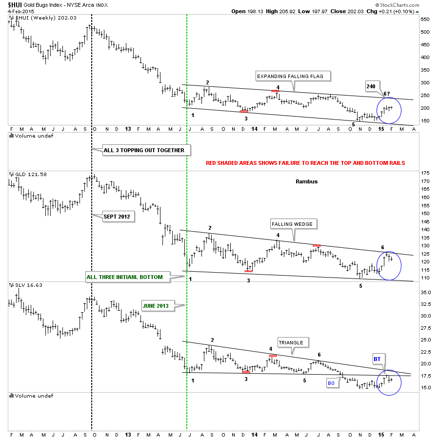 Now I would like to do an in depth report on the HUI starting with the 2 hour chart, in linear scale, and focus on what we have in place at the moment. The first chart pattern is the double bottom that started to form in November of last year with the second bottom coming in late December. I’ve measured the double bottom price objective using the black arrows. Just measure the distance of the first two black arrows and add that distance to the breakout point on the double bottom which gives us a price target to 212 which the HUI has achieved. Since the first reversal point the HUI has been chopping out the blue triangle. At this point we still don’t know if it’s going to be a consolidation pattern to the upside or a 5 point reversal triangle to the downside. If the HUI breaks out to the upside then I would have to view the blue triangle as a consolidation pattern which would be a halfway pattern. To get the price objective we would measure the distance from the breakout from the double bottom trendline to the first reversal point in the blue triangle. We then take that distance and add it to the breakout of the blue triangle which would give us a price objective up to the 238 area or the top of the falling expanding wedge I showed you on the combo chart above. If that is what the markets want to give us then we’ll take it but first we have to see the breakout of the blue triangle.
 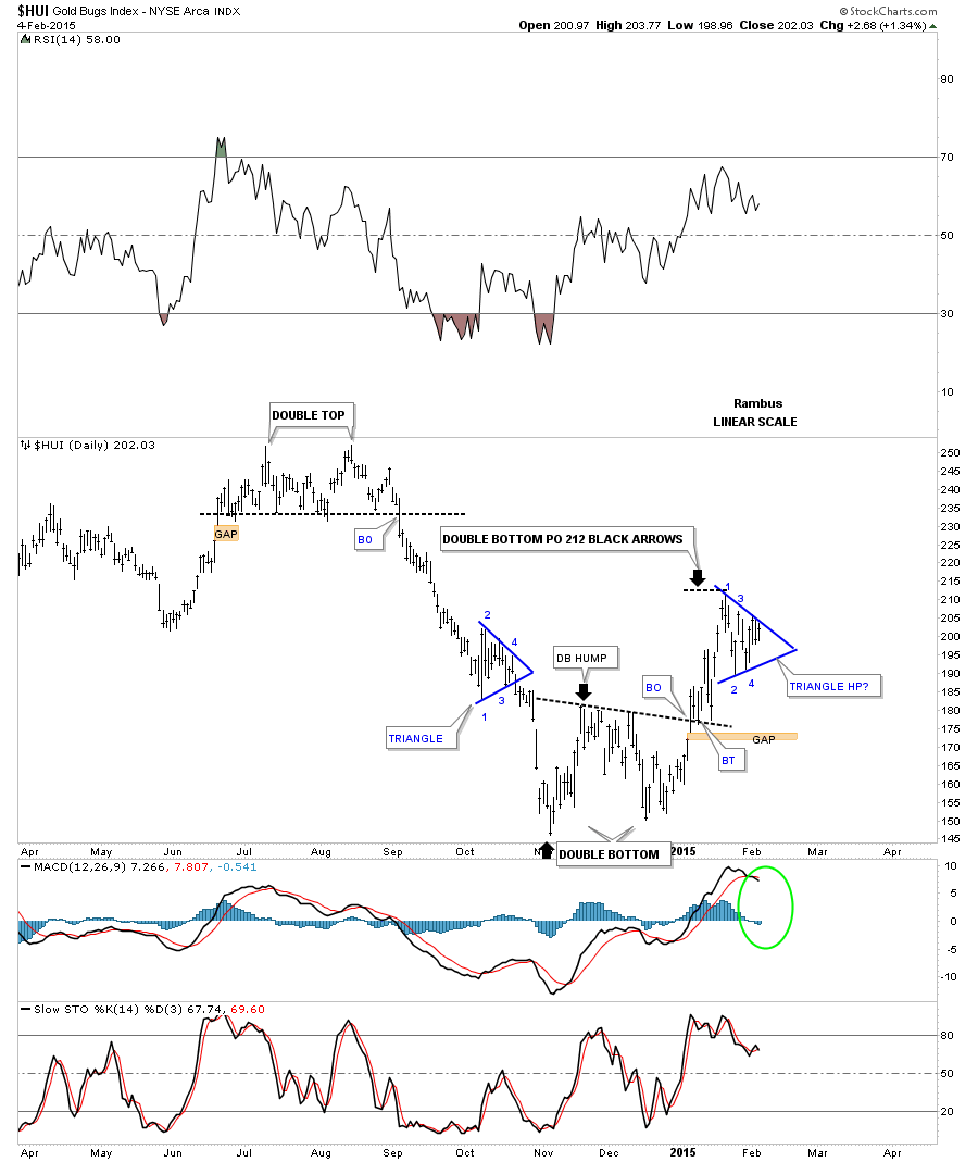 The four horsemen are still all crossed to the downside.
 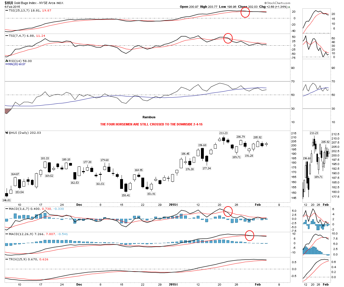 If the HUI is going to get to the 240 area then it has some overhead resistance it’s going to have to deal with first. Below is a weekly chart for the HUI that shows some fanlines made off the 2008 crash low. The HUI is currently testing fanline #4 with the bottom rail of the blue triangle just overhead at 220. The red circles shows where the backtests took place in the past which is common with fanlines.
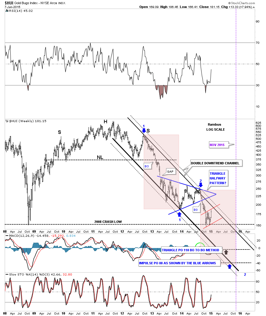
 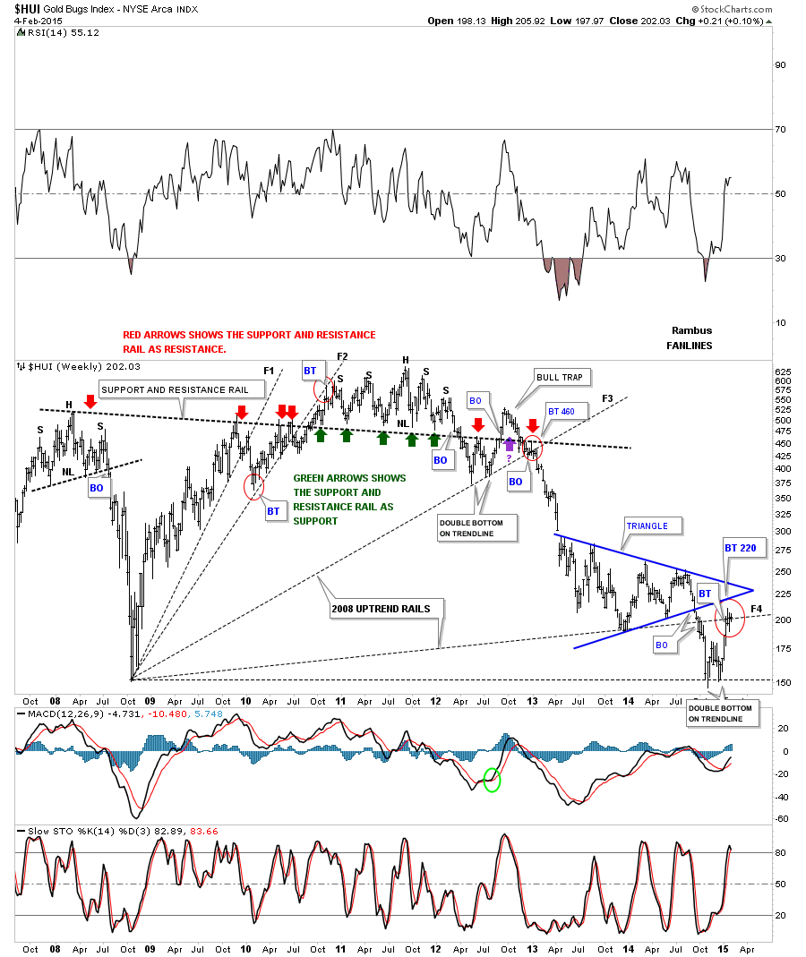 Now I would like to show you some fanlines that began at the 2000 bear market low. Fanline #1 showed up when the 2008 H&S top broke down. Fanline #2 came into play when the massive H&S top gave way in 2011. Fanline #3 gave way last September when the blue triangle broke down. A backtest to the underside of fanline #3 would come in around the 220 area, green circles.
 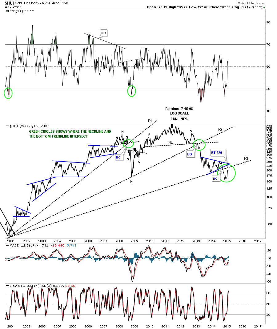 Below is another weekly chart for the HUI that shows a downtrend channel that the HUI is currently testing from below.
 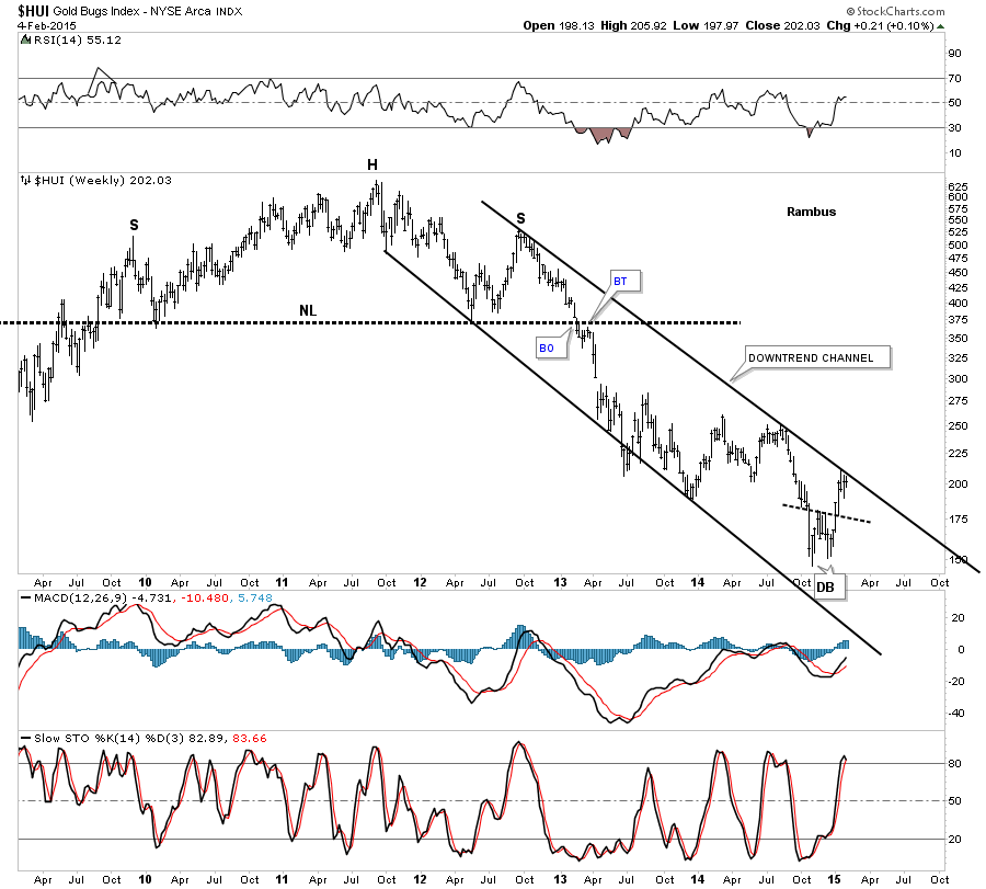 Below is a slightly different look at the downtrend channel that I originally showed you about 4 or 5 months or so ago. It’s what they call a double downtrend channel where you have an outside trendline, dashed, on both sides of the main downtrend channel. As you can see the HUI is now in its third week of testing the outer black dashed trendline from below. The higher pink shaded area shows the first impulse move down in time and price. I’ve added the lower pink shaded area, which is exactly the same size as the higher one, that may show us where to look for the ultimate low in November of this year.
 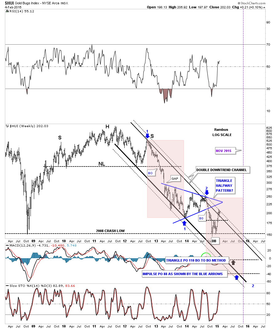 Now I would like to show you some long term charts so you can see where the HUI has been and where it may go in the future. This next chart for the HUI shows its entire history going all the way back to 1995. Note the huge bottom that formed in the late 1990’s that gave the HUI the energy to have a 10 year bull market. You can see the smaller blue triangle consolidation patterns that formed during the bull market years. Next you can see the beautiful and symmetrical H&S top that reversed the 10 year bull market that has led to our most recent low. Note how much different the chart looks when you compare the left side bull market years to the right side bear market years.
 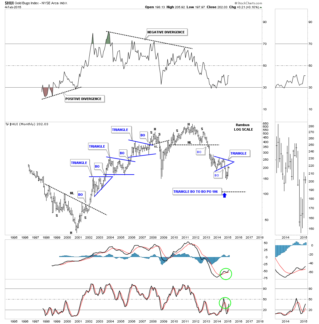 Below is a monthly candlestick chart that shows you when you’re in an impulse move either up or down. When you see a string of white candle, all in a row, you know your in an impulse move up and when you see a string of black candle you know your in an impulse move down. When you see a mixture of black and white candle you know your probably in a consolidation zone as the present picture shows.
  Lets look at one last long term monthly chart for the HUI that shows the bull market took on the shape of a rising wedge. Note the breakout in April of 2013 that took out the neckline of the massive H&S top and also took out the bottom rail of the rising wedge in one big long bar. That’s been almost two years ago already. There is little doubt that we’re in a bear market it’s just that these consolidation and backtesting phases can be long drawn out affairs. As you can see during the bull market years the same thing happened going up. A bull market is much easier to trade because one can hold on to your stocks if you didn’t catch the exact low, which nobody does, and wait for the next leg up to get you back in the game. So we wait for further clues to help guide us in this never ending quest to slay the PM Dragon . All the best…Rambus
Category Archives: public
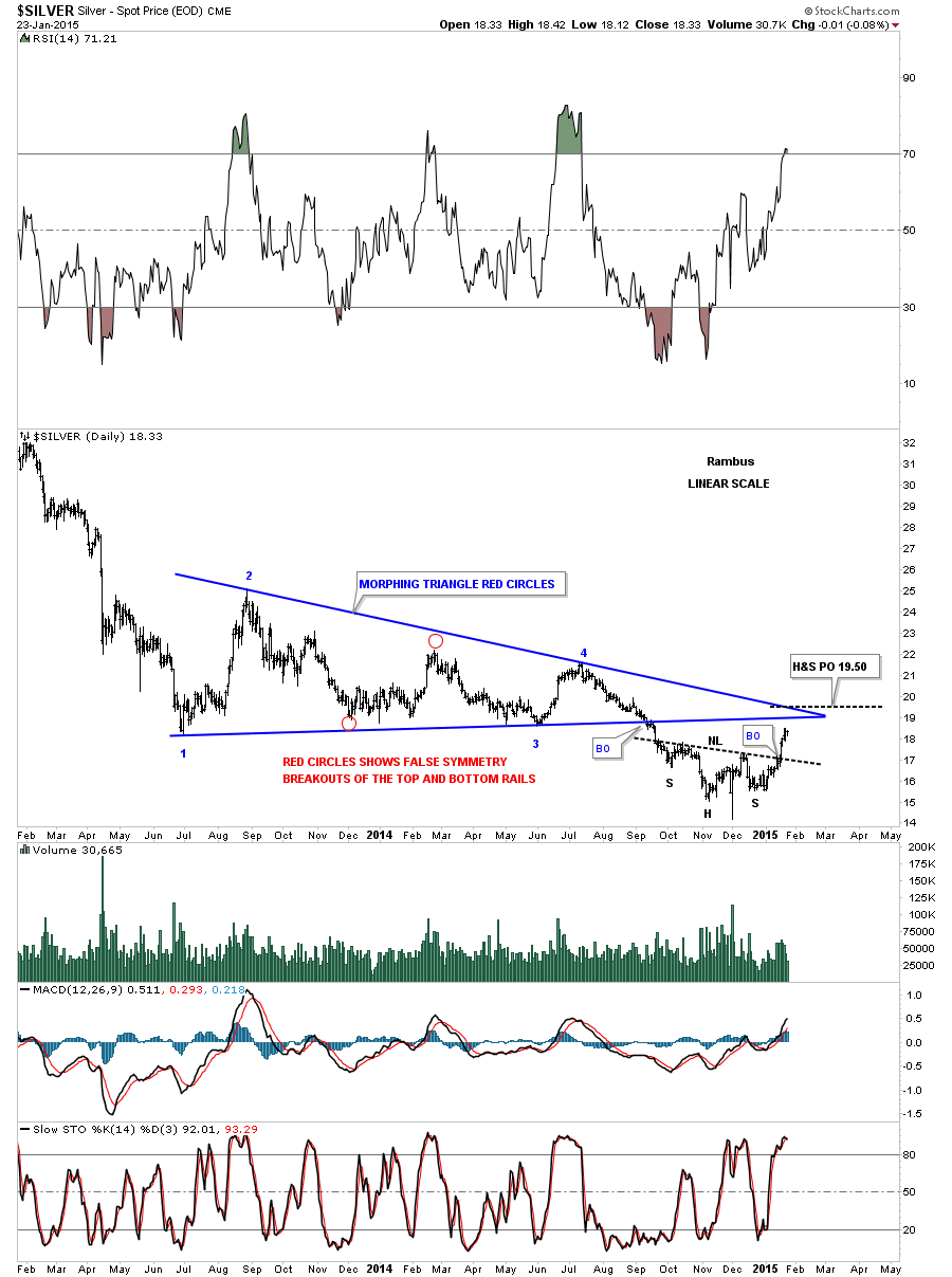
…The Comprehensive Chartology of Silver….
Five days ago silver broke out of an inverse H&S bottom that has temporarily reversed the downtrend. I measured the more conservative price objective using the higher low instead of the Swiss spike low which comes in around the 19.80 area on the log chart. It will be interesting to see if the Swiss spike low will be the ultimate low for the bear market or just a short to intermediate low. Sometimes big trends can end with one last shake out of the weak hands similar to the Swiss spike low.
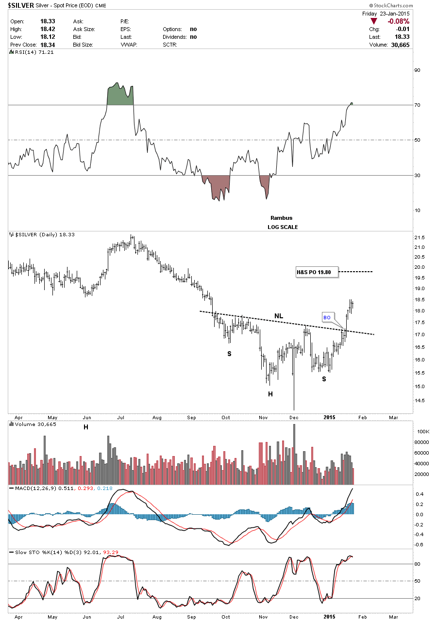
Below is a two year chart for silver that shows its big triangle consolidation pattern that did a little morphing before it finally broke down in September of last year as shown by the red circles. Since the breakout silver has built out an inverse H&S bottom and is now in rally mode. As you can see on the chart below silver is approaching two very important trendlines from the big blue triangle consolidation pattern. The price objective of that inverse H&S bottom comes in around the 19.50 area which is slightly above the apex. One thing we need to keep in mind is that the inverse H&S bottom is a reversal pattern that can reverse a downtrend. It’s way too early yet to think about a reversal of the bear market but if silver can ever trade above the apex of the blue triangle that would be the first step in the right direction.
This long term weekly chart for silver shows it bouncing off of the next lower support line at 14.65 with the Swiss spike low. Now it’s entering into the brown shaded support and resistance zone which is just over head. Bottom line is silver has to have more buyers than sellers to overcome which looks like strong resistance overhead.
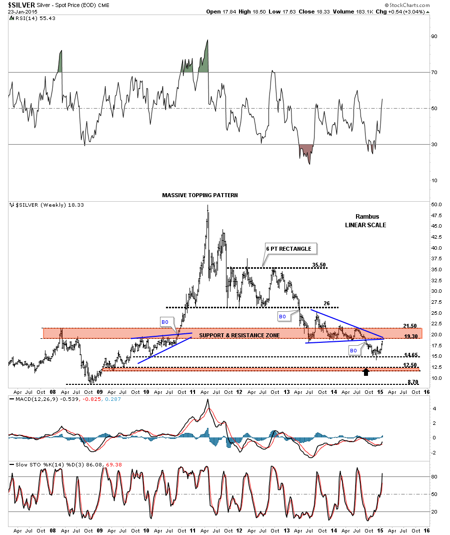
This next long term weekly chart for silver shows the parabolic rally phase into the April 2011 top which ended the bull market. From the bull market top silver has been trading in a parallel down trend channel for almost four years now which is a pretty lengthy move in one direction. Again it’s up to the bulls to reverse this downtrend channel in a similar fashion to the way they did back in 2008 crash low. You can see the price objective to the 50 area in 2011 using two different patterns. The inverse H&S bottom had a price target up to 45.75 and the red expanding triangle halfway pattern had a price objective up to 50. Impulse moves like that are mush easier to trade than these big 18 month consolidation patterns.
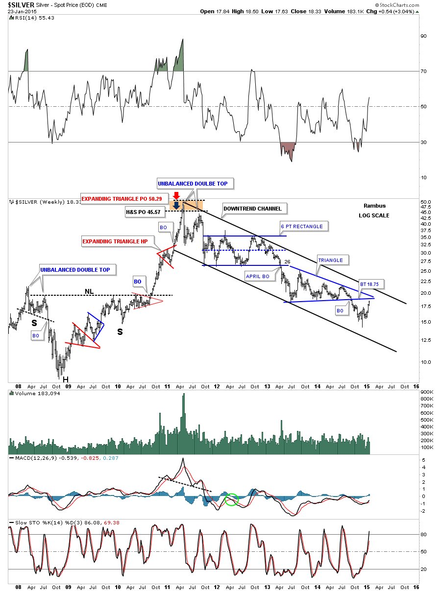
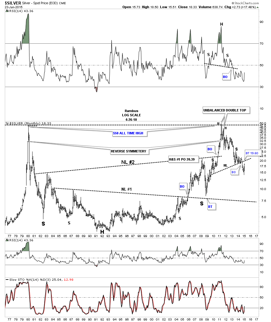
This last chart for silver is a 40 year look that shows its bull market top in 1980 and the decline that followed and the long drawn out sideways trading range that went on for many years. There is actually some very nice symmetry on the left and right side of the chart as shown by the big necklines. We’ve been following a potential very large H&S top where the price action broke below the neckline about six months ago. It’s now attempting to backtest the neckline to the 19.60 area which will be critical resistance. At least you have some perspective of where silver was in the past and how it relates to the present which is important to know.
In the Weekend Report we’ll take a good hard look at some of the Kamikaze stocks to try and gain some insight on what is taking place right now with these volatile stocks. All the best…Rambus
Weekend Report Part 2…Under the Hood in the PM Indexes
I believe today marked a breakout on the PM stock indexes and Gold which have different reversal patterns. Below is the combo chart we’ve been following that has the HUI on top and GLD on the bottom. As you can see the HUI broke above its double bottom trendline today while GLD broke above its neckline. Both reversal patterns have a price objective back up to the top rails of their 18 month consolidation patterns. I’m still viewing this rally off of the November low as a counter trend rally within the bear market. Instead of having just four reversal points it looks like we’ll see at least six to complete their respective consolidation patterns. A serious break above the top rail of the 18 month consolidation would then call into question the validity of the bear market.
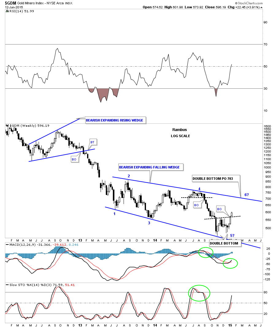
Below is a weekly chart for GDM that shows its 18 month blue bearish expanding falling wedge. The double bottom has a price objective up to the 700 area which coincides with the top rail. Our line in the sand is now the double bottom trendline. Above is bullish and below is bearish. Note the price action at reversal point #4. If you recall we went short on the breakout of that black dashed horizontal trendline using JDST and DUST. You can see the string of black candles that accompanied that decline. This week is just getting started but we have two white candles in place so far.
Lets now look under the Hood to see what is running these indexes starting with one of the big ones ABX. The monthly chart shows where the neckline extension rail may come into play if we get this counter trend rally to the upside.
The weekly chart for GG shows it trying to breakout from a small double bottom. It could backtest the bottom rail of the blue bearish rising wedge again.
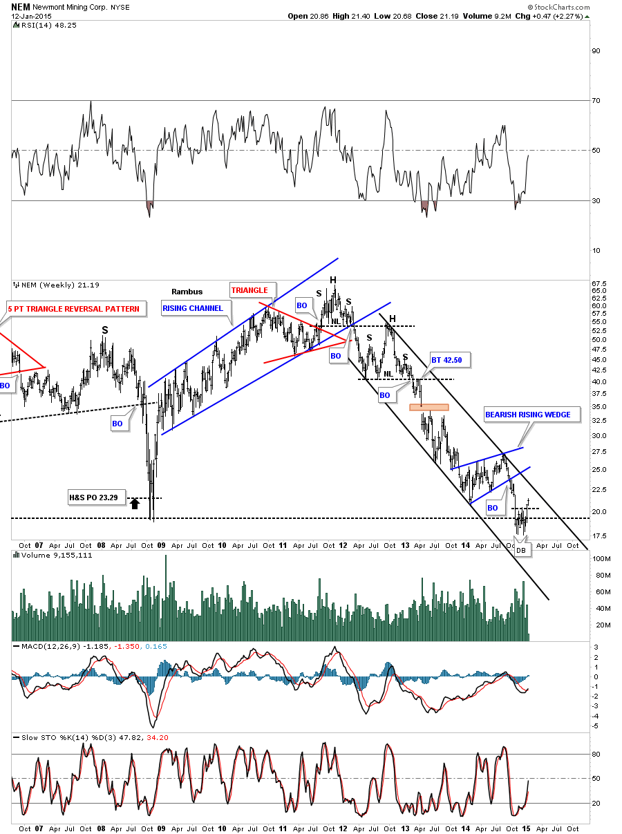
NEM is another big cap PM stocks that is breaking out above a small double bottom.
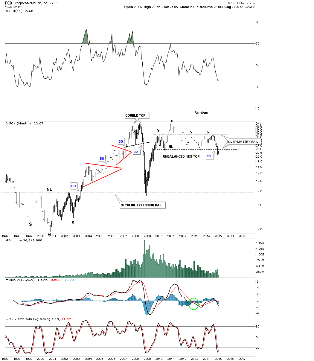
It looks like FCX is in the process of backtesting the neckline from an unbalanced H&S top.
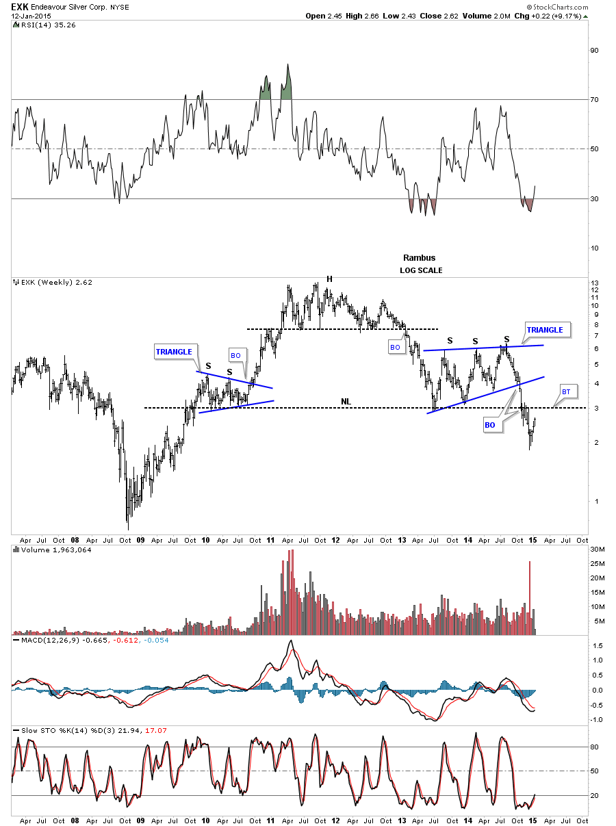
EXK looks like it to is in the process of backtesting its potential multi year neckline.
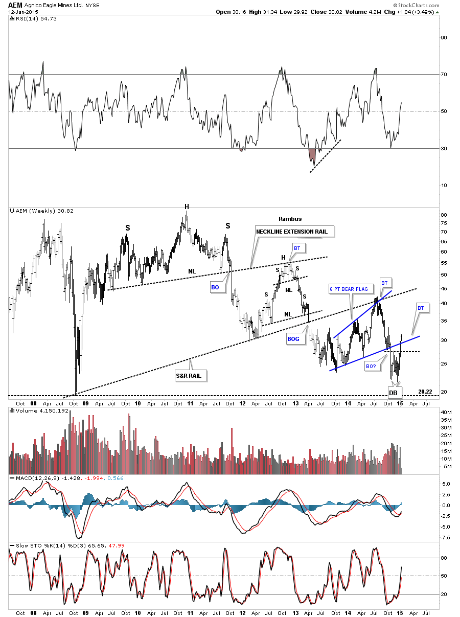
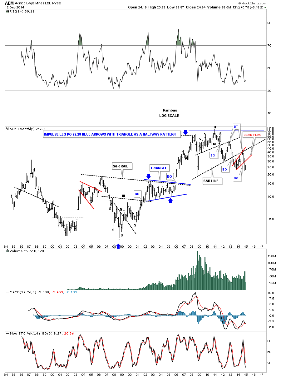
AEM is showing some strength after breaking out from its double bottom and is now breaking above the bottom blue rail of a 6 point expanding bear flag.
ASA is showing some strength by closing back above the bottom rail of a well defined rectangle.
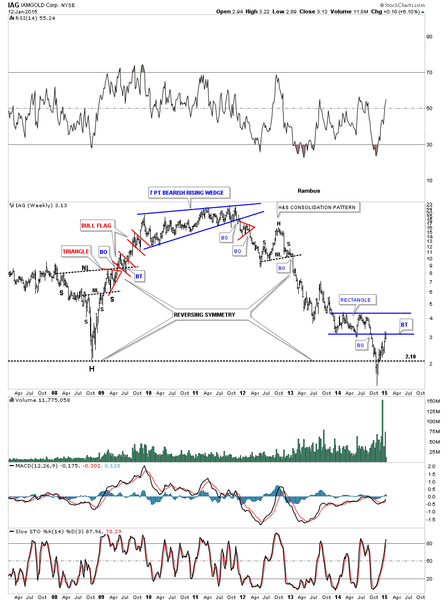
IAG hit the bottom rail of its blue rectangle but sold off on the initial hit. One to keep an eye on.
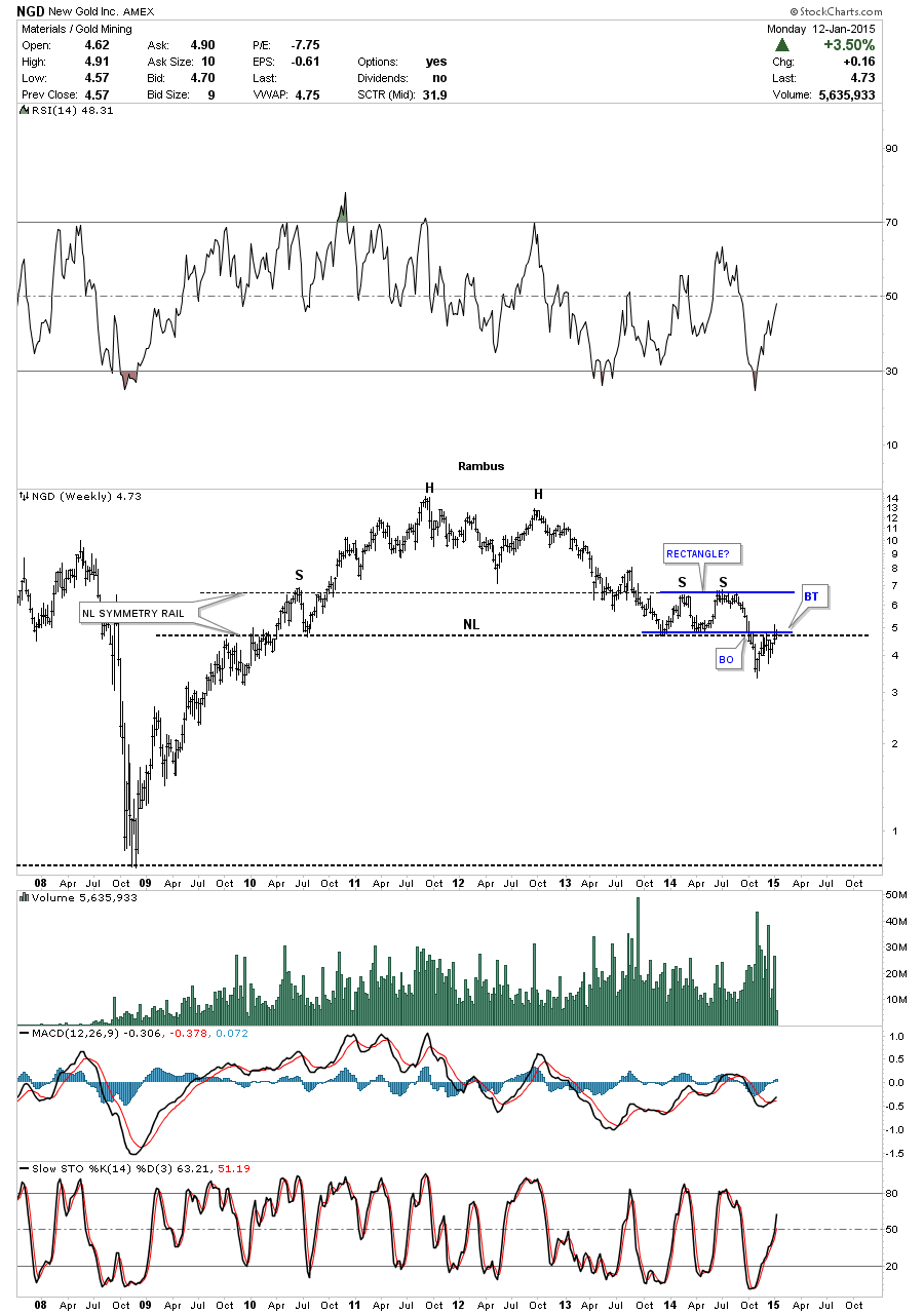
NGD is attempting to backtest its multi year neckline.
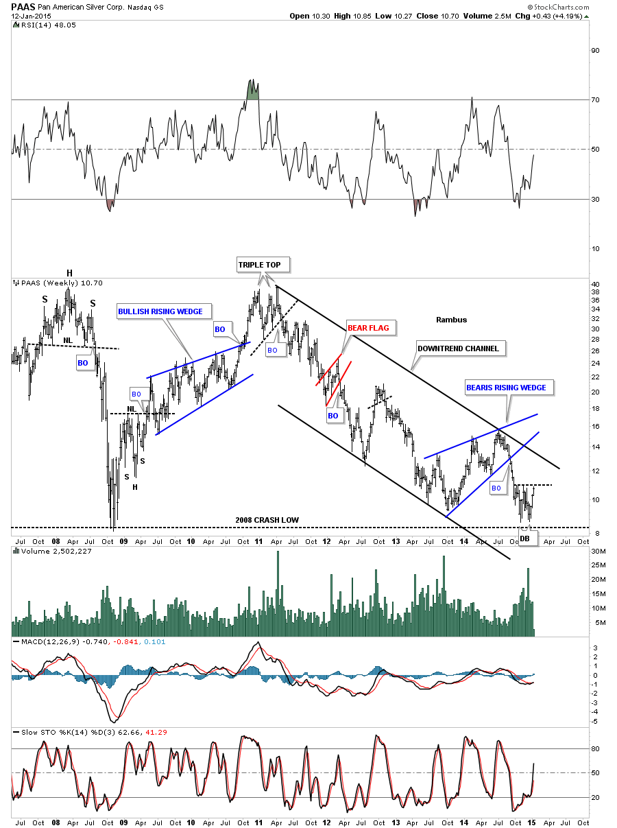
PAAS is showing a potential small double bottom within the major downtrend channel.
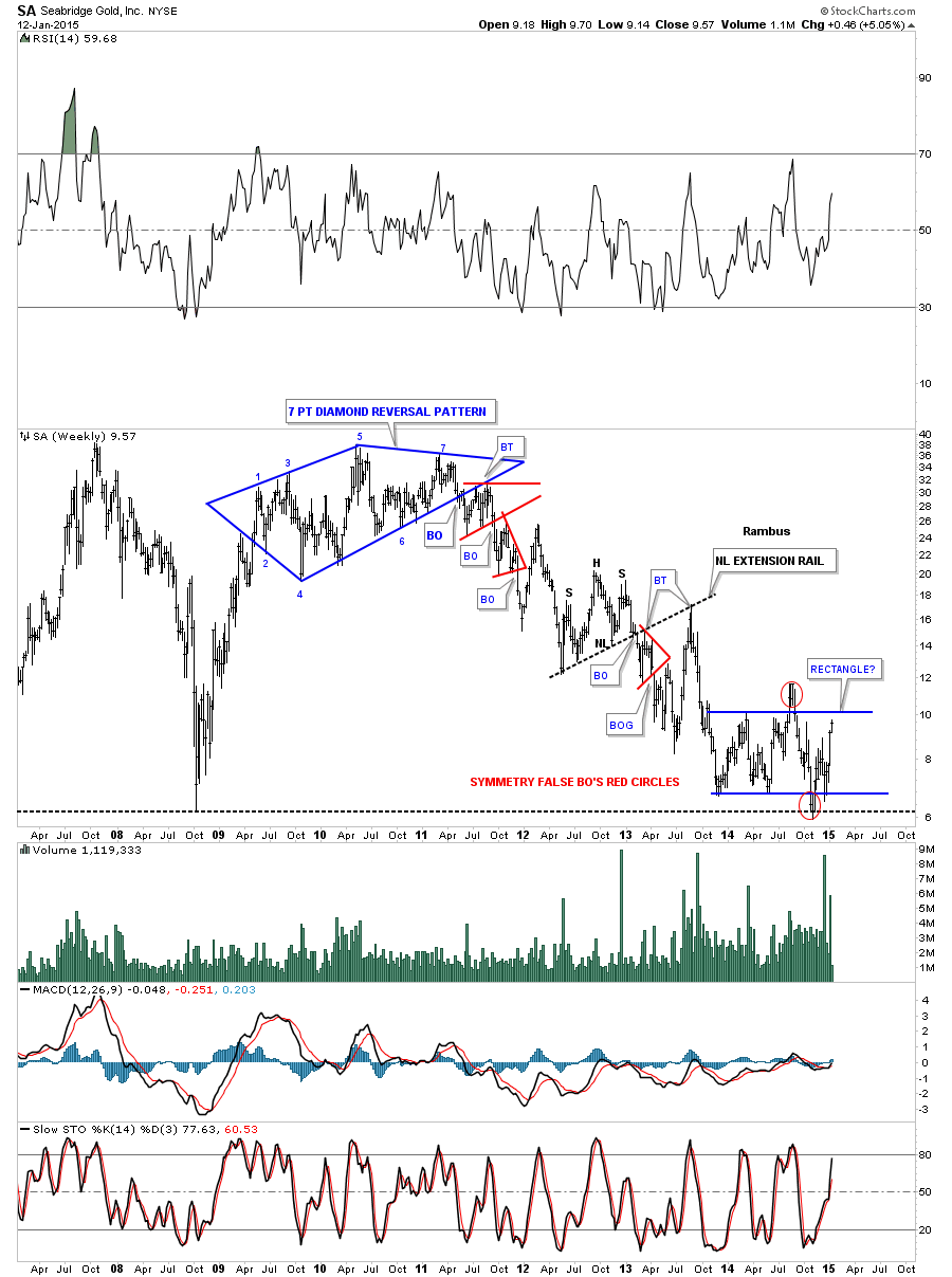
SA is still chopping around in a big one year loose rectangle.
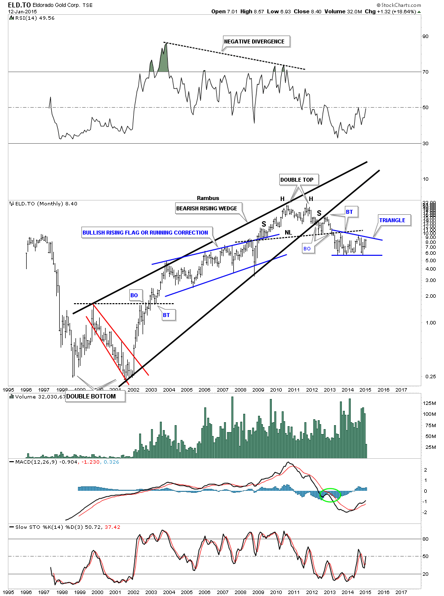
ELD.TO is trading inside the blue triangle which is located just below the big neckline.
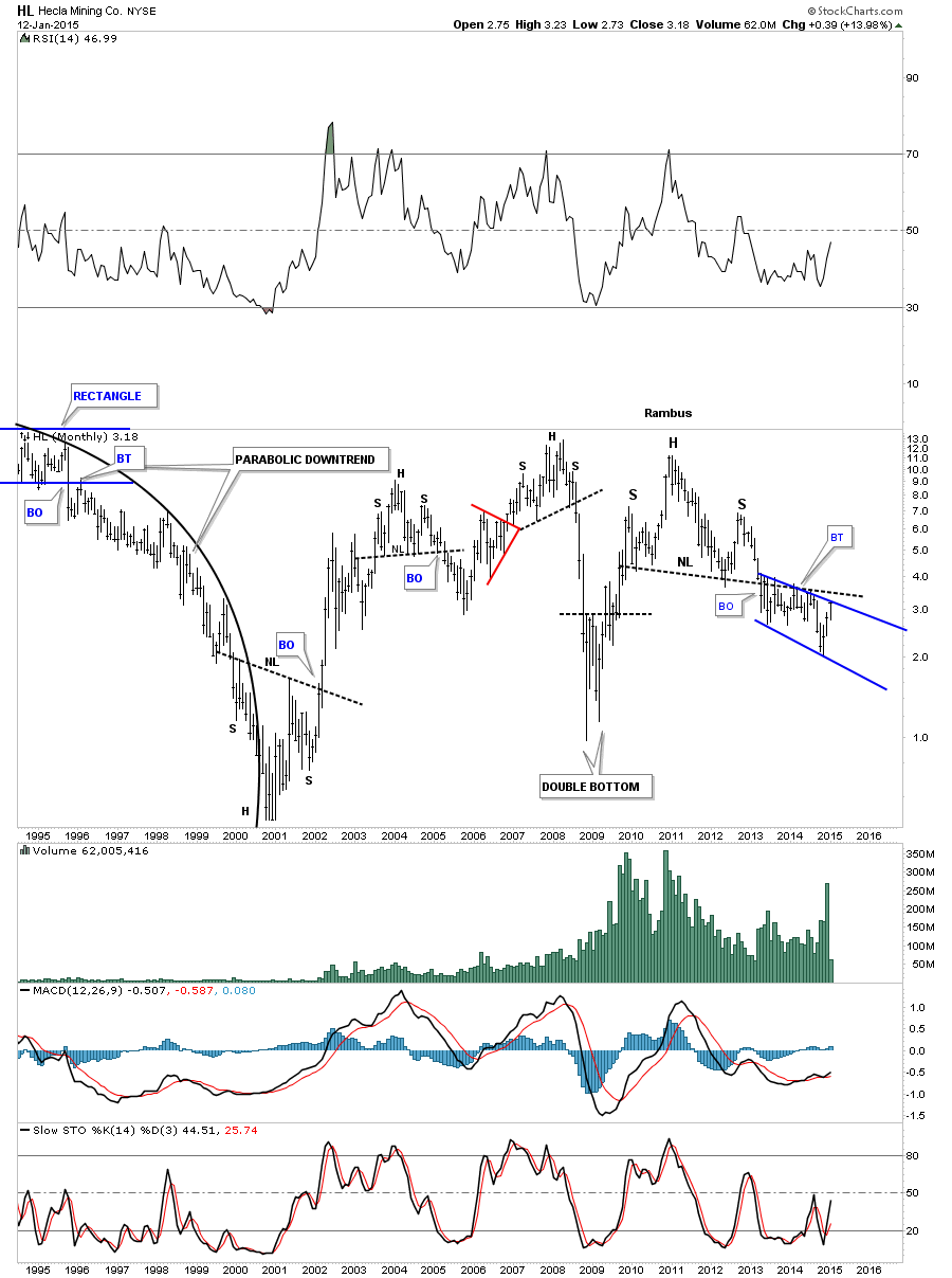
HL is still chopping around below its big H&S neckline.
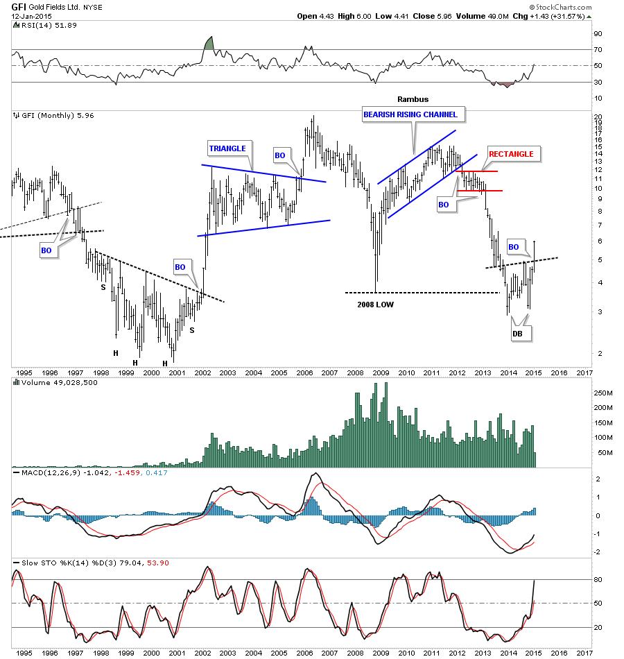
GFI is showing some relative strength by breaking above its double bottom trendline.
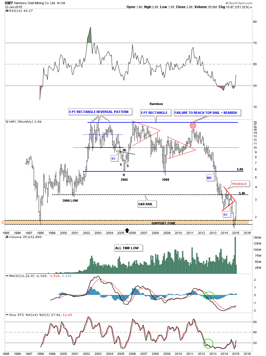
HMY is another South African producer that is looking strong on a relative basis.
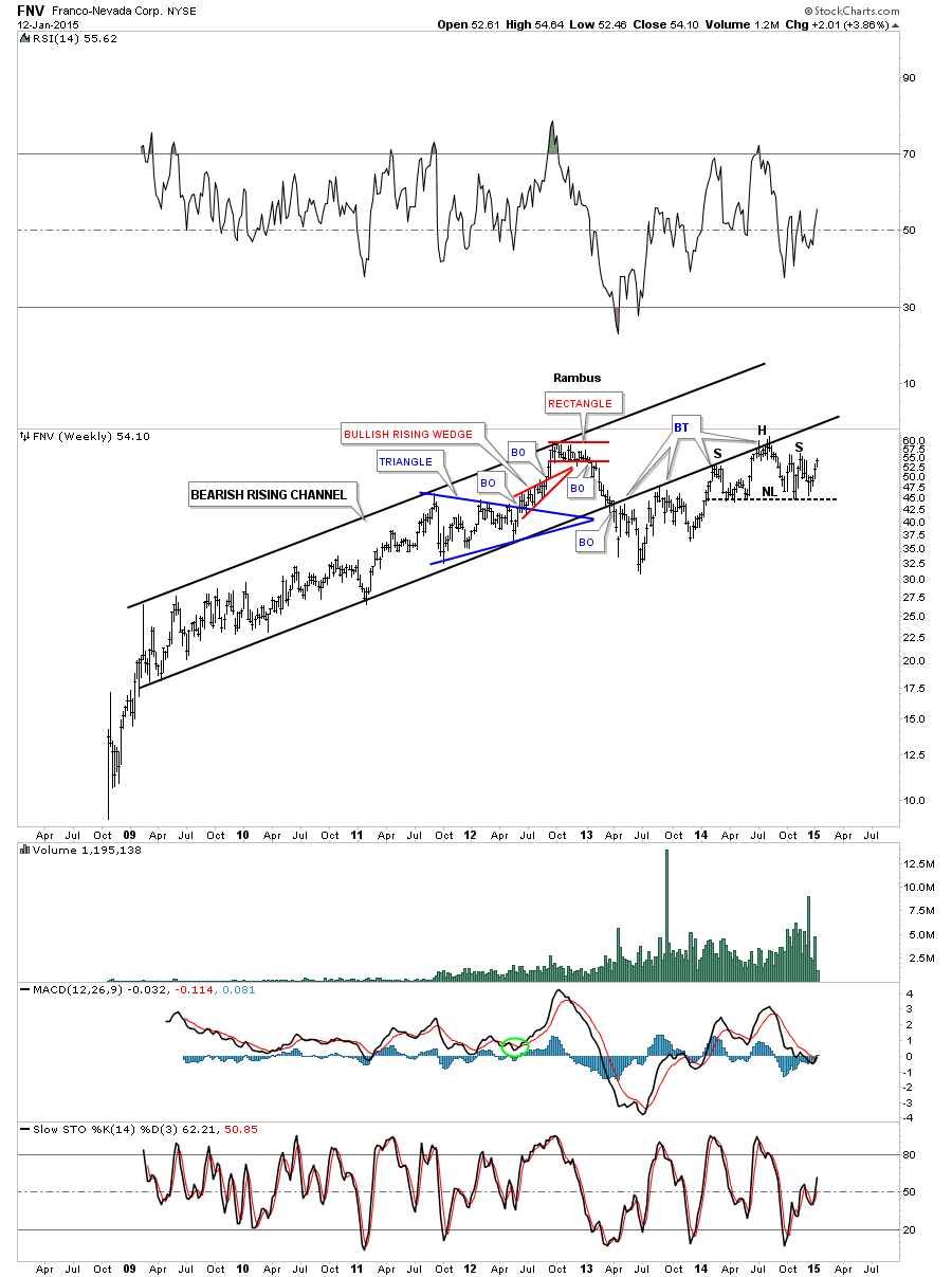
FNV is still trading below the bottom rail of the huge rising channel. Maybe it will backtest the bottom black rail again for the 5th time if the PM stock remain buoyant.
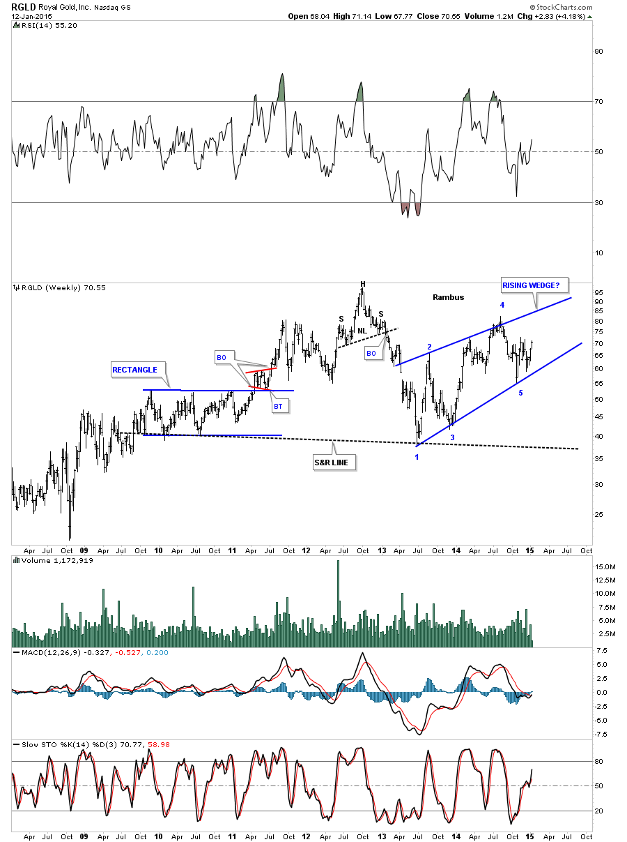
RGLD is still chopping around inside a rising wedge creating a possible 5th reversal point.
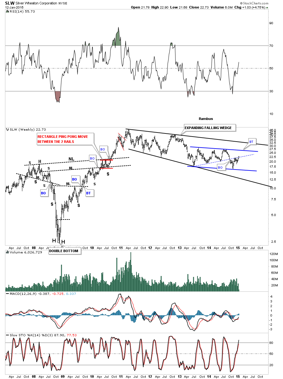
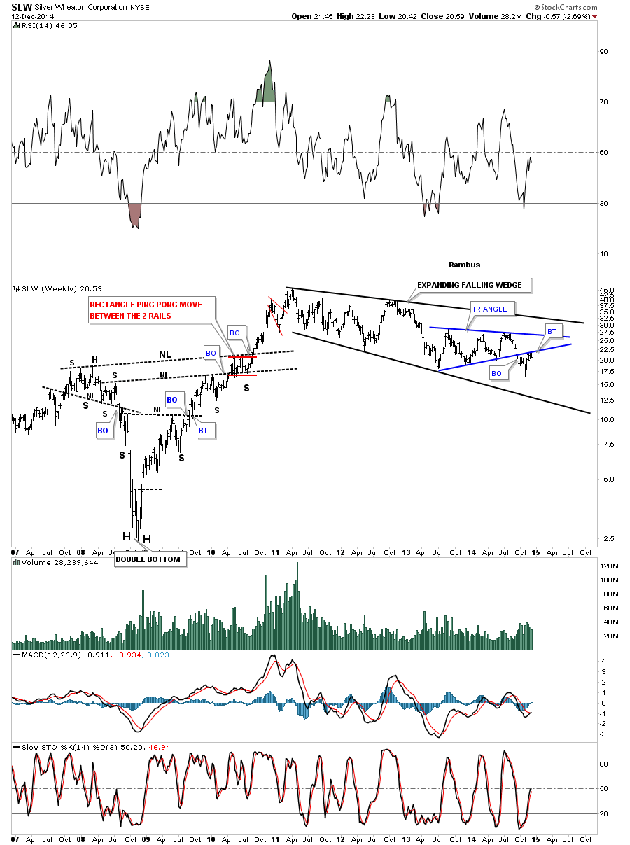
SLW is trading back inside the blue triangle which is part of a bigger consolidation pattern an expanding falling wedge.
I’ll keep a close eye on these stocks and others for clues to see how high they may move. Right now it’s still a mixed bag with some looking more bullish than others. The top rail of the expanding falling wedge, on the GDM chart above, will tell the tale if or when we get there. All the best…Rambus
Wednesday Report…BIG MOVES DEVELOPING IN STRATEGIC MARKETS…
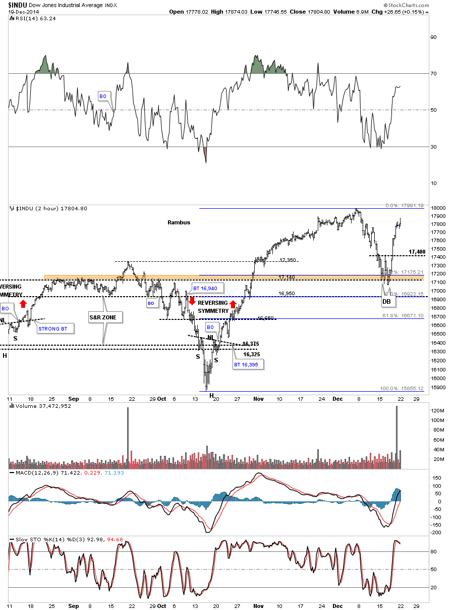
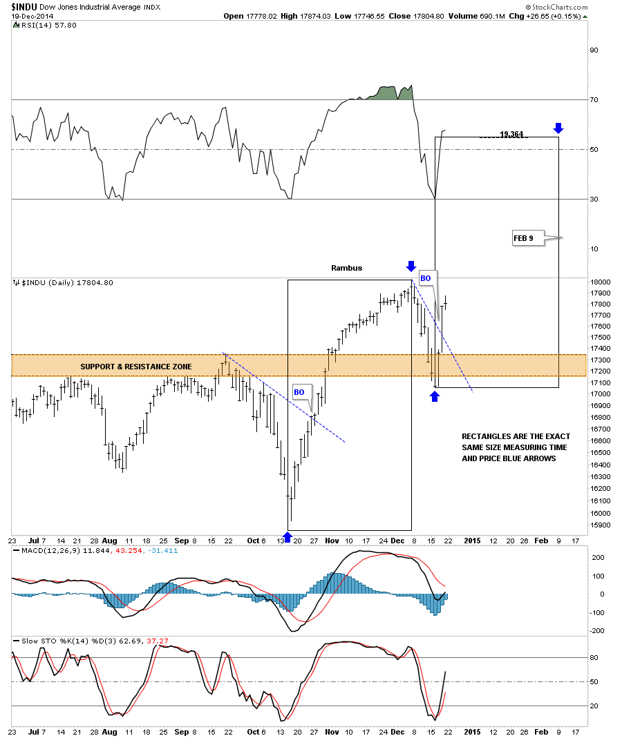
Tonight I would like to touch on several different areas in regards to our trades we have going right now. First lets look at the INDU and some of the reasons I went short yesterday. The daily chart shows a rising wedge in which the price action closed below the bottom rail yesterday. Today’s bounce was a little stronger than what I was hoping for closing above the bottom rail of the falling wedge. There is also another and I believe stronger chart pattern in play and that is a possible double top. As you can see on the rising wedge, reversal point #4 is higher than reversal point #2. When you look at the RSI, at the top of the chart, you can see a big negative divergence. The same holds true with the MACD at the bottom of the chart. The blue histogram is still negative and the slo sto is falling. The 50 dma comes in just above at 17,632 so all these indicators are negative.
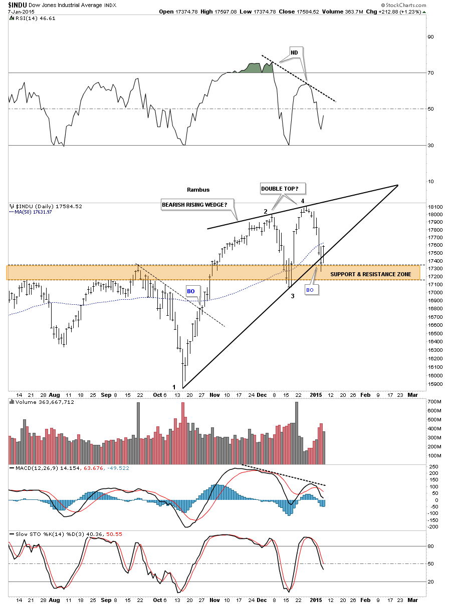
The four horsemen are all negative at this time.
Next I would like to expand on the possible double top scenario and how it may play out if indeed that is what we’re seeing. Below is the down to up volume chart that shows you a clear picture of the possible double top with the negative divergence on the far right hand side of the chart. There is also the black dashed S&R line that is made from the previous tops that has been working as support.
This next chart is a long term daily look that shows the expanding rising wedge we’ve been following that has now had two false breakouts through the top rail. Monday’s decline put the price action below the now dashed original rail and I move the top rail up to connect the December 2013 high and our most recent two highs made in November and December of this year. For the time being I’ve labeled the pattern as a morphing expanding rising wedge until we get more confirmation one way or the other.
If the double top plays out the price objective would be down to the 16,100 area as shown by the black arrows. That is an important number in the big scheme of things which I will show you after this next chart.
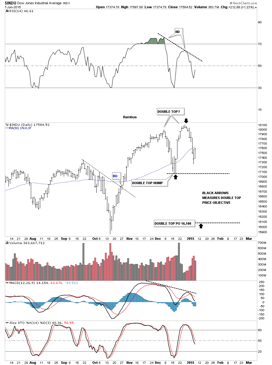
The very long term monthly chart for the INDU shows the expanding triangle that I call the JAWS OF LIFE. If the INDU is putting in a double top and the price objective for that double top is around the 16,100 area then that would be another backtest to the top rail of the expanding triangle which I have at 16,150. So putting all the pieces of the puzzle together I can see another small correction down to the 16,100 to 16,150 area that doesn’t hurt the major uptrend that has been in place since 2009. This is how I’m seeing the setup right now.
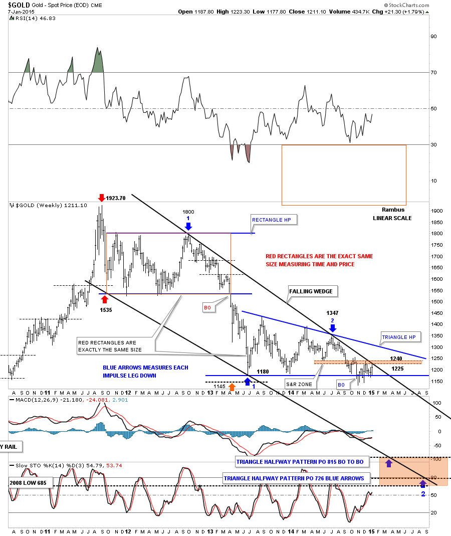
Next lets look at the weekly chart for gold that shows the price action since the bull market high at 1923. I want to focus in on the top black rail of the falling wedge and this weeks price action. Notice the thin brown shaded support and resistance zone that comes in between the 1225 and 1240. As you can see the high this week has been up to 1223 which is touching the top rail of the black falling wedge. So gold is now trading at resistance until proven otherwise.
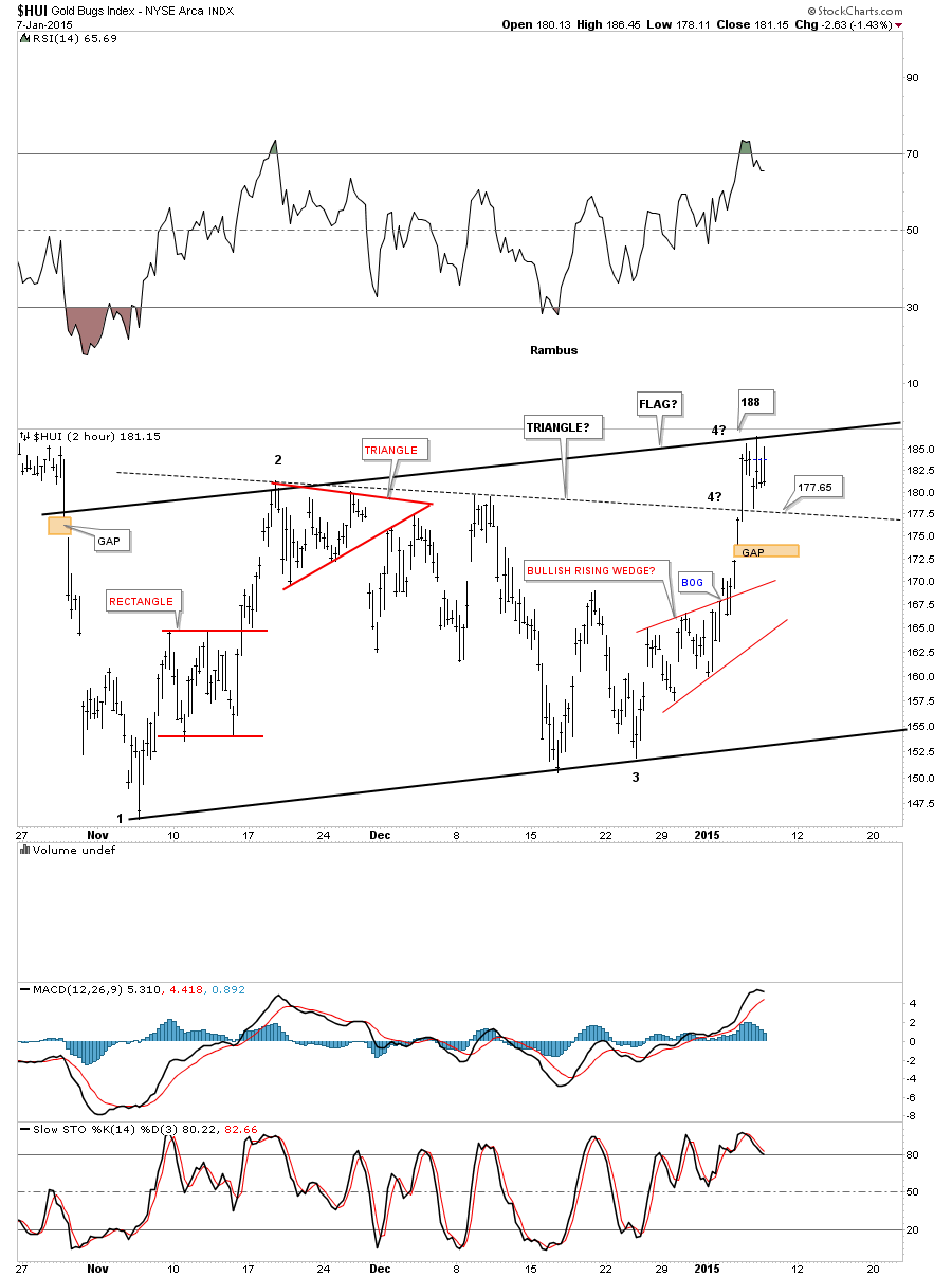
Lets take a quick look at the HUI that has been bouncing between the potential top rail of a bear flag and the top rail of a triangle. What’s important about this area is that we need to see a fourth reversal point to finish up a consolidation pattern. As of today the solid top rail is holding resistance which is critical to begin a move down to at least the bottom of the potential bear flag. The fourth reversal point won’t be complete until the price action touches the bottom rail so there is still a lot of work to do yet with the HUI. As I’ve shown you in the past this area is critical as a halfway spot to the lower price targets.
Let’s put the potential bear flag in perspective and look at another long term daily chart for the HUI. Again the possible red bear flag won’t be complete until the bottom rail is hit.
Previously I showed you a possible triangle that was forming in the major downtrend channel in the HUI. I’ve now changed it to the potential red bear flag. Notice how the price action is getting closer to the top solid rail of the downtrend channel. It can get there from trading sideways or by moving higher or a combination of the two. I’m still viewing this pattern as a halfway pattern to the downside. As you can see there is still a large time component left which needs to be fulfilled to reach the bottom price objectives.
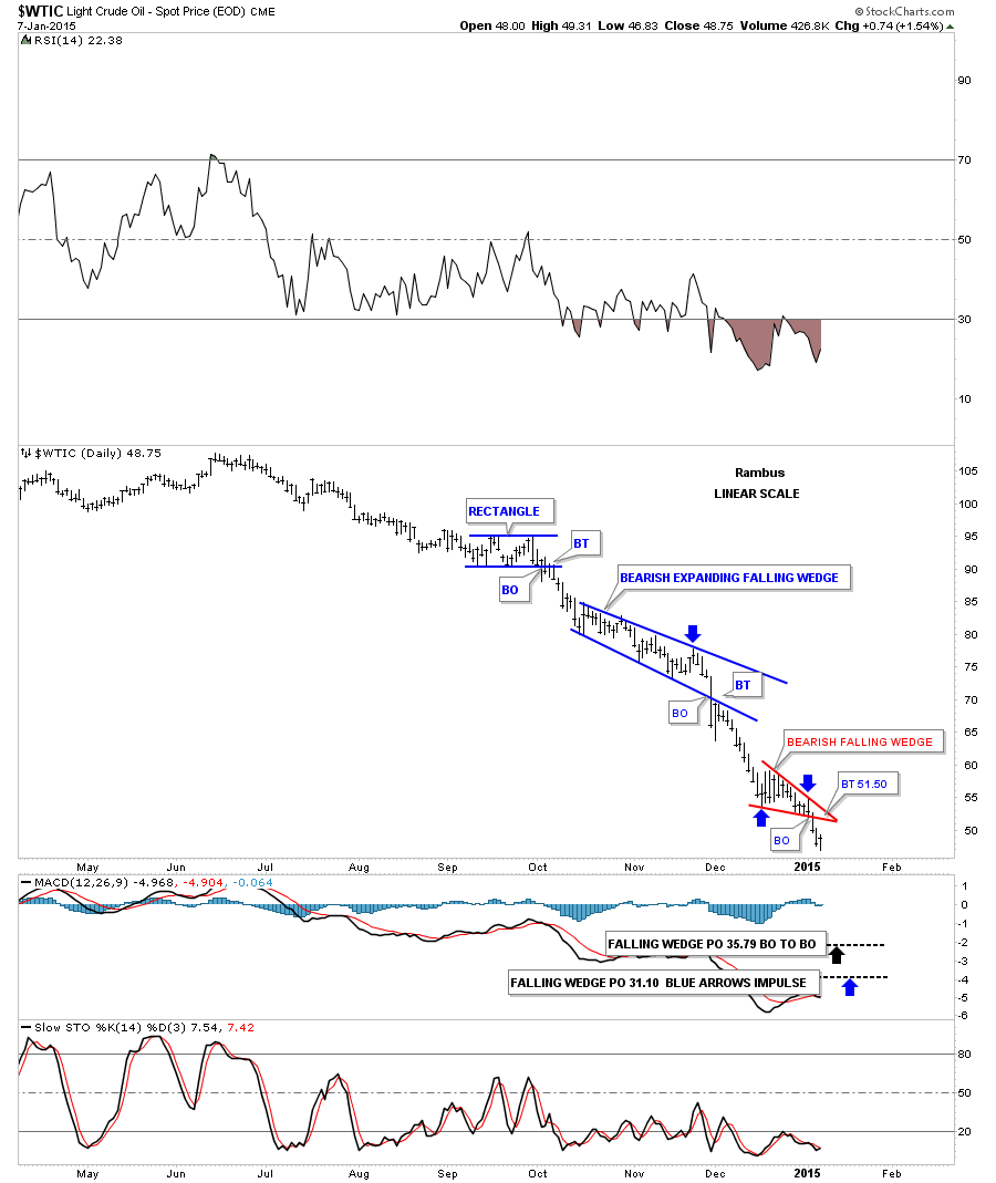
Now lets take a look at the daily oil chart that has been doing pretty good for us so far. Three days ago oil broke out of a small red bearish falling wedge which is the third and possible last consolidation pattern to form in this downtrend. A possible backtest would come in around the 51.50 area. If this little red bearish falling wedge plays out it will give us a price objective down to the 35 area which is the top of the old trading range.
Below is a long term daily chart that shows the massive top that oil broke out from to get this kind of move down. Once that big S&R line broke all the pent up energy was released and this is what we got.
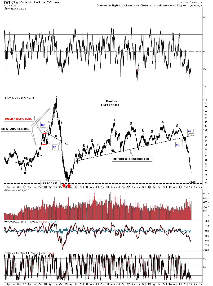
This long term monthly candlestick chart for oil shows it’s now in its seventh month of decline.
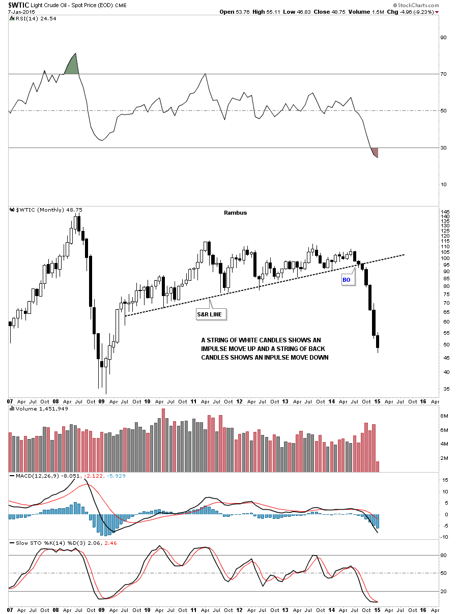
This last chart for oil shows its total history and the the big trading range between 10 and 40 dollars. The brown shaded support and resistance zone, between 35 and 40, is what I’m shooting for.

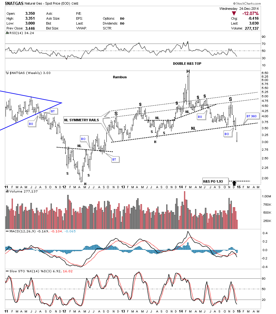
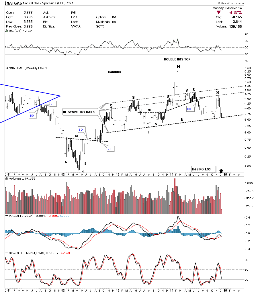
Moving on to natural gas lets look at the daily chart and see what it maybe showing us. After breaking out from the small double top, bouncing off of the S&R line which caused a backtest to the underside of the double top hump, natural gas finally broke out and moved lower. Natural gas has been bouncing around for the last week and a half or so as shown by the red horizontal lines. It maybe trying to build out a small consolidation pattern between 2.81 and 3.15.
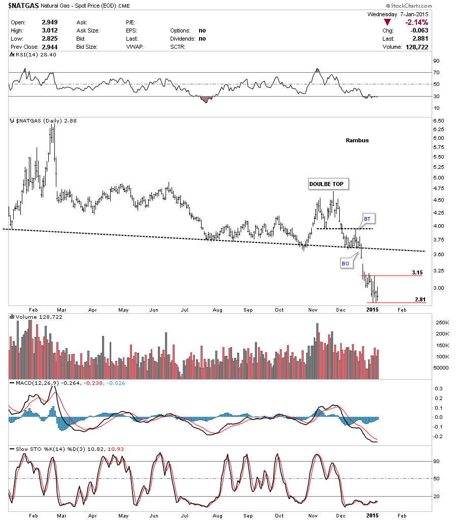
Looking at the weekly chart we can see natural gas has broken down out of a very large and symmetrical H&S top. It took roughly 2 1/2 years to build out that large H&S top so this move down is just getting started on a relative basis. Big pattern big move.
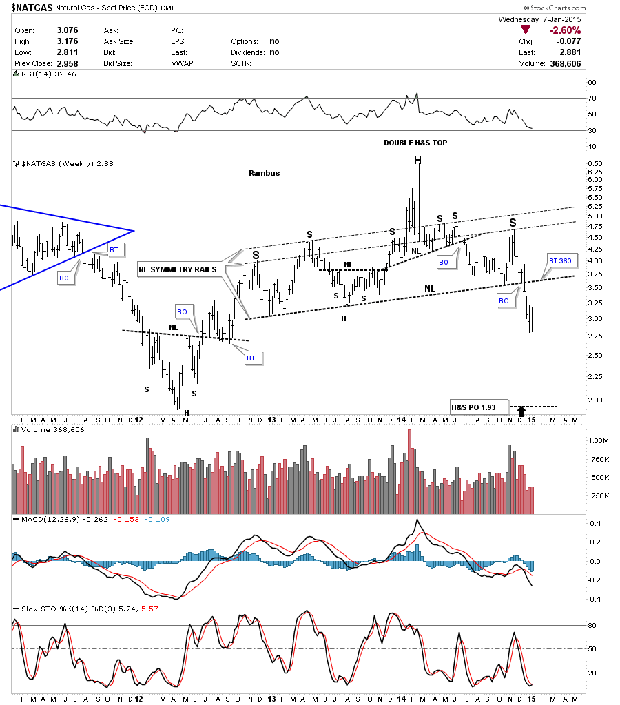
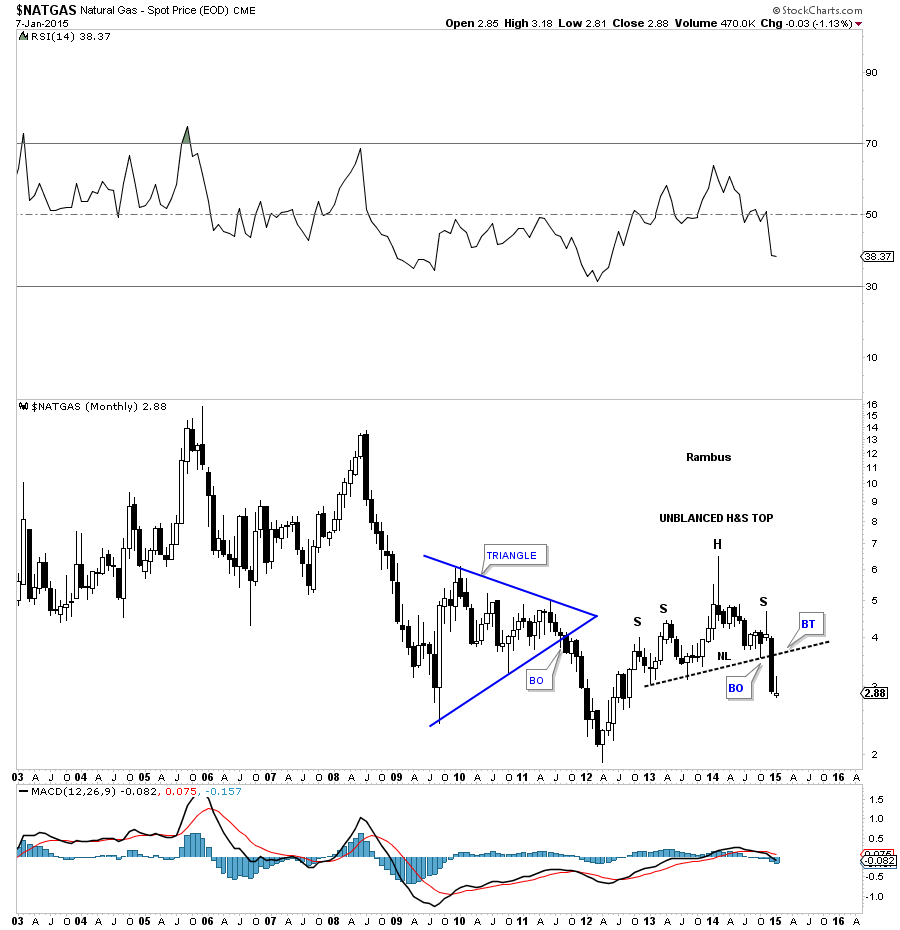
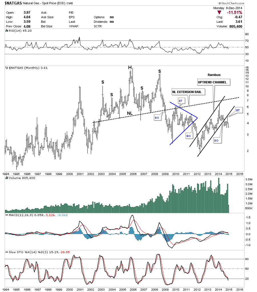
Below is a monthly candlestick chart for natural gas that shows just one black candle so far in this decline. You can also see the H&S top from the chart above.
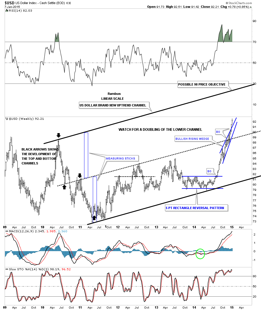
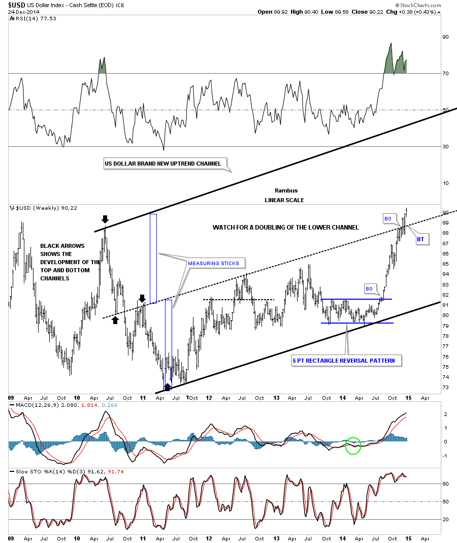
Lets look at one last chart for tonight which is a long term weekly chart for the US dollar. As you can see the blue bullish rising wedge, that has formed in the middle of a possible new uptrend channel, is still plugging along to the upside. If things keep moving up for the US dollar the top rail, of the now possible uptrend channel, would be touched around the 98 area depending on where it gets hit and how soon. Just something to keep an eye on. All the best…Rambus
Gold Targets for 2015
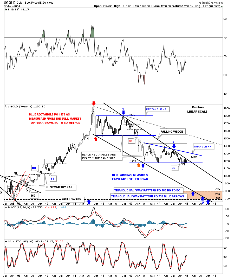
Below is a gold chart I worked on this weekend. It has a lot of information on it to digest. First thing to note is the top rail of the black falling wedge. As you can see the top rail comes in around the 1215 to 1220 area. Not that it means anything but the two black rectangles are exactly the same size that measures time and price for the rectangle on top and our current triangle below. If our current triangle plays out as a halfway pattern, I have it measured using the BO to BO and the impulse method with the price objectives at the bottom of the chart. I think we could see a small halfway pattern form during the second impulse move down before the actual price targets are hit. The very bottom price objective is the 2008 crash low at 685 which looks like it would hit the bottom rail in October. Something to watch when the bottom rail gives way.
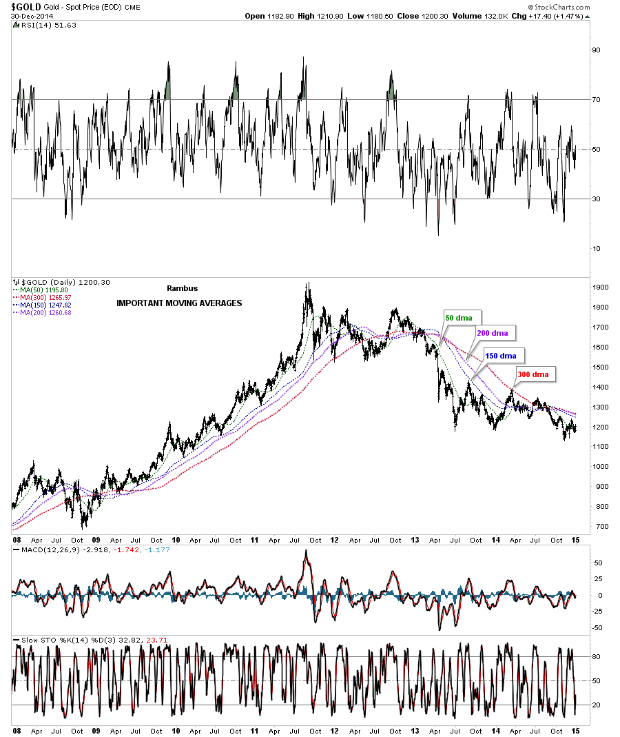
I have followed these moving averages on gold for many years and consider these to be the most important ones.
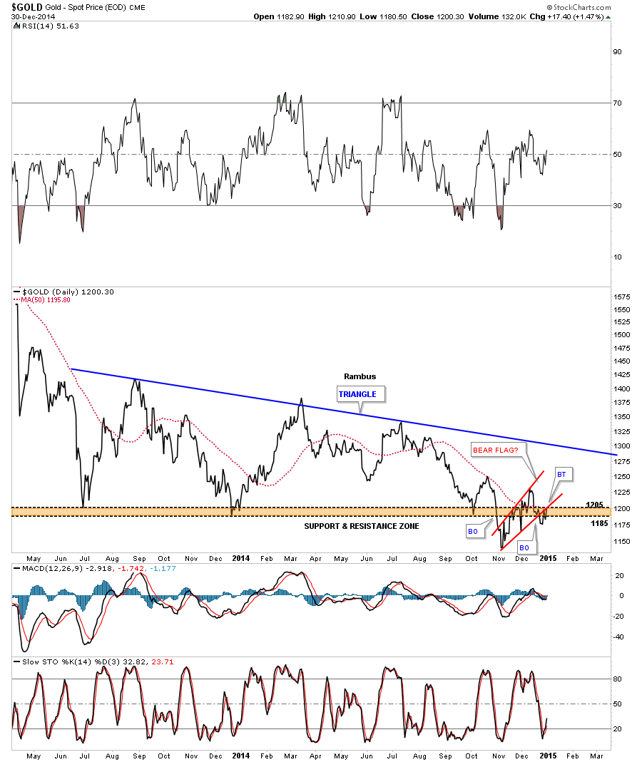
Gold’s 18 month daily line chart showing the triangle consolidation pattern.
All the best in 2015
Rambus
Wednesday Report… The Gold Target..Merry Christmas
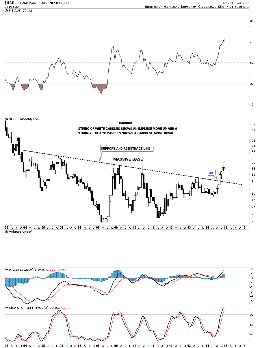
I have a busy night ahead but I just wanted to post a few long term charts to show you the relative nature of a chart pattern. I know most of you know that the bigger the consolidation or reversal pattern the bigger move to expect. If one is looking at a minute chart and see’s a triangle the move is relative to that time frame. On the other end of the spectrum when you see a big reversal pattern, that takes a year or longer to complete, then you know the move is not going to be a flash in the pan. When looking at a big impulse move from the monthly perspective I like to use the black and white candlesticks that will general confirm the impulse move your are expecting or are currently in.
Lets start with the US dollar which broke out of its huge base four months ago already. It’s hard to believe because we had to wait at least a year, since recognizing that big base, for the breakout to occur. You can see a string of six white candles, all in a row, telling us this is an important impulse move taking place. Also note the size of that big base. That is a huge base that tells us the US dollar is in a bull market that is going to last for quite awhile.
To give you an idea of what happened in a similar move for the US dollar we can look at a 20 year monthly chart that shows a fractal base that was made back in the 1980’s and 1990’s which took about three years to reach its bull market peak at 120 in 2001 or so once the support and resistance rail was broken to the upside.
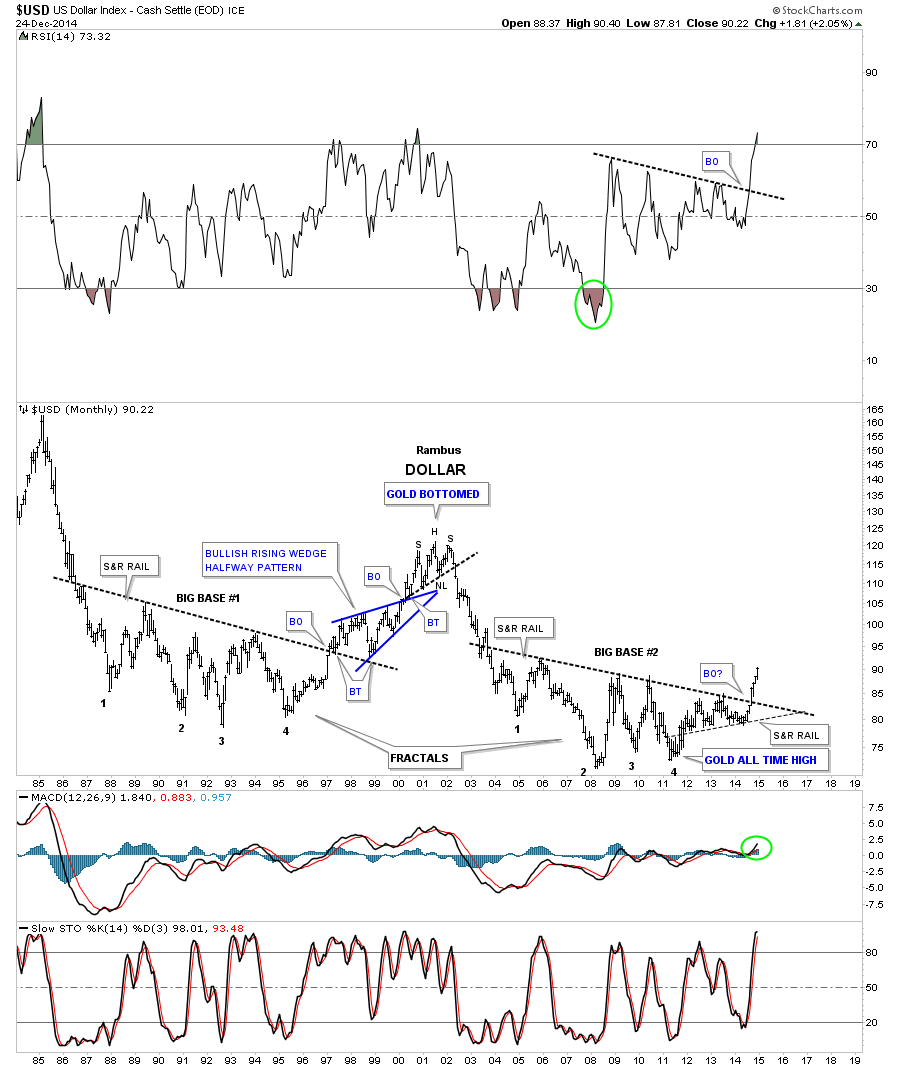
Before we leave the US dollar there is one more chart I would like to update that I showed you about a month or so ago where the US dollar could be doubling the size of its uptrend channel. I believe the dollar was just cracking the mid black dashed trendline. I said I would like to see some confirmation of the center dashed mid line if it got backtested from above and held. You can see the backtest was a little strong but held beautifully so far.
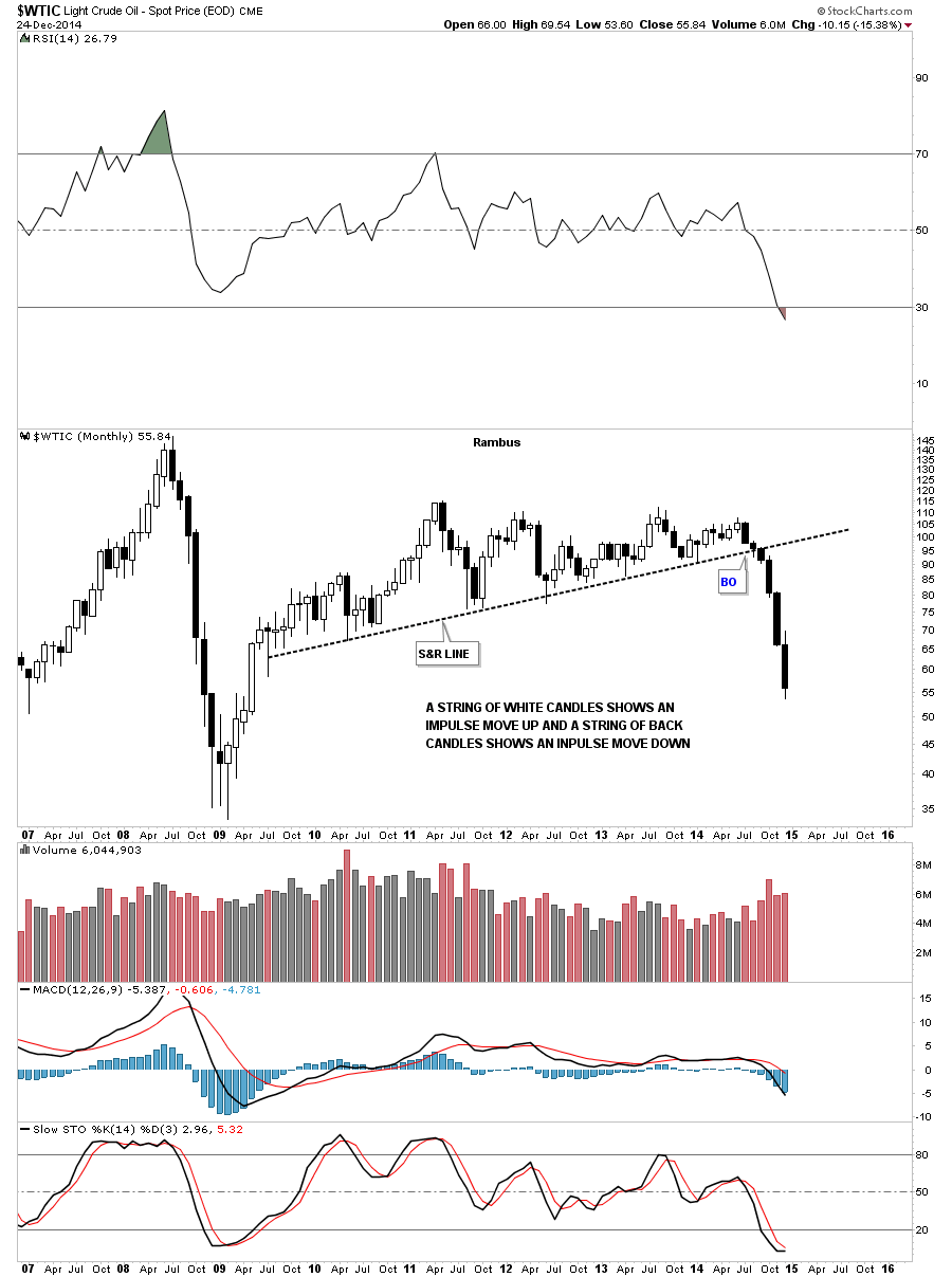
For those that think the US dollar isn’t affecting the commodities lets take a look at a monthly chart of oil using the black and white candles. We counted six white candles on the US dollar which is also the number of back candles on oil. Coincidence? Again keep in mind the size of that huge topping pattern on oil which tells us to expect a big move down which we’re getting.
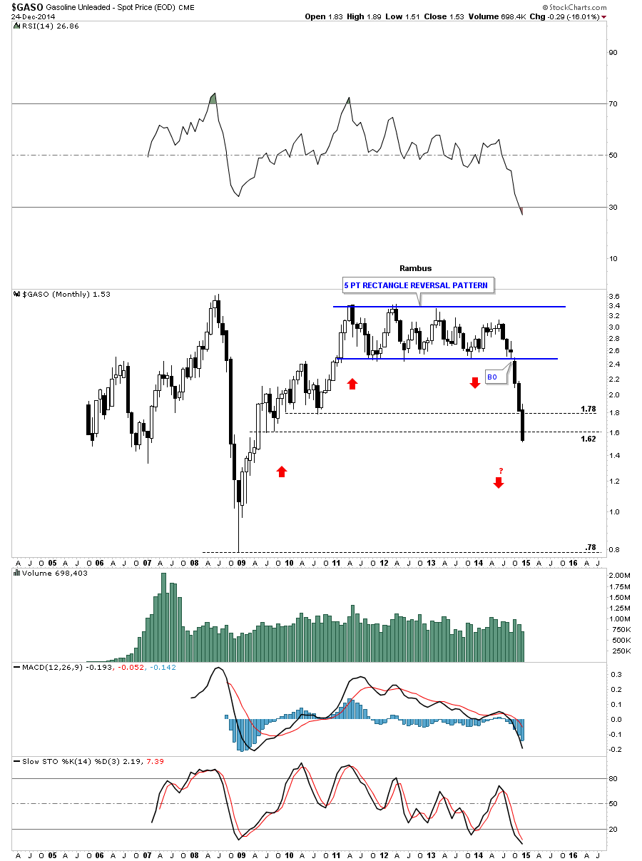
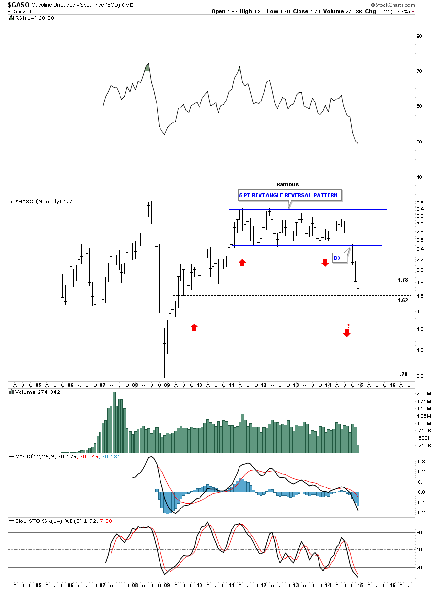
If you recall I showed you this monthly chart for GASO when it broke below the bottom rail of the blue 5 point rectangle reversal pattern. Count the number of black candles. I also showed you how the red arrows may show us some reverse symmetry to the downside relative to the way GASO went up. We’re at a spot where we could some consolidation take place but until we do follow the price action.
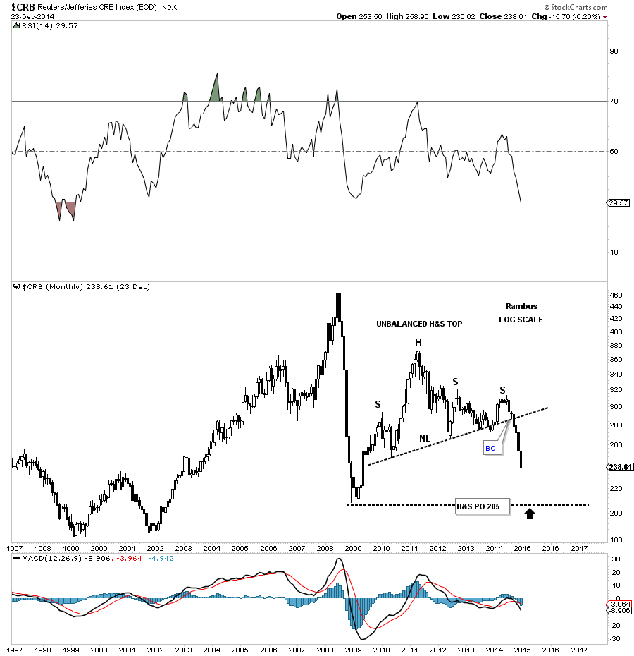
Lets take a look at the CRB commodities index and see how the US dollar is affecting it. Here you can see the CRB index has built out an unbalanced H&S top and now has six black candles, in a row, to the downside. That unbalanced H&S top is about 5 years in the making so we know the move still has a ways to go yet before it burns itself out.
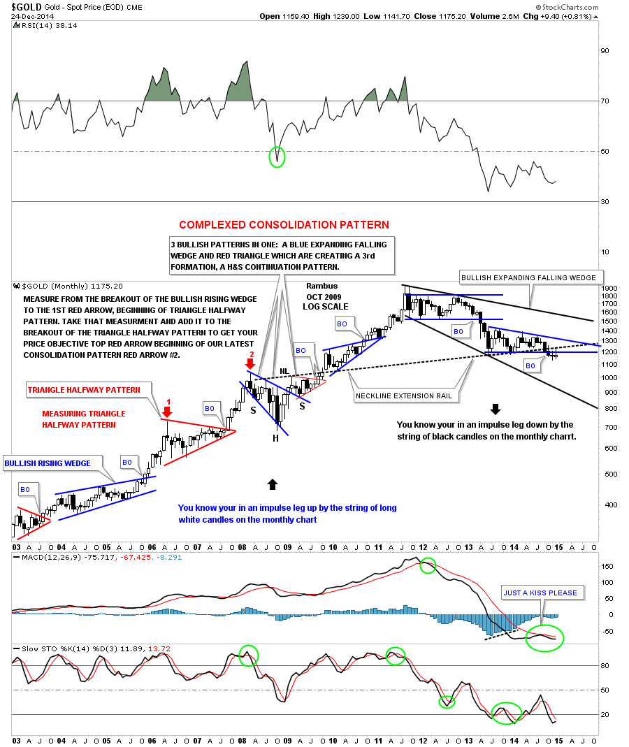
Below is a long term weekly chart for gold that I haven’t posted in probably close to a year or so which shows all the beautiful consolidation patterns that gold made during its bull market. This weekly chart also shows the black and white candles that accompanied the bull and bear impulse moves. During the bull market years, once one of the consolidation patterns broke out you can see the string of white candles that formed the impulse move. Where you see a black candle in the impulse move up there is a small consolidation pattern that shows up on the daily chart. Note the sting of black candles that formed during gold’s first leg down in its new bear market. If you look real close you’ll see one small white candle that formed just before gold broke below its big rectangle consolidation pattern back in April of 2013. As you can see since gold started it latest consolidation pattern, about 18 months ago, there is a mix of black and white candles that tells us the impulse move hasn’t begun yet but when it does we’ll see a string of black candles just like the first impulse move down off of the rectangle high. One last note on this weekly chart below. Notice the blue expanding falling wedge that formed as part of a complex bottom back in 2008. I think there is a good chance that we may see the final low for gold when it touches the bottom rail of the much bigger black expanding falling wedge which could turn out to be a huge halfway pattern in the secular bull market. Just something to think about right now. There is still a lot of work to do yet.
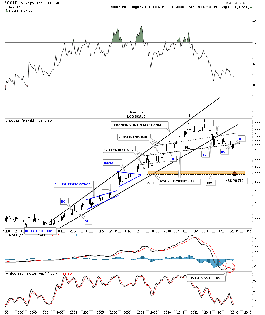
Below is a beautiful monthly chart for gold that we’ve been following for well over a year or so. This is the chart where I extended the neckline from the 2008 crash H&S consolidation pattern to the far right hand side of the chart, think reverse symmetry, labeled neckline extension rail. Note the last bar on this chart which shows gold backtested the neckline from below again this month. December marks the third month now that gold has been trading below that neckline.
Lets look at one more chart for natural gas that shows the big H&S top that broke down last week. Keep in mind the relative size of that big H&S top that shows you this move down in natural gas isn’t going to be a flash in the pan type of move. It took over two years to build out that H&S top and the impulse move isn’t going to end in one or two weeks or months. It’s all relative.
I want to wish everyone a Merry Christmas and a happy holiday season. I also want to thank everyone who has joined Rambus Chartology. I want to thank Sir Fullgoldcrown, Audept and my wife, who takes care of the Pay Pal accounts, because without these folks there would not be a Rambus Chartology. All the best…Rambus.
Weekend Report…The Jaws of Life Update .
.
In this Weekend Report I would like to show you some charts on a potential very bullish setup that maybe in play for the US stock markets right now. If you recall back on November 19, The Wednesday Report, I showed you some critically important support zones that needed to hold if this was just going to be a minor correction from the big rally off the October low. Let’s visit a few of those charts and see how they panned out.
Wednesday Report: Nov 19
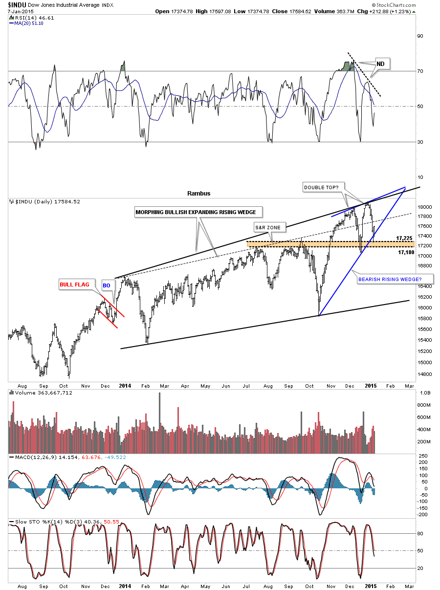
The first chart we’ll look at is the INDU that shows the price action breaking below the top rail of the expanding rising wedge which I viewed as a negative. The real support I was looking for was the brown shaded support and resistance zone that is based on the previous highs made in July and September of this year. What had been resistance should now turn into support which you can see was the case. The 38% retrace and 50 dma also came into play right there as well. As you can see the INDU has now traded back above the top rail of the expanding rising wedge which I’m going to call the backtest as a, strong backtest, until something tells me differently.
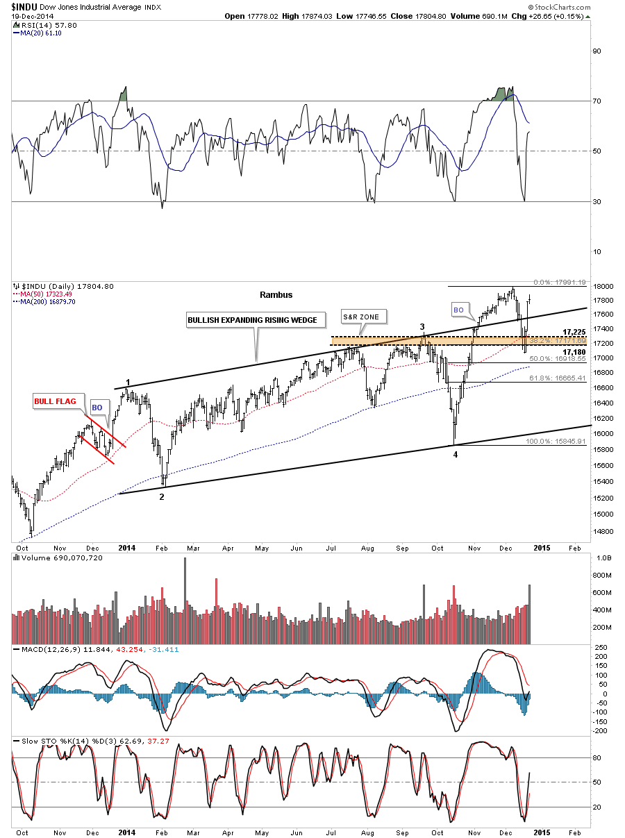
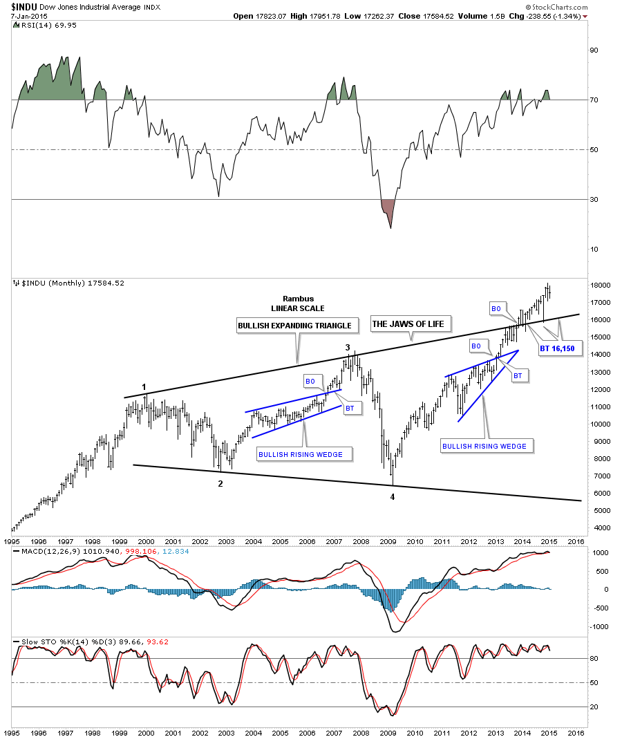
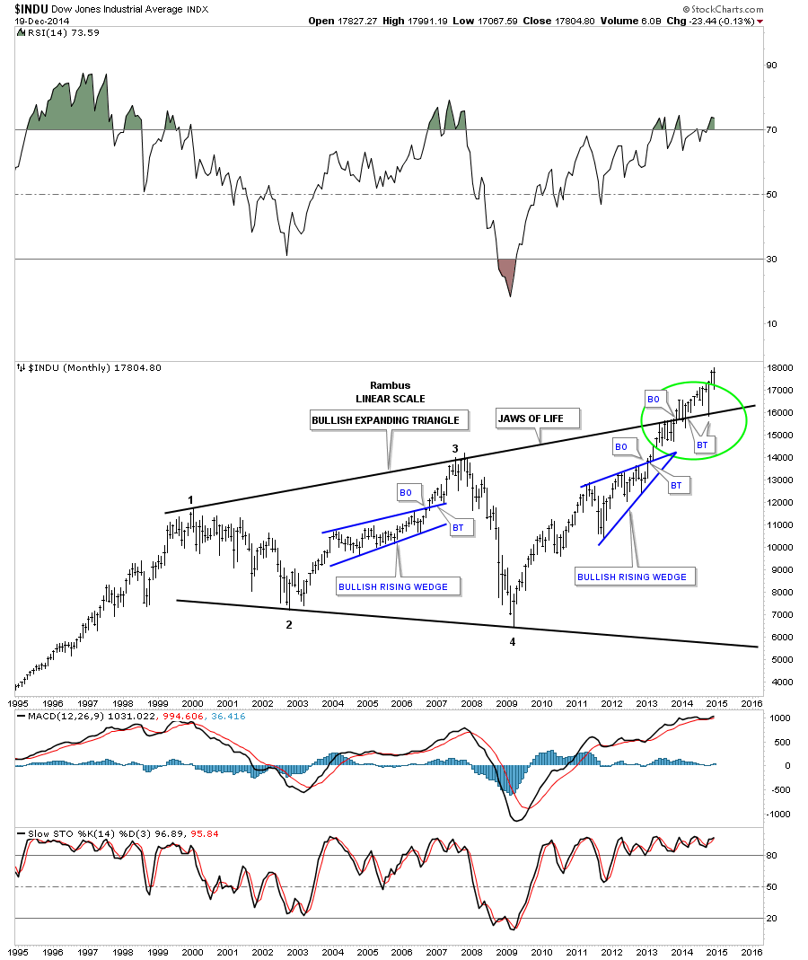
I know many don’t believe in the longer term prospects for the stock markets but the long term charts are saying something totally different IMHO. Below is the long term monthly chart for the INDU which shows the expanding triangle that I’m calling the JAWS of LIFE. Note the long bar that bactested the top rail of the expanding triangle just three months ago during the October correction. That was one critical backtest that confirms for me the top rail is hot and the new impulse move is underway. There’s still a week or so of trading before the monthly bar for December can be put into stone. Unless things really change over the next few weeks this is a very bullish looking chart to me.
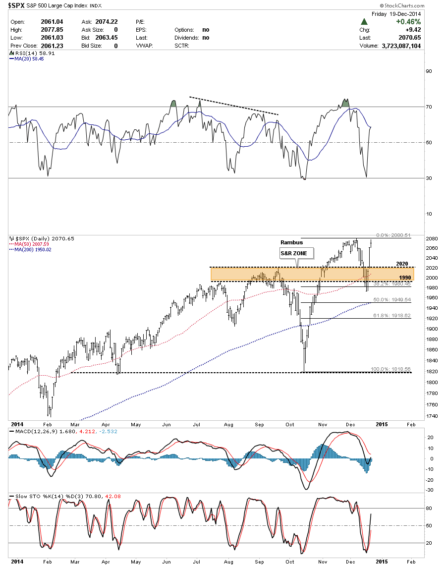
I won’t go into a lot of detail but the daily chart for the SPX shows how the brown shaded S&R zone held support just like the INDU.
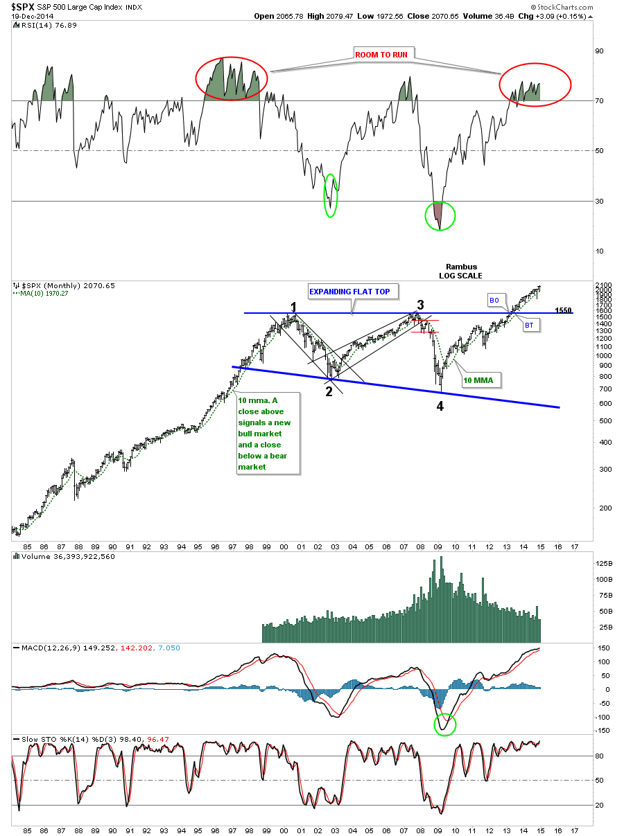
Below is a long term monthly chart for the SPX that shows it built out a flat top triangle as its massive consolidation pattern. Since the top rail is horizontal the breakout came much earlier than the INDU’s breakout. Note the RSI at the top of the chart and how long it can stay in overbought territory.
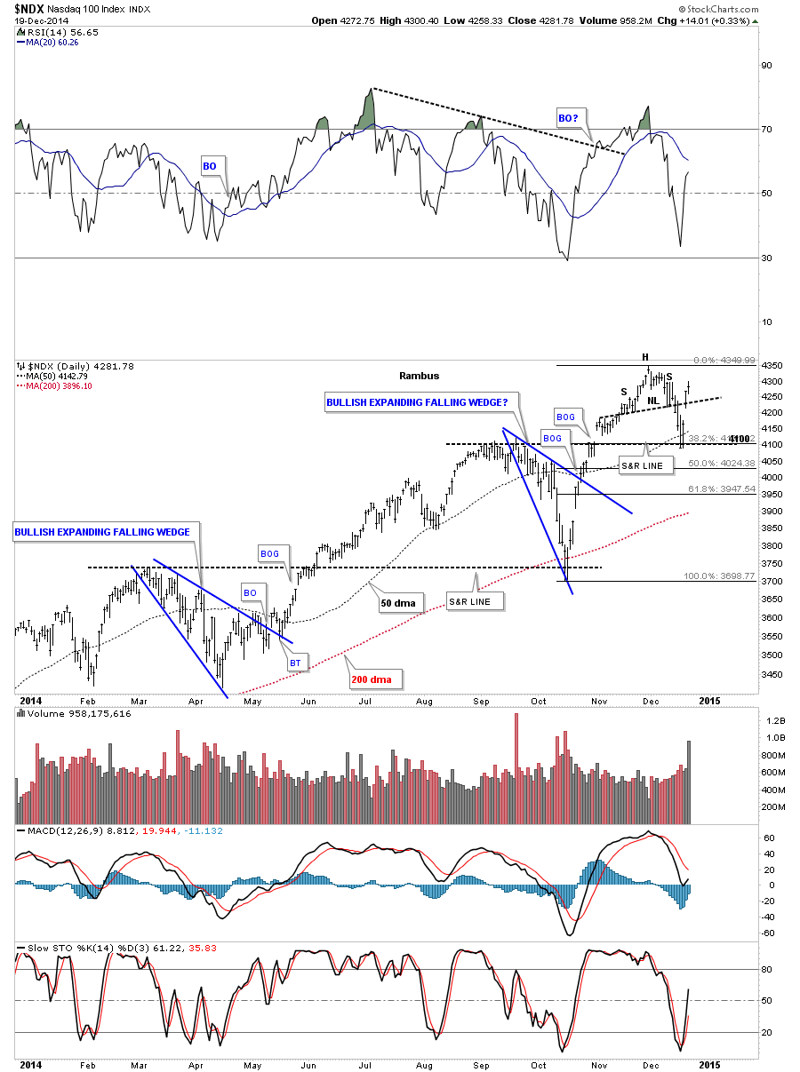
The daily chart for the NDX shows the similar support setup that the INDU and SPX had. Here you can see support that 4100 did in fact hold at the previous high made in September, the 38% retrace and the 50 dma all coming into play.
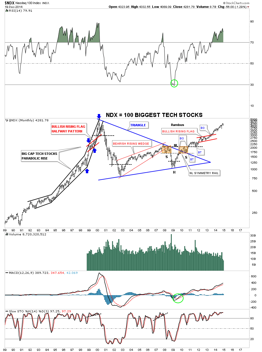
Below is the long term monthly chart for the NDX 100 that shows the massive blue triangle consolidation pattern that broke out in 2009. Note the beautiful Chartology that appeared at the end of the big blue triangle consolidation pattern. I have shown you how H&S patterns can form on wedges and flags when the left shoulder and head forms inside the pattern and the right shoulder forms as the backtest to the top rail, in this case of the blue triangle. Note how steep the rally phase was from 1995 to the 2000 bull market high back then compared to our recent price action. I expect we will see similar steepening of our current rally as time goes on. One last note on the chart below which shows the red bullish rising flag that formed at the halfway point of the finally run to the bull market high as shown by the blue arrows.
Lets turn our attention to the RUT 2000 that has a totally different short term setup compared to the charts above. On Tuesday of this week when the correction was at its strongest I showed you this daily chart for the RUT that showed how it broke below the bottom rail of the blue rectangle but found support on the top rail of the much bigger bullish expanding falling wedge. Normally you have to give the benefit of a doubt to the bigger chart pattern in a situation like this. As long as the top rail held support that was still a bullish setup. On the other hand if the top black rail had failed then that would have called into question the whole bullish scenario at that time. Note the breakout gap of the blue rectangle that occurred on Thursday. This chart shows a good example of how one has to be flexible in their thought process and follow the price action.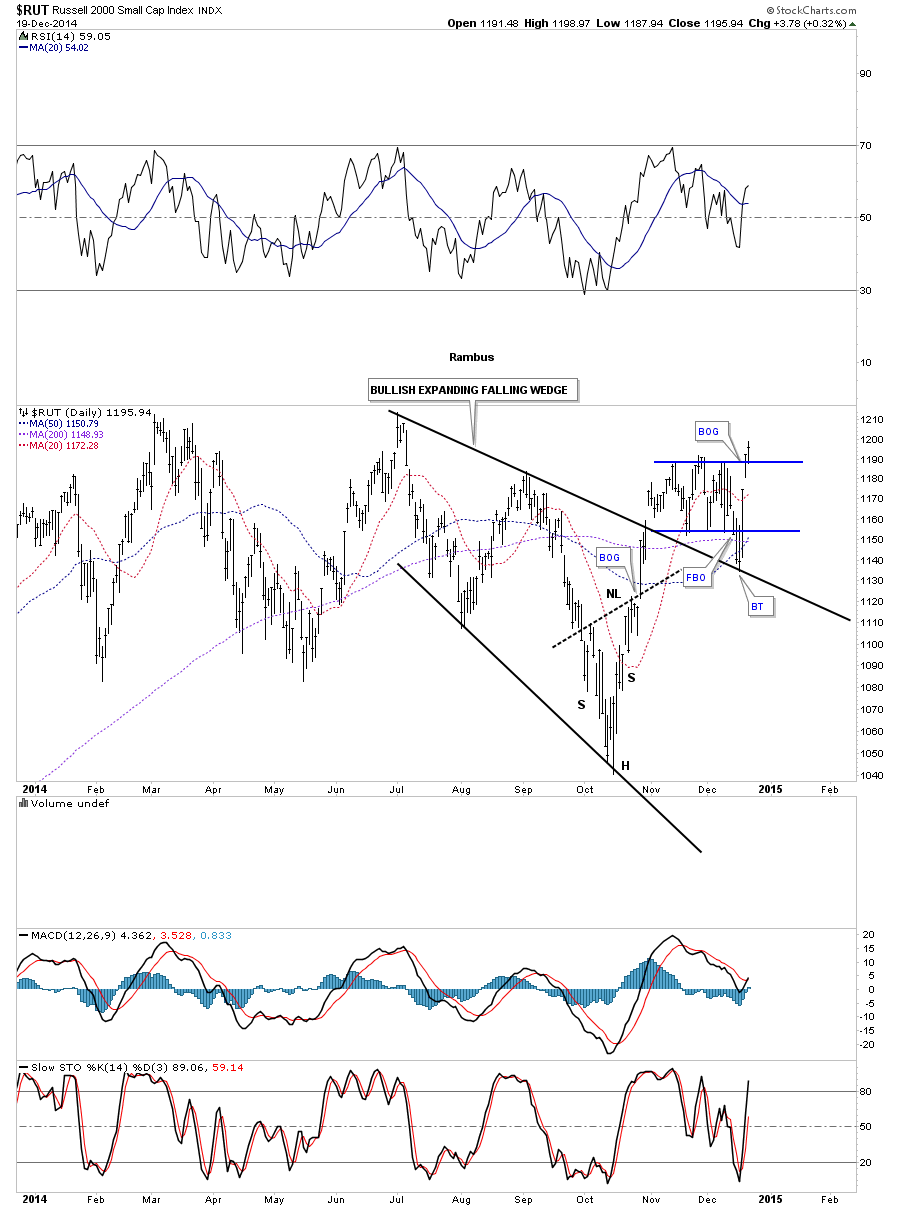
The weekly chart for the RUT is getting a lot more bullish as we approach the top rail of that big one year blue rectangle consolidation pattern. It seems like the RUT likes to fake us out with its false breakouts. Notice the one at the bottom of the blue rectangle. I showed you a H&S bottom on the NDX long term monthly chart that finished off that massive triangle consolidation pattern. There is one on this weekly chart for the RUT that is building out toward the end of the blue rectangle consolidation pattern. It doesn’t get any better than this if you’re looking for a big pattern to finish building out, than to see a H&S bottom in this case, form at the tail end of the blue rectangle.
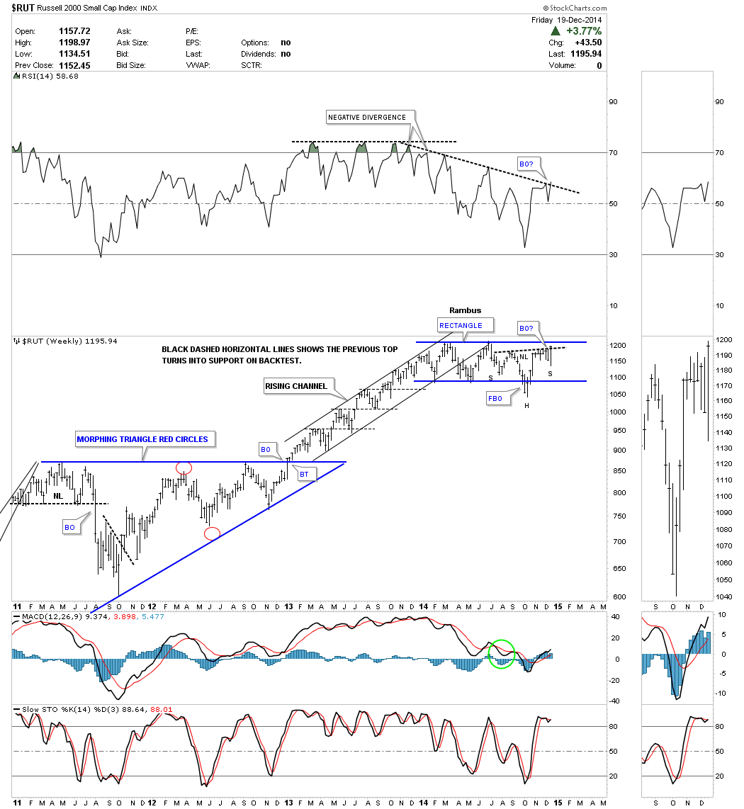
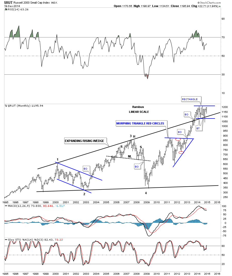
As I’m trying to paint a bullish picture for the short term and the longer term lets look at the monthly chart for the RUT 2000 that has a similar setup to the INDU. This monthly chart shows the RUT breaking above the top rail of its massive expanding rising wedge consolidation pattern and forming that blue rectangle that we just looked at on the chart above. Note how it’s forming right on the top rail of the massive expanding rising wedge. Again this is perfect Chartology. One last note on the monthly chart below. During the October correction the RUT broke below the bottom of the blue rectangle and the top rail of the massive expanding rising wedge, as a false breakout move. It quickly reversed direction and is now trading well above the top black rail which I view as strongly bullish. The bears had their chance but couldn’t capitalize on it. When you look at the chart patterns on this long term chart for the RUT put yourself in a similar spot, just below an important trendline, as shown by the current blue rectangle, to see what took place when the chart pattern broke out. That includes the neckline on the H&S top that broke down. The point is we should expect a very large move that should last at least a year or longer. The timing couldn’t be better for those looking to establish long term positions.
Now I want to show you the meat and potatoes of this Weekend Report by looking at the shorter term charts for the INDU, SPX, NDX and the RUT and what may lie ahead for the very short term. First I consider the rally off of the October correction low as a very important landmark for the breakout move to the next level in the stock markets. If this is the case then we should see some good follow through to the upside.
I’m going to start with the SPX 2 hour chart that has a nice looking bullish expanding falling wedge that found support right where we wanted to see it which tells us we’re on the right track. Many times in a fast move up one can label that move up as a flag pole. The rally off of the October low to the December high would be the flag pole with the blue expanding falling wedge as the flag flying at half mast. If this is truly taking place right now we should see a move that is equal in time and price to the rally off the October low to the December high leaving the blue expanding falling wedge showing up as a halfway pattern. Below is the 2 hour chart for the SPX.
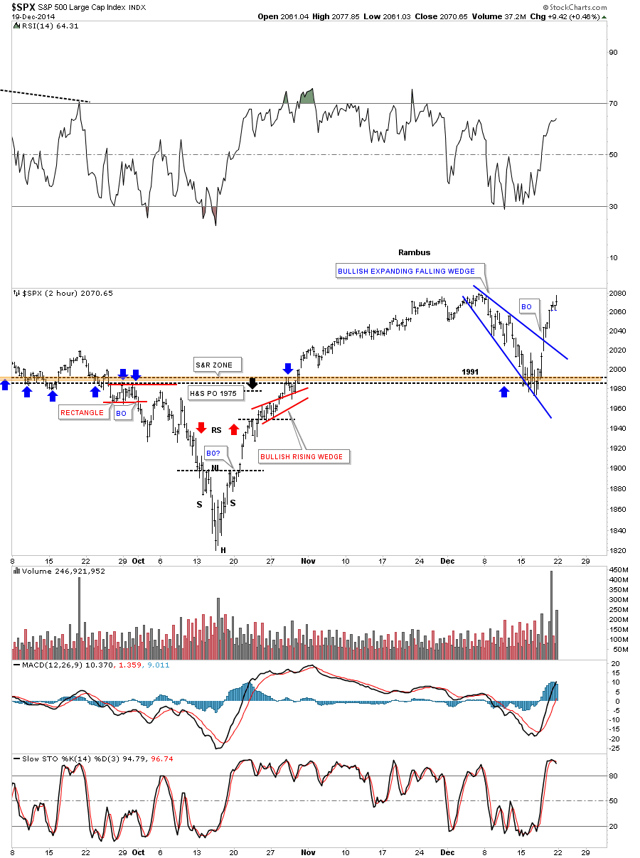
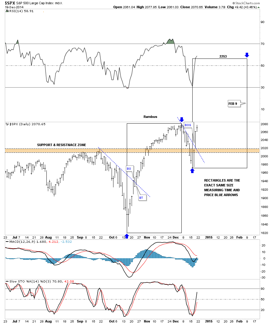
Below is a daily chart for the SPX that shows two black rectangles that measures time and price as shown by the blue arrows which would be using the impulse method of finding our price objective. One thing is for sure. This move will have to start this week and be just as strong as the October to December rally. Anything less would call this potential very bullish setup into question.
Below is a 2 hour chart for the INDU that shows it found support right where we wanted to see it come in and is now reversing symmetry back up. As you can see it’s at a points where we may see a little hesitation before moving higher.
Below is a daily chart for the INDU that shows the possible time and price if this scenario works out.
The 2 hour chart for the NDX 100 threw us a curve ball this past week when it broke below the bottom rail of its falling expanding wedge. Friday it broke back above the top blue rail in a show of strength even though it’s lagging a bit in here. It did find support where it needed to be found at 4100.
The daily chart for the NDX shows it’s just breaking above its S&R line on Friday. The black rectangles shows the time and price objective for the second leg higher if this setup takes place.
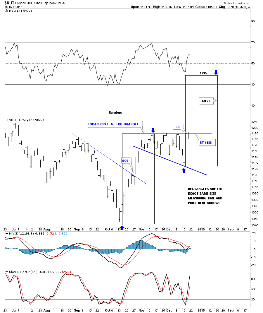
Actually the RUT 2000 is the real reason why I think this potential big rally can take place. As you know the small caps have been under preforming the big caps for awhile now. This daily chart for the RUS shows a 6 point flat top expanding triangle consolidation pattern that broke out on Thursday of last week with a breakout gap. A backtest would come in at the top of the flat top expanding triangle at 1188 or so.
One thing about this trade is we won’t have to wait long to know if this setup is going to work. We should see a similar move off the October low to the December high which is pretty straight up. The first thing we’ll need to see is for the different sectors, we discussed above, to make new highs right away. Any correction should be very short and only show up on the minute charts. What I’m describing here is for the short term. Those big consolidation patterns, that I showed you on the monthly charts above, is where the big money will be made IMHO but it won’t be easy.
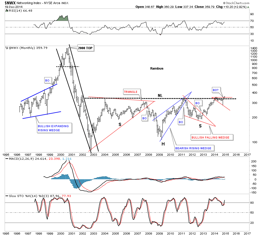
I will show you this week some of the big multi year consolidation patterns that are forming on many individual stocks that made big moves back in the tech bubble that have been laying dormant but are waking up. Below is a sector that has been lagging the rest of the tech sectors but looks like it’s coming to life now. If one is looking for bargains this would be a good place to start looking. Below is a weekly chart for the $NWX, networking stocks, that just broke out of a bullish expanding falling wedge and backtested the top rail this week.
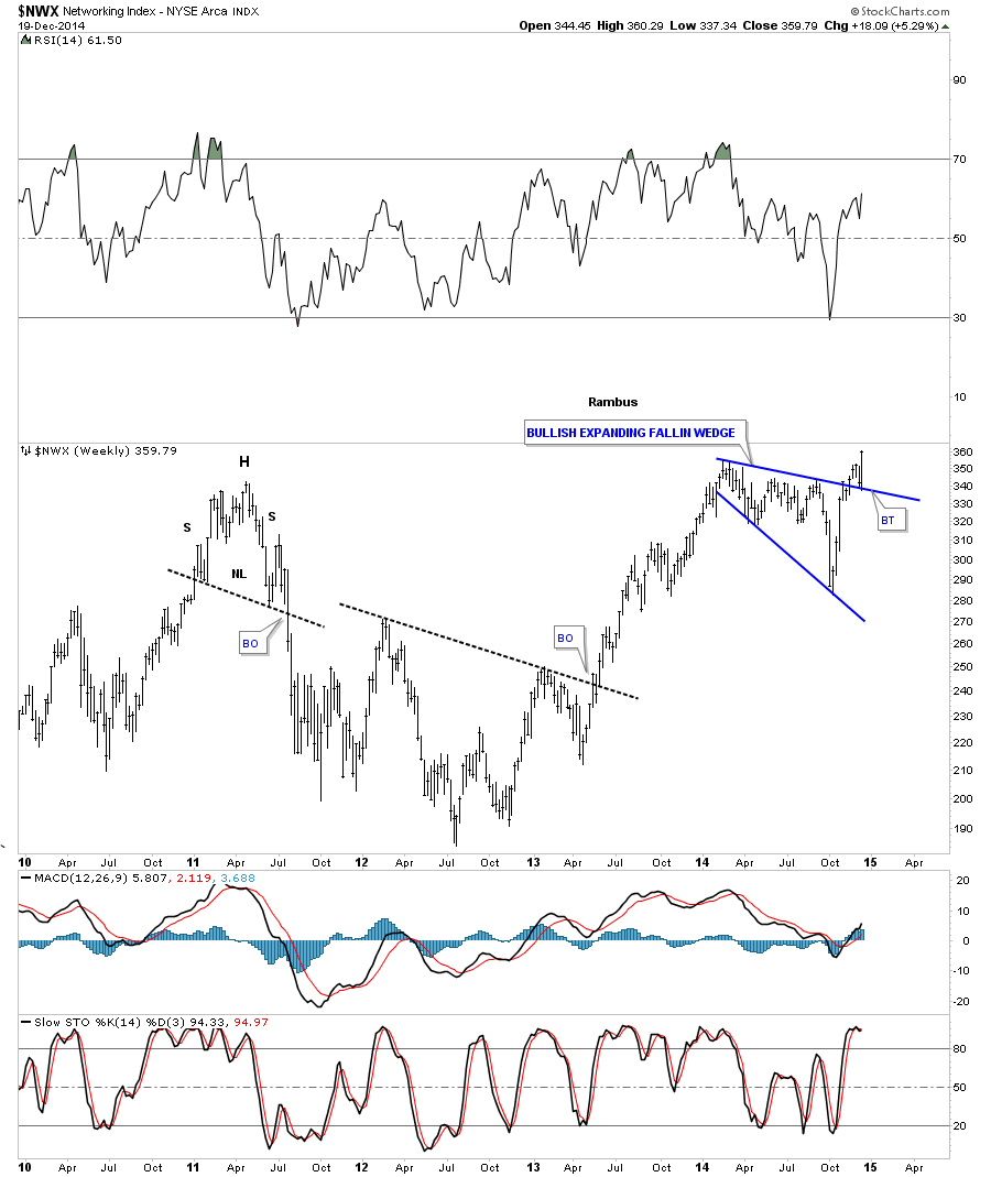
Guess where that bullish expanding falling wedge is located on the long term monthly chart for the NWX? It as formed just below the long term neckline which as I have shown you many times in the past is a bullish setup. It’s taking out two important lines in one shot. Think rotation in tech stocks which will drive the next leg higher in this sector. All the best…Rambus
Precious Metals Stocks : Are We There Yet ?
The Psychology of a Triangle
One can only draw so many lines on a chart before they become completely confused on what trendline is actually important. Many will just start connecting two top points and two bottom points and calling it a pattern. That’s not how you find a chart pattern. A chart pattern shows the fight between the bulls and the bears. Lets use a triangle as an example of the fight between the bulls and the bear in an uptrend.
If the stock is in an uptrend the first reversal point will be when the initial top takes place. This can be on any time frame. Next you need to see the bears take control and drive prices lower creating the first reversal point starting at the top. At some point the bears will run out of gas and the bulls come charging back rallying the price backup to another high that is slightly lower than the first reversal point number one high, before they run out of strength to move the stock higher. Once the lower high is in place you can put a number 2 under the first low inside the triangle.
I always put a 3? with a question mark, at the second high within the triangle, until I can see the bears taking back control and start moving the price lower again. This time the bears couldn’t drive the price below the previous low, at reversal point number two, before the bulls took control again. Once the bull took control I can then take the question mark off of the third reversal point, second high within the triangle. So at this point we have the first reversal point at the first top, the second reversal point at the first bottom, the third reversal point at the second lower high and now we wait for the fourth reversal point to reach the trendline that connects the first and third reversal points. Once that trenline is reached we can now label the fourth reversal point as the second higher low. A breakout of the top rail will then signal the bulls are back in charge in the dominant trend once again. Three things I like to look for on a breakout are in increase in volume, a possible gap or a nice long bar that is bigger than anything around it.
What I described above shows you the fight between the bulls and the bears that was a give and take event. A proper chart pattern needs to show these individual battles moving between the top and bottom rails of whatever pattern is setting up. Many inexperienced chartists will just start connecting tops and bottoms on a chart with no idea of the psychology that is needed to identify a true pattern. It’s the individual swings between the top and bottom trendlines that you need to identity in order to have a true chart pattern. Again just connection two high points and two low points, at random, shows you nothing of importance.
The reason I took this time to explain to you on how to identity the psychological makeup of a chart pattern, is because you’re going to see a ton of them on the precious metals stocks to follow. Chartology is the study of charts and the psychology behind the charts.
……………………………
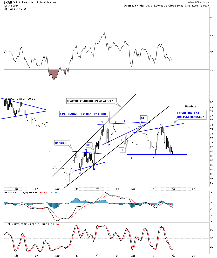
Before we look at the individual precious metals stocks I would like to start out by look at the XAU as a proxy for the rest of the PM stock indexes. This first chart is a 2 hour line chart that shows the correction that has been in place since the PM stocks bottom in early November. Keeping in mind what we discussed above, the first chart pattern shows a blue four point triangle consolidation pattern. Note how the price action transverses between the top and bottom trendlines. That shows how the bulls and the bears each took a shot to dominate this short term trend. As you can see the bulls won the fight when they were able to break above the top rail of the triangle. As the triangle formed in the uptrend the first reversal point had to start at the first high just as I described on the tutorial above. Note the near vertical move off of the fourth reversal point in the blue triangle that accompanied the breakout of the top rail. The bulls were clearly in charge as they were able to rally the XAU all the way up to the first reversal point in the top blue triangle before they ran out of gas. Reversal point number one is where the bulls ran out of gas and the bears took over for awhile. As you can see the triangle, at the top of the chart, shows the battle that ensued between the bulls and the bears with each side winning and loosing ground. The main thing to understand is the individual reversal points within the triangle, from top to bottom and then bottom to top.
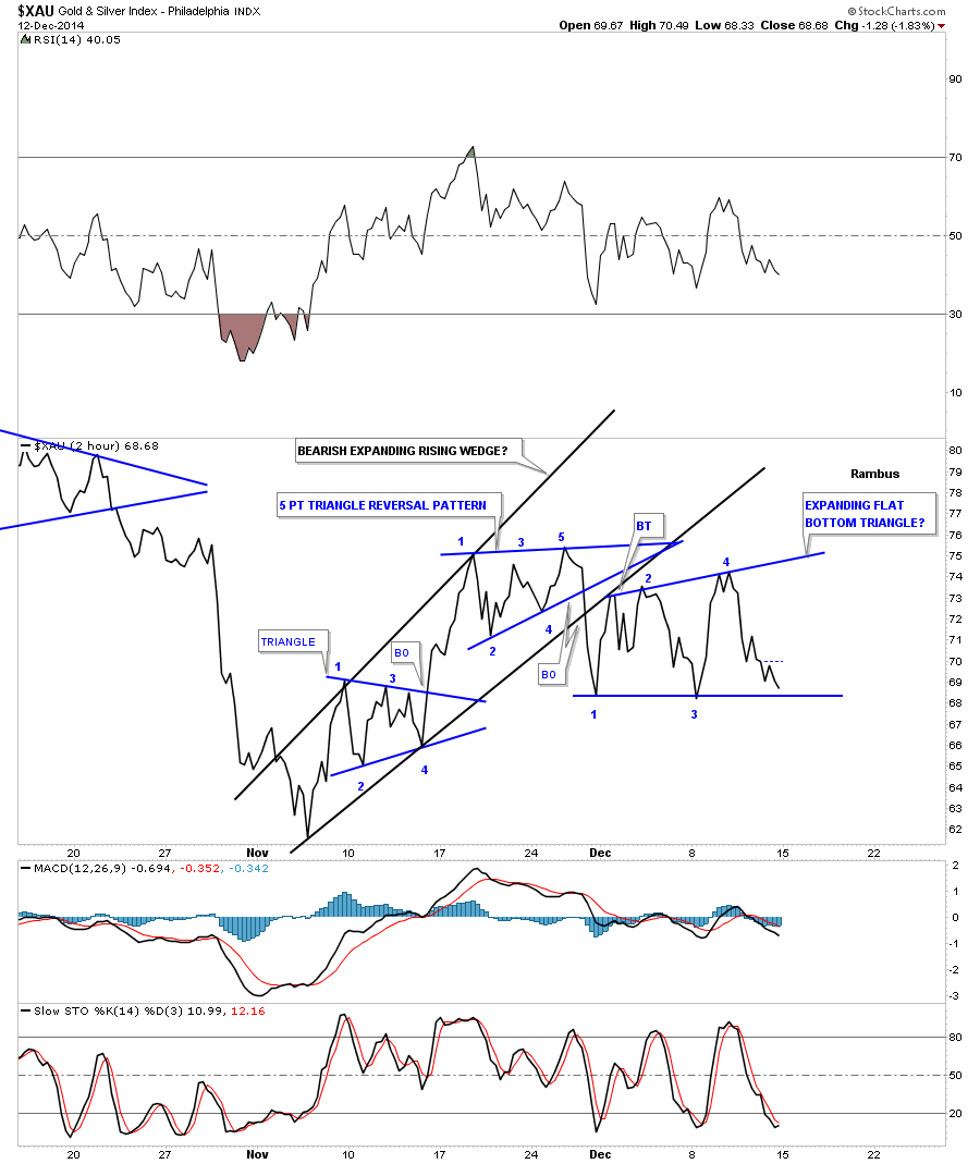
Here’s where it gets interesting. During a consolidation pattern you need to see an even number of reversal points, 4, 6, 8 and so on. A reversal pattern will have an odd number of reversal points such as 3, 5, 7 or more. As you can see the triangle at the top of the chart has 5 reversal points which makes it a reversal pattern that told us the bears were back in charge as the bulls were unable to take out the top rail. Note that the 3rd reversal point doesn’t show the price action reaching the top rail. That’s because this is a line chart which just shows the closing price for this 2 hour time frame. I will post this exact same chart showing a bar chart that does show reversal point number 3 was indeed touched.
So now we have the five point triangle reversal pattern in place, at the top of the chart, which is reversing this small counter trend rally off of the November low. The third chart pattern on this chart is still building out which is taking on the shape of a flat bottom triangle. As you can see it has formed below the blue 5 point triangle reversal pattern and is testing the bottom rail which will complete the 4th reversal point when or if it’s touched. Note in the downtrend, the first reversal point started at the first low. So on the very short term time frame the XAU is in a confirmed downtrend. A break of the bottom rail will set in motion the next move lower to the November low. This next chart is a bar chart which is the exact same chart as the line chart above. I’ve left the trendlines in place, which I showed you on the line chart, so you can see the subtle difference between the two.
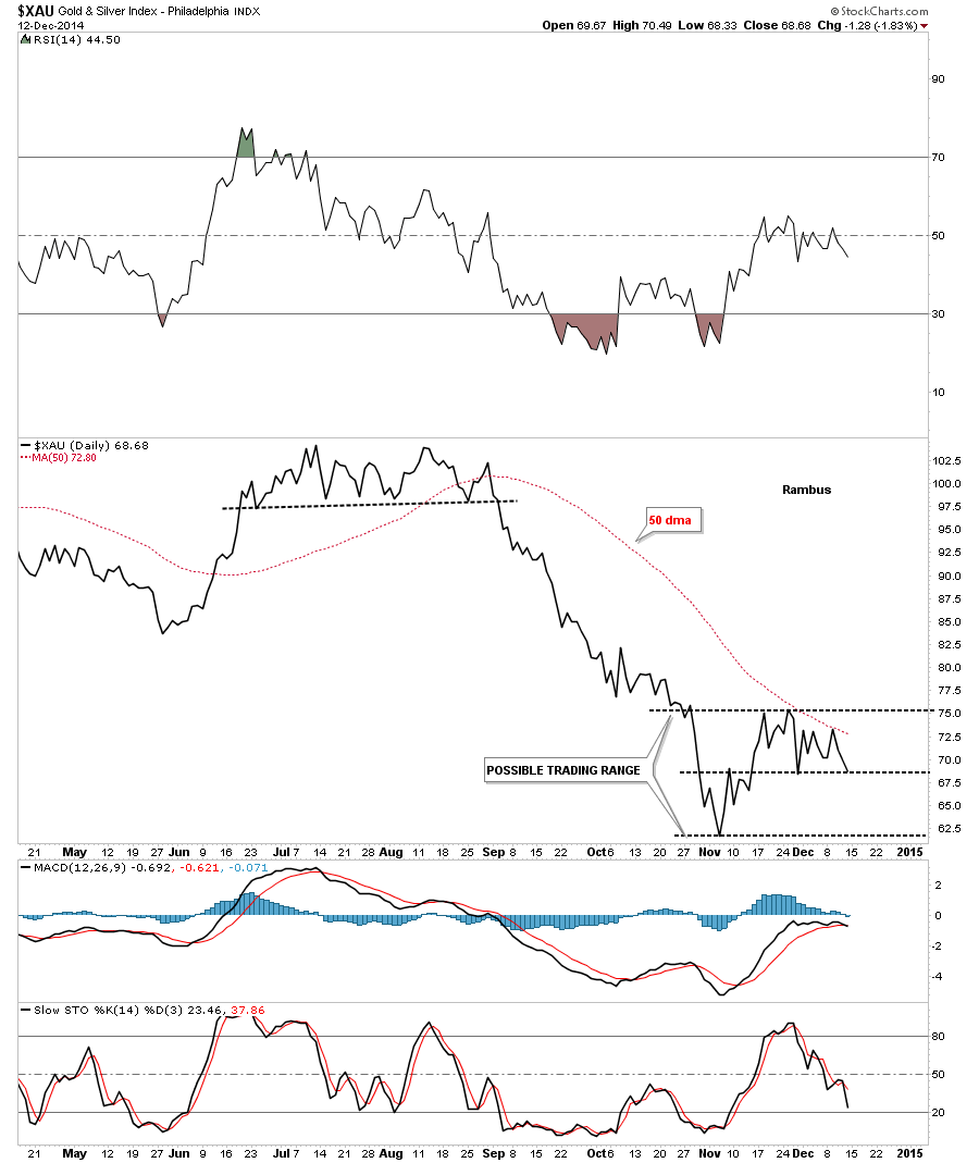
This next chart is a daily line chart that shows the counter trend rally off of the November low. You can see how important that dashed mid line is as it reversed its role, to what had been resistance on the way up, to now holding support on the way down. There is not much support on this chart if the mid dashed line breaks to the downside until the November low is reached. Note the 50 dma has been holding resistance so far.
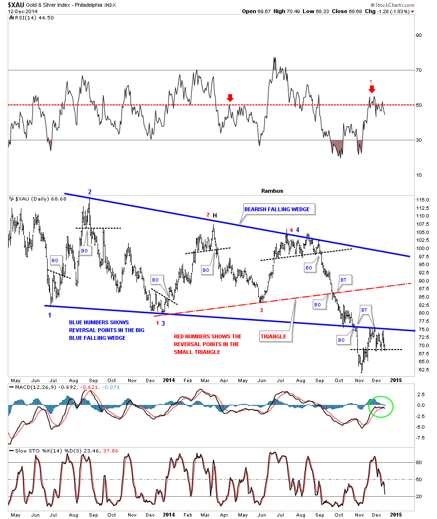
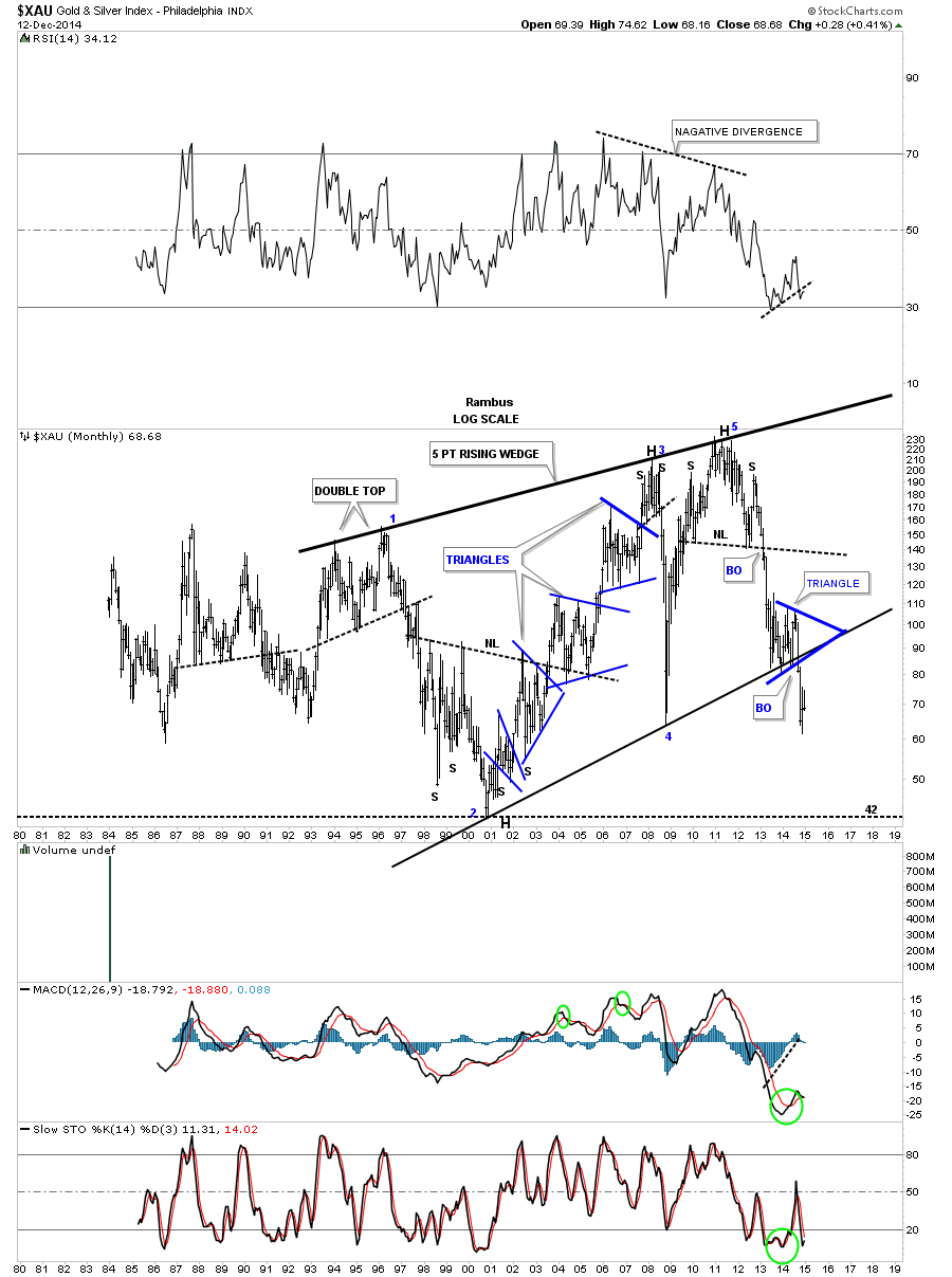
This next long term daily chart for the XAU puts everything in perspective. First notice the big four point blue falling wedge which is labeled with blue numbers and the smaller red triangle labeled with red numbers. The main thing to grasp here is the big patterns are still in play regardless of all the reasons this counter trend rally is the beginning of a new bull market. Note the price action down at the bottom of the blue falling wedge at the breakout point. As you can see the XAU got an initial pop when it hit the bottom blue rail that lasted several weeks. Next came the breakout and our counter trend rally off of the November low which is backtesting the bottom rail of the falling wedge from below. You can see how critically important this backtest is. Note the RSI at the top of the chart which is just above 50 or so that often times signals a top within a downtrend. Also the MACD and histgram are now negative at the bottom of the chart. So if there was ever a place to start the next impulse move down this is as good as any. One last note on this chart below. If you look at the fourth reversal point on the blue falling wedge you can see a small top that formed. When the price Acton broke below that black dashed trendline we were fully invested in the Kamikaze Stocks. That portfolio more than doubled when the November low was hit. However, just this small counter trend rally took away about 90% of those gains in a week or two. I’m just bringing this to your attention so you know how volatile these Kamikaze stocks, such as JDST and DUST are.
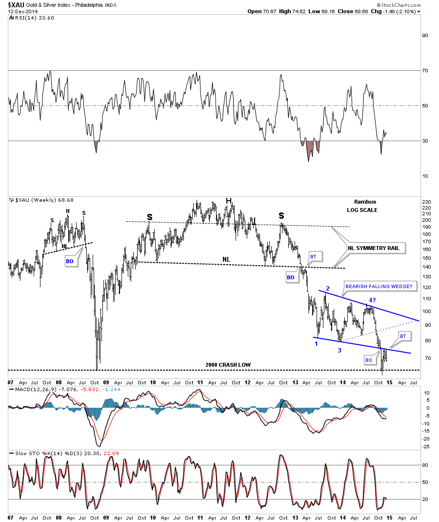
Now lets put the blue falling wedge in perspective by looking at the weekly chart. First notice the beautiful massive H&S top that reversed the bull market. The neckline symmetry rail showed the high for the right shoulder. When the XAU broke below the big neckline you can see it had a quick backtest that told us the neckline was hot and the next impulse move down was gaining strength. We rode most of that big impulse move down when we went short in the first week of December of 2012. On this chart you can also see the smaller H&S top that formed just before the 2008 crash that virtually nobody else seen at the time for which I took a lot of flack from the gold bugs. They wanted my head for blasphemy. The bottom line is, I look at the blue bearish falling wedge and see the breakout and now the backtest which looks like it’s completing. We won’t know until we can look back in hindsight, however it sure looks like this chart is getting ready for the next impulse move down.
The monthly line chart tells a story of its own. On a monthly closing basis it shows the XAU already breaking out of an expanding triangle and on its way lower. When using a line chart note how clearly the inverse H&S bottom that launched the bull market, the 2008 H&S top and the massive multi year H&S top look. They stand out like sore thumbs.
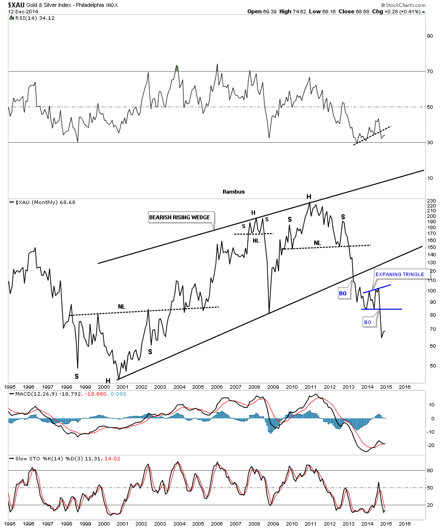
The monthly bar chart for the XAU shows a bearish picture but from a different perspective. This monthly bar chart shows the XAU formed a blue triangle right on the bottom rail of the 5 point bearish rising wedge and then broke out. Note the three blue consolidation patterns that formed during the bull market years. That’s what a bull market looks like. Now compare the price action to the right side of the chart. That’s what a bear market looks like. This chart shows you a good example of how hard it’s to short a bull market and how hard it’s to buy in a bear market. You have to nail the tops and bottoms perfectly in order to capture a profit. I’m not saying it can be done but it’s by a magnitude, much harder going against the main trend. How many have made any real money shorting the stock markets or buying the PM stocks, over the last three years or so, and not giving it all back on the next impulse move.
As investors we always want to see things make sense to us when we invest in the markets. For instance when the US dollar is falling gold and commodities should be rising which is the case most of the time but not always. Recently a lot things we thought should be happening are out of sync with conventional wisdom so when we look at the following precious metals stocks, that make up the PM stock indexes, lets just focus on the chart patterns and what they’re telling us right now, today. We can complicate things to any extreme we desire by looking at so many things that one becomes so confused they don’t know down from up anymore. Keeping it simple and understanding what the charts are saying takes away a lot of unnecessary noise from making a rational decision. Believe me I know how hard it can be at times. As I’ve said many times in the past, we’re playing the toughest game on the planet to win and be successful. We’re playing against the brightest minds and computers in this arena and they want to take every dime you have and don’t care one bit if you go broke. It’s eat or be eaten.
When looking at some of the longer term charts notice the many massive H&S tops and how a lot of PM stocks are testing or have already broken below their 2008 low. There are also some PM stocks that are backtesting below previous support which is turning into resistance now. BO means breakout and BT means backtest.
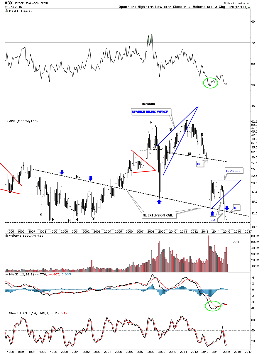
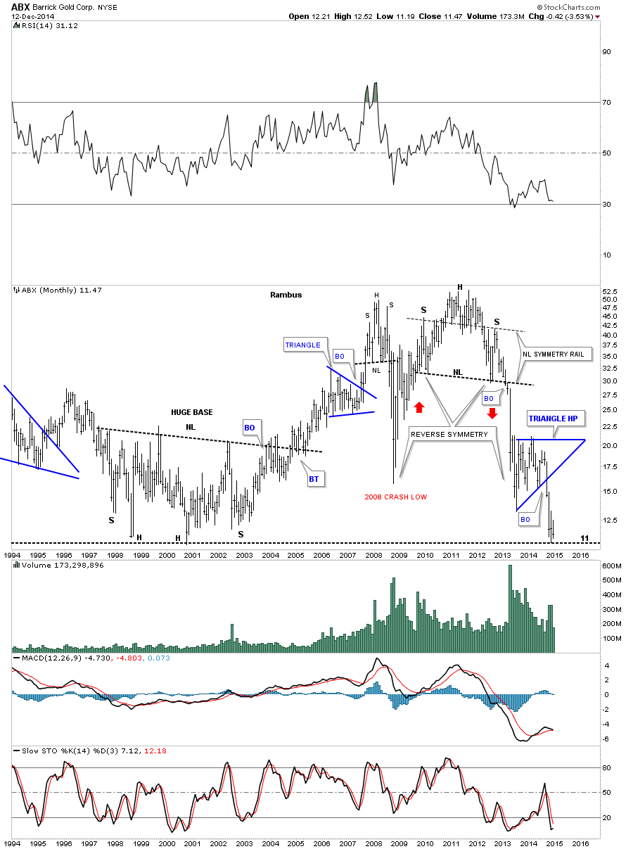
Lets start with one of the big cap PM stocks ABX. This weekly chart shows ABX backtesting the summer low and is beginning to sell off.
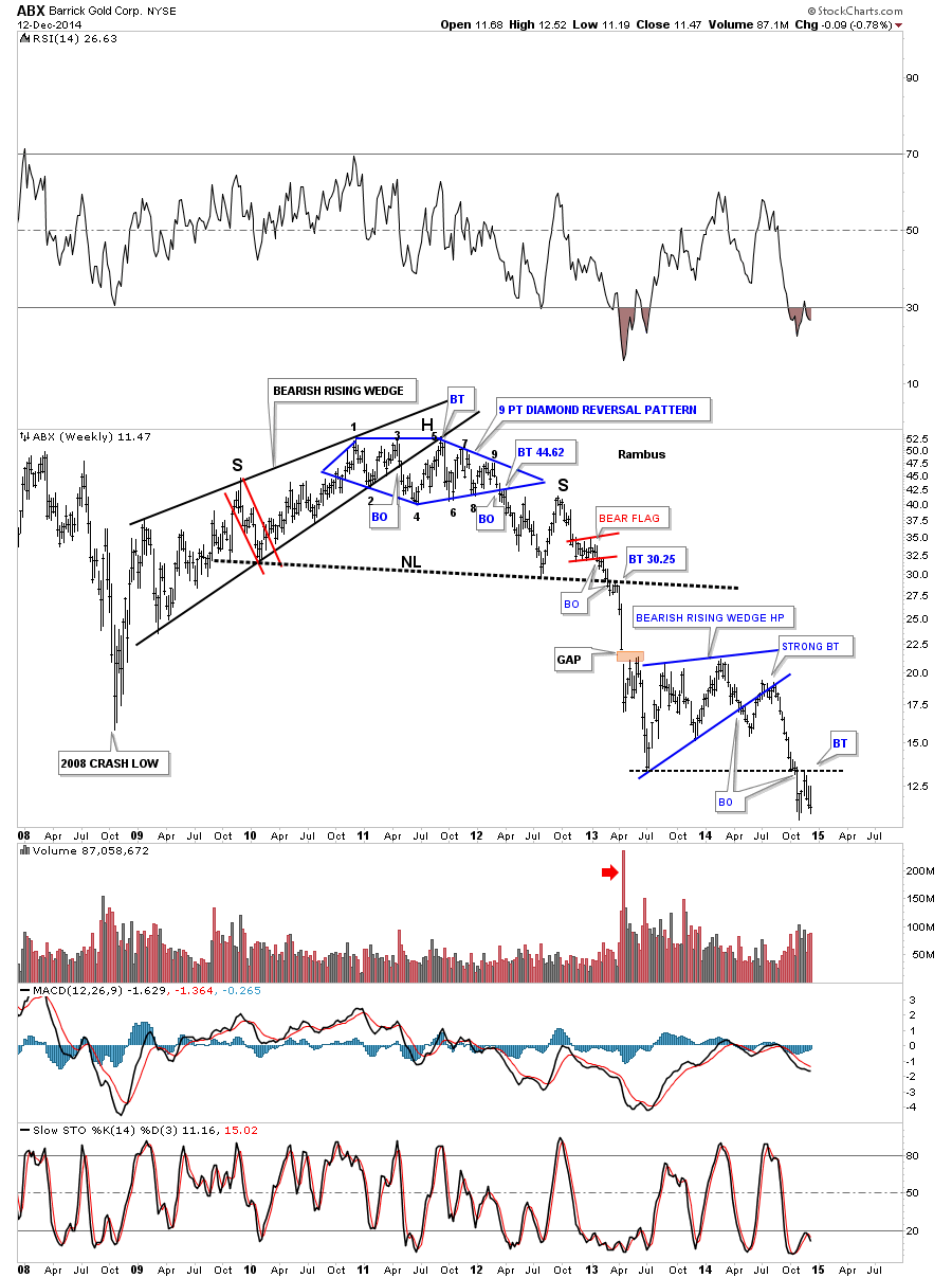
This long term monthly chart shows the neckline extension rail where I’ve extended the neckline from the bear market low in 2000. As you can see it’s still hot right up to last month where it backtested the neckline extension rail from the underside, blue arrows. Note how it’s reversed its role from support to resistance. ABX is also trading way below its 2008 crash low and is testing its all time low. Repeat : All Time Low !
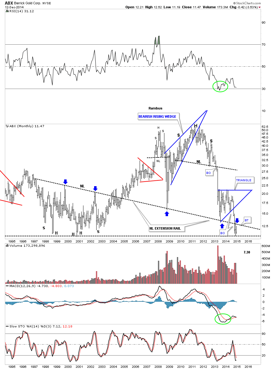
As ABX is one of the giants in the industry lets look at one more monthly chart that shows the blue triangle that I’m viewing as a, HP, halfway pattern to the downside. When this one broke down from the massive H&S top I told members to look for reverse symmetry to the downside as the 2008 rally was so strong it didn’t leave behind much in the way of any consolidation patterns to help stop this bear market decline once it got started.
The weekly chart for AEM shows it recently broke out of the 6 point blue bearish rising flag and has attempted a backtest to the bottom rail. A break below the most recent low would suggest that the backtest is compete and the new impulse down is underway.
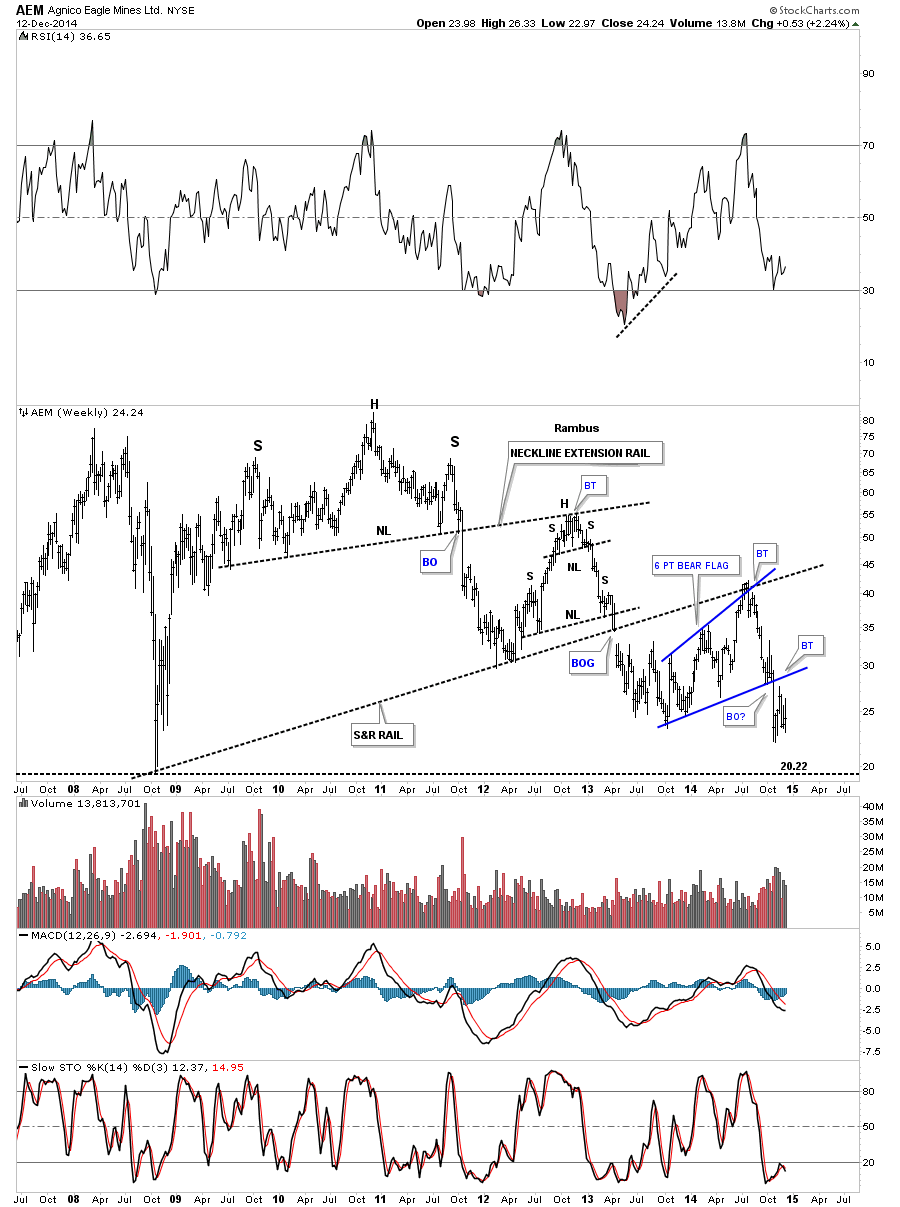
This long term monthly chart for AEM shows its entire history with our current red bear flag just hanging below the black dashed support and resistance line as the backtest. Note how similar the price action is to when AEM backtested the neckline of its H&S top.

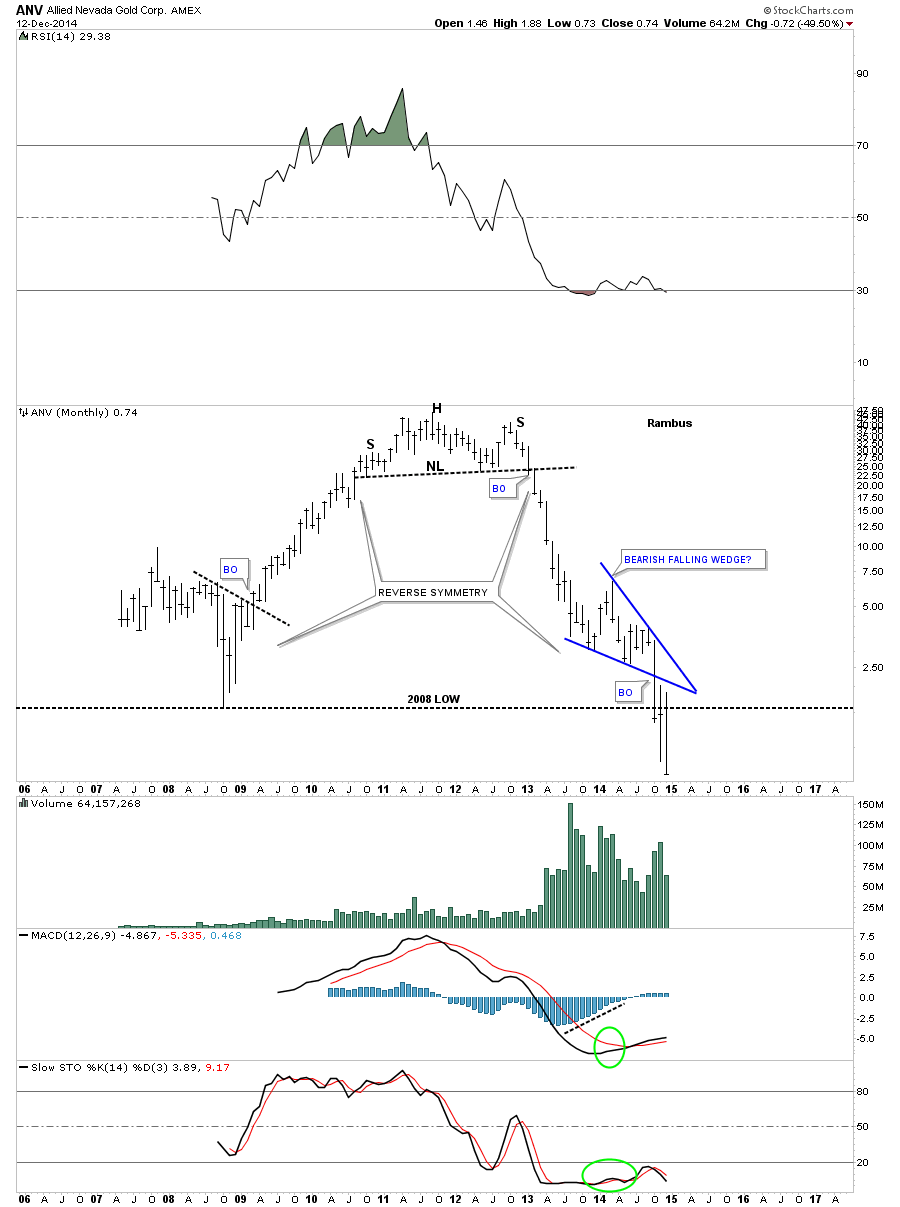
The weekly chart for ANV shows the massive H&S top that has led to the most recent low. If one was aware of that big H&S top they would have saved themselves a lot of pain in this popular PM stock. Note the most recent blue expanding triangle consolidation pattern that has formed at the 2008 crash low. It completed a breakout and backtest before the bottom fell out. Try to be unemotional about this if you recently bought this stock thinking it could not possibly go any lower . Well It did and you can’t .
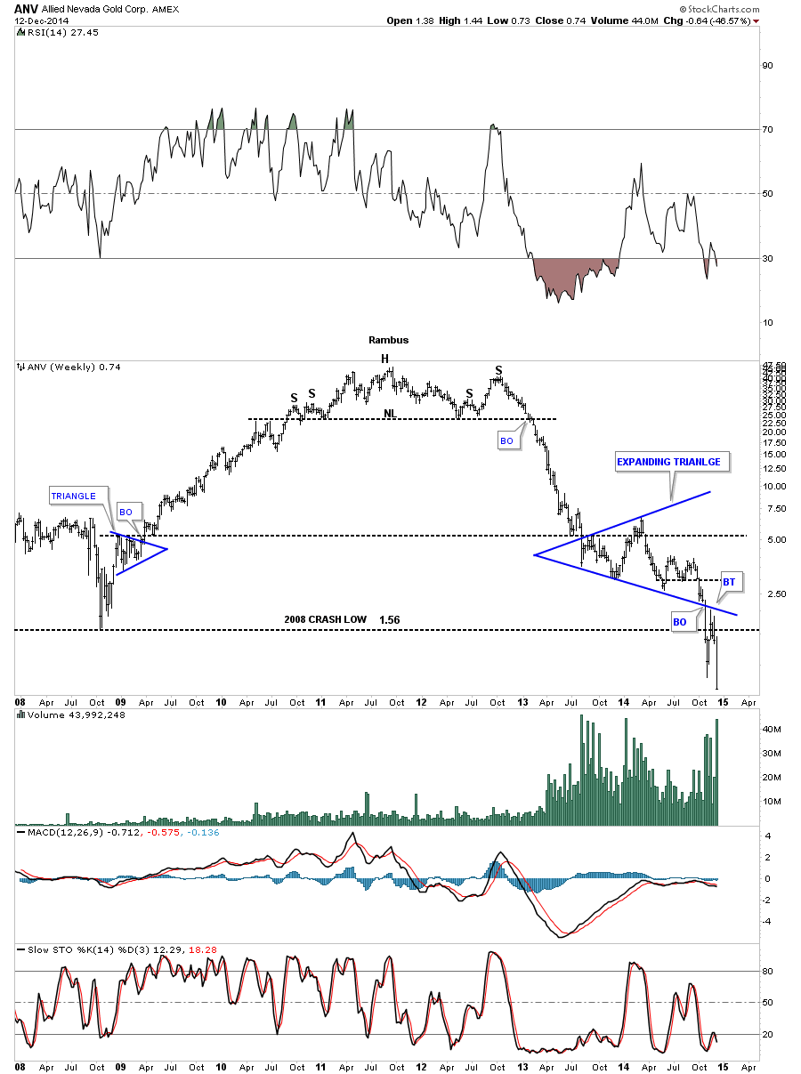
The monthly chart for ANV shows you one of those bearish falling wedges that tend to show up in strong impulse moves on any time frame. It showed some very nice reverse symmetry to how it went up and how it came back down.
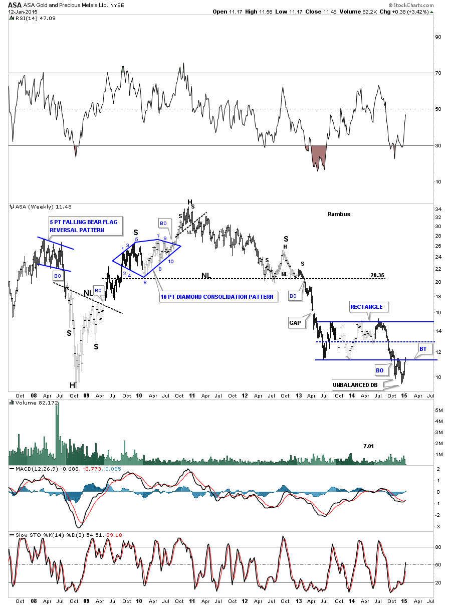
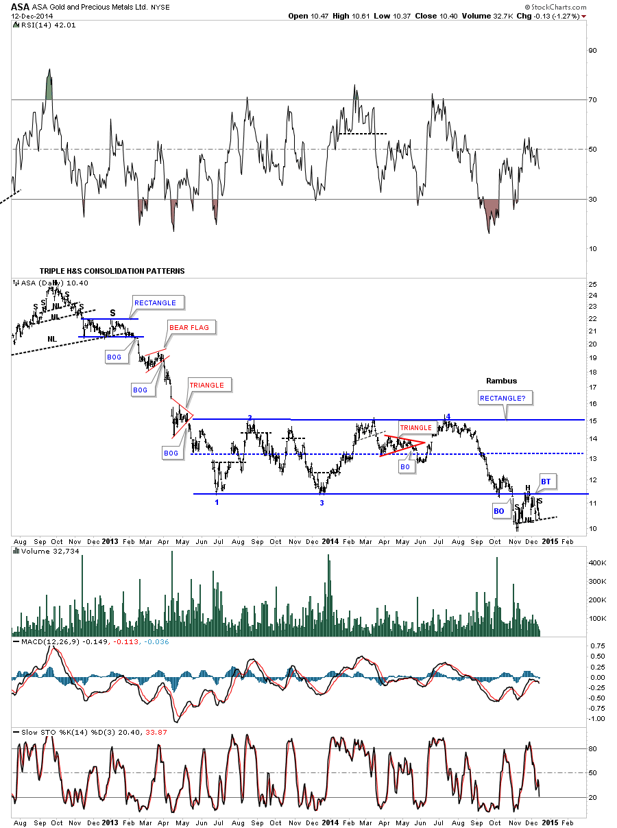
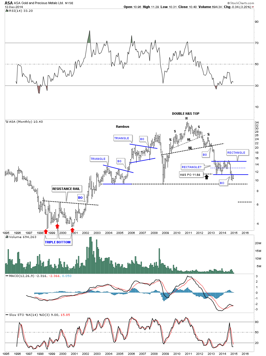
One thing I like about trading the PM stocks is that it’s a small enough universe in which you get to know all the stocks almost on a personal level. I like to watch the ones that have a nice clean chart pattern, that has developed, which helps in understanding how the PM stocks on a whole may move. This daily chart for ASA shows it has been building out a beautiful rectangle consolidation for over a year and a half. I have shown this chart many times before the break in late October. The backtest to the bottom rail looks like a H&S consolidation pattern pointing to new lows if the little neckline gives way.
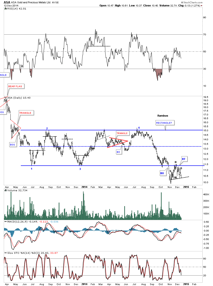
I’ve extended the left side of the chart out in time so you could see what a real impulse move down looks like. After putting in a triple H&S top you can see a series of smaller red consolidation patterns that formed during the big impulse move down in 2013. Think of the big blue rectangle as a halfway pattern between the triple H&S top to the next major low. If the backtest is finished then ASA is close to duplicating the last impulse move down as shown on the chart below.
This weekly chart for ASA is interesting because it shows the multi year expanding downtrend channel that broke below the bottom rail. The backtest is what set into motion the second reversal point in the blue rectangle. Note how the bottom black rail, of the expanding downtrend channel, reversed its role several times from support to resistance and most recently back to resistance where the bottom of the blue rectangle intersect as the backtest for both important trendlines. If ASA can trade above those two intersecting trendlines then the bulls will be back in charge. Until that happens the trend is down. That area shows a nice clean line in the sand.
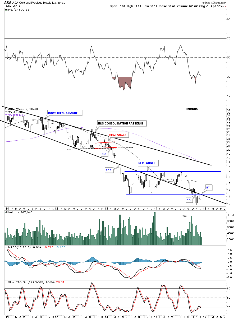
As always the monthly chart puts everything into perspective. As you can see ASA’s bull market top ended with a double H&S top reversal pattern with the blue rectangle, which I’m viewing as a halfway pattern, from the breakout of the H&S top.
Editors Note : Rambus Provided 20 more Charts of Major and Junior Miners for subscribers which have been left out for expedience
…………………………………………………………….
I’m going skip on down and show you one last stock that I know a lot of folks are interested in. Below is a weekly chart for SLW that shows it just breaking out of a blue triangle consolidation pattern and is backtest mode. This blue triangle sits inside a much bigger pattern an expanding falling wedge.
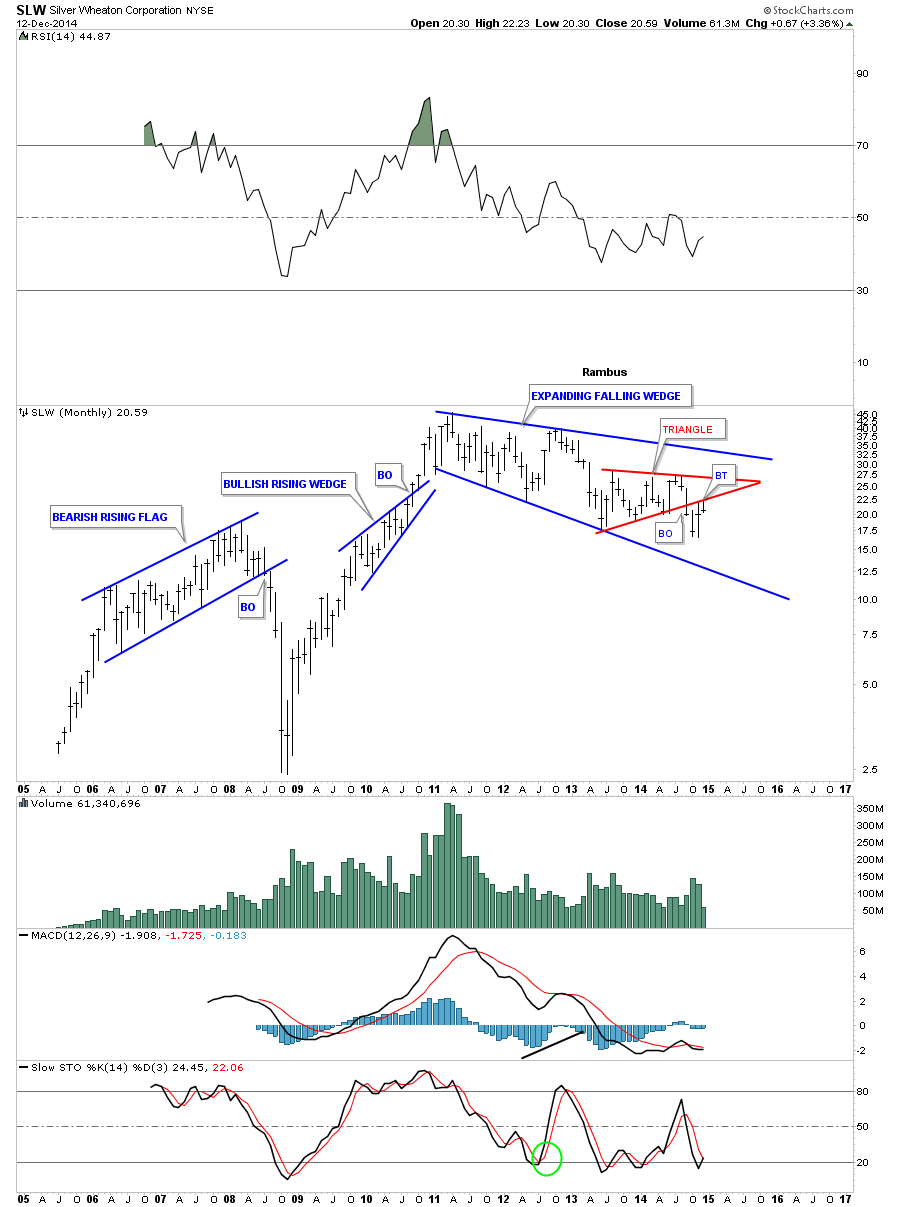
This monthly chart for SLW shows its entire history. I’ll let you decide if this looks like a place to backup the truck or get on the train before it leaves the station. I hope these charts make it abundantly clear to you that the bear market is still in full force and buying the dips may still be hazardous to your health which many a gold bug will shortly find out. There are still a few big caps I haven shown you in this report but these are the bulk of big cap stocks that make up the PM stock indexes. This is where the truth lies IMHO. It’s not in the price of gold or the US dollar or any other fundamentals you want to throw at the gold stocks. Whatever the real reason is it’s showing up in the price action of all these charts. The time is coming, but the answer to the question “Are we there yet ? ” is still No .
All the best…Rambus
Some Follow Through In the Commodity Sector Today
Below are a few charts from the Weekend Report that are still following through with their impulse moves out of their bearish falling wedges or flags.
CRB daily:
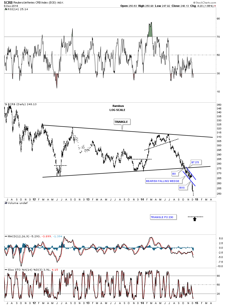
CRB weekly:
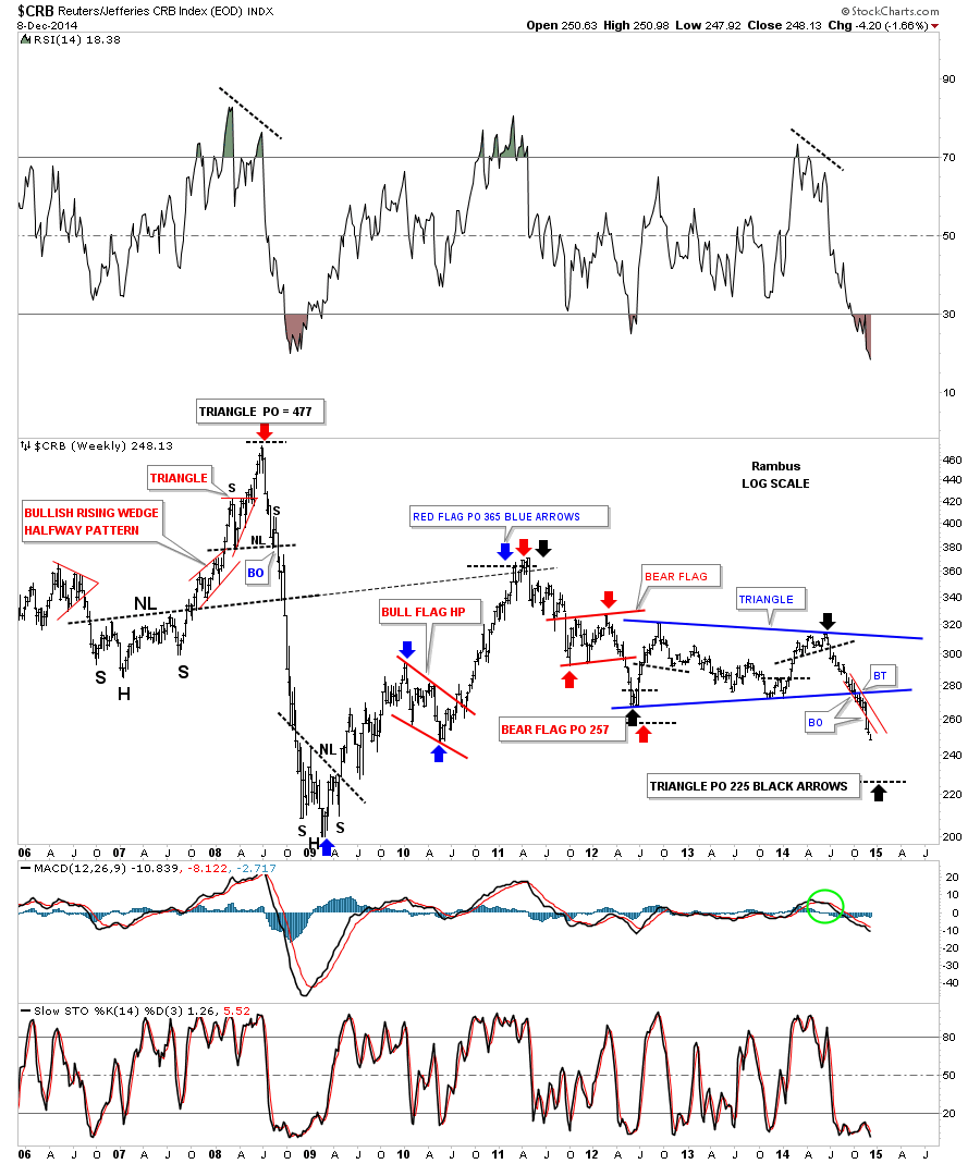
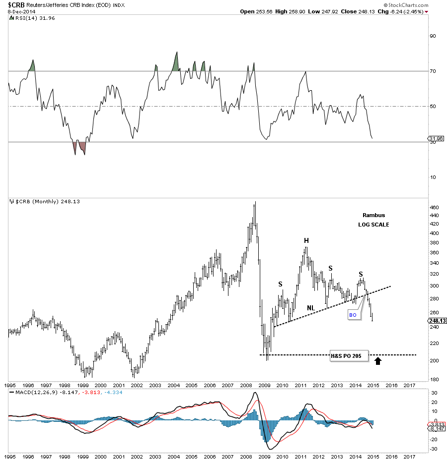
CRB monthly:
GNX day:
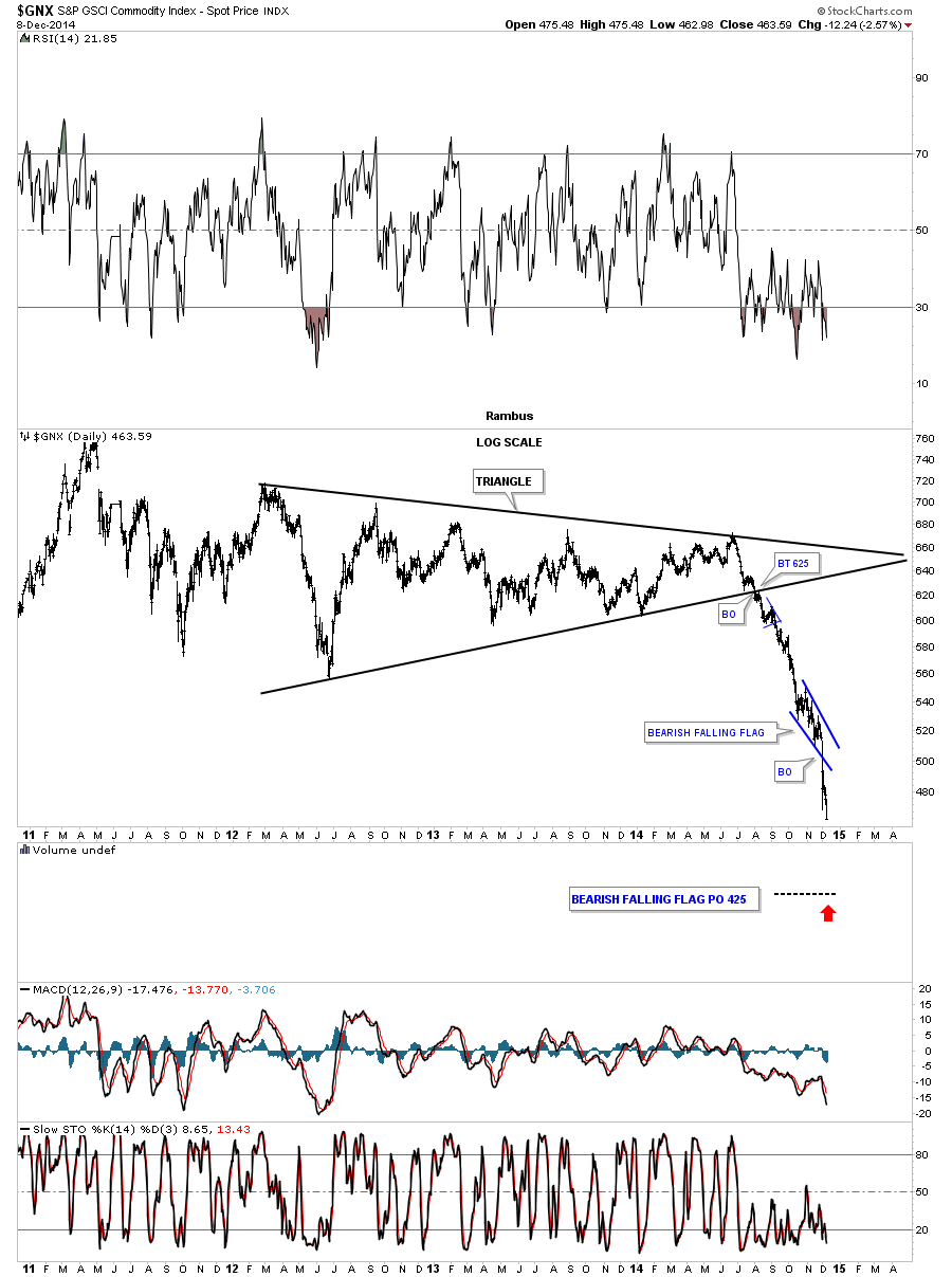
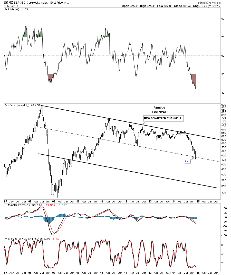
GNX weekly possible new downtrend channel.
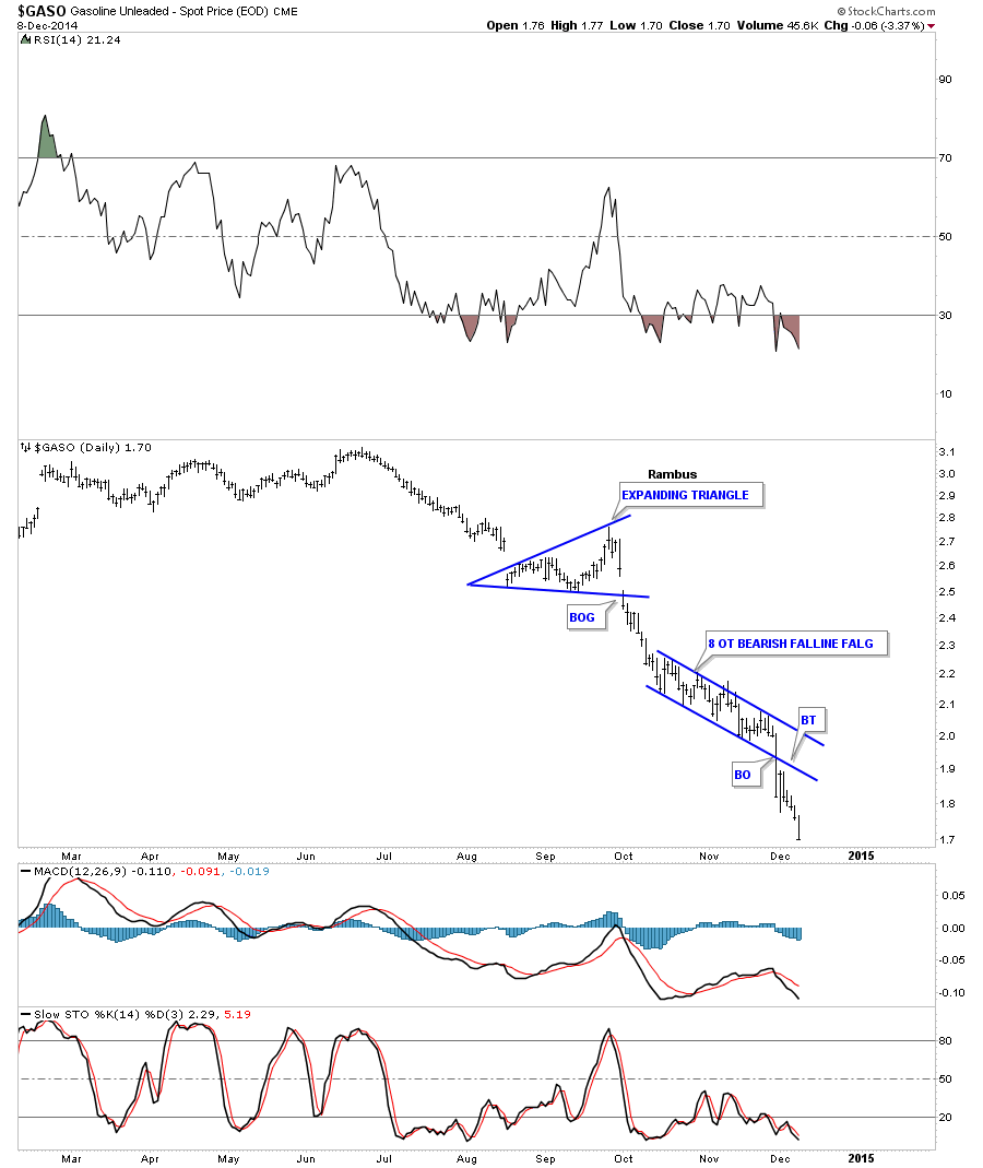
GASO day:
GASO monthly:
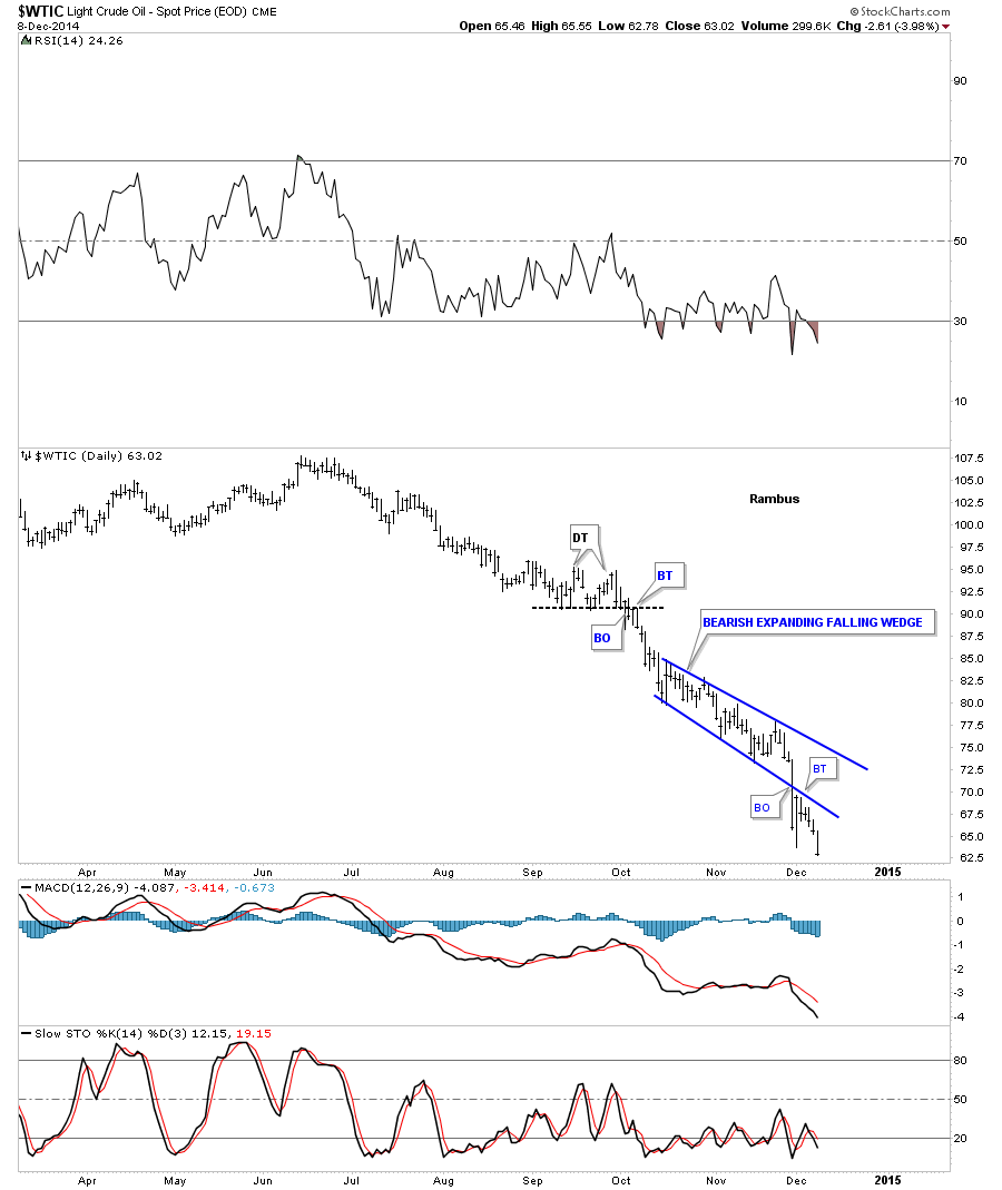
Oil day:
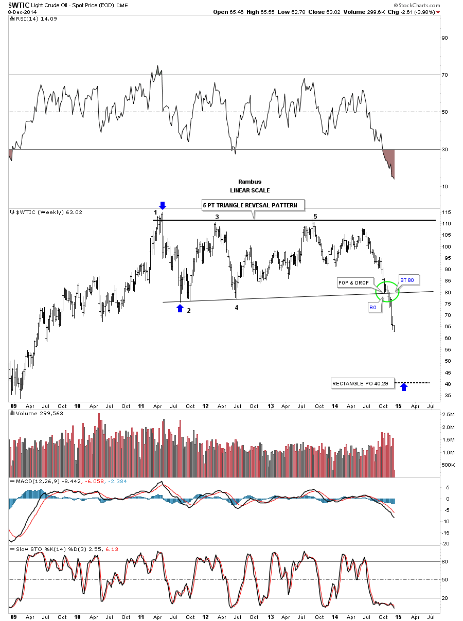
Oil weekly:
Natural Gas weekly closed right on the neckline.
Natural Gas monthly:
UUP daily. Most currencies held their ground today.