This content is for Yearly and Monthly members only.
Subscribe
Subscribe
Already a member? Log in here

We’ve been looking at massive H&S patterns in the last two reports I’ve posted so you can get a feel for the bigger picture which is so important to grasp. It’s always much easier to make money trading within the big trend. For instance if you’ve been trading the precious metals stocks over the last 3 years or so you have had a strong headwind blowing against your trades making it very difficult to make a decent profit and then hold on to those profits. If you’re a short term trader and can catch the little swings up and down you at least have a chance but that to is very hard to do constantly. Knowing the direction of the big trend can bail an investor out if his timing is off but if you trade against the trend and your timing is off then you will pay dearly as the markets can be unforgiving.
As I promised you in the Weekend Report, tonight we’ll look at some massive H&S tops that are showing up on some of the major currencies from around the world. When looking at some of the charts keep in mind how they will affect the US dollar. These charts will have a direct impact on the long term direction for the US dollar regardless of why the dollar has to crash and burn.
Lets start with the Canadian Dollar that is showing a smaller H&S top on the daily chart.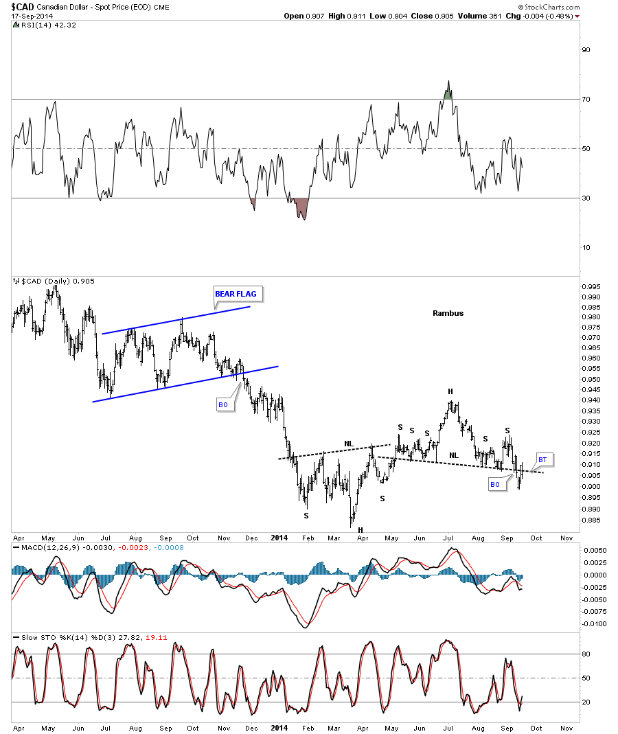
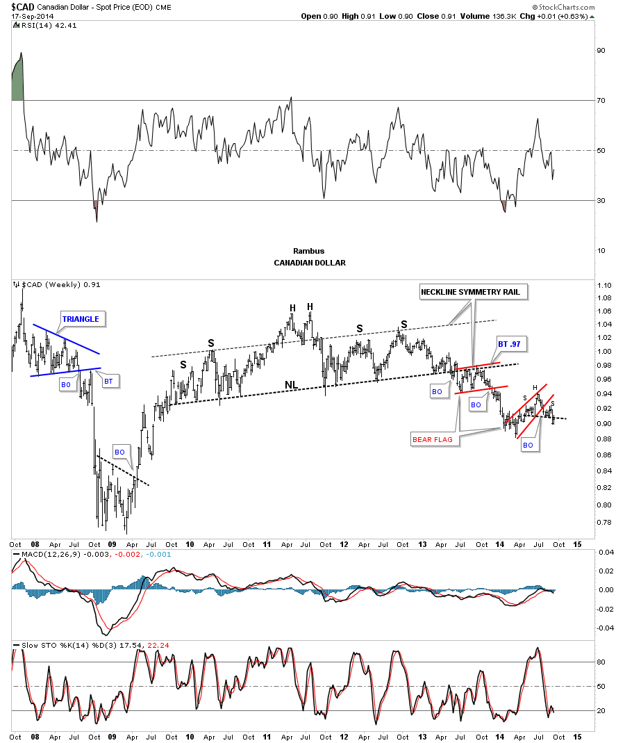
We’ve been following this long term weekly chart for the Canadian Dollar since it broke below the massive H&S neckline in the middle of last year. The breakout took its sweet ole time forming a bear flag just below the neckline which was telling us the bearish setup was in place. Since the breakout of that massive H&S top the Canadian Dollar has now formed its second red bear flag that broke out to the downside two months ago and is starting an impulse move lower. You can see the little H&S top that formed at the high of the lower red bear flag that I showed you on the chart above.
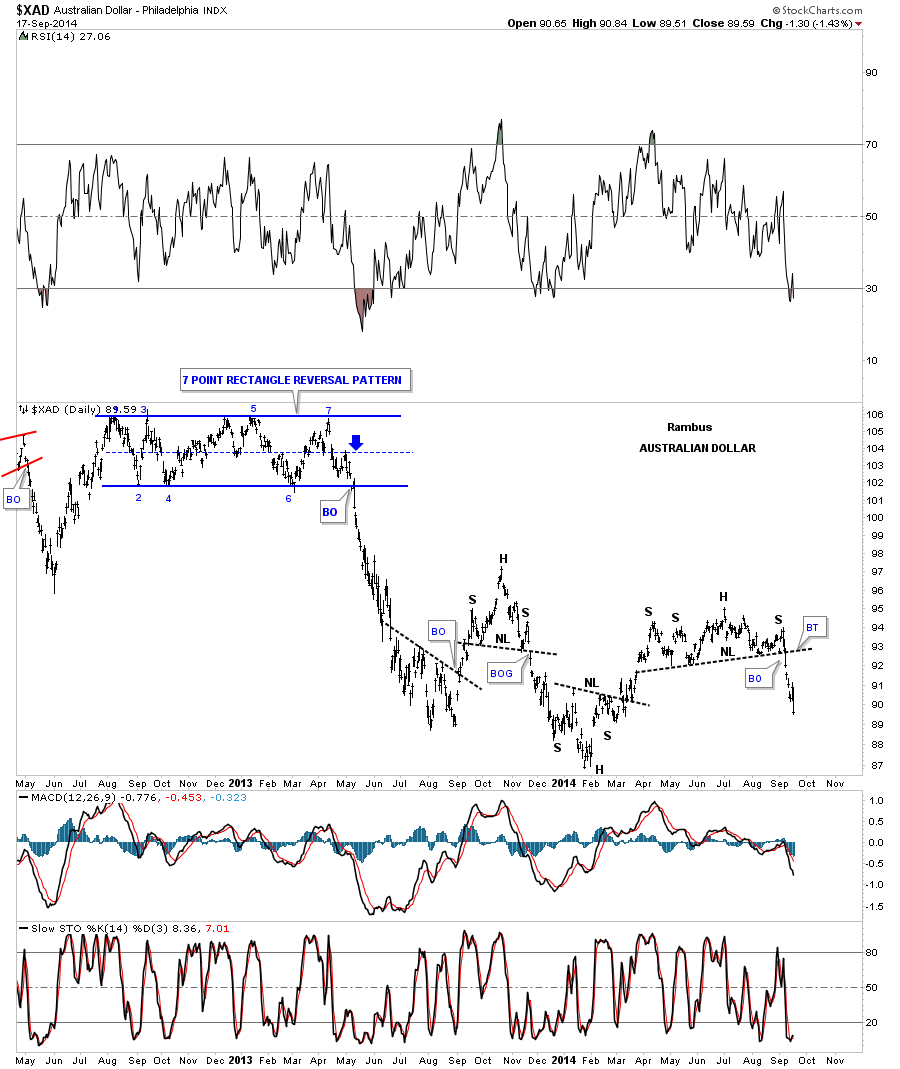
The Australian Dollar looks an awful lot like the Canadian dollar on the daily and long term weekly charts. The daily chart shows XAD breaking down out of a H&S top last week.
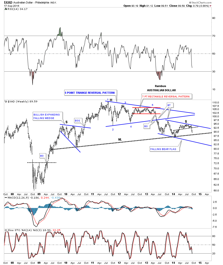
The long term weekly chart for XAD shows some really nice Chartology. The head portion was made up of the blue five point triangle reversal pattern that finished up with a seven point red rectangle. Remember an odd number of reversal points equals a reversal pattern and an even number of reversal points equals a consolidation pattern. The left shoulder was made up of the blue expanding falling wedge while the right shoulder is being made up of the blue falling flag. The neckline is still unbroken to the downside yet but the price action is closing in on it. As I have mentioned before these big patterns will take a long time to reverse the downtrend that is being put in place.
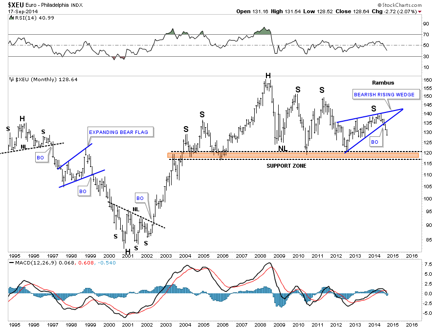
The long term monthly chart for the euro shows a massive H&S top forming. It’s not one of the prettiest H&S tops I’ve ever seen but all the pieces are in place suggesting that at a minimum the breakout of the blue rising wedge, which is creating the right shoulder, should take the price down to the brown shade support and resistance zone. From that point we’ll have to see what develops.
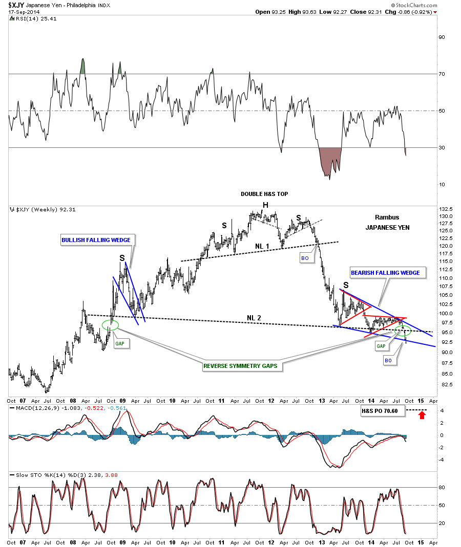
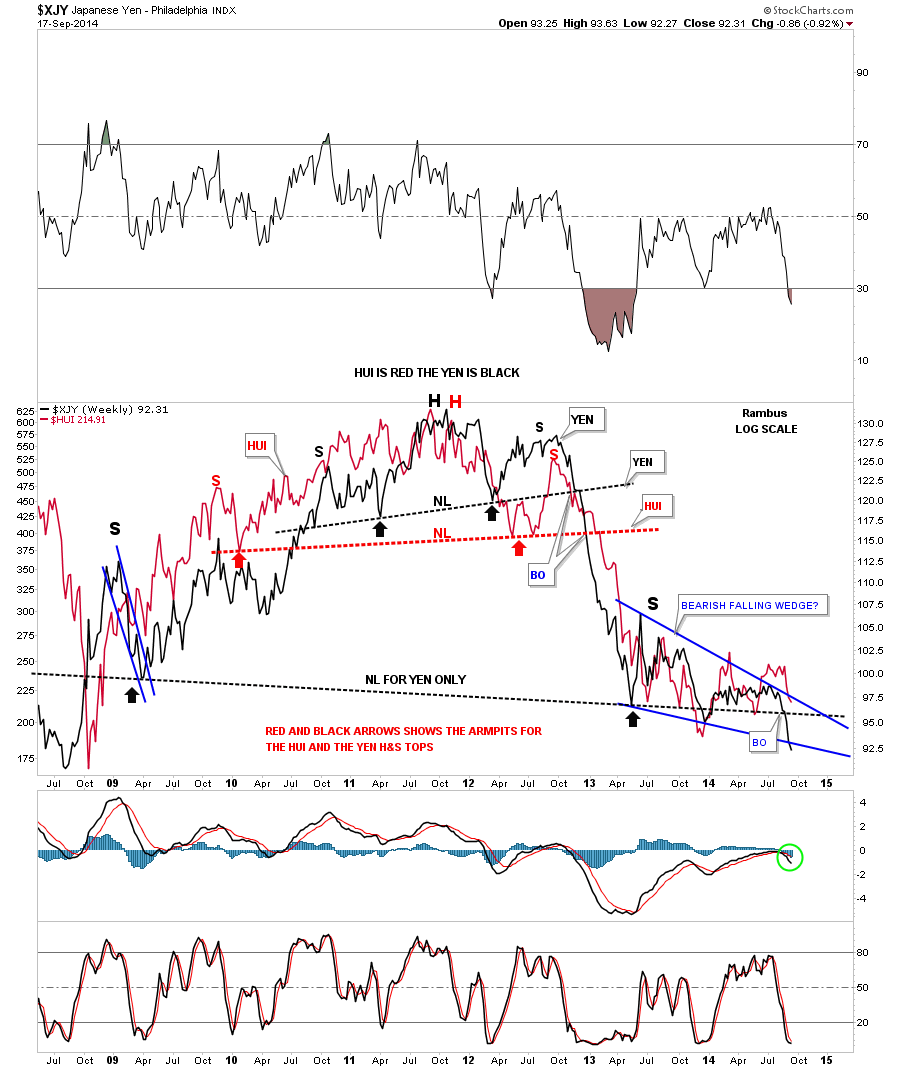
If you’re a goldbug this next chart for the Japaneses Yen should make you stand up and take notice. There are a thousand fundamental reasons why gold should be going up but the XJY is telling you the truth in which I’ll show you in a minute. I first posted this long term weekly chart for the yen when the much smaller H&S top, that is forming the head portion of the massive H&S top, broke out. Note the almost vertical decline once the energy was released to the downside. The right shoulder is a nice piece of Chartology as it shows the two red triangles that are creating a much bigger blue bearish falling wedge. Today the XJY broke below the bottom rail of the blue bearish falling wedge signaling the impulse move is just beginning. One last note on reverse symmetry. Note the green circle on the left hand side of the chart. It matches perfectly to the green circle on the right hand side of the chart that shows you the breakout of that massive H&S top neckline. It just doesn’t get an prettier.
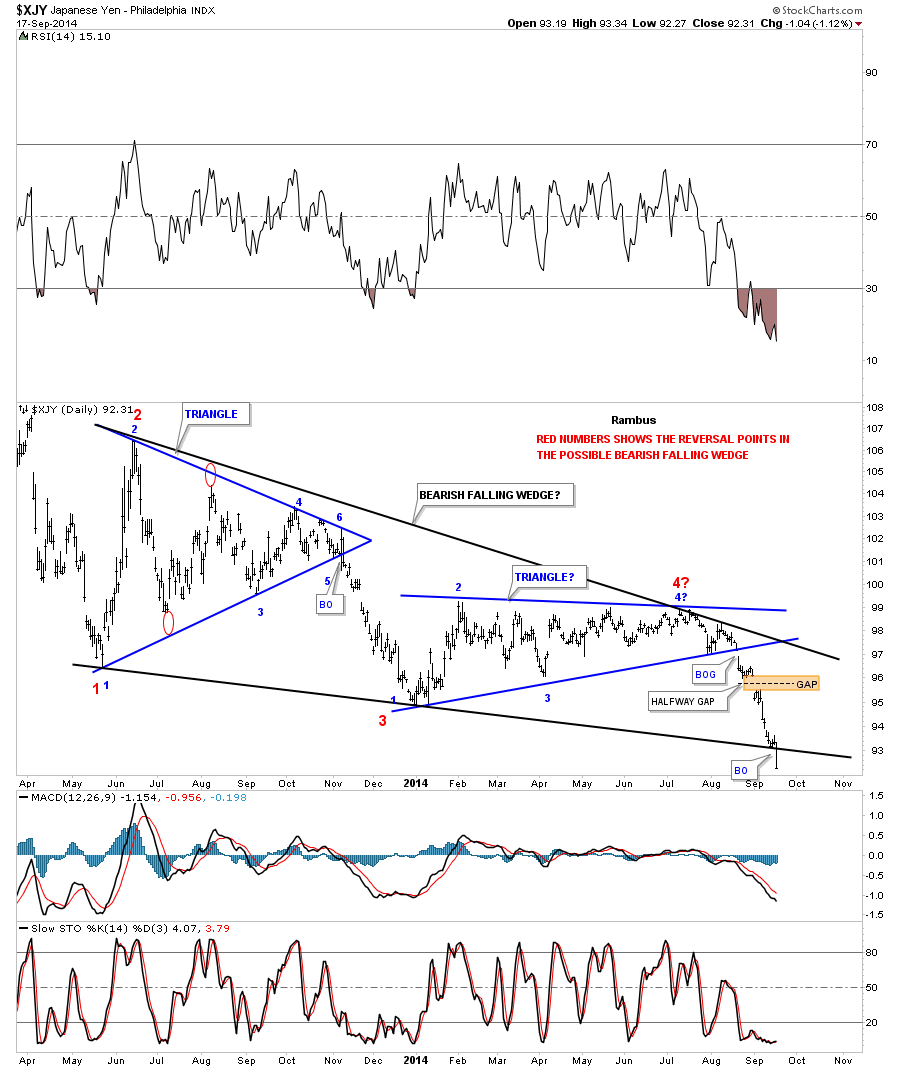
Below is a daily chart for the XJY that shows the bearish falling wedge in more detail with today’s breakout.
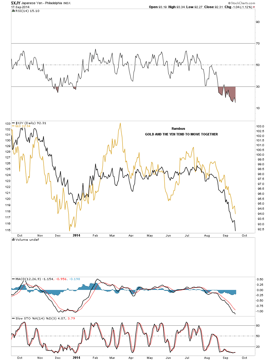
This next daily chart for the yen I’ve overlaid gold on top so you can see the near perfect correlation of the two. I’ll leave it up to the fundamentalist out there to come up with why this correlation is so strong. From a Chartology perspective I don’t need a reason why only that it is happening and that’s whats most important. Following the price action.
This next chart I’ve overlaid the HUI on top of the XJY that shows a similar correlation that gold has with the yen. Here you can see the massive H&S top that both the yen and the HUI made before they broke down below their respective necklines. The correlation is close enough that I wouldn’t want to bet against it.
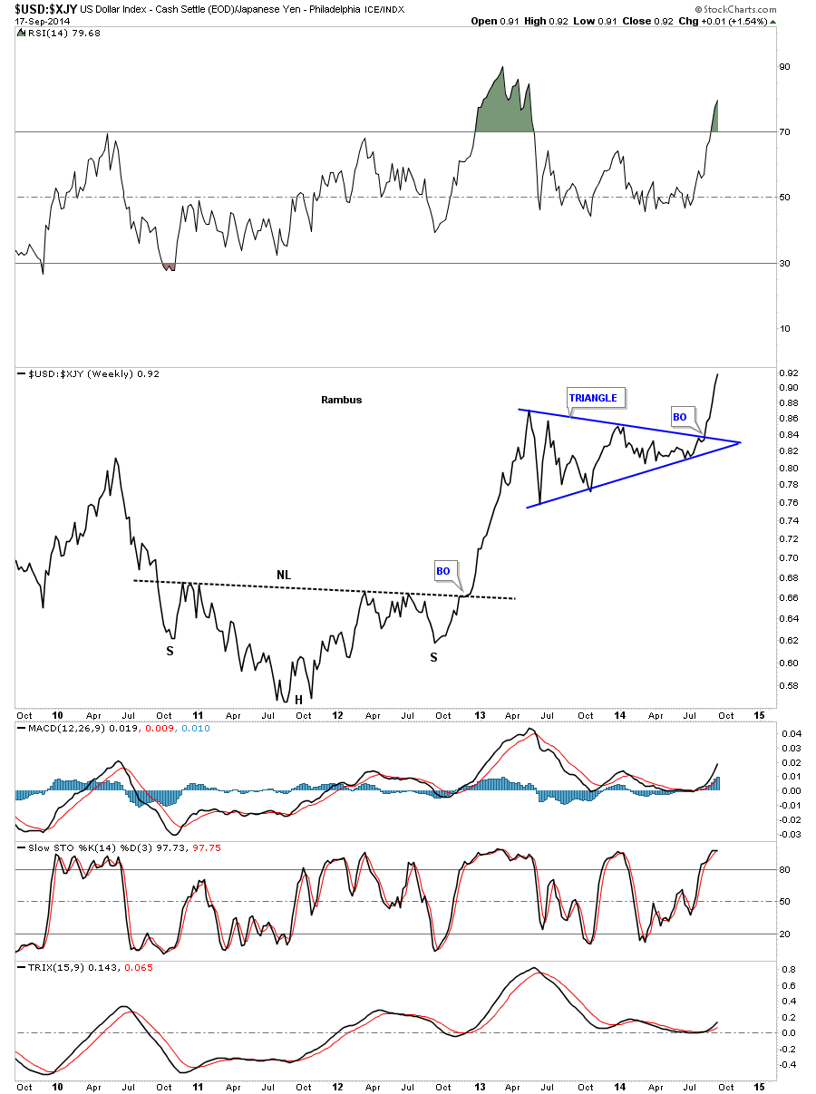
While we’re on the Japaneses Yen I would like to show you a ratio chart that compares the US dollar to the Yen. On the chart below is a long term weekly look that shows a massive inverse H&S bottom with a near vertical move once the breakout occurred. After a pause to refresh, blue triangle, this ratio chart is in another near vertical move up showing how much stronger the US dollar is compared to the Yen. So we have gold and the HUI following the yen lower while the US dollar is going strongly in the opposite direction which isn’t a good sign for the commodities or precious metals complex.
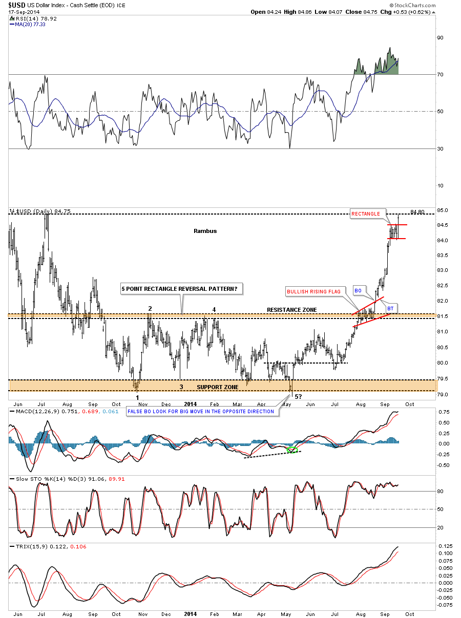
All the different currencies have a direct impact on the US dollar so lets see how the US dollar looks vs the different currencies. This first chart is a daily look that shows the beginning of the impulse move up for the the US dollar. As you can see the move started after the US dollar broke out of the five point rectangle reversal patten and hasn’t looked back. There is no question that the US dollar is overbought and is trading back at its most recent highs. In fast moving conditions, like the US dollar finds itself in right now, it can form one small flag type consolidation, one after the other, until it’s time for a bigger correction. You can see the first little red consolidation pattern, the red bullish rising flag, that formed on the top rail of the five point rectangle. Notice the vertical move out of that pattern that is called a flag pole. Today the US dollar just broke out of a small rectangle which might very well be another halfway pattern to the upside with a vertical move to follow that is similar in nature to the one leading up into the red rectangle.
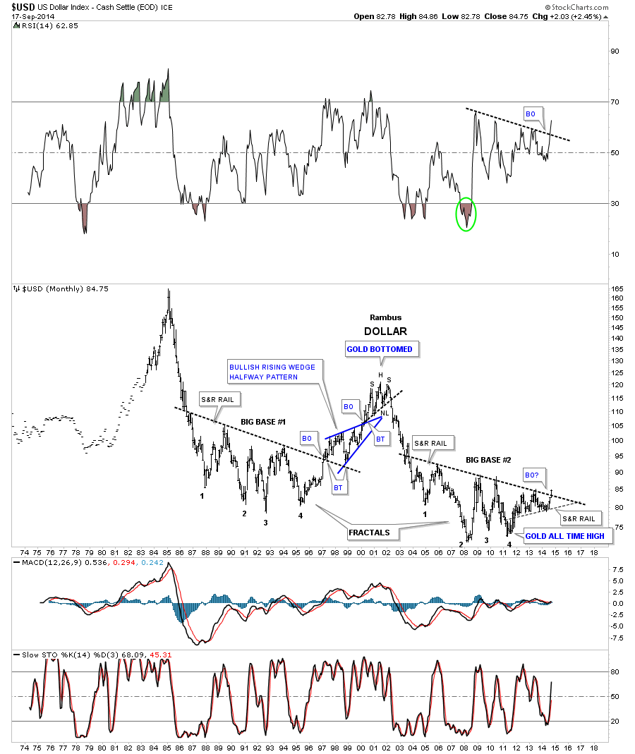
If many of the currencies I showed you on this post have massive H&S tops in place it stands to reasons that the US dollar should also have a massive H&S base. Below is my epiphany chart when I first discovered the two fractals for the US dollar. As you can see, finally after a year and a half of waiting for big base #2 to breakout, it’s finally happening this month. I have to say it’s very rewarding to finally see something you seen a year and a half ago come to fruition. A lot of investors are wondering why the US dollar is so strong right now. The reason the US dollar is so strong right now is because it’s breaking out of that massive big base #2, it’s a breakout move.
I have believed for a very long time that the US dollar was going to take center stage at some point in time. With all the massive H&S tops in place, on a lot of the most important currencies, this is telling me that things related to a strong US dollar are going to be under pressure for sometime to come. We’re not talking about a few days or weeks or even months but most likely years before those massive distribution patterns play their selves out. It’s just my interpretation of the Chartology that is leading me to this conclusion. The fundamentals will show their hand further down the road but it will be too late to take full advantage of what lies before us right now. The big picture is painted in full color for everyone to see if they choose to look. I like what I see from purely from a Chartology perspective. All the best…Rambus